hotstamp, Disc Golf Mike Inscho 5/21/20 hotstamp, Disc Golf Mike Inscho 5/21/20 Amanda Melwiki - 2020 Team MVP Tour Series Read More Design, hotstamp Mike Inscho 2/13/20 Design, hotstamp Mike Inscho 2/13/20 Schrock-A-Doodle-Doo Read More hotstamp Mike Inscho 8/6/19 hotstamp Mike Inscho 8/6/19 Robokitty 2.0 Read More Illustration Mike Inscho 1/17/18 Illustration Mike Inscho 1/17/18 The Beat Doc Read More
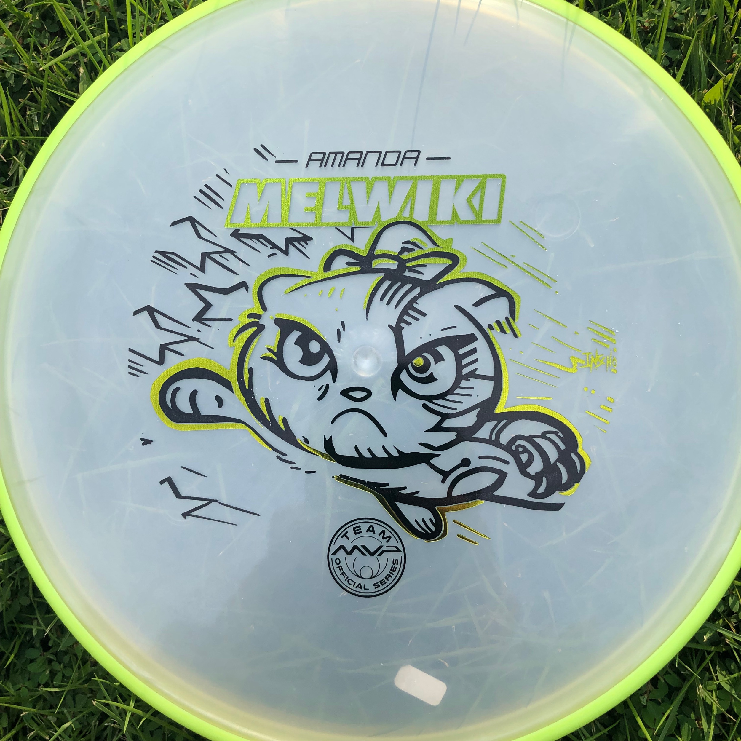
hotstamp, Disc Golf Mike Inscho 5/21/20 hotstamp, Disc Golf Mike Inscho 5/21/20 Amanda Melwiki - 2020 Team MVP Tour Series Read More
Design, hotstamp Mike Inscho 2/13/20 Design, hotstamp Mike Inscho 2/13/20 Schrock-A-Doodle-Doo Read More