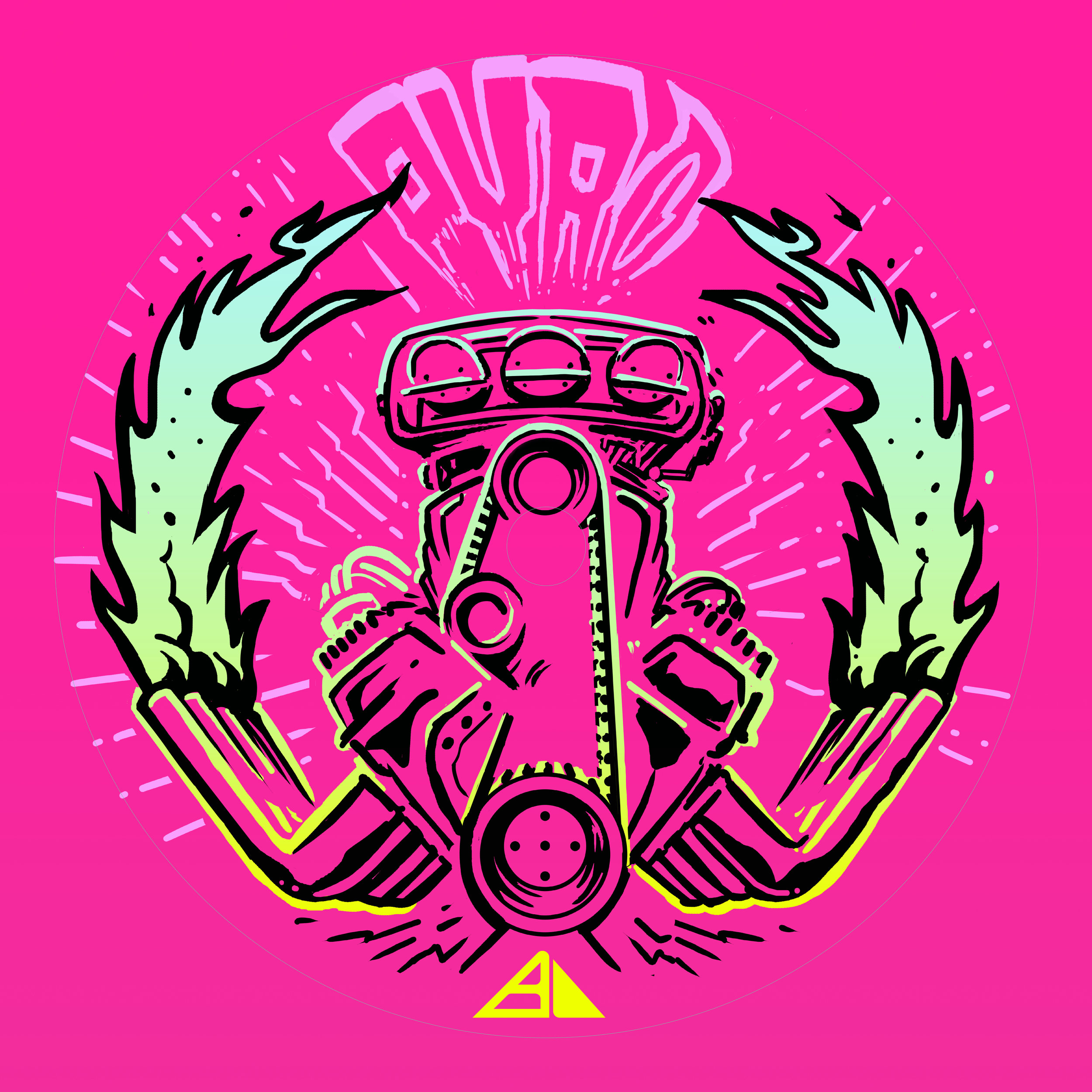
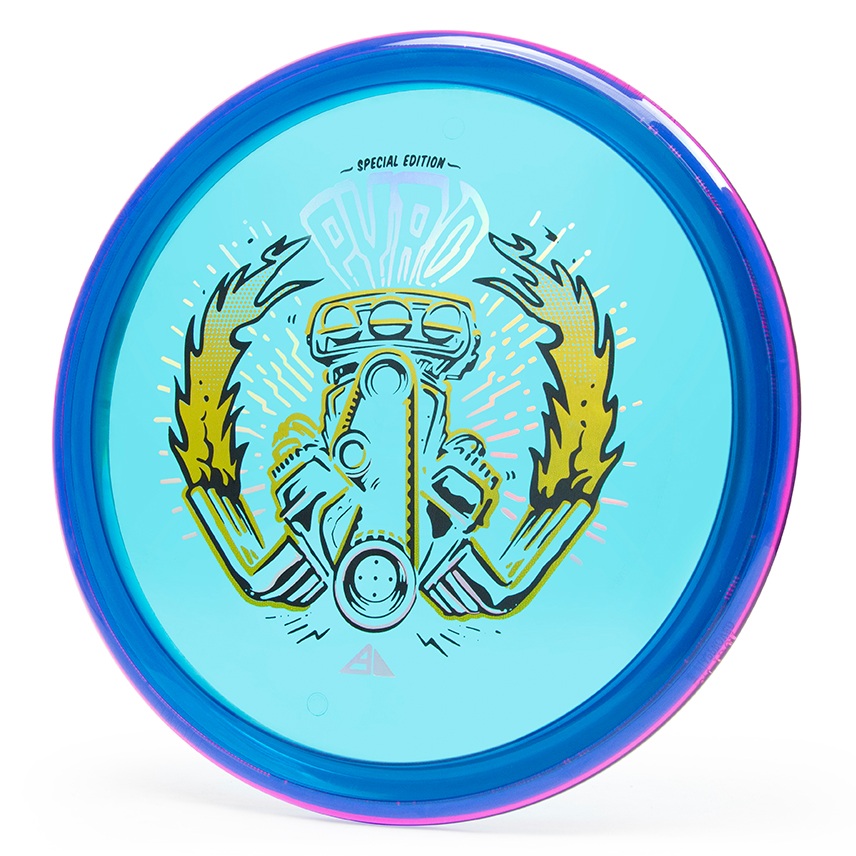
The Prism Pyro Special Edition took a few twists and turns until we reached the final intended direction. Those first twists and turns I (sadly) cannot show. BUT! I can let you in to where the project really started picking up steam (errr….heat). This project put Axiom Discs in a position to really push a different side of the the alternative scene. Zachary Kelbaugh had done a punk character riding a Big Wheel on the Proton Mayhem SE and that’s how far it ever really went in a hot rod type of direction.
The design stemmed from a quick thumbnail while I was thinking of an awesome game around 2006/2007 time frame by the name of Brutal Legend from Double Fine Games. Brutal Legend had an intro with a chrome beast named Ormagöden, "The Fire Beast, Cremator of the Sky, and Destroyer of the Ancient World." We liked the symmetry of the skull/ fire/ pipes (that were mistaken as lab beakers) in the thumbnail stage. From that idea, we traveled down the late 60’s & 70’s wild illustration of engines and chrome. An area I know a little too well.
The design was road-mapped out in Adobe Photoshop. It was there that we decided 80% of our foil allocation. The lines were cleaned up and then ported into Adobe Illustrator. A higher pixel count helps make sure that there’s no quality issues when using Illustrators’ Live Trace feature. The important thing about designing on a translucent type of plastic is to allow it to breathe. Really, that’s a good fundamental to remember with any stamp! For Proton Plastic in general, the goal was to introduce the core color wherever possible. The last design decision was to allow negative space to creep into the top parts of the flame tips. This in turn allowed the intensity to be focused at the hottest part of the flames closest to the engine. The design wrapped up by inspecting all 3 stamp layers and double checking for discrepancies.
What do you all think? Was this the right direction to go? Please take a minute to like and share this post!


