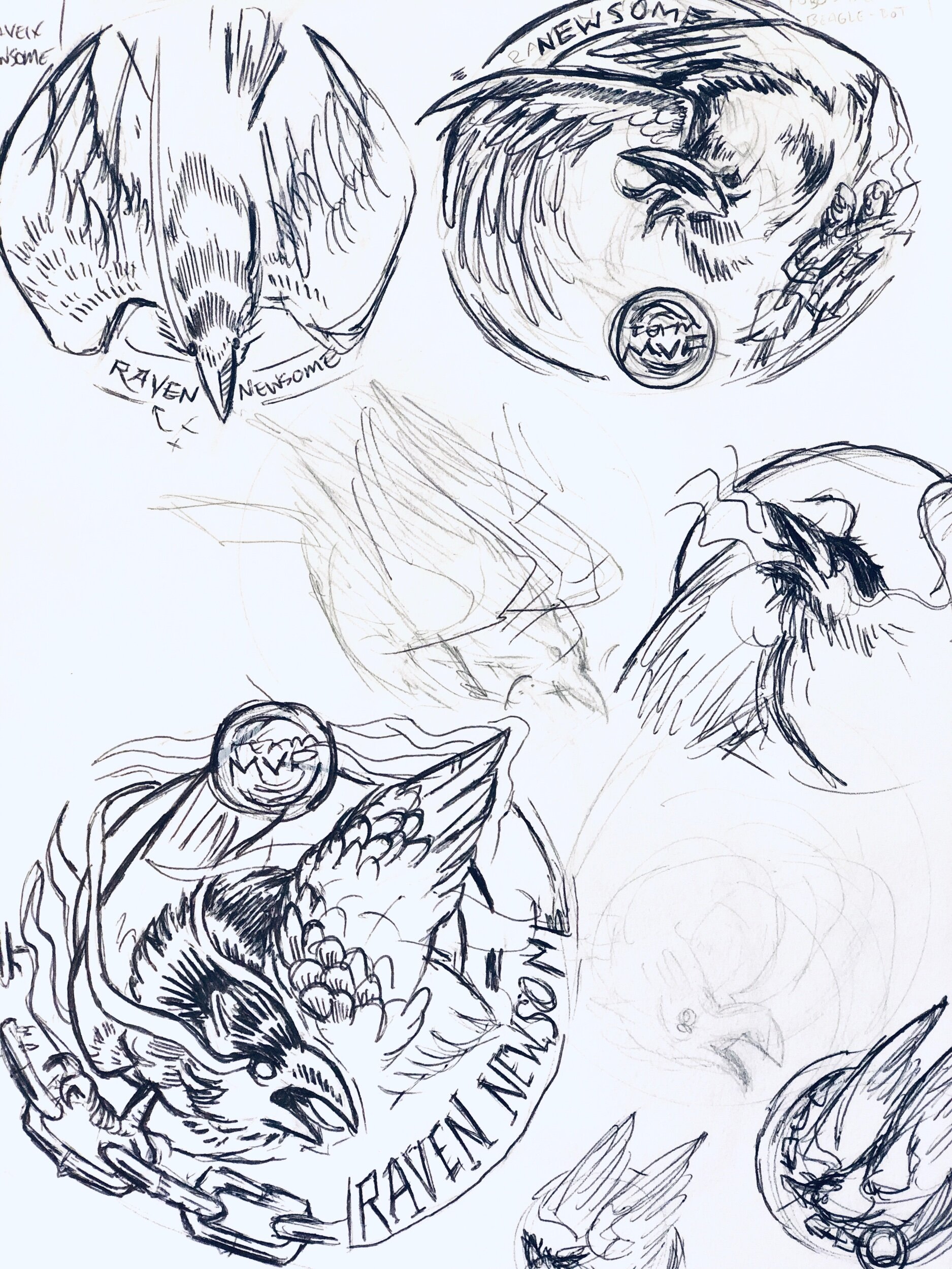
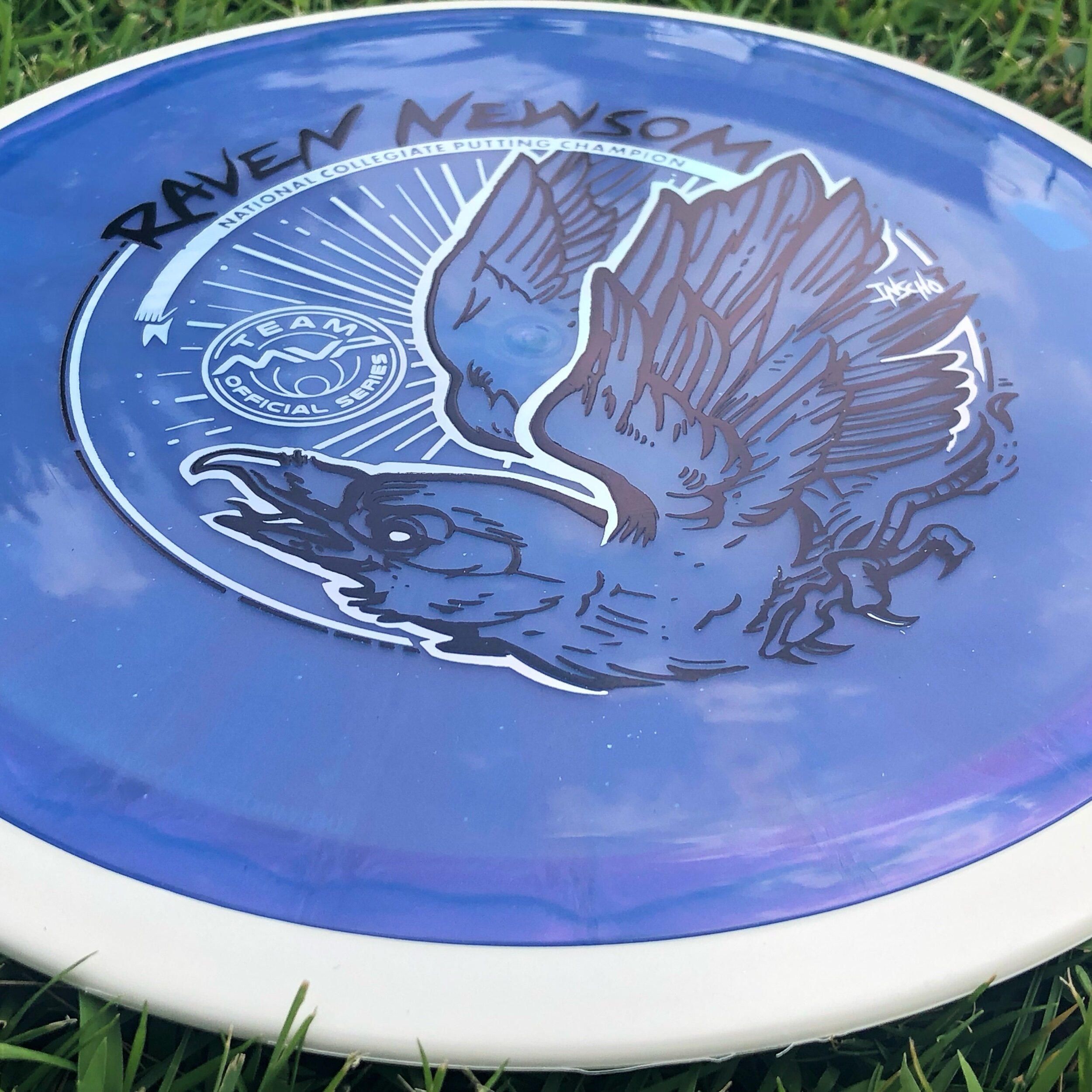
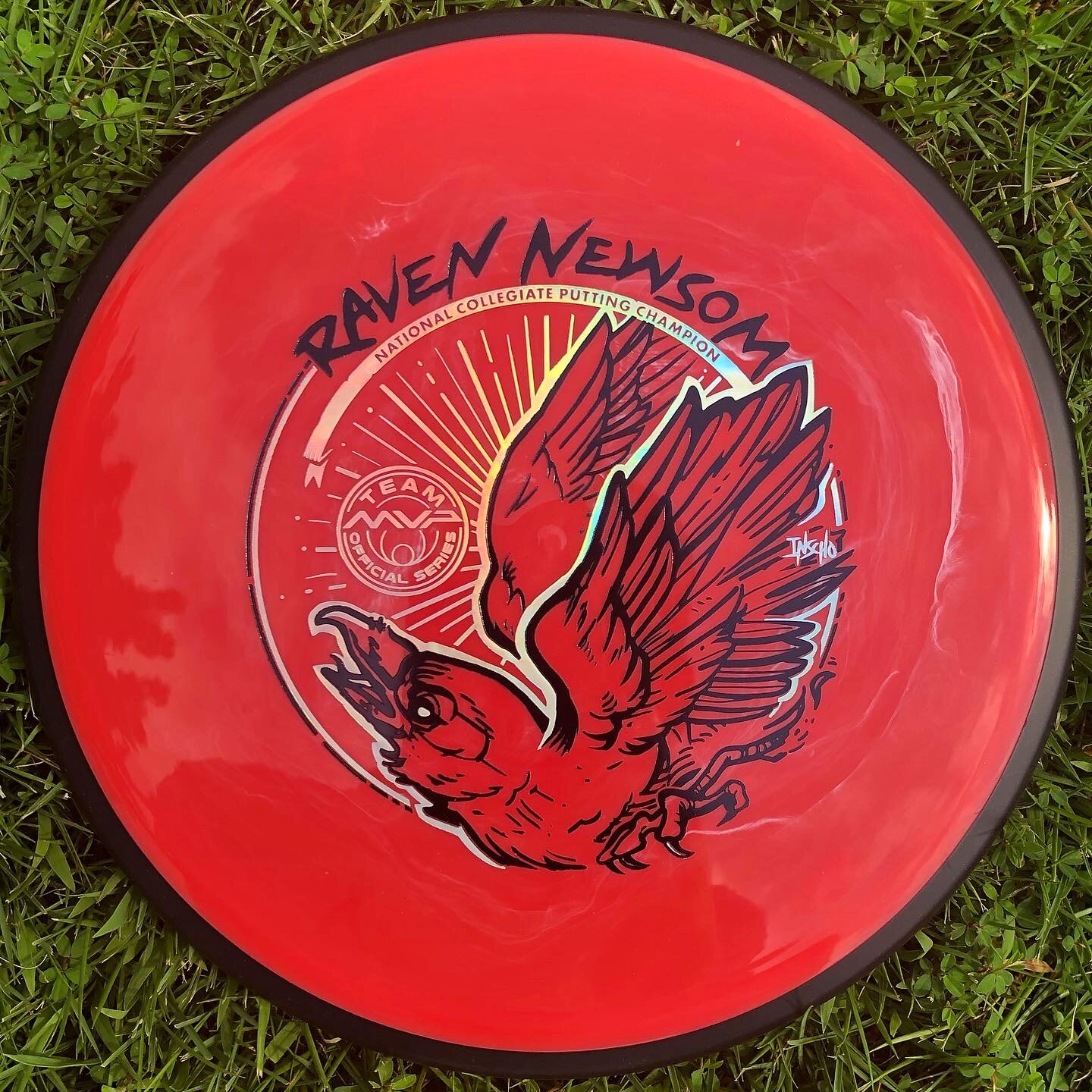
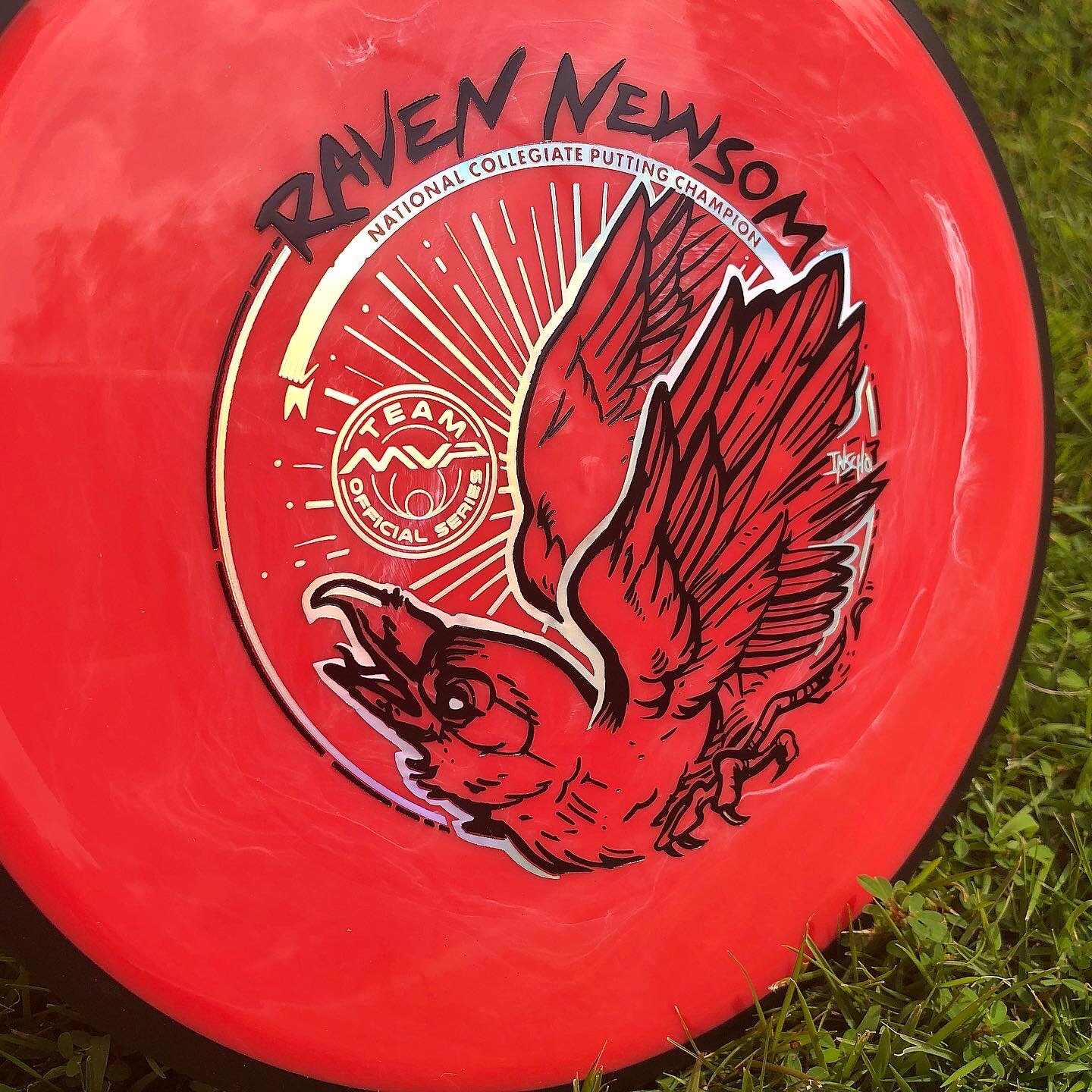
Raven Newsom officially went all-in on the 2021 season. He’s toured and pretty much played every National Tour and Disc Golf Pro Tour event that was on the calendar. I started early and before the holiday season of the previous year to get something geared up to help his touring efforts.
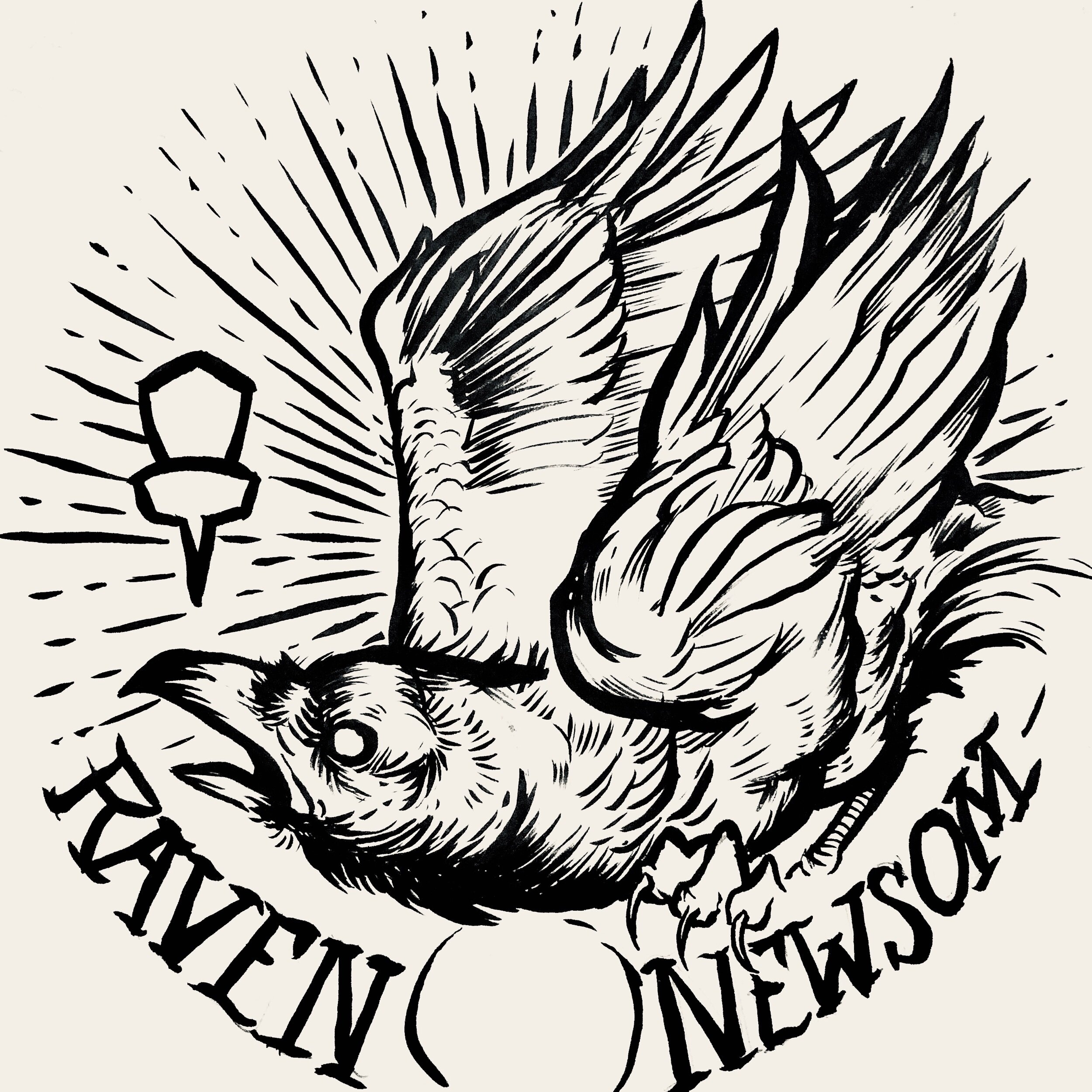
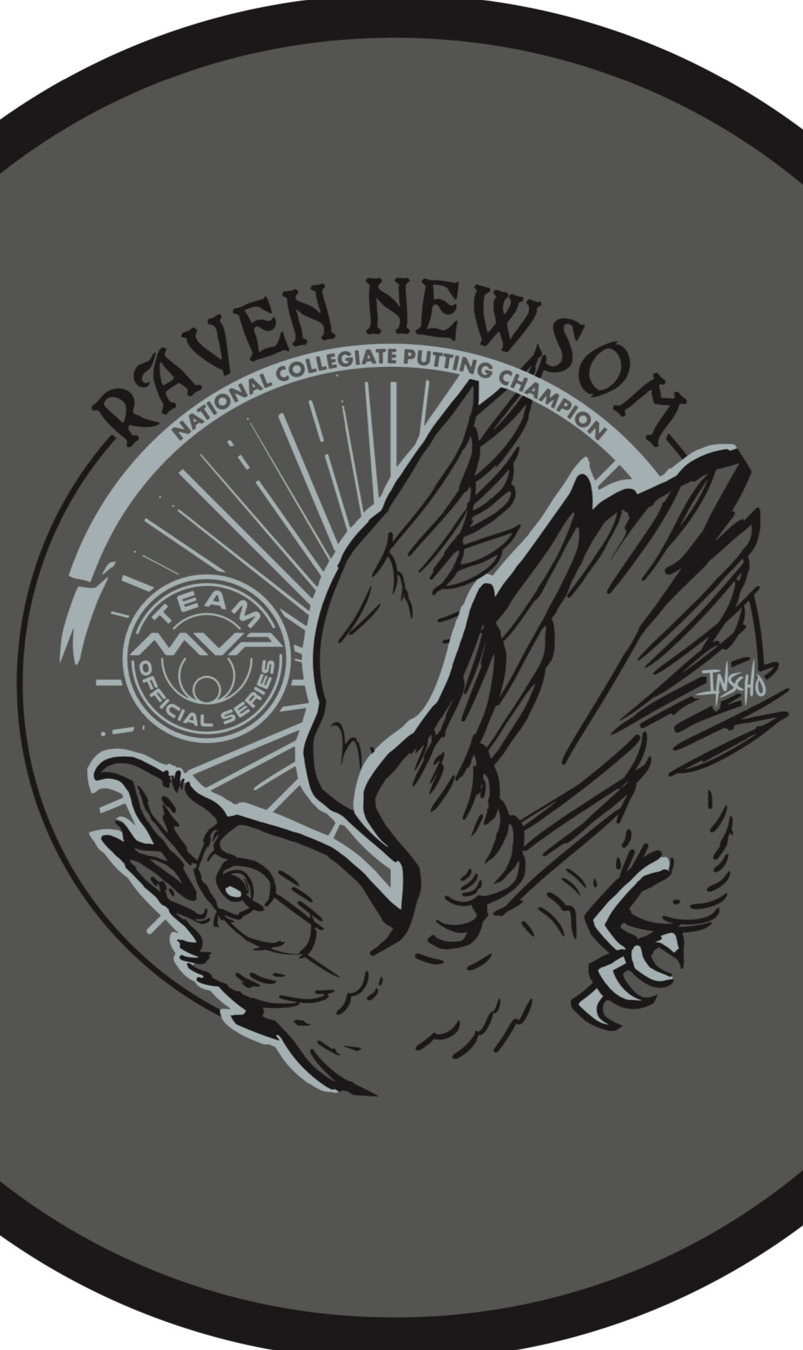
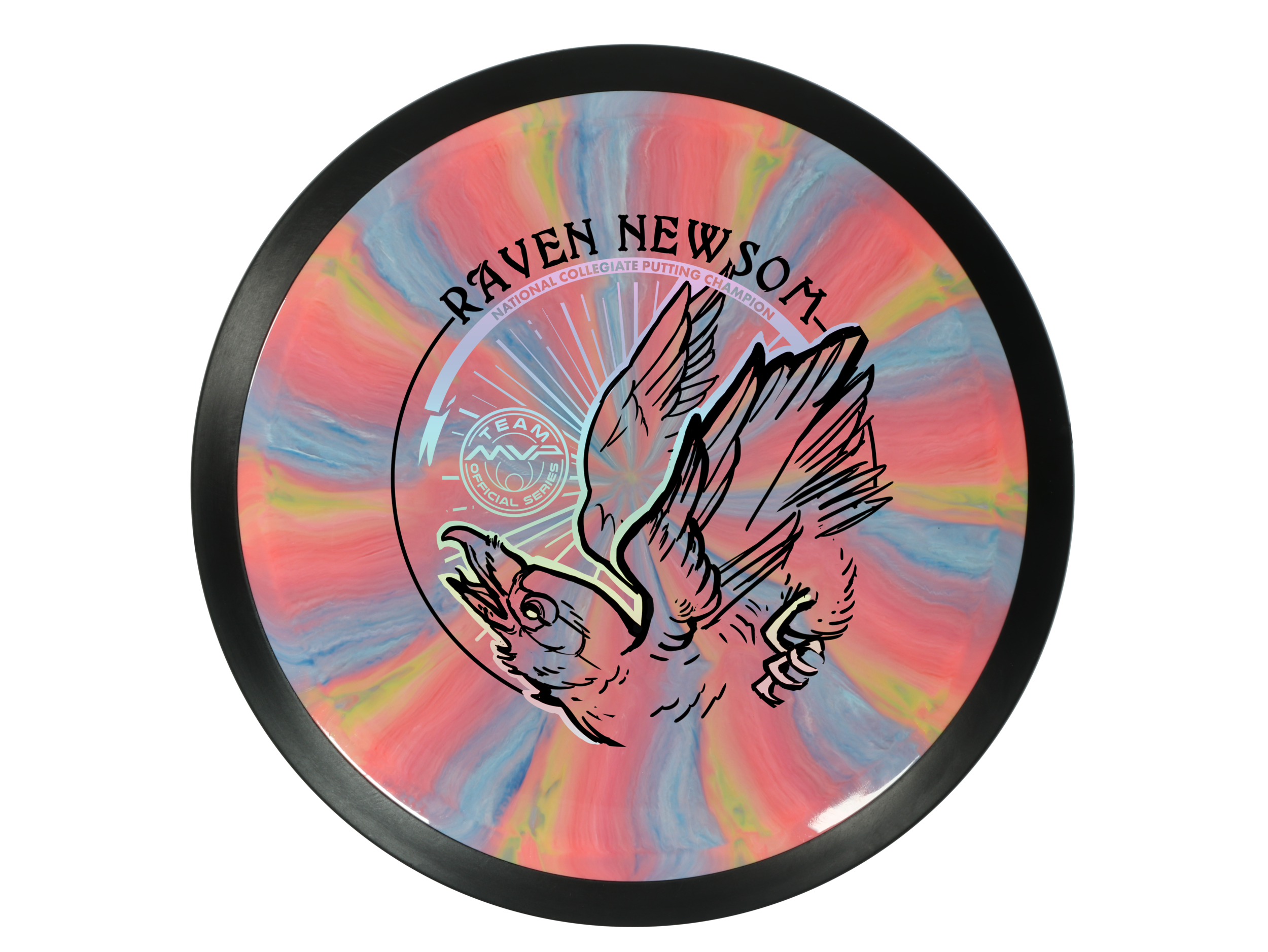
Raven made the process super easy. He trusted my design skills and let me come up with a few ideas to ponder over. As you see for the very early stages, the raven was refined and some of the heavy linework from my brush pen was slimmed down a bit. Everything was bold and it didn’t allow your eye to rest. I felt it was chaotic and the bird seems way out of shape. It took some more reference gathering to really started feeling better about the bird, its outstretched wings, and the overall ability to add in “Collegiate National Champion” with a bit of class.
With the worldwide COVID-19 pandemic; it’s been tough getting this design to the masses with only one or two small releases up to this point. Keep a lookout for more runs coming from Raven. I want to thank Raven for giving me this opportunity. If you have any questions, please hit me up or leave a comment!


Firm Electron Envy - Special Edition
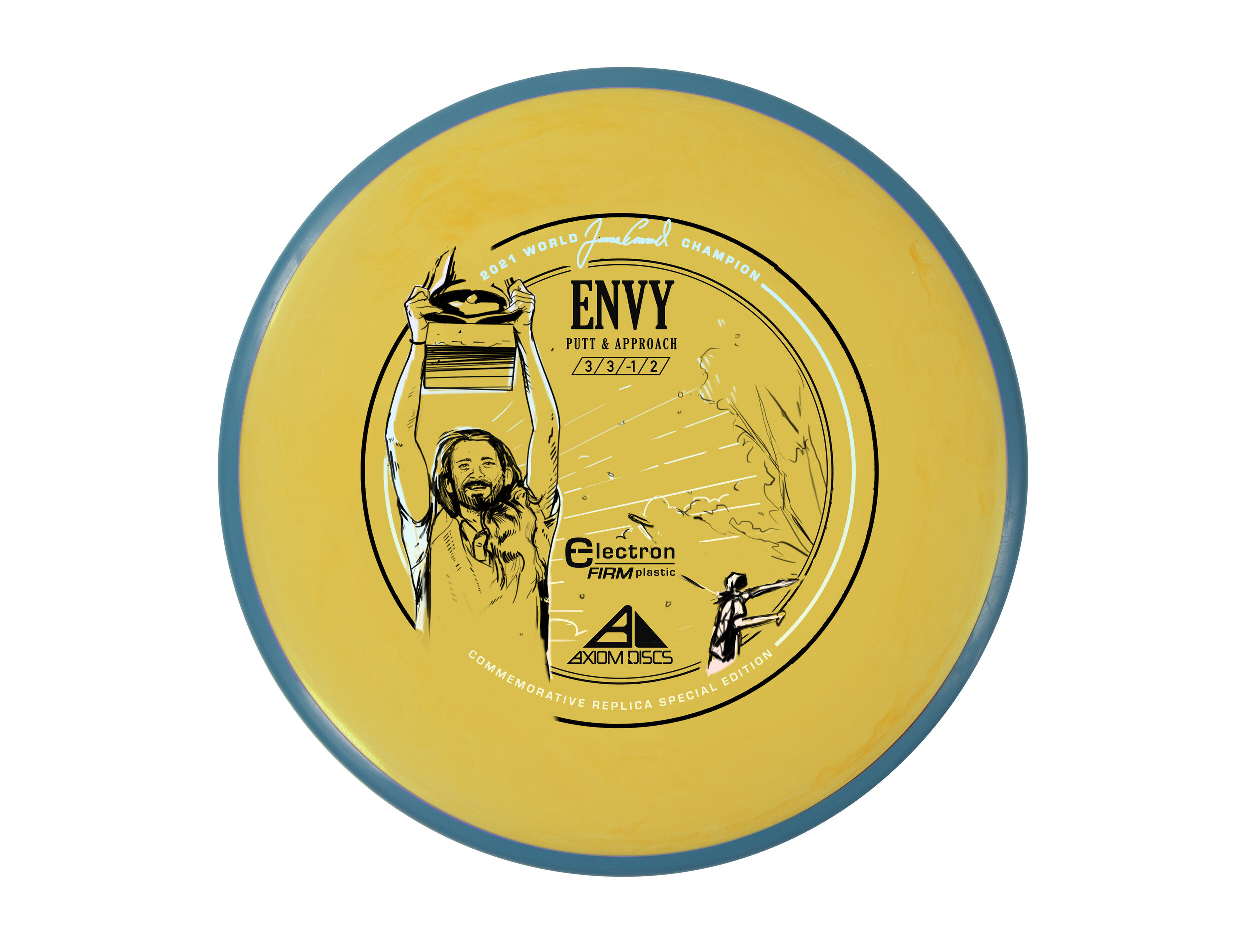
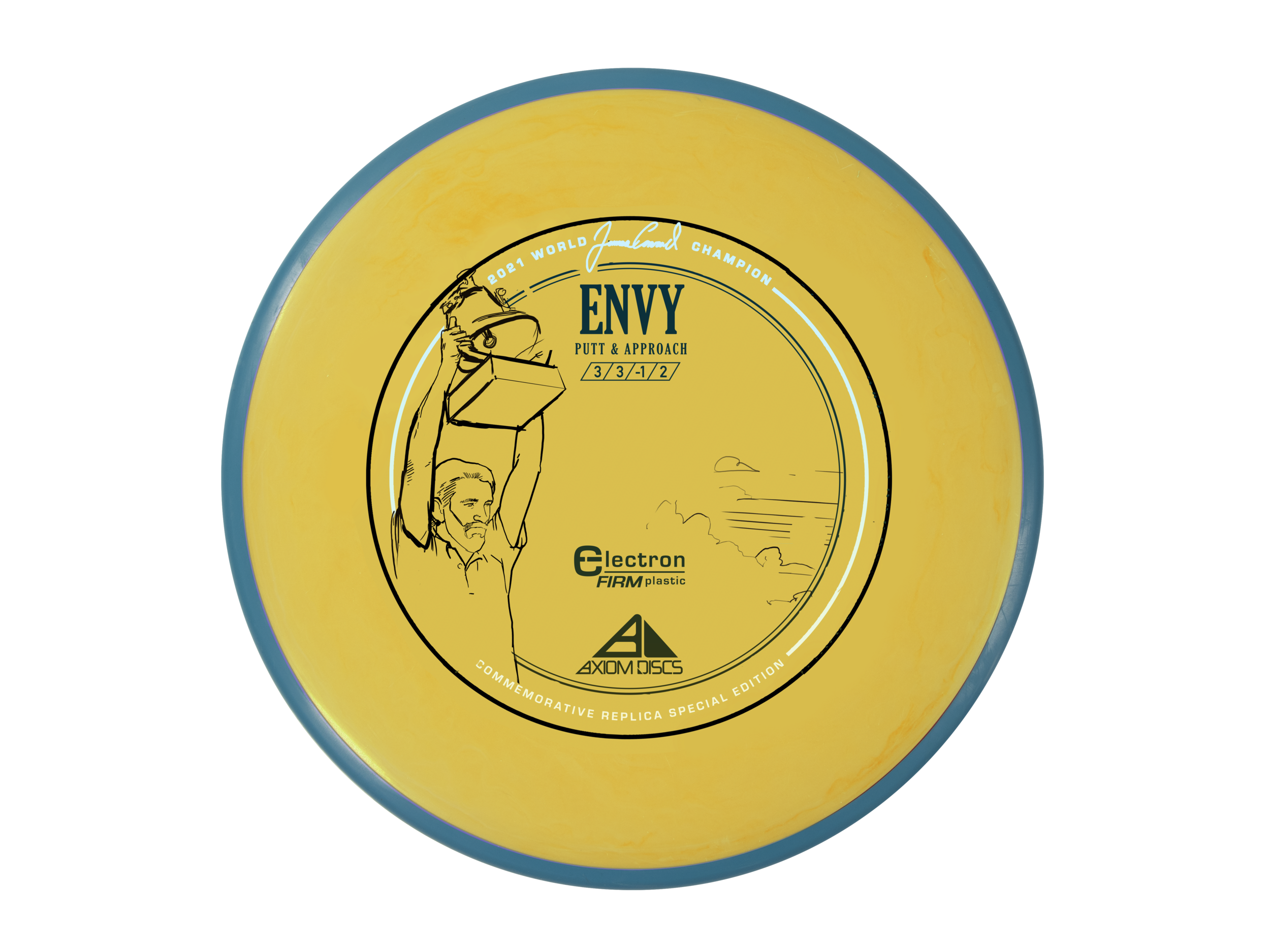
James Conrad. What a performance!! If you’ve been living under a disc golf rock, here’s the final round of the 2021 PDGA Disc Golf World Championships. That shot propelled MVP and Axiom Discs to run its first custom colorway since the early Axiom Artist Series releases. It’s been a little over a year since that day but I’ve finally told myself I should probably post this before the 2022 World Championships. We wanted to truly honor the win while also acknowledging the sheer interest in the Electron Firm Envy that he threw in from 257 ft to force the playoff with 5x World Champion, Paul McBeth.
This is up there with some of the most prolific design jobs I’ve ever done in the disc golf space. I knew going in that getting and sorting through all the media from that weekend was going to be the task at hand. We had boots on the ground with Team MVP Team Manager and Marketing Director, Andrew Johnson following James and getting some insane footage. We also had PDGA and Gatekeeper Media content at our disposal. It was important for us at MVP to celebrate “The Shot” but to also put the viewer in the exact moment James raised the trophy. He’ll remember that particular moment for the rest of his life. I think the decision to create a replica yellow core, blue rim Electron Firm Envy was decided on just a few days after everything went down. MVP HQ wanted to make sure that was something they could facilitate both with plastic availability and machine time.
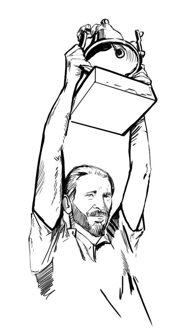
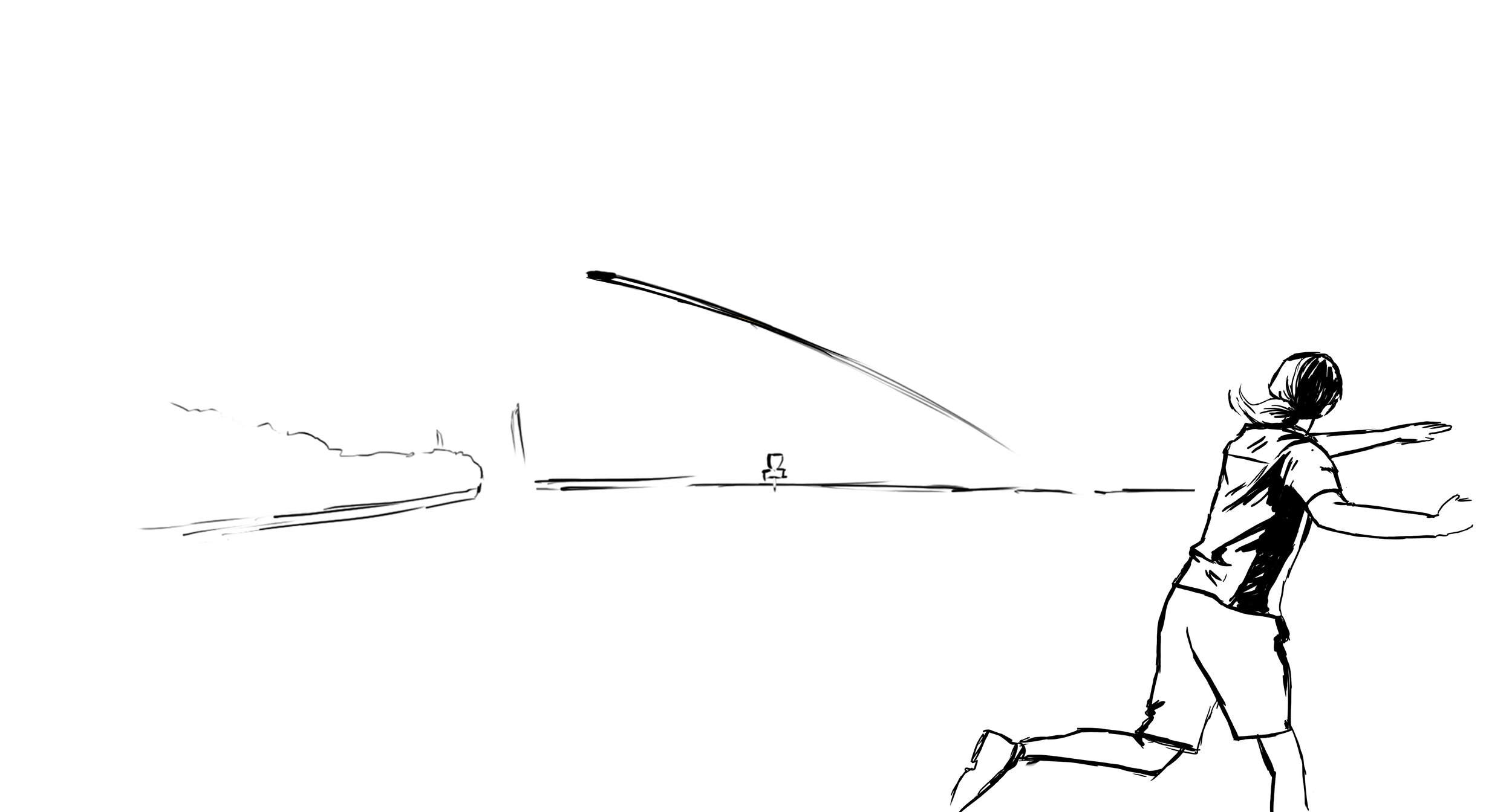
I had already made a mental note that most likely that was probably going to happen and started tinkering on editing the stock stamp created by Zachary Kelbaugh with some tasteful and clean Worlds win text. I wanted the stock Axiom Electron putter stamp to remain as much as possible while facilitating the celebration. While in the quick and dirty thumbnail phase, my gut said something had to go. The tightly wound audio waveforms representing the plastic firmness around the outside were extracted. I began working on a few inking pieces based closely on references of James that I paused from video footage. I’ve watched the shot 100+ times and probably in slow more for a majority of those trying to find particular moments. I remember the amount of pollen floating in the air, the time of day, and the sheer amount of sunlight beaming down on Hole 18 during the final approach. The grandstand, the crowd, the line, and the commitment around that right side tree. All of it. I put as much as possible while keeping it mostly uncluttered.
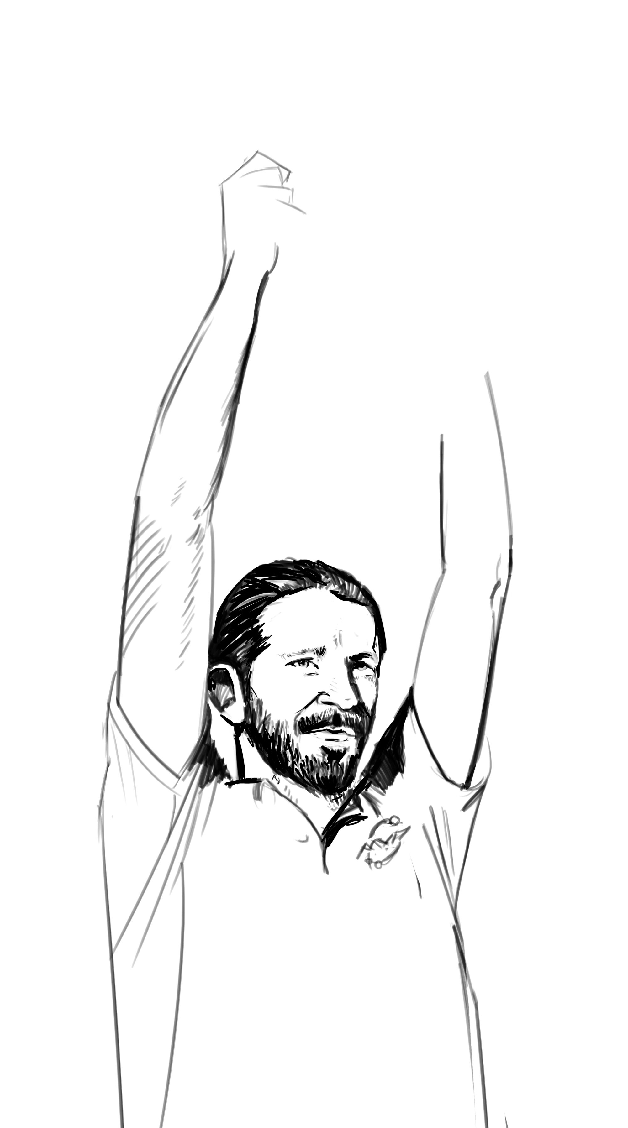
If you notice from the images I’ve shared below, we almost used the front-facing James shot from the award ceremony. I felt the rawness, the immediacy of the trophy raise near the water carried the energy from that thrilling playoff hole and favored that idea. With that finally decided, I went back and tightened up the Hole 18 grandstand, backhand throw, sunrays, and pollen around the Axiom and Electron Firm logos. This was a fast-paced project but I felt the ability to rush something out in a day or two just wasn’t the greatest idea. We wanted a classic design centered around James’ first PDGA Worlds win and something that acknowledged and represented the absolute insanity of the final round.
The Special Edition Firm Envy is out in the wild. Please be sure to ask your local retailer if they have any left in stock!


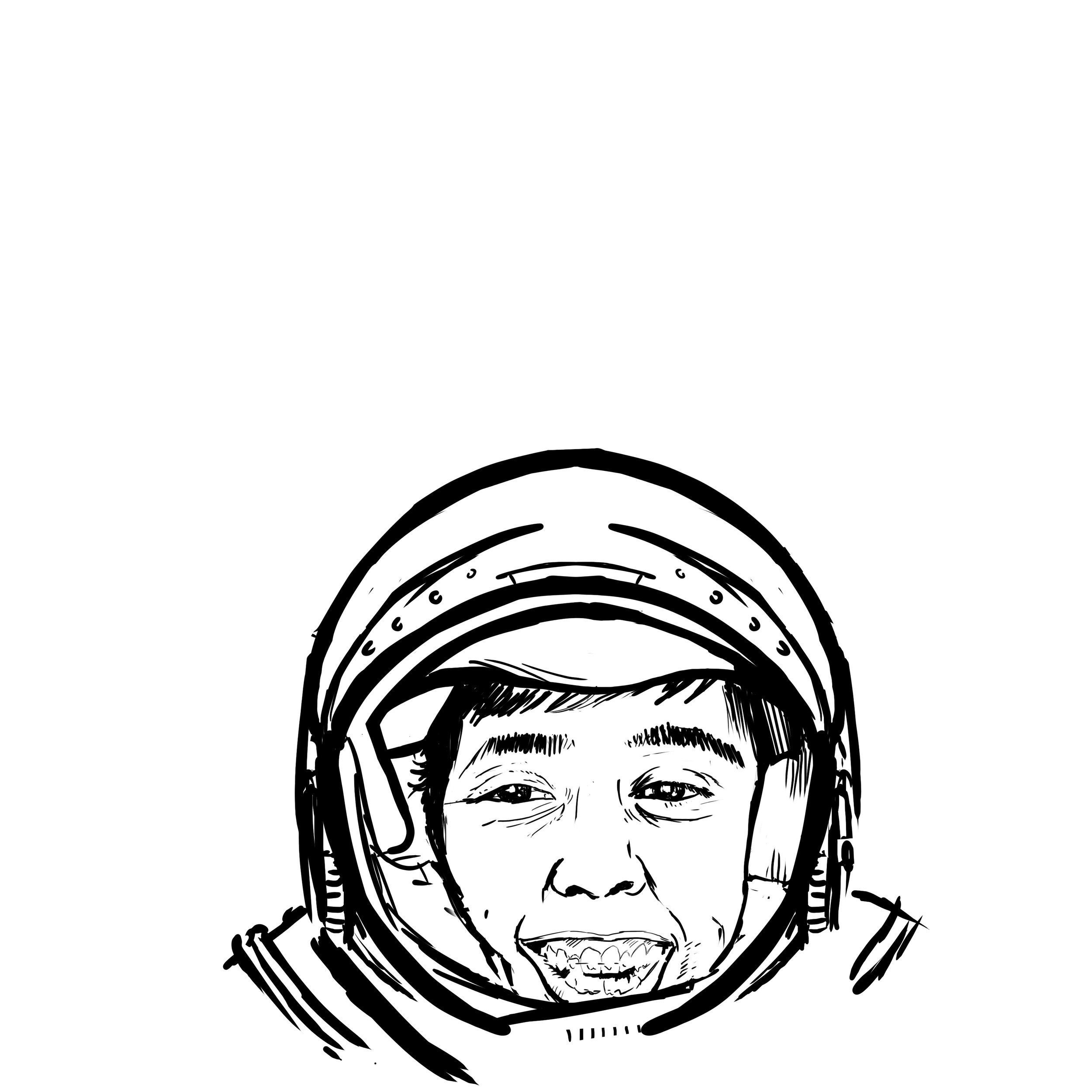
Jordan Castro "Castronaut" 2020
Jordan Castro is a new face to the MVP team this year. I was very fortunate to get a private message from him asking if I could help him out and get a stamp ready. Not knowing Jordan personally; I kept asking questions. What is he about? What are his passions? I went to down on a few ideas that would work within the disc template. Let’s just say I didn’t get off to the greatest start for his first Tour Series disc. Jordan is extremely humble, humorous and has an incredible work ethic. I wanted to take some of those traits and relate them to the artwork.
Shortly after the first/second round of ideas, we went back to the drawing board and Jordan hits me up one day and says “Castronaut! Can you work with an astronaut theme?” From then on we were locked in and the project really got rolling. We were lucky that one of the first one or two thumbnails nailed the direction. This straight on astronaut suit seemed to fit the easiest circular composition. I didn’t fully love that his helmet would be stuck to the bottom area of the stamp but you’re limited in some areas because of template restrictions. This layout really opened up the top to celebrate the “Castronaut” title and minimum Team MVP seal standards toward the top of the stamp.
Nailing the likeness of Jordan was extremely tough. The thumbnail gave more of a caricature feeling and I wanted the audience to instantly recognize. It took shades/ no shades/ and a few photo mashup’s to get the eye's and overall expression where I had envisioned it to be. The last phase was polishing up the Castronaut wording and framing by using the Illustrator 3D text tool and adding star bits and filigree to the top portion of the stamp.
All in all, this took a bit more development than I had anticipated. Jordan was awesome the entire way through this process and helped with reference photos and gathering resources where he could on top of his busy schedule. I hope this stamp starts a successful series for him and his years with Team MVP and MVP Disc Sports.
You can contact Jordan Castro on his tour fundraiser discs here!
https://www.facebook.com/jordan.castro.90


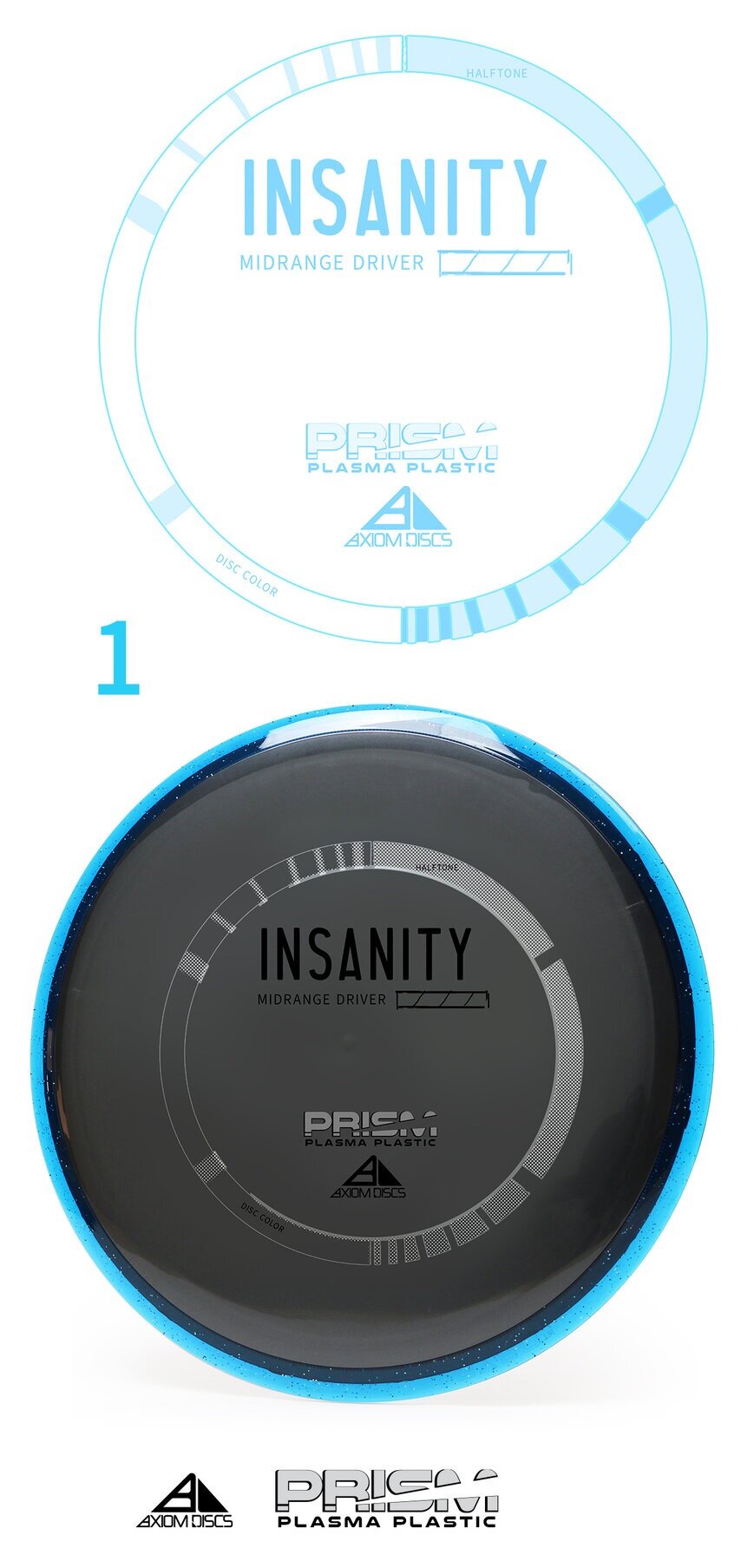
Axiom Prism Plasma - Stock
The Axiom Discs Prism Plasma plastic brings the shimmering beauty of a core fused with the luster of a candy-like Prism outer rim. In this development blog, I dip my toes into a few decisions that made me arrive at its current design. With pen and paper in my hand; the first thought was how can I get in and get out with the least amount of wreckage?
The plastic combination does the work for you! My goal was to create a non-intrusive 3 foil design that allowed the plastic to speak to the consumer. Axiom branding has dabbled in the Fibonacci sequence, DNA, flying machines and very artistic approach to high-level concepts. I centered this piece on simplicity. The ring uses to shape sequences that follow the 1,1,2,3,5,8,13,21 sequence. The design is duplicated and flipped on the opposite side. This creates this really cool halftone fill/ inverted look with the silver holofoil. Again, making this design bleed some of that beautiful, shimmering foil through. The 3 foils break down to Black, Silver holofoil for the ring and color transition holofoil for the Name/Prism logo fill. The font chosen to represent the disc name and flight numbers is Antonio. I wanted a font that was clean with a little bit of height to be legible from a distance.
All in all, sometimes the super simple designs take the most time. I’m glad we stuck to our guns on the outlining goals of this stamp art. It’s simply celebrating the look of the plastic and allowing a stamp to go along for the ride. It also looks really cool spinning through the air.


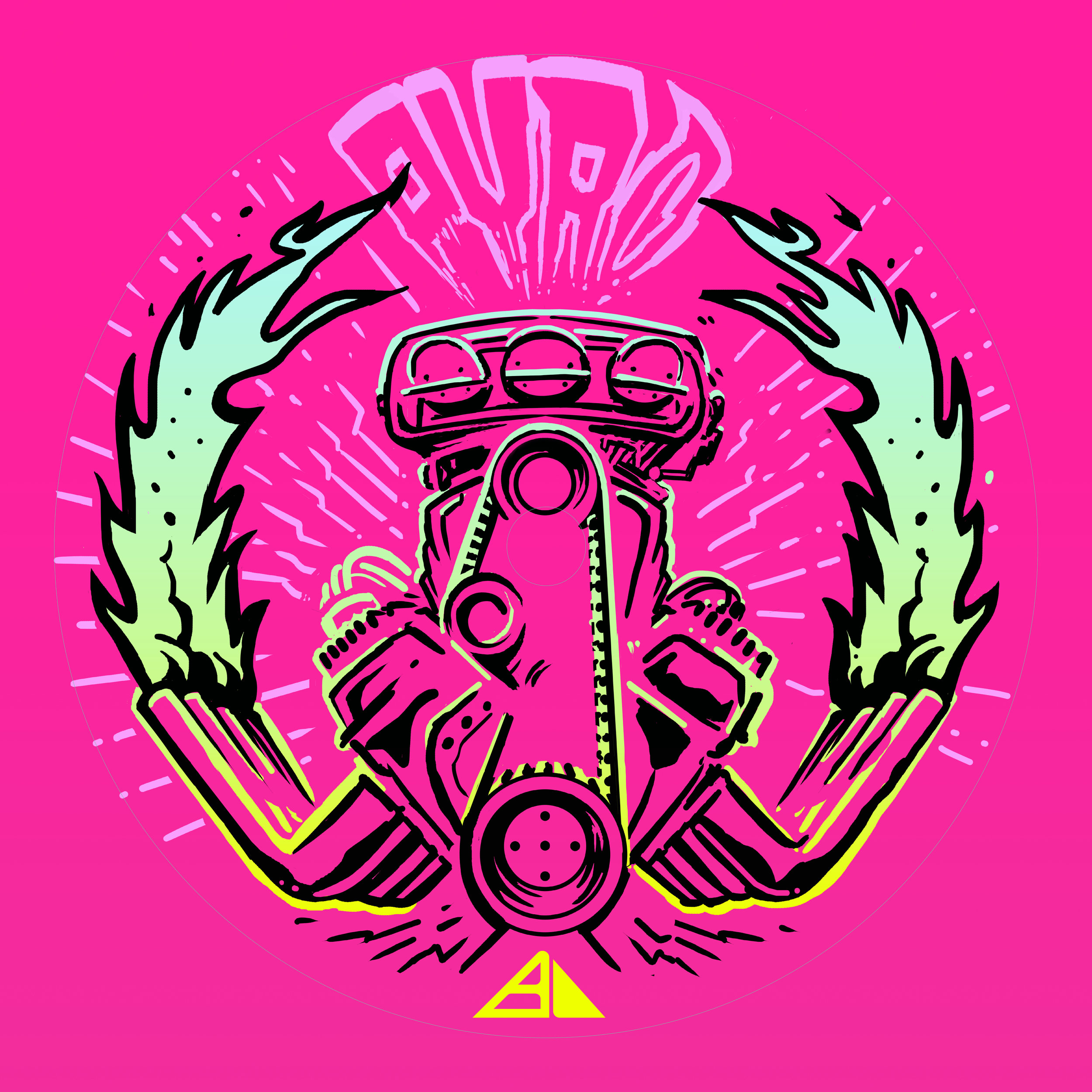
Prism Proton Pyro - Special Edition
The Prism Pyro Special Edition took a few twists and turns until we reached the final intended direction. Those first twists and turns I (sadly) cannot show. BUT! I can let you in to where the project really started picking up steam (errr….heat). This project put Axiom Discs in a position to really push a different side of the the alternative scene. Zachary Kelbaugh had done a punk character riding a Big Wheel on the Proton Mayhem SE and that’s how far it ever really went in a hot rod type of direction.
The design stemmed from a quick thumbnail while I was thinking of an awesome game around 2006/2007 time frame by the name of Brutal Legend from Double Fine Games. Brutal Legend had an intro with a chrome beast named Ormagöden, "The Fire Beast, Cremator of the Sky, and Destroyer of the Ancient World." We liked the symmetry of the skull/ fire/ pipes (that were mistaken as lab beakers) in the thumbnail stage. From that idea, we traveled down the late 60’s & 70’s wild illustration of engines and chrome. An area I know a little too well.
The design was road-mapped out in Adobe Photoshop. It was there that we decided 80% of our foil allocation. The lines were cleaned up and then ported into Adobe Illustrator. A higher pixel count helps make sure that there’s no quality issues when using Illustrators’ Live Trace feature. The important thing about designing on a translucent type of plastic is to allow it to breathe. Really, that’s a good fundamental to remember with any stamp! For Proton Plastic in general, the goal was to introduce the core color wherever possible. The last design decision was to allow negative space to creep into the top parts of the flame tips. This in turn allowed the intensity to be focused at the hottest part of the flames closest to the engine. The design wrapped up by inspecting all 3 stamp layers and double checking for discrepancies.
What do you all think? Was this the right direction to go? Please take a minute to like and share this post!


Axiom Plasma Fireball: Special Edition
The Axiom Fireball has been a chosen go to for overhand and forehand dominant players. I was given the opportunity to create a special fundraiser for the Disc Golf Pro Tour in 2018. When the opportunity landed in my lap to create a Plasma design for Axiom Discs this year; I was all over it.
Overall, the idea in my head was there. It was just a matter of figuring out the horizon line and overall fireball shape. I have a huge respect and love for Robert Valley’s work. He was trained under Peter Chung and worked along artists I’ve been admiring for years; Alberto Mielgo & Jamie Hewlett (NSFW). I like that push, pull and stretch that Robert is able to get with his perspective and characters. It’s more of an elongated figure style. Both simplified and graphic in his approach. Robert is a master at the fish eye effect. It’s more of first person view to his stories. I love that he doesn’t think about it, it just happens. You see this style with the final guy on the right side of the stamp.
All in all, It went through a few stages. We found that my initial punk dude was more in a comical superman pose. It didn’t feel right so ZAM (Art Director at MVP Disc Sports) helped me out and scrounged together a few reference photos of silhouetted bodies against a blast. Nothing too grotesque. If I could’ve kept the clouds filled in and graphic, that most likely would’ve been my ending place with overall cloud style. The restrictions of hot stamping needed me to break it a part a bit. I experimented with some tribal’esque cloud fills but felt overall, it didn’t fit the vibe well. It did, but it didn’t. I wasn’t aiming for a Polynesian scene or outcome but when I do, I’ll make sure to transfer that idea forward.
What do you all think? Did this equal up to 2018’s MVP Open Fireball stamp? If not, why? Leave your comments and I’ll make sure I return any questions or opinions you might have! Thanks.


Tyler Schrock- The Schloth
I would say Tyler Schrock and I had a successful freshman outing with his “Schroctopus” Tour fundraiser disc for 2018. He was able to make a few refresh orders to help get him to disc golf events last year after being sponsored by MVP Disc Sports. It was awesome to see that he wanted to work with me again in 2019 on a concept in the same vein as the previous. This time, the connection was a game his alumni club came up with called “Sloth”. It was a mix of rugby/soccer/handball.
We shared some references back and forth and it was time to get to work. The most iconic way you see a sloth in their habitat is hanging from a branch. That position also gives way to a rounded shaped backside that works withing the template I previously mentioned. I went to the sketchbook and nailed the position. The likeness of a sloth was a lot of trial and error. Either the sloth looked to chimpanzee-like or not enough to identify.
In the end, the reference gathering process helped me out so much. I was able to look at a few stylized examples and put those observations into our final stamp layout. This stamp screams lightheartedness. It really is an example of the person this art represent. While I’ve yet to meet Tyler, I know he’s represents MVP Disc Sports with the upmost professionalism as an athlete and ambassador.
Do you like the design for this year? I’d love to hear your thoughts in the comments!


2018 Amateur Worlds
2018 Amateur Worlds are here! MVP Disc Sports has partnered up with Am Worlds to produce a limited run of prototyped Prism Insanities. Prism is a concept teased last year where we run a translucent rim and core. It sure looks like a million bucks and I think people will be stoked to have one of these.
Going into this design, as a team we knew we wanted to shed away from the norm. A typical layout for the host city would be a skyline shot somewhere within the design. I wanted to play off of where Charlotte got its name. I scoured the internet to find this article written by Tom Hanchett explaining the birth of the City:"King George III still ruled the Colonies when European settlers chartered the town back in 1768. They named the new hamlet after the King's wife, Queen Charlotte, and gave the surrounding county the name of Mecklenburg in honor of her majesty's birthplace in Germany".
From this bit of information I stumbled across a pastel portrait of Queen Charlotte created by Francis Cotes. It was this portrait that sparked the idea of meshing new with old. With her finger so eloquently pointed up, I thought it would be a great idea to have her spinning a disc.
The Dogwood being our state tree and the Laurel on the left signifying the spirit of competition. Designating the 3 different foils was tricky. Since this was to be stamped on a Proton core, you have to pay attention to how much surface area you're allotting and how much light penetrates through it. Too many marks creates a thick and messy appearance when the stamp is in low lit areas.
You can pick up one of these beauties at the MVP tent at Amateur Worlds in Charlotte, NC. Quantities are limited!


Sol Spinner
I was presented with a great opportunity. I play disc golf. It's a serious hobby of mine since back in 05'. MVP Disc Sports/ Axiom Discs (both operating under the same roof in Brown City, MI) approached with an idea to start an "Artist Series" where they would seek and find unique artists to create a stamp pertaining a certain theme. They would be able to chose what color combination to go with, to support the design. Pretty much I'm running the pilot for this new line and couldn't be happier. The idea was to release this in the summertime.
Anyone knows how blistering hot it gets here in the south. No one wants to leave their air conditioned living room on some days. That blistering sun is something trying to be captured in this design. I don't surf or skate but I've always had a love for the artwork making it's way on boards. I want to thank Chad and Brad Richardson from MVP Disc Sports / Axiom Discs and ZAM. Not only for the support but allowing me to be the first design coming off their press using gold foil. There were a lot of firsts with this one.
This disc is a limited release (only a 1000 made) Axiom Clash. It sports an orange Proton flight plate/ white GYRO™ rim with gold stamping. It will be available on September 12th.
Here she is!