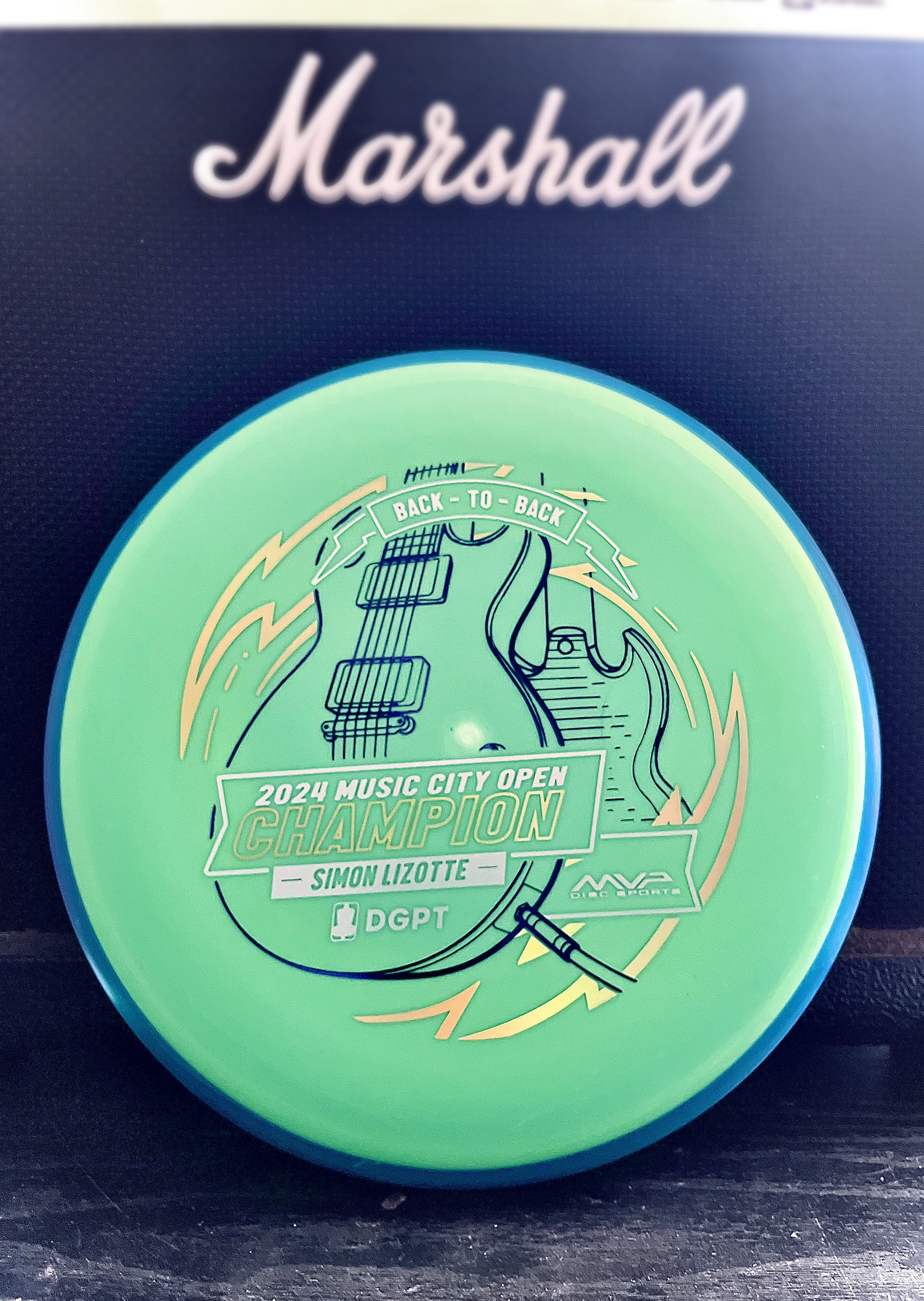
Sunday, mid-afternoon the text came in to start thinking about a stamp. Simon Lizotte had a 2 stroke lead going into the final round. He played out of his mind and was making the proper plays down the fairway and hitting some incredible putts all weekend. We knew the Pixel would be the disc we would run. I took a quick hour that Sunday afternoon while action was kicking off to create a stand in stamp just in case. The initial idea was to keep with the theme of this year and the Les Paul. My initial blocking in was to feature the body of the guitar in simplified drafting shapes.
The decision to go with a “back to back” was universal within the MVP Disc Sports ranks. Sunday night I got on it and started gathering referencing of both front and back of the SG and Les Paul guitars. I used a mix of different library models from Google Sketchup to nail camera field of view. Mainly, it was an excellent resource to help me get both guitars on guitar stands and in proper perspective
The final stretch was adding in a sense of “flow state” which was mentioned quite a few times on the live event broadcast. Simon seemed to be in that headspace all weekend and I wanted to incorporate that element. I used radial symmetry and bolts to add the 2nd foil and consciously used the 3rd foil for the Event/ Logos/ and “Back-To-Back” banner up top. The final stamped product was dressed in dark purple metallic, gold holographic, and brushed silver foil. The custom triple foil stamp took a solid 2.5 days from start to completion.
The concept is pretty straight forward but overall, with the amount of pressure and time to get something to final, I’m pretty stoked on the outcome. Let me know what you think? How could I have done “back-to-back” differently? Thanks for stopping by.
MVP Nomad - James Conrad Special Edition
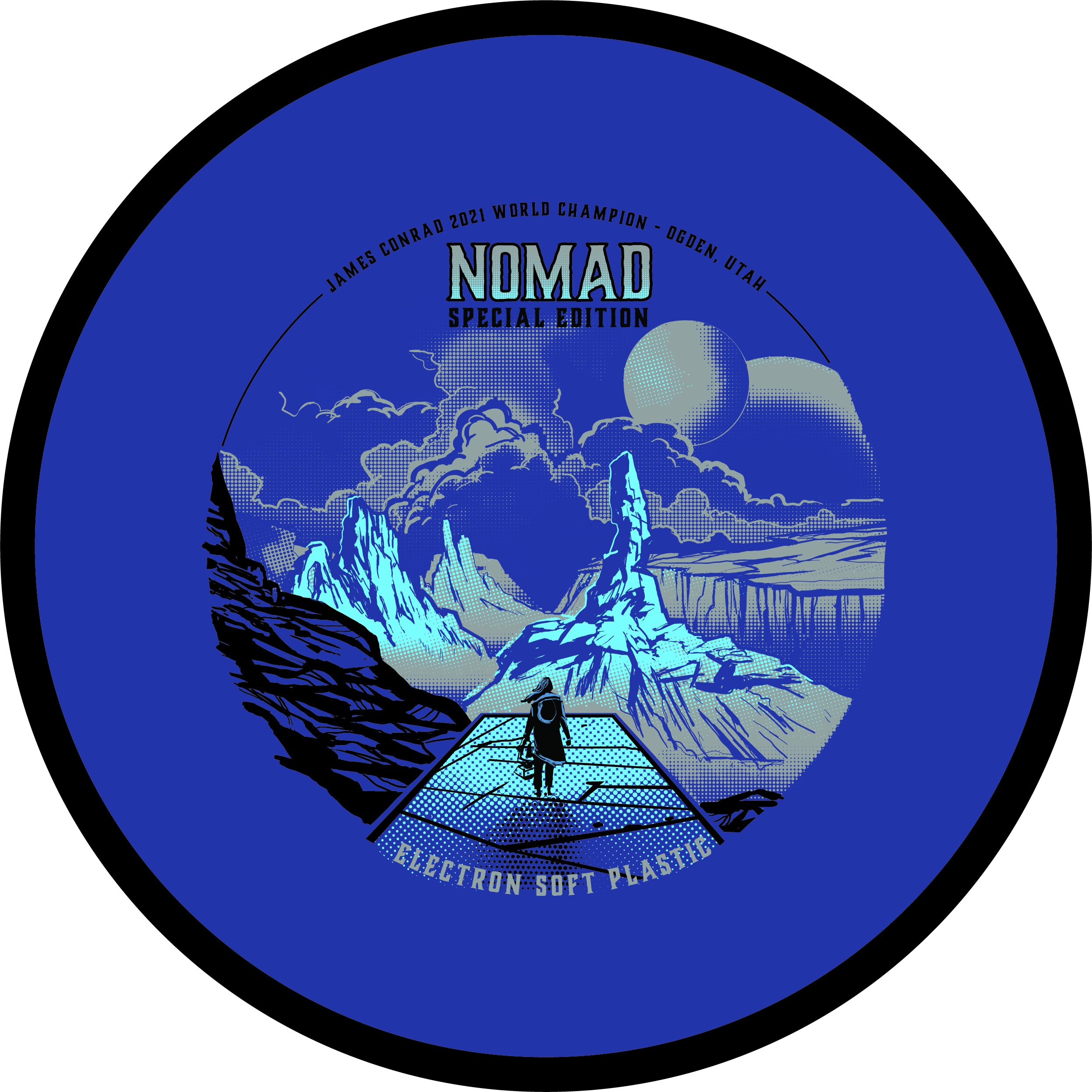
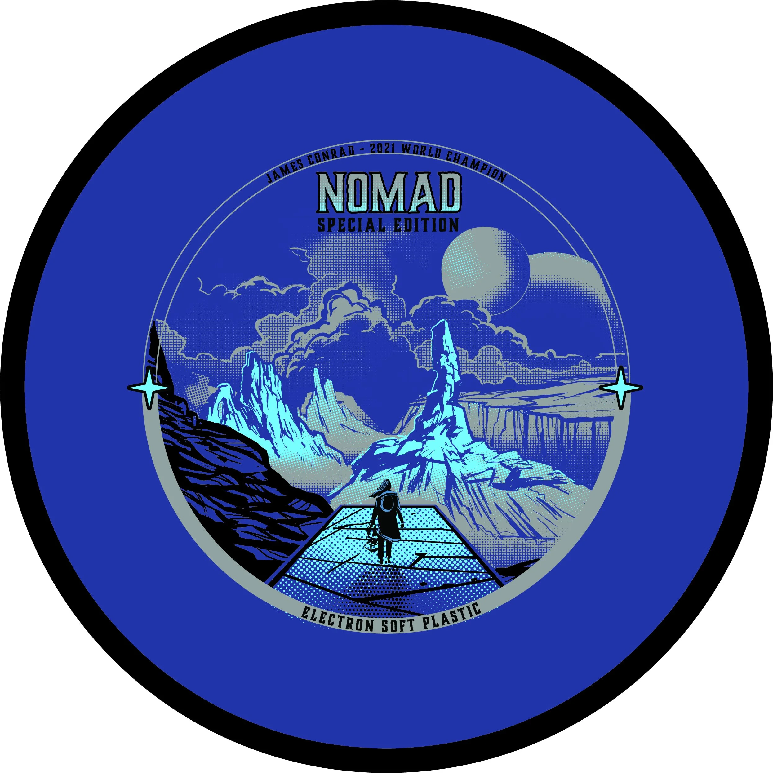
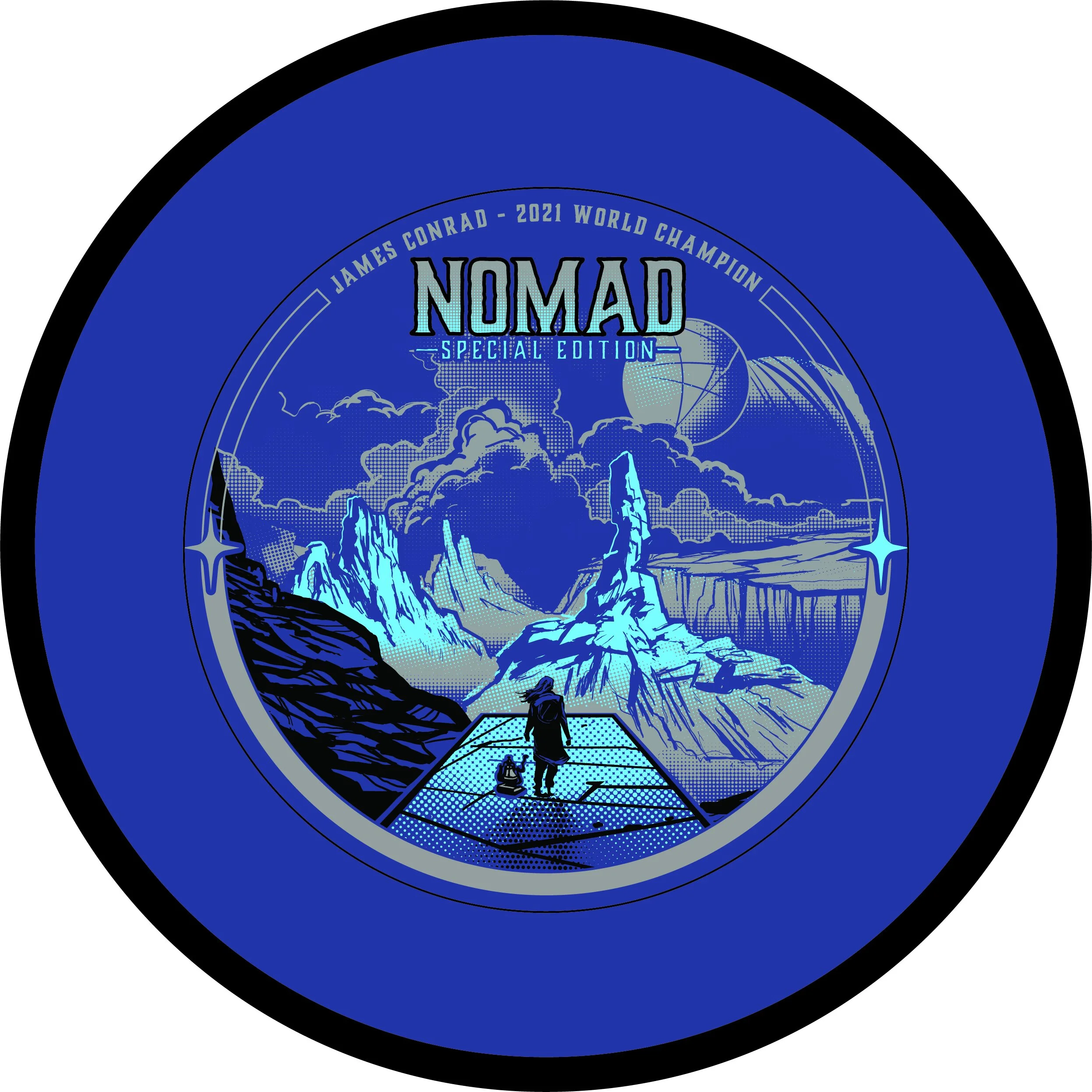
The MVP James Conrad Nomad Special Edition was a unique one. This project kicked off a bit earlier than most people realize. We had James Conrad’s Signature Line Nomads in production before he hit the biggest shot in disc golf (IMO). With that event happening and the surge and interest solely on MVP and their debut of James’ first designed putter; We shifted gears just before going into final stamp design.
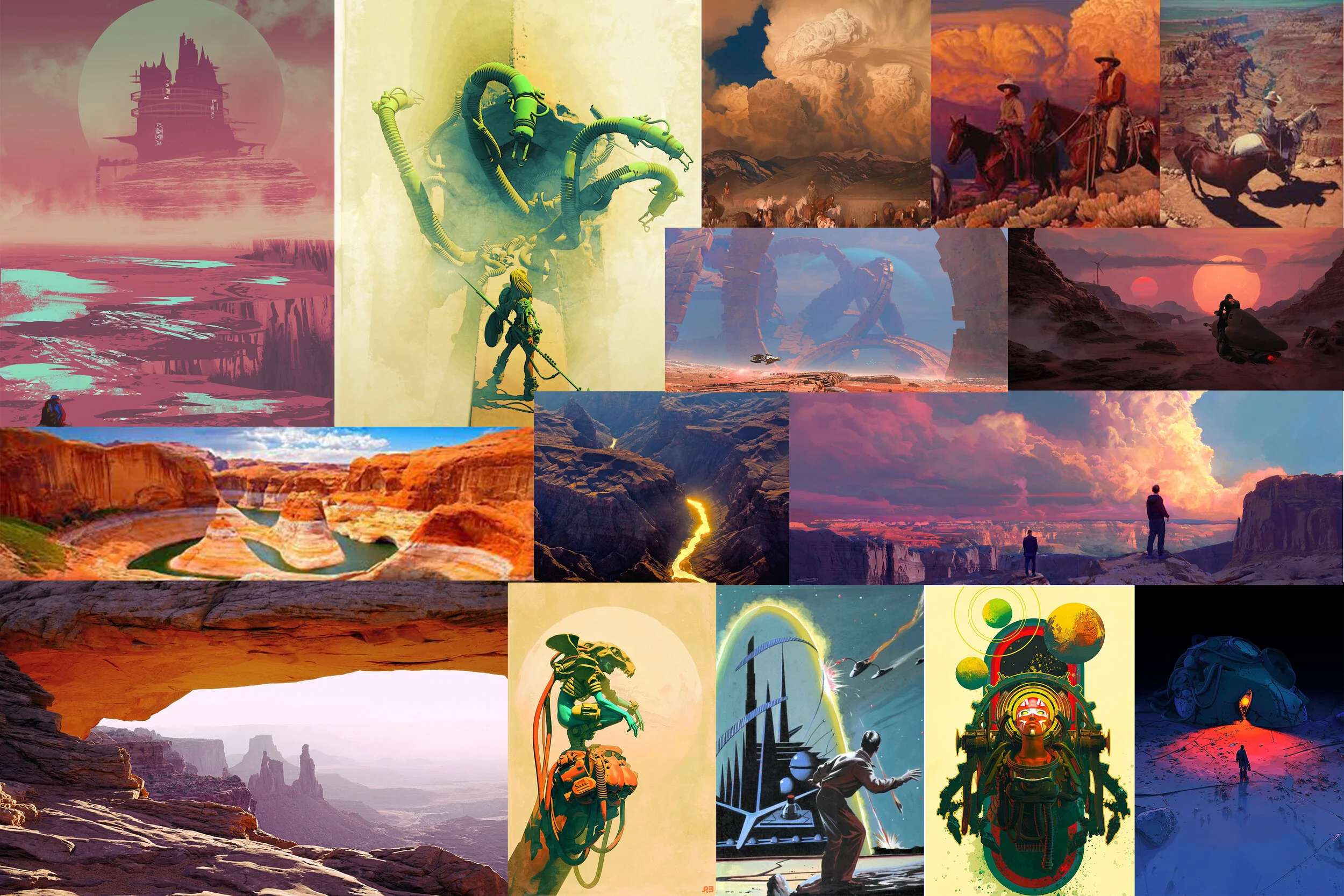
First off, this design from the get-go was a collective agreement from the MVP Media Dept. that it should be a cohesive nod to the stock Electron Nomad stamp that was also debuting at the same time. With that, I was able to dial in on the “traveler/ nomad” aspect and reach down into my science-fiction/ dystopian love. I’m one to do extensive research before going into the thumbnail stage. Grand Canyon/ desert paintings from the incredible minds of Mark Maggiori, Pablo Carpio, and Pascal Blanche helped dial in a smooth style with the rock formations and overall composition.
With this project; I knew I wanted to push the limits of our Election stamping capabilities. Although nervous, I knew our MVP HQ stamping team could put their best into making sure these came out successful. It took quite a bit of value painting work to figure out the half-toning fills. I worked back and forth with the inclusion of black within the stamp and found a great compromise of subtracting the would be black line work from the background.
In the end, i’m glad this art was in preproduction before James Conrad flipped MVP on its head. I was able to adjust on the fly and include the Worlds nods relatively easily. I’m glad this went ver so well with James and the pro players he showed during his warmup rounds. That meant a lot.
What did you enjoy most about the Nomad Special Edition?
Fission Wave Special Edition
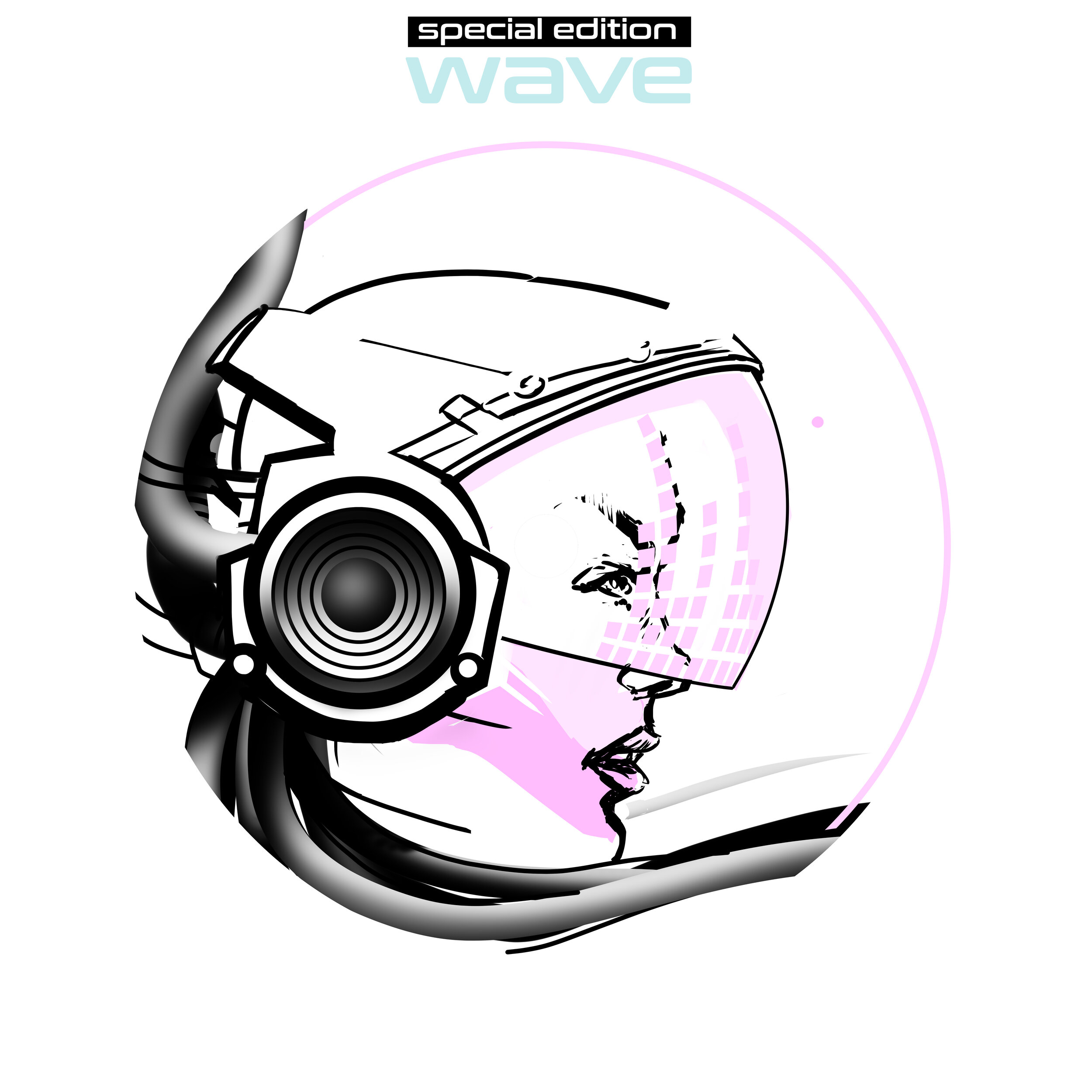
A new mold in MVP Disc Sports’ Fission™ plastic debuts and it’s the ever-popular Wave. Fission™ plastic bases its technology by considerably lightening the center core and increasing the outer weight in the overmold. You’re able to get a more gyroscopic flight.
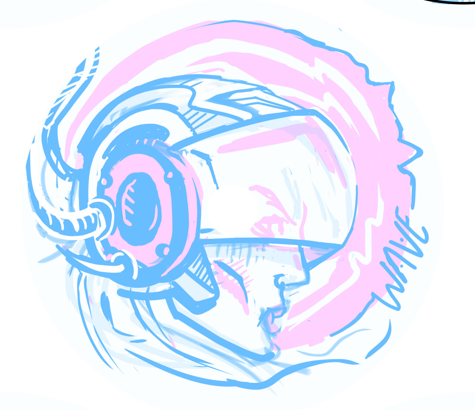
I was tasked to bring an idea to the table. Instead of reinventing the wheel, the team and I looked back to a bunch of different ideas from previous MVP specific Special Editions I created that weren’t used. A lot of them had potential and it was a mix of an older MVP Limit thumbnail in combination with an idea I can’t share right now that really got the Marketing Department’s excitement up. When I’m pitching these ideas to the department, I’m trying to show them my linear progression in decision making. Once I shared the solid previous idea; interdepartmental conversation really helped to meld the two solid ideas together.
I’ve done some small reading on human resonant frequency in the past. I pictured this character having the gift and future technology to harness and magnify those vibrations into an auditory superpower. Sort of the same concept of pulling all of that weight to the outside rim of Fission™ Technology. Throughout the progression of the stamp; I battled with having a background to reinforce the story. I tried bolts and linear waves but felt the “WAVE” text and visor elements needed that space on the right side to breathe. So much was happening with the helmet and cable hair. Detail on this stamp was selective and when dealing with MVP and it’s history of Special Editions; it was an effort to keep this design clean and precise. From the rough to final draft, you see that it stuck really close to the original concept. With the help of female profile references to cyberpunk, & retro wave influences; I was able to create something that hopefully puts a positive look onto MVP and their multi-stamping abilities.
Get your hands on the Fission Wave arriving in stores, August 14th!
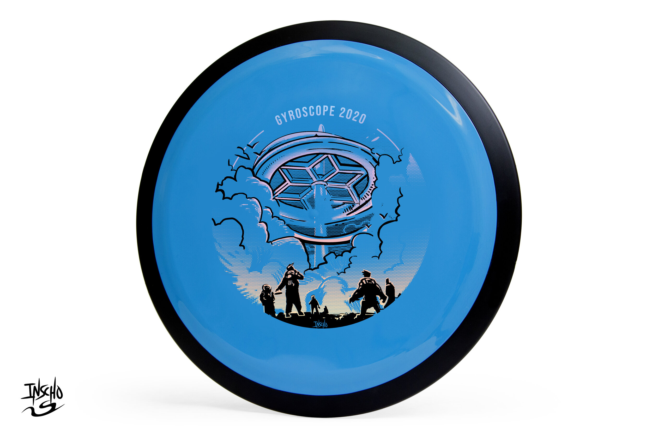
Gyroscope 2020
GYROscope is an event ran by Mike Sullivan out of Northern Virginia. The goal of the tournament is to promote MVP Disc Sports, run a fun PDGA (Professional Disc Golf Association) event and offer a one of a kind disc per event. Last year’s, 2019 think tank produced a handful of ideas and one of those core concepts was reciprocated to 2020.
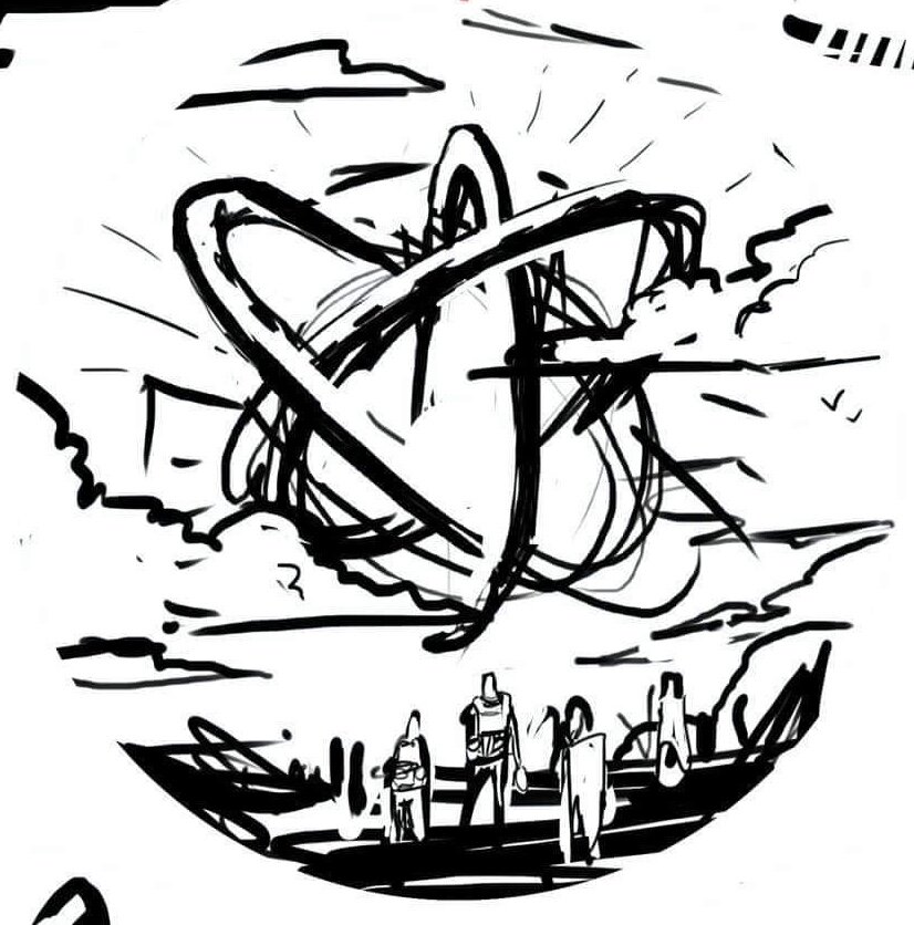
There’s a dead-center area of the disc that get’s unpredictable with stamping. Because of that reason, designers are faced with working the art around this area. The second thing I noticed is while the concept showed a sense of scale, the gyroscope wasn’t really present. I was more similar to a floating orb and I wanted to change it to a grounded structure. The concept fed off of last year’s Gyromonster theme. The Gyronauts figured out that the Gyromonster wasn't simply exchanging energy for its own benefit, it was taking that energy and spreading it far across the galaxy to an ancient source. This scene shows the travelers discovering the ancient ruin.
The design really only took a bit of 3D staging within Google Sketchup and re-inking cleanup. The gradient effect for the 2nd applied foil was done with a halftone dot technique. It’s the most efficient and practical way to lay down transitions in single color layers. I want to thank Mike Sullivan for the continued support and having faith in me to deliver a quality design. It’s with that confidence, that I’m able to hunker down and come out with something we’re all proud of.
How do acquire this stamp? Reach out to Mike Sullivan through
https://www.discgolfscene.com/tournaments/MVP_Disc_Sports_presents_GYROscope_1_The_Third_Campside_Open_2020/registration
OR
his Facebook page for future releases.
Schrock-A-Doodle-Doo
As 2019 was coming to a close, Tyler Schrock, Team MVP Pro asked me if I would like to do his 2020 Tour Series disc. Working with Tyler is pure joy. He’s kept an animal theme over the past few years that allowed me to do design an octopus and sloth. This year, his idea was a rooster. It turns out that his father was a chicken farmer! He raised chickens for 25 years. So this stamp idea was something he knew his family would love.
This idea started with chicken reference gathering even though I had a good idea of how I’d be able to pull this off. I think the strongest silhouette of a chicken is from the side. It gave me the room in the center of the disc to stay free from any no stamping zones. The chicken mouth action/or spit never made the final. That was an attempt to add that classic “action” seen in cartoons to show loud noises. We didn’t want the chicken looking like it was spitting so it was axed toward the end. The shading detail near the chest add a bit of contrast to show that it’s different color of feather.
The final pass was simply to add body/feather detail and import the consistent ring graphic from last years design. It was important to Tyler to continue that look and feel from year to year. When you display these side by side; it really adds a nice series look to them. I hope you all dig it! Share, like, comment on what you think!
Axiom Cosmic Neutron - Stock
If you’re a first-time reader and unfamiliar with MVP Disc Sports/ Axiom Discs/ Streamline Discs then you’ll need to look up who Zachary Kelbaugh aka ZAM is and his importance in setting a high standard with all three brands. While MVP Disc Sports follows more an analytical/ scientific realm; Axiom goes into more of the visual arts, punk, and a little bit more on the wild side if pushed that far. If you think about it, the parameters keep you grounded but a LOT of ideas can flow from that base.
I was given the difficult task to create a new stock stamp that would be used for Cosmic Neutron plastic within the Axiom branding. Cosmic Neutron plastic produces some unbelievable controllable swirling patterns. At this current time, swirls seem to be trending with multiple disc golf companies coming up with their ways to achieve it. It was my job to design something that could hang with Neutron’s iconic imagery that has been stamped on Axiom discs for 6 years.
With Neutron art at the very front of my reference gathering, I wanted to create something that seamlessly blended into the stock stamp Axiom family. That was goal #1. MVP’s history runs deep. The last thing I want to do is shred that to pieces. If you look at the far left image below; our heads were looking at high-level science, Leonardo da Vinci, 3D DNA molecule structures and honeycombed flower patterns. While all of those sounded great; the flying machine has been done. My research through da Vinci’s sketches led to me start researching perpetual motion machines. Bhaskara’s Wheel, Sadi Carnot and the Carnot Cycle. My mind went down the rabbit hole, you can say. I landed on the fact that while all of these machines and concepts sounded cool, quantum mechanics and the complex nature/theory burned me out. That doesn’t mean I won’t return back to these notes at a later date. Time was of the essence and I had to get to work.
I landed on a 3 cylinder schematic concept. The main idea is of a 3 piston firing order that is pushing energy toward the epicenter. A transfer of energy through the stamp design to the actual swirl look of the plastic.
Here are a few key points in the final Axiom Cosmic Neutron design:
•Get the name of the disc higher up on the flight plate so it can be seen on store shelves
•Disc name is the boldest part of the design while keeping with the overall schematic style of font. It doesn't scream old world but doesn't modern either.
•Keep key shapes present in the new design. Circles, triangles, font look, and feel.
•Integrate a fresh idea
The below image gallery shows a peek into the 2-week process:
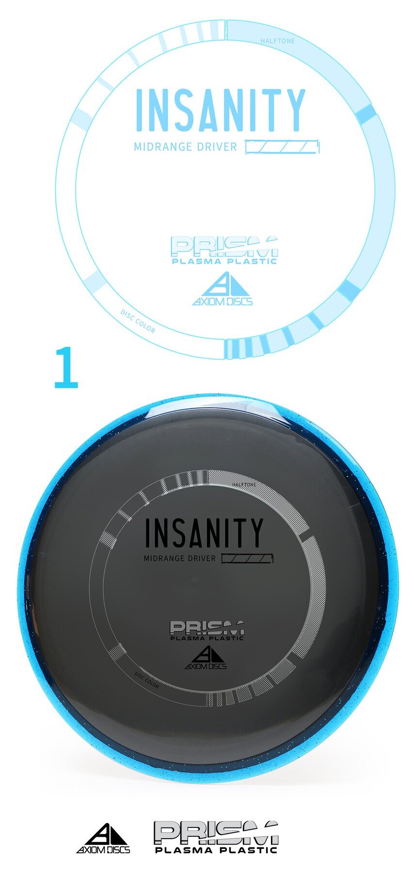
Axiom Prism Plasma - Stock
The Axiom Discs Prism Plasma plastic brings the shimmering beauty of a core fused with the luster of a candy-like Prism outer rim. In this development blog, I dip my toes into a few decisions that made me arrive at its current design. With pen and paper in my hand; the first thought was how can I get in and get out with the least amount of wreckage?
The plastic combination does the work for you! My goal was to create a non-intrusive 3 foil design that allowed the plastic to speak to the consumer. Axiom branding has dabbled in the Fibonacci sequence, DNA, flying machines and very artistic approach to high-level concepts. I centered this piece on simplicity. The ring uses to shape sequences that follow the 1,1,2,3,5,8,13,21 sequence. The design is duplicated and flipped on the opposite side. This creates this really cool halftone fill/ inverted look with the silver holofoil. Again, making this design bleed some of that beautiful, shimmering foil through. The 3 foils break down to Black, Silver holofoil for the ring and color transition holofoil for the Name/Prism logo fill. The font chosen to represent the disc name and flight numbers is Antonio. I wanted a font that was clean with a little bit of height to be legible from a distance.
All in all, sometimes the super simple designs take the most time. I’m glad we stuck to our guns on the outlining goals of this stamp art. It’s simply celebrating the look of the plastic and allowing a stamp to go along for the ride. It also looks really cool spinning through the air.
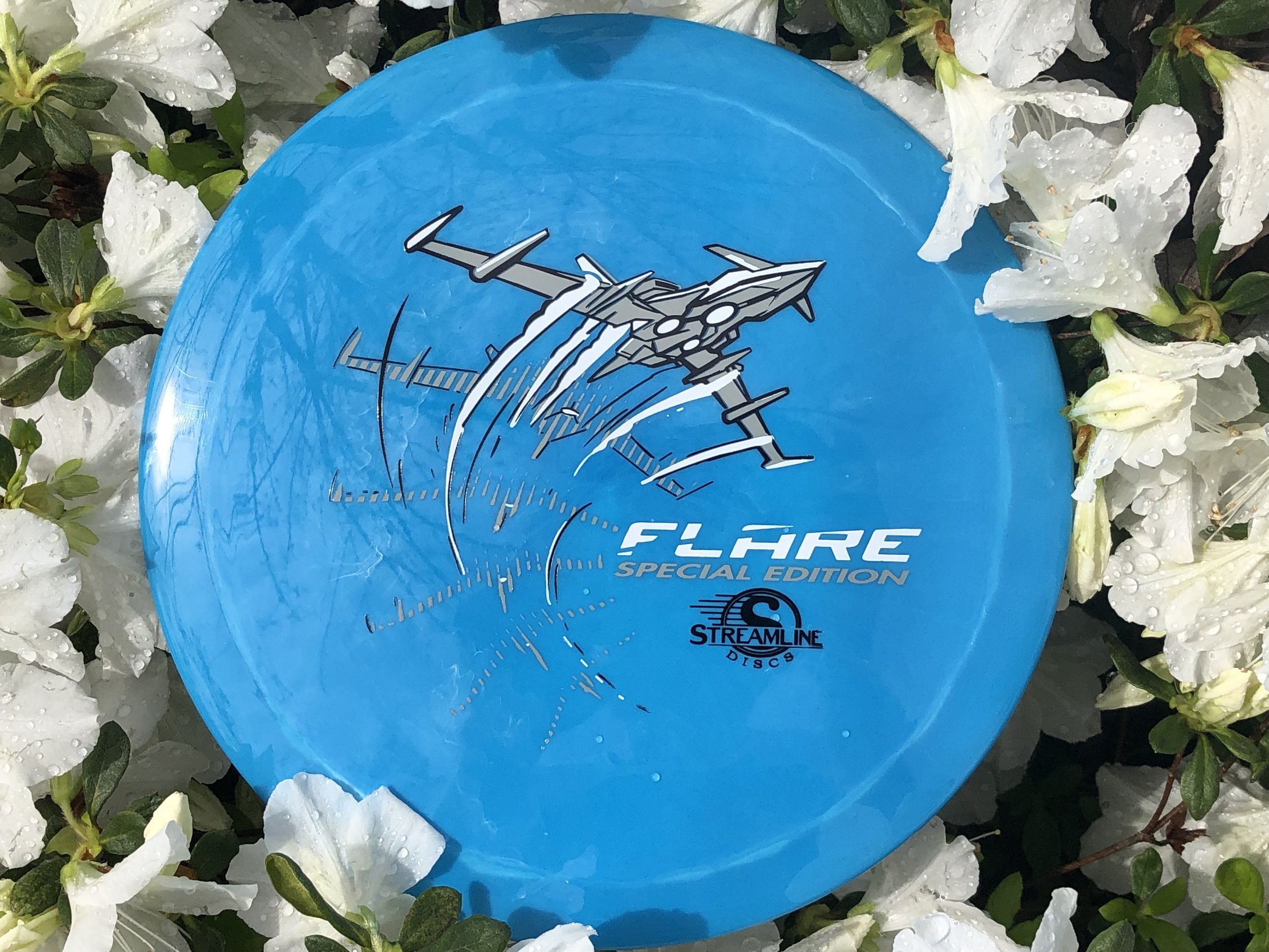
Streamline Flare Special Edition
The Streamline Flare is the newest Fairway Speed 9 driver delivered with plenty of overstability for even the strongest arms in the disc golf game. I was asked to design around that special ability of the disc to fight out of constant steady winds. It’s a true wind fighter.
The design started with a page of ship designs based on direct relationships to the flare countermeasure that provides a decoy to heat sinking missles. Other quick concepts went the sci-fi ship route and that aspect of the design stuck out with the group. The frame-type of motion was liked by all and continued into the rough phase. Connecting the design with it’s actual flight characteristics was important to me. I used a rough block-in 3D model to mock up the ship orientation and ported that into Illustrator. The whole intent of that process was to create motion.
Other Streamline designs that I’ve done were in a direction where you couldn’t place a certain time period on it. It was kinda Sci-Fi/ kinda modern age but I wanted to take this into a futuristic realm. So I added lower propulsion units on the bottom and kept the edges and angles sharp. A few references of the Royal Canadian Forces doing evasive maneuvers in a valley inspired me to put atmospheric trails coming off the wings. Carrying that curve language subtracted from the “Flare” typeface finishes it off.
In the end, MVP Disc Sports HQ used a new grey pigment-based foil in combination with black and white to create a truly comic-like vibe with the stamp. You can find these by most big online retailers of MVP, Axiom and Streamline on April 19th.
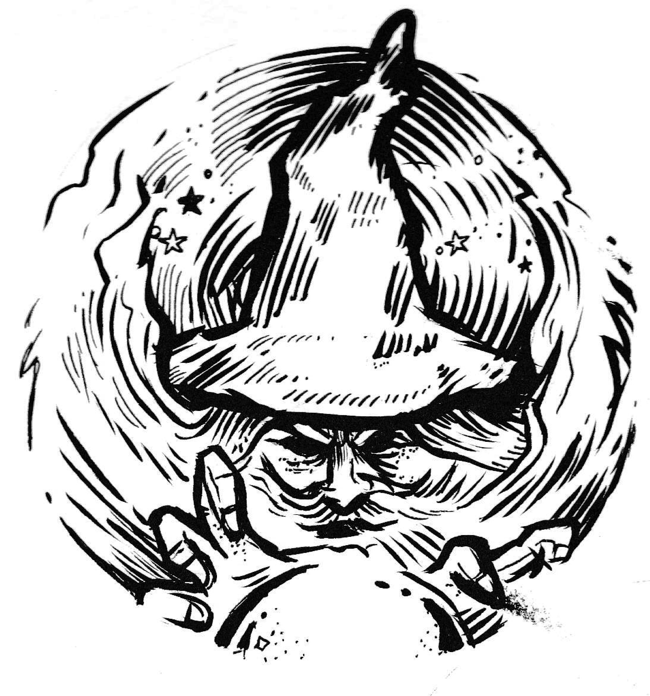
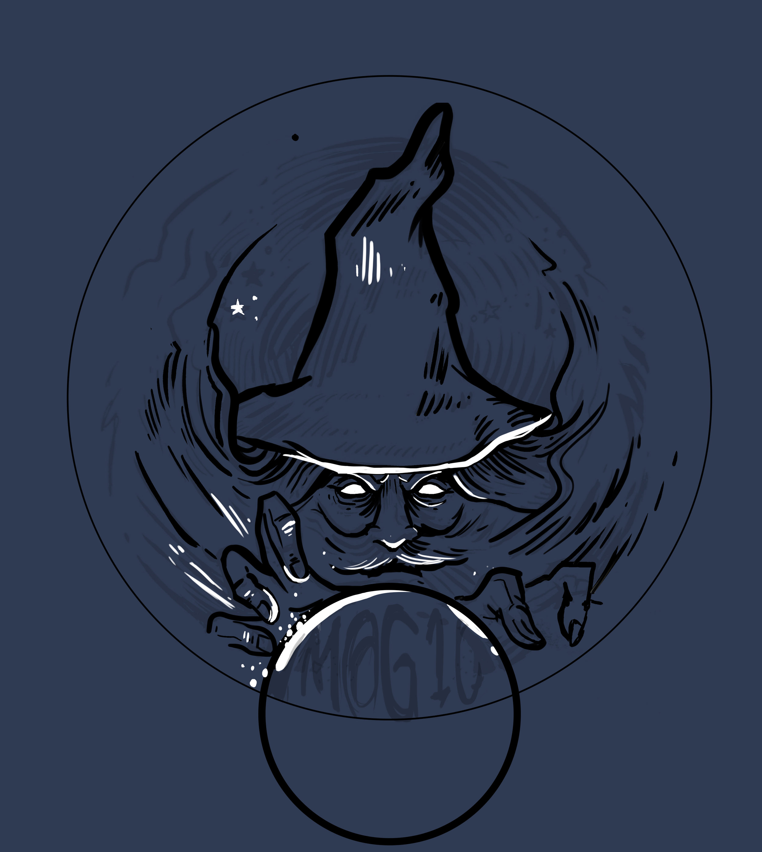
Magic Warlock
Mystical designs are something I don’t have a lot of experience with. When the request came in from Mike Visgar to bring his idea to life, I was all about it. Visgar had an idea that incorporated his M@g1c nickname. The first of that series of idea was the warlock concept. After just a few sketchbook doodles, I landed on this warlock pencil drawing and proceeded to use my Pentel brush pen to add some character to the line work. The pen allows me to go super thick and thin very quickly and give the doodles that much more life.
Dual foil brings in another aspect of design. There needs to be a purpose for bringing in that secondary color. I chose the light of the crystal ball to represent it. MVP Headquarters chose a rainbow metallic to really enhance the light play without making it too crazy on the viewer. I ditched the busy circular filler behind the warlock and opted for stars. Lastly, the added in some pointillism dot work to add a bit of grit and give it that slight vintage/ stoner rock feel.
Mike V. was great to work with and trusted me completely throughout the process. I appreciate that sort of working relationship and hope there’s more to this series coming later down the road. Please comment, like, and share this post if you wish. Thanks for stopping in.
2019 Jomez Pro
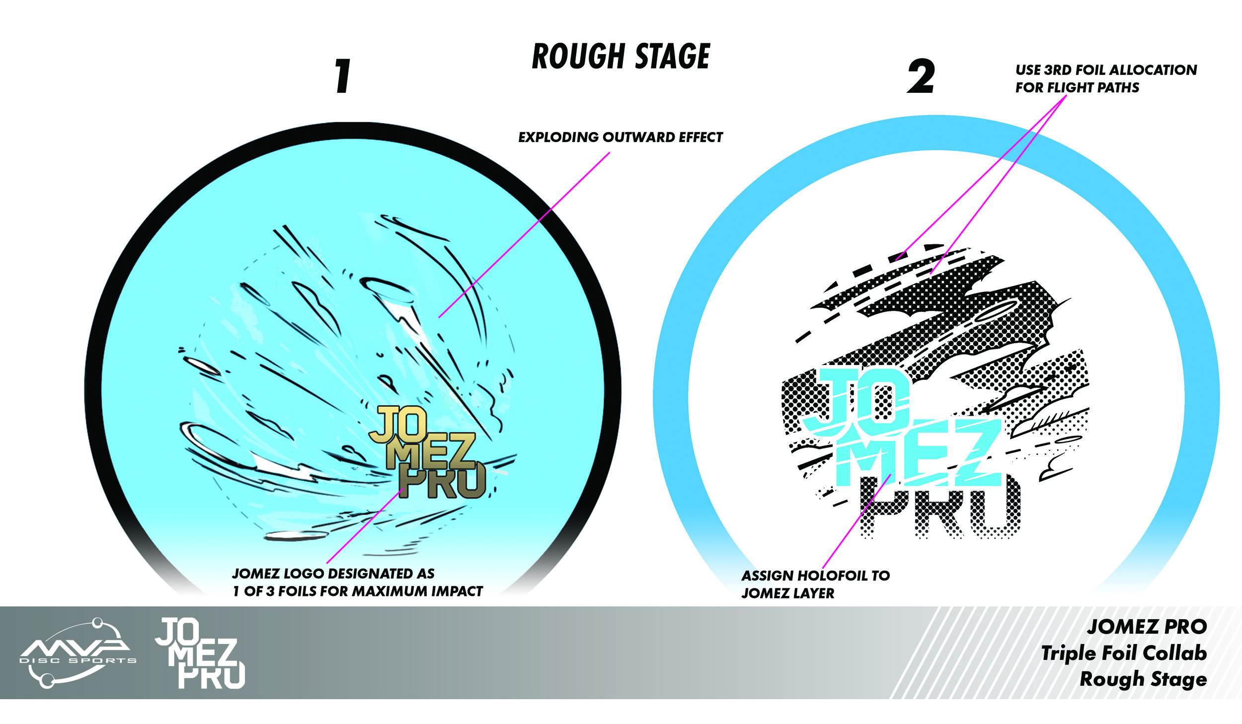
Another one of these awesome moments where an opportunity fell in my lap to assist an MVP/ JOMEZ Pro partnership for an order. Jomez is a film production company pushing out top notch disc golf footage. There wasn’t any preconceived ideas they wanted to run. The slate was clean and I quickly got to work. One thing I really dug about Jomez’s look from the year previous was the style in which they used for their video intro’s. It’s very similar to a style I’ve admired for years that combines 2D animation with live action film. You’ll see it in Who’s Framing Roger Rabbit, Gorillaz, A-Ha “Take On Me” music video, and many others. If you want to geek out, Here’s a great video explaining it in the first 6 minutes.
We expanded a bit on the explosion coming from the Jomez Pro logo similar to their introduction sequence. Jomez wanted to see what the next step of that design would look like. While we loved the idea of it, i felt like their logo was taking a smaller role in the stamp didn’t feel right. The other idea both parties really honed in on was the Follow Flight shot tracking stamp idea. Follow Flight is essentially Jomez’s most featured post production trick that they use. It allows viewers to view a replay with the flight of the disc highlighted in the shot. The biggest thing is it created more space for a much larger logo.
It was back and forth within MVP’s design team on whether halftone should be included. Everyone was on board for a lightened load of main black foil. The design without it allows the whole stamp to breath a bit more. To have a stamp work on a variety of plastic properties is highly important when they’re wanting a large order. In the end, Jomez was stoked and we were proud to get their support. Let me know if you dig this design! Were there thumbnails that you would’ve liked to see expanded more? Leave a comment and share this blog. Thanks for tuning in!
You can buy the stamp here from Jomez directly!
https://www.jomezpro.com/shop/?orderby=date
Axiom Plasma Fireball: Special Edition
The Axiom Fireball has been a chosen go to for overhand and forehand dominant players. I was given the opportunity to create a special fundraiser for the Disc Golf Pro Tour in 2018. When the opportunity landed in my lap to create a Plasma design for Axiom Discs this year; I was all over it.
Overall, the idea in my head was there. It was just a matter of figuring out the horizon line and overall fireball shape. I have a huge respect and love for Robert Valley’s work. He was trained under Peter Chung and worked along artists I’ve been admiring for years; Alberto Mielgo & Jamie Hewlett (NSFW). I like that push, pull and stretch that Robert is able to get with his perspective and characters. It’s more of an elongated figure style. Both simplified and graphic in his approach. Robert is a master at the fish eye effect. It’s more of first person view to his stories. I love that he doesn’t think about it, it just happens. You see this style with the final guy on the right side of the stamp.
All in all, It went through a few stages. We found that my initial punk dude was more in a comical superman pose. It didn’t feel right so ZAM (Art Director at MVP Disc Sports) helped me out and scrounged together a few reference photos of silhouetted bodies against a blast. Nothing too grotesque. If I could’ve kept the clouds filled in and graphic, that most likely would’ve been my ending place with overall cloud style. The restrictions of hot stamping needed me to break it a part a bit. I experimented with some tribal’esque cloud fills but felt overall, it didn’t fit the vibe well. It did, but it didn’t. I wasn’t aiming for a Polynesian scene or outcome but when I do, I’ll make sure to transfer that idea forward.
What do you all think? Did this equal up to 2018’s MVP Open Fireball stamp? If not, why? Leave your comments and I’ll make sure I return any questions or opinions you might have! Thanks.
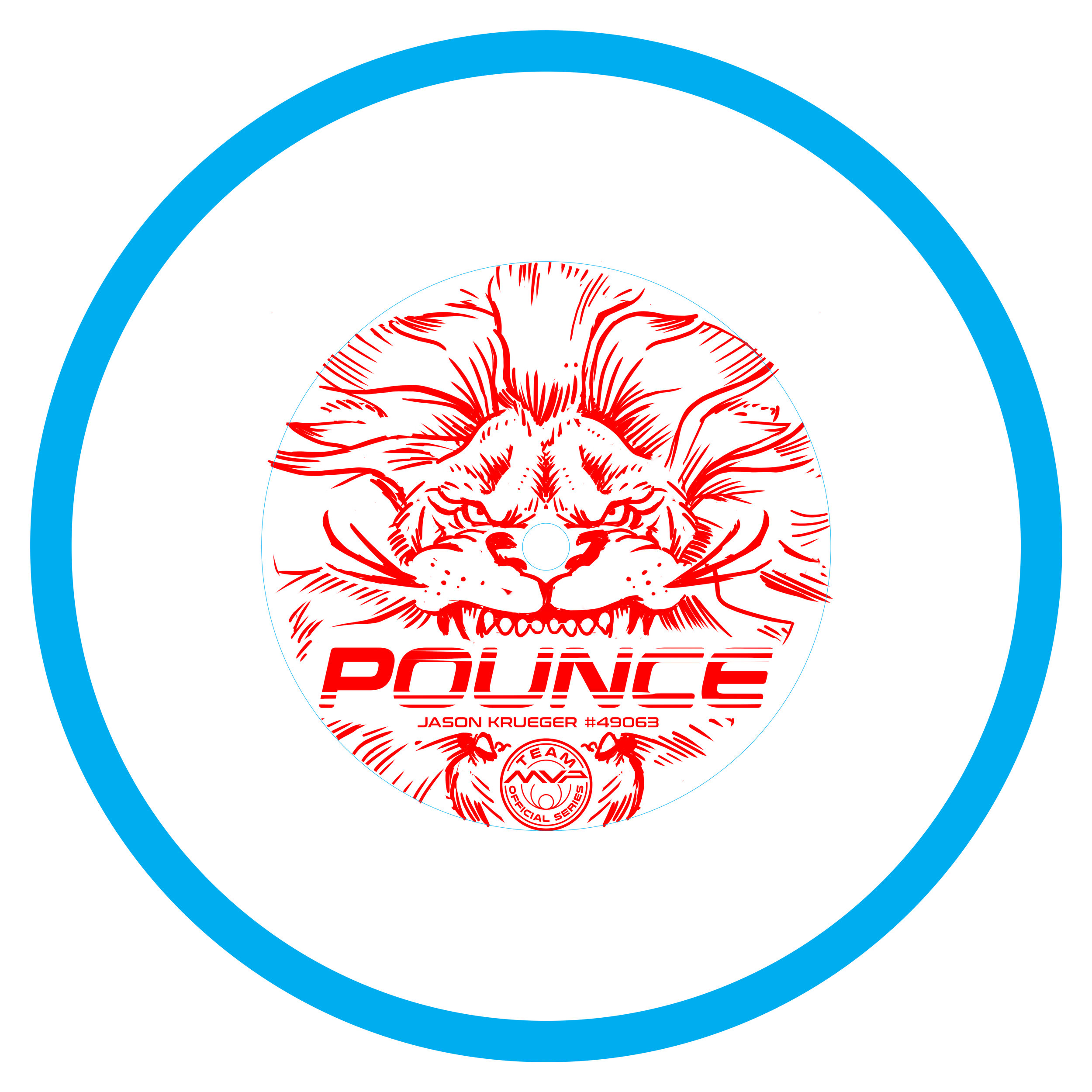
Pounce
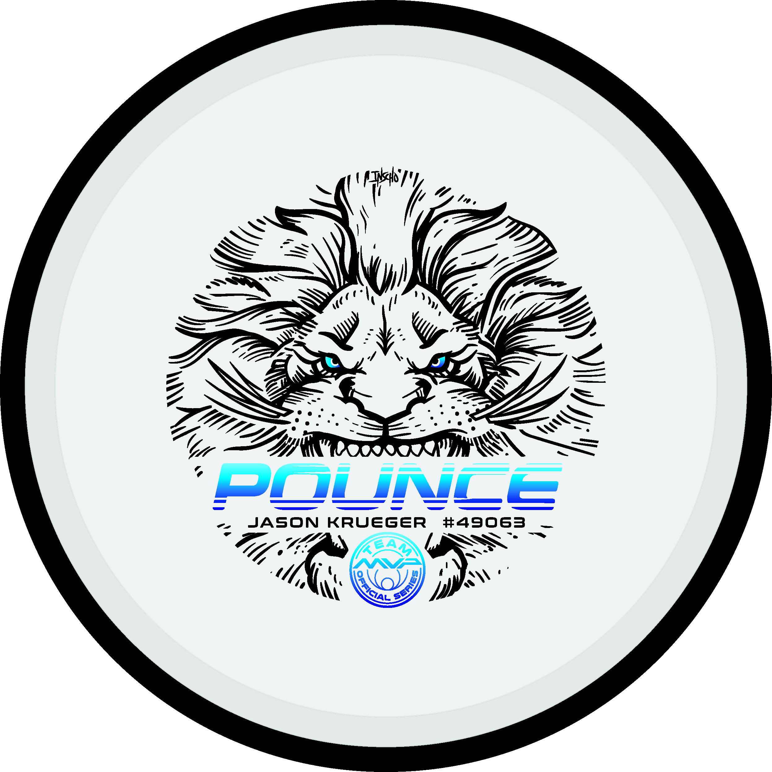
It's always a pleasure to help out some fellow Team MVP members with their tour fundraiser stamps. They're depending on a great stamp that will help them travel and tour to the biggest events out on the Professional Disc Golf Association (PDGA) National Tour. Jason Krueger hit me up to do just that.
Jason has done a great job branding himself up to this point with his Pounce branding. He wanted me to create a lion stamp with Pounce text treatment in the mouth. I started by hitting the sketchbook and seeing what came out. This stage was all about exploring detail limits, size relationships and where the client valued one thing more than another. Jason was great at knowing what he had in mind. It kept the guesswork minimal and allowed me to hit this stamp fast.
Thumbnail was chosen and It's common for me to jump into Photoshop to start cleaning up line work. Something wasn't right. Leaving area for the center sprue was deleting detail in the nose that helps identify a lion. I went back to the drawing board and gathered inspiration/ reference to see where I could fix my existing image. I realized there needed to be a few things that needed to exit the stamp. The light rays behind the head was one of them.
Redrawing happens. Don't force something that doesn't feel right. The end result ended up being a mixture of a thumbnail I thought was too detailed and wasn't going to work. With the combination of elements and deleting away a bit of the detail, we had a winner. I want to thank Jason Krueger for his patience and confidence that I could deliver what he was envisioning.
have any questions? I'd be glad to answer them. Please leave a comment and share this post!
MVP Open Fireball LE
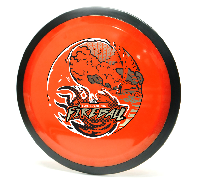
I loved everything about working on this project. You go into the thumbnail process thinking that something like what you did could never work or not be as good. During our initial staff meeting, I was able to show a few of the thumbnails from my sketchbook. The vast majority and better reaction was to the yin yang design. I'm glad I've got great people to rely on and encourage me to take that idea a bit further. The other thumbnails were worthy enough for possible future expansion so I can't show them, unfortunately.
The shot is called an underhand thumber. It looks rather painful but a shot that does exist to get the player out of an unfortunate spot. I found the shot through an old throwing clinic video on YouTube. I watched the flight and thought it would fit perfectly (with a little bit of modification) to that of my yin yang concept. I think the dynamic of the fireball crashing toward the foreground is why this was a success. Last thing I want to mention about the design is the spacing of the the heavy items of the stamp. The Fireball text and ball itself are pretty heavy. I consciously wanted that weight balanced so I gave the sky a full foil with minimal spacing for rays and birds in the sky. I think the balance worked out well!
The Limited Edition Fireball design is a tour fundraiser for the Disc Golf Pro Tour. The MVP Open will be at Maple Hill Disc Golf Course located in Leicester, Massachusetts. This event brings some of the world's top players and will be an exciting time. If you're in attendance, there may be some left at the Maple Hill Disc Golf store.
Robokitty
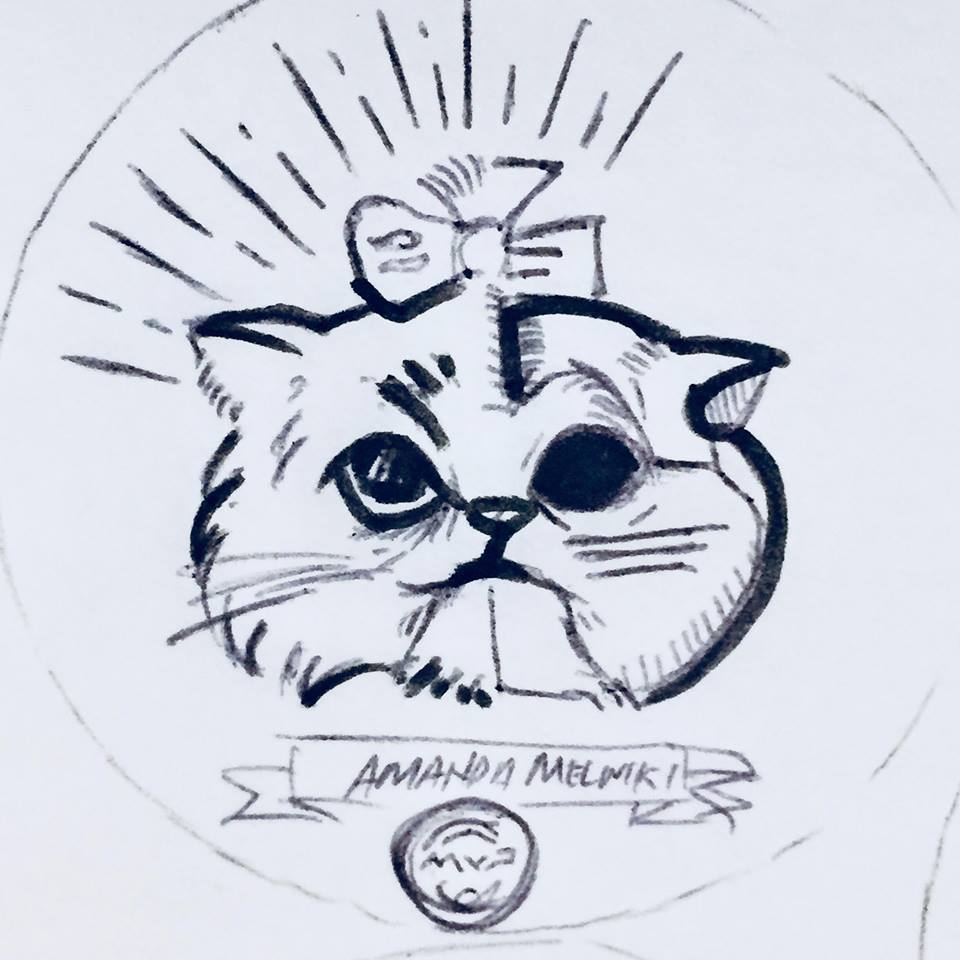
As the disc golf season starts, I often get the opportunity to help disc golfers fund their season long ambitions. Amanda Melwiki approached me with a rather interesting design idea for her tour series disc. She says to me:
"I’m thinking a cat but I want pieces of him to be missing and under he’s a robot"
"you might have to get a bit girly too..."
Amanda was rocking a dubstep tune by Excision called "Robo Kitty". The idea came to her that with her love of felines and an appreciation for this track. The idea was worth exploring. With those beginning ideas and rules now set, it was time to get to work.
Reference Sheet
I began with a pretty extensive reference sheet. Drawing cats is not my strong suit. So getting as much anatomy and idea reference as possible will help me and the client understand what direction this idea could lead to.
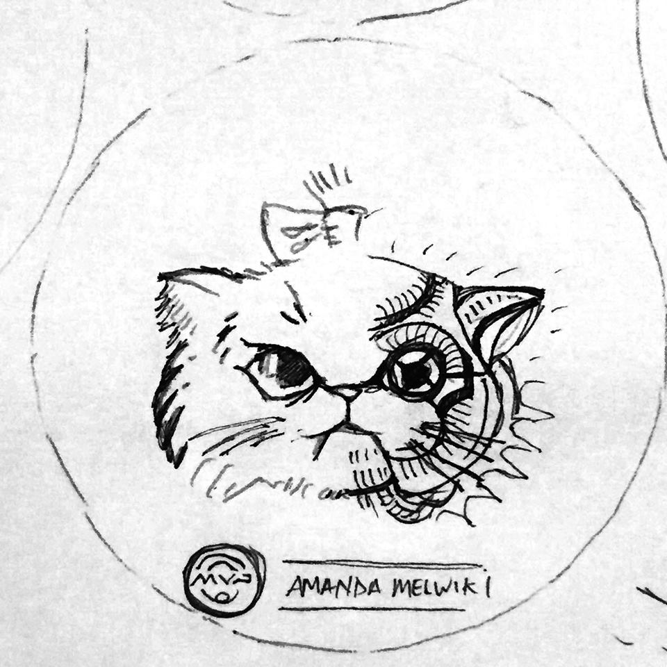
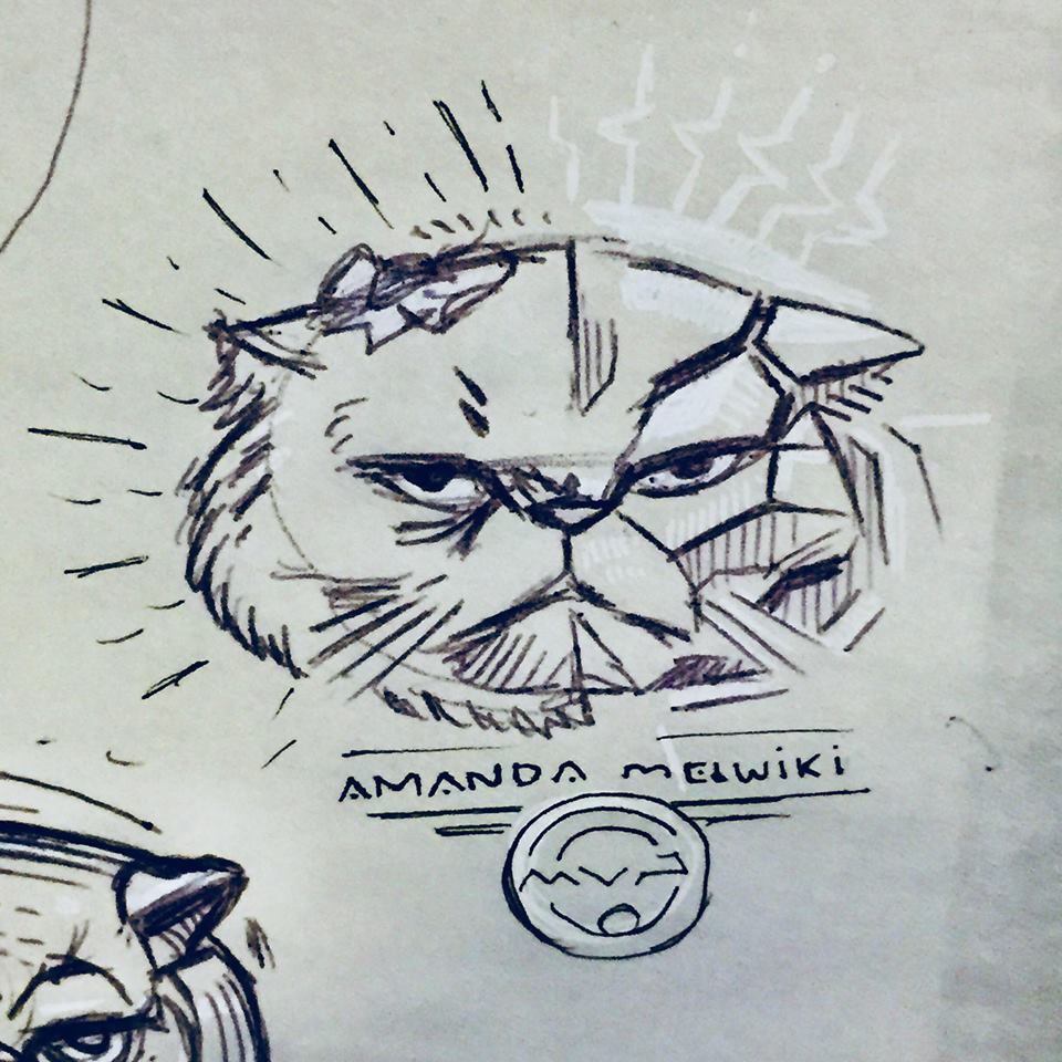
The challenge with this design was clearly "How am I going to mix a kitten with its face missing in spots and keep it cute?" I tried a dozen or more sketches. We both arrived at the idea of introducing more foils to the design and splitting the concept straight down the middle. It allows both sides to have a clear representation while not overcrowding/ overcomplicating the design.
First crack
Here is the very first go at it mixing feline and robot/cyborg properties to her. You have to start somewhere. I'm exploring the Persian kitten because of the well defined face features. They're adorable kittens and well renown.
Bad ideas out of the way! It's rare that the first drawing you ever do for a project sticks. The upper left persian grumpy kitty stuck out to both of us. Now it was the task of mixing the robotic properties and adding a bit of cuteness. The idea of the split came from this initial Pinterest board Amanda had created to get some ideas flowing.
Fork in the road
The idea of the split came from this initial Pinterest board Amanda had created to get some ideas flowing. You can see I took a liking to the idea of doing a split down the middle like the left side example.
These roughs were made knowing that split was going to happen. The next stage was figuring out how the robot side of things were going to look like. The great thing about this is I'm still in a traditional mindset and pumping out quick ideas on paper. Nothing is digital yet so those options can be explored rather quickly. As you can see from the sheet, some of these ideas (especially dealing with the eye socket of the kitten) got a bit dark/ or away from cute. Toward the end, I was able to reel it back in and experiment with the rays/electric bolts surrounding the Robokitty head.
Amanda was excited and loved the roughs. It was now time to really finalize the robot side of Robokitty and get this stamp finished for her. Main things that needed tackling were how the two hot stamping foils were going to be split up. Would I do the left side in black..and the right side of the kitty in pure secondary foil? It took a few mockups in photoshop to determine what I was going to do in Adobe Illustrator.
Final Mock Up
I like to create a splash image for my clients to use to get the word out. During this time between file submission and receiving product, If they want to tease the notion of what's coming, I leave them the option to do so.
I'd like to thank Amanda Melwiki from Team MVP for being so engaged in the process. She helped gather references she was drawn to. She was quick with feedback on every draft I sent her. Robokitty was a challenging task but she made this project fun. I'd also like to thank MVP HQ for giving this dual foil stamp what it needed. They did an excellent job using accent foils that really fit Amanda as a person.
Limited Edition-Streamline Pilot
I received a task to assemble a Limited Edition rendition over a short period of time. A Limited Edition run refers to a design that has a specific number of discs available for purchase. MVP Disc Sports Headquarters usually runs a thousand of these designs and then retires the stamp art.
I knew that one day, whether it would be for my employer or as a separate release through my freelancing opportunities; this idea was going to happen. The short film called "Paths of Hate" by Damian Nenow had a renown affect. I remember watching this film for the first time and being so taken away by the sheer beauty of the clouds and flight of the planes. The look of the film was rather inspirational as well. Another huge influence was the "Aces High" art created for Iron Maiden. With these two fantastic references and a nice sheet of helmet and stylistic goals, it was off to the races.
The only challenges were the hands, yoke and overall look of the pilot. I scoured through countless old war plane movies to help improve the drawing overall. The way the thumb pads are putting weight on the triggers from my initial drawings, was the reason I left them be. In the "Aces High" example, the thumbs are exaggerated; as if "Eddie" was quickly willing to fire. I feel they were an important part of the story but the main focus and action lines went more toward the pilot's piercing menace. Halftoning is a popular method of shading using one color, but sticking with clean heavy to light parallel lines kept the overall design less chaotic. This method also allowed me to take focus on the curvatures of the hard surfaced elements. Goals for the look of the fighter pilot were to mix old and new. Keep the overall style clean with a slight retro feel to it. The use of initial symmetry in the vectorizing process, helped keep this stamp balanced. In the end, I actually really like and recommend this disc to players. That enthusiasm and the chance to create a limited edition, really helped me pull through to get this stamp ready for production.
These are available online on April 20th from most major MVP and Axiom retailers. What do you all think? Please like, share this with your friends and comment!
Nailed It! Disc Golf - Custom Hot Stamp
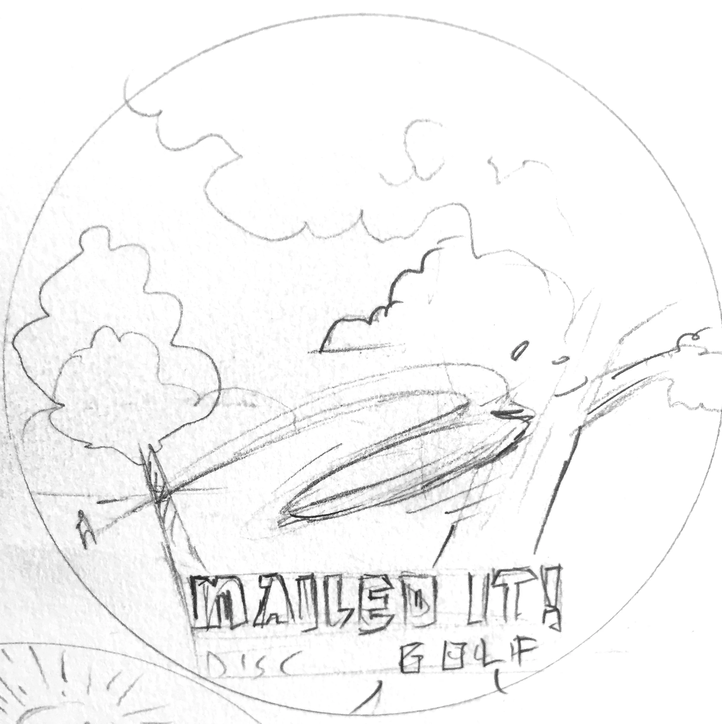
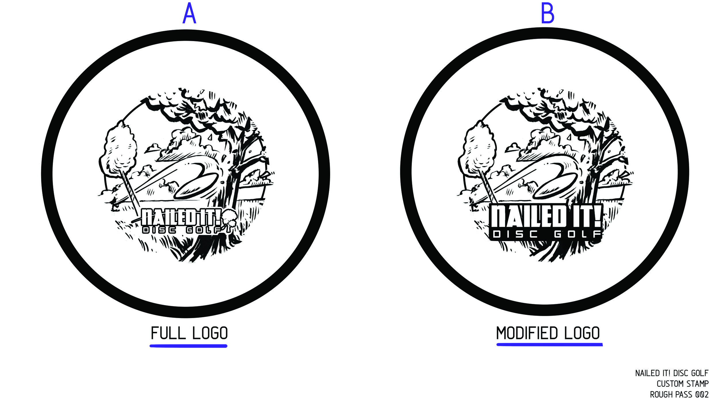
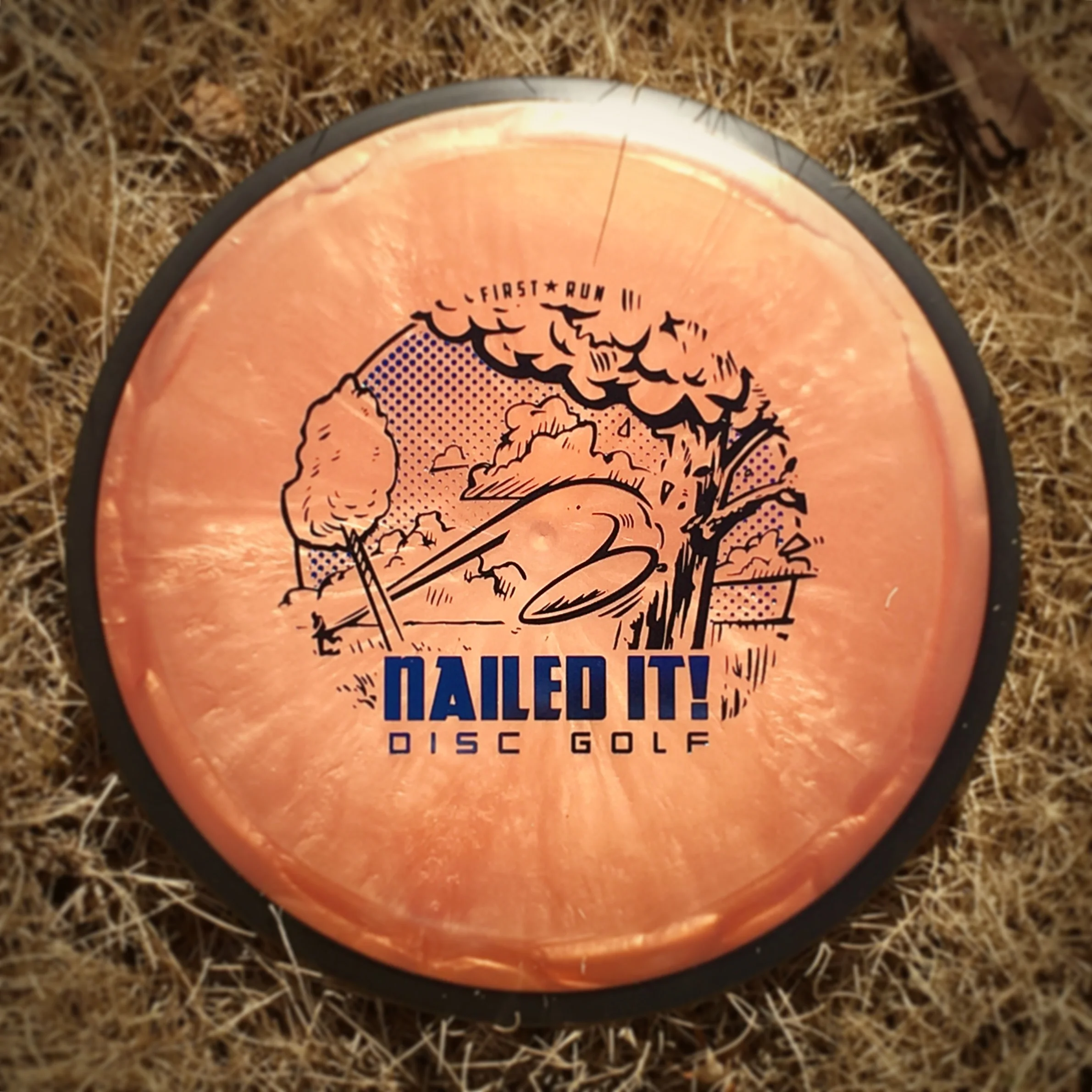
I was approached by Brad and Jenna Tritten from Nailed It! Disc Golf store out of Weston, Wisconsin. One of the best clients are the ones who see your strengths and let you have creative freedom to hit the sketchbook and see what sticks. Going into this stamp, I wanted "Nailed It! Disc Golf" to be priority one. This kind of 2 foil concept worked well for previous Solitude Open stamps so I translated it to their idea.
The original Nailed It logo includes a disc flight path and a tree to the right of the typography. I felt extracting that from the logo and developing a stamp along the lines of a disc golfers nemesis. Tree's seem to be something even the most skilled disc golfer can't always escape. I felt like this idea would resonate with most disc golfers. The plan was to keep the illustration in black/ base foil and allow their logo shine with the second metallic foil. Toward the end, I felt a soft gradient could really lend itself to different colored foil options for the hot stampers at MVP Disc Sports, Headquarters. This stamp was also run as a single foil offering for Dynamic Discs, Latitude 64 and Westside disc options.
I want to thank Brad and Jenna of Nailed It! Disc Golf for their patience and overall positive attitude throughout this entire design process. Everything from stamp creation to help with embroidered patches. It was one of my favorites from 2017. What do you all think? I'd love to hear your initial thoughts and reactions in the comment section.
You can purchase these discs and various items at their website!
