2023 PDGA Membership Discs

In mid-summer of 2022, Vic Allen reached out to me to ask if I’d be interested in taking on the 2023 stamp. On the table were the Membership, Birdie Club, and Ace Club discs. These discs were slated to be stamped on black R2 (MVP’s recycled line) Craves. So with that in mind, you’ve got your black line layer on the flight plate which allows you 3 colors to accent that. It’s a different way of thinking with stamp design but a fun one.

I’d noodle in my sketchbook for about a week or so when Vic came back with an idea to possibly do a collaboration with John Dorn. John has been doing disc golf/ frisbee stamp design for decades. He had recently created the 2021 Relay Turtle stamp that went over really well. I jumped at the opportunity, hit up John Dorn on a phone call to work out the pipeline, and we got to work.

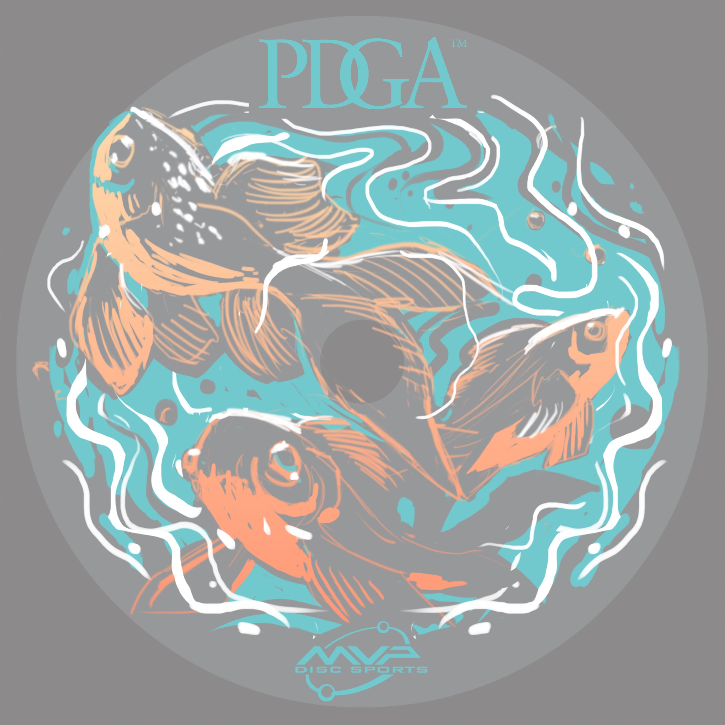
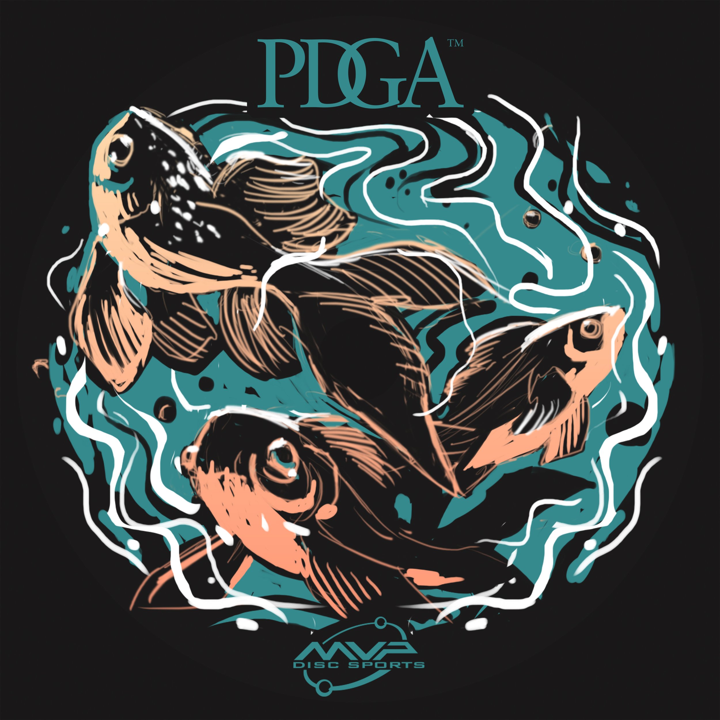
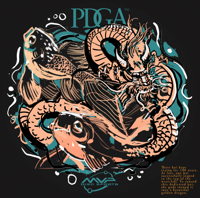
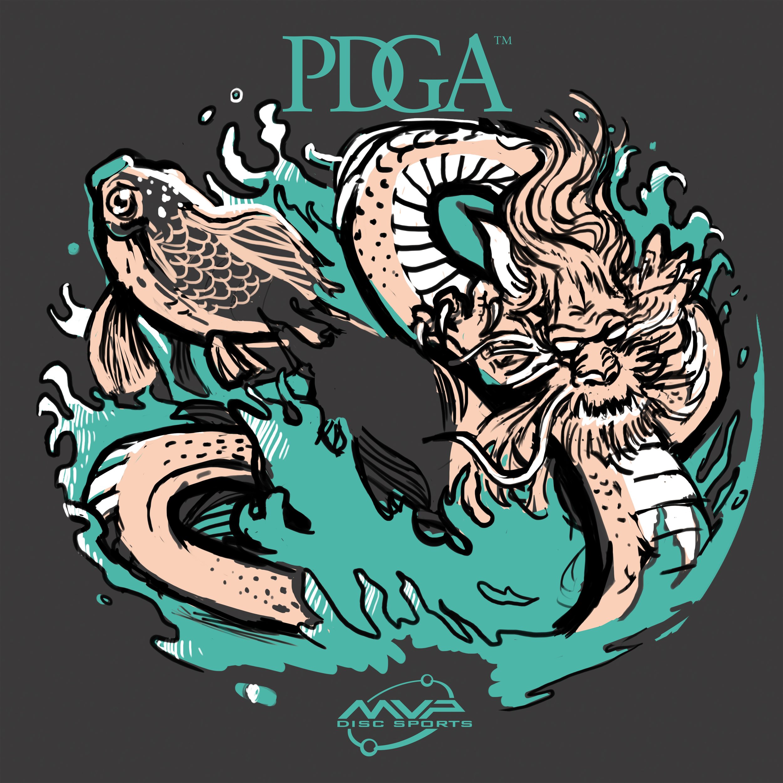
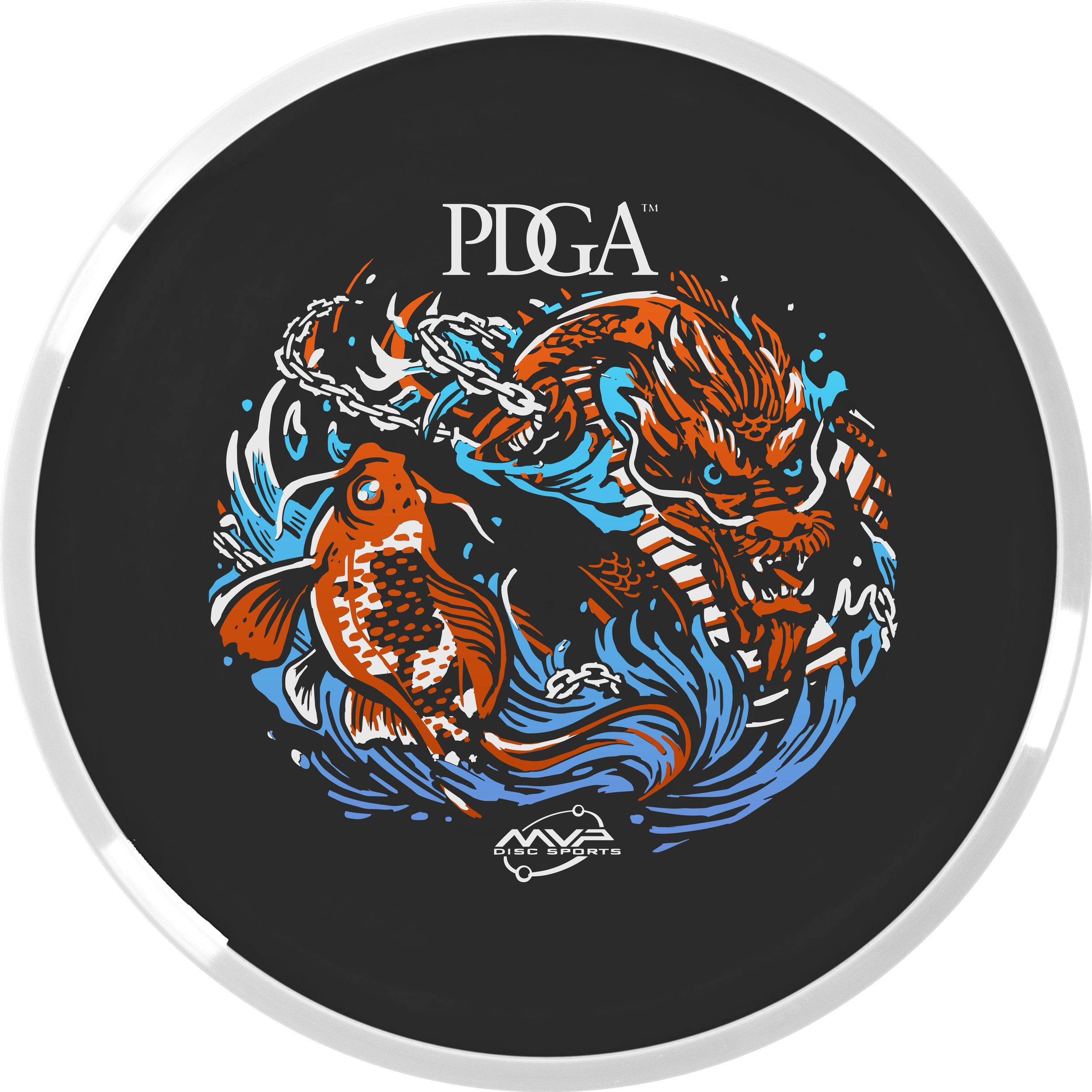
2023 PDGA Membership Disc: Koi Dragon

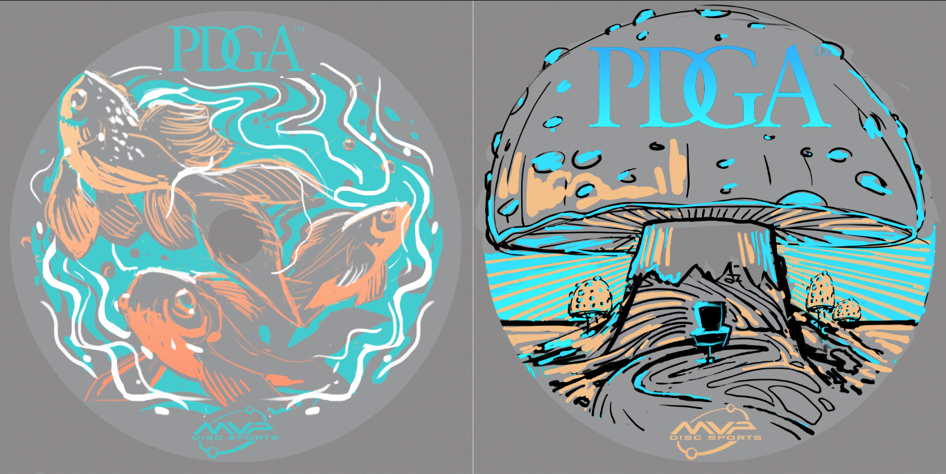
The Koi Dragon stamp started off as 3 fish swimming aimlessly in a fish bowl. After passing off this thumbnail to John, he added in the dragon and explained the story of how a Koi fish turns into a dragon. I thought this was awesome and definitely gave a jolt to this concept. John passed the concept back and it was my turn to dilute some of the noise and chaos happening and to bring this illustration home into 3 foil form. It took a bit to do that. The dragon was giving me fits. I probably redrew the dragon 2 or 3 times until I was happy with it.

The last edit going into the final phase was adding the important disc golf element. To do that, we came up with the solution to use a basket silhouette within the koi and include chains within the watery mix. I think this design turned out great!

2023 PDGA Birdie Club:

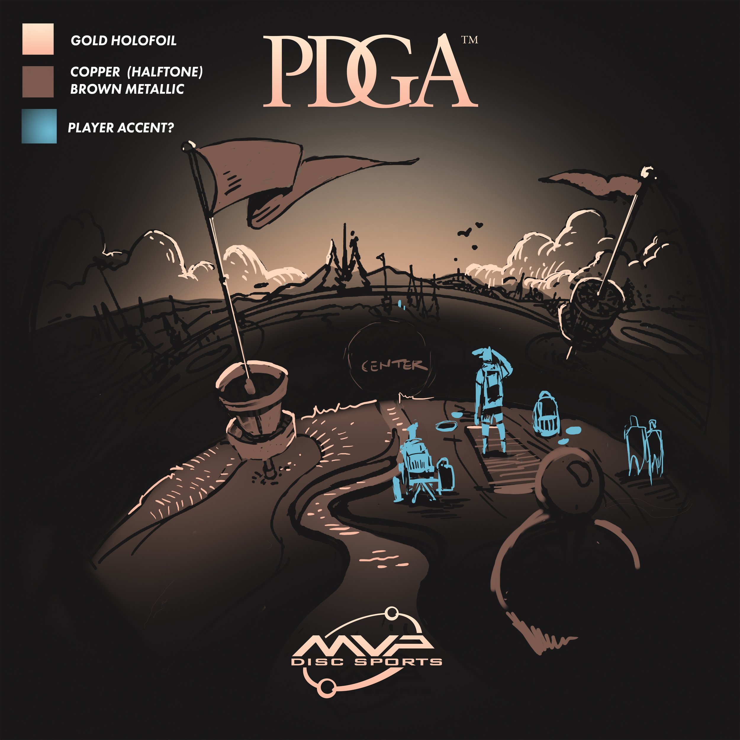
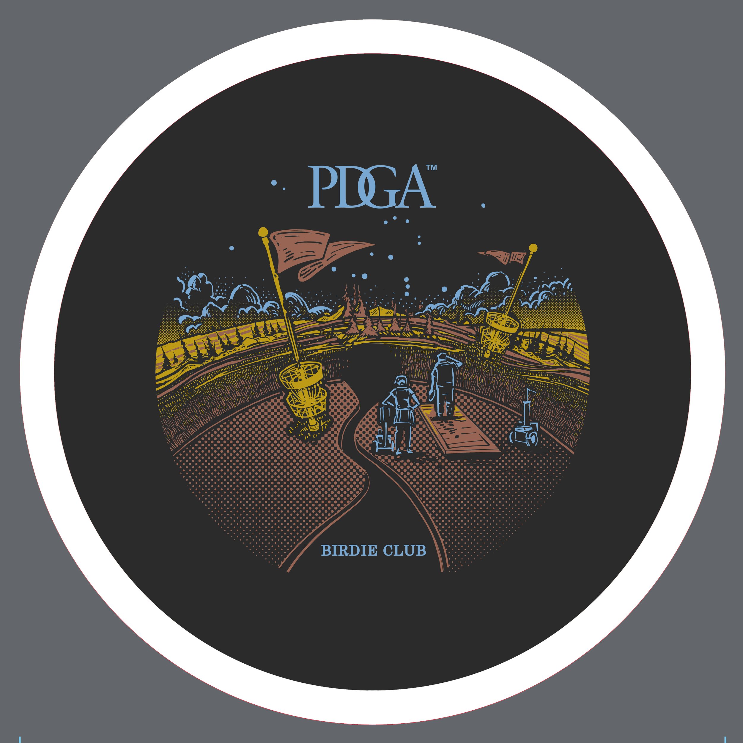
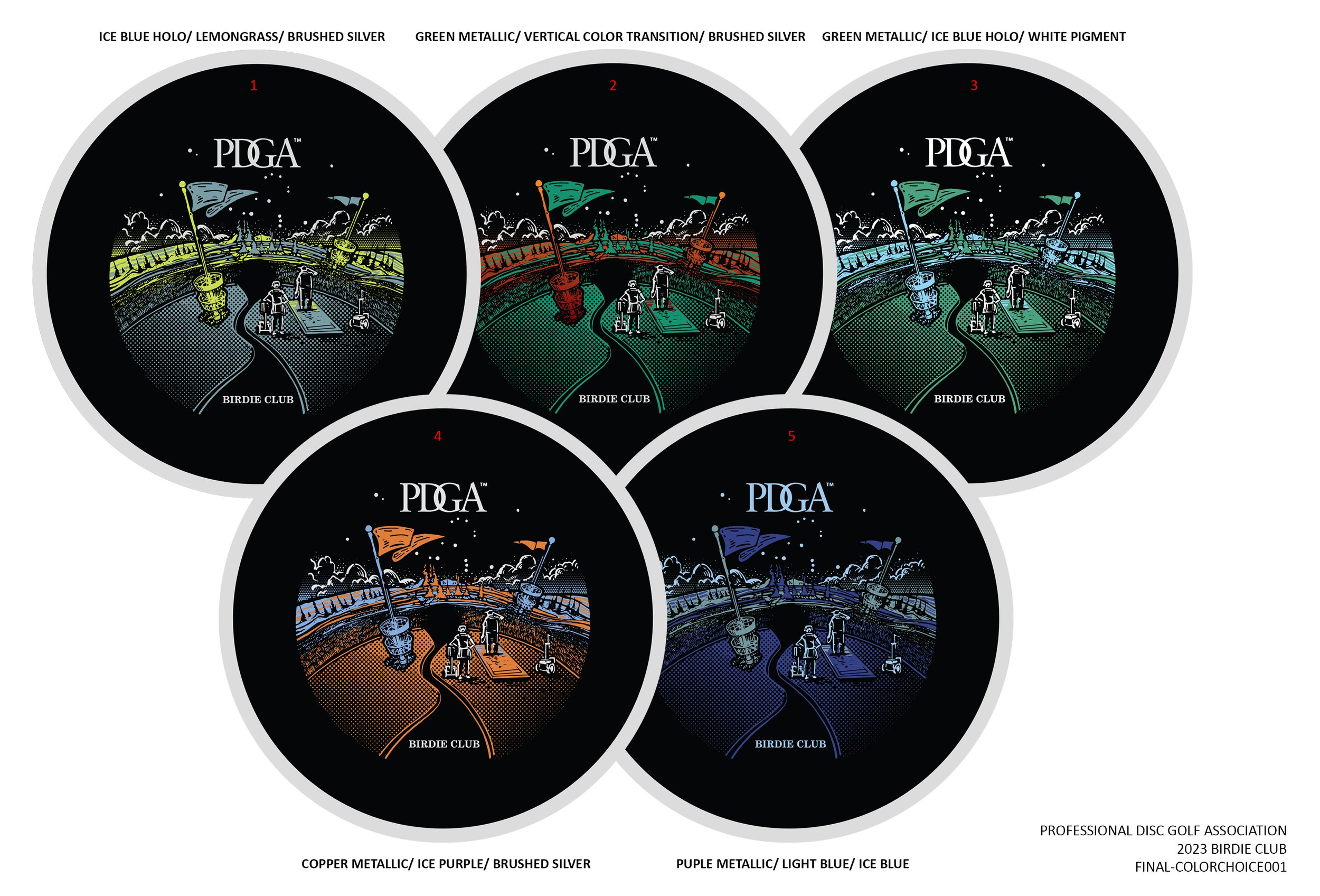
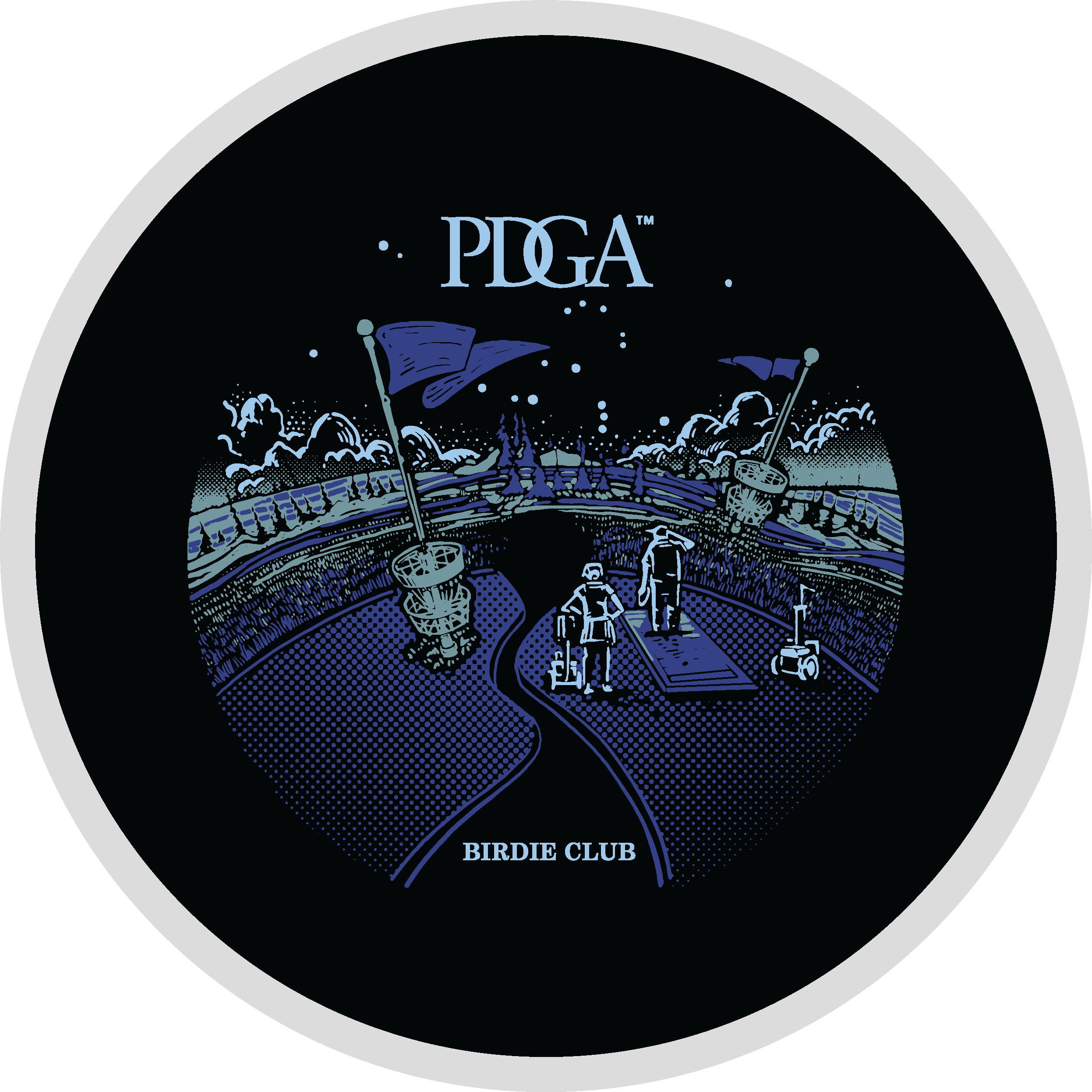
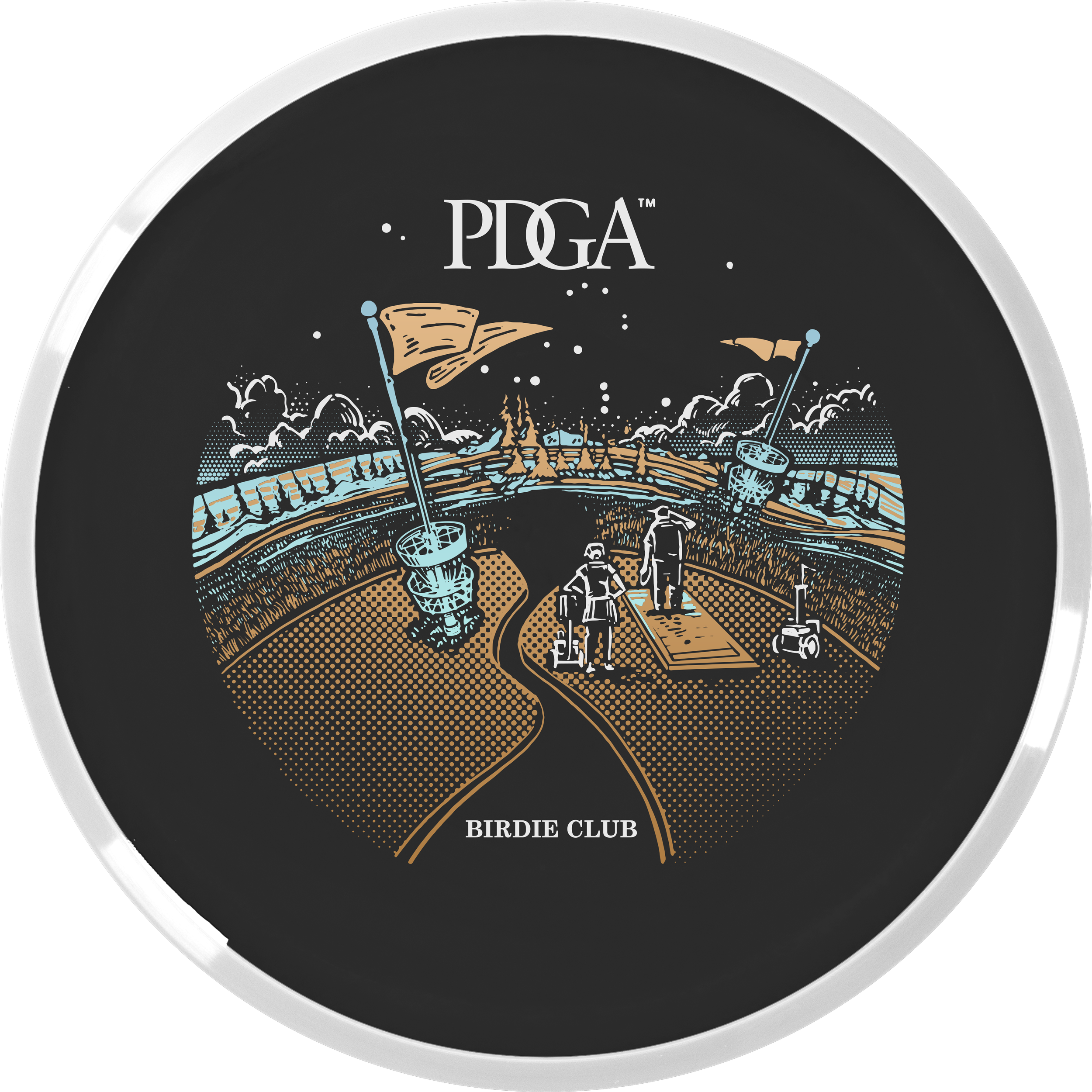
John started off with a super strong line drawing thumbnail for Birdie Club. When we passed off our designs, my first objective was to get this on a black background and start figuring out how this was going to work with foiling. I used gradients to John’s strength. He has a printing background and uses a halftone pattern fill for heavier parts of a design. I thought this could be a great way to blend the stamp into the dark flight plate. I thought that while the visual landscape was interesting; we needed characters navigating the course. That excitement of playing a disc golf course you’ve never played before. This felt very much like a dreamscape to me.

2023 PDGA Ace Club:

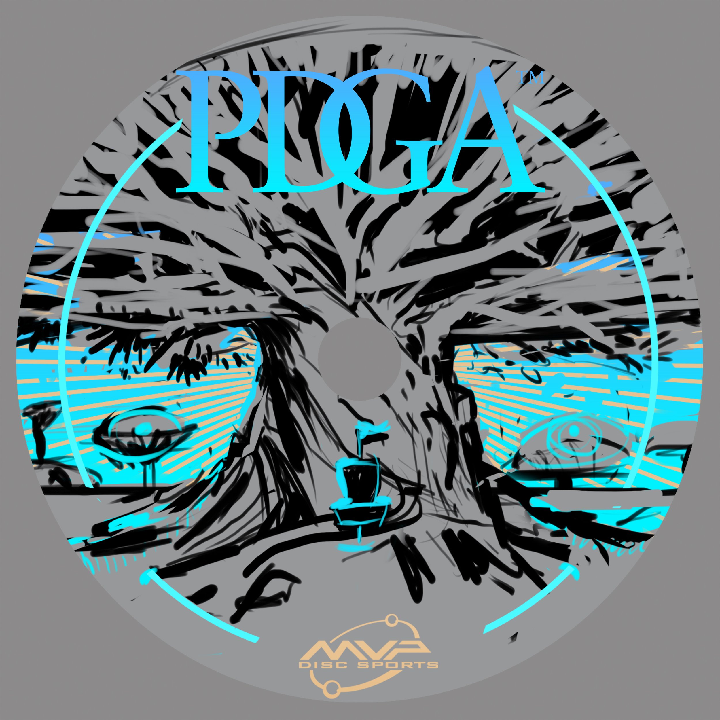
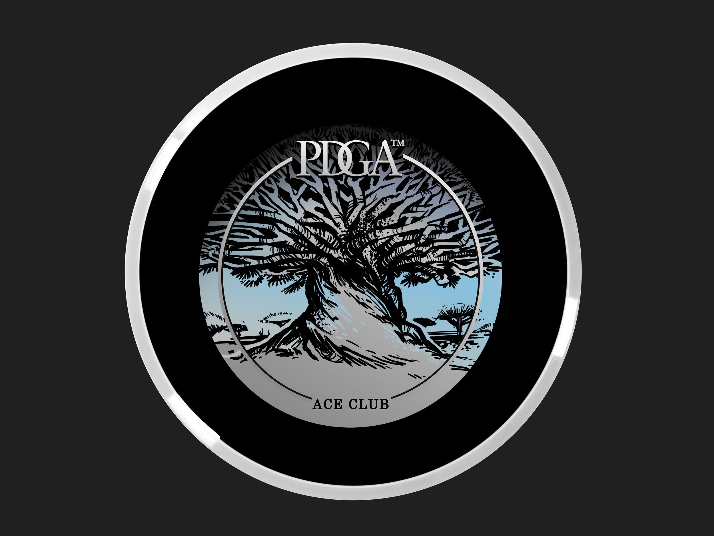
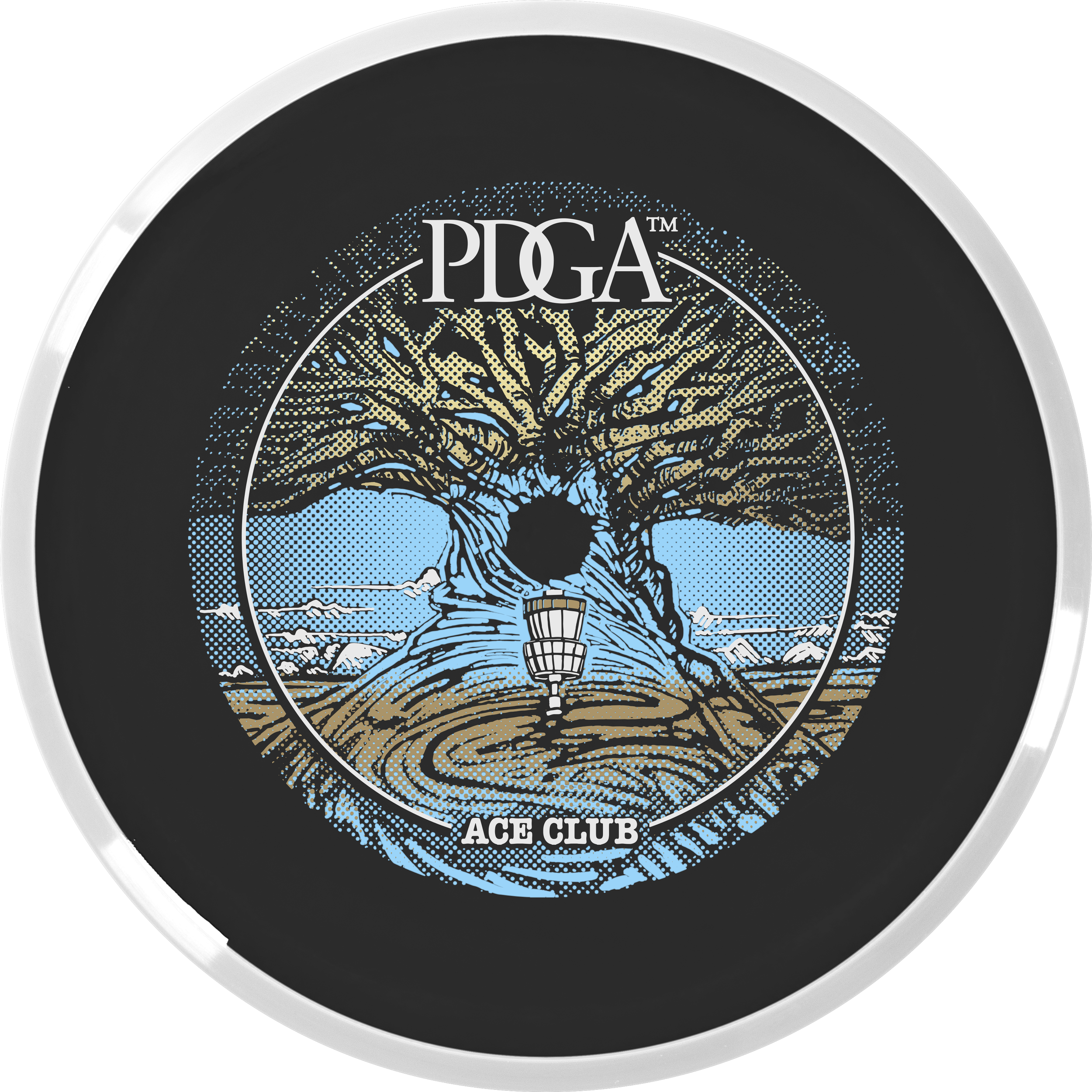
This Ace Club design started with a pretty strong photo from the known photographer, Beth Moon. The reference pulls from a dragon’s blood tree from Socotra Island. I love the umbrella-like silhouette and rigid shape of the canopy. It’s from there that I ventured away from the reference and put a more massive trunk like a very old oak tree. A combination of two ideas. John took then took my thumbnail idea and placed the basket and swirling root/ whimsical touch in the foreground section. We moved away from the gigantic mushroom because we didn’t want to show any psilocybin/ drug references as a PDGA offering. The absolute biggest hurdle with this stamp was the clipping area around the tree. Using the black R2 core to help with coverages and getting the correct foil gradients to do that work for us.

I just want to finish this by thanking Vic Allen for giving us the opportunity. It was a rewarding experience working alongside a disc golf design legend, a specific dark core color, and having to think about foil properties early on in the development stages. It helped us solve a lot of those issues before the Rough/ final phase of the artwork was to be addressed. A few stamp tests had to be sent to the PDGA before the final foils were chosen. I want to personally thank Ian Palmer for handling those logistics and collaborating to make sure we have the best foil represented on these. If you have any questions, feel free to ask below! You can actually purchase a Membership disc with your PDGA Membership renewal for $20!

Fission Wave Special Edition

A new mold in MVP Disc Sports’ Fission™ plastic debuts and it’s the ever-popular Wave. Fission™ plastic bases its technology by considerably lightening the center core and increasing the outer weight in the overmold. You’re able to get a more gyroscopic flight.

I was tasked to bring an idea to the table. Instead of reinventing the wheel, the team and I looked back to a bunch of different ideas from previous MVP specific Special Editions I created that weren’t used. A lot of them had potential and it was a mix of an older MVP Limit thumbnail in combination with an idea I can’t share right now that really got the Marketing Department’s excitement up. When I’m pitching these ideas to the department, I’m trying to show them my linear progression in decision making. Once I shared the solid previous idea; interdepartmental conversation really helped to meld the two solid ideas together.

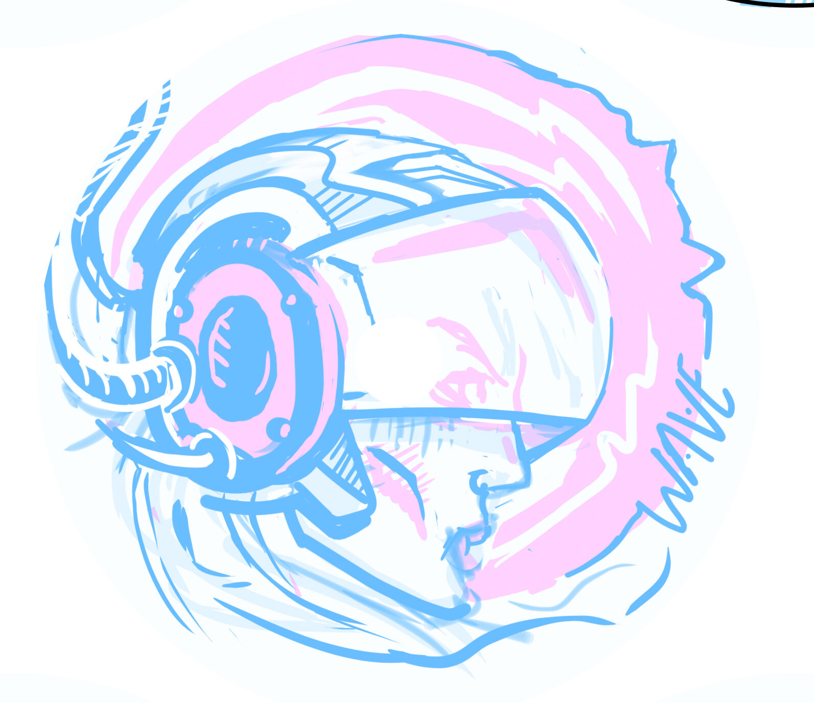
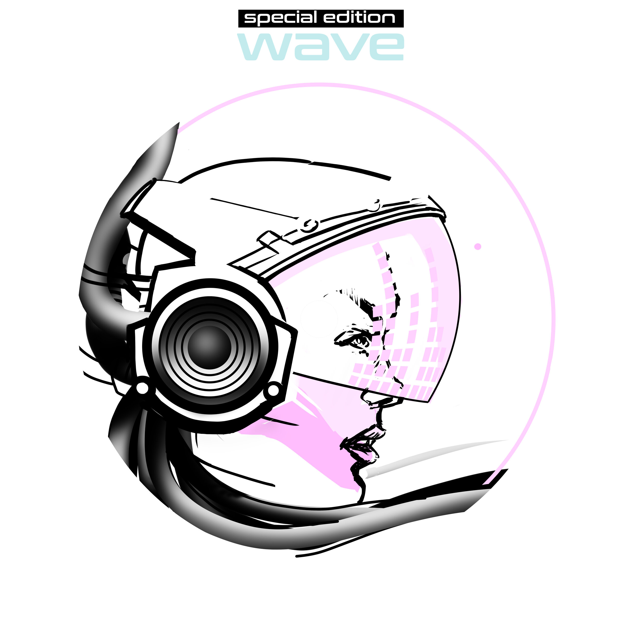
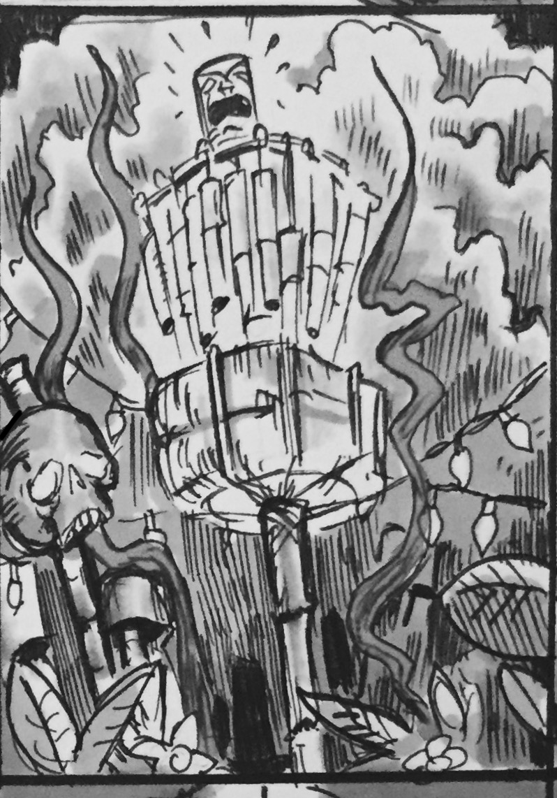
I’ve done some small reading on human resonant frequency in the past. I pictured this character having the gift and future technology to harness and magnify those vibrations into an auditory superpower. Sort of the same concept of pulling all of that weight to the outside rim of Fission™ Technology. Throughout the progression of the stamp; I battled with having a background to reinforce the story. I tried bolts and linear waves but felt the “WAVE” text and visor elements needed that space on the right side to breathe. So much was happening with the helmet and cable hair. Detail on this stamp was selective and when dealing with MVP and it’s history of Special Editions; it was an effort to keep this design clean and precise. From the rough to final draft, you see that it stuck really close to the original concept. With the help of female profile references to cyberpunk, & retro wave influences; I was able to create something that hopefully puts a positive look onto MVP and their multi-stamping abilities.

Get your hands on the Fission Wave arriving in stores, August 14th!
Schrock-A-Doodle-Doo

As 2019 was coming to a close, Tyler Schrock, Team MVP Pro asked me if I would like to do his 2020 Tour Series disc. Working with Tyler is pure joy. He’s kept an animal theme over the past few years that allowed me to do design an octopus and sloth. This year, his idea was a rooster. It turns out that his father was a chicken farmer! He raised chickens for 25 years. So this stamp idea was something he knew his family would love.

This idea started with chicken reference gathering even though I had a good idea of how I’d be able to pull this off. I think the strongest silhouette of a chicken is from the side. It gave me the room in the center of the disc to stay free from any no stamping zones. The chicken mouth action/or spit never made the final. That was an attempt to add that classic “action” seen in cartoons to show loud noises. We didn’t want the chicken looking like it was spitting so it was axed toward the end. The shading detail near the chest add a bit of contrast to show that it’s different color of feather.

The final pass was simply to add body/feather detail and import the consistent ring graphic from last years design. It was important to Tyler to continue that look and feel from year to year. When you display these side by side; it really adds a nice series look to them. I hope you all dig it! Share, like, comment on what you think!

Robokitty 2.0

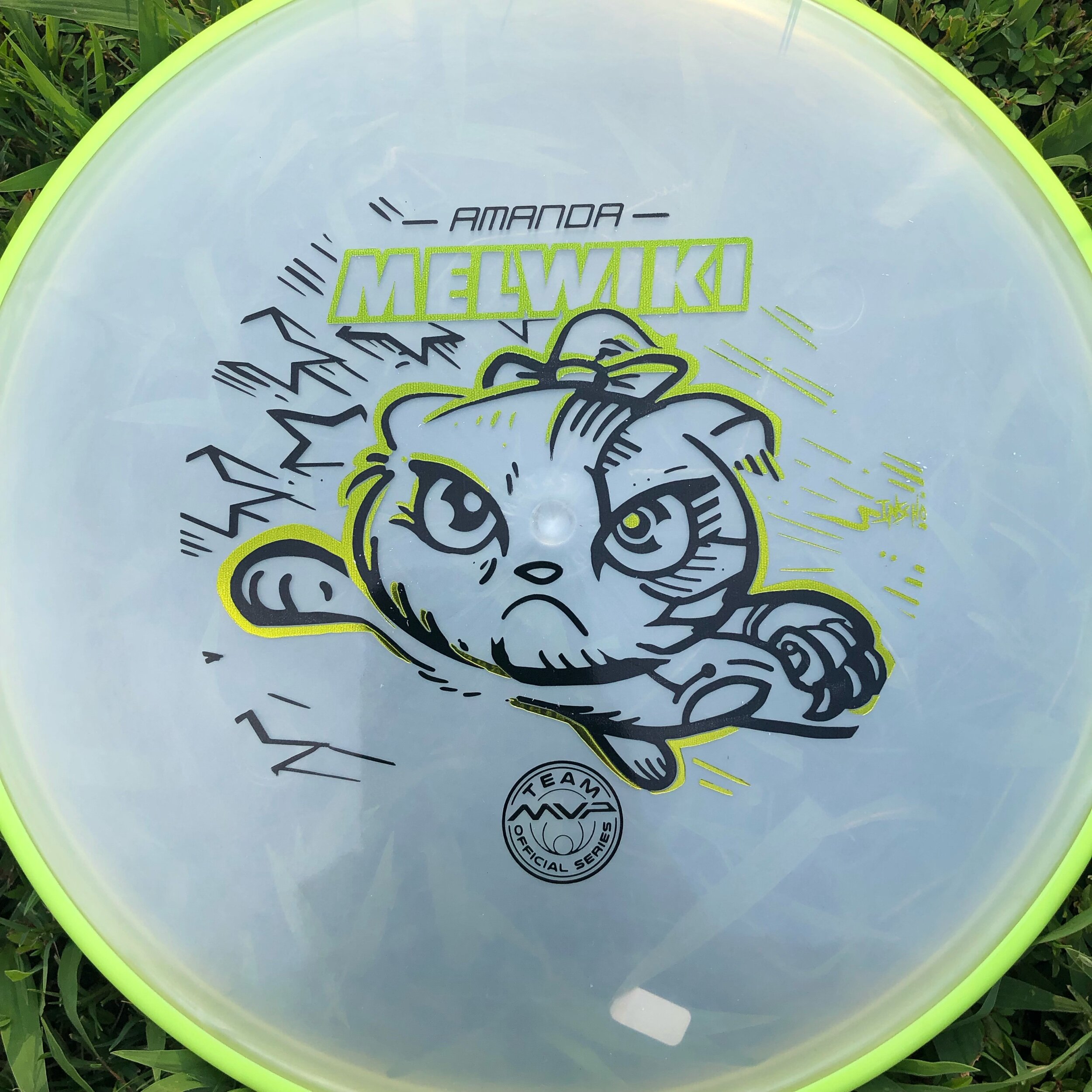
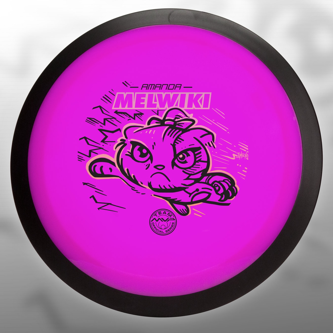
I received a request from an Team MVP member to change up a 2018 stamp design. Amanda Melwiki had a great 2018 year and her Robokitty design was a hit. She came to me with the idea of changing up the foils and adding a few elements to last years design. I had bigger plans for Robokitty and I’m glad she trusted me to do something new but a continuation of the concept.

I knew I wanted to show a fiercer side of the kitty. I wanted to marry the concepts of cute/friendly with the deep down drive and determination of getting better. That fueled the fire going into the concept stage. I had the idea more stored in the back of my head so this design didn’t really consist of a lot of reference gathering. Bringing in that exaggerated anime pop and allowing the opportunity to expand on the Robokitty character were the goals first and foremost. From there it was a few experiments with stars and how I was going to incorporate them into the design.

A huge thanks goes out to Amanda. Were you able to snag one? If not, she has a few available but will be selling out fast. Follow her here:

https://www.facebook.com/AmandaMelwiki

Streamline Pilot Special Edition

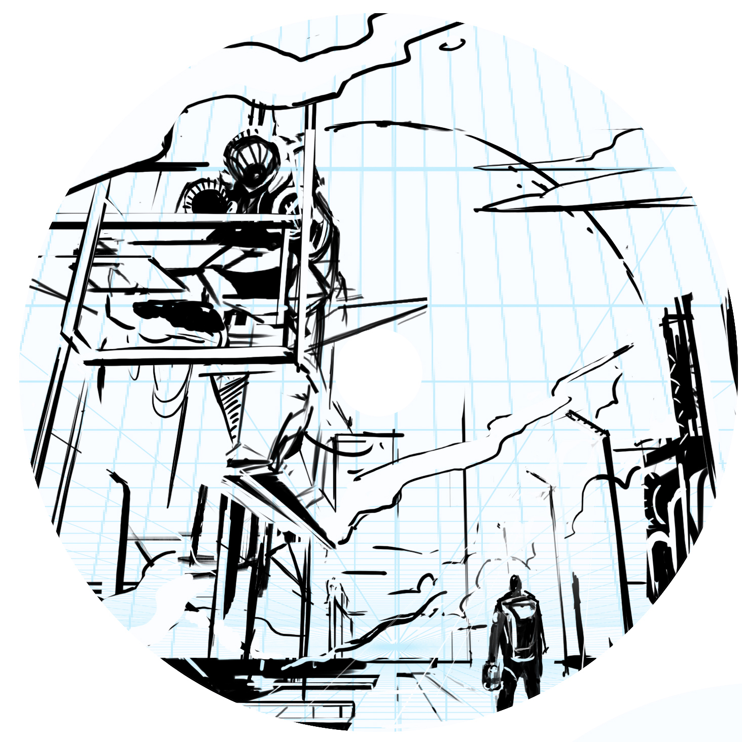
When given the opportunity to revisit a disc called the Pilot; I was all over it. The last time setting foot in the Streamline Pilot universe was for the Electron Limited Edition. That design featured a fearless fighter pilot locking in on his target. This time, however, it was time to step outside of that mindset.

Going into this design, I initially thought about how cool it’d be to take what I did with the Electron design but pump it up and put in a science fiction/ futurism space. I created a ton of thumbnails based on a technologically advanced fighter jet pilot. The thought of holograms or how future pilots would navigate the skies really stuck with me. In the end, we all agreed that while neat; we should create something totally fresh and new for the Neutron line. Those ideas might be revisited so I apologize in advance for not showing them.

I diverted to a Pilot character stepping onto the tarmac. Putting the viewer in the scene of a spacecraft pilot getting ready to debark on his mission. There’s something about showing massive scale between the character and where his attention is. I thought about mission bays, Ralph McQuarrie (prolific Star Wars concept artist) and how effective they were at creating these imaginative ideas. The ending result was a homage to the work that really got my gears going in concept art and illustration. There were numerous Star Wars concept art prints lining the school I was attending. Those pieces made me inquire more about that type of work and motivated me to go after that discipline.

My philosophy is to create these vast landscapes while always letting the viewer to fill in bits of detail. It allows them to create their own story or simply add to it. That’s what this stamp was all about. It was about not strapping down Streamline Discs’ brand identity to a certain period or time but expanding the possibilities heading into the future. The long steam trails coming from the left side of the image is homage to early 70’s fantasy and poster art. Thanks so much for taking the time to read this. Feel free to share among your peeps on any of your social spaces.

2019 St. Patrick's Classic

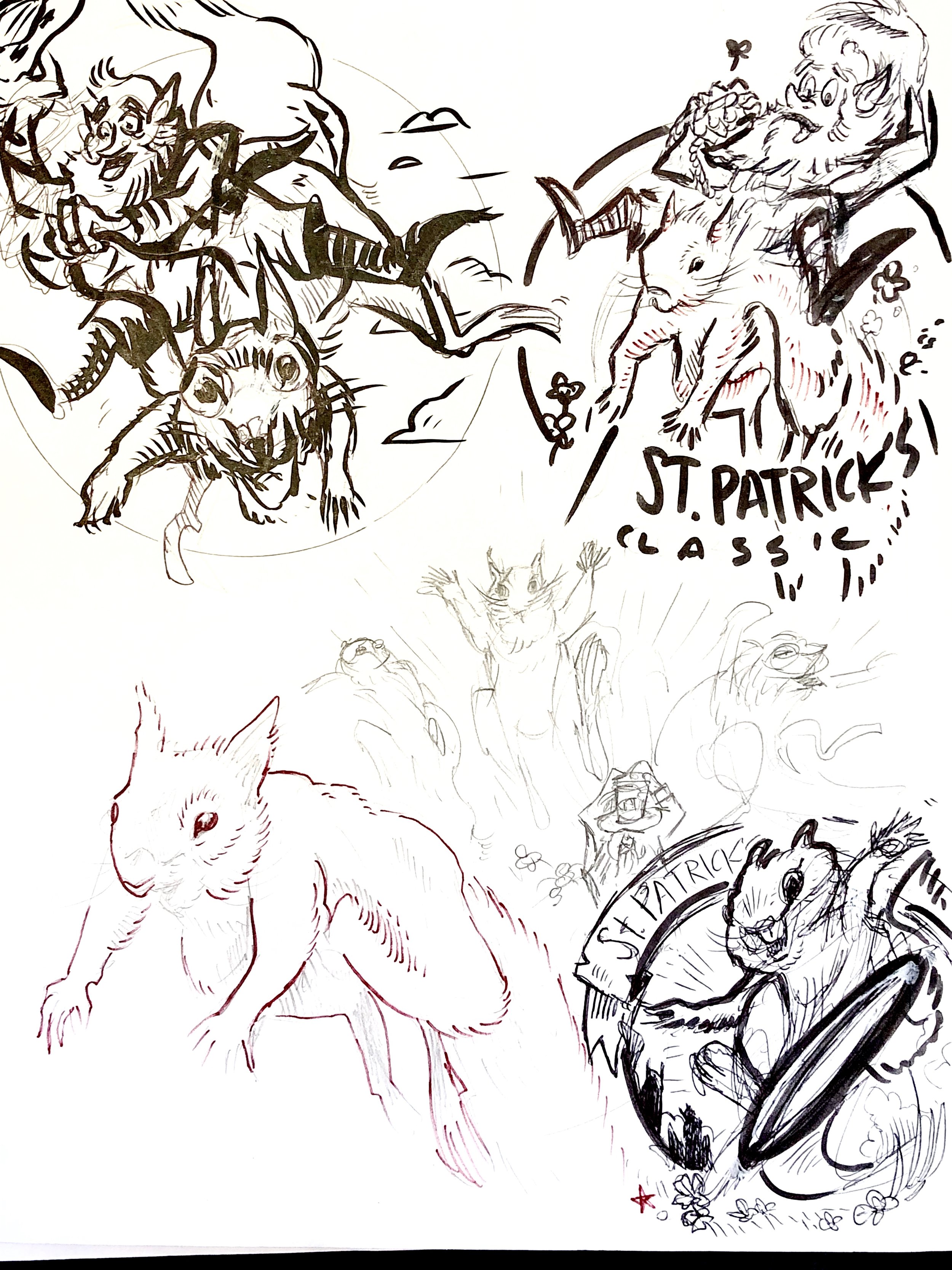
The 2019 St. Patrick’s Classic is a tournament that caught my attention when I started playing competitively. I realized right then and there that great artists are involved with the game of disc golf. Final 9 Sports had a great artist doing art for their St. Patrick’s Classic tournament. I was later informed that artist was Jimmi Myers who has sadly passed away just a few years ago.

A fellow disc golf art talent; Tyler McNair reached out and connected me to Bruce Kinsley who runs Final 9 Sports. Bruce was awesome to work with and provided me with all the past art for this event. This stamp had a huge weight on my shoulders. I wanted to impress the client that grabbed my attention those many years ago. Squirrels, Leprechauns, Celtic Knots and Shady Oaks Disc Golf Course are all many themes that have been done before. The squirrels really spoke out to me. They offered so many stories and are often the innocent bi-standards on the course. I felt like the was the direction we should go.

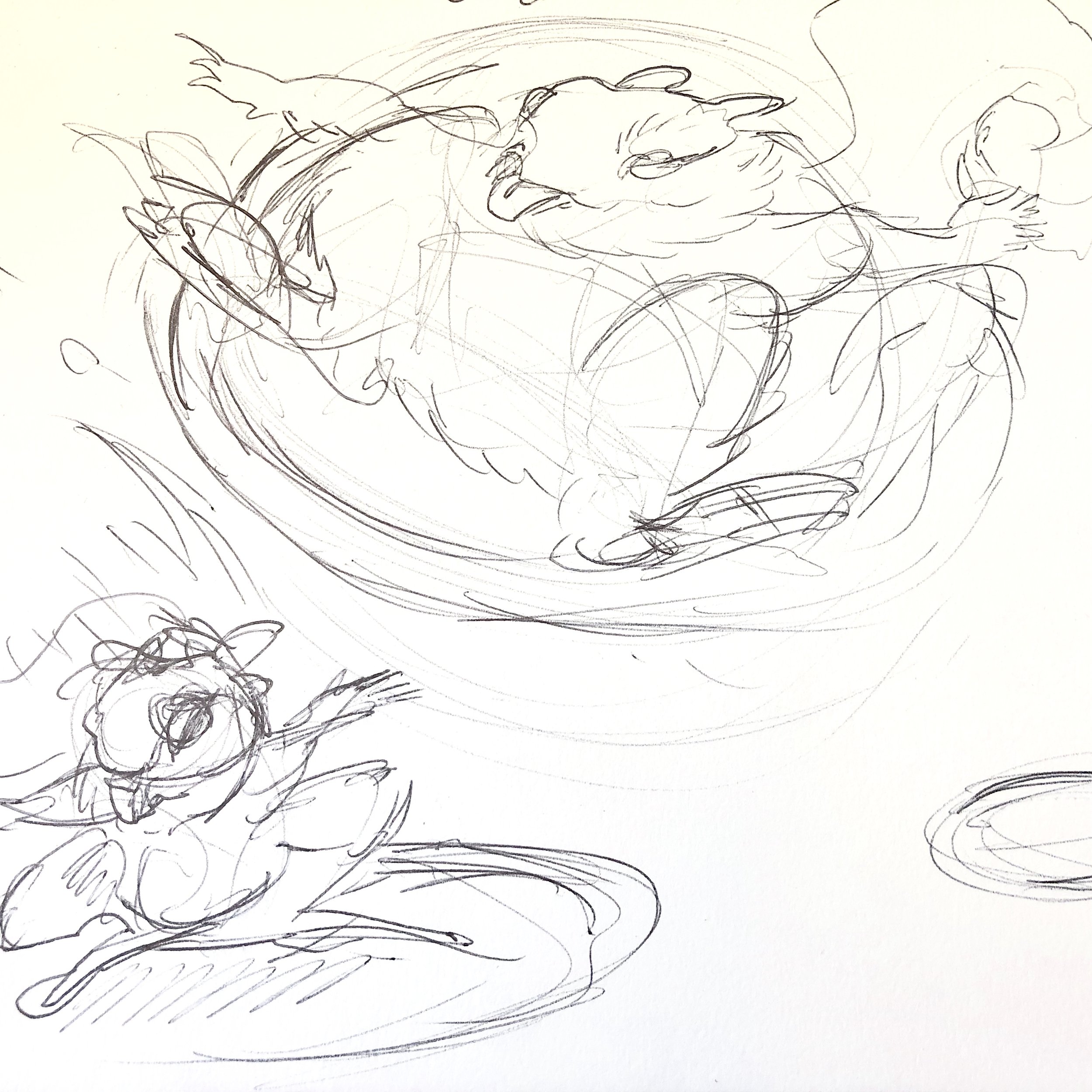
It took a lot of finessing as you can see from below. I’m just glad the drafts got better the more we worked through it. In the end, I believe the client was happy. I hope they had a successful event. If you’re out in the Orangevale, CA area, I hope you were able to attend and get your hands on some of these.

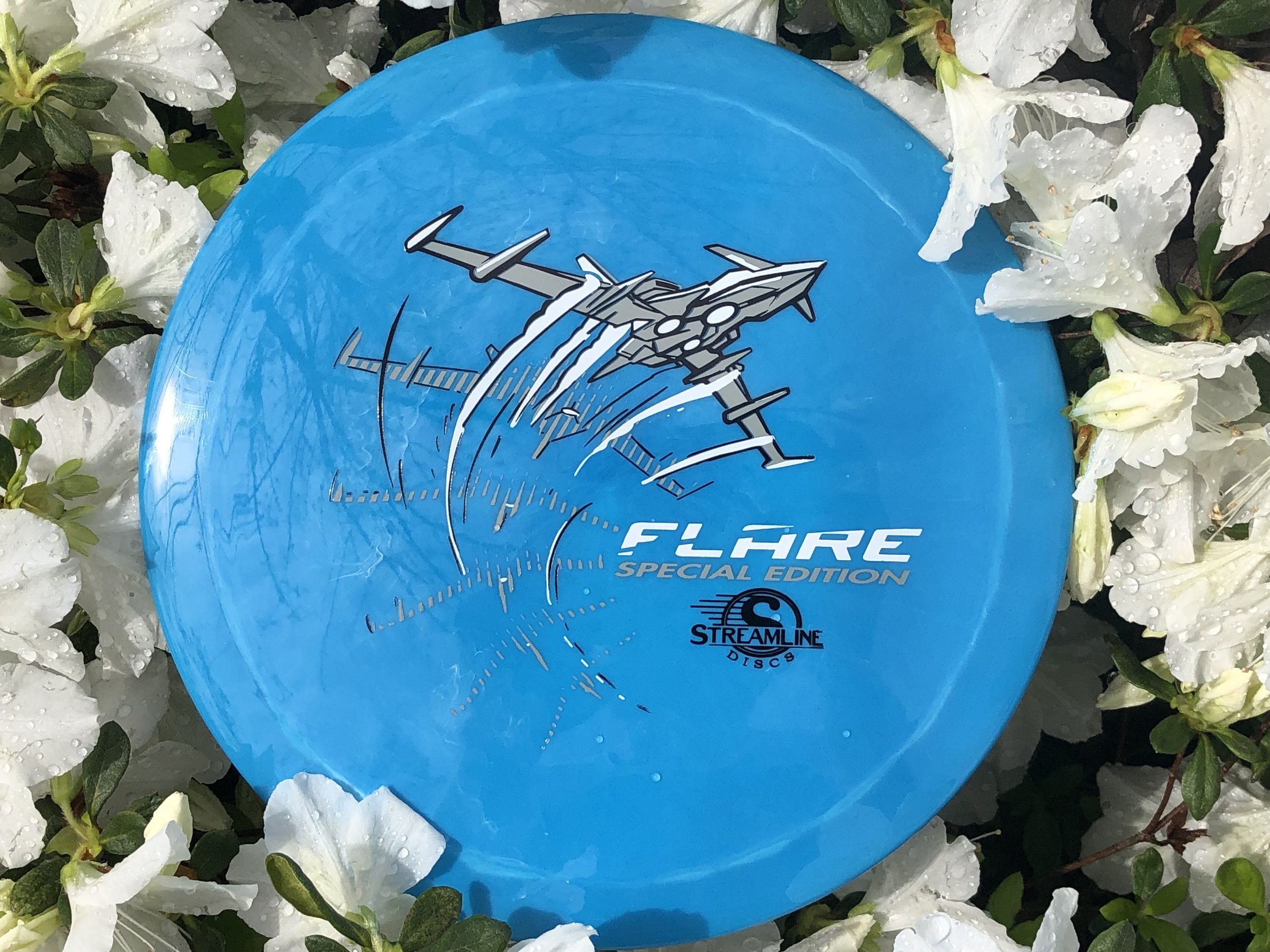
Streamline Flare Special Edition

The Streamline Flare is the newest Fairway Speed 9 driver delivered with plenty of overstability for even the strongest arms in the disc golf game. I was asked to design around that special ability of the disc to fight out of constant steady winds. It’s a true wind fighter.

The design started with a page of ship designs based on direct relationships to the flare countermeasure that provides a decoy to heat sinking missles. Other quick concepts went the sci-fi ship route and that aspect of the design stuck out with the group. The frame-type of motion was liked by all and continued into the rough phase. Connecting the design with it’s actual flight characteristics was important to me. I used a rough block-in 3D model to mock up the ship orientation and ported that into Illustrator. The whole intent of that process was to create motion.

Other Streamline designs that I’ve done were in a direction where you couldn’t place a certain time period on it. It was kinda Sci-Fi/ kinda modern age but I wanted to take this into a futuristic realm. So I added lower propulsion units on the bottom and kept the edges and angles sharp. A few references of the Royal Canadian Forces doing evasive maneuvers in a valley inspired me to put atmospheric trails coming off the wings. Carrying that curve language subtracted from the “Flare” typeface finishes it off.

In the end, MVP Disc Sports HQ used a new grey pigment-based foil in combination with black and white to create a truly comic-like vibe with the stamp. You can find these by most big online retailers of MVP, Axiom and Streamline on April 19th.

Out Of Bounds #2 - Sasquatch

Here's the 2nd installment in the Out of Bounds Series! I've partnered up with Brian Sweet to venture deep into the woods with this one. The first installment was a Kraken theme where the disc golfer perched on top of the cliffside went for the putt. Brian puts it so eloquently:
 
"What lurks in the out of bounds when playing disc golf? A whisper in your ear, the electricity of your hairs standing on the back of your arm. You can feel your heartbeat all the way up in your neck as you are frozen in fear"

Going into the second design, our initial idea was to have a towering sasquatch camouflaged into the tree line. The disc golfers would have no idea that this giant gargantuan of a beast, looms overhead. This idea did have its challenges. 

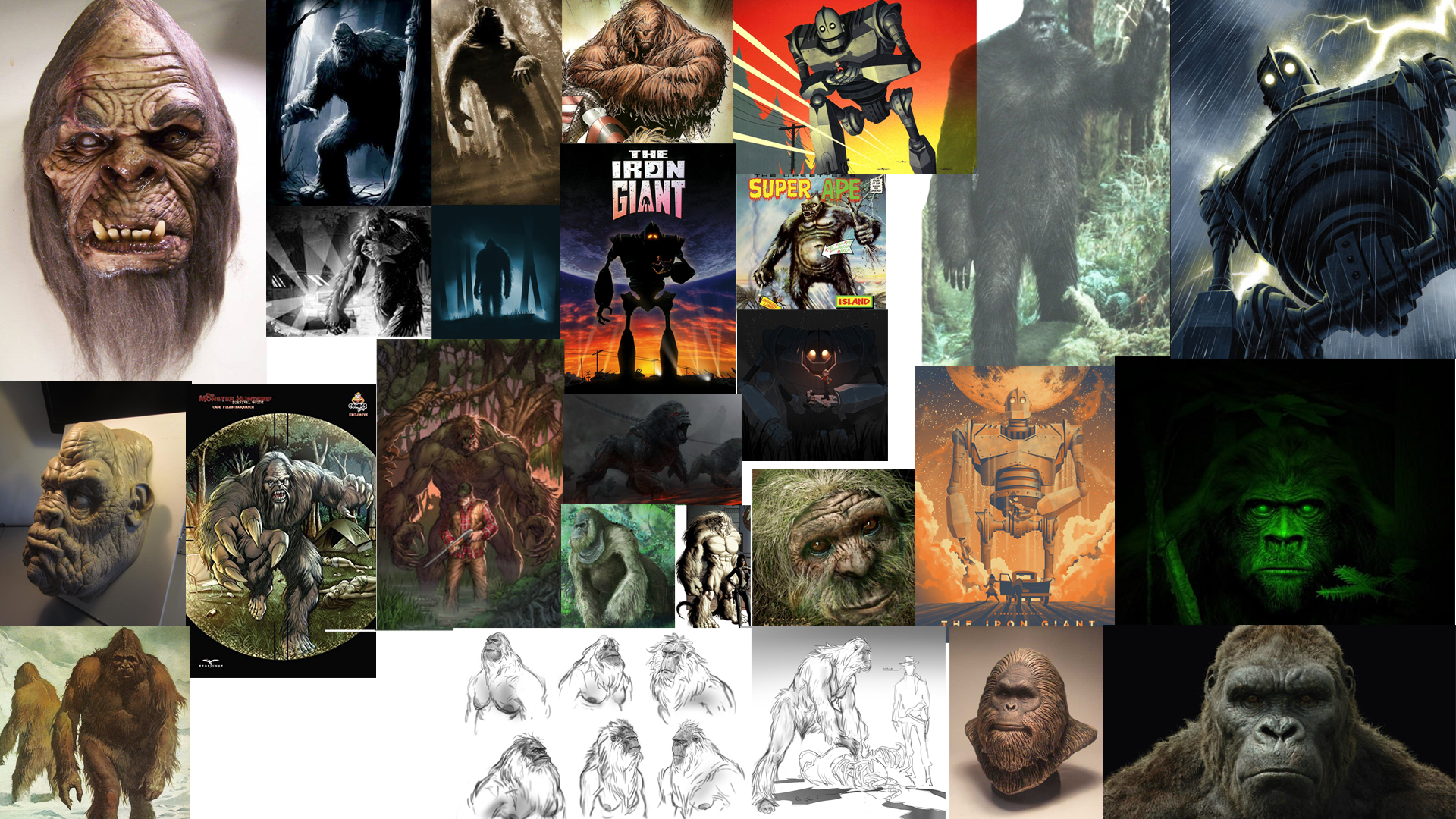
The first challenge was scale. To have this beast towering with the treetops dismissed the typical size of a Sasquatch. What really is the size of one of these beasts? My gut reaction and typical approach, when faced with this decision, is to go big! So initial sketches showed the scale I was hoping. As you can see from my rough ideas, blending the beast into the wood line left a lot of opportunities off the table. Typically, a person dominating a scene in a film has the subject taking priority in the shot. To make it this rule effective, I needed to scale the Sasquatch above the tree line. 

In the end, you see that we changed course at the last possible second. Sometimes grinding on a design is an indicator that it just isn't working. Sasquatch dude felt more like "King Hippo" from Mike Tyson's Punch-Out!!. Bending the main character over made it felt like he was engaged in the scene. Taking some of that chunk out of his frame and choosing Sasquatch identifiers helped sell the idea. His giant hand shadowing over the poor soul who has no clue, and the chain necklace of his most recent winnings, really made the scene.  All in all, I'm really happy on how this second installment turned out. I want to thank everyone for their support with the Out of Bounds series. I look forward to the next one! ...whenever that might be.  To keep in the loop, join this Facebook group for all "Out of Bounds" news related items!
https://www.facebook.com/OBdiscgolf/

Warrior Transition Battalion-Stamp

Christopher Altman, a fellow Cary Area Disc League member, approached me to offer him some help. He wanted to host a tournament to get soldiers involved with disc golf. To do that, he was going to organize a tournament for the Warrior Transition Battalion (WTB) down at Ft. Bragg, NC. The overall goal of the WTB is to provide the commensurate quality of life, quality of healthcare services and quality of leadership which matches the quality of service and sacrifice made by our sick, injured and wounded warriors in transition and their families. 

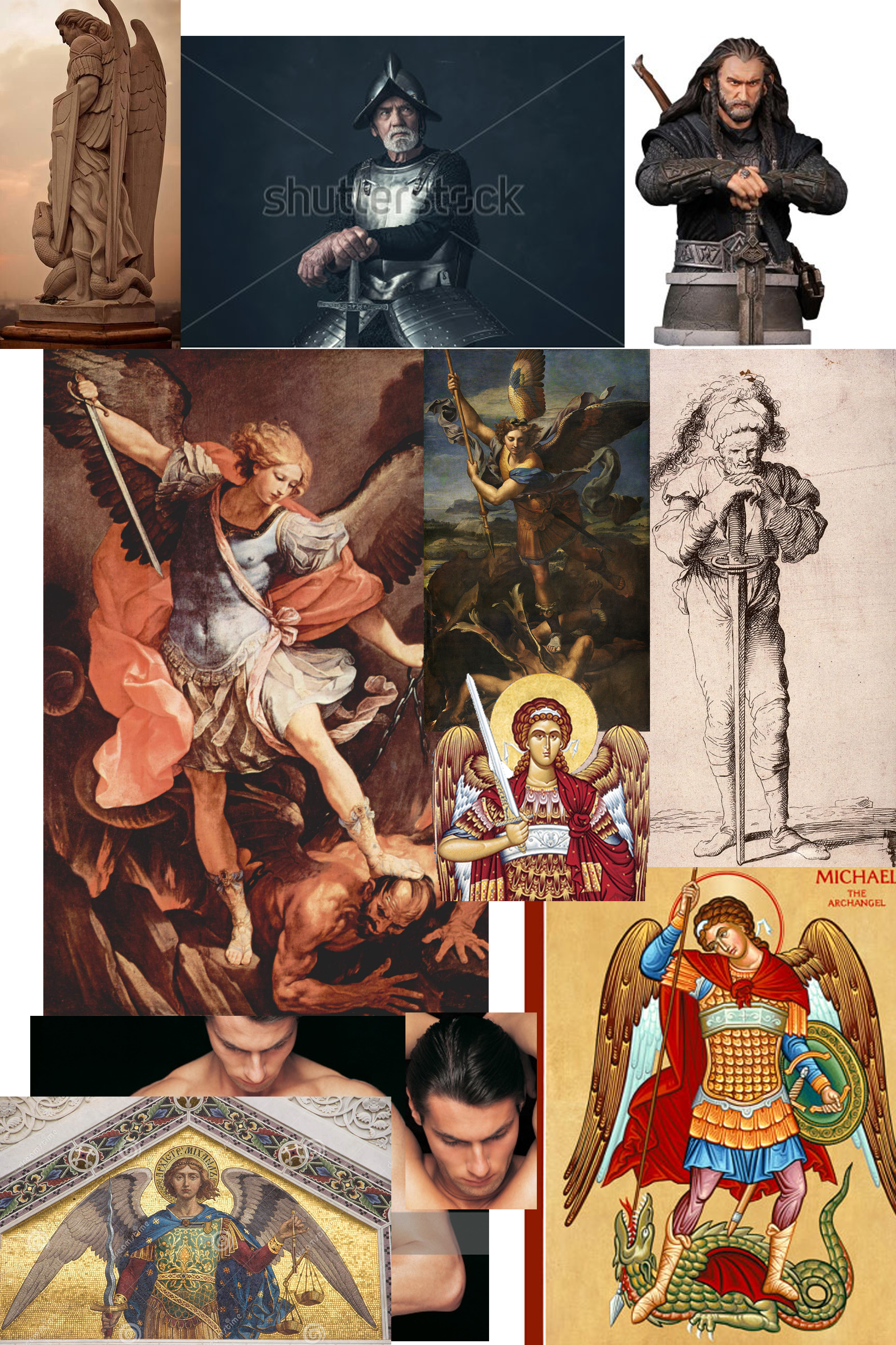
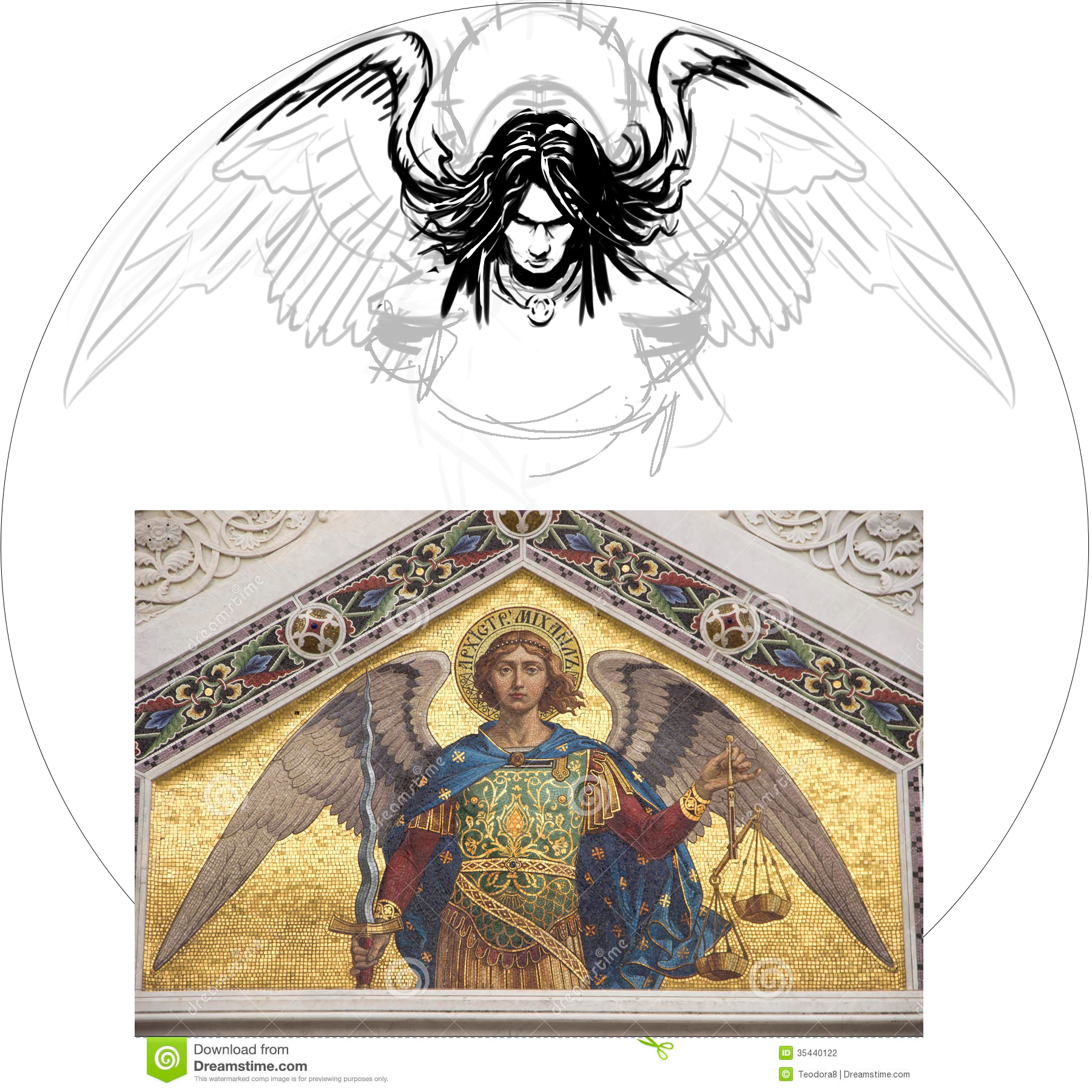
The goal of the stamp was to include a mixture of 4 different elements. The WTB logo, St. Michael, and a soldier helping a wounded warrior off of the battlefield. Lastly, the words "Find New Strength". The only image supplied to me was the soldier helping another soldier. The Airborne's St. Michael artwork someone had previously done. The styling of St. Michael was inspired by religious iconography from both Google searching and my wife and I's trip to Rome and Greece a few years back. With the combination of 4 elements, It was my job to do the best I could to incorporate them into one design. 

In the end, it took a little bit to finish up. I was working on this design during my off time while working a full schedule. I'm very happy to support a great program and a great cause. I hope the tournament go'ers enjoyed this event and continue playing disc golf. 

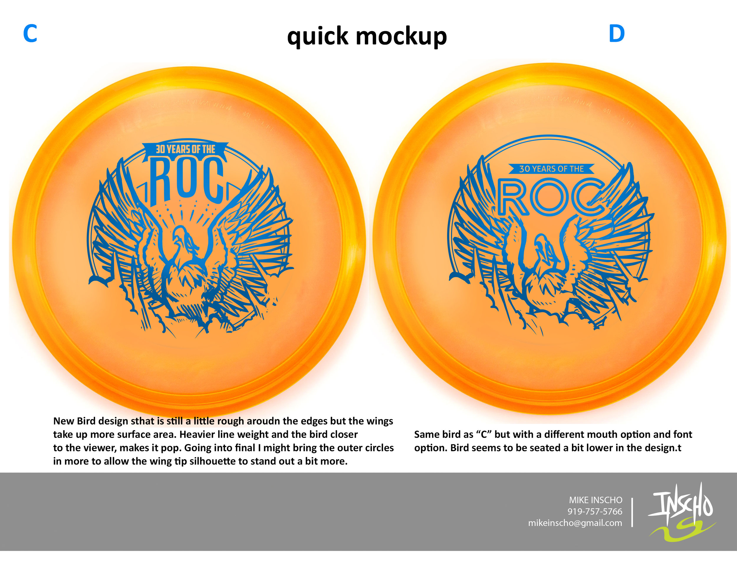
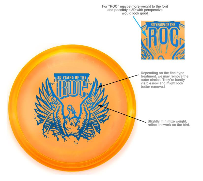
30th Anniversary of the Roc

Excited is an understatement. Jeff Panis (Marketing Director of Innova Champion Discs) reached out quite a while ago when he assumed his new role. A lot of things were on his plate at the time, so we talked briefly and got back in touch a few months down the road. An opportunity was in place to design a commemorative stamp honoring 30 years of the Roc's existence. The Roc has been one of Innova's most popular molds without question. This was a huge opportunity that came with a lot of weight.

In the initial sketches I proposed, there were some good things to build off of. I had awesome friends who helped me out in critique. One of the main things I overlooked that they quickly pointed out was the silhouette strength of the head. My goal was to have this Roc reach a point of near weightlessness. For example, If you stretch your back out in your chair (I do this from time to time) , you arch the back, the chest protrudes out and your chin tips up. This pose is something I tried to capture. As Innova and I progress through the development of the stamp, The head tips back down a bit to give the bird more shape. The wings extend out to give some symmetry to the stamp. The body develops all the way to it's last and final version and the final is the result of of multiple revisions for the better.

If it wasn't for my friends and their fresh eyes to give me critique, the direction of Jeff Panis, Levi Wilcox and the crew to keep pushing this stamp, it would've honestly turned out to be less than what it should've been. What do you all think?  I'd love to hear your thoughts in the comments. Thanks for reading.

MVP "Limited Edition" Teleport

The MVP Teleport is the first one out of the gates for MVP Disc Sports 24.5mm class of high-speed drivers. To commemorate the release of this disc, MVP came to me wanted a limited edition stamp.  My job was to portray teleportation while sticking with what MVP's brand identity is and to create this design using their three foil stamping abilities. 

Mathematics, science, and technology take the forefront of what MVP's graphics have always been about, My mind started there. How would I depict teleportation in a way that worked well? That was tough. If you take a look at my thumbnail process in the very first gallery image, you see the spectrum was pretty wide. Anything from math grids and charts to space pilots entering a warp tunnel. My main hurdles with this design were turnaround times and getting the funnel graphic and perspective to give off a disorienting point A and B. Hot stamping has a limit to line width that will be transferred to the disc successfully. What I wanted to do is convey these two portal entry's that disappeared to the disc color while keeping the main and important element (the Teleport name and MVP logo) bold and black. 

All in all, I'm super grateful for the opportunity and learn the most when I step outside my comfort zone. The Limited Edition stamp will be available through most major retailers that carry MVP Disc Sports merchandise. What do you all think? Does it keep with the brand? Leave me a note in the comment section. Thanks for stopping by. 

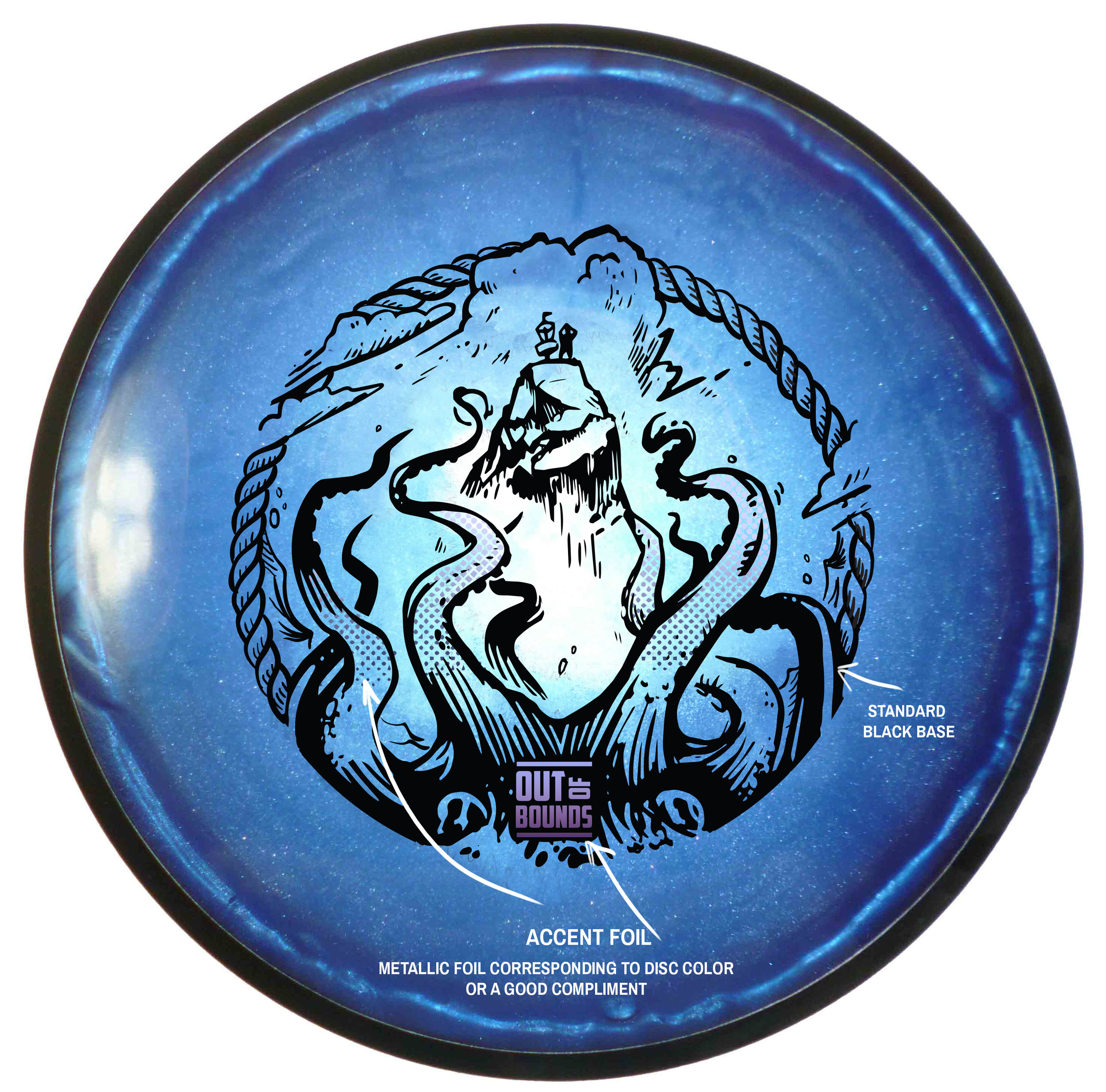
Out of Bounds Series #1

The Out Of Bounds Series was an idea drawn up by a fellow MVP Gyronaut by the name of Brian Sweet. He came to me with an interesting take that I've never thought about before. Tight fairways, landing areas and almost impossible pin placements exist somewhere in the disc golf world. His idea is to shed light on these situations. 

This idea stems from fantastical ideas about what lurks hidden, as your disc takes a plunge into the unknown. Out Of Bounds Series #1 explores the depths of an impossible landing area. The disc is now belonging the keeper. A mix of Cthulu/Kraken/Squid vibes. I wanted the eyes of the creature fixated to the onlooker. The eyes had to adjust from the sides of the beast to more in front to convey the idea. The introduction of the second foil to bring the viewers attention from the bottom of the stamp up toward the poor fellow on the cliff side. 

I want to thank Brian Sweet for having the faith to let me run with his napkin sketch and go for it. These are available in a dual foil set up exclusively on MVP/Axiom/Streamline Discs plastic.

Please let me know what you think in the comments and share with your friends! 

2017 Fantasy Disc Golf Calendar

After seeing the 2016 Fantasy Disc Golf calendar with work of disc golf artists, John Dorn and Manuel Trujillo; I knew I had to inquire to see what it'd take to get on the 2017 team. the 2017 team of artists included John Dorn, Manuel Trujillo, Benjamin Hopwood, Duncan "Skulboy" Crawford, Steven Colatriano, Cooper Harkins and myself. 

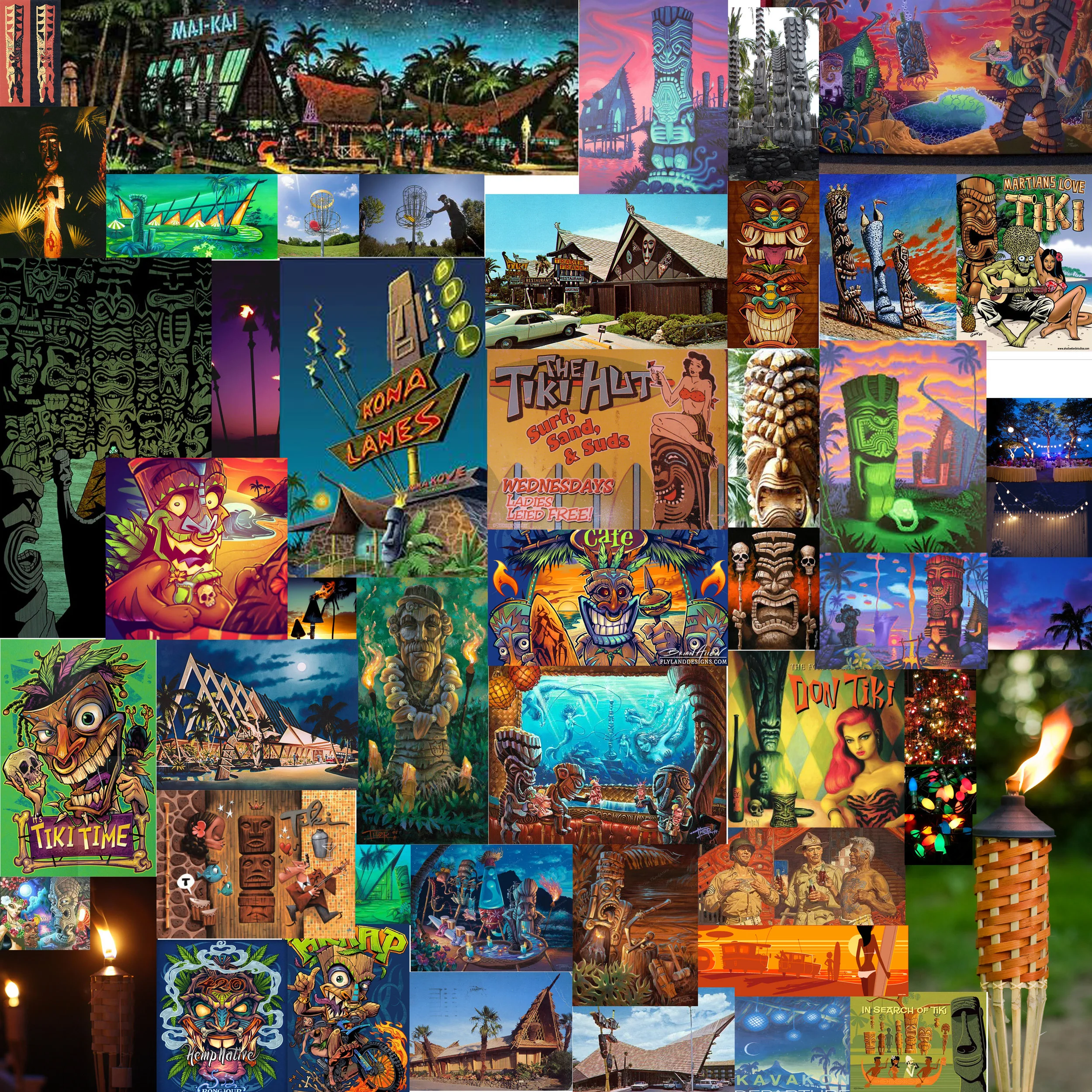
I was assigned the months of August and November. I've always wanted to do more themed disc golf illustrations. I appreciate John giving me the chance. August (Summer) got me interested in revisiting some Tiki artists I found while I was researching for a mural project years ago.  Brad "Tiki Shark" Parker and Tom Thordarson really inspired this tiki piece. November early sessions had cornucopia themes in mind but as soon as I saw great fall reference, I switched to a forest scene with stirring foliage. I found these neat fire tornadoes while searching as well. One thing led to another. Really pleased with how both pieces turned out.

This is exciting and new for me. My prints are available here!!:
High Quality Archival Prints
More affordable option

2016 Basket Bashers

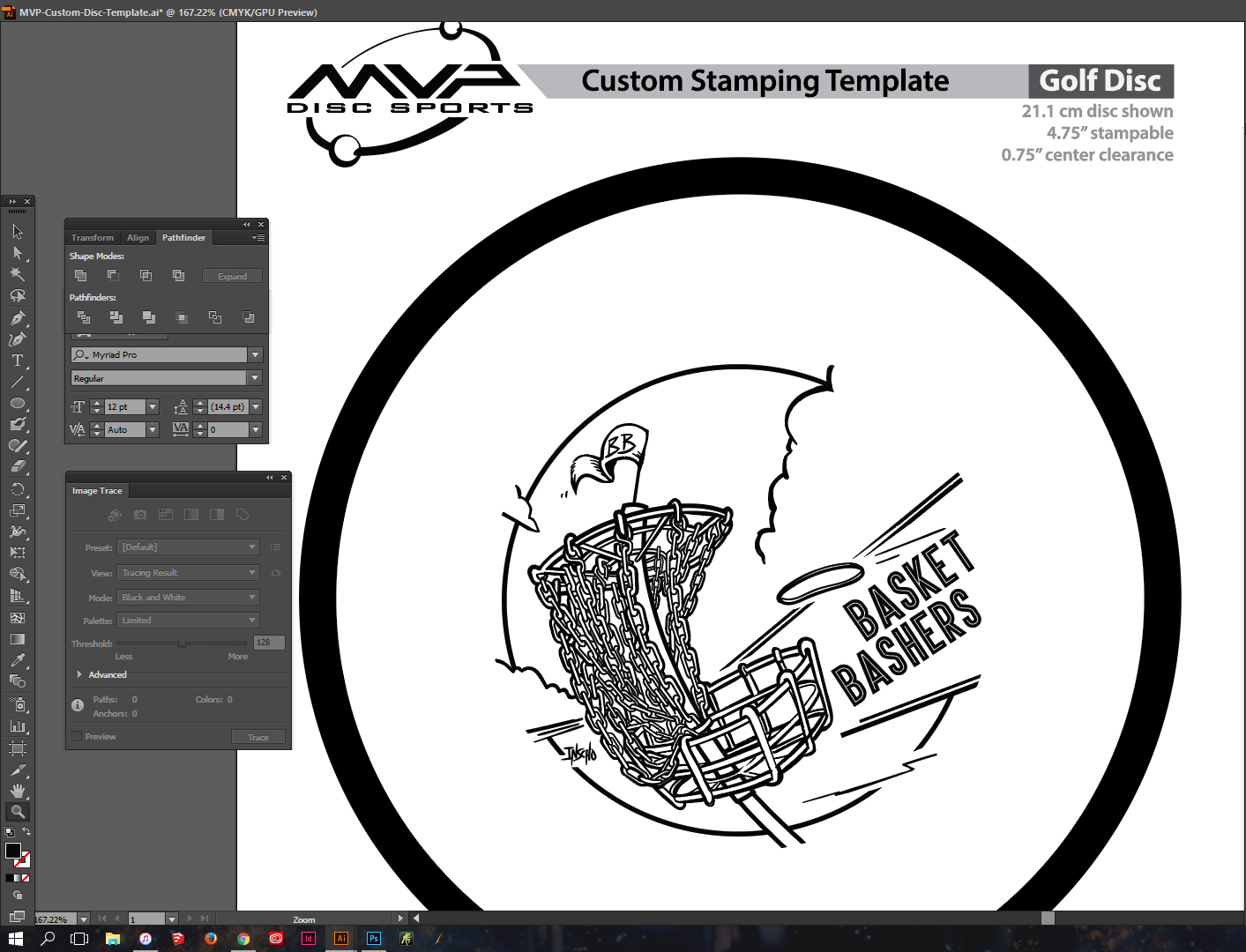
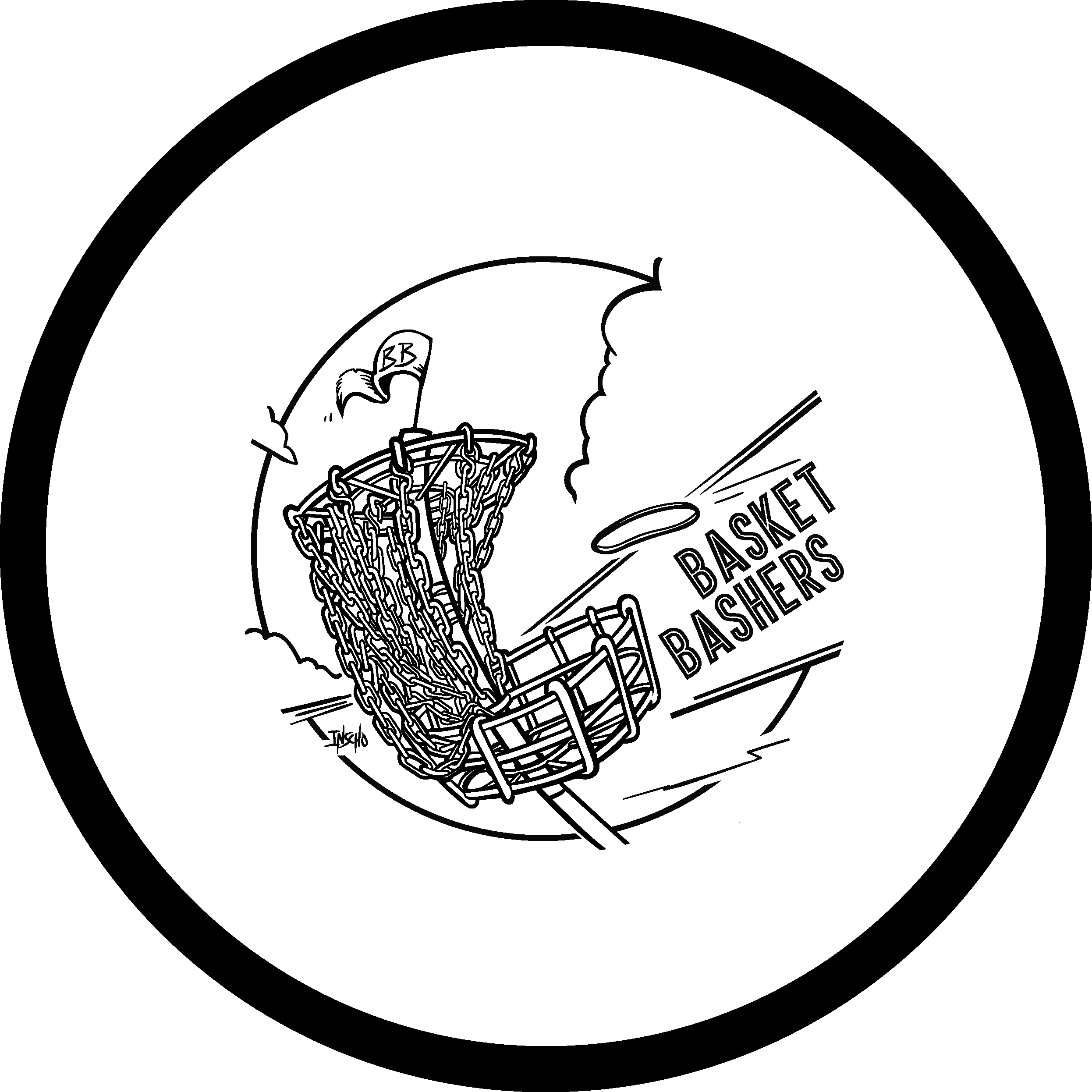
Soon after I finished the Jen Sawyer "JSaww" stamp, I received a buzz from Jerry Pectol, owner of Basket Bashers Disc Golf. Jerry just wanted something that was going to spark interest within his community of clientele. Didn't matter what, but he mentioned the previous artwork that I've done and just had to stay tasteful, as his demographic stretched a wide variety. 

Going into this stamp, I wanted to improve upon his Basket Bashers logo immediately. I was lucky enough to hit it on the first go and it was smooth sailing from there. I want to thank Jerry for giving me the creative liberties few actually get. If you're interested in getting a disc with this image on it, please hit up Jerry at basketbashersdiscgolf@aol.com

2015 Tupelo Bay Open Hot Stamp

I received a call from Phil Lawrence, Tournament Director of most disc golf events up in Greensboro/ High Point area. He had an idea, but needed me to pull it off.  Working with a 5 inch radius, some of those ideas didn't make the cut. I fit in what I could, to make sure the stamp resemble the overall story. 

The annual Tupelo Bay Disc Golf tournament is set up on a professional golf course located at Tupelo Bay Golf Center in Garden City, South Carolina. 9 holes I believe, are permanent all year round. The rest of the course is set up with mobile baskets. It's one of the few events with an area so large, that participants are able to use golf carts.  At the end of the tournament there is a little competition to see who can grab the most baskets with their golf carts. 

The main idea was to have some of these items:
The name of the event/ golf cart/ baskets being transported/ a resemblance to the Tupelo Bay course/ and the Tournament Director, Kirk Yoo in the fairway with a measuring wheel.  You will see on some of the less successful attempts I try to cram all the ideas in the design but they always feel too busy.

I appreciate Kirk Yoo, Chris MacLeod, Mike Norris and Phil Lawrence for giving me trust in this tournament hot stamp design.

A lot of firsts.

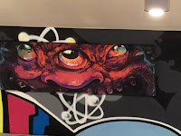
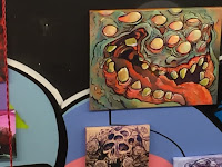
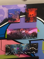
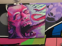
I received my chance a few months ago. I inquired about being a feature artist for a First Friday event. The first Friday of each month showcases artists in the heart of downtown Raleigh. Atomic Salon and Drink Drank Drunk gave me the opportunity to get the acrylics out from storage and start painting traditionally again. Being slated for an October show at a cool venue, provided the stage to do what subject matter I love to do.

While Hurricane Joaquin was rearing his head off of Cuba, the rain continued to hit NC just days before the show. I thought for sure, nobody was going to come out in the muck. The turnout was incredible. It was really great to be introduced to so many cool people.

Thanks to everyone who had helped get my work on the walls and the one's who enjoyed my art enough to purchase a piece or two. I truly appreciate it. Feel free to visit Drink Drank Drunk and Atomic Salon from now till the end of October to see the remaining art still being shown. There are still pieces of art to be had.

Please contact me at

mikeinscho@gmail.com

if any remaining pieces interest you.