Schrock-A-Doodle-Doo

As 2019 was coming to a close, Tyler Schrock, Team MVP Pro asked me if I would like to do his 2020 Tour Series disc. Working with Tyler is pure joy. He’s kept an animal theme over the past few years that allowed me to do design an octopus and sloth. This year, his idea was a rooster. It turns out that his father was a chicken farmer! He raised chickens for 25 years. So this stamp idea was something he knew his family would love.

This idea started with chicken reference gathering even though I had a good idea of how I’d be able to pull this off. I think the strongest silhouette of a chicken is from the side. It gave me the room in the center of the disc to stay free from any no stamping zones. The chicken mouth action/or spit never made the final. That was an attempt to add that classic “action” seen in cartoons to show loud noises. We didn’t want the chicken looking like it was spitting so it was axed toward the end. The shading detail near the chest add a bit of contrast to show that it’s different color of feather.

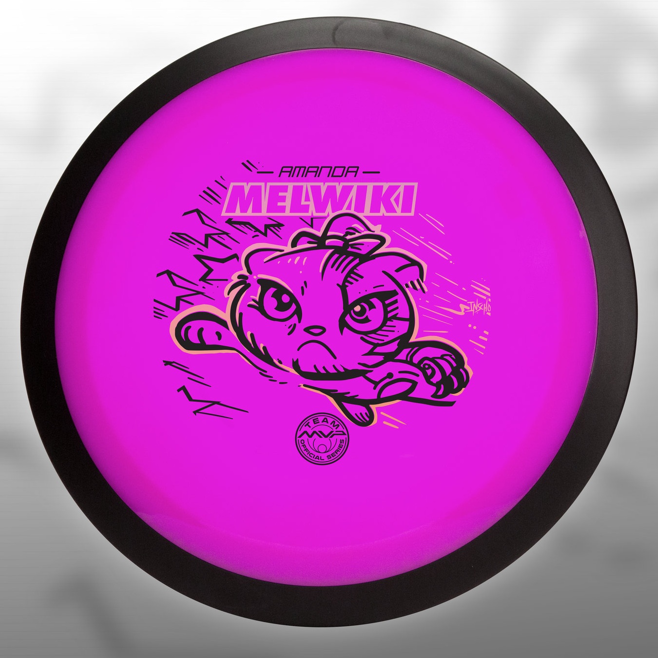
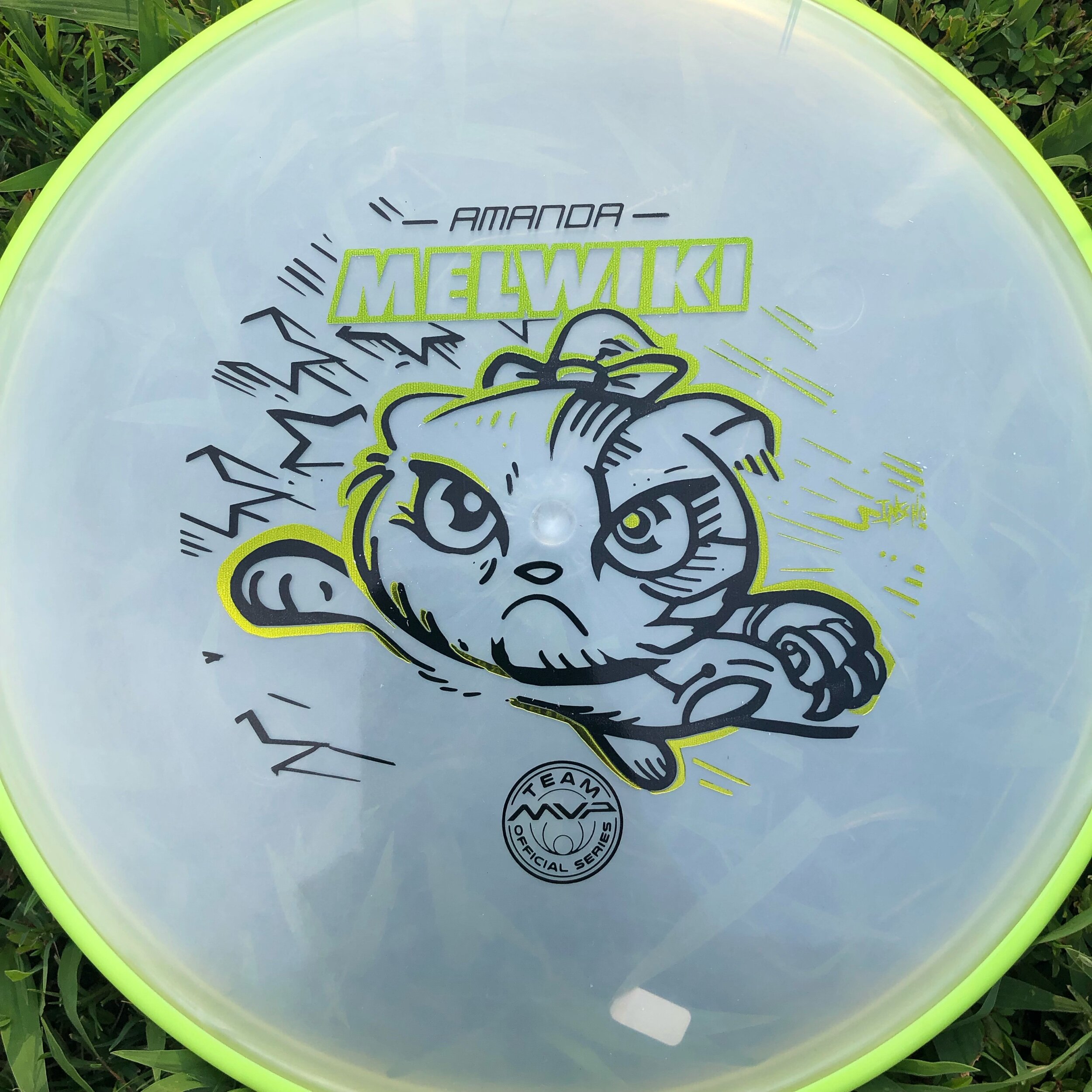
The final pass was simply to add body/feather detail and import the consistent ring graphic from last years design. It was important to Tyler to continue that look and feel from year to year. When you display these side by side; it really adds a nice series look to them. I hope you all dig it! Share, like, comment on what you think!

Robokitty 2.0

I received a request from an Team MVP member to change up a 2018 stamp design. Amanda Melwiki had a great 2018 year and her Robokitty design was a hit. She came to me with the idea of changing up the foils and adding a few elements to last years design. I had bigger plans for Robokitty and I’m glad she trusted me to do something new but a continuation of the concept.

I knew I wanted to show a fiercer side of the kitty. I wanted to marry the concepts of cute/friendly with the deep down drive and determination of getting better. That fueled the fire going into the concept stage. I had the idea more stored in the back of my head so this design didn’t really consist of a lot of reference gathering. Bringing in that exaggerated anime pop and allowing the opportunity to expand on the Robokitty character were the goals first and foremost. From there it was a few experiments with stars and how I was going to incorporate them into the design.

A huge thanks goes out to Amanda. Were you able to snag one? If not, she has a few available but will be selling out fast. Follow her here:

https://www.facebook.com/AmandaMelwiki

Out Of Bounds #2 - Sasquatch

Here's the 2nd installment in the Out of Bounds Series! I've partnered up with Brian Sweet to venture deep into the woods with this one. The first installment was a Kraken theme where the disc golfer perched on top of the cliffside went for the putt. Brian puts it so eloquently:
 
"What lurks in the out of bounds when playing disc golf? A whisper in your ear, the electricity of your hairs standing on the back of your arm. You can feel your heartbeat all the way up in your neck as you are frozen in fear"

Going into the second design, our initial idea was to have a towering sasquatch camouflaged into the tree line. The disc golfers would have no idea that this giant gargantuan of a beast, looms overhead. This idea did have its challenges. 

The first challenge was scale. To have this beast towering with the treetops dismissed the typical size of a Sasquatch. What really is the size of one of these beasts? My gut reaction and typical approach, when faced with this decision, is to go big! So initial sketches showed the scale I was hoping. As you can see from my rough ideas, blending the beast into the wood line left a lot of opportunities off the table. Typically, a person dominating a scene in a film has the subject taking priority in the shot. To make it this rule effective, I needed to scale the Sasquatch above the tree line. 

In the end, you see that we changed course at the last possible second. Sometimes grinding on a design is an indicator that it just isn't working. Sasquatch dude felt more like "King Hippo" from Mike Tyson's Punch-Out!!. Bending the main character over made it felt like he was engaged in the scene. Taking some of that chunk out of his frame and choosing Sasquatch identifiers helped sell the idea. His giant hand shadowing over the poor soul who has no clue, and the chain necklace of his most recent winnings, really made the scene.  All in all, I'm really happy on how this second installment turned out. I want to thank everyone for their support with the Out of Bounds series. I look forward to the next one! ...whenever that might be.  To keep in the loop, join this Facebook group for all "Out of Bounds" news related items!
https://www.facebook.com/OBdiscgolf/

The Beat Doc

Mike Murray is The Beat Doc. Beats and percussion are his lifeline. When Mike came to me needing help, I couldn't turn him down. Friends have to help each other out in times like these. Since Mike plays drums for many different artists in and around New York City, it only seemed fitting to create a brand around his drumming using a graphic logo. The initial idea was simple, assemble drumsticks into an EKG line play. The idea is simple yet fits so well with his Beat Doc branding. 

Mike had a previous concept ready for viewing. The concept lacked clarity and looked so oversimplified that the scale/ length of the sticks didn't make too much sense. This image was to 1: Create an image for the background of his website. 2: This image would also have the possibility of producing shirts. The first challenge: How to improve upon this design he was set on? How can we have these drumsticks make sense being different lengths of the EKG heartbeat? We break them.

"One man's trash is another man's treasure". I feel that saying fits Mike perfectly. Mike walks his dog, Pistachio daily and discovers the coolest items. Discarded drum pieces that could be brought back to life.  Using the broken sticks and assembling them into something that makes sense and beautiful was the ultimate goal. Attached is the pipeline and work it took to get the graphic at its final state.  Make sure to check out The Beat Doc at https://www.thebeatdoc.com/

2017 Carolina Hurricanes Homegrown Series

2016-2017 was a crazy time. I was glad to be a part of the first Homegrown Series put on by the Carolina Hurricanes. The fact that I was offered an opportunity to assist on more than one occasion had me above the clouds. The Homegrown Series is an idea that started last year that introduces fans to enjoy local food, beer, As their 20th year anniversary as a hockey club was approaching, I wondered if they were going keep it going for this anniversary year. I wondered how much it'd change based on last years reception. I was reached out to by Kyle Fowlkes (Carolina Hurricanes Graphic Designer) and was asked if I'd be able to return and contribute a poster design alongside this year's new lineup of amazing artists.

This years design is quite similar to direction as last year's PNC Arena poster. The concept this time around was to bring more of a personal approach to the design. The idea was to bring in the teams Captains and leading goalie into the eye of a storm. I wanted it to be intense, powerful and convey the team and fans unwavering spirit. I used a few symmetrical composition tricks to help set up the poster for the most impact.

Below is a timeline on how this poster came to fruition. I want to thank Kyle, the Carolina Hurricanes and everyone who had helped with personal critique of this poster. As one of my close friends said recently: "We operate in a profession that contains constant critique. Our world is much different than a traditional artist who sells their skills and particular image. Sometimes we need to step back and realize not all people want to be critiqued." 

I gladly took it and tried to better this design. What do you all think? Does it succeed? Does it improve upon the work from last year's Homegrown Series?  I'd love to hear your thoughts! Come out and see the poster with your own eyes on March 31st, 2018 when the Hurricanes play the NY Rangers at PNC Arena! You can check out the Homegrown Series page here

Warrior Transition Battalion-Stamp

Christopher Altman, a fellow Cary Area Disc League member, approached me to offer him some help. He wanted to host a tournament to get soldiers involved with disc golf. To do that, he was going to organize a tournament for the Warrior Transition Battalion (WTB) down at Ft. Bragg, NC. The overall goal of the WTB is to provide the commensurate quality of life, quality of healthcare services and quality of leadership which matches the quality of service and sacrifice made by our sick, injured and wounded warriors in transition and their families. 

The goal of the stamp was to include a mixture of 4 different elements. The WTB logo, St. Michael, and a soldier helping a wounded warrior off of the battlefield. Lastly, the words "Find New Strength". The only image supplied to me was the soldier helping another soldier. The Airborne's St. Michael artwork someone had previously done. The styling of St. Michael was inspired by religious iconography from both Google searching and my wife and I's trip to Rome and Greece a few years back. With the combination of 4 elements, It was my job to do the best I could to incorporate them into one design. 

In the end, it took a little bit to finish up. I was working on this design during my off time while working a full schedule. I'm very happy to support a great program and a great cause. I hope the tournament go'ers enjoyed this event and continue playing disc golf. 

2015 In Review

The end of 2015 is near and it's been an adventure. After Christmas when all the stress is out the door, I like to think backward to January, 1 and think about all the projects I've been a part of. Did I truly maximize my output?  I know the answer is going to be no.  Every artist is going to tell themselves that. They'll try to build on lessons they've learned and continue pushing onward. 

I'm fortunate that I had a full-time position for a good 75% of this year. Freelance is tough. You won't ever realize until you're in the thick of it with no other assurance underneath you. It makes me want to thank all of those who gave me a kick in the ass this year. My friends who've stopped what they were doing to give me a fresh take on a 3rd logo attempt and pushing you to go forward instead of stalling out.  

I wouldn't be where I am today without them, without my wife's patience for all the late nights up in the office because of a quick deadline. To all the people who had faith in me to help them with a project, or an idea they needed me to see through.  Thank you. Here's to a more productive 2016!