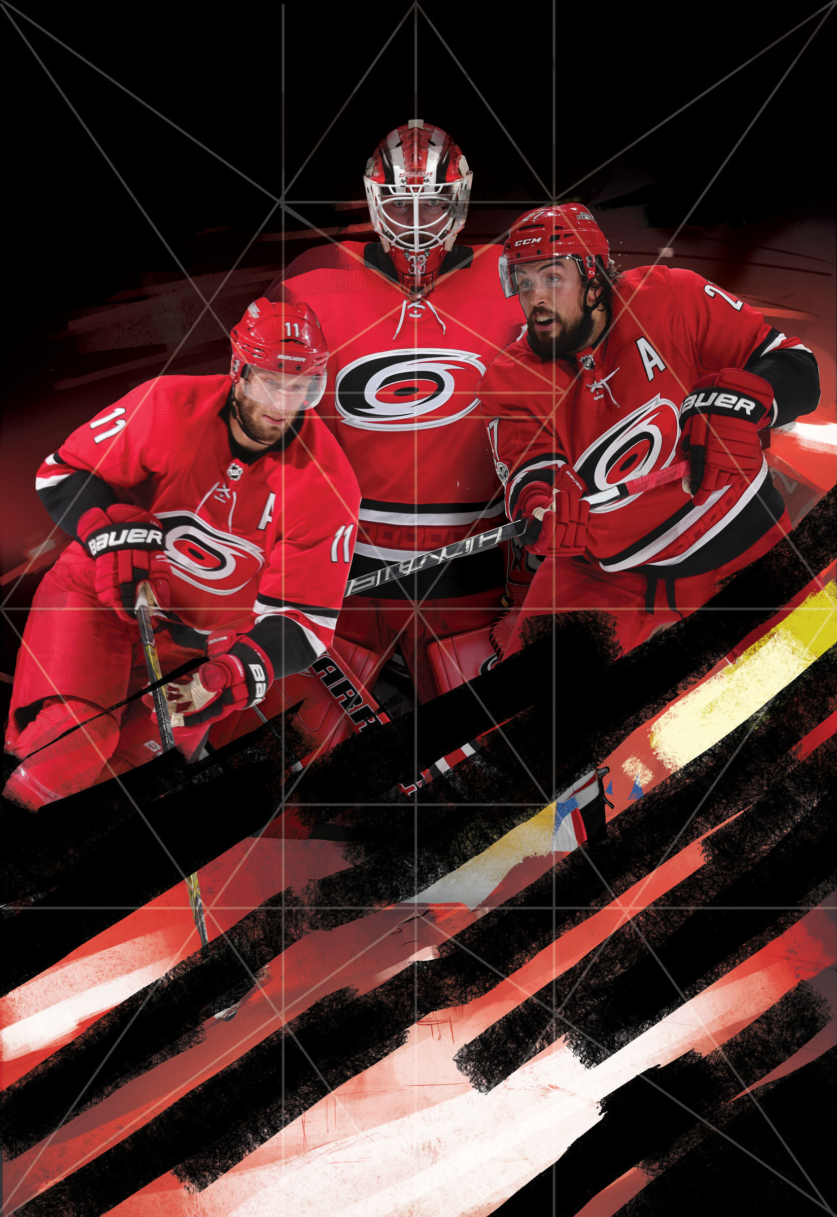
2016-2017 was a crazy time. I was glad to be a part of the first Homegrown Series put on by the Carolina Hurricanes. The fact that I was offered an opportunity to assist on more than one occasion had me above the clouds. The Homegrown Series is an idea that started last year that introduces fans to enjoy local food, beer, As their 20th year anniversary as a hockey club was approaching, I wondered if they were going keep it going for this anniversary year. I wondered how much it'd change based on last years reception. I was reached out to by Kyle Fowlkes (Carolina Hurricanes Graphic Designer) and was asked if I'd be able to return and contribute a poster design alongside this year's new lineup of amazing artists.
This years design is quite similar to direction as last year's PNC Arena poster. The concept this time around was to bring more of a personal approach to the design. The idea was to bring in the teams Captains and leading goalie into the eye of a storm. I wanted it to be intense, powerful and convey the team and fans unwavering spirit. I used a few symmetrical composition tricks to help set up the poster for the most impact.
Below is a timeline on how this poster came to fruition. I want to thank Kyle, the Carolina Hurricanes and everyone who had helped with personal critique of this poster. As one of my close friends said recently: "We operate in a profession that contains constant critique. Our world is much different than a traditional artist who sells their skills and particular image. Sometimes we need to step back and realize not all people want to be critiqued."
I gladly took it and tried to better this design. What do you all think? Does it succeed? Does it improve upon the work from last year's Homegrown Series? I'd love to hear your thoughts! Come out and see the poster with your own eyes on March 31st, 2018 when the Hurricanes play the NY Rangers at PNC Arena! You can check out the Homegrown Series page here


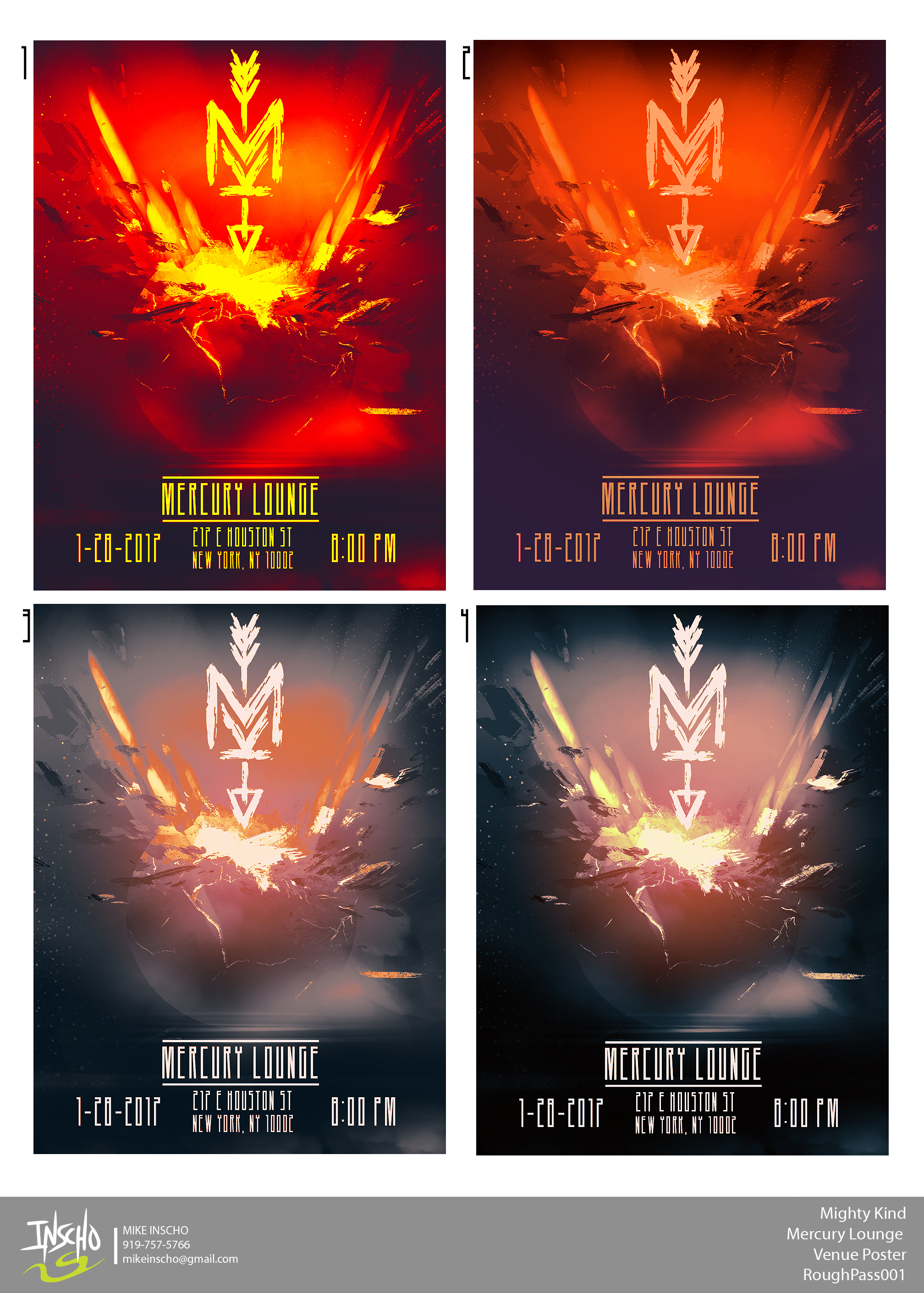
Mercury Lounge
The beginning of the year has started off strong and I apologize for the lack of updates. Here is one of the many projects I can share from January.
I've been working with the band Mighty Kind for the past year. I've helped them through their logo design and various show posters. Starting 2017 right, I was offered the chance to created their first show venue poster of 2017. The common theme up to this point has been the "MK" logo smashing into either the venue or something that relates to the showplace. Mike Murray (drummer for the band) states that "the band always jokes about how our sets are going to destroy the venue, because we feel that we pack a whollop of rock n' roll punch into each set and performance." He goes onto state that the smashing theme helps to convey the power that they bring to each show.
As soon as I got the go on a space theme and Mercury. I couldn't wait to jump in and paint some destruction. Illustrating an impact of this magnitude took a lot of reference gathering and it's something I don't paint often. I wanted the viewer to be drawn to the arrow tip impacting the top of Mercury. I wanted the lighting of the earth's core and spray to feel real and contain the energy the band thrives on. I am super stoked on how this came out and again, can't thank Mighty Kind for trusting in me to do this work for them.
I am always willing to grow as an artist. I'd love to see your comments and hear your thoughs on what you like or dislike about this poster!