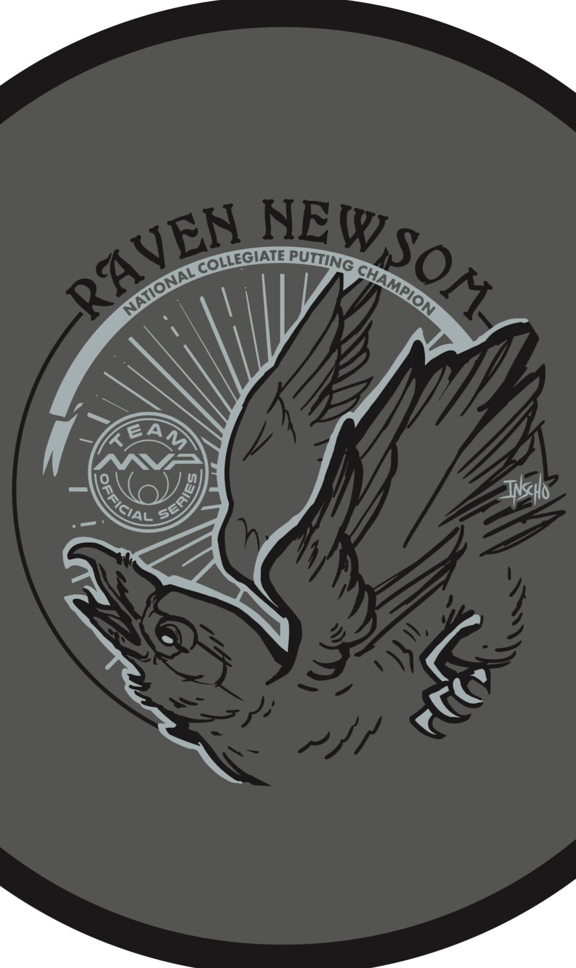
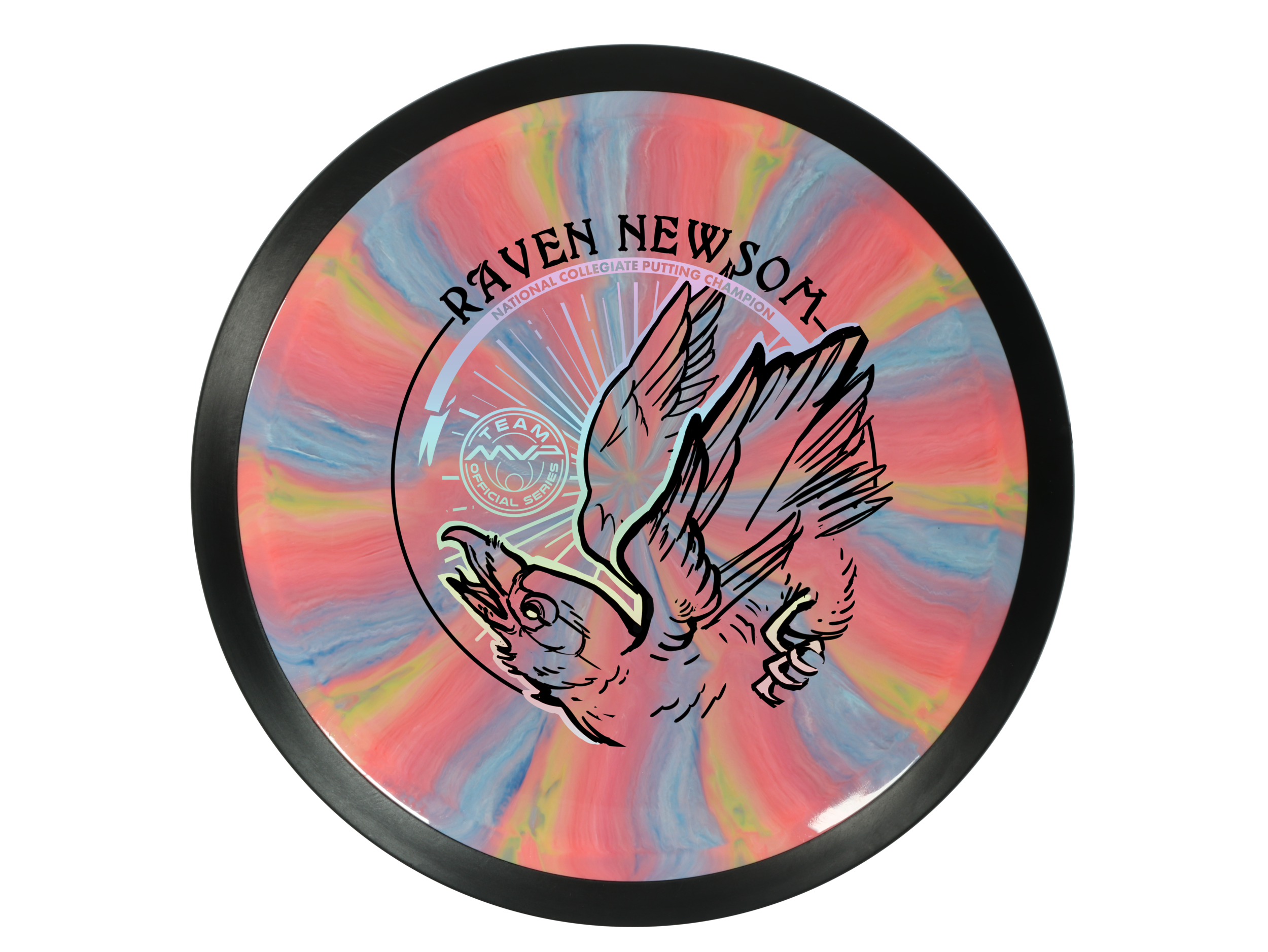
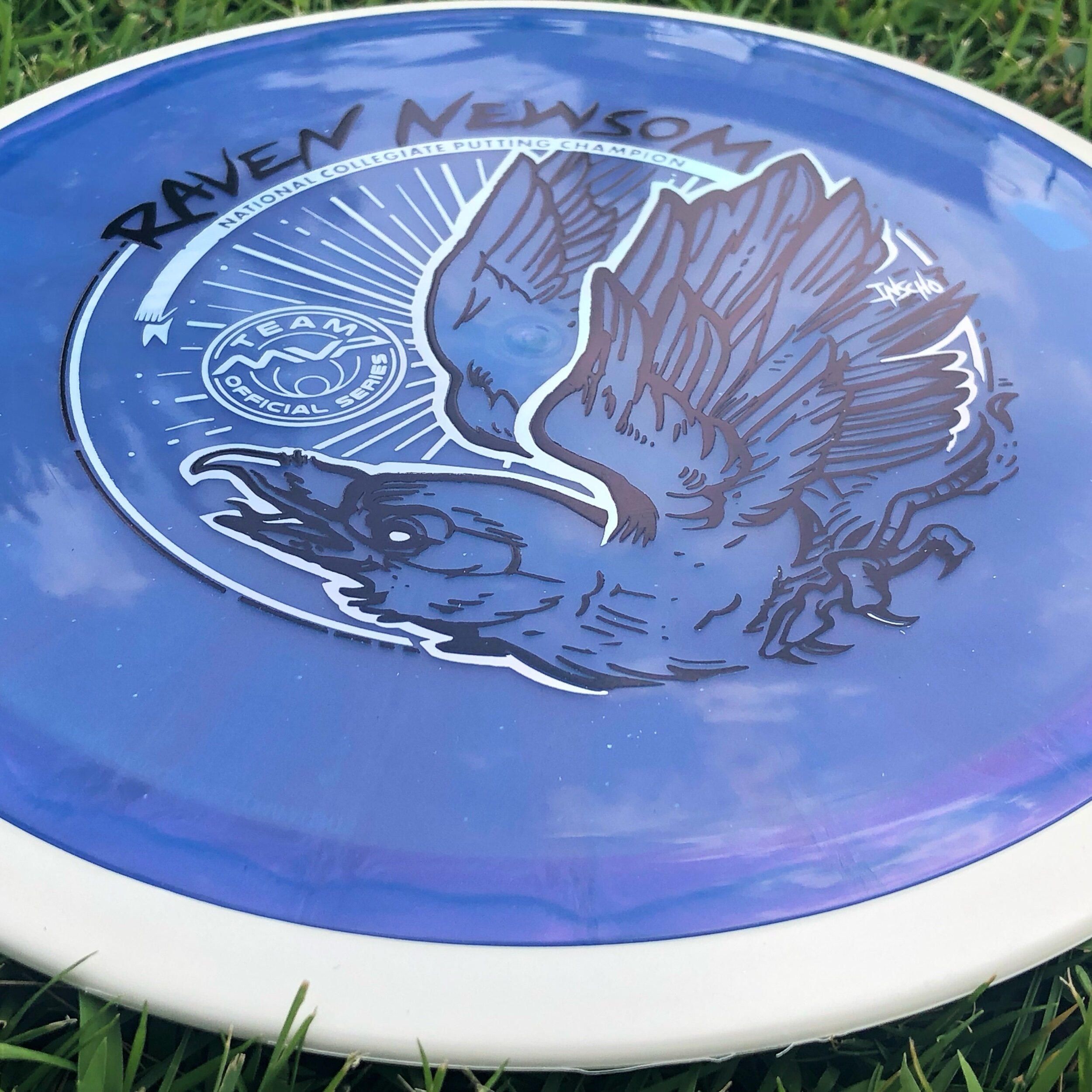
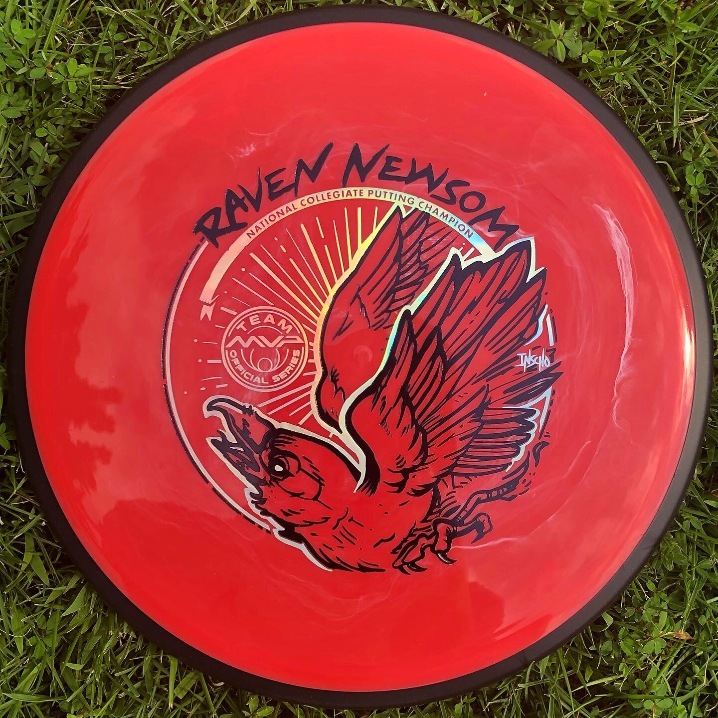
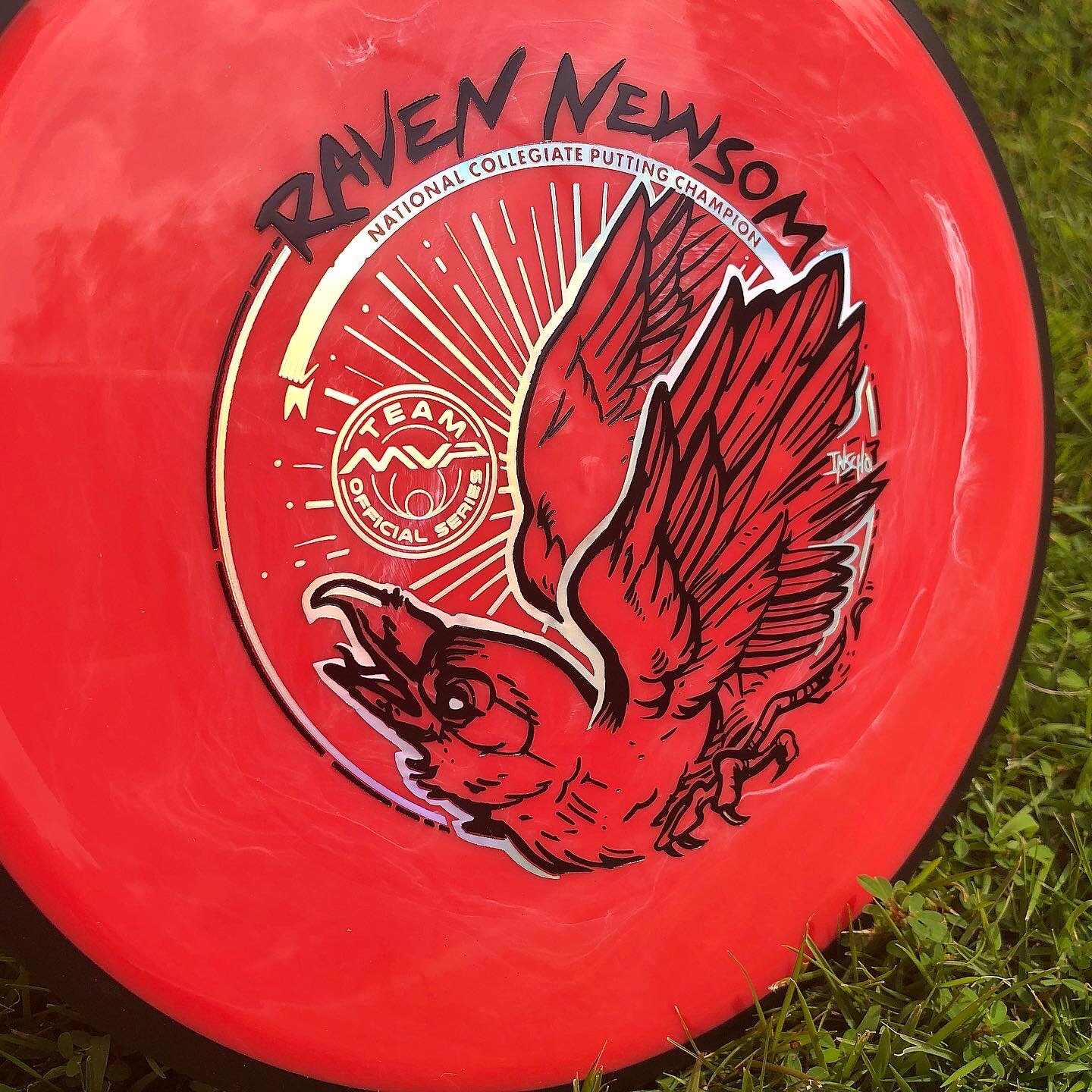
Raven Newsom officially went all-in on the 2021 season. He’s toured and pretty much played every National Tour and Disc Golf Pro Tour event that was on the calendar. I started early and before the holiday season of the previous year to get something geared up to help his touring efforts.
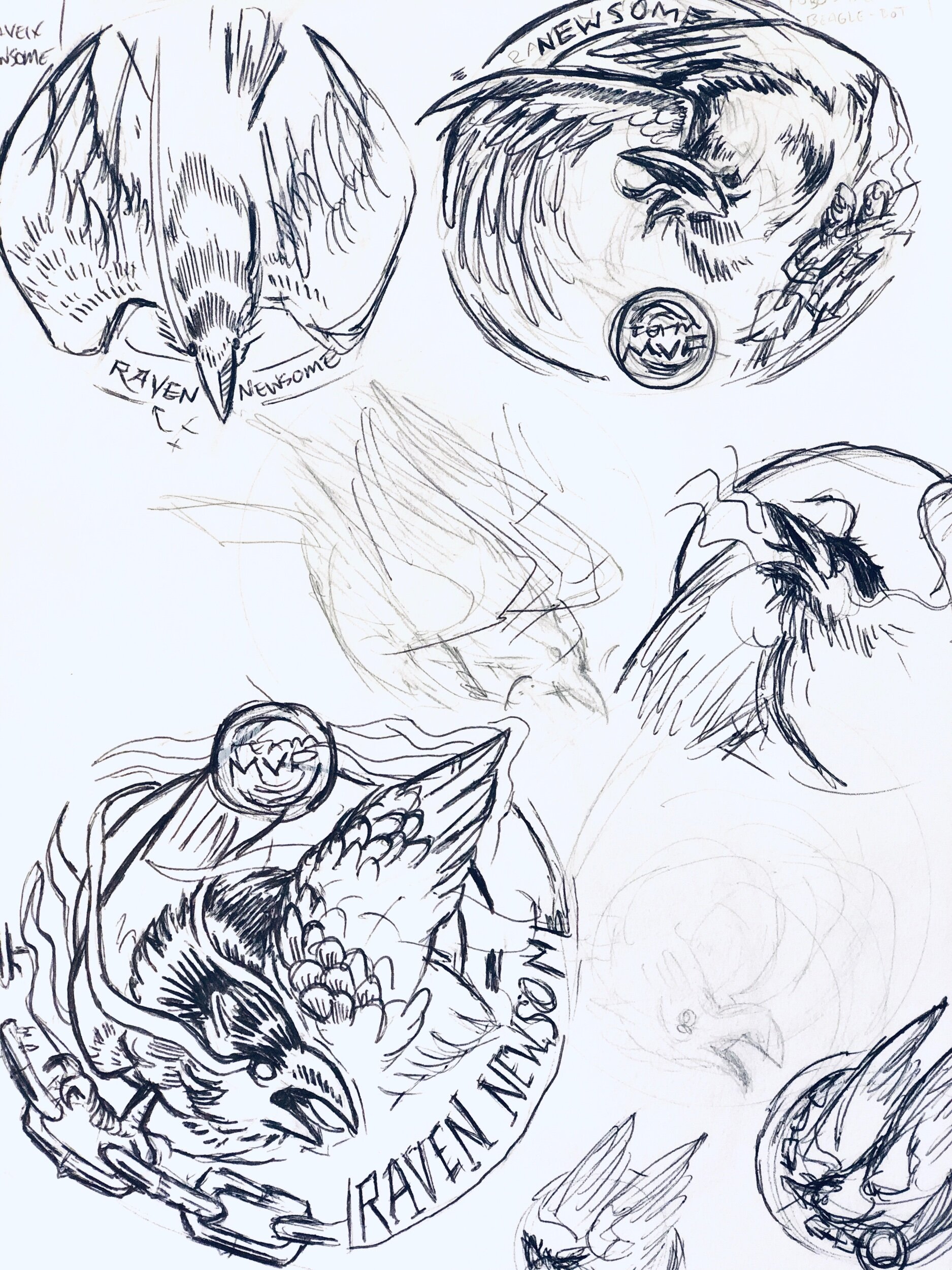
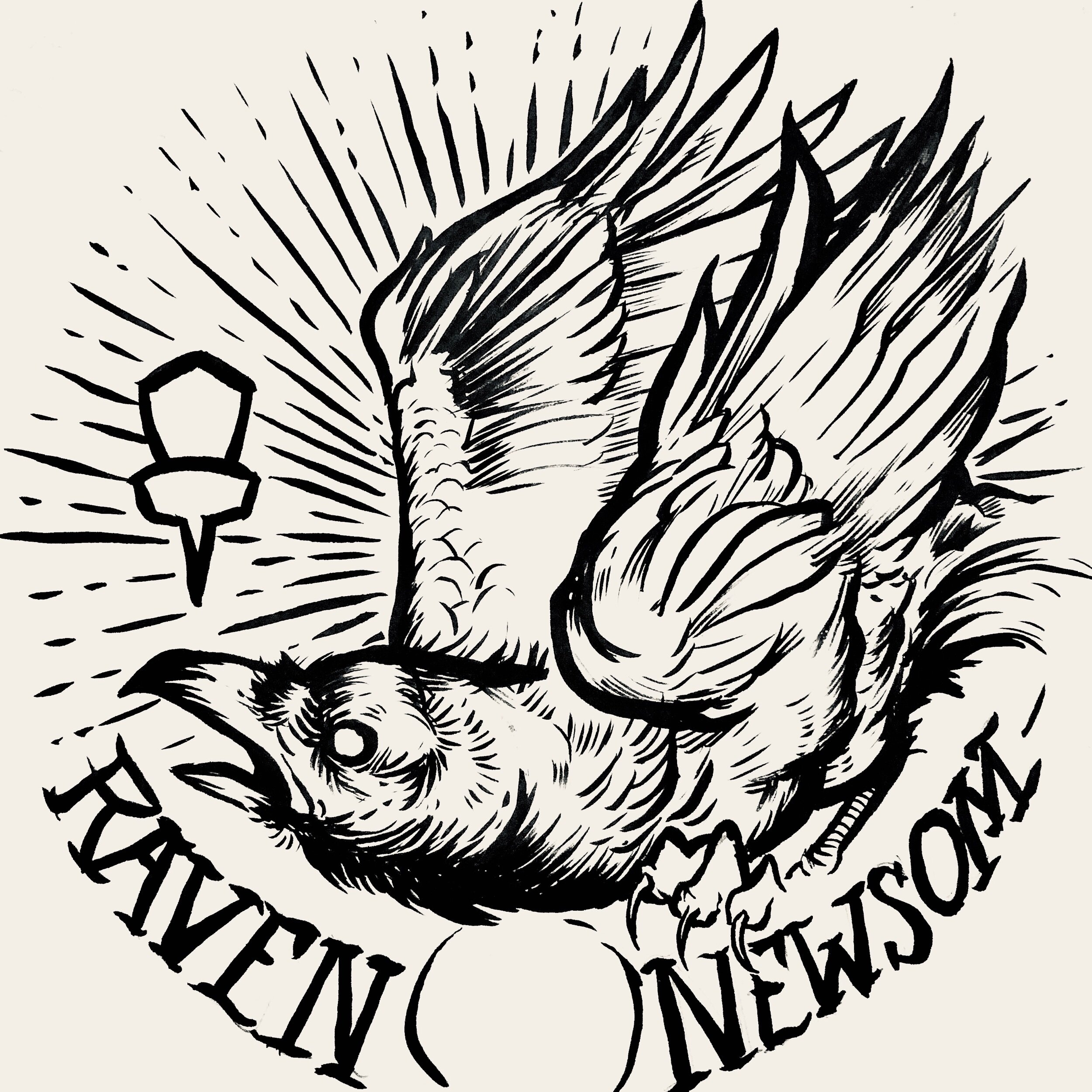
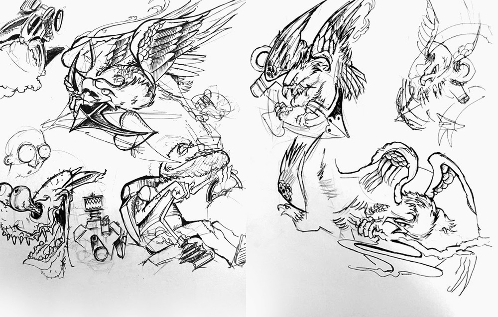
Raven made the process super easy. He trusted my design skills and let me come up with a few ideas to ponder over. As you see for the very early stages, the raven was refined and some of the heavy linework from my brush pen was slimmed down a bit. Everything was bold and it didn’t allow your eye to rest. I felt it was chaotic and the bird seems way out of shape. It took some more reference gathering to really started feeling better about the bird, its outstretched wings, and the overall ability to add in “Collegiate National Champion” with a bit of class.
With the worldwide COVID-19 pandemic; it’s been tough getting this design to the masses with only one or two small releases up to this point. Keep a lookout for more runs coming from Raven. I want to thank Raven for giving me this opportunity. If you have any questions, please hit me up or leave a comment!
Schrock-A-Doodle-Doo
As 2019 was coming to a close, Tyler Schrock, Team MVP Pro asked me if I would like to do his 2020 Tour Series disc. Working with Tyler is pure joy. He’s kept an animal theme over the past few years that allowed me to do design an octopus and sloth. This year, his idea was a rooster. It turns out that his father was a chicken farmer! He raised chickens for 25 years. So this stamp idea was something he knew his family would love.
This idea started with chicken reference gathering even though I had a good idea of how I’d be able to pull this off. I think the strongest silhouette of a chicken is from the side. It gave me the room in the center of the disc to stay free from any no stamping zones. The chicken mouth action/or spit never made the final. That was an attempt to add that classic “action” seen in cartoons to show loud noises. We didn’t want the chicken looking like it was spitting so it was axed toward the end. The shading detail near the chest add a bit of contrast to show that it’s different color of feather.
The final pass was simply to add body/feather detail and import the consistent ring graphic from last years design. It was important to Tyler to continue that look and feel from year to year. When you display these side by side; it really adds a nice series look to them. I hope you all dig it! Share, like, comment on what you think!
Axiom Cosmic Neutron - Stock
If you’re a first-time reader and unfamiliar with MVP Disc Sports/ Axiom Discs/ Streamline Discs then you’ll need to look up who Zachary Kelbaugh aka ZAM is and his importance in setting a high standard with all three brands. While MVP Disc Sports follows more an analytical/ scientific realm; Axiom goes into more of the visual arts, punk, and a little bit more on the wild side if pushed that far. If you think about it, the parameters keep you grounded but a LOT of ideas can flow from that base.
I was given the difficult task to create a new stock stamp that would be used for Cosmic Neutron plastic within the Axiom branding. Cosmic Neutron plastic produces some unbelievable controllable swirling patterns. At this current time, swirls seem to be trending with multiple disc golf companies coming up with their ways to achieve it. It was my job to design something that could hang with Neutron’s iconic imagery that has been stamped on Axiom discs for 6 years.
With Neutron art at the very front of my reference gathering, I wanted to create something that seamlessly blended into the stock stamp Axiom family. That was goal #1. MVP’s history runs deep. The last thing I want to do is shred that to pieces. If you look at the far left image below; our heads were looking at high-level science, Leonardo da Vinci, 3D DNA molecule structures and honeycombed flower patterns. While all of those sounded great; the flying machine has been done. My research through da Vinci’s sketches led to me start researching perpetual motion machines. Bhaskara’s Wheel, Sadi Carnot and the Carnot Cycle. My mind went down the rabbit hole, you can say. I landed on the fact that while all of these machines and concepts sounded cool, quantum mechanics and the complex nature/theory burned me out. That doesn’t mean I won’t return back to these notes at a later date. Time was of the essence and I had to get to work.
I landed on a 3 cylinder schematic concept. The main idea is of a 3 piston firing order that is pushing energy toward the epicenter. A transfer of energy through the stamp design to the actual swirl look of the plastic.
Here are a few key points in the final Axiom Cosmic Neutron design:
•Get the name of the disc higher up on the flight plate so it can be seen on store shelves
•Disc name is the boldest part of the design while keeping with the overall schematic style of font. It doesn't scream old world but doesn't modern either.
•Keep key shapes present in the new design. Circles, triangles, font look, and feel.
•Integrate a fresh idea
The below image gallery shows a peek into the 2-week process:
Robokitty 2.0
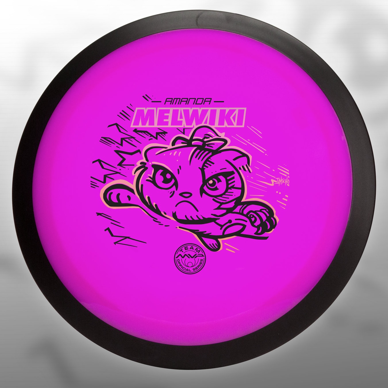
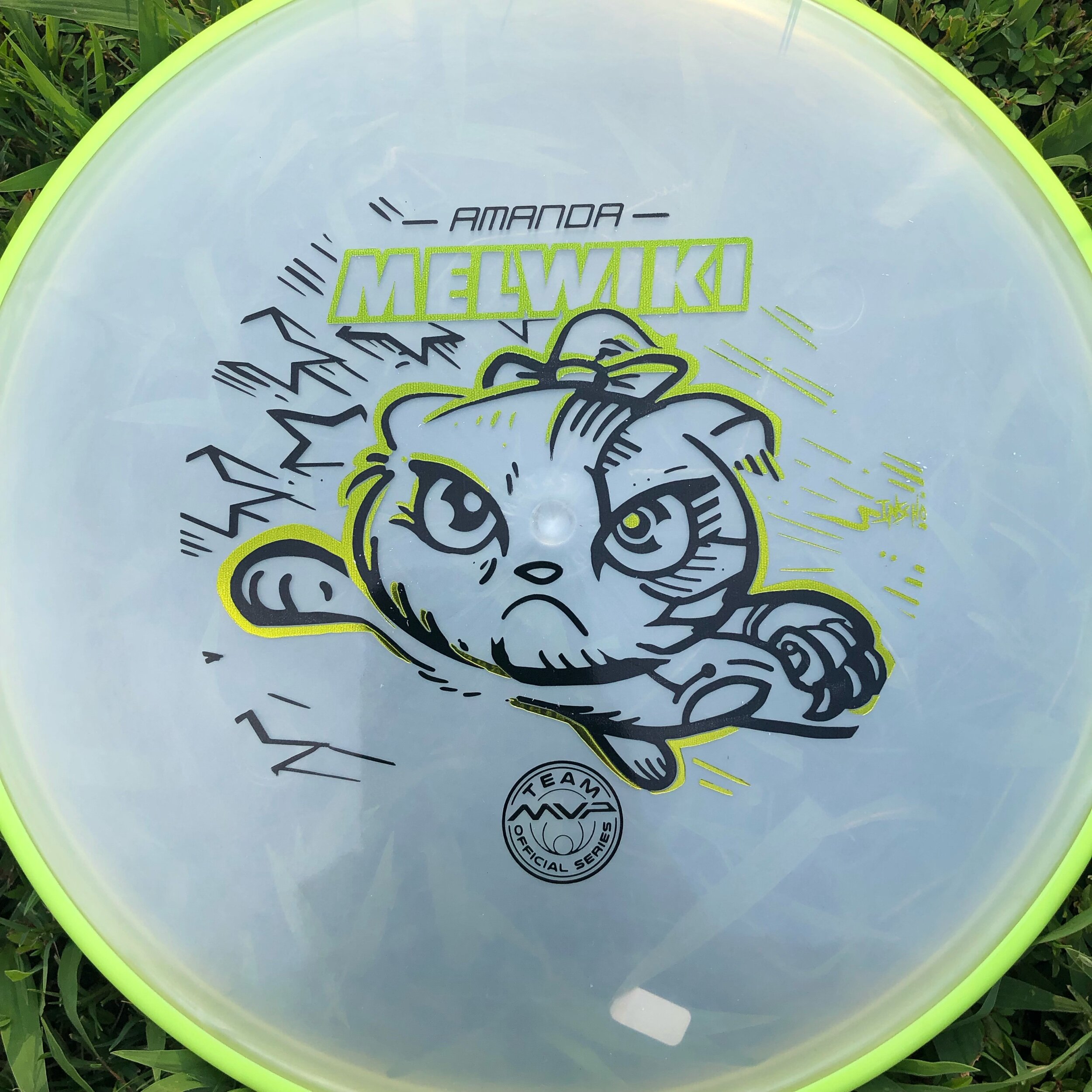
I received a request from an Team MVP member to change up a 2018 stamp design. Amanda Melwiki had a great 2018 year and her Robokitty design was a hit. She came to me with the idea of changing up the foils and adding a few elements to last years design. I had bigger plans for Robokitty and I’m glad she trusted me to do something new but a continuation of the concept.
I knew I wanted to show a fiercer side of the kitty. I wanted to marry the concepts of cute/friendly with the deep down drive and determination of getting better. That fueled the fire going into the concept stage. I had the idea more stored in the back of my head so this design didn’t really consist of a lot of reference gathering. Bringing in that exaggerated anime pop and allowing the opportunity to expand on the Robokitty character were the goals first and foremost. From there it was a few experiments with stars and how I was going to incorporate them into the design.
A huge thanks goes out to Amanda. Were you able to snag one? If not, she has a few available but will be selling out fast. Follow her here:
https://www.facebook.com/AmandaMelwiki
MVP Open Fireball LE
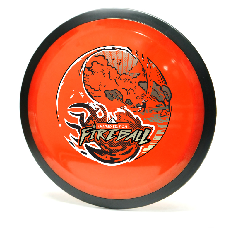
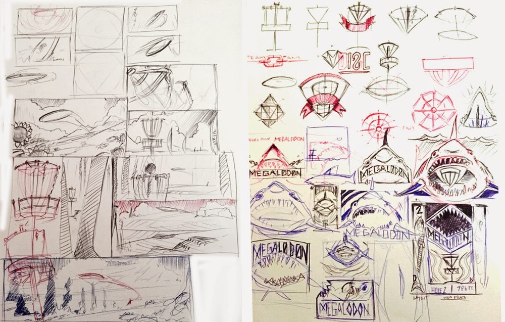
I loved everything about working on this project. You go into the thumbnail process thinking that something like what you did could never work or not be as good. During our initial staff meeting, I was able to show a few of the thumbnails from my sketchbook. The vast majority and better reaction was to the yin yang design. I'm glad I've got great people to rely on and encourage me to take that idea a bit further. The other thumbnails were worthy enough for possible future expansion so I can't show them, unfortunately.
The shot is called an underhand thumber. It looks rather painful but a shot that does exist to get the player out of an unfortunate spot. I found the shot through an old throwing clinic video on YouTube. I watched the flight and thought it would fit perfectly (with a little bit of modification) to that of my yin yang concept. I think the dynamic of the fireball crashing toward the foreground is why this was a success. Last thing I want to mention about the design is the spacing of the the heavy items of the stamp. The Fireball text and ball itself are pretty heavy. I consciously wanted that weight balanced so I gave the sky a full foil with minimal spacing for rays and birds in the sky. I think the balance worked out well!
The Limited Edition Fireball design is a tour fundraiser for the Disc Golf Pro Tour. The MVP Open will be at Maple Hill Disc Golf Course located in Leicester, Massachusetts. This event brings some of the world's top players and will be an exciting time. If you're in attendance, there may be some left at the Maple Hill Disc Golf store.
2017 Carolina Hurricanes Homegrown Series
2016-2017 was a crazy time. I was glad to be a part of the first Homegrown Series put on by the Carolina Hurricanes. The fact that I was offered an opportunity to assist on more than one occasion had me above the clouds. The Homegrown Series is an idea that started last year that introduces fans to enjoy local food, beer, As their 20th year anniversary as a hockey club was approaching, I wondered if they were going keep it going for this anniversary year. I wondered how much it'd change based on last years reception. I was reached out to by Kyle Fowlkes (Carolina Hurricanes Graphic Designer) and was asked if I'd be able to return and contribute a poster design alongside this year's new lineup of amazing artists.
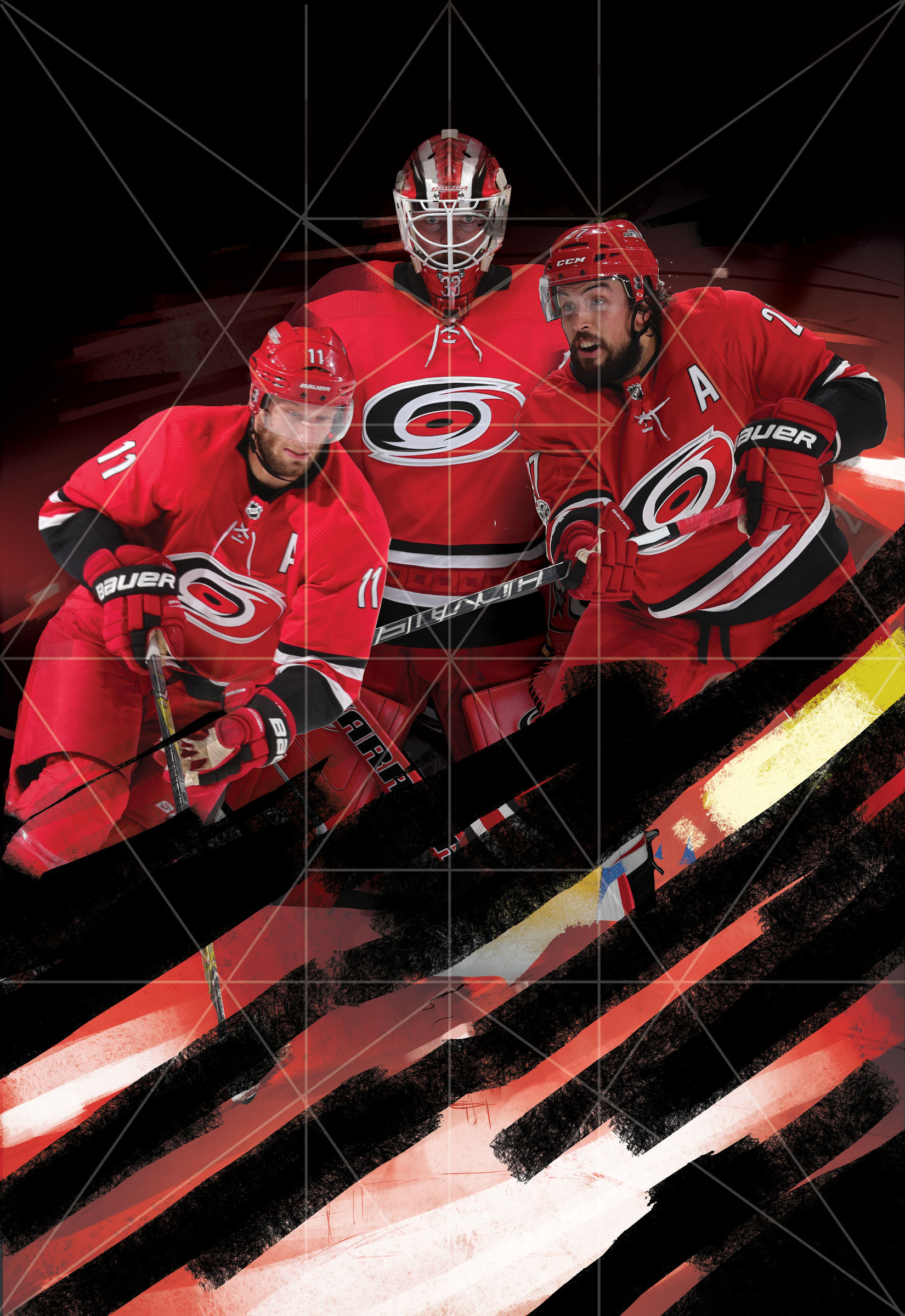
This years design is quite similar to direction as last year's PNC Arena poster. The concept this time around was to bring more of a personal approach to the design. The idea was to bring in the teams Captains and leading goalie into the eye of a storm. I wanted it to be intense, powerful and convey the team and fans unwavering spirit. I used a few symmetrical composition tricks to help set up the poster for the most impact.
Below is a timeline on how this poster came to fruition. I want to thank Kyle, the Carolina Hurricanes and everyone who had helped with personal critique of this poster. As one of my close friends said recently: "We operate in a profession that contains constant critique. Our world is much different than a traditional artist who sells their skills and particular image. Sometimes we need to step back and realize not all people want to be critiqued."
I gladly took it and tried to better this design. What do you all think? Does it succeed? Does it improve upon the work from last year's Homegrown Series? I'd love to hear your thoughts! Come out and see the poster with your own eyes on March 31st, 2018 when the Hurricanes play the NY Rangers at PNC Arena! You can check out the Homegrown Series page here
Exeter "Non Sequitur" Album Art
The last opportunity I had to design an album cover was from Exeter's "Prolepsis" album in 2007. I was still in art school, still learning the many things about digital painting and one of my side kicks since, Adobe Photoshop. My friend came to me this past spring and wanted to know if I'd love to design their album cover for their upcoming album "Non Sequitur".
Non Sequitur: a conclusion or statement that does not logically follow from the previous argument or statement.
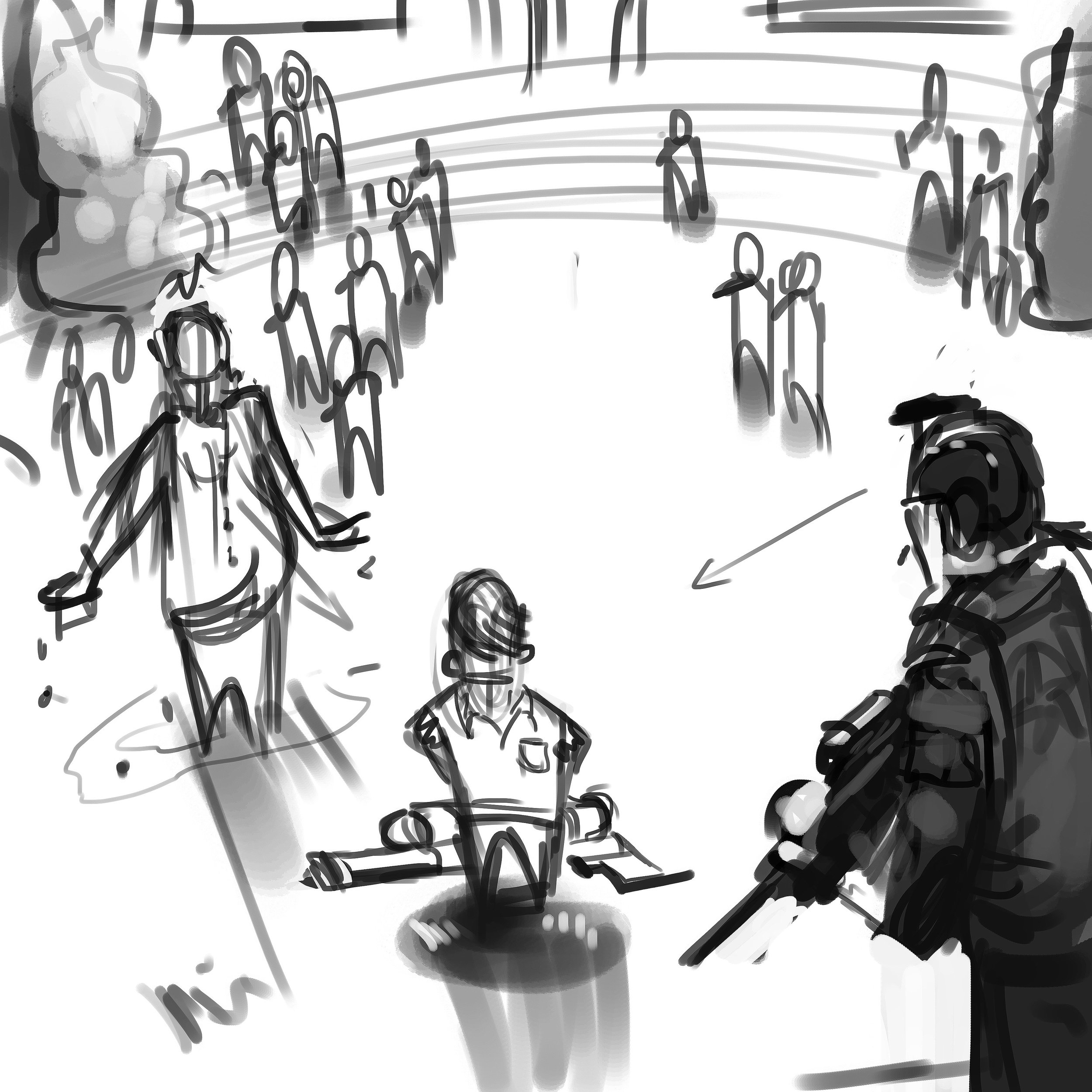
I learned quickly that the general sentiment of this album, vastly different from their first effort (hence the album title), was to express the band's strong libertarian leanings, and in particular showed an anti-authoritarian bent. The cover itself was intended to critique what the band sees as an overt and perhaps overly aggressive and reactionary militarization of American police forces. These are, according to the band, POLICY issues, not intrinsically policing issues. The first thing he asked was if I was going to be comfortable doing album art with such strong political meaning. My job as an artist is to give the client what they want. I wanted to push the bar a bit more than they were expecting. The design process took a little bit to finish but I'm glad they were patient and let me finish this for them.
I experienced some challenges during this illustration. The direction was to show the protagonist/antagonist (depending on one's view) center screen with his class peers in uniform garb, looking on from a distance. It had to be clearly read that the kid only had a super soaker-like squirt gun. The victim, in this case a faceless administrator, had to be shown that he was dowsed in water and have them surrounded by a police presence. That's a lot to fit into one image. I focused on the kid first and came up with a composition that would work to facilitate everything they wanted in the main image. The background reference I gathered came straight from a school I attended from 4th to 10th grade. It's not meant to be a message to my hometown but the band wanted a rural, low key type of school yard setting. These older school that were built in the 40's-60's had a certain type of charm and aesthetic that I wanted to portray in the background imagery.
Working through a thumbnail to rough pass, I was able to show different angles and quick lighting scenarios to the band. The reference helped show the real world influence. It truly helps bring in a more accurate human element that would not of been achieved by purely relying on memory. Your memory can only remember so much and I urge other artists to always have reference. I can't stress that enough.
Halen, Luke & Dave, thank you very much for the opportunity to design this cover. You can purchase the album through these venues:
https://www.cdbaby.com/cd/exeter3
https://itunes.apple.com/us/album/non-sequitur/id1150069777
https://play.google.com/store/music/album/Exeter_Non_Sequitur?id=Blmytyabwcyqjolsye6ci4uzy4a&hl=en
https://www.amazon.com/Non-Sequitur-Explicit-Exeter/dp/B01M02LK8E
2015 In Review
The end of 2015 is near and it's been an adventure. After Christmas when all the stress is out the door, I like to think backward to January, 1 and think about all the projects I've been a part of. Did I truly maximize my output? I know the answer is going to be no. Every artist is going to tell themselves that. They'll try to build on lessons they've learned and continue pushing onward.
I'm fortunate that I had a full-time position for a good 75% of this year. Freelance is tough. You won't ever realize until you're in the thick of it with no other assurance underneath you. It makes me want to thank all of those who gave me a kick in the ass this year. My friends who've stopped what they were doing to give me a fresh take on a 3rd logo attempt and pushing you to go forward instead of stalling out.
I wouldn't be where I am today without them, without my wife's patience for all the late nights up in the office because of a quick deadline. To all the people who had faith in me to help them with a project, or an idea they needed me to see through. Thank you. Here's to a more productive 2016!
A lot of firsts.
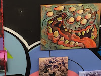
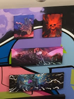
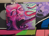
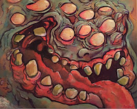
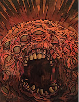
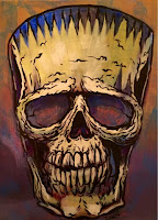
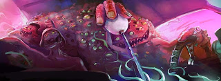
I received my chance a few months ago. I inquired about being a feature artist for a First Friday event. The first Friday of each month showcases artists in the heart of downtown Raleigh. Atomic Salon and Drink Drank Drunk gave me the opportunity to get the acrylics out from storage and start painting traditionally again. Being slated for an October show at a cool venue, provided the stage to do what subject matter I love to do.
While Hurricane Joaquin was rearing his head off of Cuba, the rain continued to hit NC just days before the show. I thought for sure, nobody was going to come out in the muck. The turnout was incredible. It was really great to be introduced to so many cool people.
Thanks to everyone who had helped get my work on the walls and the one's who enjoyed my art enough to purchase a piece or two. I truly appreciate it. Feel free to visit Drink Drank Drunk and Atomic Salon from now till the end of October to see the remaining art still being shown. There are still pieces of art to be had.
Please contact me at
mikeinscho@gmail.com
if any remaining pieces interest you.


Brooklyn Body Blossom
I received a call from a good budd of mine, Dr. Michael Murray over the summer. He was rebranding his practice to display more of his holistic approach to chiropractics. He needed my help to rebrand his business with a logo for the newly formed
.
Key initial ideas were:
1. Display the Brooklyn Bridge in some form
2. Show cues of an inspirational artist;
3. Include a lotus shape.
First and foremost, I want to thank Dr. Murray for working with me through last summer. This was a tough assignment but he was great with feedback and as an artist himself, I think we collaborated well to create a logo we're both proud of. I'll show the finished product first and then a few pieces that helped lead up to the final design.

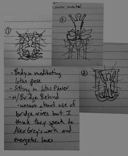
Clients quick napkin sketches

Inspiration board
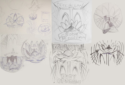
1st pass of thumbnail sketches
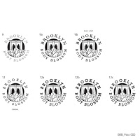
Almost there! Final font selection
Sketchbook
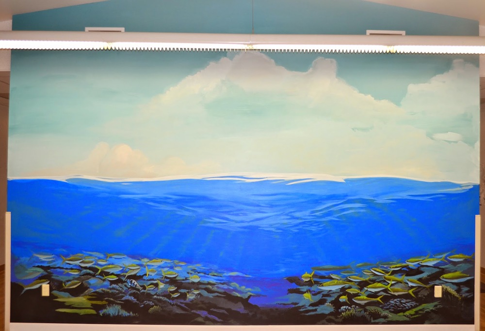
The Goddard School - Apex Mural
