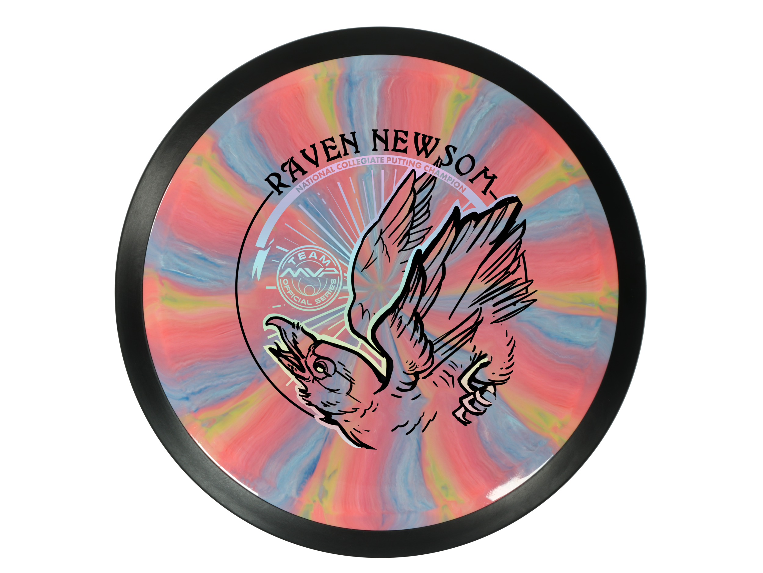
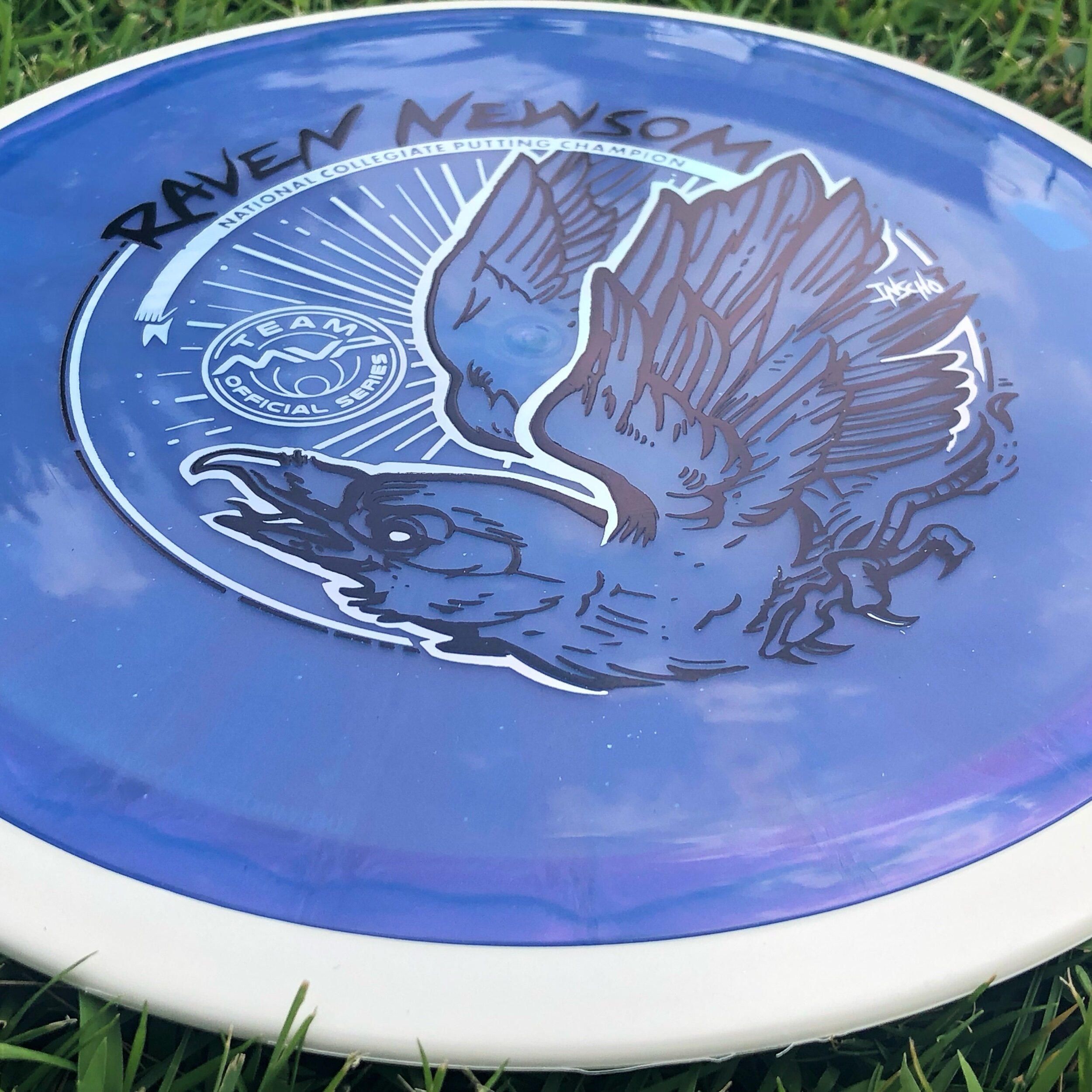
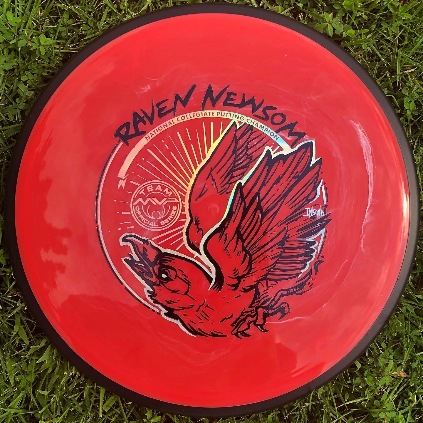
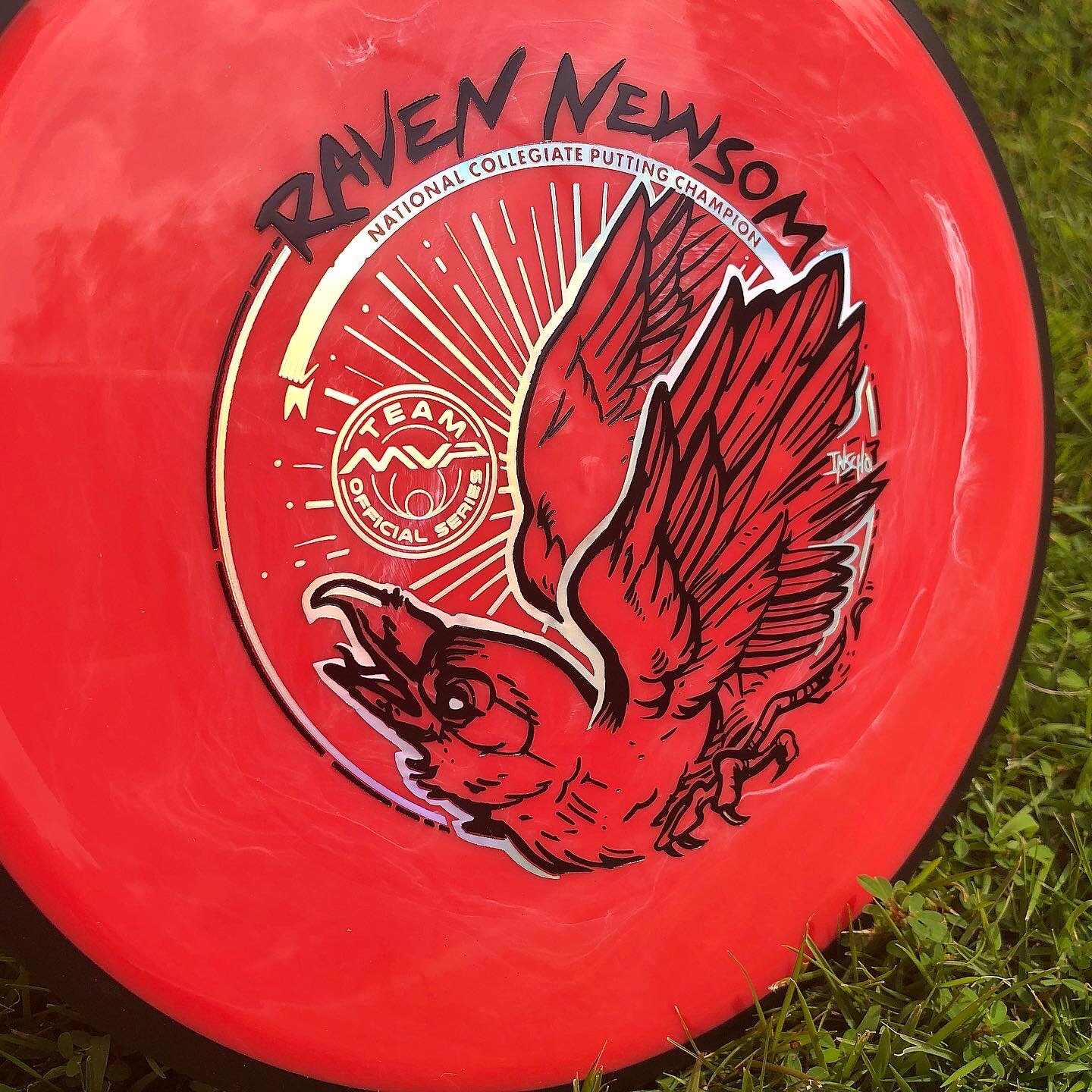
Raven Newsom officially went all-in on the 2021 season. He’s toured and pretty much played every National Tour and Disc Golf Pro Tour event that was on the calendar. I started early and before the holiday season of the previous year to get something geared up to help his touring efforts.
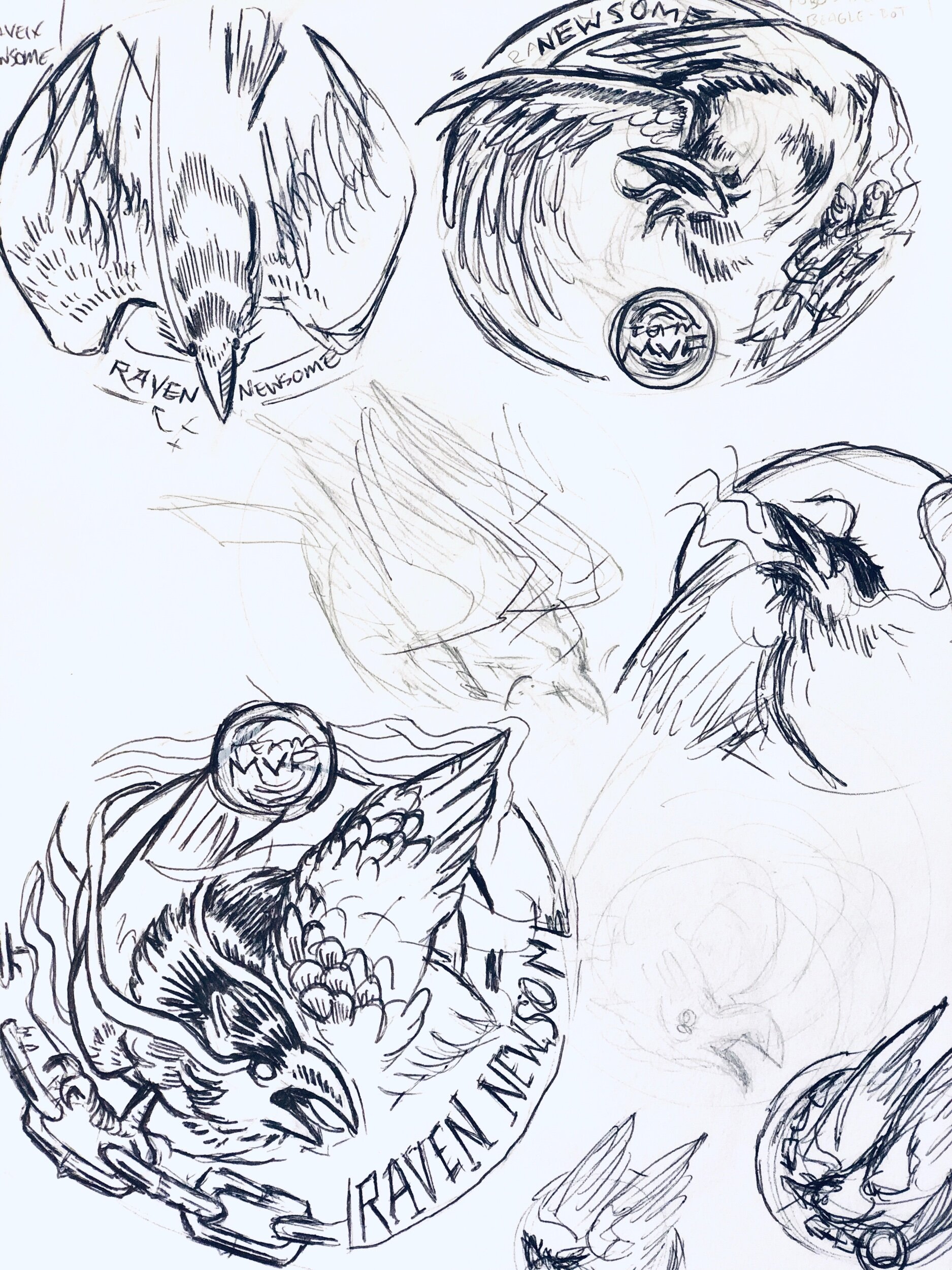
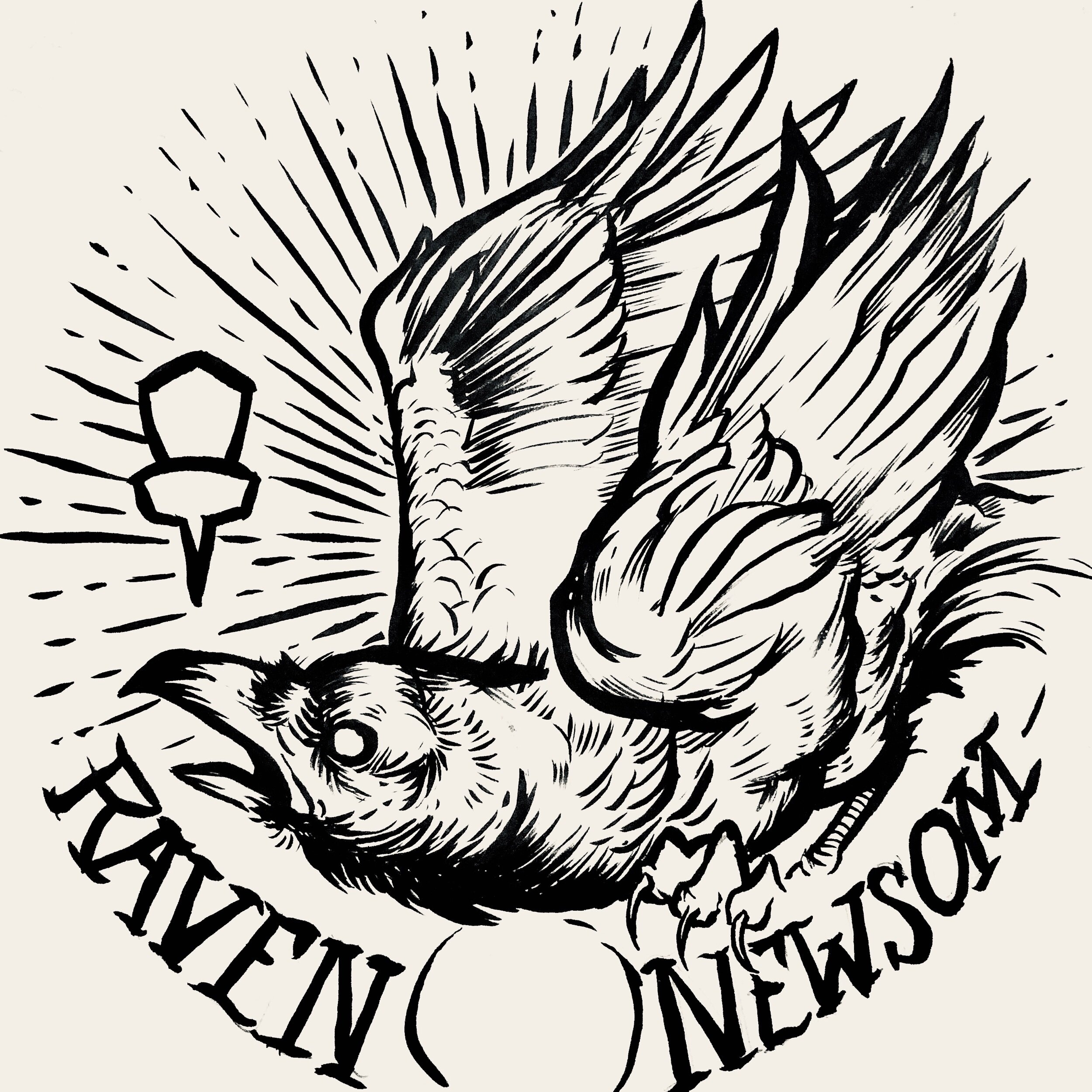
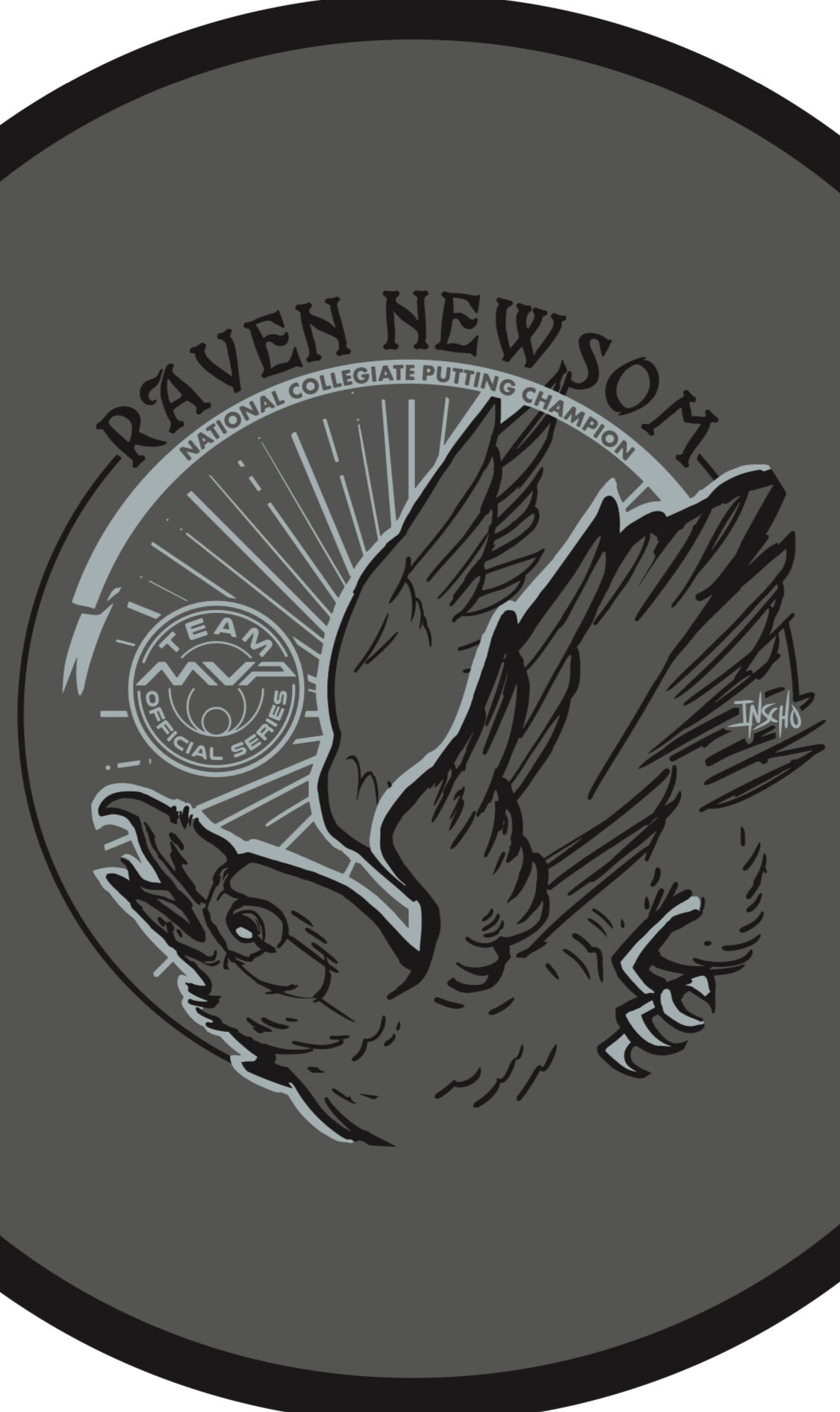
Raven made the process super easy. He trusted my design skills and let me come up with a few ideas to ponder over. As you see for the very early stages, the raven was refined and some of the heavy linework from my brush pen was slimmed down a bit. Everything was bold and it didn’t allow your eye to rest. I felt it was chaotic and the bird seems way out of shape. It took some more reference gathering to really started feeling better about the bird, its outstretched wings, and the overall ability to add in “Collegiate National Champion” with a bit of class.
With the worldwide COVID-19 pandemic; it’s been tough getting this design to the masses with only one or two small releases up to this point. Keep a lookout for more runs coming from Raven. I want to thank Raven for giving me this opportunity. If you have any questions, please hit me up or leave a comment!
Basket Bashers- Rebranding
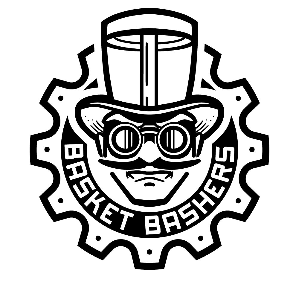
Wow! What a journey. I remember not too long ago I was doing some freelancing work for Jerry Pectol (previous owner of Basket Bashers Disc Golf) when I went to full time. Since then, Jerry had recently decided to hang it up. Good local friends, Logan & Stacy acquired the Basket Bashers company and approached me to create their new logo to revive the brand. Initial talks led down a path of doing something more with an illustrative tone. Letting the highly, eye-catching artwork attract people into wanting to wear it on various merchandise. We went through a few ideas and pushed and pulled to what we thought a logo should be.
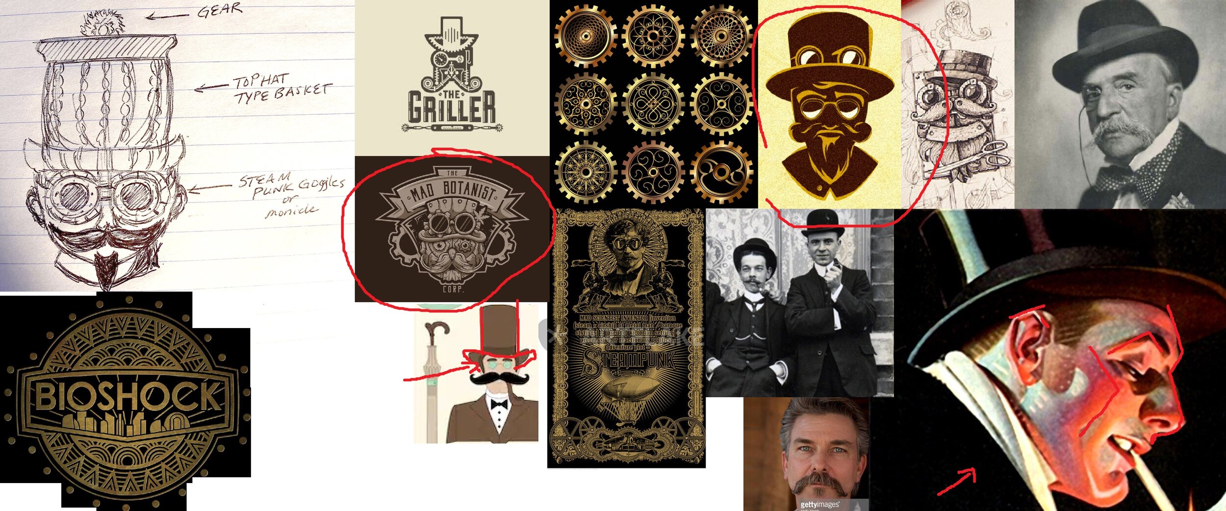
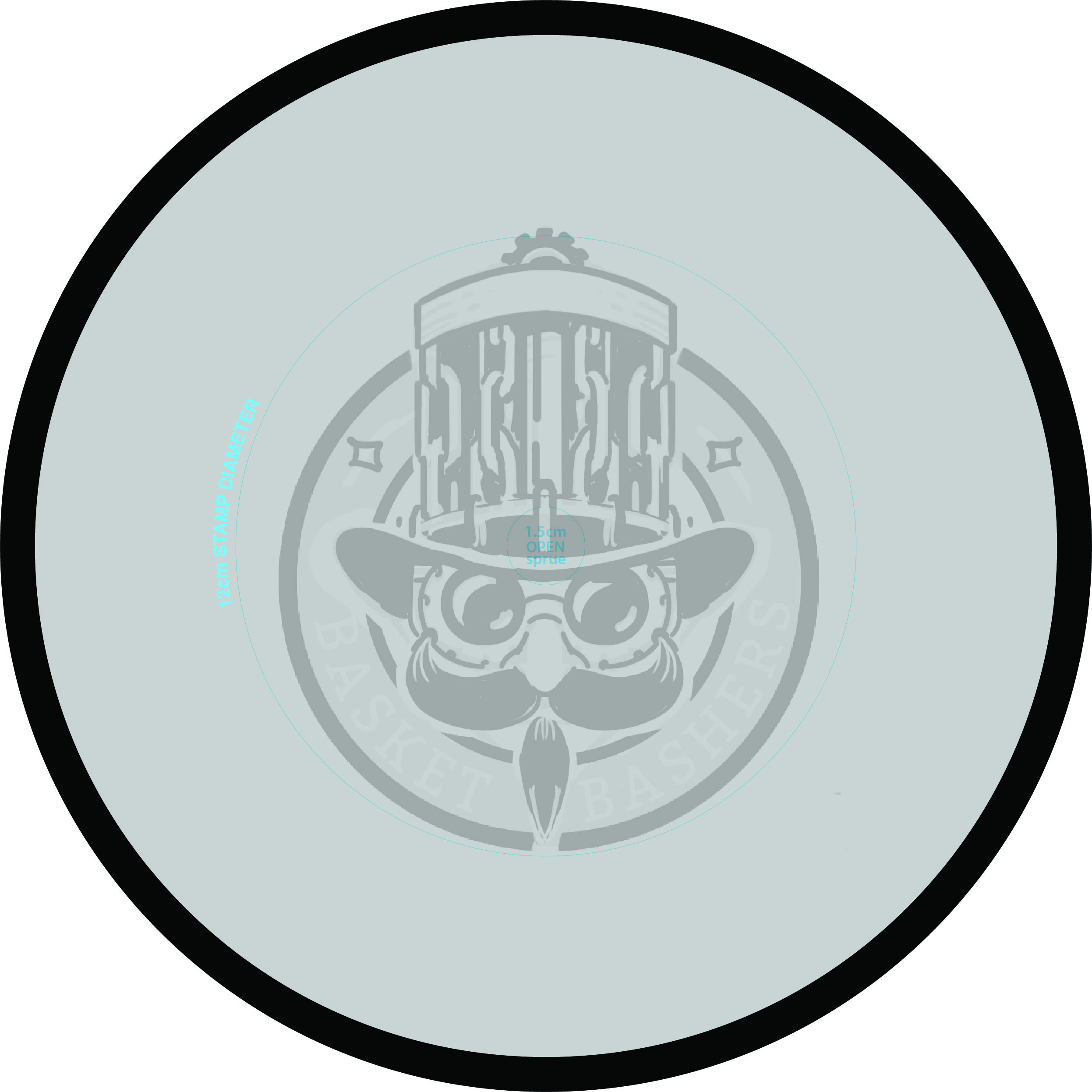
The common direction was initiated by Stacy and it really got this project headed toward the finish line. It was a rough napkin sketch but it revitalized everyone. That initial image is located in the far upper left of the reference sheet. I used that as a stepping stone and put together 3 ideas of what it could be. These felt really good and I knew any one of them would’ve transitioned well into final form. Another design requirement lead me to continually test this design as a full-sized stamp in MVP’s stamping template. Those parameters were constantly reminding us of what we could and could not do as far as logo layout.
After a few rough passes, it was safe to start bringing the idea into vector form. In closing, I can’t stress how important a company logo is. To be able to educate while working through these passes; we ended up in a really good spot with further room to expand on the branding. I look forward to helping them out even more with future endeavors.
Check out their Facebook and website for the latest updates!
Schrock-A-Doodle-Doo
As 2019 was coming to a close, Tyler Schrock, Team MVP Pro asked me if I would like to do his 2020 Tour Series disc. Working with Tyler is pure joy. He’s kept an animal theme over the past few years that allowed me to do design an octopus and sloth. This year, his idea was a rooster. It turns out that his father was a chicken farmer! He raised chickens for 25 years. So this stamp idea was something he knew his family would love.
This idea started with chicken reference gathering even though I had a good idea of how I’d be able to pull this off. I think the strongest silhouette of a chicken is from the side. It gave me the room in the center of the disc to stay free from any no stamping zones. The chicken mouth action/or spit never made the final. That was an attempt to add that classic “action” seen in cartoons to show loud noises. We didn’t want the chicken looking like it was spitting so it was axed toward the end. The shading detail near the chest add a bit of contrast to show that it’s different color of feather.
The final pass was simply to add body/feather detail and import the consistent ring graphic from last years design. It was important to Tyler to continue that look and feel from year to year. When you display these side by side; it really adds a nice series look to them. I hope you all dig it! Share, like, comment on what you think!
Axiom Cosmic Neutron - Stock
If you’re a first-time reader and unfamiliar with MVP Disc Sports/ Axiom Discs/ Streamline Discs then you’ll need to look up who Zachary Kelbaugh aka ZAM is and his importance in setting a high standard with all three brands. While MVP Disc Sports follows more an analytical/ scientific realm; Axiom goes into more of the visual arts, punk, and a little bit more on the wild side if pushed that far. If you think about it, the parameters keep you grounded but a LOT of ideas can flow from that base.
I was given the difficult task to create a new stock stamp that would be used for Cosmic Neutron plastic within the Axiom branding. Cosmic Neutron plastic produces some unbelievable controllable swirling patterns. At this current time, swirls seem to be trending with multiple disc golf companies coming up with their ways to achieve it. It was my job to design something that could hang with Neutron’s iconic imagery that has been stamped on Axiom discs for 6 years.
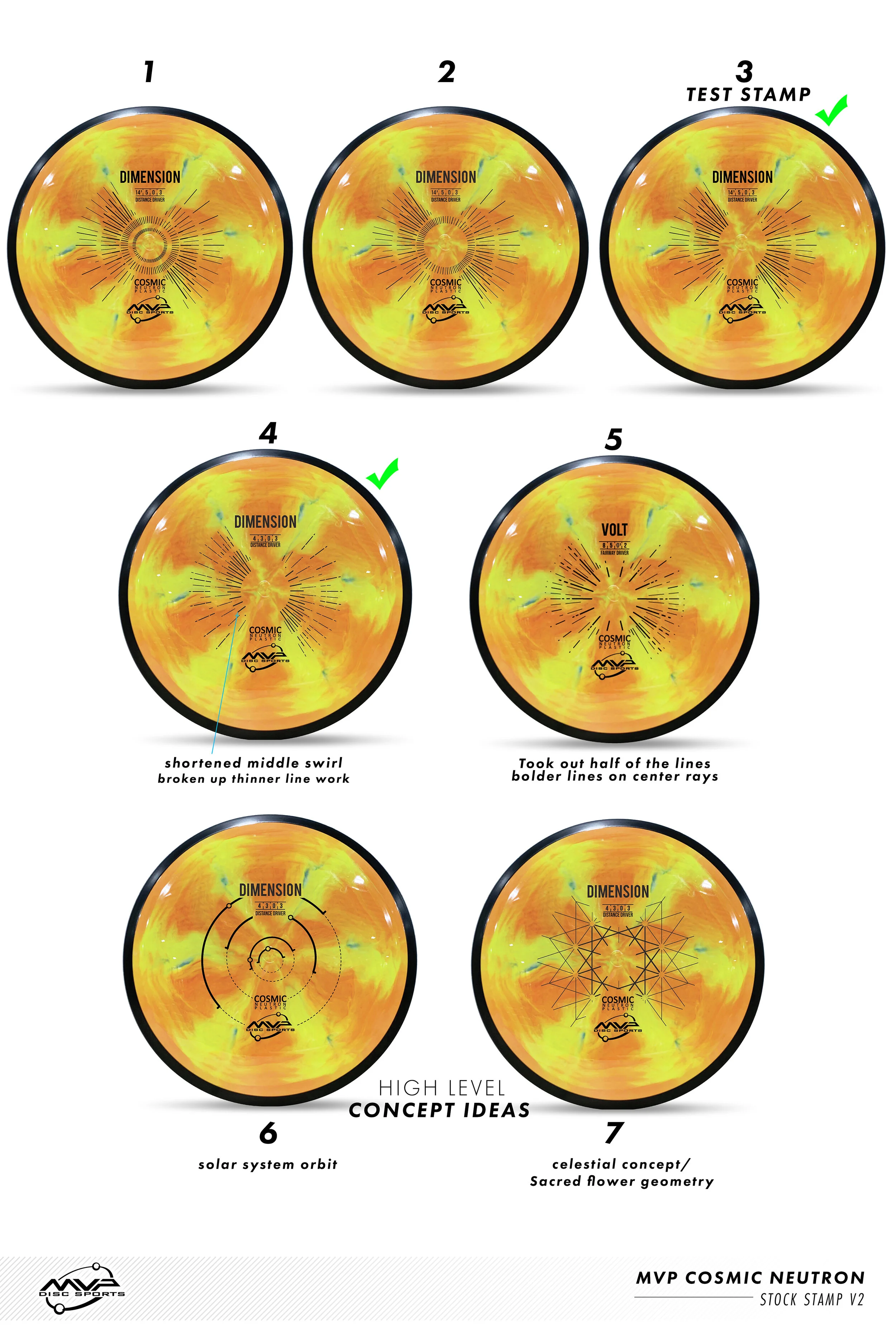
With Neutron art at the very front of my reference gathering, I wanted to create something that seamlessly blended into the stock stamp Axiom family. That was goal #1. MVP’s history runs deep. The last thing I want to do is shred that to pieces. If you look at the far left image below; our heads were looking at high-level science, Leonardo da Vinci, 3D DNA molecule structures and honeycombed flower patterns. While all of those sounded great; the flying machine has been done. My research through da Vinci’s sketches led to me start researching perpetual motion machines. Bhaskara’s Wheel, Sadi Carnot and the Carnot Cycle. My mind went down the rabbit hole, you can say. I landed on the fact that while all of these machines and concepts sounded cool, quantum mechanics and the complex nature/theory burned me out. That doesn’t mean I won’t return back to these notes at a later date. Time was of the essence and I had to get to work.
I landed on a 3 cylinder schematic concept. The main idea is of a 3 piston firing order that is pushing energy toward the epicenter. A transfer of energy through the stamp design to the actual swirl look of the plastic.
Here are a few key points in the final Axiom Cosmic Neutron design:
•Get the name of the disc higher up on the flight plate so it can be seen on store shelves
•Disc name is the boldest part of the design while keeping with the overall schematic style of font. It doesn't scream old world but doesn't modern either.
•Keep key shapes present in the new design. Circles, triangles, font look, and feel.
•Integrate a fresh idea
The below image gallery shows a peek into the 2-week process:
MVP Cosmic Neutron
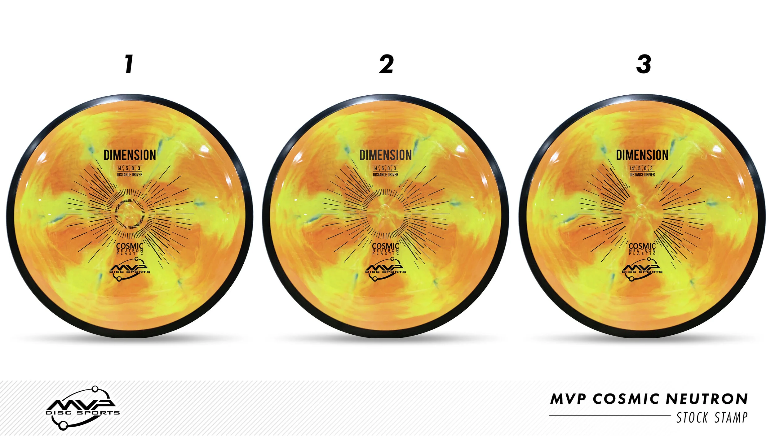
MVP Cosmic Neutron plastic creates some epic swirl patterns that you wouldn’t think would be possible in plastic manufacturing. This plastic was so awesome that MVP Disc Sports created a new plastic line and needed a stock stamp produced for all of it’s models. It was my job to research, design and implement it into MVP’s lineup.
The first design decision was an easy one: MVP’s standard Neutron plastic has this nice center alignment from Zachary Kelbaugh’s original and “New”tron stamp designs. I wanted to continue that nod into Cosmic Neutron. The second idea played off of the center plastic induction sprue. It’s the center of where all of these patterns meet. It felt fitting to hit that concept and start thinking of ways I could create a stamp that would rest in harmony with the beauty of the plastic. This idea sort of camouflages the radiating rays but bolds out the Disc name/ flight numbers/ MVP Orbit logo. This design nearly made it to final. The design was submitted and the die was sent off and created. We stamped Cosmic Neutron Volts and Entropy’s and let it sit and marinate within the team.
In the end, the earlier mock-ups (based on the zoom/swirl pattern) felt too forced and did the exact opposite of what this stamp needed to be. It needed to be bold enough to stand on its own against the Cosmic Neutron swirl but also open enough to let the plastic shine. So with that in mind, I feel very strongly about the concept of our solar system with a modern look/ feel to it. What I liked most is it's based on our solar systems ecliptic plane. The bold lines indicating when the planets are below the sun. It very well fits the Cosmic narrative and gives the stamp substance and reasoning. I would compare stock stamps like creating a company logo. You want something classic that will stick for a long time without updating. Even though the costs are much smaller for a changeover; that’s not really something I’m thinking about when designing.
I hope you’ve all enjoyed this deep dive into MVP’s Cosmic Neutron design process. I want to thank the people and MVP staff who gave me some honest and informative feedback through this process. Without that; I don’t think it would’ve turned out as it did.
What do you all think? Did the project reset improve the overall quality of the stamp?
Oak Hollow Open 2015 Stamp
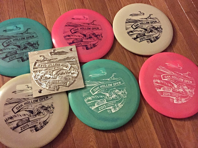
The idea behind the stamp comes from memories of playing the temporary course as a motivated intermediate disc golfer back in 2010 or so. You see many new courses, new faces and make great memories playing the tournaments blind. I remember Festival Park. I remember it well. Driving into Festival offers you a beautiful hillside view of Oak Hollow Lake and wood dock for Hole 1.
Out of all the crazy ideas in the thumbnail process, the scene of Festival made the most sense. With the suggestion of Phil, we decided to use a scenic shot of the signature Hole 9. It's an elevated tee throwing over the water and tight landing zone onto the green. I wanted to create a sense of energy that was in the rough draft. To do that, I was able to live trace my pen drawing into Illustrator and then go back through and clean up trouble areas.
The end result came out killer and really speaks to why this tournament gets bigger and better every year. Thanks to Oak Hollow Disc Golf Club for giving me this opportunity!
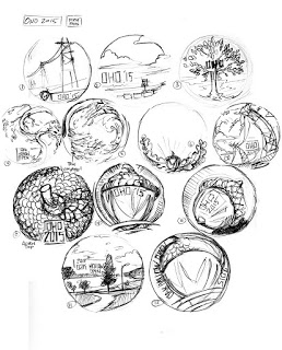 |
| Thumbnail session |
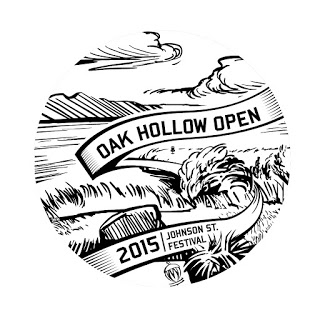 |
| Final |
Brooklyn Body Blossom
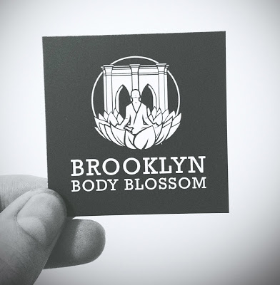
I received a call from a good budd of mine, Dr. Michael Murray over the summer. He was rebranding his practice to display more of his holistic approach to chiropractics. He needed my help to rebrand his business with a logo for the newly formed
.
Key initial ideas were:
1. Display the Brooklyn Bridge in some form
2. Show cues of an inspirational artist;
3. Include a lotus shape.
First and foremost, I want to thank Dr. Murray for working with me through last summer. This was a tough assignment but he was great with feedback and as an artist himself, I think we collaborated well to create a logo we're both proud of. I'll show the finished product first and then a few pieces that helped lead up to the final design.
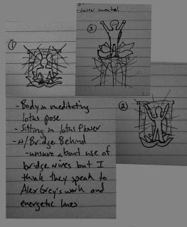
Clients quick napkin sketches
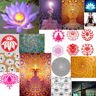
Inspiration board
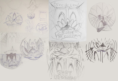
1st pass of thumbnail sketches
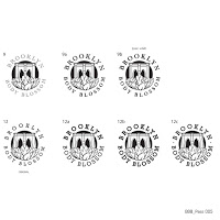
Almost there! Final font selection
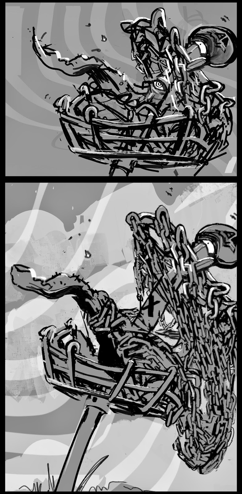
Crazy Chain
  |
| Final |
Mural Step Process
Here are progress shots of the recent mural
 |
| Prepping the wall. |
 |
Tracing phase. The projector quit working half way through.
|
 |
| End of first paint session. |
 |
| lower tonal values blocked in for coral and clouds detailed. |
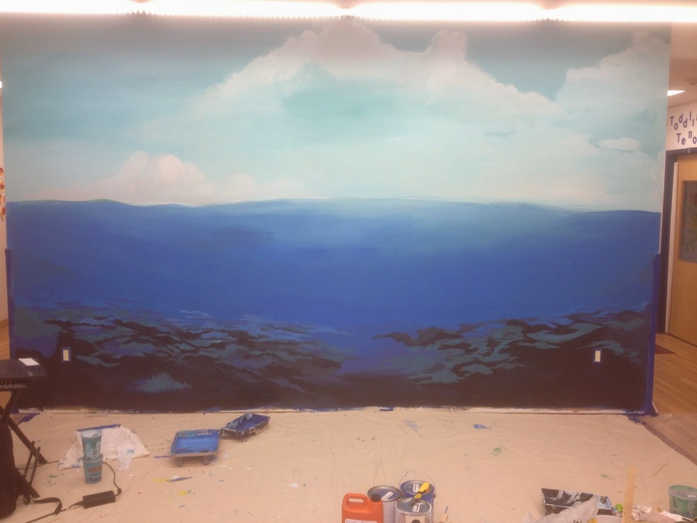 |
| Coral blocked in. |
 |
Initial ripple idea. It ended up more on the purple side.
|
 |
| Close up of initial fish painting. Blocking in coral. |
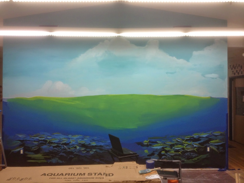 |
| Bright under-painting before thinned blue covering. |
 |
| Close up of ripple blending. |
