Marie Curie Eclipse Glow Reactor

I’m working my typical day and the word came down that MVP HQ is experimenting with a new & improved Eclipse Glow blend of plastic with overmolds. With the recent success of the Reactor mold; both ideas hit me at once and we pitched the idea to try Reactors & see how they would mold up. The initial idea for a Glow Reactor Special Edition came in the form of glowing toxic material and powerplants.

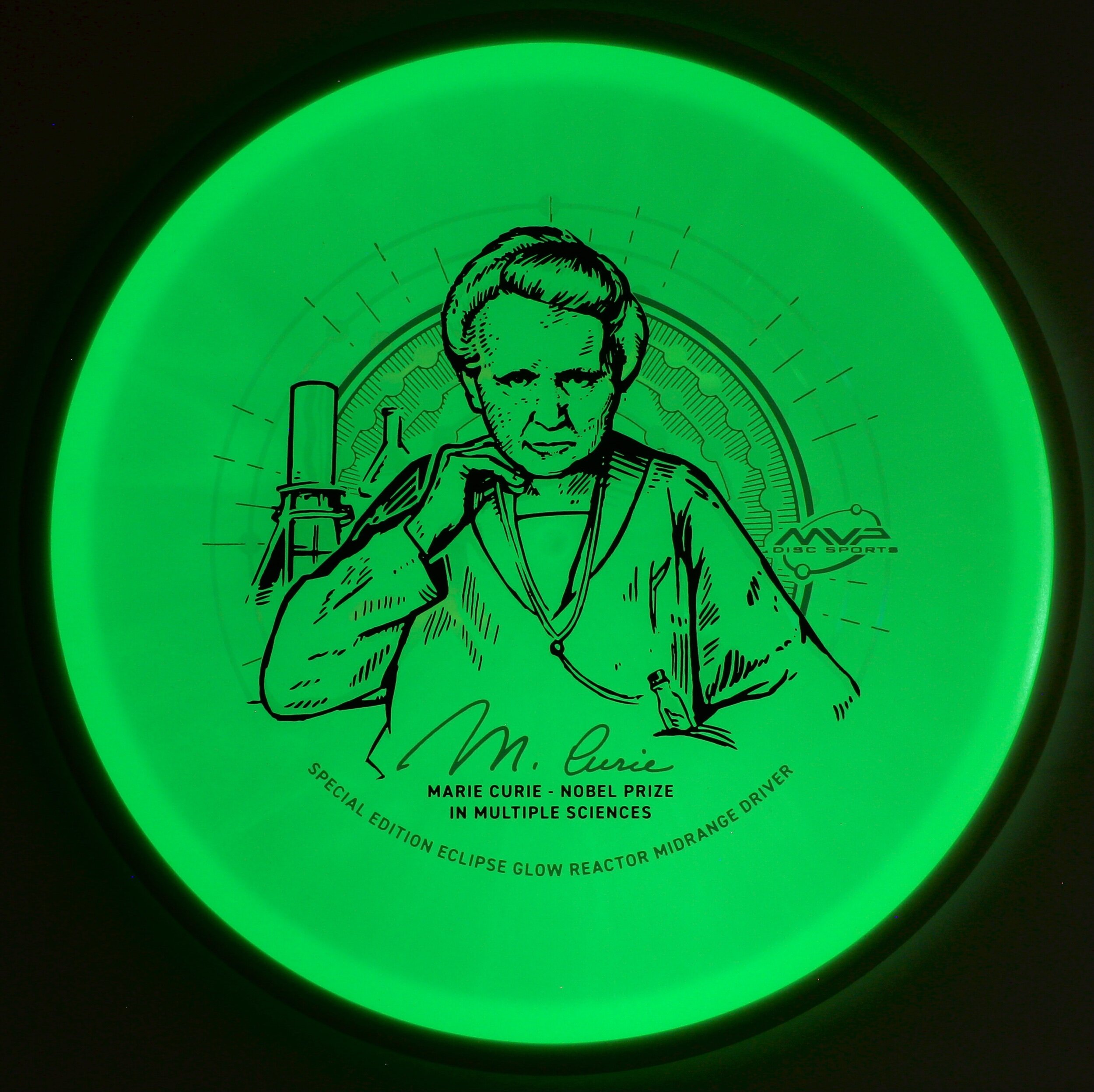
Some say it’s not always good to roll with your first idea. We marinated a bit on the qualities of the plastic and used them to our strengths. The natural look of the Eclipse 2.0 blend in the daytime gives off a milky white/greenish appeal. I felt using this opportunity to honor the late Marie Curie and her life as a scientific pioneer. She would be the first woman to win multiple Nobel Prizes in both sciences. She’s also the first female featured in MVP’s Limited and Special Edition scientific line of stamps. We use this platform to give nods to some of the notable humans that have contributed to the world of science. Her magnificent and intense story led MVP down the path to honor her in this stamp.

While diving in and reading about Marie Curie; I jotted a few notes that would aid in design cues and decisions while building the vector art. Marie and Pierre found and named a new element called Radium that was 4x more radioactive than Uranium itself. Long story short, She and Pierre would take the next 4 years to process an incredible 10 tons of pitchblende down to 1/10th of Radium Chloride residue. She was able to give an atomic mass of Radium of 225.9 (226) and place it correctly in the Periodic table. I thought that was a pretty significant number that took an immense amount of work to arrive at. I would later use that number of radial lines from the discs’ center.

I used a variety of images of her from both her early years as a college student and those of her later years to compose a set of thumbnailed ideas. There are era-appropriate shapes and symmetry to really help merge the unique plastic color. MVP stamping and marketing worked in conjunction to test and make the transparent foil worked with the artwork. The molecular compound of Radium is featured as a clear holofoil backdrop that appears a muted grey when illuminated in the darkness. The new 2.0 Eclipse is so bright that the white foil we used allows light to soak through giving even more depth in the darkness. Marie’s pose is intense as in her work. Time is not wasted. Electrometer and infamous MVP shaped beaker are placed behind her. In her lower pocket is a glass tube of Radium. She was known to carry it around in the lab; as she wasn’t aware of the effects of radiation.

In the end, it’s the overall goal to honor a legend in the science field with tact and class. Use the plastic qualities as we did in the 2018 Am Worlds ”Queen Charlotte” and make it feel like it belongs in the lineage of MVP stamps created to honor those featured. We felt as a Marketing Department that this stamp did just that. These Special Edition Marie Curie Eclipse Reactors will be available at most major MVP Disc Sports dealers for a small amount of time. Be sure to inquire about them before they’re gone for good!

MVP Ohm-Special Edition

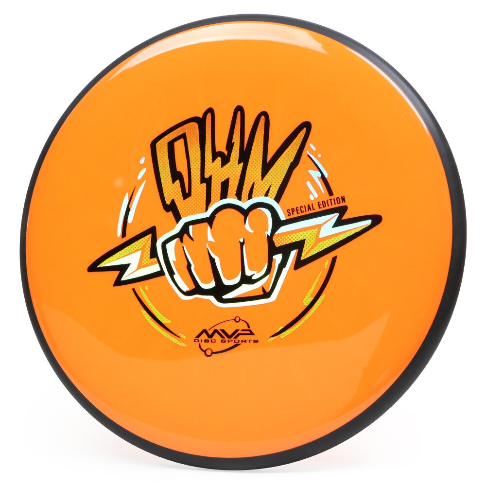
The Ohm Putt & Approach disc gives customers the glide, feel, and flight of the popular Streamline Pilot but in an overmold form. I feel this disc is going to be a favorite for years to come. Approaching the design for the Special Edition, I ventured to amplifier tubes and how Ohms relate to the temperament of amplifiers and the management of current. Since Ohm’s deal around a concept, that difference between two points is directly proportional to the resistance of the circuit; We shifted gears and went away from the amplifier tube idea.

From the jump, I wanted to have a sense of energy within the bolts and stay clear from the expectation of yoga and “oohhhmmmmmmmm”. I felt that idea was too easy and not really fitting within the MVP brand. Using my love of illustration within concert posters; I was able to rough in that staggered jolt. It was the second round of ideas that steered us to the fist/ hand concept. It’s a simple visual that represents current flow and the resistance that the fist creates.

I’m a firm believer that nothing comes easy. It took some churning to personally bring the best idea forward. All in all, to step back as a marketing department and reassess the direction of this design, seemed like the best thing that happened. What do you all think of the Special Edition design? How are you liking the MVP Ohm in general? Thanks for stopping by.

Schrock-A-Doodle-Doo

As 2019 was coming to a close, Tyler Schrock, Team MVP Pro asked me if I would like to do his 2020 Tour Series disc. Working with Tyler is pure joy. He’s kept an animal theme over the past few years that allowed me to do design an octopus and sloth. This year, his idea was a rooster. It turns out that his father was a chicken farmer! He raised chickens for 25 years. So this stamp idea was something he knew his family would love.

This idea started with chicken reference gathering even though I had a good idea of how I’d be able to pull this off. I think the strongest silhouette of a chicken is from the side. It gave me the room in the center of the disc to stay free from any no stamping zones. The chicken mouth action/or spit never made the final. That was an attempt to add that classic “action” seen in cartoons to show loud noises. We didn’t want the chicken looking like it was spitting so it was axed toward the end. The shading detail near the chest add a bit of contrast to show that it’s different color of feather.

The final pass was simply to add body/feather detail and import the consistent ring graphic from last years design. It was important to Tyler to continue that look and feel from year to year. When you display these side by side; it really adds a nice series look to them. I hope you all dig it! Share, like, comment on what you think!

MVP Proton Deflector

MVP Disc Sports Deflector is a midrange driver that they’ve been needing for a long time. It took continuous development to make sure the public got the overstable midrange they were wanting. The wind is no match for this mid and it’s their most overstable in the lineup. Proton plastic adds a bit more toughness to the Deflector mode and introduces some highly visible colors like chartreuse, bright orange, pink and blue.

I approached this Deflector concept by doing research on old tube tv technology. I gathered my pieces of reference on magnetic forces, inner TV diagrams, and previous/current MVP Proton stock stamps. It was my goal to create something that would seamlessly fall into the lineup. No matter how hard I worked to create something unique; It felt a bit too close to Zachary Kelbaugh’s idea for a Neutron Deflector Special Edition set. The other hurdle was the use of 3D. If you look at most of the current stock stamps in the first gallery example; you’ll see crisp line work and believable lit geometry. I used the free 3D program called Blender.

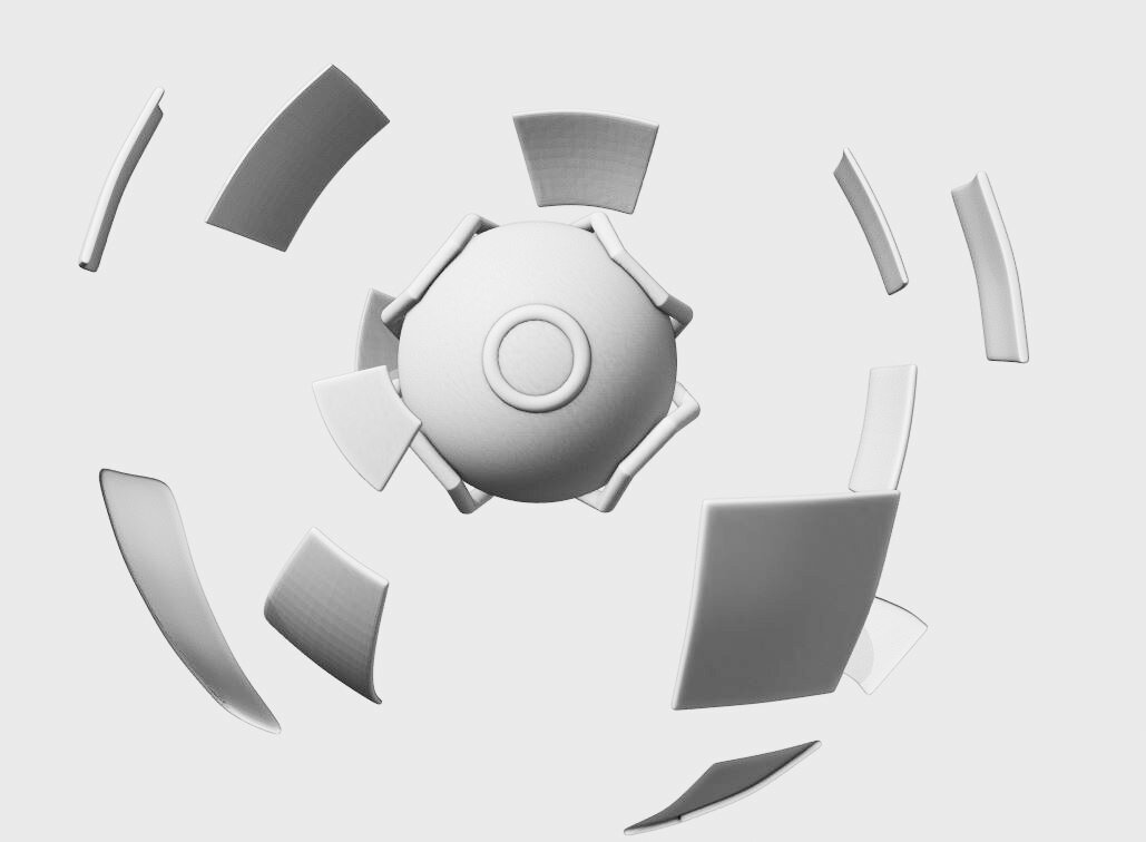
My idea derived from the reference I saw on a circular looking reactor. The MVP Tangent, Axis, Atom and a few others have a common shape appearance; the sphere. Starting from there, I dove into a science fiction “deflection shield” idea. The protected metallic panels would orbit this levitating drone and protect it from the enemy. It was important to keep it very much away from any Pokemon tie in so it remained simple with these 4 supporting braces cupping the main housing. After the scene was lit and materials were configured, I set up a quick viewfinder render and used that as a base for the vector shapes in Illustrator.

The final addition was to bring back in the grids I found while researching deflectors/ TV tech. I felt it fit with the metallic styling of the panels and added a bit more depth to the stamp. I hope you all enjoyed this brief look into the design decisions of the MVP Proton Deflector stock stamp. Leave a comment and please share if you’re willing. Thank you!

MVP Cosmic Neutron

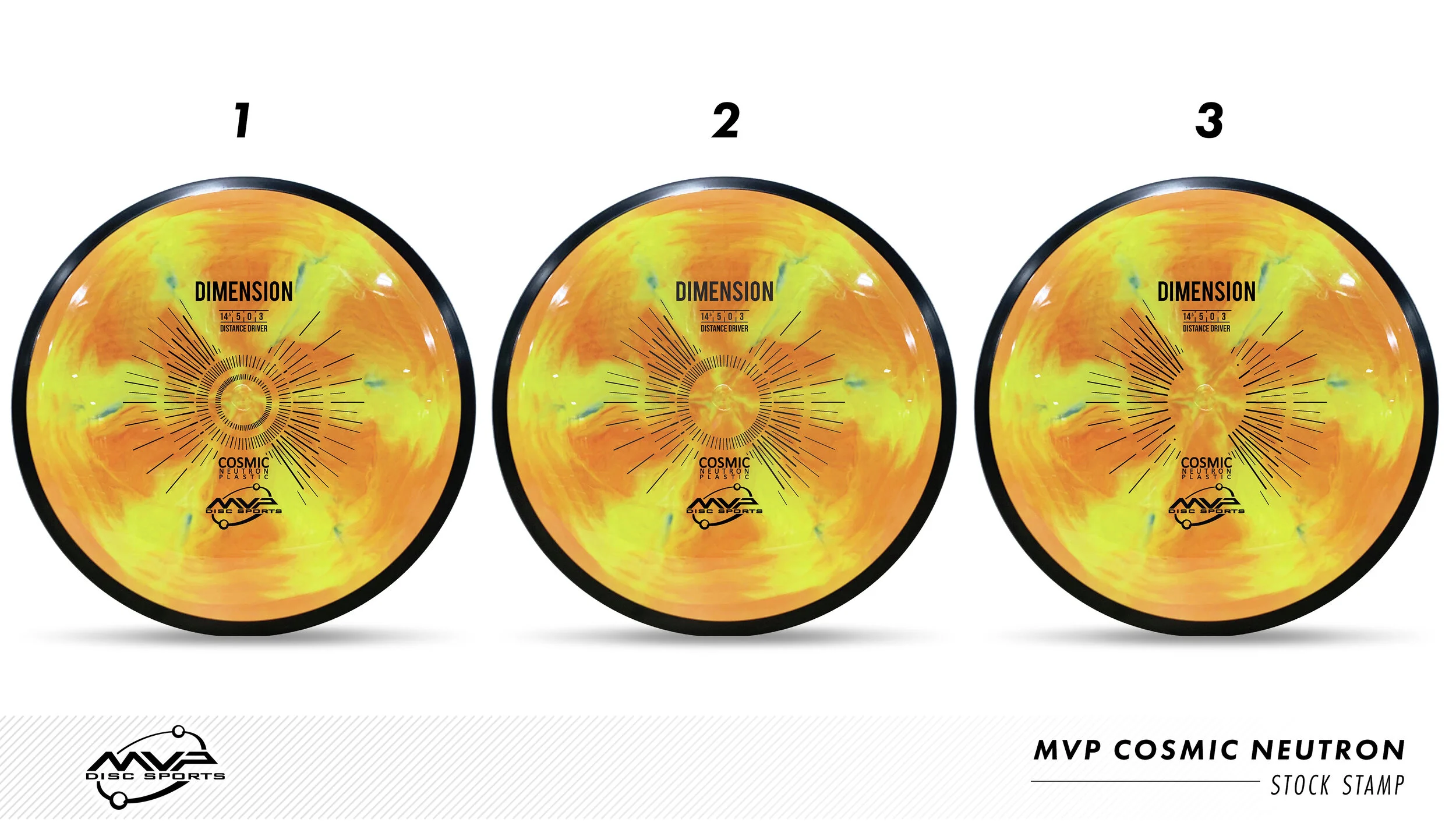
MVP Cosmic Neutron plastic creates some epic swirl patterns that you wouldn’t think would be possible in plastic manufacturing. This plastic was so awesome that MVP Disc Sports created a new plastic line and needed a stock stamp produced for all of it’s models. It was my job to research, design and implement it into MVP’s lineup.

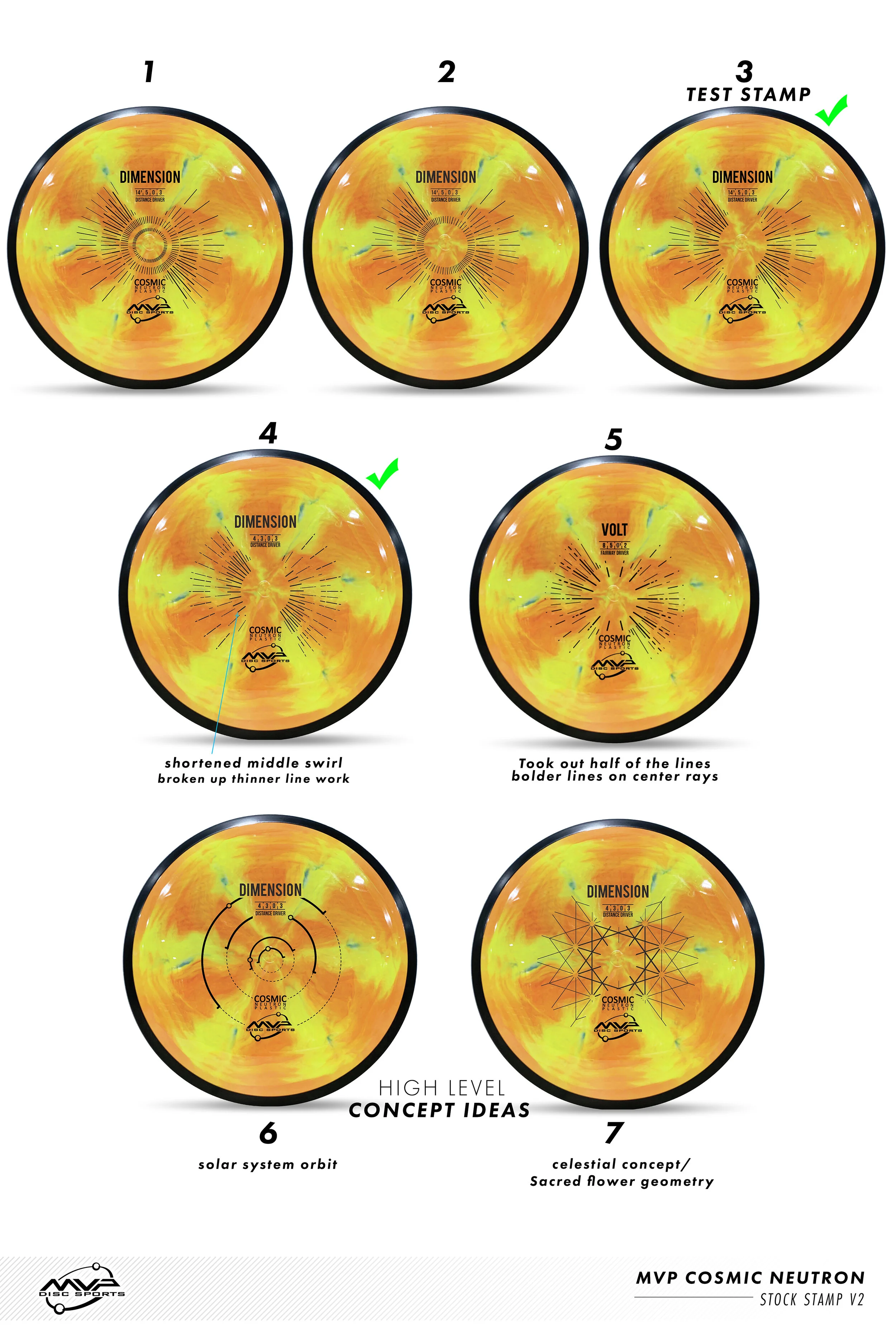
The first design decision was an easy one: MVP’s standard Neutron plastic has this nice center alignment from Zachary Kelbaugh’s original and “New”tron stamp designs. I wanted to continue that nod into Cosmic Neutron. The second idea played off of the center plastic induction sprue. It’s the center of where all of these patterns meet. It felt fitting to hit that concept and start thinking of ways I could create a stamp that would rest in harmony with the beauty of the plastic. This idea sort of camouflages the radiating rays but bolds out the Disc name/ flight numbers/ MVP Orbit logo. This design nearly made it to final. The design was submitted and the die was sent off and created. We stamped Cosmic Neutron Volts and Entropy’s and let it sit and marinate within the team.

In the end, the earlier mock-ups (based on the zoom/swirl pattern) felt too forced and did the exact opposite of what this stamp needed to be. It needed to be bold enough to stand on its own against the Cosmic Neutron swirl but also open enough to let the plastic shine. So with that in mind, I feel very strongly about the concept of our solar system with a modern look/ feel to it. What I liked most is it's based on our solar systems ecliptic plane. The bold lines indicating when the planets are below the sun. It very well fits the Cosmic narrative and gives the stamp substance and reasoning. I would compare stock stamps like creating a company logo. You want something classic that will stick for a long time without updating. Even though the costs are much smaller for a changeover; that’s not really something I’m thinking about when designing.

I hope you’ve all enjoyed this deep dive into MVP’s Cosmic Neutron design process. I want to thank the people and MVP staff who gave me some honest and informative feedback through this process. Without that; I don’t think it would’ve turned out as it did.

What do you all think? Did the project reset improve the overall quality of the stamp?
 

MVP Open-LE Resistor

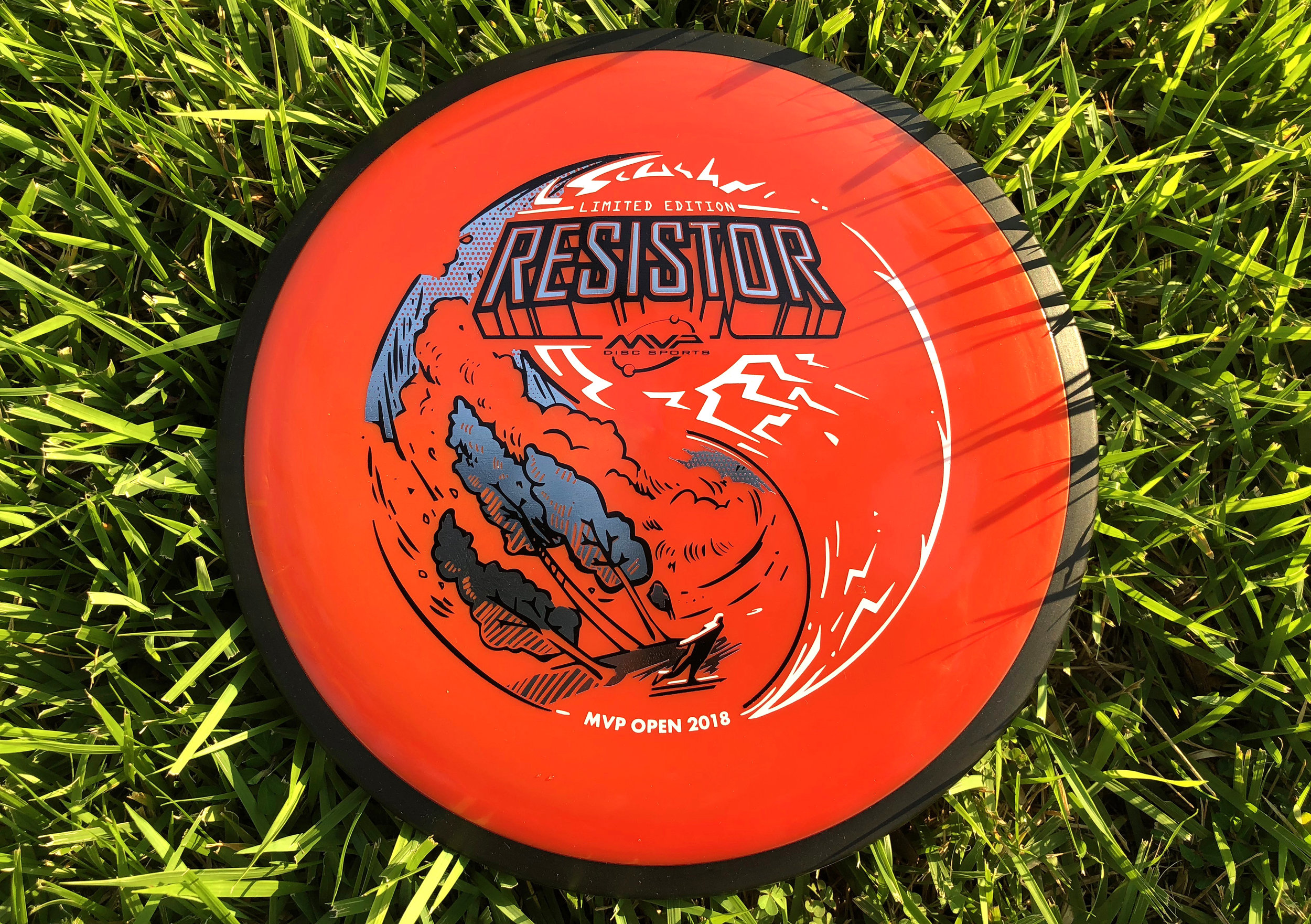
With the success of the MVP Open Pro side Limited Edition Fireball stamp, it was now time to turn my focus. The goal was to take the same general theme as the Fireball and create a triple foil stamp with the same visual appeal for the Amateur side of the MVP Open tournament. Since this disc will also debut in the same new "Firebalm" Plasma plastic as the Fireball, it should me for a pretty nice pairing. 

Going into this design, the idea of inverting/ flipping of what was done previously, was brought up among the marketing team. I really liked that idea and ran with it. The Resistor is a widely used utility fairway driver that also has a lot of overstability (the typical flight of a disc that turns left for a right handed backhand thrower). Since I couldn't use the shot mimic'd in the first stamp, I have the disc golfer throwing a typical backhand hyzer that follows the overall circumference of the outer edge of the stamp.

The Fireball had it's font treatment on the bottom of the design, I also wanted to change this up as well. For the Resistor wording on the top portion of the design, I would design that area to act as if the circuit board and different pathways connecting itself to it. As I continued to layout out the circuits and pathways, it felt flat. I switched gears toward the end and made the call to work around the Resistor typeface and create bolts to simplify.

All in all, it was awesome to continue a theme from one Limited release to another. That's a first for me and hope everyone digs it. Thanks so much for stopping in and reading about this design. The MVP Open was a huge success and I can’t wait to see what next year brings for MVP Disc Sports.
 

2018 Amateur Worlds

2018 Amateur Worlds are here! MVP Disc Sports has partnered up with Am Worlds to produce a limited run of prototyped Prism Insanities. Prism is a concept teased last year where we run a translucent rim and core. It sure looks like a million bucks and I think people will be stoked to have one of these.

Going into this design, as a team we knew we wanted to shed away from the norm. A typical layout for the host city would be a skyline shot somewhere within the design. I wanted to play off of where Charlotte got its name. I scoured the internet to find this article written by Tom Hanchett explaining the birth of the City:"King George III still ruled the Colonies when European settlers chartered the town back in 1768. They named the new hamlet after the King's wife, Queen Charlotte, and gave the surrounding county the name of Mecklenburg in honor of her majesty's birthplace in Germany". 

From this bit of information I stumbled across a pastel portrait of Queen Charlotte created by Francis Cotes. It was this portrait that sparked the idea of meshing new with old. With her finger so eloquently pointed up, I thought it would be a great idea to have her spinning a disc. 

The Dogwood being our state tree and the Laurel on the left signifying the spirit of competition. Designating the 3 different foils was tricky. Since this was to be stamped on a Proton core, you have to pay attention to how much surface area you're allotting and how much light penetrates through it. Too many marks creates a thick and messy appearance when the stamp is in low lit areas. 

You can pick up one of these beauties at the MVP tent at Amateur Worlds in Charlotte, NC. Quantities are limited! 

MVP Open Fireball LE

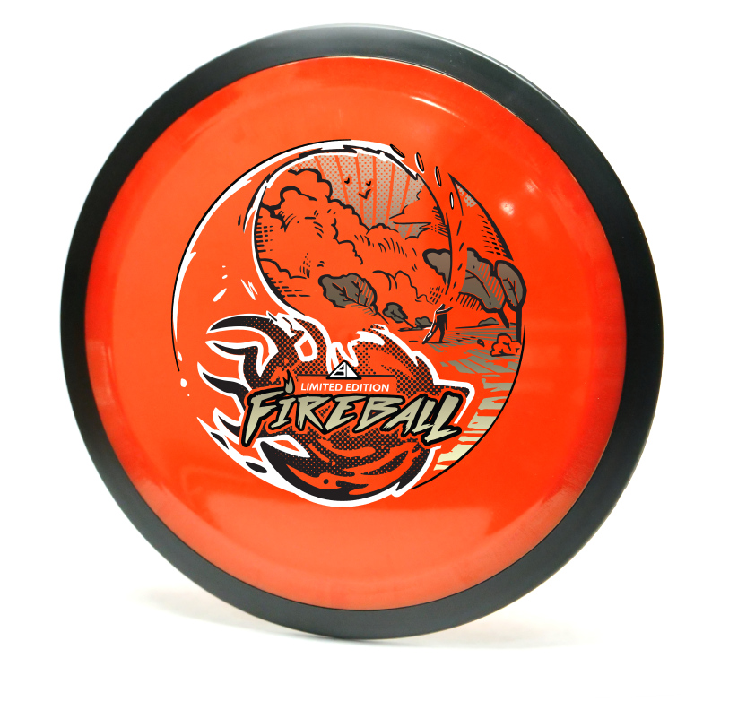
I loved everything about working on this project. You go into the thumbnail process thinking that something like what you did could never work or not be as good. During our initial staff meeting, I was able to show a few of the thumbnails from my sketchbook. The vast majority and better reaction was to the yin yang design. I'm glad I've got great people to rely on and encourage me to take that idea a bit further.  The other thumbnails were worthy enough for possible future expansion so I can't show them, unfortunately. 

The shot is called an underhand thumber. It looks rather painful but a shot that does exist to get the player out of an unfortunate spot. I found the shot through an old throwing clinic video on YouTube. I watched the flight and thought it would fit perfectly (with a little bit of modification) to that of my yin yang concept. I think the dynamic of the fireball crashing toward the foreground is why this was a success. Last thing I want to mention about the design is the spacing of the the heavy items of the stamp. The Fireball text and ball itself are pretty heavy. I consciously wanted that weight balanced so I gave the sky a full foil with minimal spacing for rays and birds in the sky. I think the balance worked out well!  

The Limited Edition Fireball design is a tour fundraiser for the Disc Golf Pro Tour. The MVP Open will be at Maple Hill Disc Golf Course located in Leicester, Massachusetts. This event brings some of the world's top players and will be an exciting time. If you're in attendance, there may be some left at the Maple Hill Disc Golf store.