Streamline Pilot Special Edition

When given the opportunity to revisit a disc called the Pilot; I was all over it. The last time setting foot in the Streamline Pilot universe was for the Electron Limited Edition. That design featured a fearless fighter pilot locking in on his target. This time, however, it was time to step outside of that mindset.

Going into this design, I initially thought about how cool it’d be to take what I did with the Electron design but pump it up and put in a science fiction/ futurism space. I created a ton of thumbnails based on a technologically advanced fighter jet pilot. The thought of holograms or how future pilots would navigate the skies really stuck with me. In the end, we all agreed that while neat; we should create something totally fresh and new for the Neutron line. Those ideas might be revisited so I apologize in advance for not showing them.

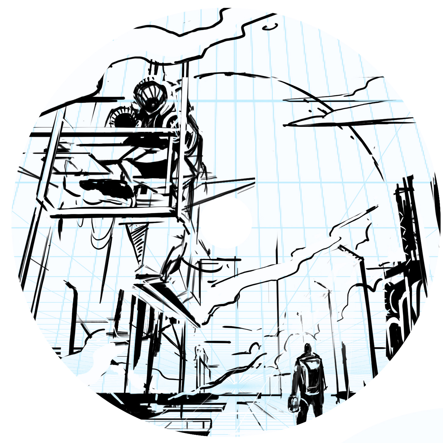
I diverted to a Pilot character stepping onto the tarmac. Putting the viewer in the scene of a spacecraft pilot getting ready to debark on his mission. There’s something about showing massive scale between the character and where his attention is. I thought about mission bays, Ralph McQuarrie (prolific Star Wars concept artist) and how effective they were at creating these imaginative ideas. The ending result was a homage to the work that really got my gears going in concept art and illustration. There were numerous Star Wars concept art prints lining the school I was attending. Those pieces made me inquire more about that type of work and motivated me to go after that discipline.

My philosophy is to create these vast landscapes while always letting the viewer to fill in bits of detail. It allows them to create their own story or simply add to it. That’s what this stamp was all about. It was about not strapping down Streamline Discs’ brand identity to a certain period or time but expanding the possibilities heading into the future. The long steam trails coming from the left side of the image is homage to early 70’s fantasy and poster art. Thanks so much for taking the time to read this. Feel free to share among your peeps on any of your social spaces.

MVP Open-LE Resistor

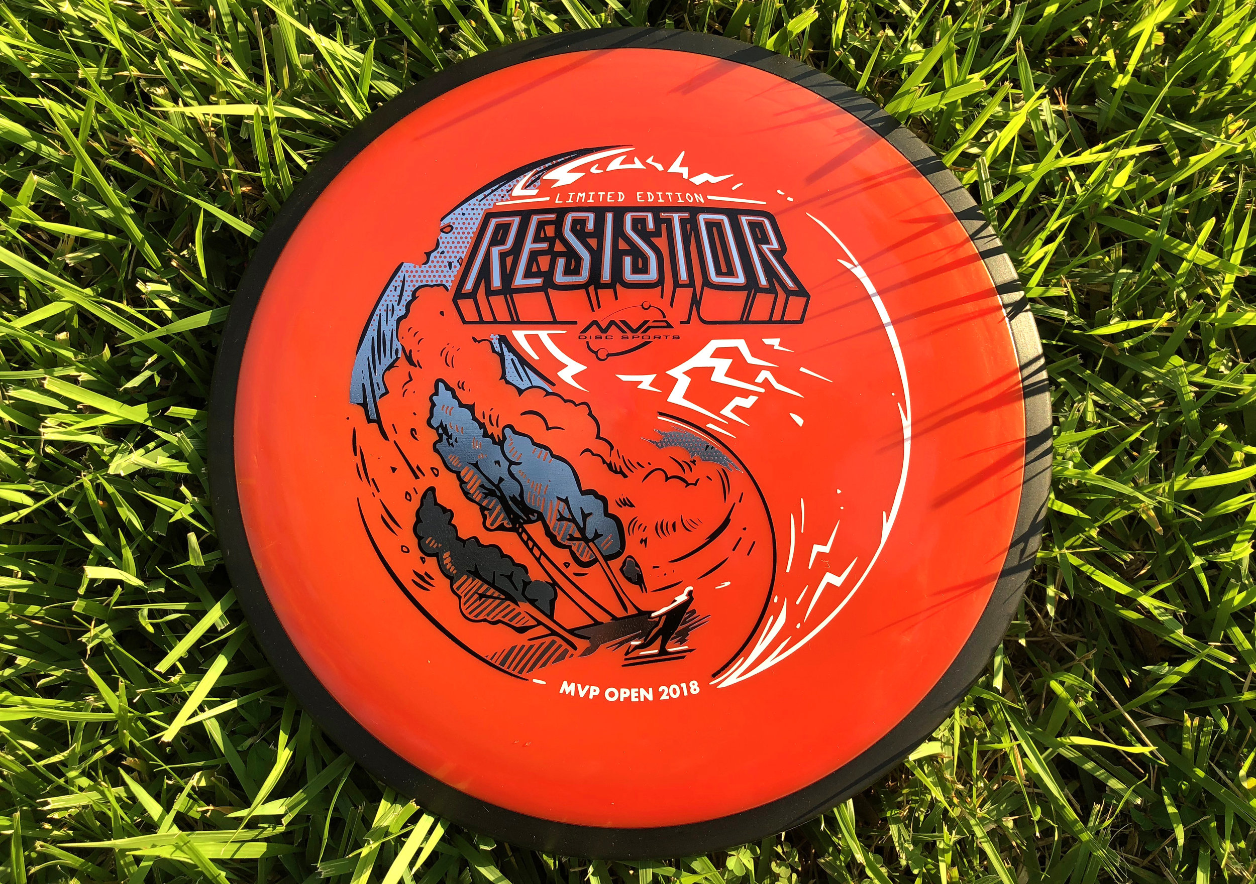
With the success of the MVP Open Pro side Limited Edition Fireball stamp, it was now time to turn my focus. The goal was to take the same general theme as the Fireball and create a triple foil stamp with the same visual appeal for the Amateur side of the MVP Open tournament. Since this disc will also debut in the same new "Firebalm" Plasma plastic as the Fireball, it should me for a pretty nice pairing. 

Going into this design, the idea of inverting/ flipping of what was done previously, was brought up among the marketing team. I really liked that idea and ran with it. The Resistor is a widely used utility fairway driver that also has a lot of overstability (the typical flight of a disc that turns left for a right handed backhand thrower). Since I couldn't use the shot mimic'd in the first stamp, I have the disc golfer throwing a typical backhand hyzer that follows the overall circumference of the outer edge of the stamp.

The Fireball had it's font treatment on the bottom of the design, I also wanted to change this up as well. For the Resistor wording on the top portion of the design, I would design that area to act as if the circuit board and different pathways connecting itself to it. As I continued to layout out the circuits and pathways, it felt flat. I switched gears toward the end and made the call to work around the Resistor typeface and create bolts to simplify.

All in all, it was awesome to continue a theme from one Limited release to another. That's a first for me and hope everyone digs it. Thanks so much for stopping in and reading about this design. The MVP Open was a huge success and I can’t wait to see what next year brings for MVP Disc Sports.
 

30th Anniversary of the Roc

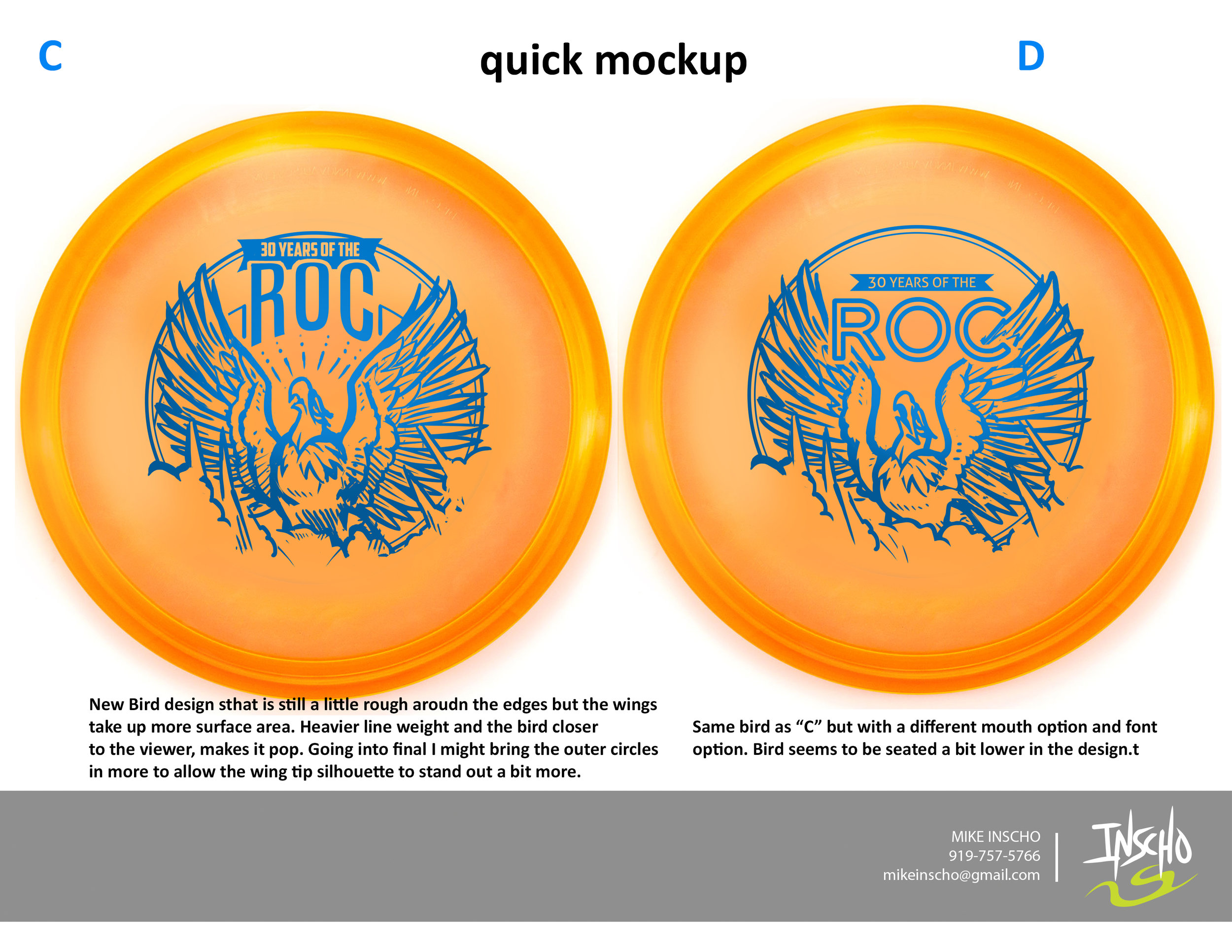
Excited is an understatement. Jeff Panis (Marketing Director of Innova Champion Discs) reached out quite a while ago when he assumed his new role. A lot of things were on his plate at the time, so we talked briefly and got back in touch a few months down the road. An opportunity was in place to design a commemorative stamp honoring 30 years of the Roc's existence. The Roc has been one of Innova's most popular molds without question. This was a huge opportunity that came with a lot of weight.

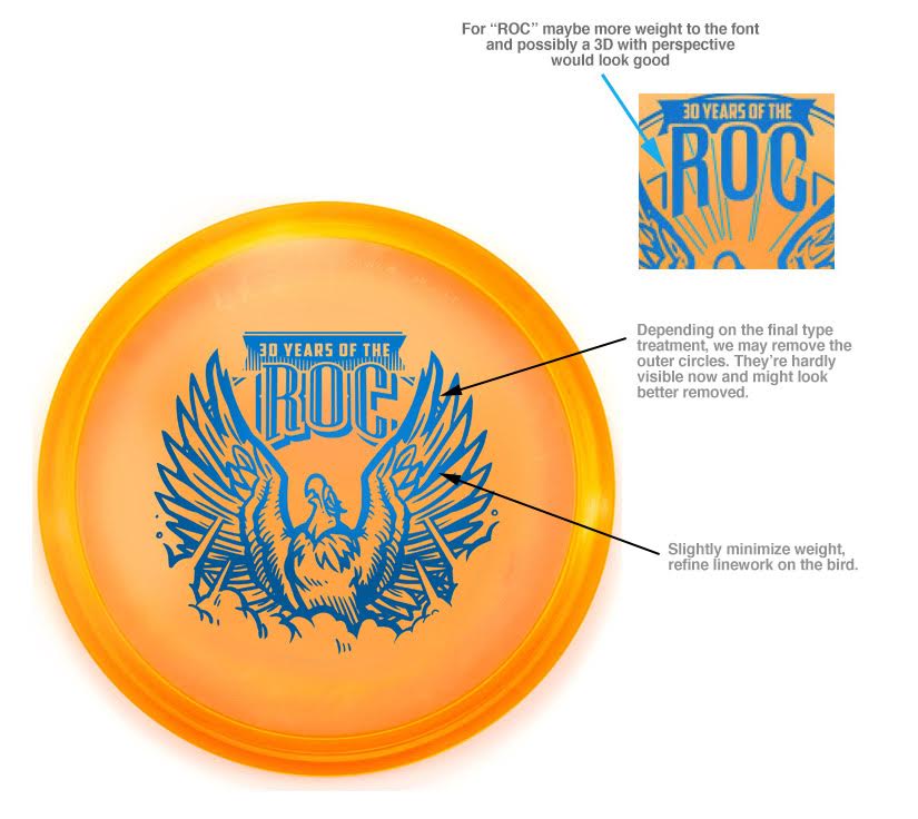
In the initial sketches I proposed, there were some good things to build off of. I had awesome friends who helped me out in critique. One of the main things I overlooked that they quickly pointed out was the silhouette strength of the head. My goal was to have this Roc reach a point of near weightlessness. For example, If you stretch your back out in your chair (I do this from time to time) , you arch the back, the chest protrudes out and your chin tips up. This pose is something I tried to capture. As Innova and I progress through the development of the stamp, The head tips back down a bit to give the bird more shape. The wings extend out to give some symmetry to the stamp. The body develops all the way to it's last and final version and the final is the result of of multiple revisions for the better.

If it wasn't for my friends and their fresh eyes to give me critique, the direction of Jeff Panis, Levi Wilcox and the crew to keep pushing this stamp, it would've honestly turned out to be less than what it should've been. What do you all think?  I'd love to hear your thoughts in the comments. Thanks for reading.

Out of Bounds Series #1

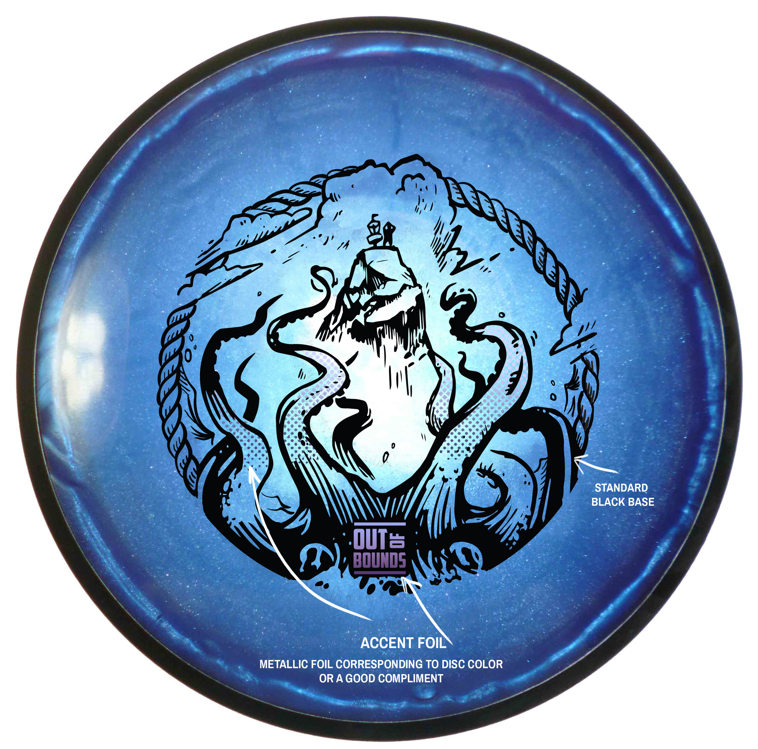
The Out Of Bounds Series was an idea drawn up by a fellow MVP Gyronaut by the name of Brian Sweet. He came to me with an interesting take that I've never thought about before. Tight fairways, landing areas and almost impossible pin placements exist somewhere in the disc golf world. His idea is to shed light on these situations. 

This idea stems from fantastical ideas about what lurks hidden, as your disc takes a plunge into the unknown. Out Of Bounds Series #1 explores the depths of an impossible landing area. The disc is now belonging the keeper. A mix of Cthulu/Kraken/Squid vibes. I wanted the eyes of the creature fixated to the onlooker. The eyes had to adjust from the sides of the beast to more in front to convey the idea. The introduction of the second foil to bring the viewers attention from the bottom of the stamp up toward the poor fellow on the cliff side. 

I want to thank Brian Sweet for having the faith to let me run with his napkin sketch and go for it. These are available in a dual foil set up exclusively on MVP/Axiom/Streamline Discs plastic.

Please let me know what you think in the comments and share with your friends! 

2017 Fantasy Disc Golf Calendar

After seeing the 2016 Fantasy Disc Golf calendar with work of disc golf artists, John Dorn and Manuel Trujillo; I knew I had to inquire to see what it'd take to get on the 2017 team. the 2017 team of artists included John Dorn, Manuel Trujillo, Benjamin Hopwood, Duncan "Skulboy" Crawford, Steven Colatriano, Cooper Harkins and myself. 

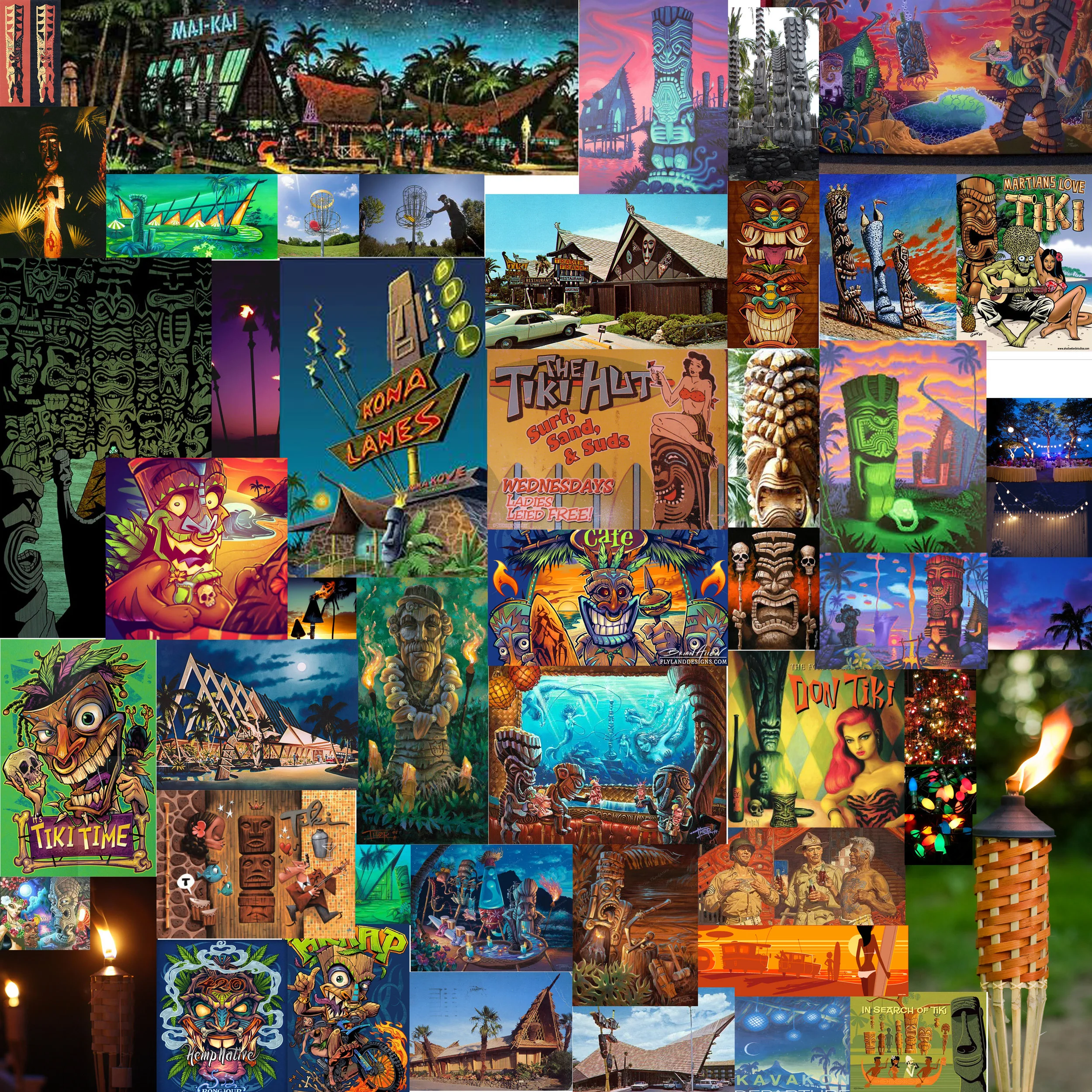
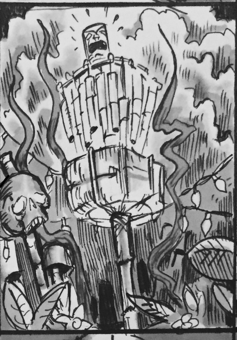
I was assigned the months of August and November. I've always wanted to do more themed disc golf illustrations. I appreciate John giving me the chance. August (Summer) got me interested in revisiting some Tiki artists I found while I was researching for a mural project years ago.  Brad "Tiki Shark" Parker and Tom Thordarson really inspired this tiki piece. November early sessions had cornucopia themes in mind but as soon as I saw great fall reference, I switched to a forest scene with stirring foliage. I found these neat fire tornadoes while searching as well. One thing led to another. Really pleased with how both pieces turned out.
This is exciting and new for me. My prints are available here!!:
High Quality Archival Prints
More affordable option

UFO Glow creation

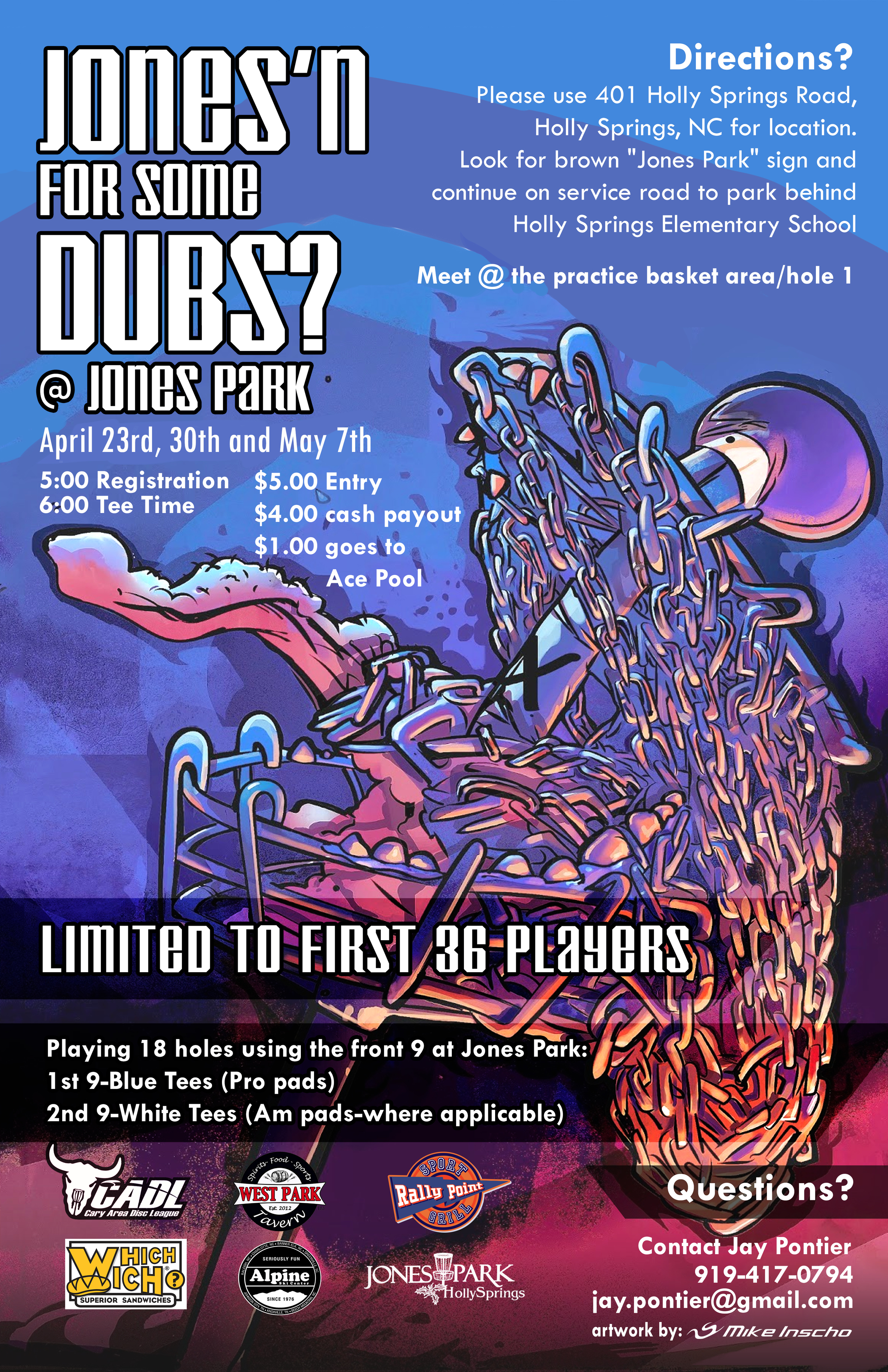
Tim Robbins and Will Davis of Disc Hunt approached me for a product they were getting ready to market called UFO Glow. They loved the art I used for a disc golf doubles event last year called "Crazy Chain". I love creating that type of style and was happy to be aboard to help them all out.

After seeing early product prototypes, What instantly came to mind was something dealing with UFO's. There were also some other ideas to play around with like the Nuclear Power plant since we're based and live rather close to the Harris Nuclear Plant.  Not saying I've been abducted by aliens in the past but many of my family members can attest to my infatuation with Aliens. I knew this is what we had to do. 

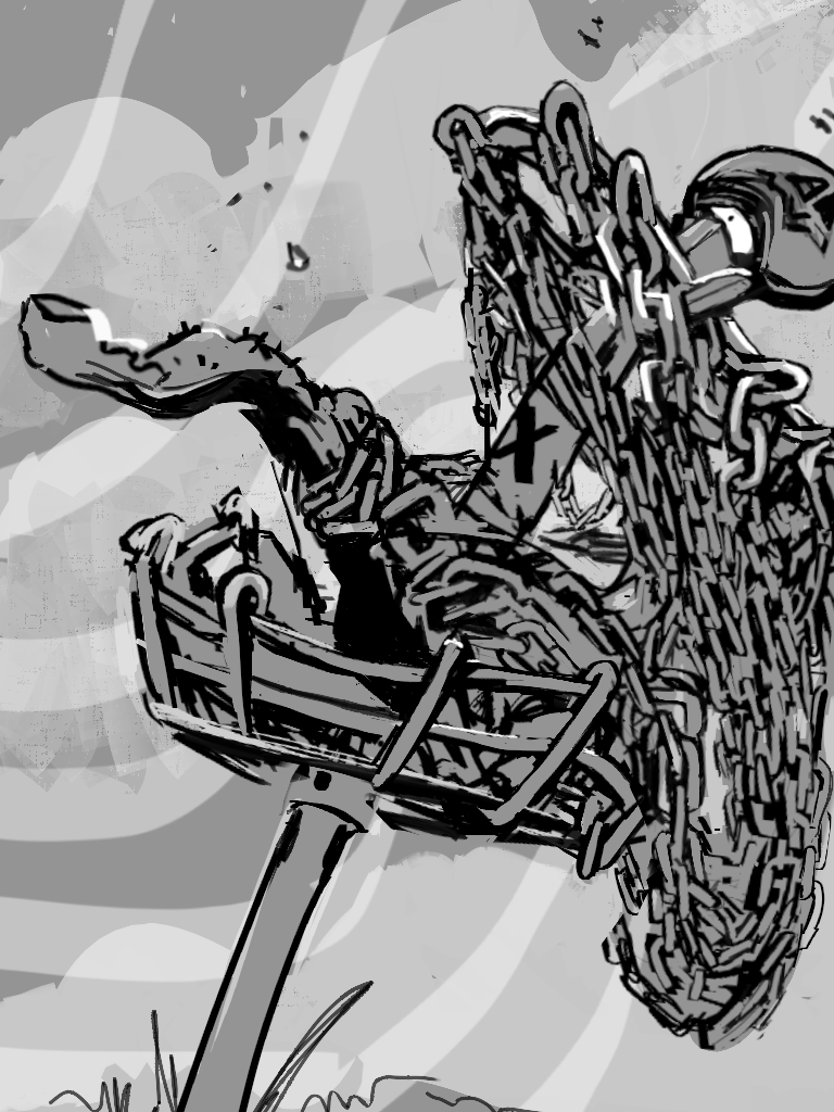
I had to overcome a few obstacles after seeing that the low camera angle would not have shown off the UFO Glow tape like I was planning to. A friend of mine really helped me get it back to what really mattered. The product itself.  I had too much going on in the first initial roughs. Your eye focused more on the disc golf basket, and UFO while the intended focal point was left to be picked up as a secondary or third read. I took the idea into Google Sketchup, nailed the camera placement and took off from there. I needed to forced the field of view more and get the product and contrast working in the foreground. 

In the end, mixing the crazy chain style of illustration with that classic B movie/ Mars Attacks! influence was the right way to go. The customer couldn't have been any happier.