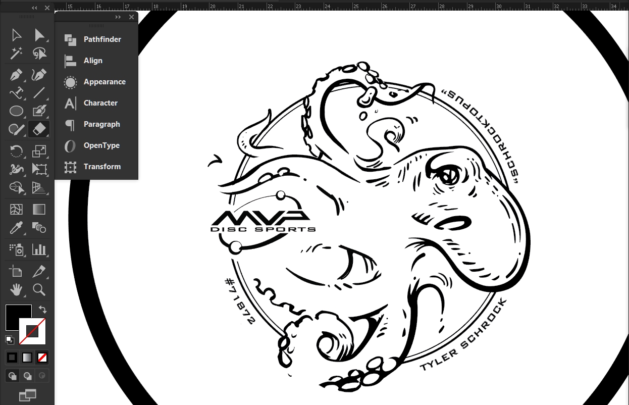
With the 2018 disc golf season among us, it was with great excitement that the first tour stamp of the year leaned on my love for the octopus. I was given pretty much open freedom to come up with a stamp for Tyler Schrock of Team MVP. "Schrocktopus" is his nickname, so we ran with it.
Going into this project, My focus was on giving Tyler Schrock the real estate I thought he wanted. I went to the sketchbook and used the octopus within his name plate. The ideas resembled something he could take and use on other applications or patches. The feedback I received from the thumbnails surprised me a bit. While most Tour Discs have the sponsored player either written somewhere in text or with a signature; Tyler didn't want that. He wanted his stamp to focus more on the art and his nickname. Going into the rough draft, I had a pretty clear picture of how this artwork was going to finish out as. There were last minute changes that needed to be made, though. It's a valuable lesson on logo use and the end solution was to insert the official Team MVP seal. It replaced the MVP "Orbit" logo from the initial final. The stamp lost a little bit of playfulness (in my opinion) but I still think it came out great!
It was a pleasure being asked to work on this for him. Contact Tyler Schrock through this link for inquiries on availability.
Out of Bounds Series #1
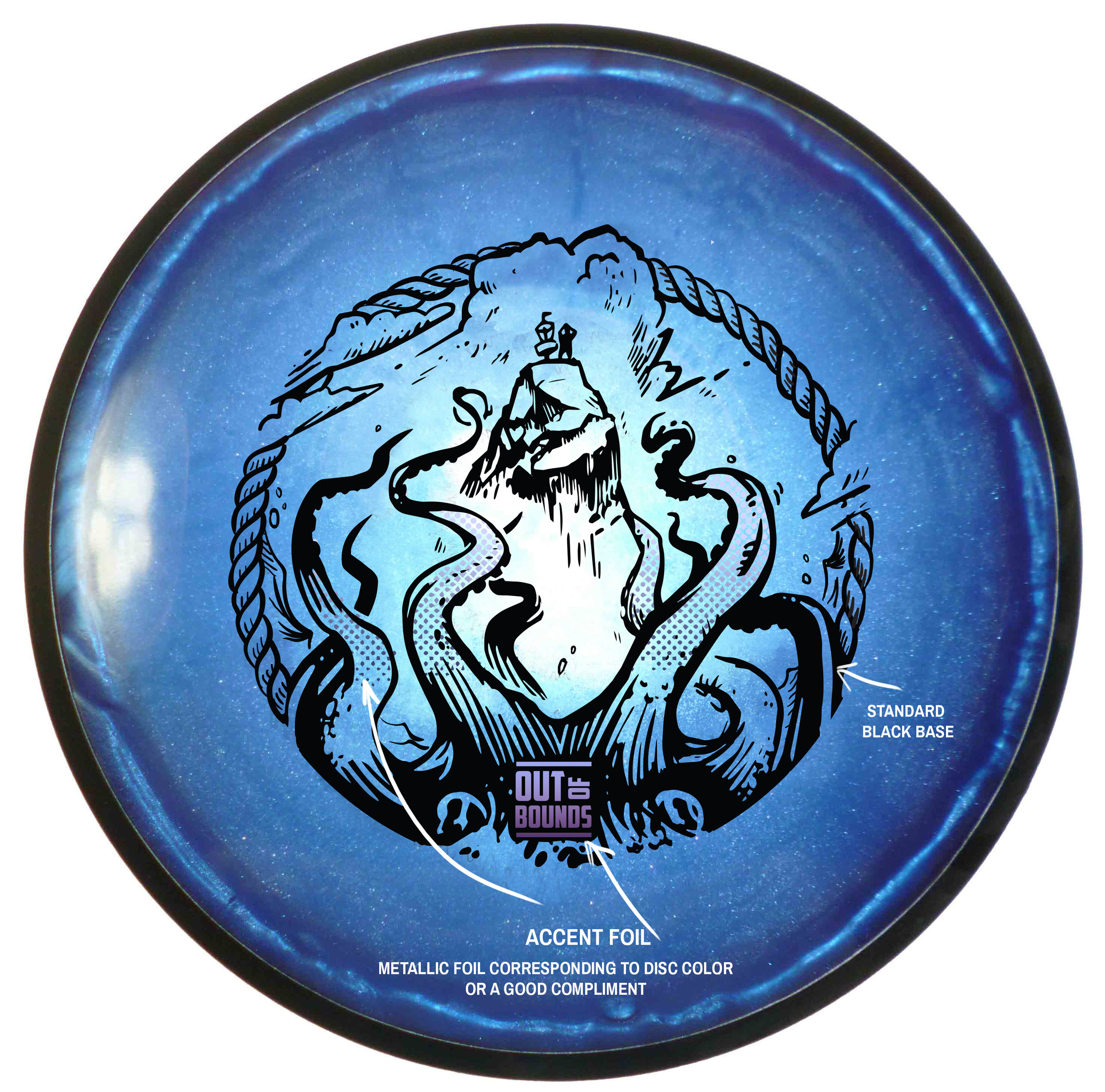
The Out Of Bounds Series was an idea drawn up by a fellow MVP Gyronaut by the name of Brian Sweet. He came to me with an interesting take that I've never thought about before. Tight fairways, landing areas and almost impossible pin placements exist somewhere in the disc golf world. His idea is to shed light on these situations.
This idea stems from fantastical ideas about what lurks hidden, as your disc takes a plunge into the unknown. Out Of Bounds Series #1 explores the depths of an impossible landing area. The disc is now belonging the keeper. A mix of Cthulu/Kraken/Squid vibes. I wanted the eyes of the creature fixated to the onlooker. The eyes had to adjust from the sides of the beast to more in front to convey the idea. The introduction of the second foil to bring the viewers attention from the bottom of the stamp up toward the poor fellow on the cliff side.
I want to thank Brian Sweet for having the faith to let me run with his napkin sketch and go for it. These are available in a dual foil set up exclusively on MVP/Axiom/Streamline Discs plastic.
Please let me know what you think in the comments and share with your friends!
17th Annual Great 8
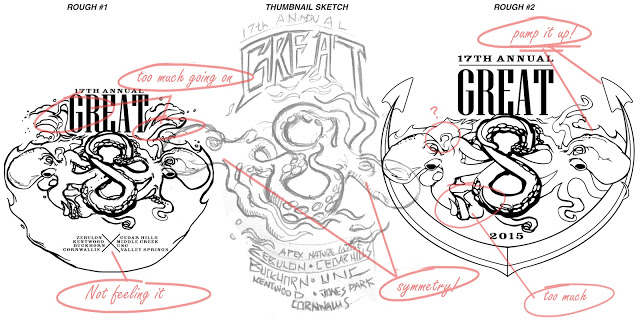
The final design was stamped on a limited number (100) Champion Fundraiser (CFR) Glow Roc3's. Here I am showing the general design process leading up to the final design. Not every pre-planning sketch is in here. It would take up too much space. Thanks for stopping by!
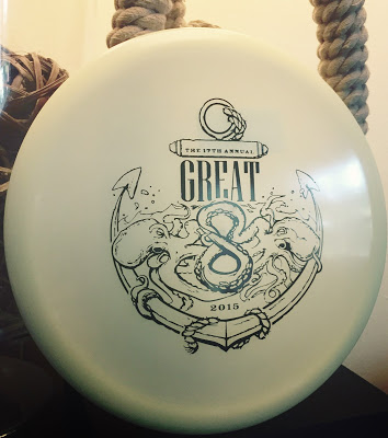  |
| Final Design |
