2024 PDGA Membership Disc

After John Dorn and I’s seemingly successful 2023 Membership campaign for the PDGA; Vic Allen (PDGA Membership Manager) reached out last year to see if John and I would be interested in doing the memberships this coming up year. What’s exciting is that they would be landing a new Eclipse R2 Plastic mold from Axiom Discs, the Insanity. The goal this year was to provide 3 triple foil stamps commemorating the Membership, Birdie Club, and Ace Club with a 4th design that would intend to be the Eagle Club disc update.

I loved what John and I did for our first collaboration in 2023. Having the opportunity to think about that drop and what we could do next to improve upon it was a consistent theme. With the larger Eclipse rim on a black R2 distance driver; we both were feeling that a cyberpunk/ futuristic-TRON subject matter could work. We would intentionally show the entire team on the Membership disc but feature the different characters on the Birdie and Ace Club to help round out the connection between all of them.

2024 PDGA Membership
With the approval of the concept greenlit, John and I got started on reference sharing. Because of how intense MVP Disc Sports’ Eclipse plastic compares to the rest of the industry; we wanted to lead with that. TRON Uprising, vintage TRON, and some weird Jodorowskys’ Dune samples made it into the mix. While John was settling into more of the classic TRON arena sphere, my concepts more or less went to this more open-air space obstacle. Grinding out how we’d include all of these characters took quite a bit of work. From the final thumbnail concept, you can see we mixed a bit of classic into the sort of upper thirds concept my original blue/yellow sketch provided. This year was also the introduction to the PDGA’s new branding. So we were able to get early access to the logos so they could make their way onto the new membership stamps.

Rough Phase
The basis of this layout goes back to the first sketch I did in the thumbnail stage. We all like that each character would have a unique silhouette, and be back facing to save us time and allow the other discs to feature the character in their environment. Going from rough shapes to the final characters took more time than we expected. How would the heavy, large-winged brute character on the left come to fruition? We wanted each character to have their uniqueness and specialty. We realized we wouldn’t have room for both male and female protagonists so we reduced the middle figure and made sure it was represented elsewhere. I took one more shot at the composition after we felt like the classic felt too close to TRON. I had John take over the rough stage and push this stamp to completion.

Final Stage
Since there wasn’t any great way of showing the idea of a smaller fairy-like female scout on the right side of the stamp, John had a great solution of taking her off the shoulder and designating a female reconnaissance bot for Ace Club. The dragonfly drone would represent the Birdie Club, and the heavy on the left side rounds out the supporting cast as the Eagle Club. It freed up a lot of foreground issues we were having. In the end, I felt John and I did a good job of creating a sci-fi subject with our twist.

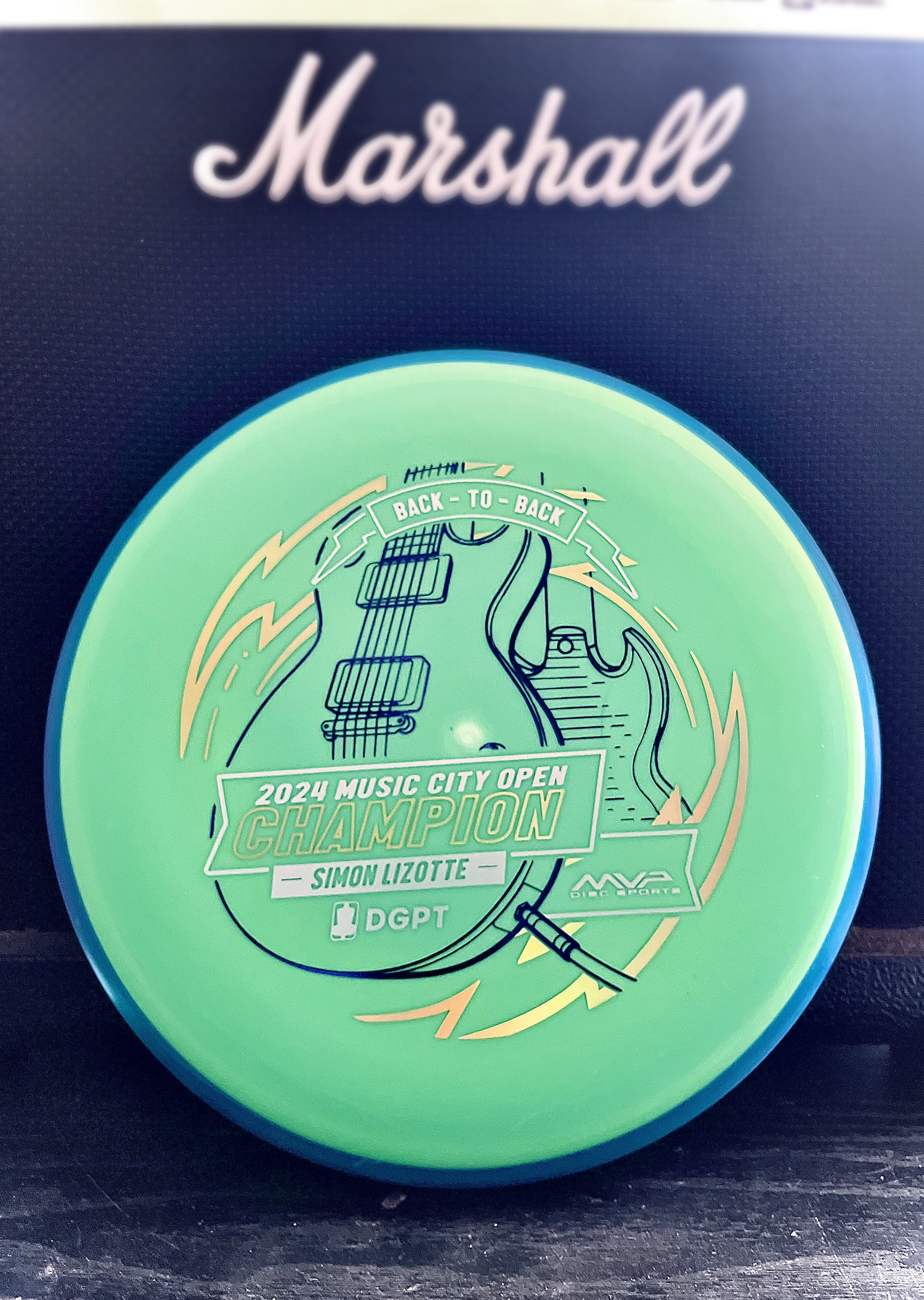
Simon Lizotte Music City Open Champion

Sunday, mid-afternoon the text came in to start thinking about a stamp. Simon Lizotte had a 2 stroke lead going into the final round. He played out of his mind and was making the proper plays down the fairway and hitting some incredible putts all weekend. We knew the Pixel would be the disc we would run. I took a quick hour that Sunday afternoon while action was kicking off to create a stand in stamp just in case. The initial idea was to keep with the theme of this year and the Les Paul. My initial blocking in was to feature the body of the guitar in simplified drafting shapes.

The decision to go with a “back to back” was universal within the MVP Disc Sports ranks. Sunday night I got on it and started gathering referencing of both front and back of the SG and Les Paul guitars. I used a mix of different library models from Google Sketchup to nail camera field of view. Mainly, it was an excellent resource to help me get both guitars on guitar stands and in proper perspective

The final stretch was adding in a sense of “flow state” which was mentioned quite a few times on the live event broadcast. Simon seemed to be in that headspace all weekend and I wanted to incorporate that element. I used radial symmetry and bolts to add the 2nd foil and consciously used the 3rd foil for the Event/ Logos/ and “Back-To-Back” banner up top. The final stamped product was dressed in dark purple metallic, gold holographic, and brushed silver foil. The custom triple foil stamp took a solid 2.5 days from start to completion.

The concept is pretty straight forward but overall, with the amount of pressure and time to get something to final, I’m pretty stoked on the outcome. Let me know what you think? How could I have done “back-to-back” differently? Thanks for stopping by.

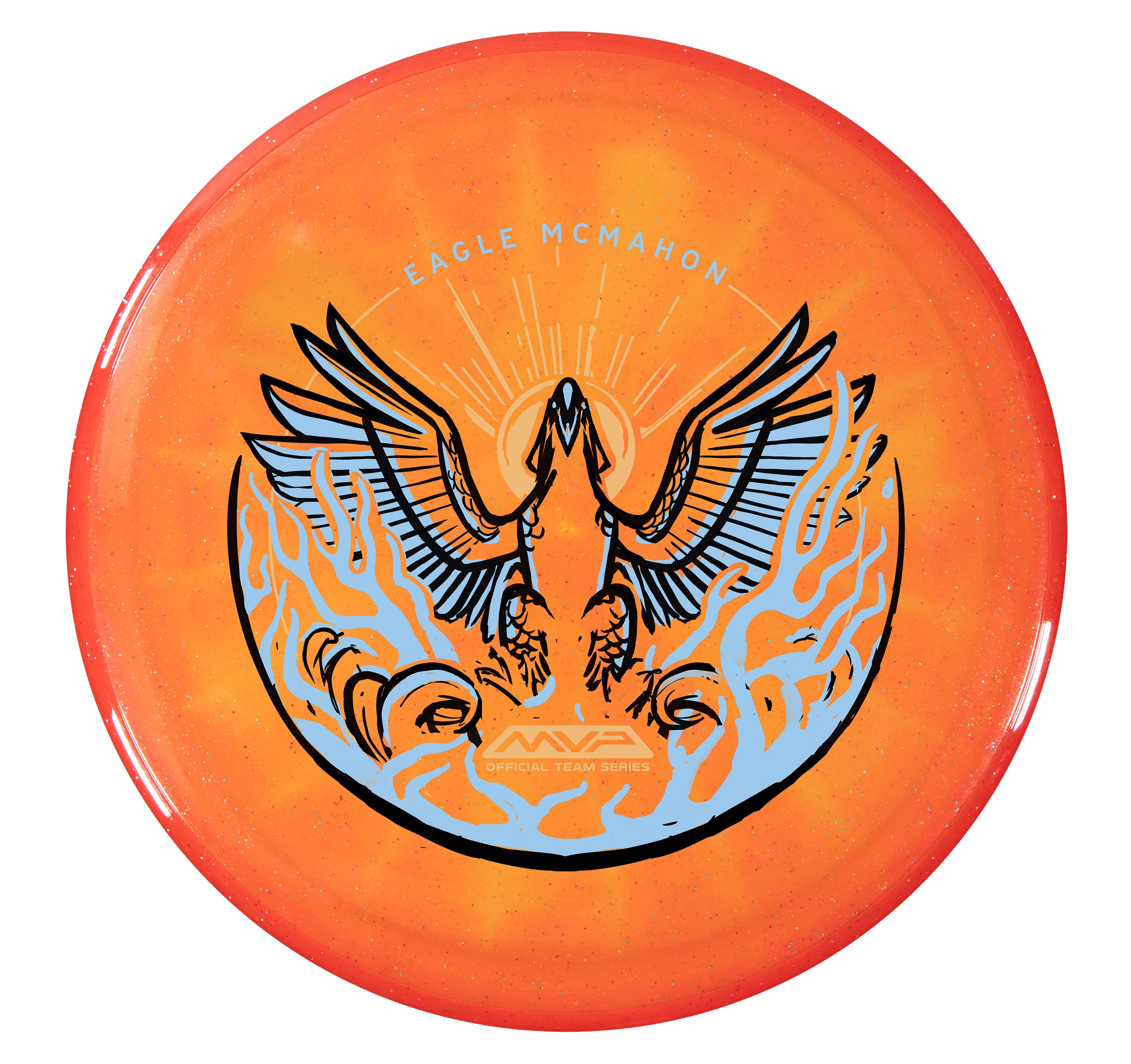
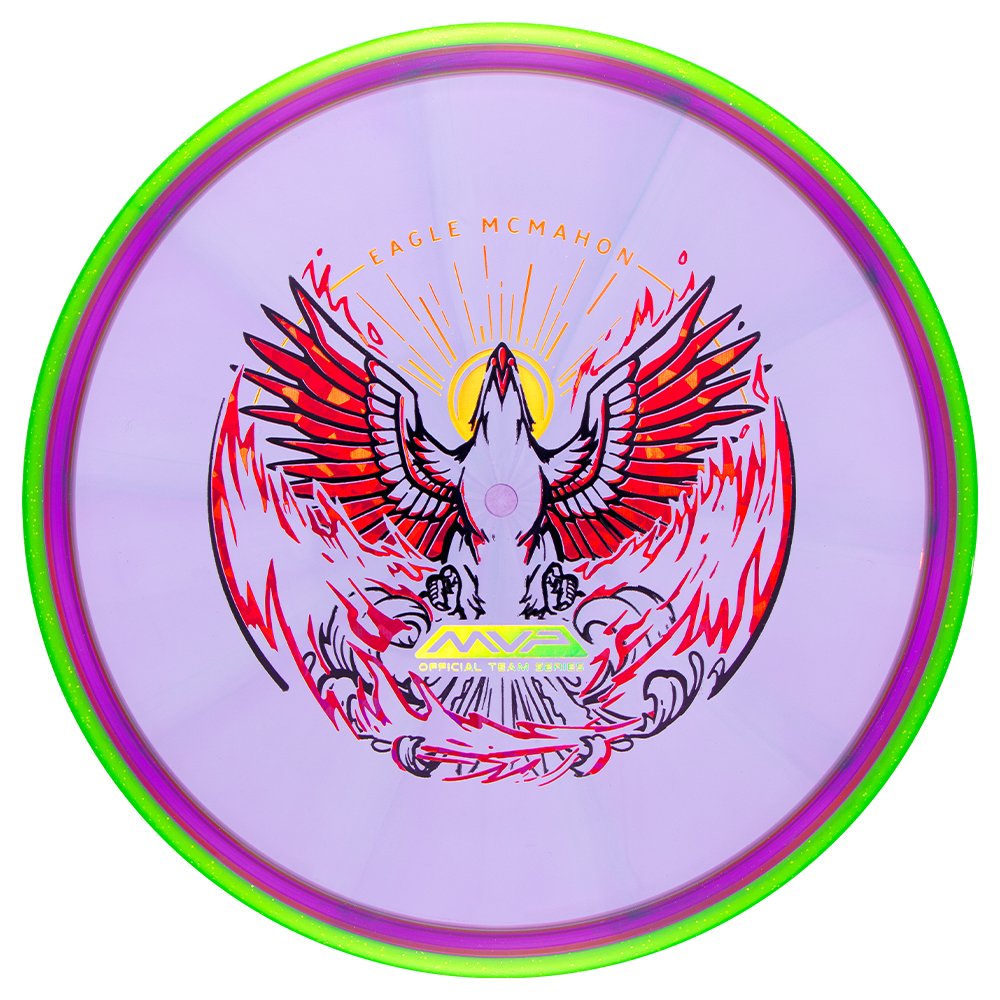
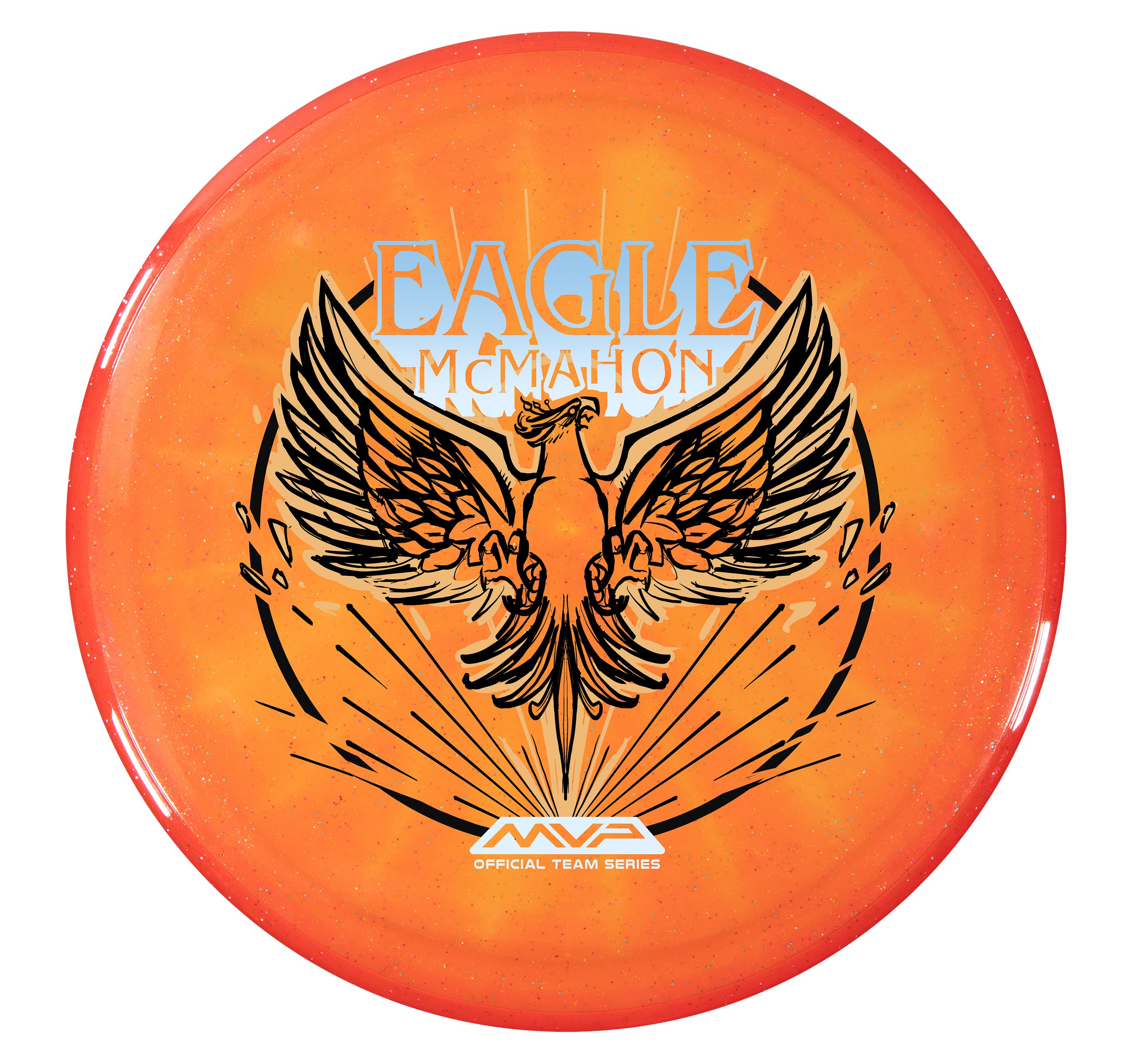
Eagle McMahon 2024 Team Series "Rebirth"

MVP Disc Sports is starting 2024 with some great Team MVP signings. One of them is Eagle McMahon! I can’t say this enough, but it was a team effort to design, film, edit, plan, and execute the Eagle McMahon recent news drop. I couldn’t be prouder to be a part of this team we have assembled. Eagle had requested in discussions that his Team Series disc be the Axiom Prism Proton Envy. Prism Proton is a combination of a Proton core with a Prism Proton rim. It differs from the standard stock Proton Envy with its Neutron overmold. It allows light to bounce through and create some remarkable results. The Envy is one of our company's most popular discs, and the Prism Proton Envy is easily one of the most gorgeous Envy’s we have ever produced.

Assignment:
To provide Eagle McMahon with a triple-foil 2024 Team Series design and to have stamped product before Eagle’s arrival at MVP HQ. At age 25, firmly in his prime, He knew this opportunity was the start of the next phase of his career. Those conversations led naturally to the concept of a phoenix, or rebirth. It was the start of something new and exciting. While this was my priority secret assignment, I had to conduct my day-to-day operations as the Art Director of MVP.

Phase 1
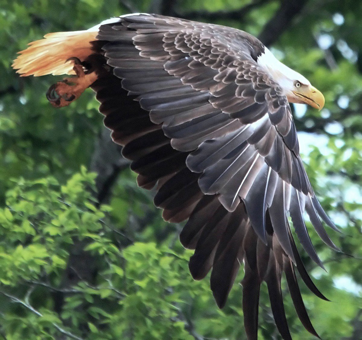
MVP/Axiom isn’t known to be a company to release anything bird-related. Where do we start? How can we work within the parameters of the phoenix lore and not create something similar to other disc golf brands? Cybernetic concepts? AI generation? The choice to use an animal has been made and redone countless times within the disc golf space. I relied on gathering references of phoenixes and eagles that displayed strong pose characteristics and unique silhouettes. While in the rabbit hole, I found references to an Eastern-style phoenix-like bird that steers toward ostrich/peacock comparisons. I felt there needed to be a sense of pomp and circumstance/elegance.

Phase 2
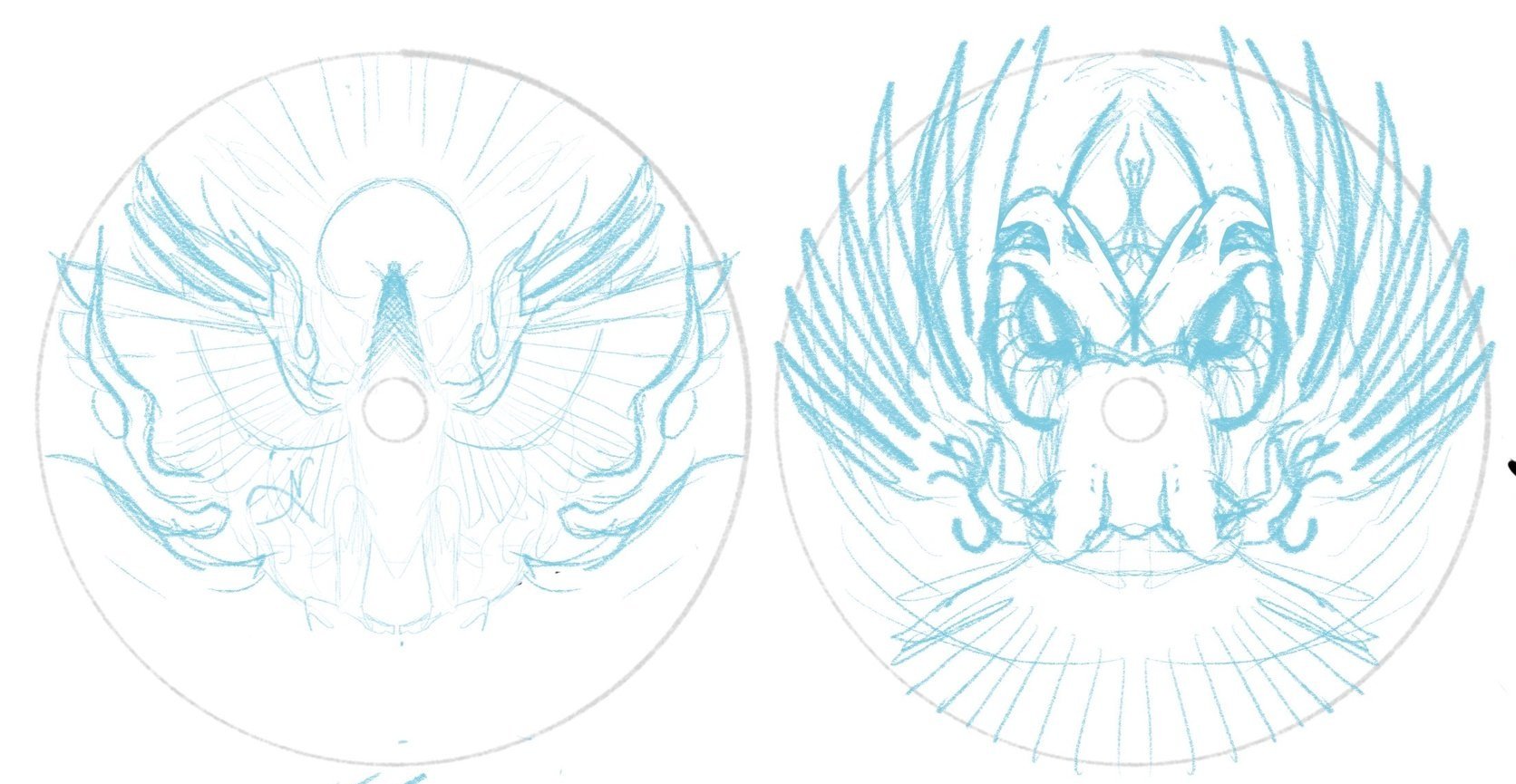
I got to work on a few sheets of thumbnails. Listening to feedback from the first thumbnail selection gave me more to chew on going into the second set of ideas. This sheet would land the bones/overall direction of the design moving forward. I brought a rough chosen thumbnail into Procreate and started to figure out bird, text, and logo placement within the stamp. There are standards for the Official Team Series seal with a minimum stamping size of 10mm tall, and I knew from the jump that those were must-haves. Going from loose drawings to idealized structure (mocked onto discs) helps show ratios and how the design feels with the characteristics of the plastic.

Phase 3
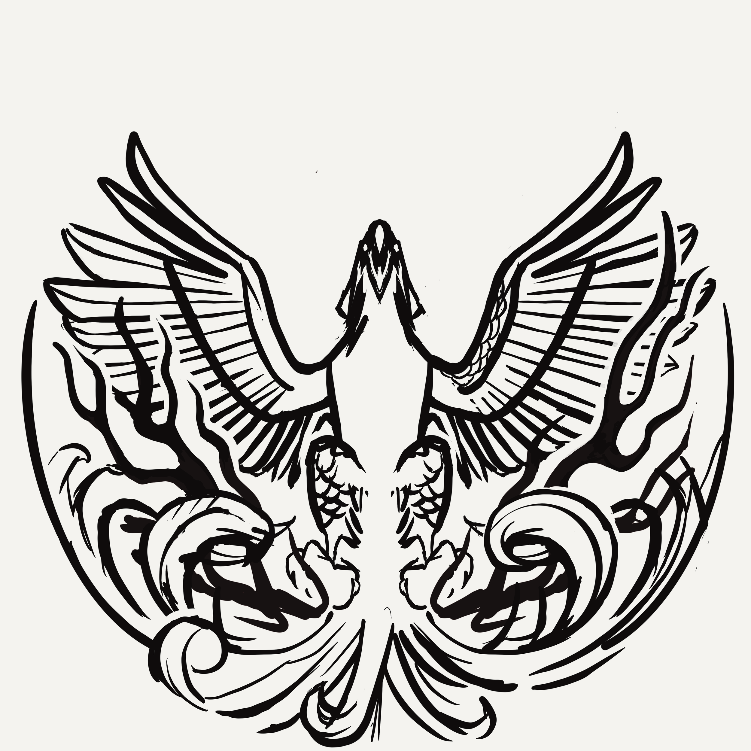
I learned a lot about Eagle during this first project. He wasn’t the biggest fan of his name taking up so much space as I initially thought we needed. We opted for a smaller footprint. The head facing to the right side offered the best silhouette value. Overall, leaving the head looking off to the side felt commonplace with the reference I’ve been seeing. Looking upward and straight on felt more engaging and powerful, so I continued with that mindset. We entered a more polished stage. I started thinking about all three foils. Eagle was pretty jazzed, and we all felt this was the final direction.

We were at the 80% mark when I felt the flames didn’t replicate the excitement/buzz going into 2024. In a traditional sense, the vibe fits more with the Eastern/traditional style fire. While working through the final ideas of the bottom stamp rocker, I realized that the airfoil caused by a bird rising from the fire would create a bit more disturbance. Adding more lateral energy helped add dynamics to the bottom portion tenfold.

The Final Phase
The last part to do was to finalize line quality, start placing the assets into the custom template, and work through final line detailing with stamping guidelines in mind. This design had to have little to no issues on the day they tested. It needed to work consistently for whoever was running the stamping machine at any point.

The Eagle McMahon “Rebirth” Team Series discs will include gold holographic foil, red holo foil styles (shatter, dots, and vertical holographic lines), and a black outline. I’d like to thank Eagle for his attitude and pure joy during this process. It aided in the extra hours needed to finish this. I’m beyond excited to see these out in the wild and can’t imagine what 2024 has in store for MVP Disc Sports. I hope you all enjoyed and feel free to ask any questions. Thanks!

2023 PDGA Membership Discs

In mid-summer of 2022, Vic Allen reached out to me to ask if I’d be interested in taking on the 2023 stamp. On the table were the Membership, Birdie Club, and Ace Club discs. These discs were slated to be stamped on black R2 (MVP’s recycled line) Craves. So with that in mind, you’ve got your black line layer on the flight plate which allows you 3 colors to accent that. It’s a different way of thinking with stamp design but a fun one.

I’d noodle in my sketchbook for about a week or so when Vic came back with an idea to possibly do a collaboration with John Dorn. John has been doing disc golf/ frisbee stamp design for decades. He had recently created the 2021 Relay Turtle stamp that went over really well. I jumped at the opportunity, hit up John Dorn on a phone call to work out the pipeline, and we got to work.

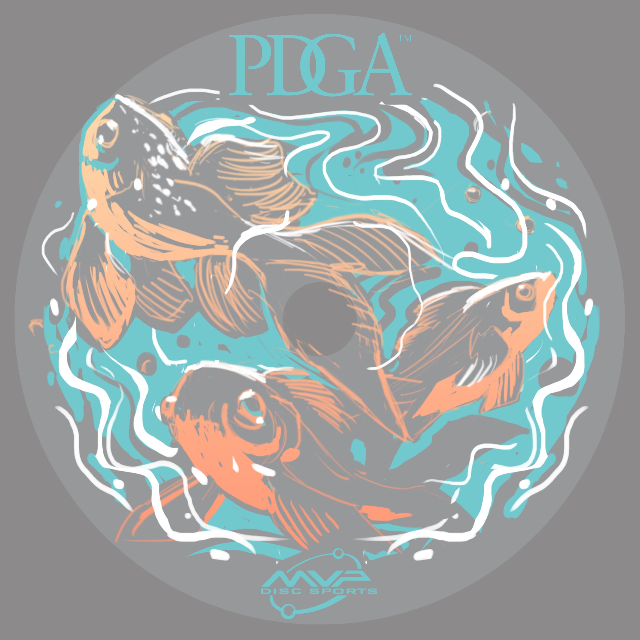
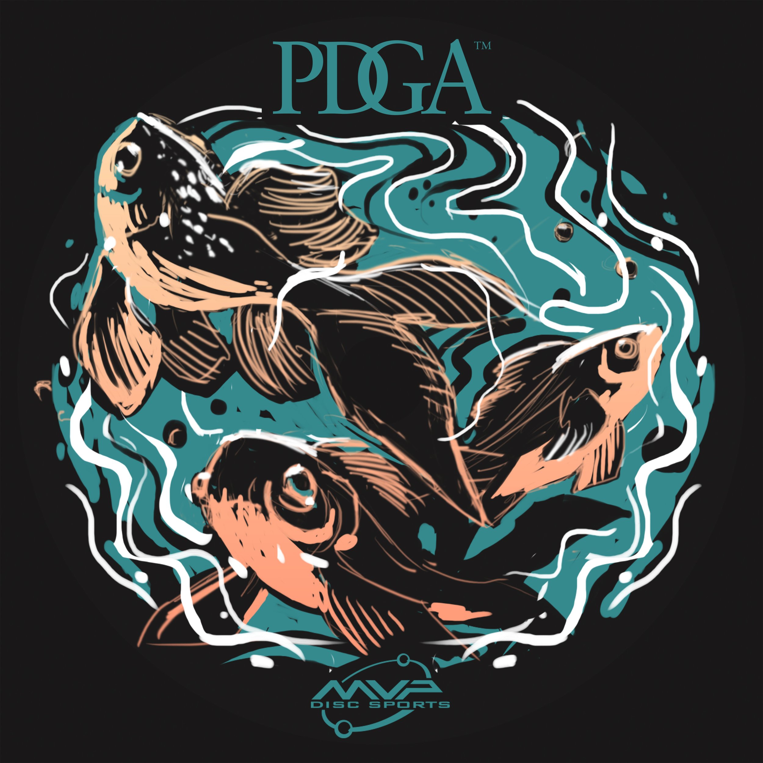
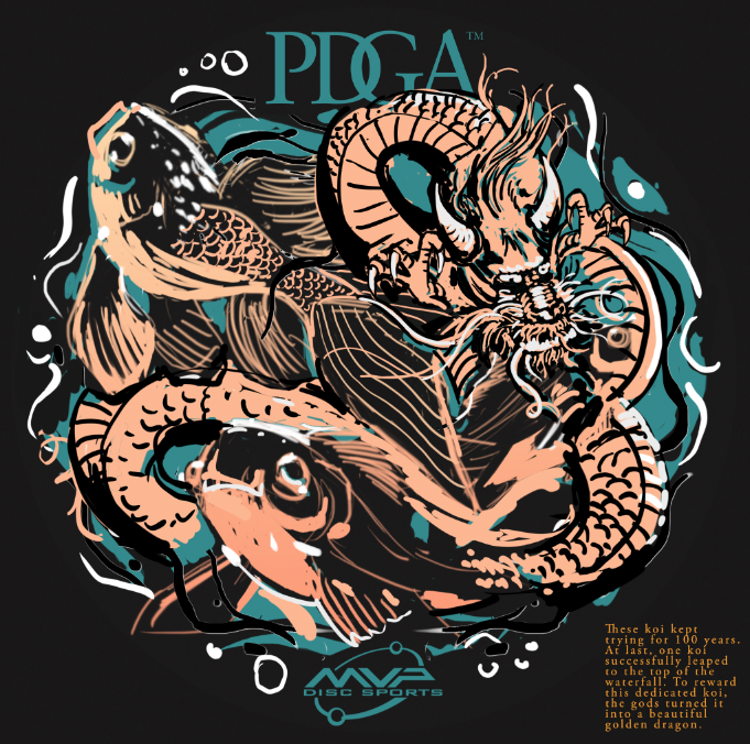
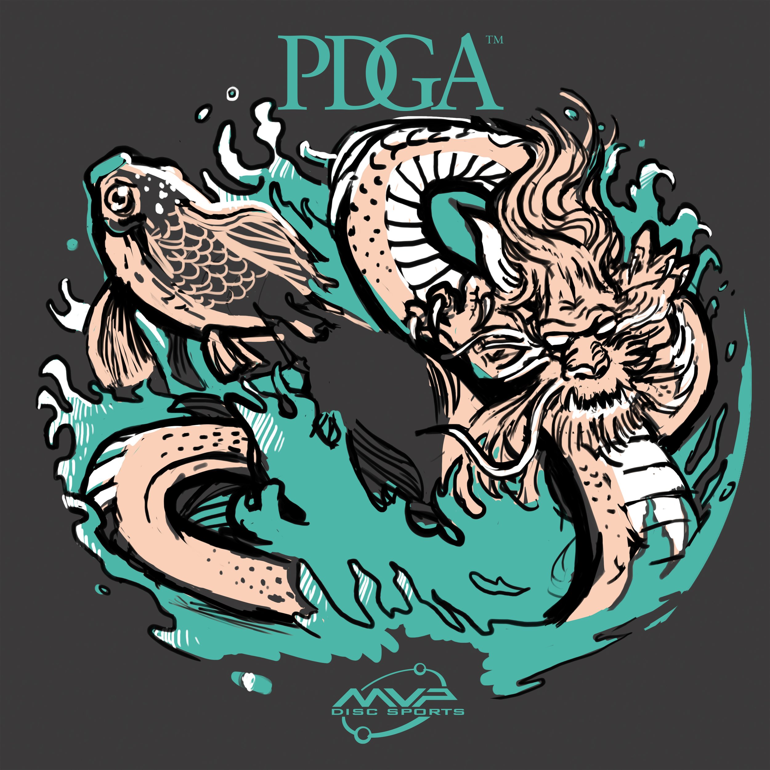
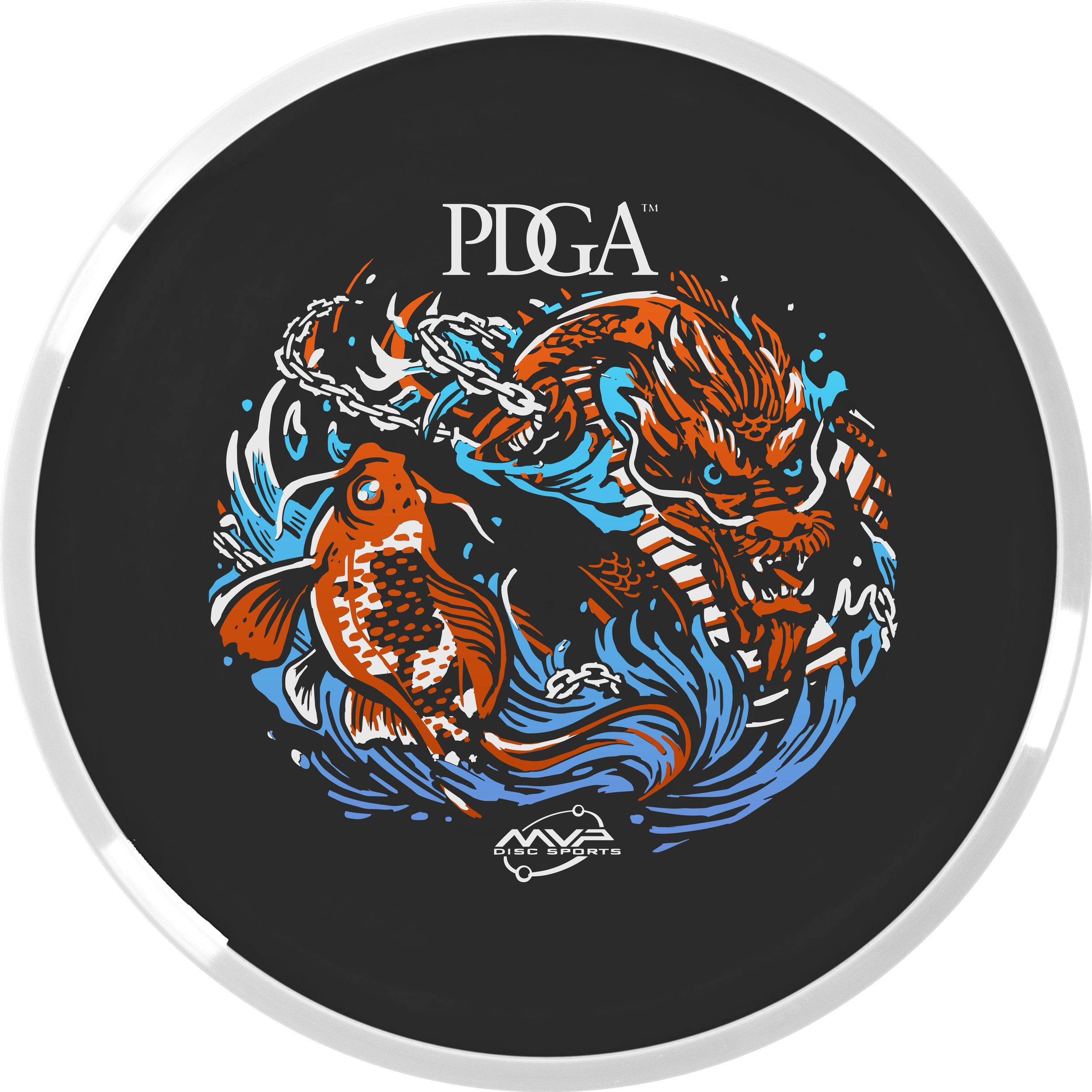
2023 PDGA Membership Disc: Koi Dragon

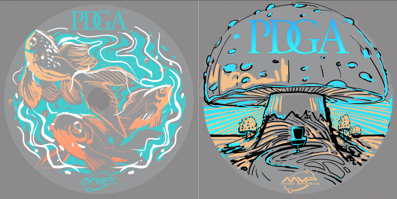
The Koi Dragon stamp started off as 3 fish swimming aimlessly in a fish bowl. After passing off this thumbnail to John, he added in the dragon and explained the story of how a Koi fish turns into a dragon. I thought this was awesome and definitely gave a jolt to this concept. John passed the concept back and it was my turn to dilute some of the noise and chaos happening and to bring this illustration home into 3 foil form. It took a bit to do that. The dragon was giving me fits. I probably redrew the dragon 2 or 3 times until I was happy with it.

The last edit going into the final phase was adding the important disc golf element. To do that, we came up with the solution to use a basket silhouette within the koi and include chains within the watery mix. I think this design turned out great!

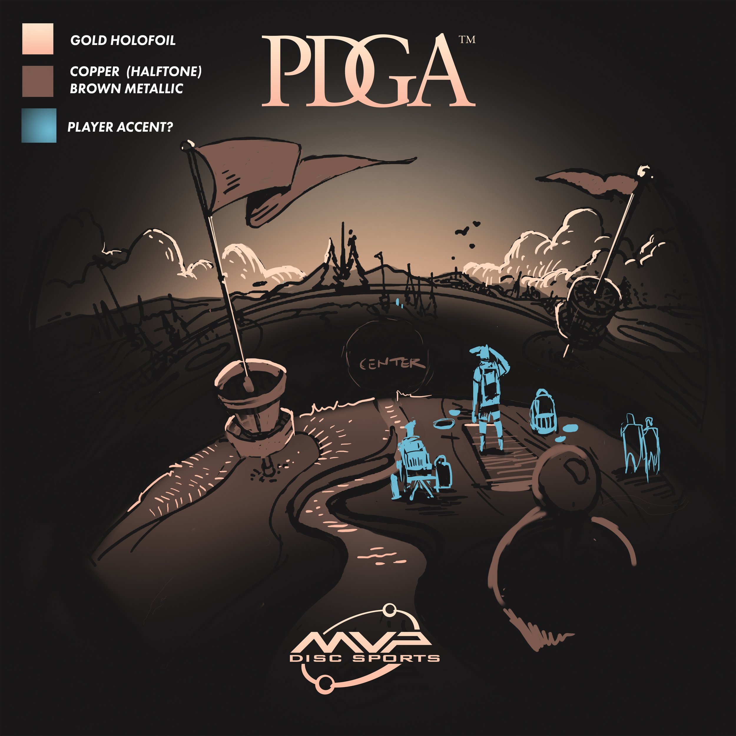
2023 PDGA Birdie Club:

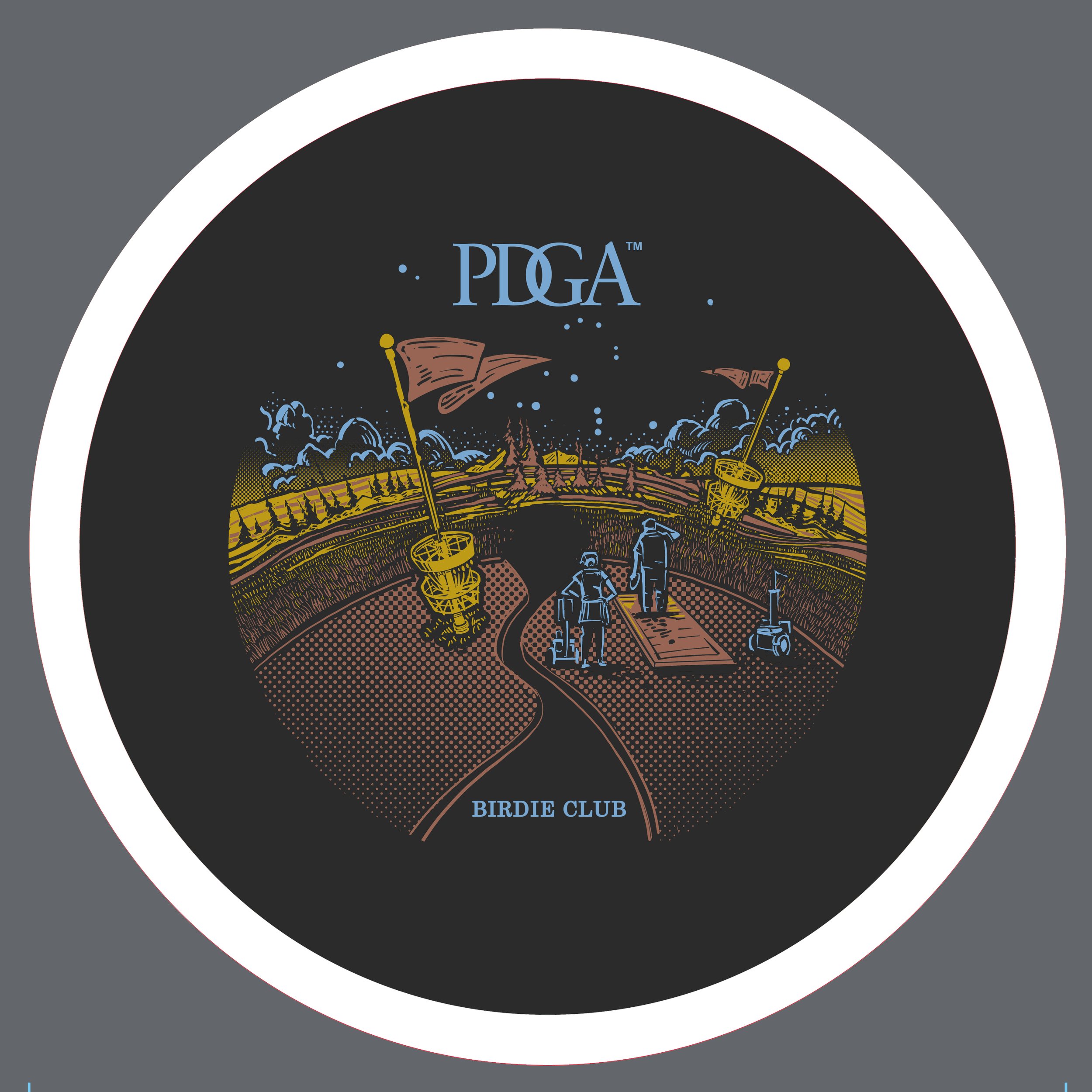
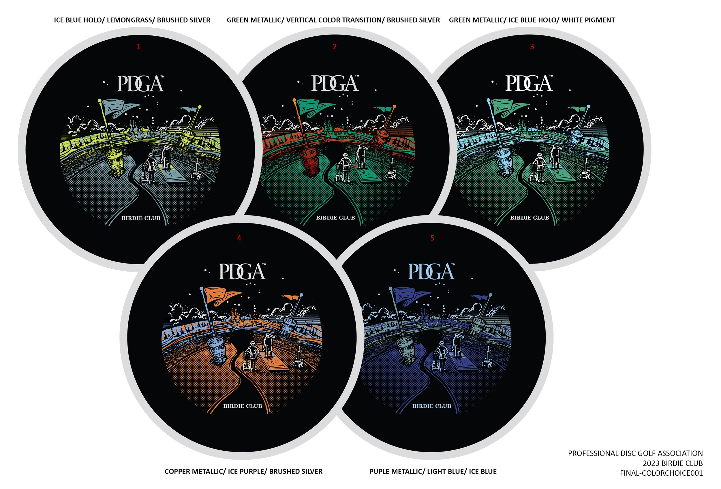
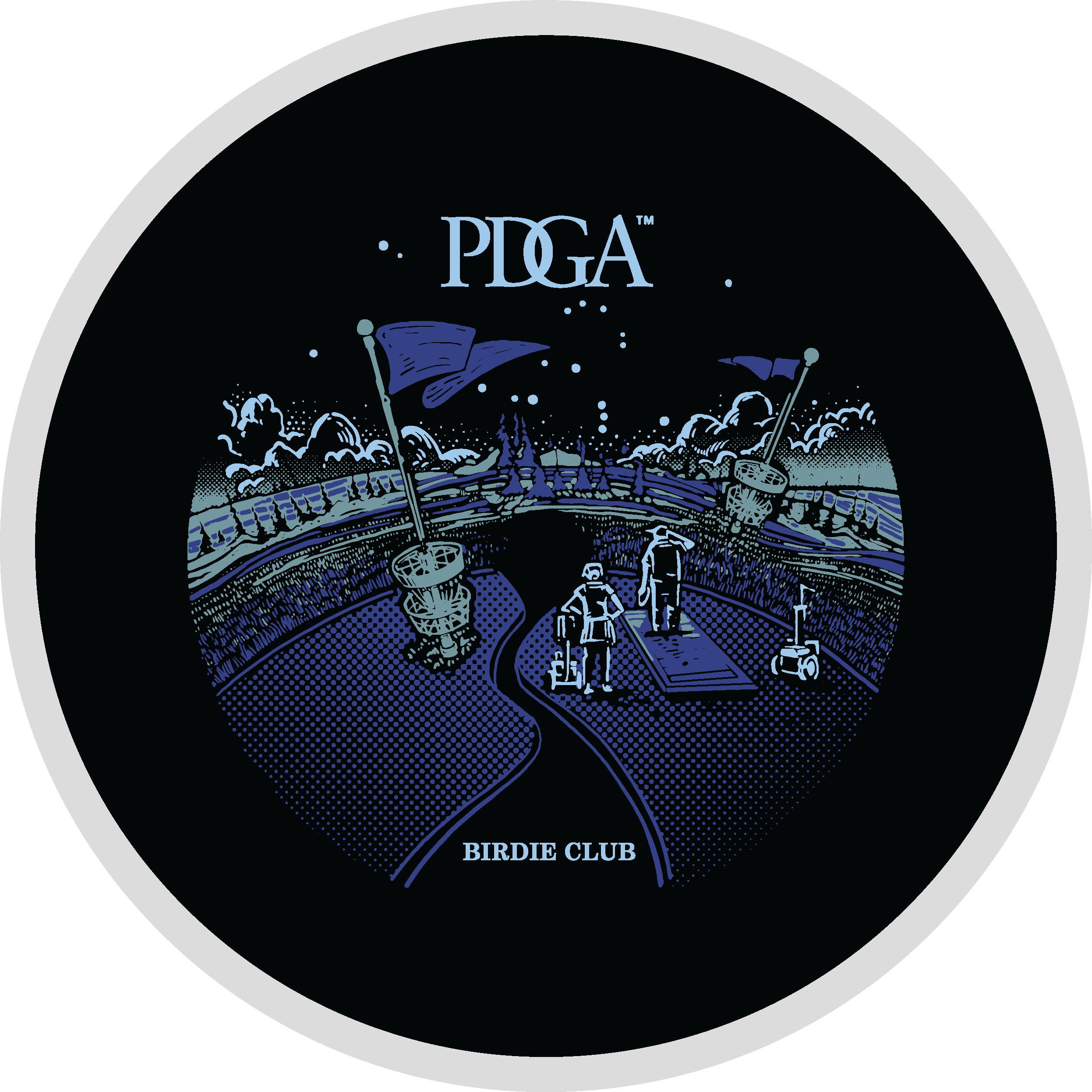
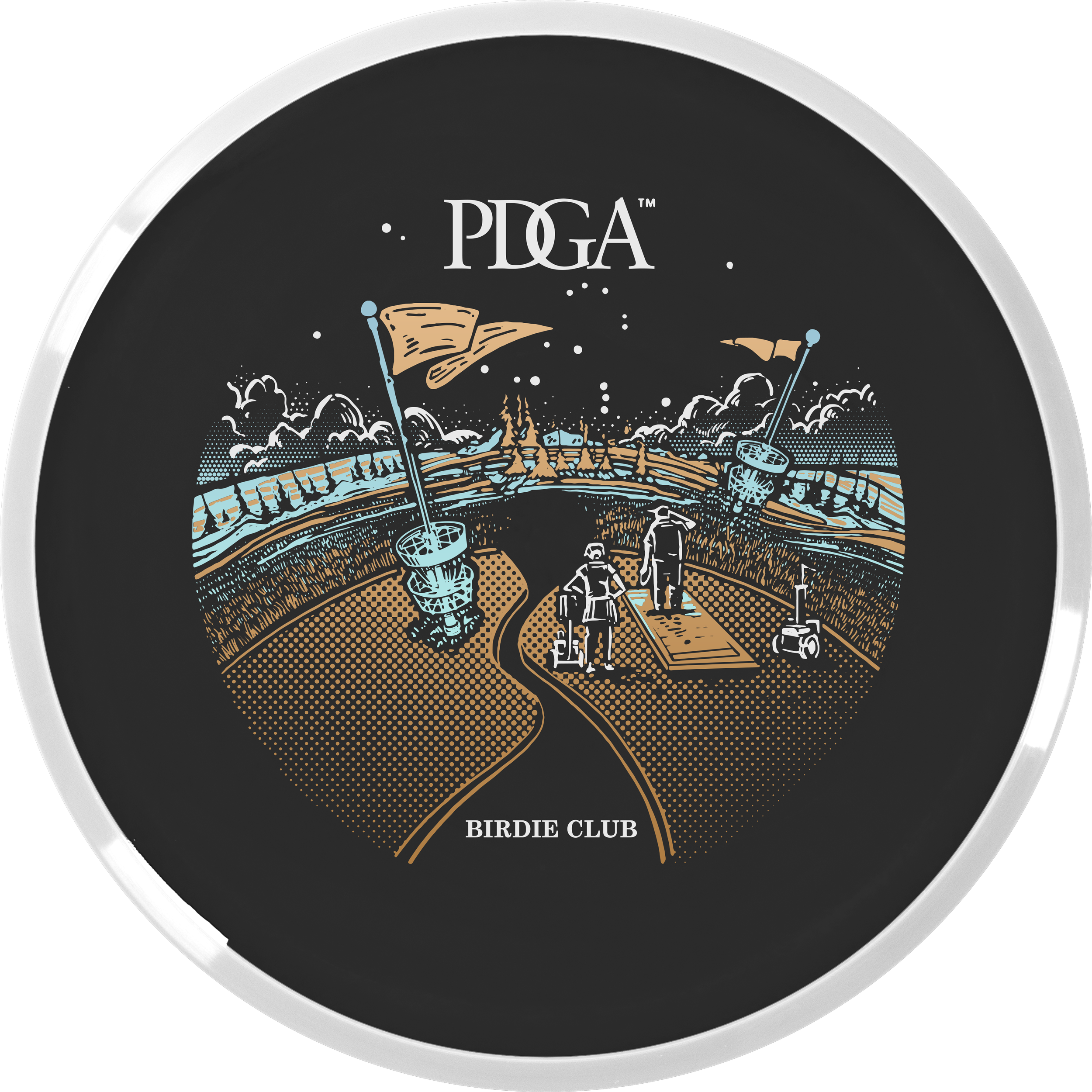
John started off with a super strong line drawing thumbnail for Birdie Club. When we passed off our designs, my first objective was to get this on a black background and start figuring out how this was going to work with foiling. I used gradients to John’s strength. He has a printing background and uses a halftone pattern fill for heavier parts of a design. I thought this could be a great way to blend the stamp into the dark flight plate. I thought that while the visual landscape was interesting; we needed characters navigating the course. That excitement of playing a disc golf course you’ve never played before. This felt very much like a dreamscape to me.

2023 PDGA Ace Club:

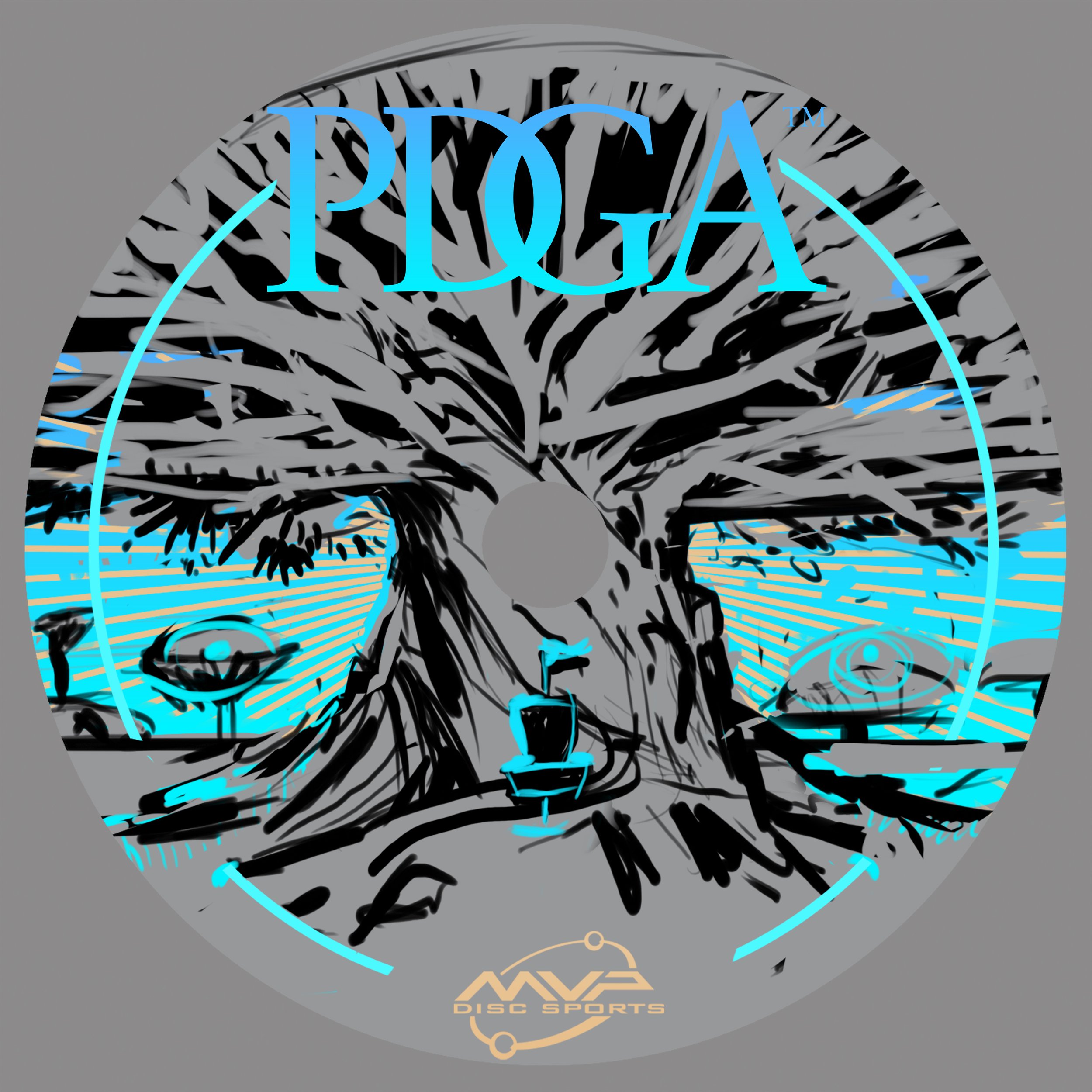
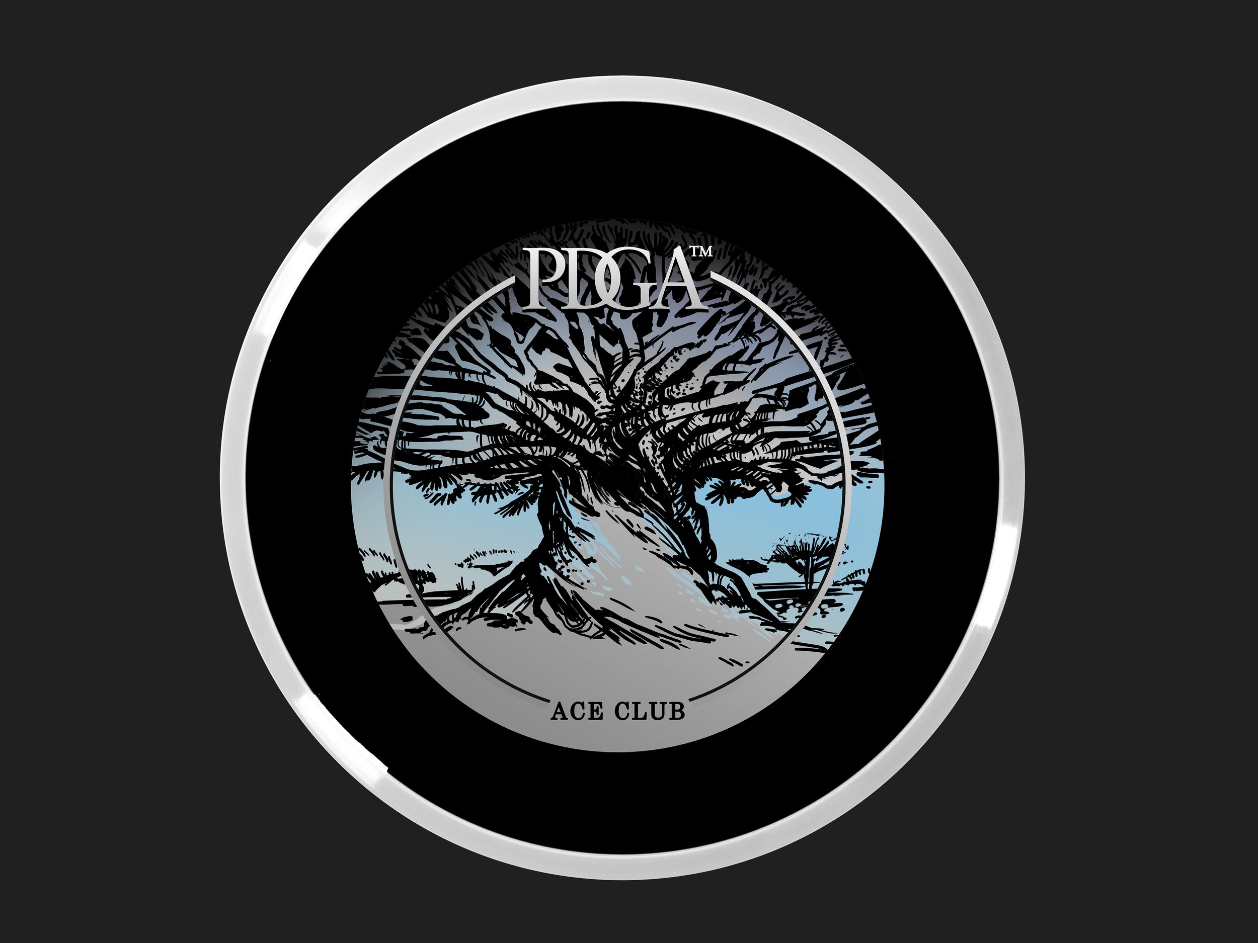
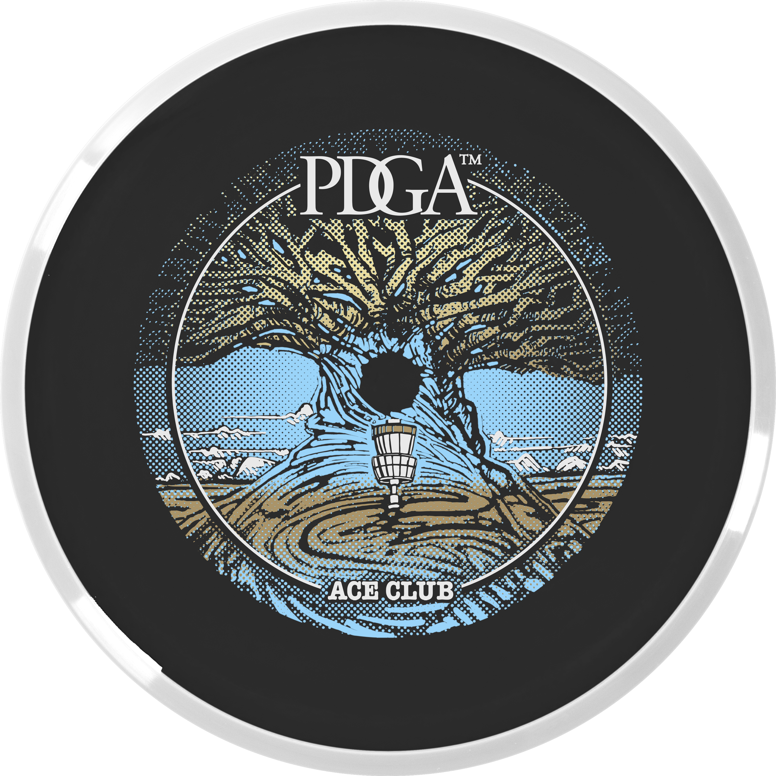
This Ace Club design started with a pretty strong photo from the known photographer, Beth Moon. The reference pulls from a dragon’s blood tree from Socotra Island. I love the umbrella-like silhouette and rigid shape of the canopy. It’s from there that I ventured away from the reference and put a more massive trunk like a very old oak tree. A combination of two ideas. John took then took my thumbnail idea and placed the basket and swirling root/ whimsical touch in the foreground section. We moved away from the gigantic mushroom because we didn’t want to show any psilocybin/ drug references as a PDGA offering. The absolute biggest hurdle with this stamp was the clipping area around the tree. Using the black R2 core to help with coverages and getting the correct foil gradients to do that work for us.

I just want to finish this by thanking Vic Allen for giving us the opportunity. It was a rewarding experience working alongside a disc golf design legend, a specific dark core color, and having to think about foil properties early on in the development stages. It helped us solve a lot of those issues before the Rough/ final phase of the artwork was to be addressed. A few stamp tests had to be sent to the PDGA before the final foils were chosen. I want to personally thank Ian Palmer for handling those logistics and collaborating to make sure we have the best foil represented on these. If you have any questions, feel free to ask below! You can actually purchase a Membership disc with your PDGA Membership renewal for $20!

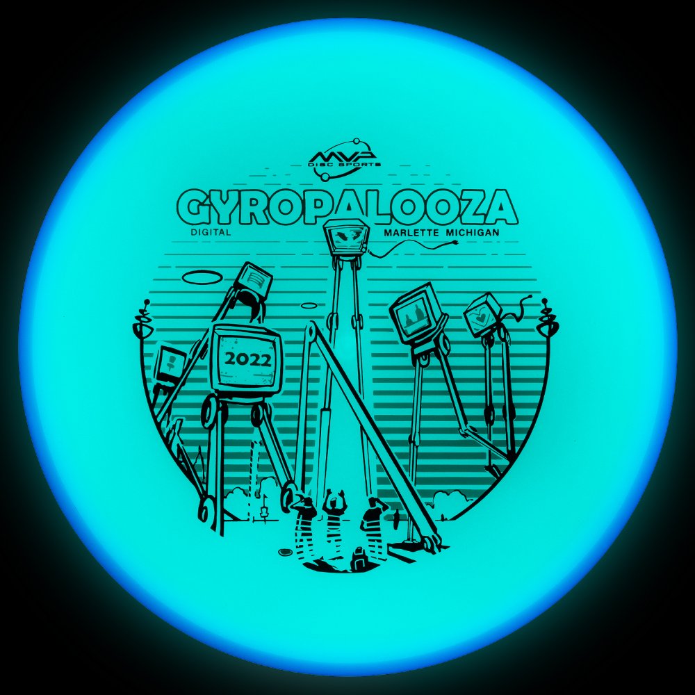
2022 Gyropalooza Total Eclipse Proxy

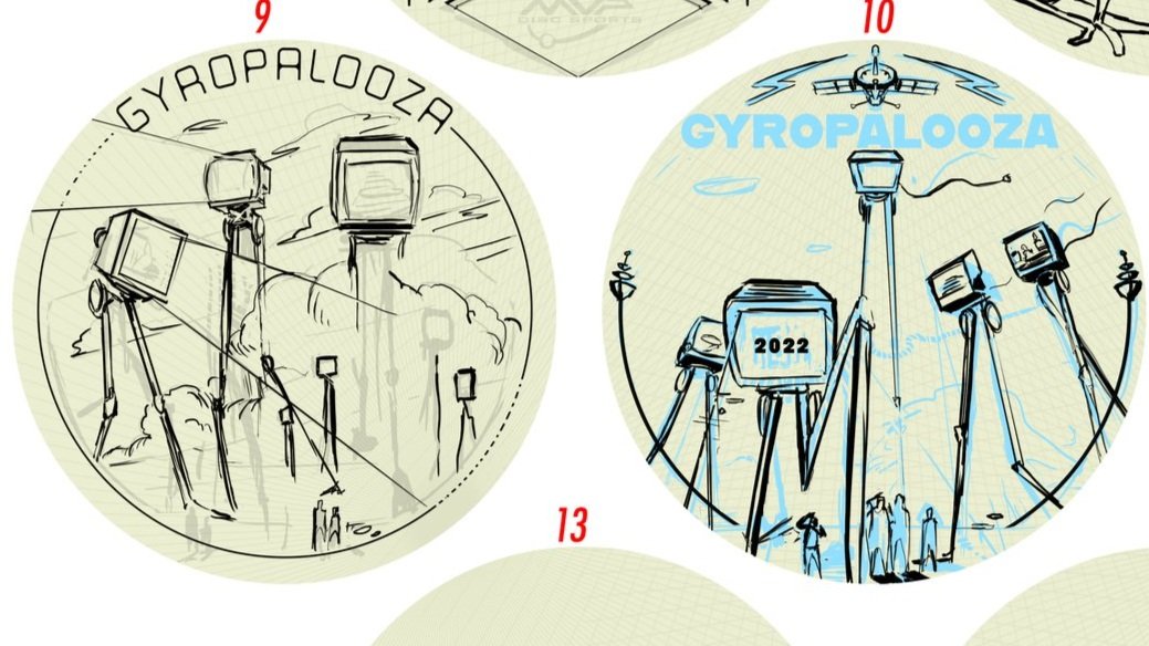
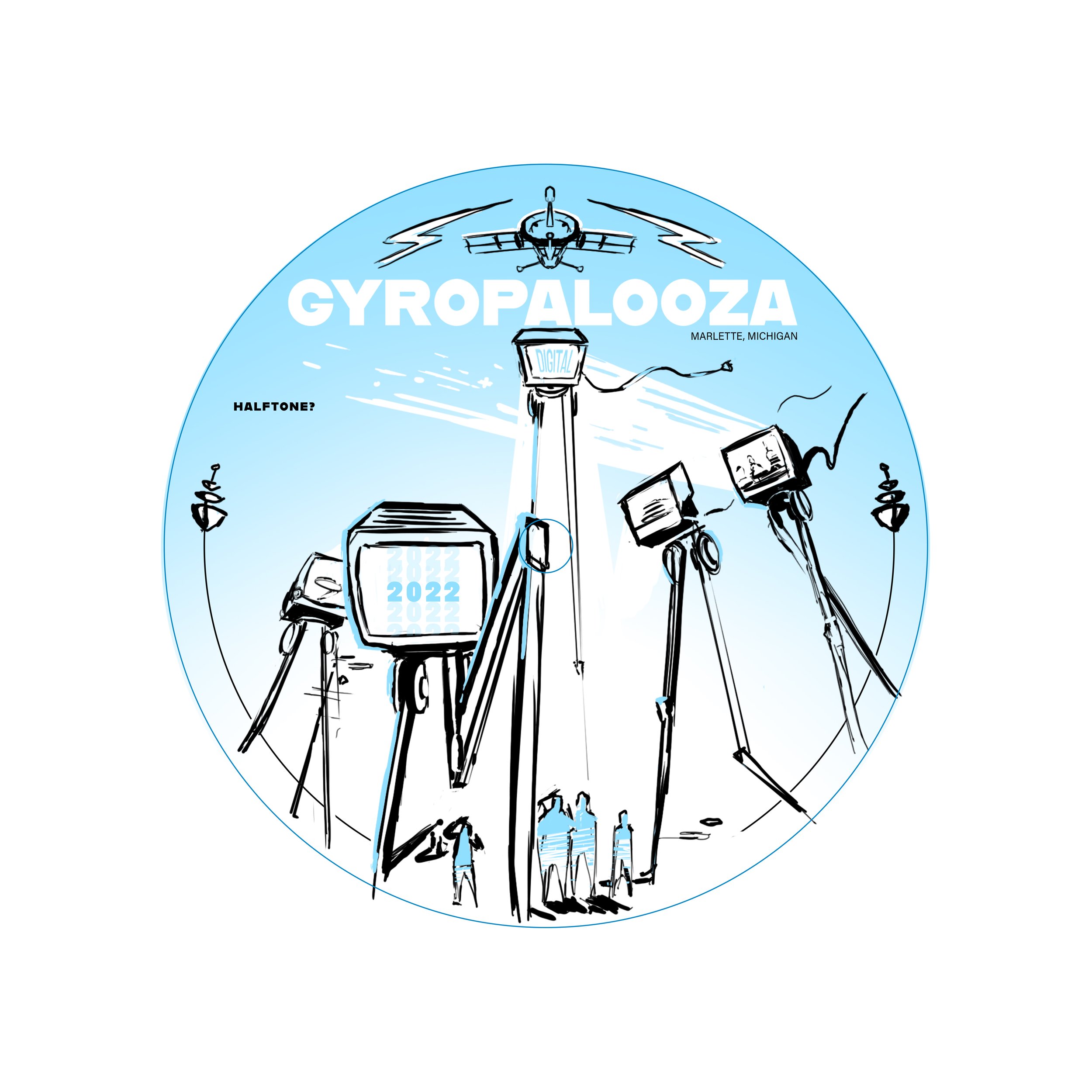
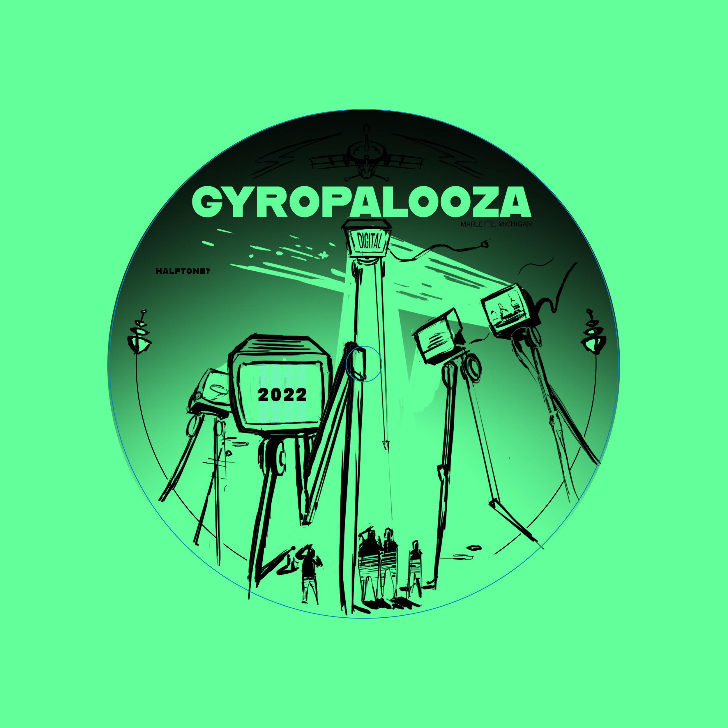
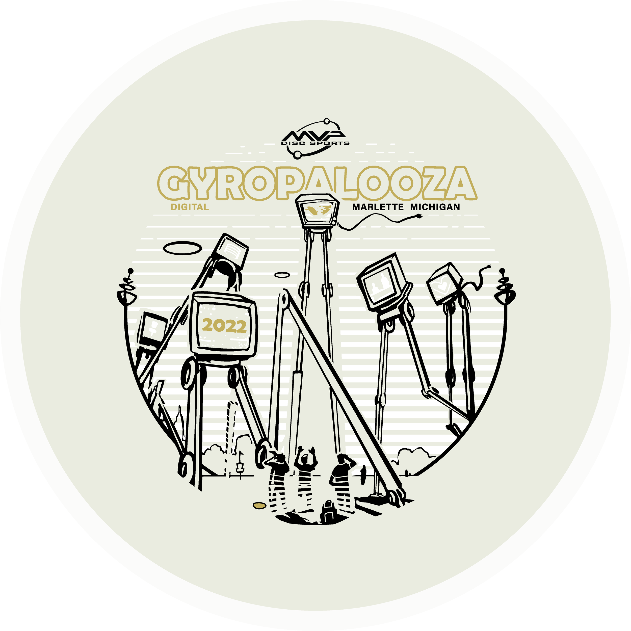
The 2022 Gyopalooza brings something pretty exciting. We had a new Total Eclipse glow technology in the lab awaiting its release. The Proxy is outfitted with both an Eclipse™ Glow flight plate and Eclipse™ Glow Rim. Colors vary from white, aqua, green, blue, and purple with a multitude of different combinations.

The Idea: I had this image in my head but instead of being an intimidating alien species laser-stomping everything in sight, they were dispatched to broadcast exclusive MVP content and news to the Gyronaut masses! All of this sounded great but the important goal from the get-go was not to hinder the glow properties. I think it’s important to design stamps with disc plastic in mind. If the glow is an important draw, why would you cloud it up with foil? Lastly, by setting up a two-point perspective grid, it gave me a great base to lay down that looming presence of the tall beings. There are still a few MVP iconic themes scattered about.

I wanted some of the TVs to engage with the local disc golfers. It was a good placement for “2022”, discs, and a Brad/Chad silhouette we’ve come to know so well these past digital versions of Gyropalooza. Lastly, the last and most important icon located on the far right represents a huge love for all of our fans who’ve stuck by us from the very beginning through the years of rapid growth. I love to infuse emotive characteristics in robots. Allowing robots to have a bit more life and curiosity like our human race. Lastly, I wanted the center alien bot to have its glow casting on the disc golfers underneath. I used a line screen in the background to enhance that particular element. Doing that for every TV would’ve clouded up where I wanted the focus to go.

Hot Stamping Foils: I’m a sucker for white pigment foil because of how bright the Eclipse glow plastic is. It allows some of that color to seep through and gives the glowing state a bit more depth. The accent color is a classy nod of brushed gold that allows it to pop off of that core plastic color. Again, it’s important that the accented foils work alongside the others during the glowing state.

Can’t wait to get some of these in my hands. MVP took their industry-leading glow and just made it better. I don’t get out and play glow rounds very often but this disc makes it tempting. What are your thoughts? Excited to see these in the wild? You can get your 2022 Gyropalooza pack from any reputable MVP dealer. Included will be this Total Eclipse Proxy, a Prototype Eclipse Color Glow Envy, and Lab Second discs for a pretty good price. Thanks for tuning in!

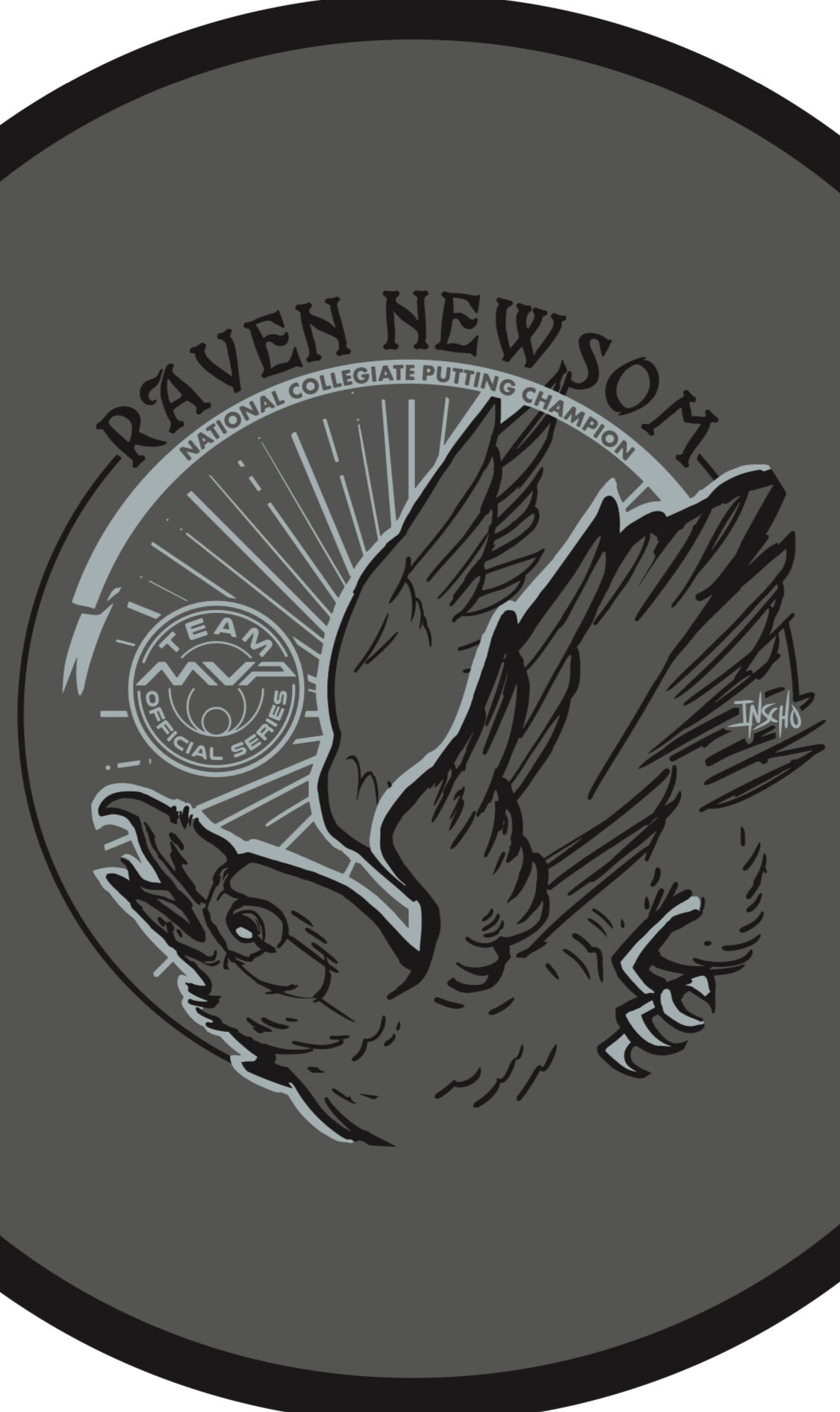
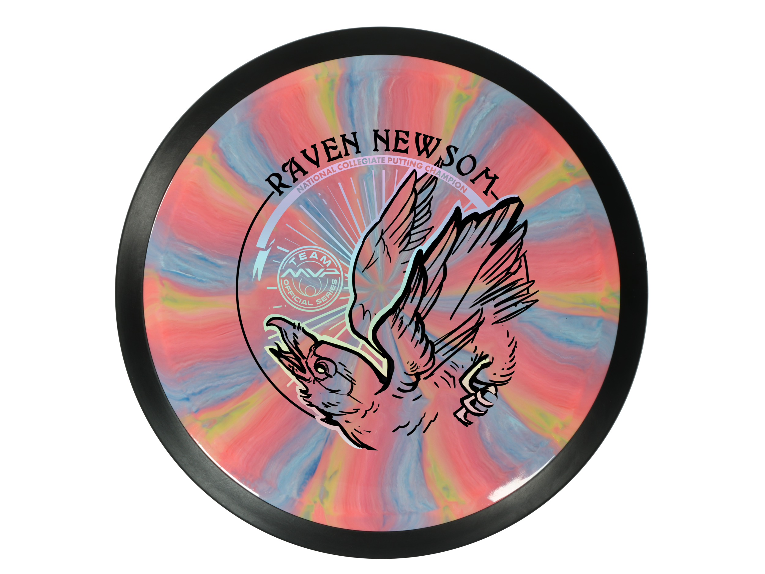
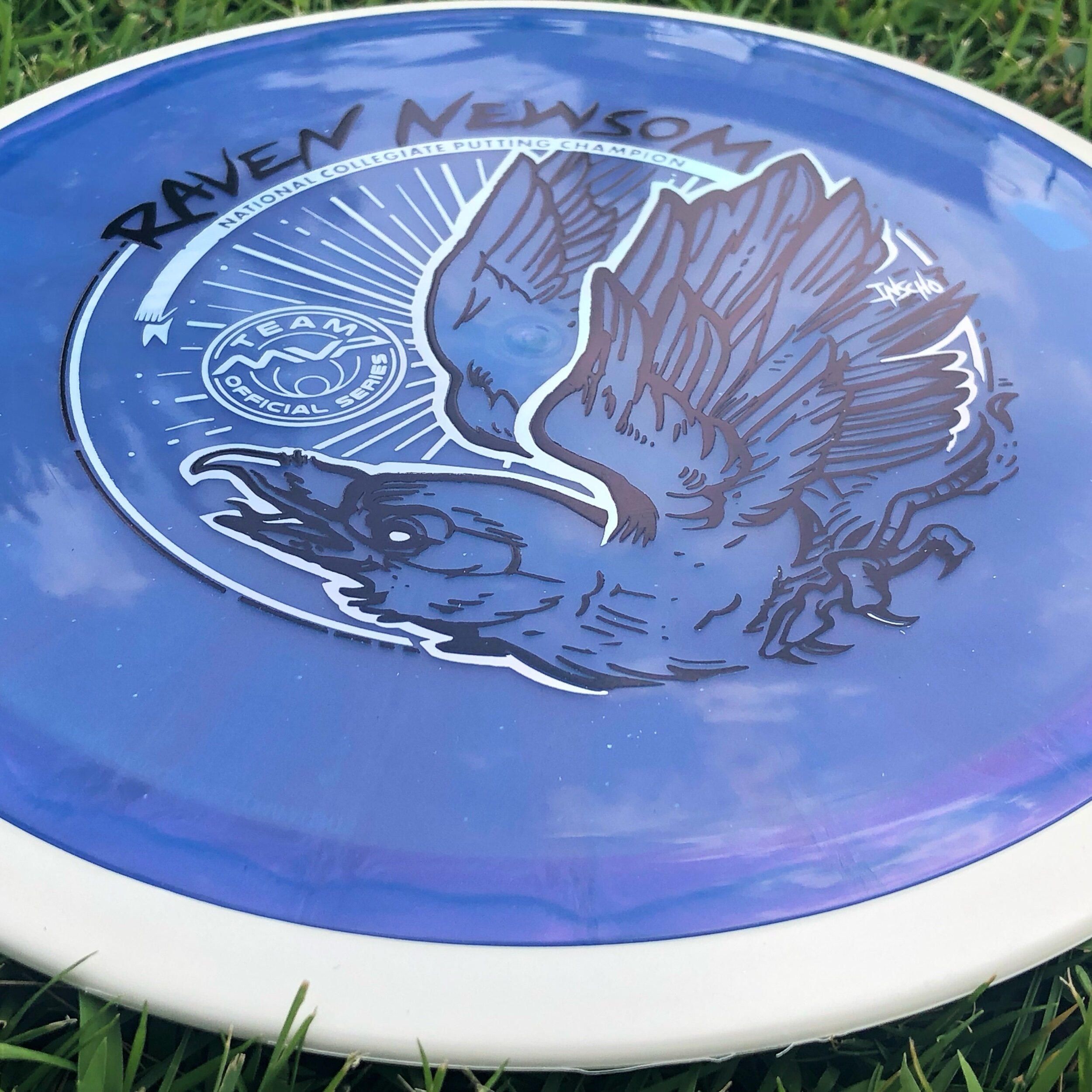
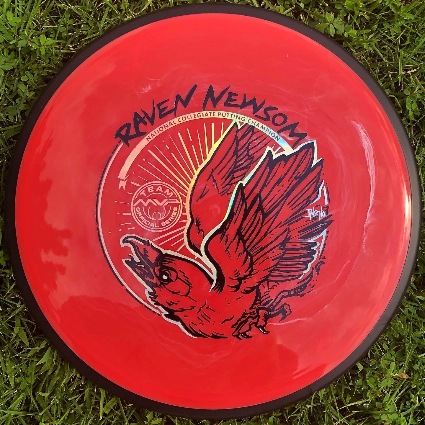
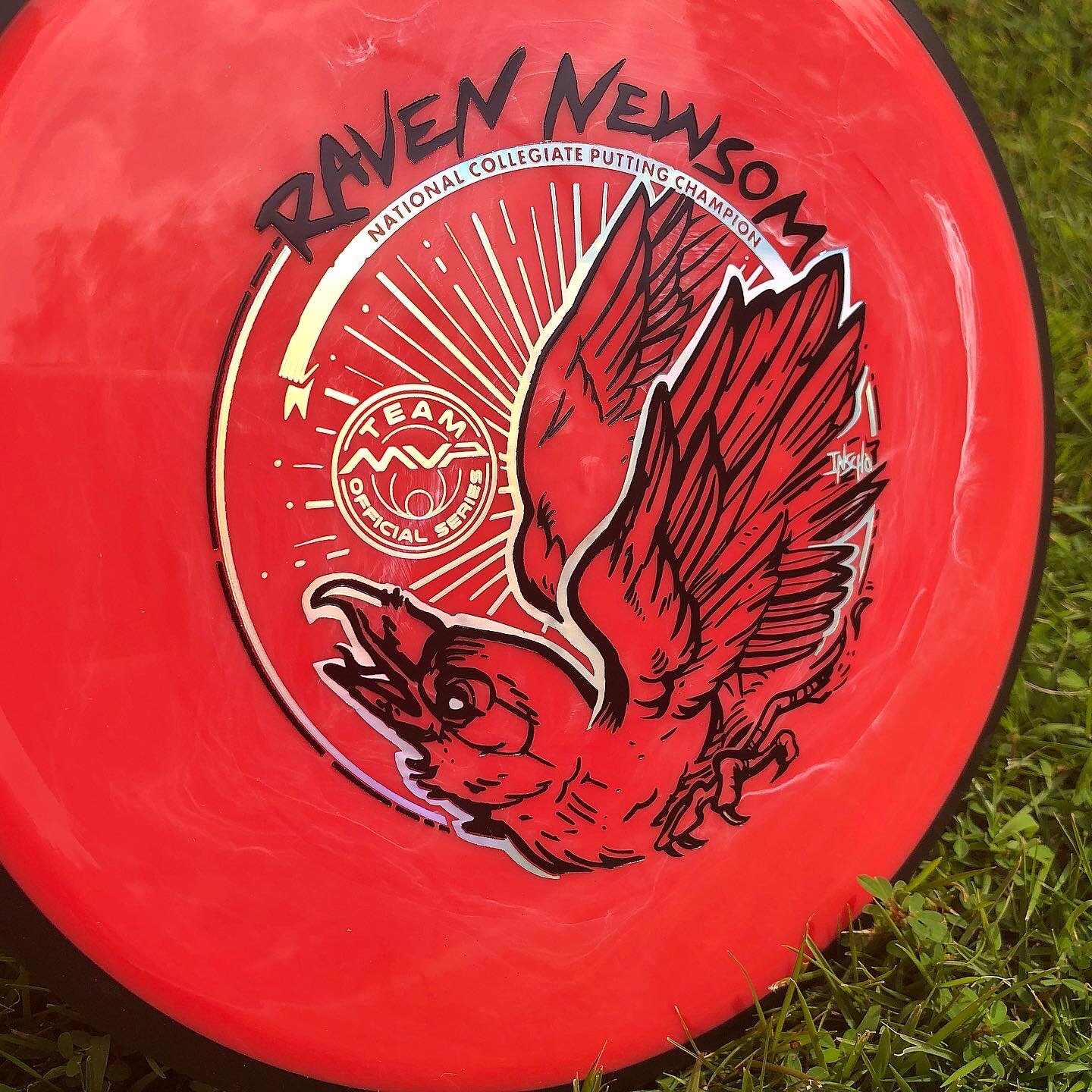
Raven Newsom - 2021 Tour Series

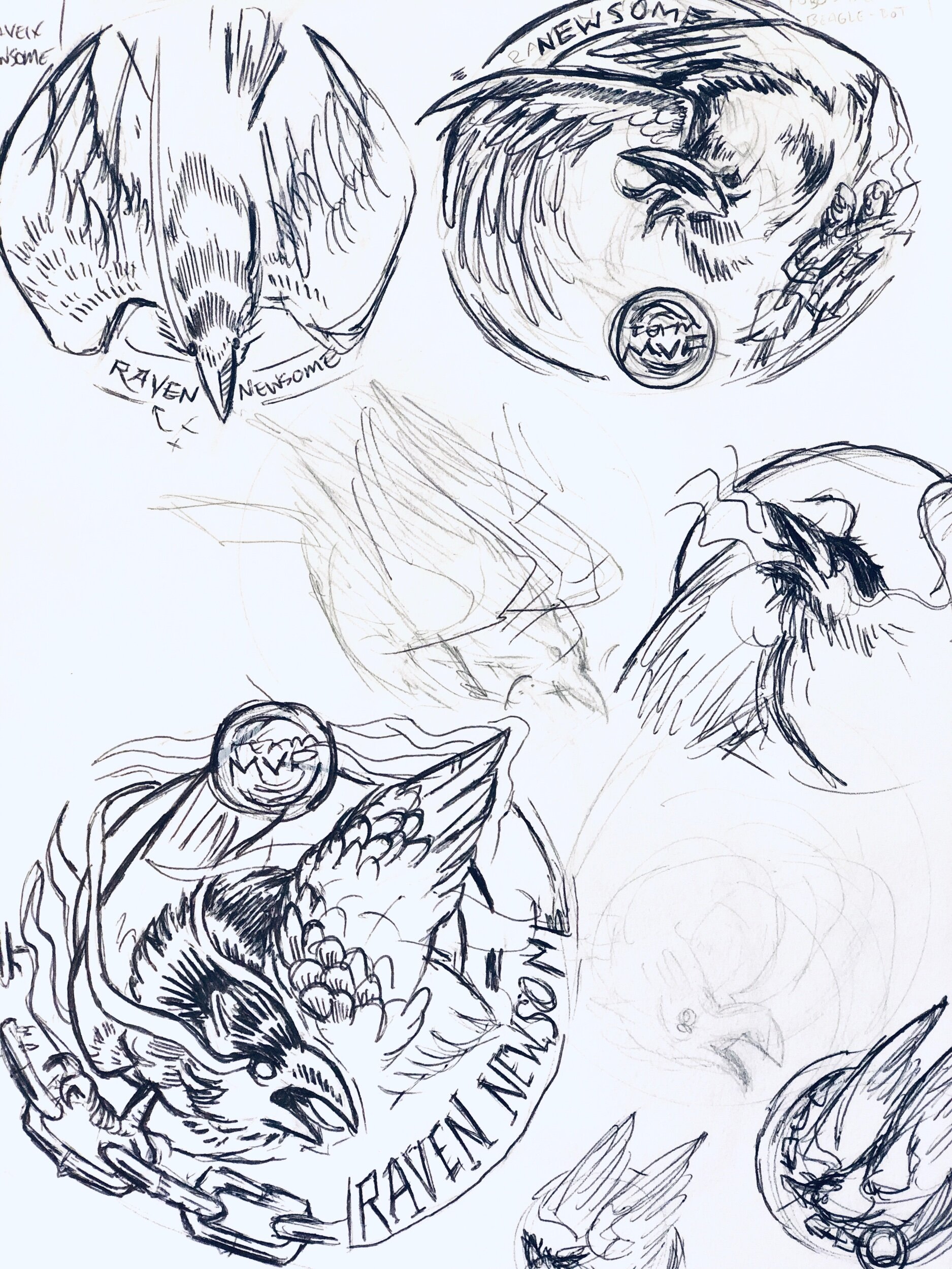
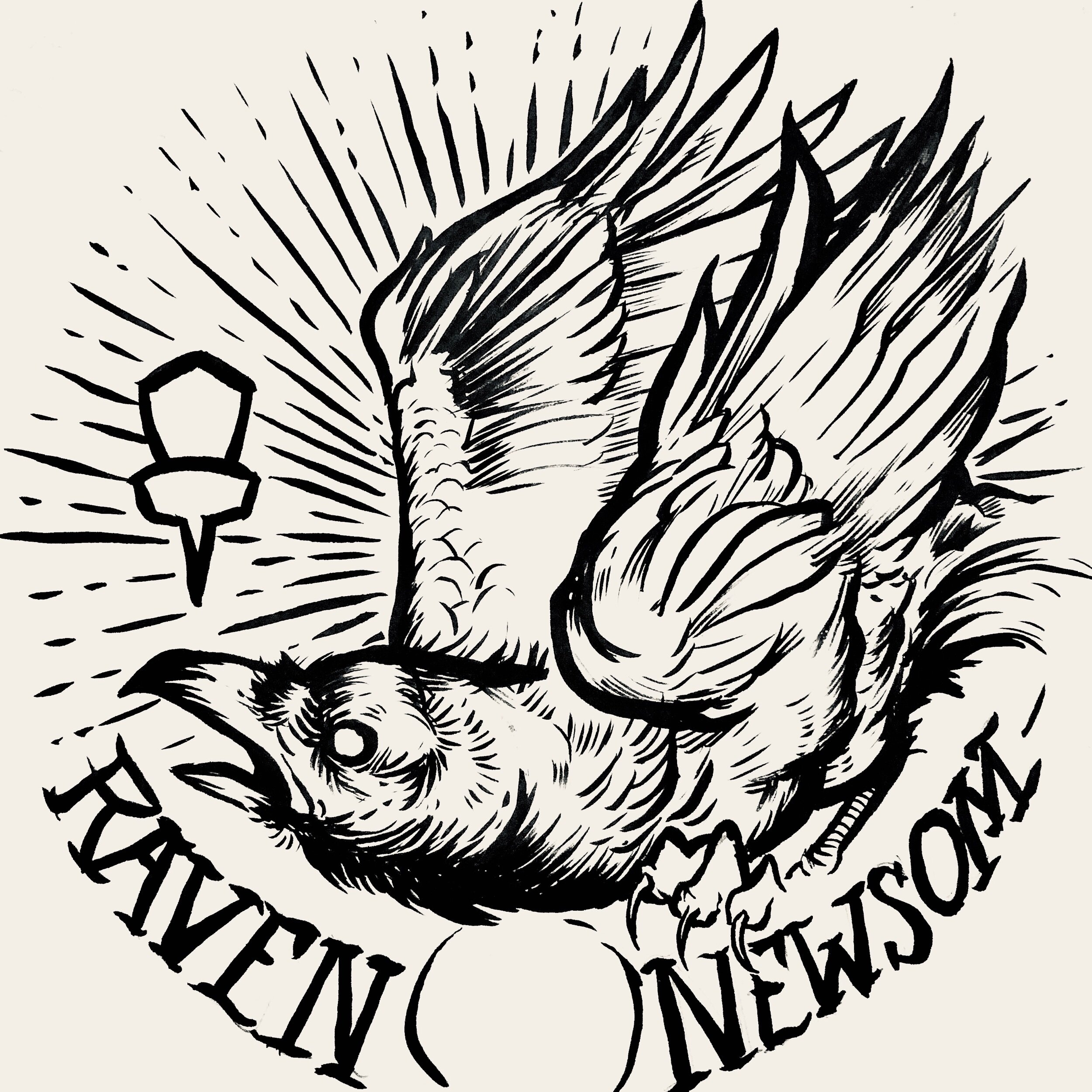
Raven Newsom officially went all-in on the 2021 season. He’s toured and pretty much played every National Tour and Disc Golf Pro Tour event that was on the calendar. I started early and before the holiday season of the previous year to get something geared up to help his touring efforts.

Raven made the process super easy. He trusted my design skills and let me come up with a few ideas to ponder over. As you see for the very early stages, the raven was refined and some of the heavy linework from my brush pen was slimmed down a bit. Everything was bold and it didn’t allow your eye to rest. I felt it was chaotic and the bird seems way out of shape. It took some more reference gathering to really started feeling better about the bird, its outstretched wings, and the overall ability to add in “Collegiate National Champion” with a bit of class.

With the worldwide COVID-19 pandemic; it’s been tough getting this design to the masses with only one or two small releases up to this point. Keep a lookout for more runs coming from Raven. I want to thank Raven for giving me this opportunity. If you have any questions, please hit me up or leave a comment!

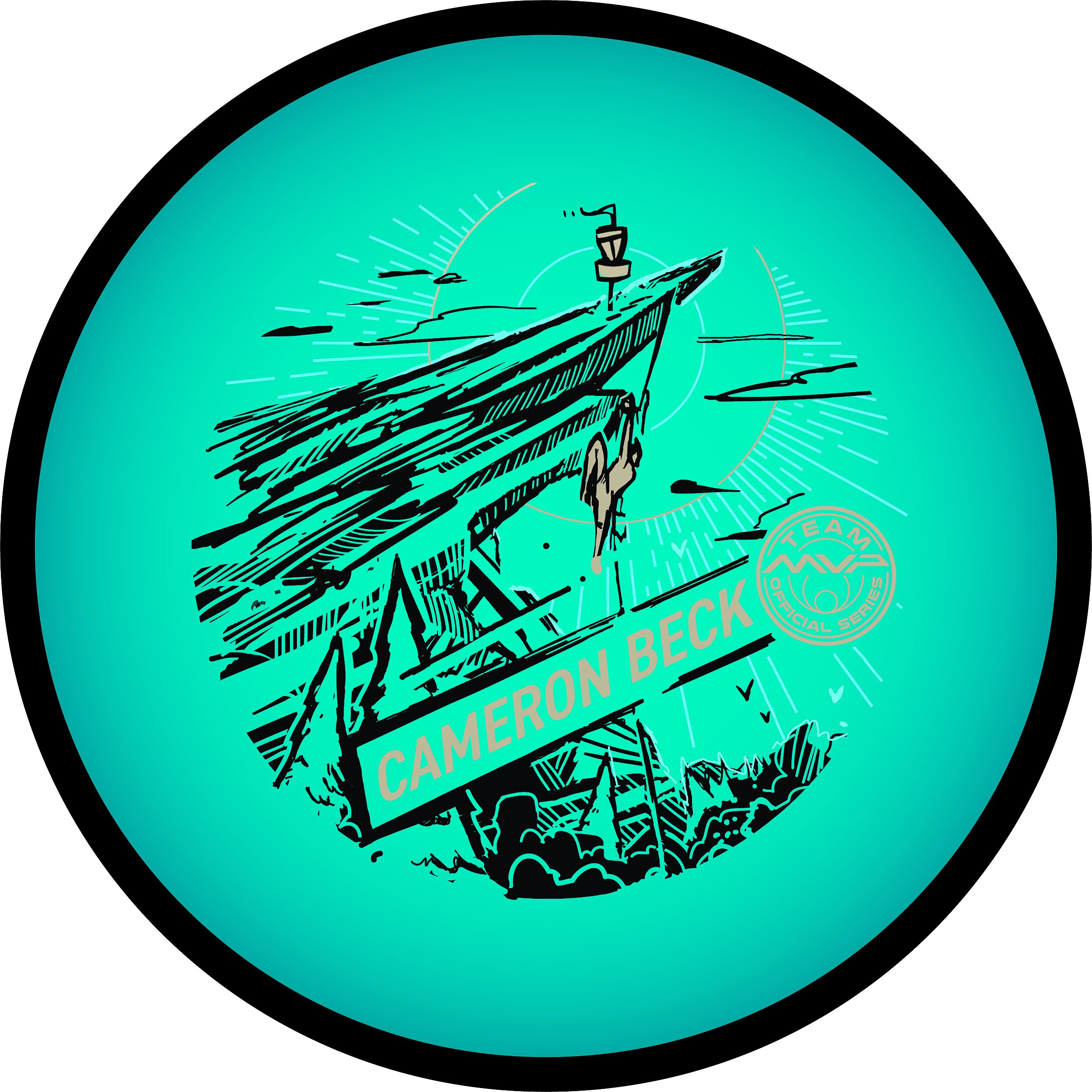
Cameron Beck 2021 MVP Tour Series

Cameron Beck is an avid climber and Team MVP member. He approached me this off-season with an idea to marry his love of rock climbing, eco-friendliness into his first official tour series stamp. Some of the proceeds would go to a local course but also support him for the 2021 touring season. I knew just by following Cameron that he spent some time over in France for a short period. Our initial thoughts on the design were to feature the cliff rocks from Étretat in Northern France. That arch is insanely beautiful and the fact that they climb with water below really got the gears going in the thumbnail stages.

I took some time to R&D but I couldn’t get enough reference of someone in the act of climbing that particular location. From there I went to a few ideas that I thought could make for a compelling stamp. The idea of this climber reaching toward a disc golf basket perched high above. It would allow me to encompass disc golf and his love of climbing into one stamp. The thumbnail sheet gave him 3 different approaches we could go with that idea. In the end, we both thought #2 had a creative solution around the center no art zone. It also featured sharp diagonals and great negative space underneath the climber to show the suspense and danger that comes along with sport climbing.

The design, shape, and placement of the rock face allowed the great vertical read from the basket - climber - down to his name in the lower 3rd of the stamp. I really liked how this stamp turned out and appreciate Cameron giving me the liberty to put something together for him.

Schrock-A-Doodle-Doo

As 2019 was coming to a close, Tyler Schrock, Team MVP Pro asked me if I would like to do his 2020 Tour Series disc. Working with Tyler is pure joy. He’s kept an animal theme over the past few years that allowed me to do design an octopus and sloth. This year, his idea was a rooster. It turns out that his father was a chicken farmer! He raised chickens for 25 years. So this stamp idea was something he knew his family would love.

This idea started with chicken reference gathering even though I had a good idea of how I’d be able to pull this off. I think the strongest silhouette of a chicken is from the side. It gave me the room in the center of the disc to stay free from any no stamping zones. The chicken mouth action/or spit never made the final. That was an attempt to add that classic “action” seen in cartoons to show loud noises. We didn’t want the chicken looking like it was spitting so it was axed toward the end. The shading detail near the chest add a bit of contrast to show that it’s different color of feather.

The final pass was simply to add body/feather detail and import the consistent ring graphic from last years design. It was important to Tyler to continue that look and feel from year to year. When you display these side by side; it really adds a nice series look to them. I hope you all dig it! Share, like, comment on what you think!

Robokitty 2.0

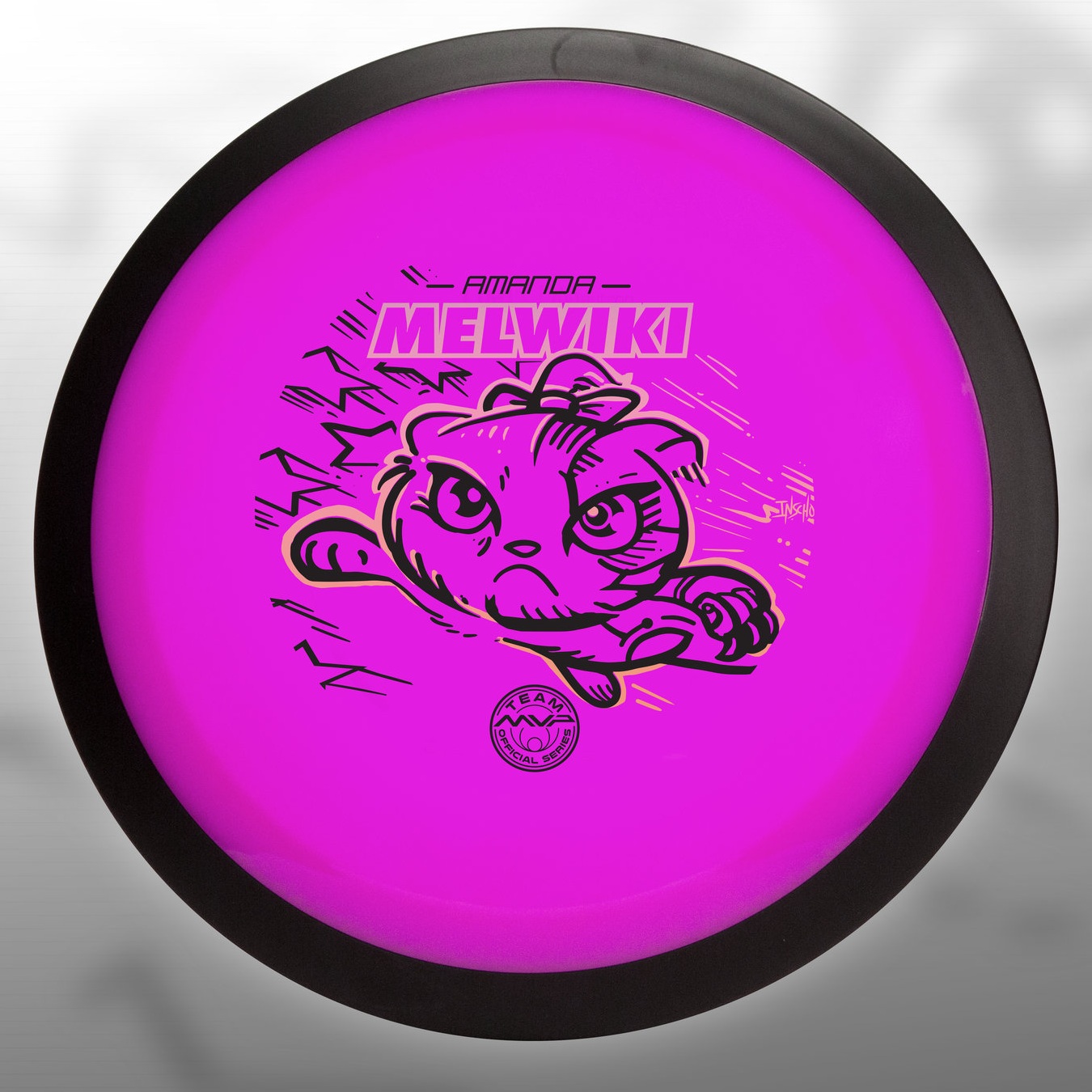
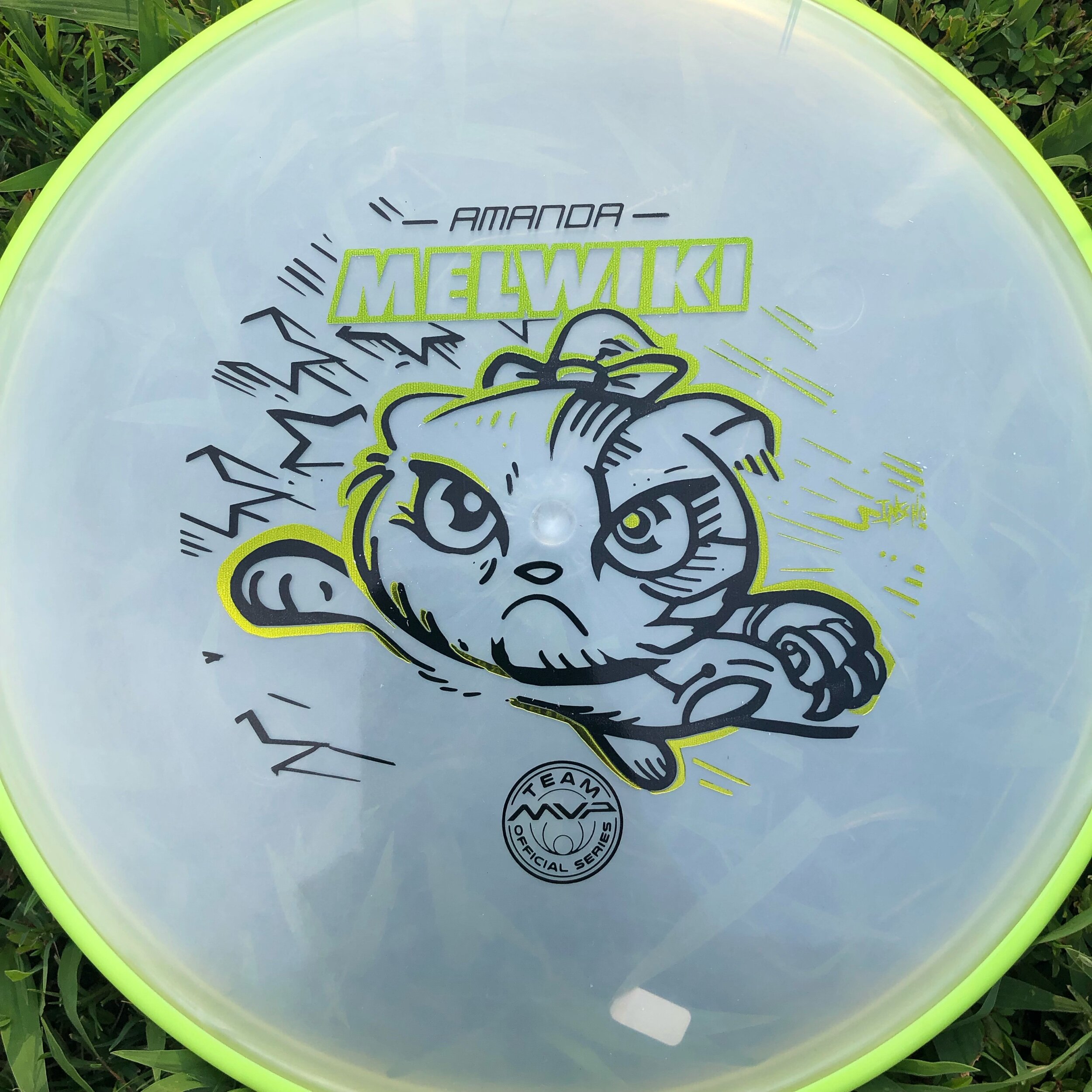
I received a request from an Team MVP member to change up a 2018 stamp design. Amanda Melwiki had a great 2018 year and her Robokitty design was a hit. She came to me with the idea of changing up the foils and adding a few elements to last years design. I had bigger plans for Robokitty and I’m glad she trusted me to do something new but a continuation of the concept.

I knew I wanted to show a fiercer side of the kitty. I wanted to marry the concepts of cute/friendly with the deep down drive and determination of getting better. That fueled the fire going into the concept stage. I had the idea more stored in the back of my head so this design didn’t really consist of a lot of reference gathering. Bringing in that exaggerated anime pop and allowing the opportunity to expand on the Robokitty character were the goals first and foremost. From there it was a few experiments with stars and how I was going to incorporate them into the design.

A huge thanks goes out to Amanda. Were you able to snag one? If not, she has a few available but will be selling out fast. Follow her here:

https://www.facebook.com/AmandaMelwiki

Carolina Hurricanes-Homegrown Series

Being invited back to such a great local hockey initiative is pretty exciting. The Carolina Hurricanes reached out for a poster design for the 2018/2019 Homegrown Season. The Homegrown Series aims to get the local art, food and breweries more visibility. After some rearrangement of days, I was assigned Jan 11th 2019 against the Buffalo Sabres. What most people do not know, is that I’m a WNY (Western New York) kid. Born and raised in Steuben County and only 2 hours south of Buffalo. This assignment was exciting but difficult as Buffalo pulls at my heart strings. To that end, I never watched much hockey growing up. The only player from Buffalo that I knew was Dominik “The Dominator” Hasek. One of the finest goalies of the NHL at that time.

To springboard off of the success of 2016's "PNC" poster, I feel as if I should stick to my passion and strength: Landscapes. I like the sound of the "Take Warning" motto the team has. I wanted to depict a small herd of Buffalo light boxed in front this gigantic (freaking huge) hurricane type of system moving in behind them. The bison would act as a secondary read. It's a mix of opponent based imagery but all in all, creating a beautiful poster that people would be proud to hang in their homes. 

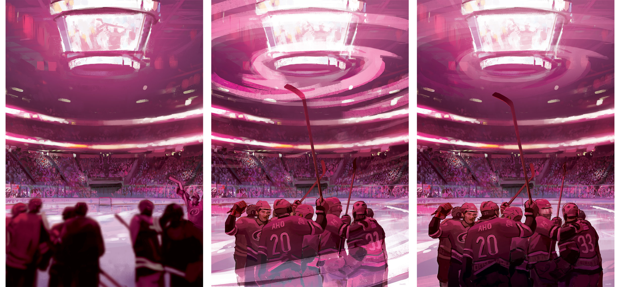
After much tweaking and trying to get this concept to work, we took a 180 and focused on an interior scene of PNC Arena. I felt it was a good compromise. The whole idea was to celebrate the “Caniacs” and fans. This year showed the birth of a cool winning celebration on home ice and to partially show that concept ended up being pretty fitting. Carolina’s starting goal tender, Scott Darling was released by the team mid season. It’s the risks you take showing players jersey’s in the poster. I was happy to edit it to make it current.

I thank the Hurricanes and the Homegrown Series for allowing artists and local business’s show what they have to offer. If given the opportunity, It'd be an honor. What do you think? Do you like the original idea or where the poster ended up? Comment and share this post!

Great 8 - 20th Anniversary

The 20th Anniversary of the Great 8 disc golf tournament was among us! The Great 8 encompasses endurance, grit and sure will to navigate and play 8 disc golf courses in ONE day. It's a grueling but rewarding endeavor. I was asked this year if I could do something to commemorate the achievement. I didn't have much time to work with but I knew a few things:

• Keep it within the marine/animal subject I've been doing the last few years (except the Fibonacci stamp)
• Involve "8" somewhere
• Serpent-like
• Involve both doubles partners into the stamp somehow


Going into this stamp, first thing I had to do was figure out how in the heck to fit 8 hydra heads on one stamp without clogging up all of my space. That in itself was rather difficult, to say the least. I probably spent 6-8 hours with my sketchbook mapping out different solutions. Either quick gestural flow mock ups with heavy line weight from the brush pen or continuations and ideas I couldn't shake. It came down to indecision. I wanted in my mind for all of these to work and be successful. I took the battle scene and a few others a bit further into Adobe Illustrator. Knowing what I had in my head was a bit clearer than what was sketched out, I wanted to give them an honest chance. Receiving real honest critique and suggestions may be hard for some people. When it's offered to me, I'll listen.

Backing up and restarting isn't easy. It's happened quite a few times in my few years of doing stamp art. Sometimes you just have to trust your gut and not try to force anything. The end product came out amazing and I hope the attendees appreciated it. I want to give a huge thank you to Jay Pontier and Capital Area Disc League for giving me another shot at this. 

Hyzerbomb-Mortar

I was reached out to by the owner of Hyzerbomb Discs to create a special stamp for the attendees of the Nick Hyde Memorial. This design was going to be on Swirl and Glow "Mortar" discs found in their players packs. While military and pre-production experience is a huge plus, I can't stress enough how much reference gathering plays an important role in the final image. 

Starting out, I really wanted to emulate an inspirational Marine Corps war propaganda poster that featured a Marine charging over the hill with a mortar gun painted by John A. Coughlin. It's such a powerful image. I love the silhouette and action within this shot.

I've had my share of firing .50 cal's, M249's and M203 Grenade launchers... Mortarmen require a special ability and something I never trained in. After doodling out those initial ideas with the poster reference in mind; I took to YouTube to find footage of a Mortar team working in harmony and really got to know an outside looking in view. I found a great video reference "Mortars Fly in the Hills of Ft. Carson" and knew this would be the center point of the design. A loader took a pause with a mortar shell primed with a cheese charge. I instantly thought: "Whoa.. who does that? This dude is a bad ass!". It gave me that same type of feeling that the poster did and worked a bit better because he's somewhat in a pause before firing the round. For stamp simplification, I chose to show the loader. This idea felt straight forward and could be easily understood by people who know nothing about mortar firing and or history. 

Lastly, I chose to chisel him up a bit. Create edges and bold, sharp angles to show a more aggressive vibe. I kept shading pretty even and clean to pair with the overall style of the stamp. Smoke in the background  clears out a bit of business to frame him up in the foreground.

All in all, seeing the reactions from Nick Hyde Memorial tournament goers and from Matt Siri is what it's all about. I want to give a huge shout out to Hyzerbomb Discs, their supporters and everyone who signed up for the Nick Hyde Memorial. It was a great pleasure being able to do a military themed stamp. 

Unique Hyzerbomb Mortars are located here while supplies last:
http://hyzerbomb.com/pro…/swirly-frontline-mortar-mortarman/

Out Of Bounds #2 - Sasquatch

Here's the 2nd installment in the Out of Bounds Series! I've partnered up with Brian Sweet to venture deep into the woods with this one. The first installment was a Kraken theme where the disc golfer perched on top of the cliffside went for the putt. Brian puts it so eloquently:
 
"What lurks in the out of bounds when playing disc golf? A whisper in your ear, the electricity of your hairs standing on the back of your arm. You can feel your heartbeat all the way up in your neck as you are frozen in fear"

Going into the second design, our initial idea was to have a towering sasquatch camouflaged into the tree line. The disc golfers would have no idea that this giant gargantuan of a beast, looms overhead. This idea did have its challenges. 

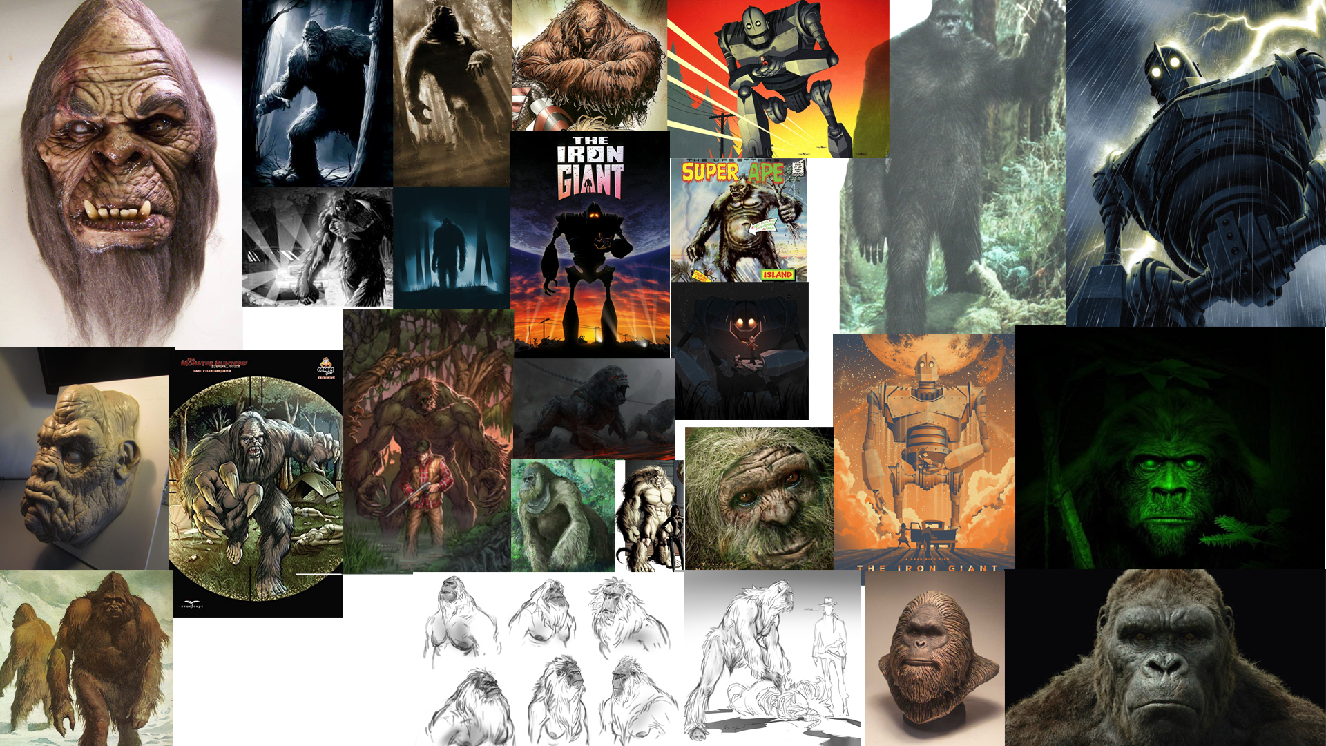
The first challenge was scale. To have this beast towering with the treetops dismissed the typical size of a Sasquatch. What really is the size of one of these beasts? My gut reaction and typical approach, when faced with this decision, is to go big! So initial sketches showed the scale I was hoping. As you can see from my rough ideas, blending the beast into the wood line left a lot of opportunities off the table. Typically, a person dominating a scene in a film has the subject taking priority in the shot. To make it this rule effective, I needed to scale the Sasquatch above the tree line. 

In the end, you see that we changed course at the last possible second. Sometimes grinding on a design is an indicator that it just isn't working. Sasquatch dude felt more like "King Hippo" from Mike Tyson's Punch-Out!!. Bending the main character over made it felt like he was engaged in the scene. Taking some of that chunk out of his frame and choosing Sasquatch identifiers helped sell the idea. His giant hand shadowing over the poor soul who has no clue, and the chain necklace of his most recent winnings, really made the scene.  All in all, I'm really happy on how this second installment turned out. I want to thank everyone for their support with the Out of Bounds series. I look forward to the next one! ...whenever that might be.  To keep in the loop, join this Facebook group for all "Out of Bounds" news related items!
https://www.facebook.com/OBdiscgolf/

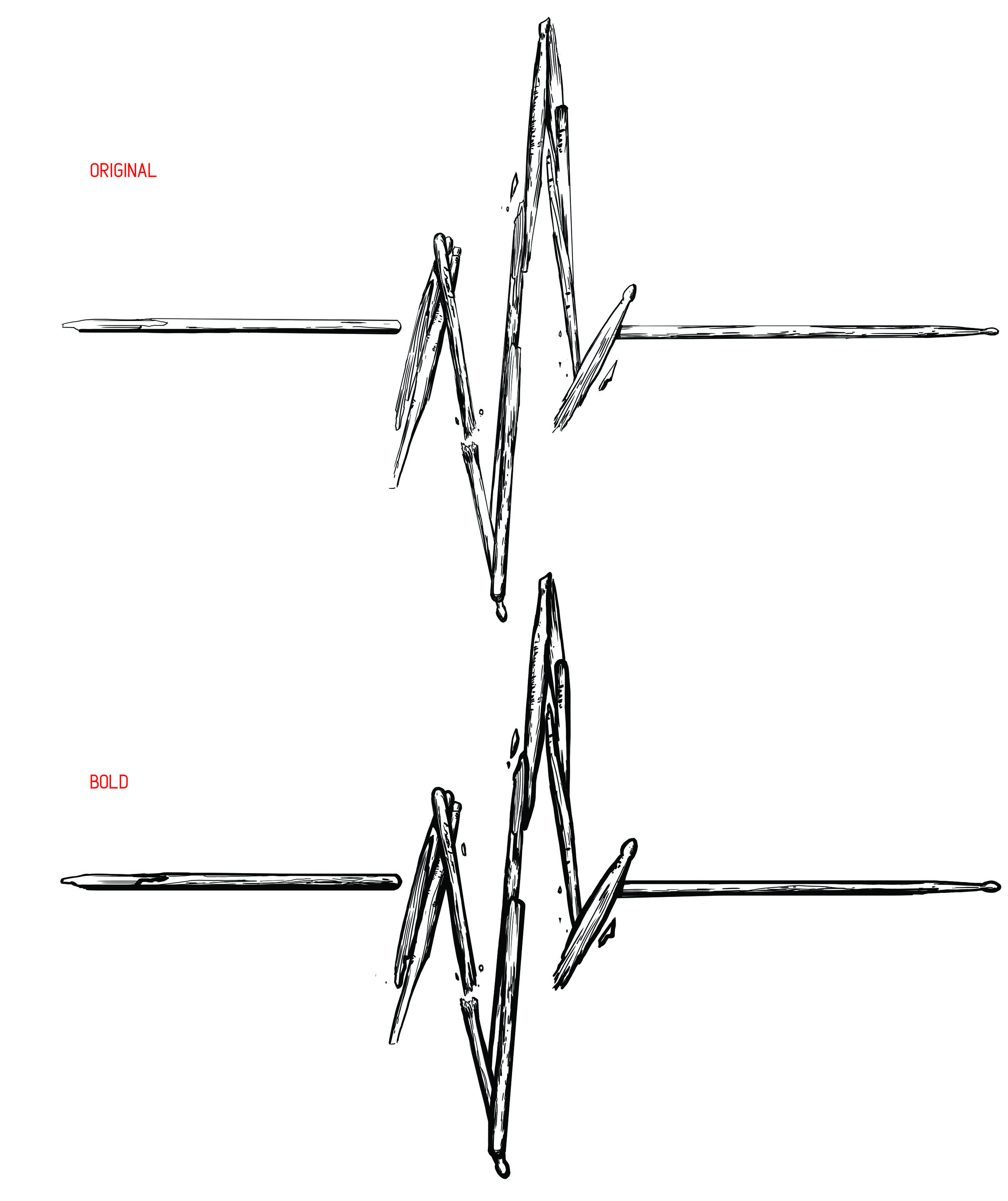
The Beat Doc

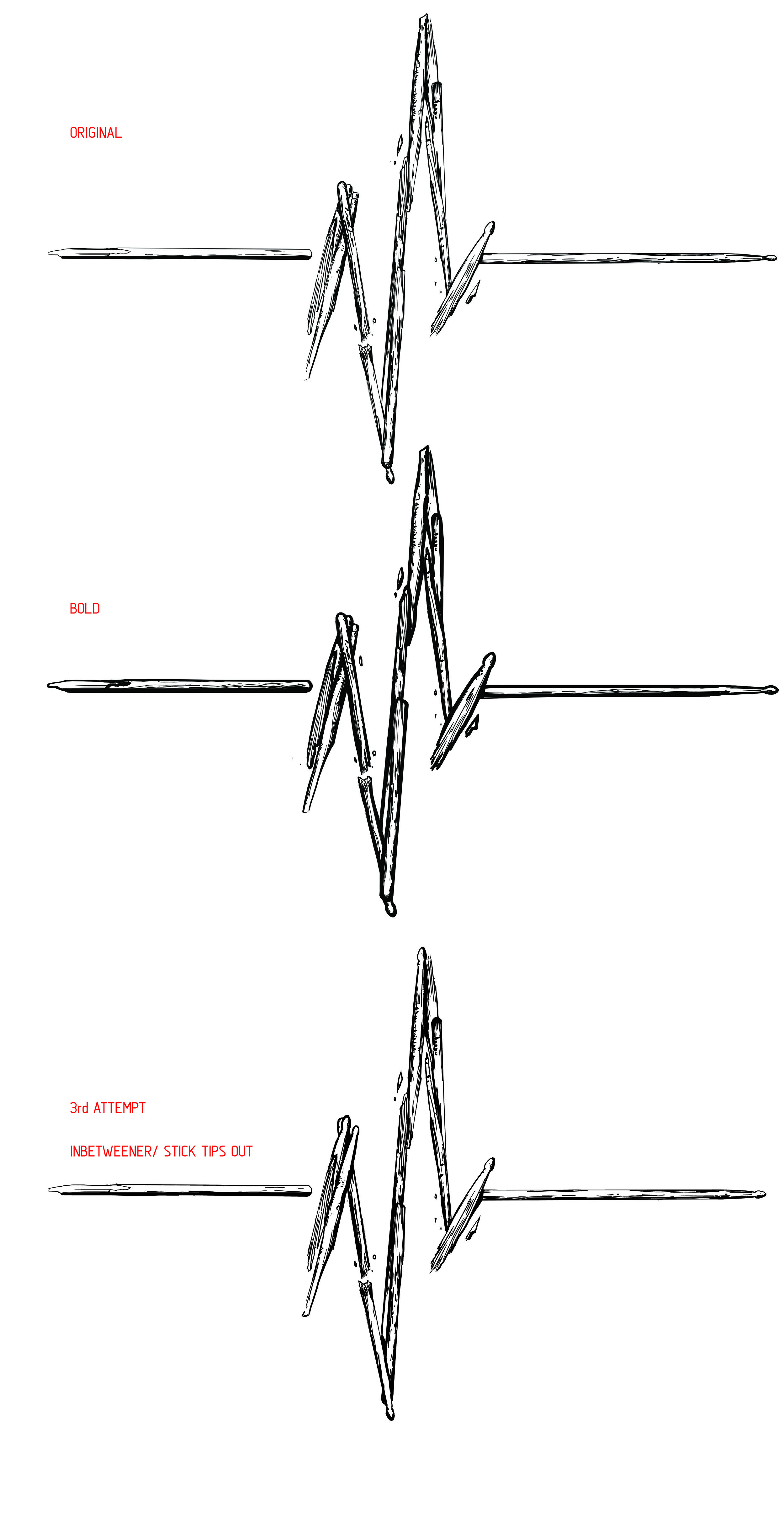
Mike Murray is The Beat Doc. Beats and percussion are his lifeline. When Mike came to me needing help, I couldn't turn him down. Friends have to help each other out in times like these. Since Mike plays drums for many different artists in and around New York City, it only seemed fitting to create a brand around his drumming using a graphic logo. The initial idea was simple, assemble drumsticks into an EKG line play. The idea is simple yet fits so well with his Beat Doc branding. 

Mike had a previous concept ready for viewing. The concept lacked clarity and looked so oversimplified that the scale/ length of the sticks didn't make too much sense. This image was to 1: Create an image for the background of his website. 2: This image would also have the possibility of producing shirts. The first challenge: How to improve upon this design he was set on? How can we have these drumsticks make sense being different lengths of the EKG heartbeat? We break them.

"One man's trash is another man's treasure". I feel that saying fits Mike perfectly. Mike walks his dog, Pistachio daily and discovers the coolest items. Discarded drum pieces that could be brought back to life.  Using the broken sticks and assembling them into something that makes sense and beautiful was the ultimate goal. Attached is the pipeline and work it took to get the graphic at its final state.  Make sure to check out The Beat Doc at https://www.thebeatdoc.com/

2017 Carolina Hurricanes Homegrown Series

2016-2017 was a crazy time. I was glad to be a part of the first Homegrown Series put on by the Carolina Hurricanes. The fact that I was offered an opportunity to assist on more than one occasion had me above the clouds. The Homegrown Series is an idea that started last year that introduces fans to enjoy local food, beer, As their 20th year anniversary as a hockey club was approaching, I wondered if they were going keep it going for this anniversary year. I wondered how much it'd change based on last years reception. I was reached out to by Kyle Fowlkes (Carolina Hurricanes Graphic Designer) and was asked if I'd be able to return and contribute a poster design alongside this year's new lineup of amazing artists.

This years design is quite similar to direction as last year's PNC Arena poster. The concept this time around was to bring more of a personal approach to the design. The idea was to bring in the teams Captains and leading goalie into the eye of a storm. I wanted it to be intense, powerful and convey the team and fans unwavering spirit. I used a few symmetrical composition tricks to help set up the poster for the most impact.

Below is a timeline on how this poster came to fruition. I want to thank Kyle, the Carolina Hurricanes and everyone who had helped with personal critique of this poster. As one of my close friends said recently: "We operate in a profession that contains constant critique. Our world is much different than a traditional artist who sells their skills and particular image. Sometimes we need to step back and realize not all people want to be critiqued." 

I gladly took it and tried to better this design. What do you all think? Does it succeed? Does it improve upon the work from last year's Homegrown Series?  I'd love to hear your thoughts! Come out and see the poster with your own eyes on March 31st, 2018 when the Hurricanes play the NY Rangers at PNC Arena! You can check out the Homegrown Series page here

Special Edition MVP Limit

"Push it to the limit"

The MVP Limit is a 24.5mm High Speed Driver designed to be the fastest, most overstable disc in MVP's entire line up. My Art Director, Zachary Kelbaugh laid out a pretty good description to start planning behind:

"We talked about the conceptual intersection for the name... being the fastest, most overstable disc -- and the class as a whole refers to space travel, with the speed of light being the theoretical limit for speed in the universe. "

I had an opportunity to bust out my love for everything 80's. I changed into my jammer shorts and pulled out the 80's action playlist on Spotify! Getting started on this didn't take me much time at all. The initial idea was to mimic the typical action movie posters of the time (Rambo, Over the Top, Big Trouble Little China). Heroic character posed in the center with explosions, and commotion happening behind him/her. I even went so far down the rabbit hole and stumbled onto some retro-futurism which was really neat. None the less, for the scope of the project and how the release was playing out, We went with a retro-wave direction into the rough and final stages. As a team, we felt like keeping the design clean and tech felt more MVP without crossing into the Axiom Discs branding. 

In the end, there are some things that you all aren't getting a chance to see. There were some really solid ideas in the thumbnail stage that just might poke their head up when a new project comes a long. A little bit out of my comfort zone but it takes experimentation like that to really grow as an artist. I hope you all enjoy. You can pick up this special edition and a bunch of online disc golf retailers. 
Exeter "Non Sequitur" Album Art

The last opportunity I had to design an album cover was from Exeter's "Prolepsis" album in 2007. I was still in art school, still learning the many things about digital painting and one of my side kicks since, Adobe Photoshop. My friend came to me this past spring and wanted to know if I'd love to design their album cover for their upcoming album "Non Sequitur". 

Non Sequitur: a conclusion or statement that does not logically follow from the previous argument or statement.

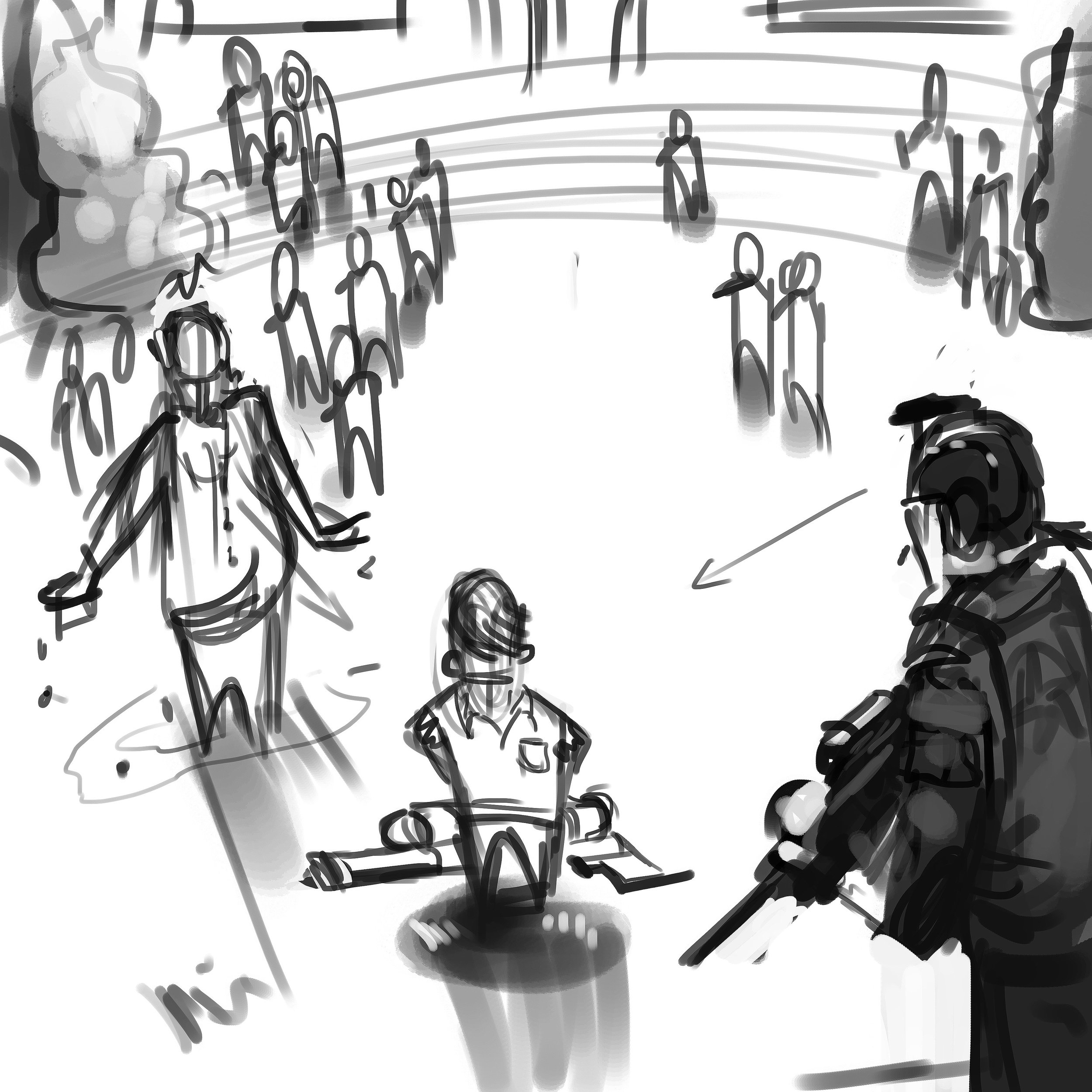
I learned quickly that the general sentiment of this album, vastly different from their first effort (hence the album title), was to express the band's strong libertarian leanings, and in particular showed an anti-authoritarian bent.  The cover itself was intended to critique what the band sees as an overt and perhaps overly aggressive and reactionary militarization of American police forces.  These are, according to the band, POLICY issues, not intrinsically policing issues.  The first thing he asked was if I was going to be comfortable doing album art with such strong political meaning. My job as an artist is to give the client what they want. I wanted to push the bar a bit more than they were expecting. The design process took a little bit to finish but I'm glad they were patient and let me finish this for them. 

I experienced some challenges during this illustration. The direction was to show the protagonist/antagonist (depending on one's view) center screen with his class peers in uniform garb, looking on from a distance. It had to be clearly read that the kid only had a super soaker-like squirt gun. The victim, in this case a faceless administrator, had to be shown that he was dowsed in water and have them surrounded by a police presence.  That's a lot to fit into one image. I focused on the kid first and came up with a composition that would work to facilitate everything they wanted in the main image. The background reference I gathered came straight from a school I attended from 4th to 10th grade. It's not meant to be a message to my hometown but the band wanted a rural, low key type of school yard setting. These older school that were built in the 40's-60's had a certain type of charm and aesthetic that I wanted to portray in the background imagery. 

Working through a thumbnail to rough pass, I was able to show different angles and quick lighting scenarios to the band. The reference helped show the real world influence. It truly helps bring in a more accurate human element that would not of been achieved by purely relying on memory. Your memory can only remember so much and I urge other artists to always have reference. I can't stress that enough. 

Halen, Luke & Dave, thank you very much for the opportunity to design this cover. You can purchase the album through these venues: 
https://www.cdbaby.com/cd/exeter3
https://itunes.apple.com/us/album/non-sequitur/id1150069777
https://play.google.com/store/music/album/Exeter_Non_Sequitur?id=Blmytyabwcyqjolsye6ci4uzy4a&hl=en
https://www.amazon.com/Non-Sequitur-Explicit-Exeter/dp/B01M02LK8E

2016 Innova Pumpkin Design

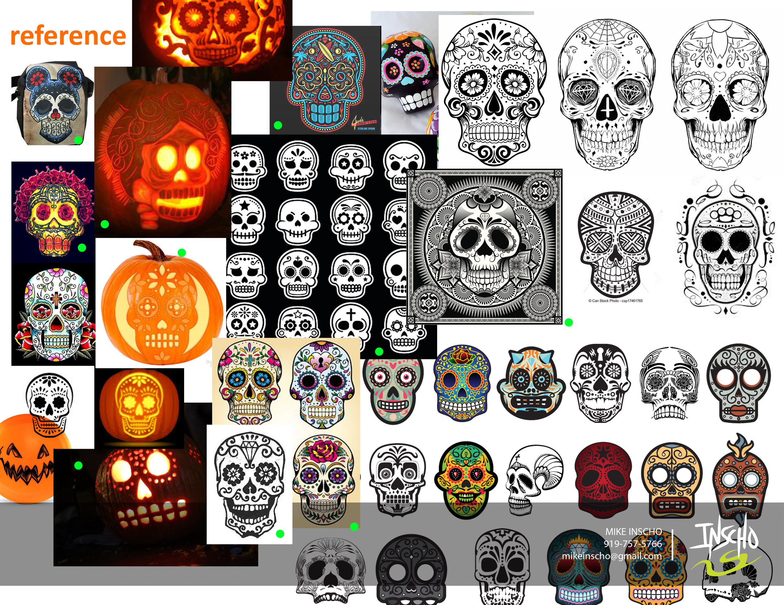
Every year since 1996, Innova Champion has put out an annual "Pumpkin" edition stamp for the Halloween season. Every year.. until this year, they've kept the theme consistent with the standard jack o' latern. After doing a first set of sketches and teasing a few skull designs toward the end of the thumbnails, Adrian Southern over at Innova mentioned the de los muertos theme and sugar skulls. So many possibilities and to give it a chance and see what comes out of the experiment.

I worked closely with Zeb Campbell and Adrian over the course of multiple revisions and options. The general consensus was the love of the bat wing basket. The challenge with this design was to incorporate the detail you see with common sugar skulls but keeping it simple enough where carving it could be believable. 

Over the course of a few weeks, It led us down a few rough passes and we ended up Frankensteining parts of the final 4 to create one design.  Here is 2016's Pumpkin Design. Thanks to Innova, Adrian and Zeb for having confidence in me to put something out against the grain. Hope you all like. 

You can purchase them here: http://dgustore.com/index.php/specialty/holiday-discs.html

2016 USDGC "Paul McBeth Commemorative"

This stamp is a staple to every US Disc Golf Champion in years past. The following year an artist will be chosen to commemorate the champion on a Collector Roc disc. I was asked this year if I'd like to take a stab at designing Paul McBeth's 2015 win. There will be 700 of these discs made. 500 available to the USDGC Partners and 200 available at the USDGC in Rock Hill, SC. The few limited discs at the event will be an opportunity for McBeth to sign if the buyer chooses.
If you don't know who Paul is; He's the #1 Rated Player in the World, PDGA World Champion 2012, 2013, 2014, and 2015, 2015 Innova Team Captain, 2015 Grand Slam (All Majors), 3x Memorial Champion, 2x European Open Champion, 2014 European Masters Champion, 2013 Copenhagen Open Champion, 4X National Tour Champion.

Going into this design, I've never been more nervous. Busting out page after page of thumbnail ideas, a couple different directions with the rough phase and then tweaking the final until it was ripped from my hands. I felt that this design, more than anything, could be my biggest opportunity to show what I can do. At the beginning, the intent was to create a design encompassing Paul's Grand Slam achievement last year (5 Major tour wins). So going into it, I initially thought about 5 sided shapes, Paul himself, and something that encompasses the names of the events he won. 

The end result doesn't feature what a lot of the thumbnails had in them. The idea to honor McBeth as the 2015 US Disc Golf Champion felt a bit more important and fit with past years winners. Innova previous produced a "Grand Slam" stamp so it seemed fitting to make this a nod to his win. 

I want to thank Adrian Southern, Jonathan Poole, DGU, INNOVA and everyone involved in critiques for giving me these three shots at 2016 USDGC artwork. What a ride. 

2016 Solitude Open presented by MVP Disc Sports

Tournament Director, Brian Usher and MVP Disc Sports joined forces to present a PDGA Pro A-Tier and Amateur B-Tier event called the 2016 Solitude Open presented by MVP Disc Sports just outside of Salt Lake City, Utah. The event is hosted at Solitude Mountain Resort and features 18 holes down this beautiful mountainside. One, if not the best, mountain disc golf course in the country. Players will have to travel to the top using the ski lift and the tournament is a must for many top tier disc golfers in the region. While looking up reference of this mountain course, what instantly struck me were the beautiful aspen trees. Their texture, contrast and unique trunk lines allowed me to play around with shapes within the viewer. By using a simple two point perspective, it keeps the design simple and centers on the player's path, landscape and event logo. 

Brian came to me in full trust to illustrate everything and anything that spoke to me about Solitude and what the course offers. We worked closely together to explore a few ideas. A sense of vastness, trees & wind vs. player, clash vs. harmony. After a few thumbnailing sessions we landed on the idea of just how massive the Solitude disc golf course is in relation to the competitor. You will see in the development sketches that we explored the idea of having multiple figures in the stamp but it ultimately came down to the "you and the course ahead" mentality and I think it worked perfectly within the composition. I really enjoyed working on this design and was honored Brian and MVP teamed up to get these produced in a 2 foil set up. Black being the base color while an accent color is used for the Solitude Open event logo. It allows a good choice of variety to the event and player's packs. 

If you are interested in scoring one of these fundraiser discs for the 2016 Solitude Open, please get up with Brian Usher at brian@brianusher.com
https://youtu.be/eMdJqFPiSVo