2016-2017 was a crazy time. I was glad to be a part of the first Homegrown Series put on by the Carolina Hurricanes. The fact that I was offered an opportunity to assist on more than one occasion had me above the clouds. The Homegrown Series is an idea that started last year that introduces fans to enjoy local food, beer, As their 20th year anniversary as a hockey club was approaching, I wondered if they were going keep it going for this anniversary year. I wondered how much it'd change based on last years reception. I was reached out to by Kyle Fowlkes (Carolina Hurricanes Graphic Designer) and was asked if I'd be able to return and contribute a poster design alongside this year's new lineup of amazing artists.
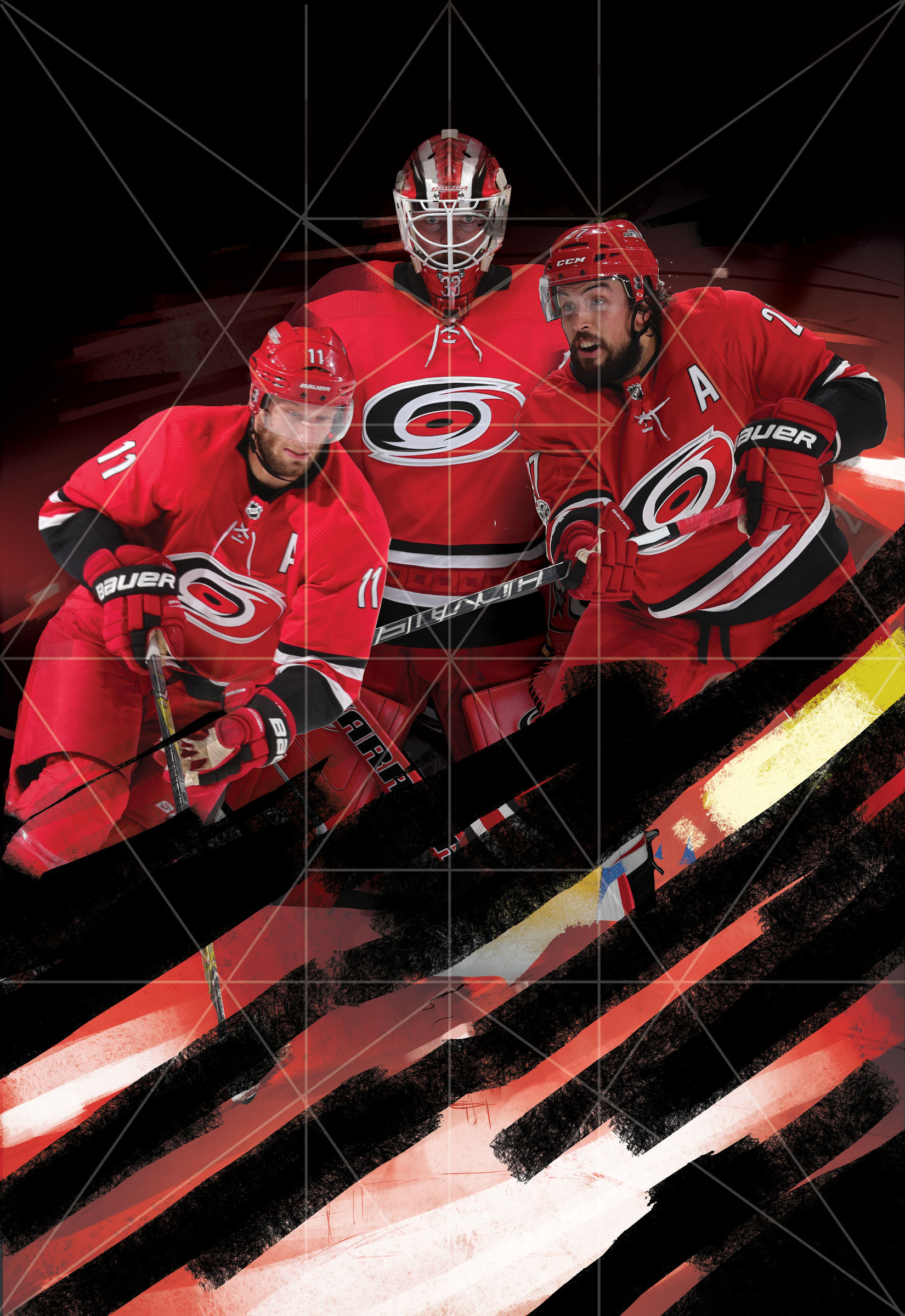
This years design is quite similar to direction as last year's PNC Arena poster. The concept this time around was to bring more of a personal approach to the design. The idea was to bring in the teams Captains and leading goalie into the eye of a storm. I wanted it to be intense, powerful and convey the team and fans unwavering spirit. I used a few symmetrical composition tricks to help set up the poster for the most impact.
Below is a timeline on how this poster came to fruition. I want to thank Kyle, the Carolina Hurricanes and everyone who had helped with personal critique of this poster. As one of my close friends said recently: "We operate in a profession that contains constant critique. Our world is much different than a traditional artist who sells their skills and particular image. Sometimes we need to step back and realize not all people want to be critiqued."
I gladly took it and tried to better this design. What do you all think? Does it succeed? Does it improve upon the work from last year's Homegrown Series? I'd love to hear your thoughts! Come out and see the poster with your own eyes on March 31st, 2018 when the Hurricanes play the NY Rangers at PNC Arena! You can check out the Homegrown Series page here
2017 Fantasy Disc Golf Calendar
After seeing the 2016 Fantasy Disc Golf calendar with work of disc golf artists, John Dorn and Manuel Trujillo; I knew I had to inquire to see what it'd take to get on the 2017 team. the 2017 team of artists included John Dorn, Manuel Trujillo, Benjamin Hopwood, Duncan "Skulboy" Crawford, Steven Colatriano, Cooper Harkins and myself.
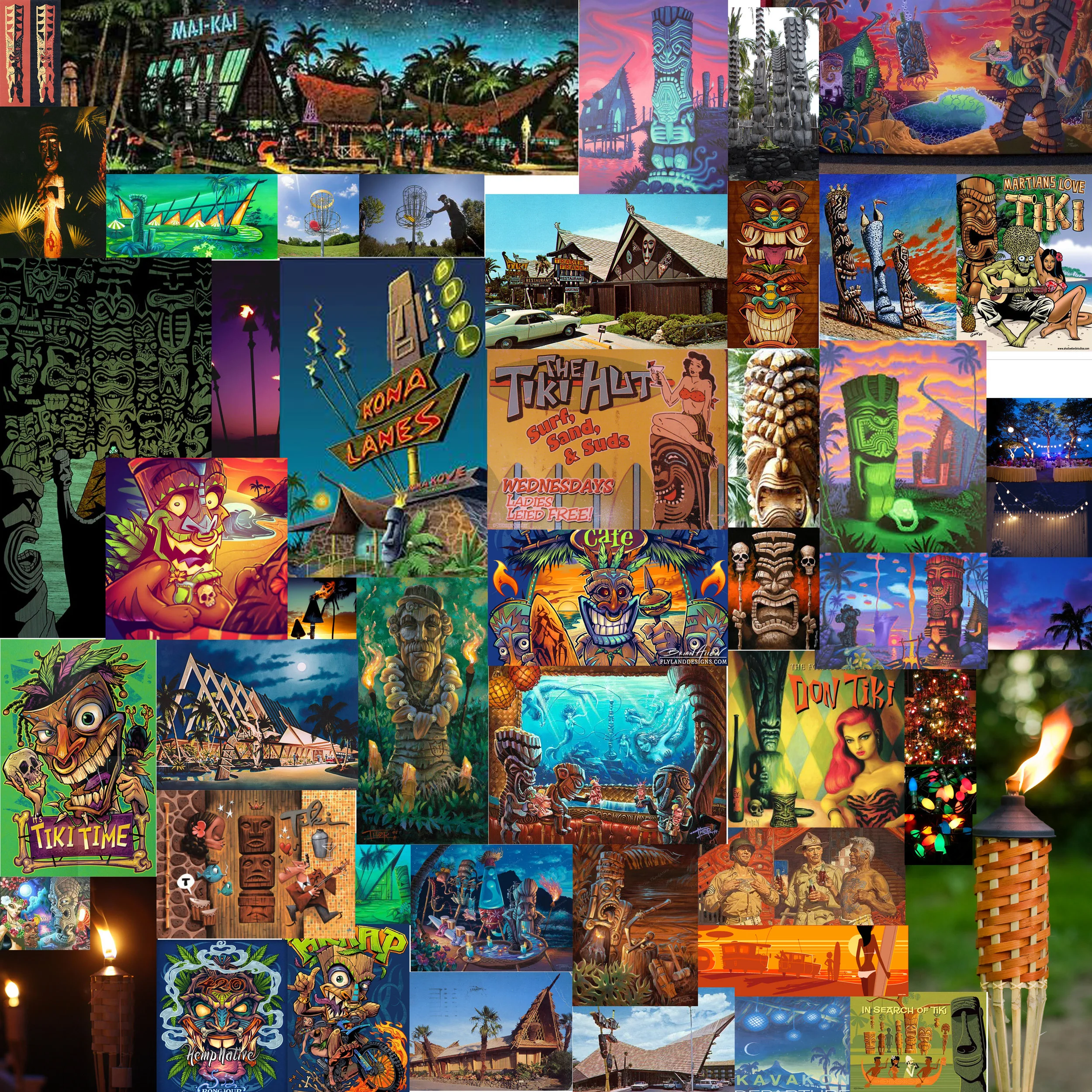
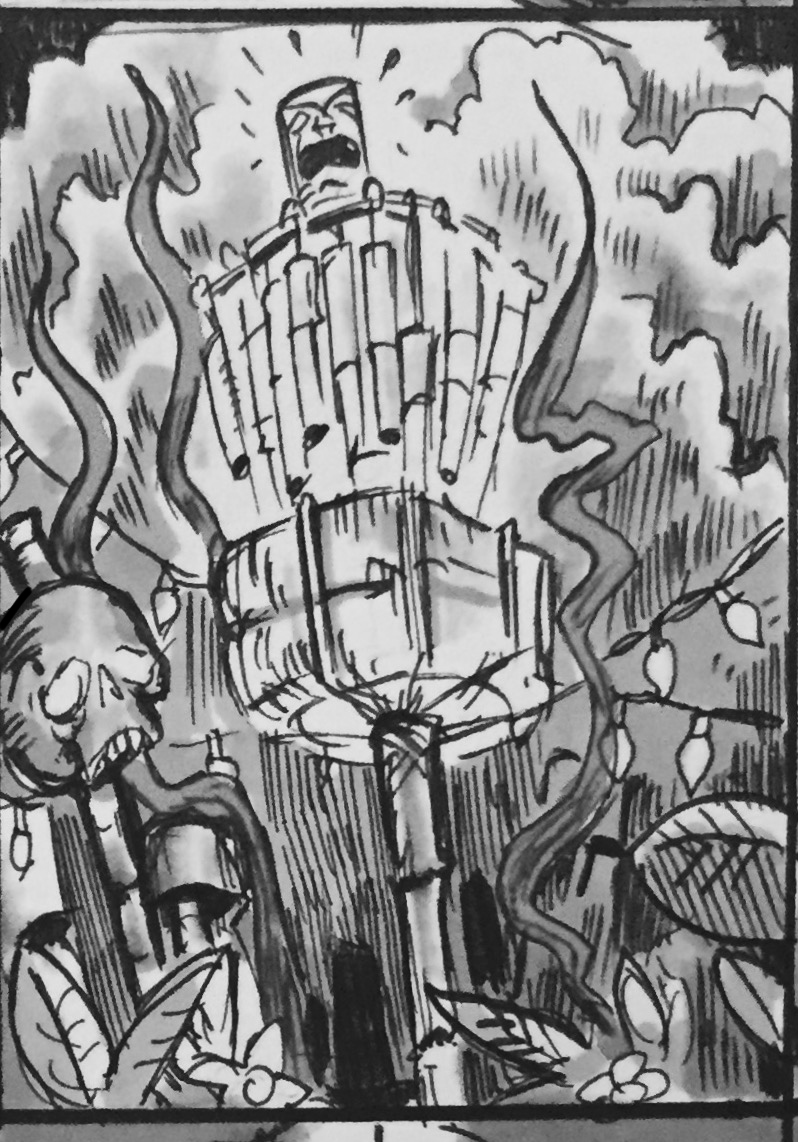
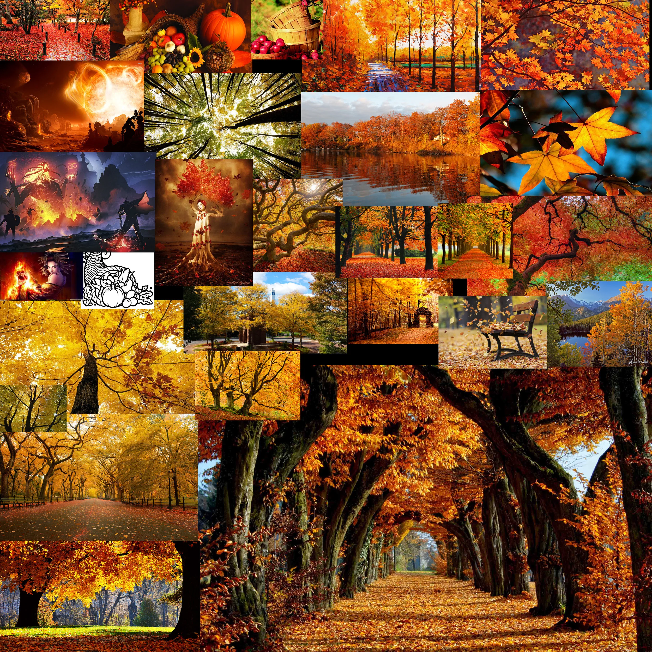
I was assigned the months of August and November. I've always wanted to do more themed disc golf illustrations. I appreciate John giving me the chance. August (Summer) got me interested in revisiting some Tiki artists I found while I was researching for a mural project years ago. Brad "Tiki Shark" Parker and Tom Thordarson really inspired this tiki piece. November early sessions had cornucopia themes in mind but as soon as I saw great fall reference, I switched to a forest scene with stirring foliage. I found these neat fire tornadoes while searching as well. One thing led to another. Really pleased with how both pieces turned out.
This is exciting and new for me. My prints are available here!!:
High Quality Archival Prints
More affordable option
A lot of firsts.
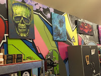
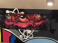
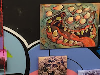
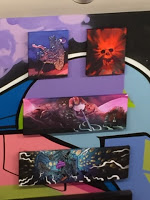
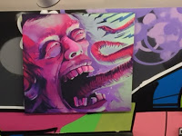
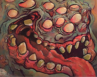
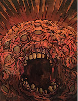
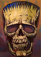
I received my chance a few months ago. I inquired about being a feature artist for a First Friday event. The first Friday of each month showcases artists in the heart of downtown Raleigh. Atomic Salon and Drink Drank Drunk gave me the opportunity to get the acrylics out from storage and start painting traditionally again. Being slated for an October show at a cool venue, provided the stage to do what subject matter I love to do.
While Hurricane Joaquin was rearing his head off of Cuba, the rain continued to hit NC just days before the show. I thought for sure, nobody was going to come out in the muck. The turnout was incredible. It was really great to be introduced to so many cool people.
Thanks to everyone who had helped get my work on the walls and the one's who enjoyed my art enough to purchase a piece or two. I truly appreciate it. Feel free to visit Drink Drank Drunk and Atomic Salon from now till the end of October to see the remaining art still being shown. There are still pieces of art to be had.
Please contact me at
mikeinscho@gmail.com
if any remaining pieces interest you.


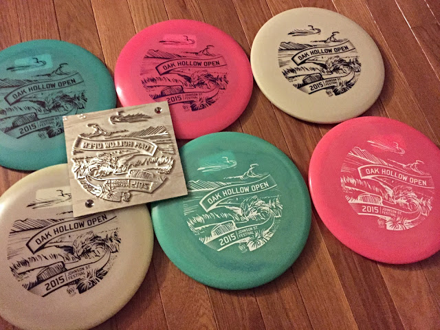
Oak Hollow Open 2015 Stamp
The idea behind the stamp comes from memories of playing the temporary course as a motivated intermediate disc golfer back in 2010 or so. You see many new courses, new faces and make great memories playing the tournaments blind. I remember Festival Park. I remember it well. Driving into Festival offers you a beautiful hillside view of Oak Hollow Lake and wood dock for Hole 1.
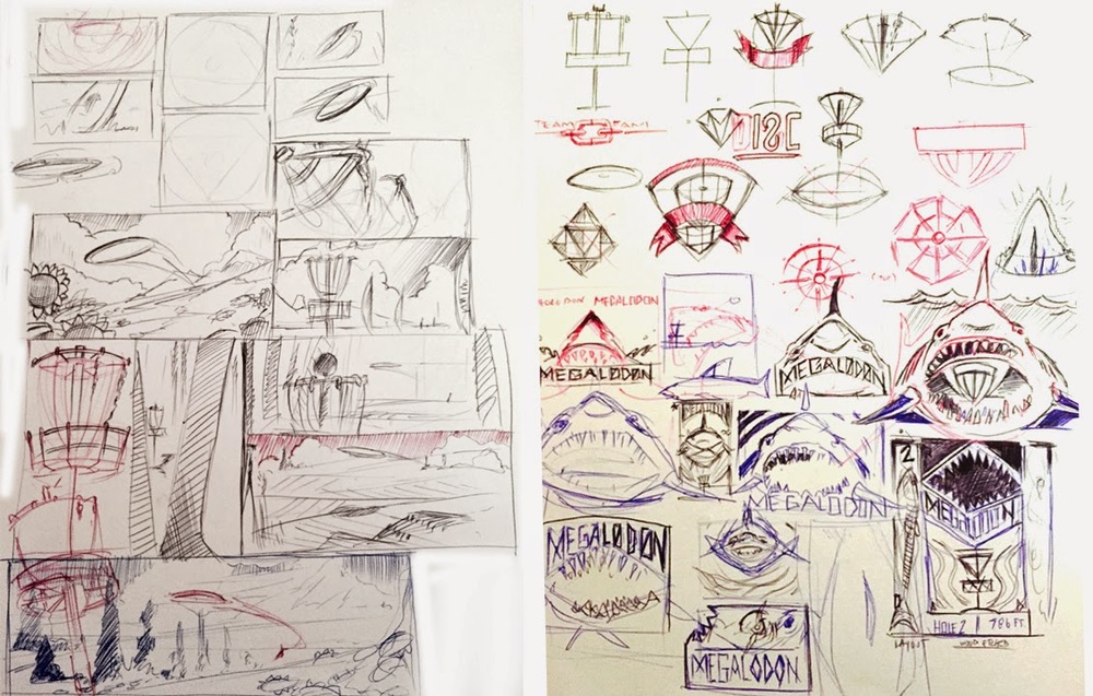
Out of all the crazy ideas in the thumbnail process, the scene of Festival made the most sense. With the suggestion of Phil, we decided to use a scenic shot of the signature Hole 9. It's an elevated tee throwing over the water and tight landing zone onto the green. I wanted to create a sense of energy that was in the rough draft. To do that, I was able to live trace my pen drawing into Illustrator and then go back through and clean up trouble areas.
The end result came out killer and really speaks to why this tournament gets bigger and better every year. Thanks to Oak Hollow Disc Golf Club for giving me this opportunity!
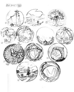 |
| Thumbnail session |
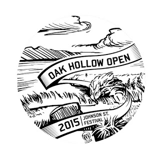 |
| Final |
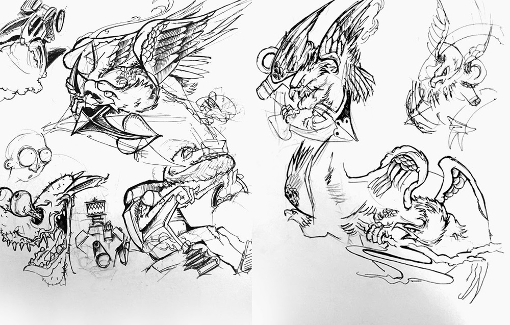
Octoalien weirdness.....head
Sketchbook
Graffito: Steampunk Graphics
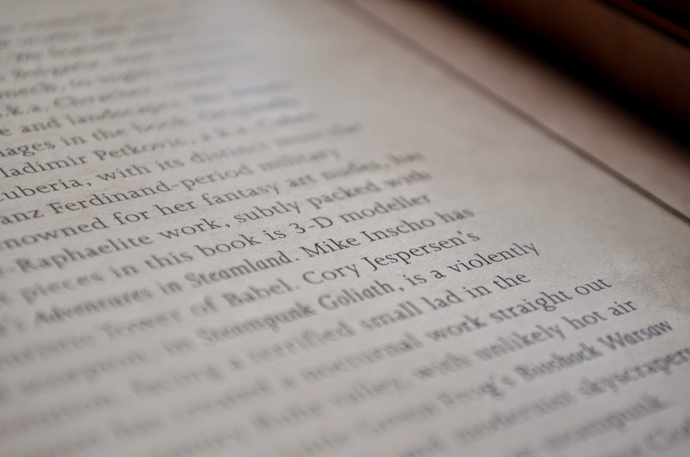
I received an email from Graffito Publishing one night. They were wanting to use an older piece of artwork that I created for a Steampunk: Myths and Legends online contest for CGSociety. I gladly, told them "Sure!" and signed authorization forms and went on my merry way. This fall, Steampunk Graphics was released and I honestly thought there would be cuts to many of the art they were able to use.
Pretty cool to open up the book to the Individual Works section and get a two page spread of your art. Never thought that was going to happen.
I want to thank Graffito Books for reaching out and wanting to use my art in their book.
Graffito Books
Sol Spinner
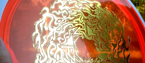
Anyone knows how blistering hot it gets here in the south. No one wants to leave their air conditioned living room on some days. That blistering sun is something trying to be captured in this design. I don't surf or skate but I've always had a love for the artwork making it's way on boards. I want to thank Chad and Brad Richardson from MVP Disc Sports / Axiom Discs and ZAM. Not only for the support but allowing me to be the first design coming off their press using gold foil. There were a lot of firsts with this one.
This disc is a limited release (only a 1000 made) Axiom Clash. It sports an orange Proton flight plate/ white GYRO™ rim with gold stamping. It will be available on September 12th.
Here she is!
Promo/Concept art
 |
| Rough draft/Neon Chain-Color Study#1 |
 |
| Rough draft/Neon Chain-Color Study#2 |
 |
| Final Promo concept used. |
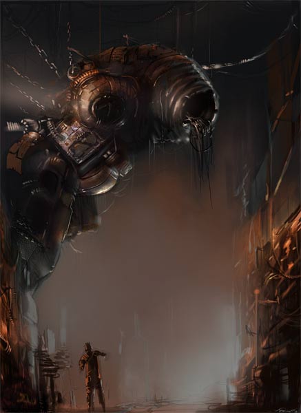
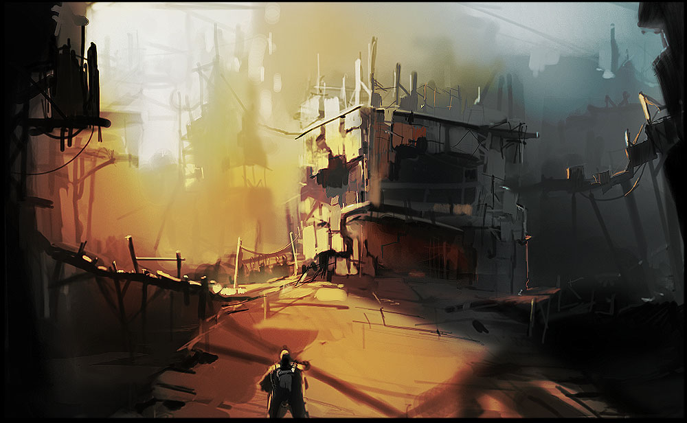
Fallen Earth: Sector 4 Concept Art
Steampunk Graphics
Halloween Hullabaloo Art Show @ Haw River Ballroom Saxapahaw, NC
Master of Sand
"Alien Cathedral"
"Robot Lady"
Tuesday Spitties
"Charon"- Based off the idea that if souls weren't buried with coins that they would have to wait 100 years until Charon would allow passage. I like the atmospherics in this one but need to refine the silhouettes of the souls to be a bit clear in the foreground.
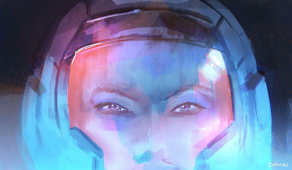
"School girl with astronaut helmet"- Well..I told myself that I was going to try and do more character work this year. Ran out of time messing to get the eyes right. Bounce lighting and visor reflections are really lacking to give it realism. A tattooed bar code or insignia on her forehead could be cool too. She seems more womanly than child like.
