Being invited back to such a great local hockey initiative is pretty exciting. The Carolina Hurricanes reached out for a poster design for the 2018/2019 Homegrown Season. The Homegrown Series aims to get the local art, food and breweries more visibility. After some rearrangement of days, I was assigned Jan 11th 2019 against the Buffalo Sabres. What most people do not know, is that I’m a WNY (Western New York) kid. Born and raised in Steuben County and only 2 hours south of Buffalo. This assignment was exciting but difficult as Buffalo pulls at my heart strings. To that end, I never watched much hockey growing up. The only player from Buffalo that I knew was Dominik “The Dominator” Hasek. One of the finest goalies of the NHL at that time.
To springboard off of the success of 2016's "PNC" poster, I feel as if I should stick to my passion and strength: Landscapes. I like the sound of the "Take Warning" motto the team has. I wanted to depict a small herd of Buffalo light boxed in front this gigantic (freaking huge) hurricane type of system moving in behind them. The bison would act as a secondary read. It's a mix of opponent based imagery but all in all, creating a beautiful poster that people would be proud to hang in their homes.
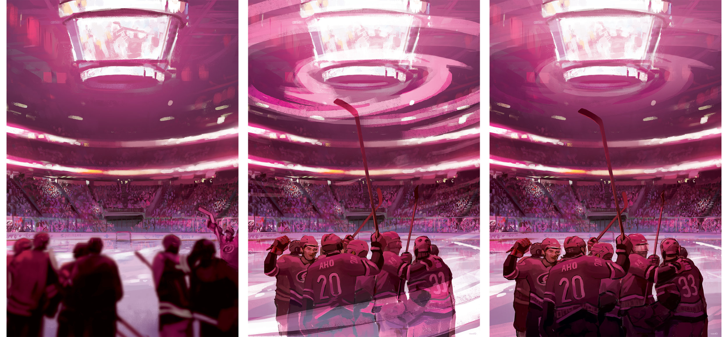
After much tweaking and trying to get this concept to work, we took a 180 and focused on an interior scene of PNC Arena. I felt it was a good compromise. The whole idea was to celebrate the “Caniacs” and fans. This year showed the birth of a cool winning celebration on home ice and to partially show that concept ended up being pretty fitting. Carolina’s starting goal tender, Scott Darling was released by the team mid season. It’s the risks you take showing players jersey’s in the poster. I was happy to edit it to make it current.
I thank the Hurricanes and the Homegrown Series for allowing artists and local business’s show what they have to offer. If given the opportunity, It'd be an honor. What do you think? Do you like the original idea or where the poster ended up? Comment and share this post!
2017 Carolina Hurricanes Homegrown Series
2016-2017 was a crazy time. I was glad to be a part of the first Homegrown Series put on by the Carolina Hurricanes. The fact that I was offered an opportunity to assist on more than one occasion had me above the clouds. The Homegrown Series is an idea that started last year that introduces fans to enjoy local food, beer, As their 20th year anniversary as a hockey club was approaching, I wondered if they were going keep it going for this anniversary year. I wondered how much it'd change based on last years reception. I was reached out to by Kyle Fowlkes (Carolina Hurricanes Graphic Designer) and was asked if I'd be able to return and contribute a poster design alongside this year's new lineup of amazing artists.
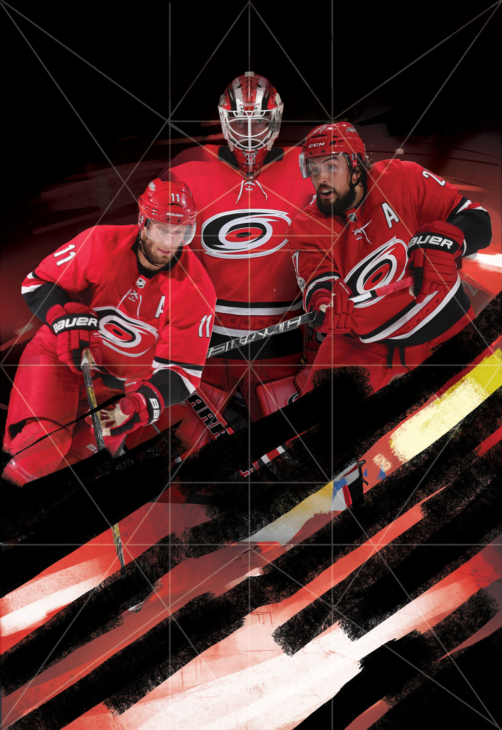
This years design is quite similar to direction as last year's PNC Arena poster. The concept this time around was to bring more of a personal approach to the design. The idea was to bring in the teams Captains and leading goalie into the eye of a storm. I wanted it to be intense, powerful and convey the team and fans unwavering spirit. I used a few symmetrical composition tricks to help set up the poster for the most impact.
Below is a timeline on how this poster came to fruition. I want to thank Kyle, the Carolina Hurricanes and everyone who had helped with personal critique of this poster. As one of my close friends said recently: "We operate in a profession that contains constant critique. Our world is much different than a traditional artist who sells their skills and particular image. Sometimes we need to step back and realize not all people want to be critiqued."
I gladly took it and tried to better this design. What do you all think? Does it succeed? Does it improve upon the work from last year's Homegrown Series? I'd love to hear your thoughts! Come out and see the poster with your own eyes on March 31st, 2018 when the Hurricanes play the NY Rangers at PNC Arena! You can check out the Homegrown Series page here
Carolina Hurricanes-Homegrown Poster #2
I can't say enough about the first poster experience . The Hurricanes were super accommodating and a absolute joy to work with. It was such an honor to be a part of the Homegrown Series not once but twice this year. As an artist, I really appreciate the concept that The Hurricanes have incorporated into their games. Reaching out into the public and calling on local musicians and artists to be a part of the games really showcases North Carolina's diverse talent and creates a sense of community, that is something that I love being a part of.
Kyle Fowlkes gave me another ring and invited myself and another artist by the name of George Hage to have the opportunity to do one more poster for this year. I wanted to stick to something I've really enjoyed over the years and that's more of a scenic landscape type of painting.
My goal was to create a calm yet uneasy feeling as you're looking toward the iconic PNC Arena. I wanted to convey the energy of the storm brewing. For me, this also translates into the energy of the players and the fans, those pregame jitters. I also wanted the opponents to look at the poster and feel that same energy, that determination that our players will exude once they step onto the ice.
What do you all think? Please leave a comment and feel free to share!
Carolina Hurricanes-Homegrown Poster
It's crazy how brief conversations turn into potential gigs down the road. To be able to be among other elite Raleigh artists and contribute to the new Homegrown Series, feels pretty freaking cool. It's Carolina's way of bringing together different local artisans, beer, design, music and food to each of their 8 Homegrown Series games. I think it's a great idea.
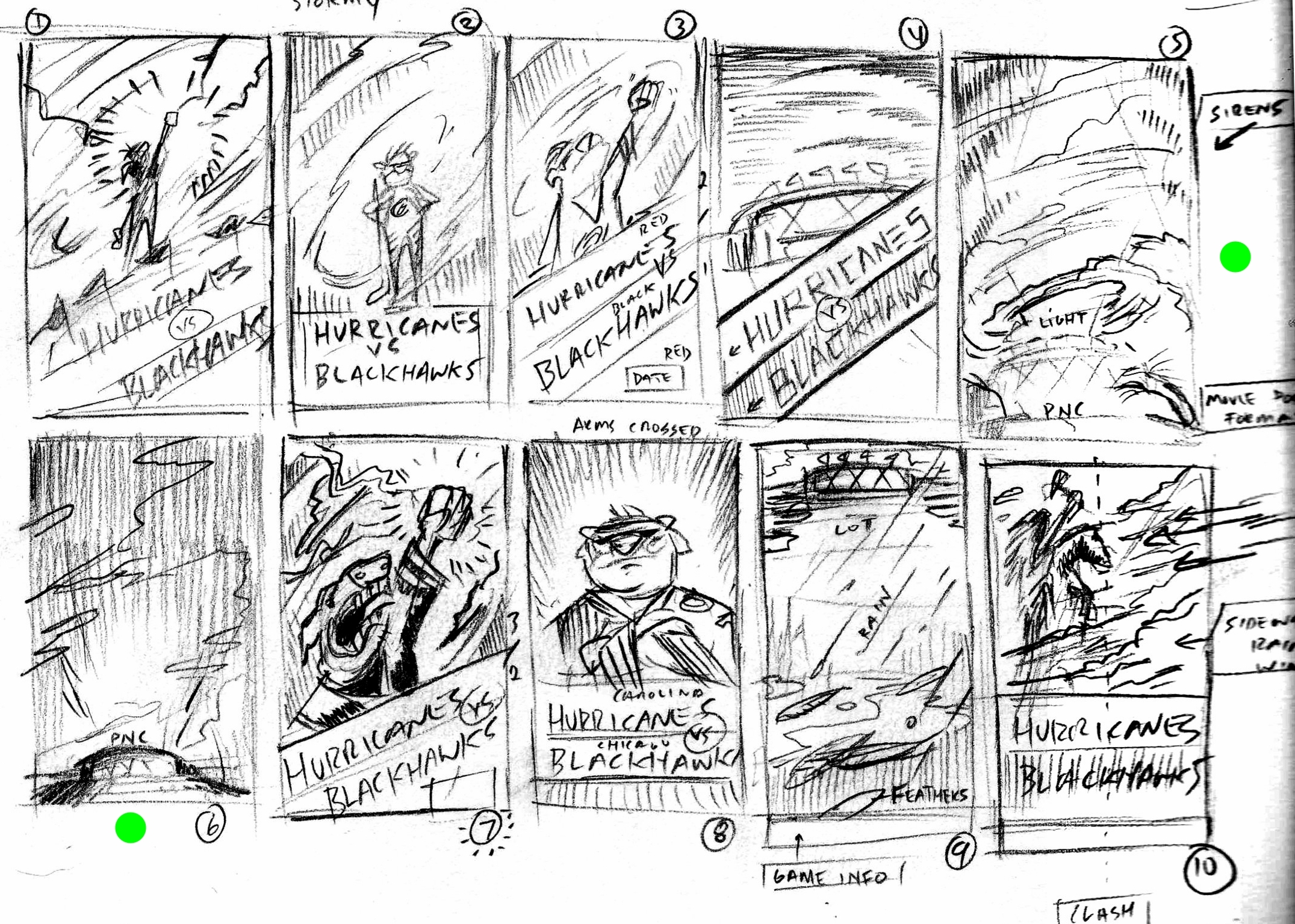
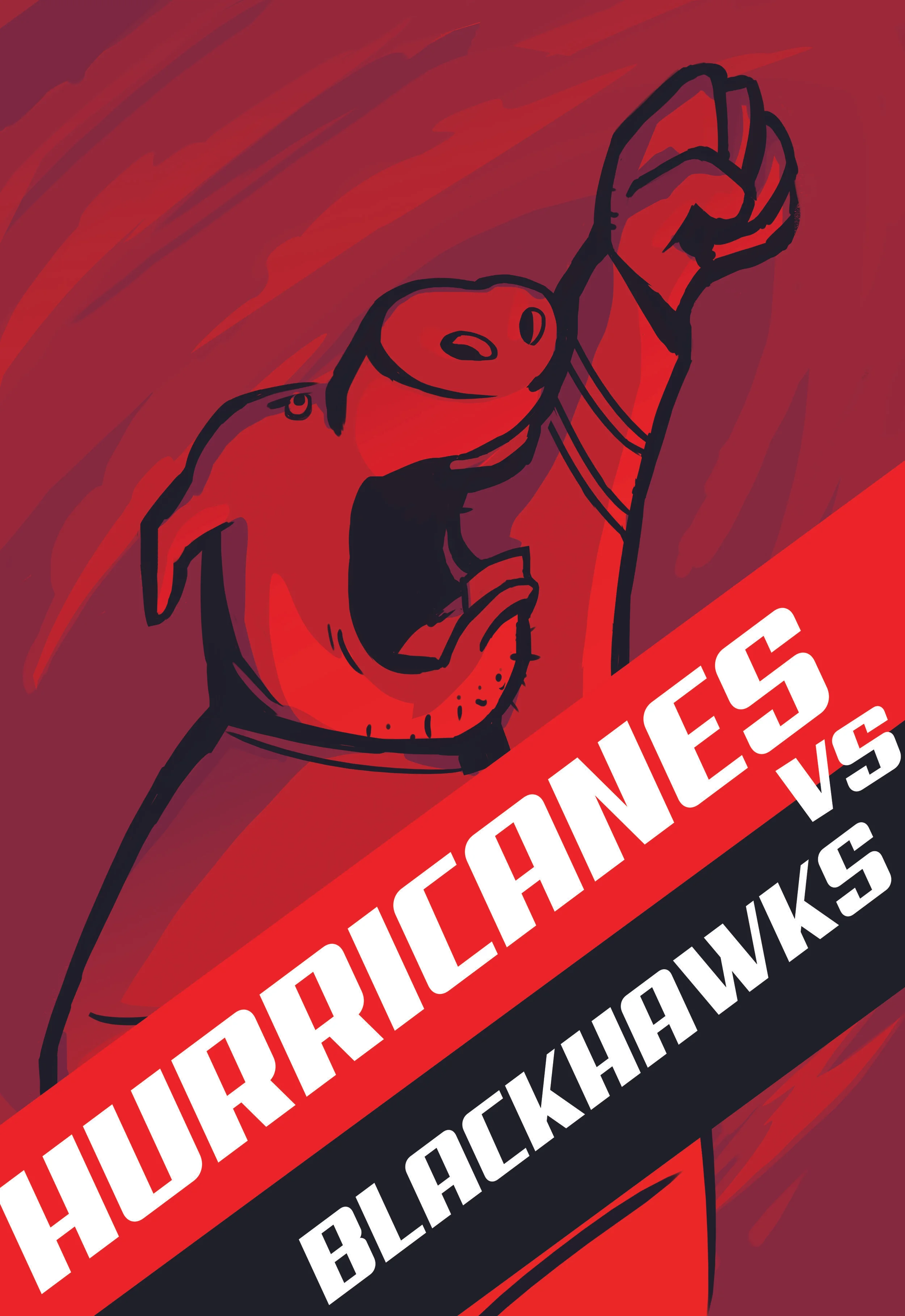
Here's the process on developing a poster for the Hurricanes vs Blackhawks matchup on December 30th. From the get go, I wanted to do Stormy the Ice Hog (Carolina's mascot). I've seen pictures but knew if I wanted to make this poster appealing, I'd have to change up the design and approach a bit differently. I started out a character design that I thought I was going to take to the end. Late one night, I pulled a 180 and designed the Ice Hog rendition that seems more up my alley.
The "REDVOLUTION" is their motto this year. I wanted to illustrate Stormy out front, leading the charge. Hurricane winds brewing in the background. I knew I wanted to get some dynamic lighting as well.
All in all, I'm pleased with what I was able to brew up. I hope I get another chance to do this series for them. I want to thank Kyle Fowlkes and the Carolina Hurricanes for giving me this opportunity and complimentary game tickets.
