2024 PDGA Ace Club Disc

Welcome back! After getting down to the wire; next up on the docket was to figure out how the dragonfly scout drone would look in its environment. These are the reasons I like doing these development blogs. Because a smaller percentage of disc golfers receive the membership and Birdie Club discs; most would not notice the change from dragonfly to hummingbird for the Birdie Club design. It was at this point that John and I decided to split the Birdie Club and Ace Club designs down the middle for the sake of time. I’ll show some of the Birdie Club development below but this blog is ultimately about the Ace Club and further developing that character for her design.

2024 Ace Club
I initially started Ace Club without knowing if the character with the dragonfly drone was male or female. So, I created male-oriented Ace Club thumbnails. When I found out she was female, I made some adjustments. From the beginning, I aimed for a power pose to show strength. I intended to have the character destroying the disc golf course with her immaculate and merciful aim, leaving behind post-battle smoke and debris. From the beginning of switching from front, back, and side I had her holding a stack of discs. It reminded me of going out to a hole wanting to throw one in. You would grab a stack of your favorite discs and proceed to launch countless times to try and see it go in off the tee. The pose took some work but that lower upward angle stuck. Vic and John gave me great feedback to add the dragonfly toward the end of the rough stage like a support drone. While the concepts for Birdie and Ace moved away from the original idea slightly, I tried to keep the TRON-like appeal and the environment intact.

You can still get these Ace Club discs from the Professional Disc Golf Association if you’re interested in registering. Joining the Ace Club is a simple option you receive after picking your Amateur or Professional status. I want to thank Vic Allen and the PDGA for allowing me to collaborate with John Dorn once again. John is a legend in the disc golf stamp design game, and some of his inspirational stamps for Worlds and events around the world made me believe that this could be a viable career one day. What were some of your favorite things from the 2024 PDGA Renewal disc drop?

2024 PDGA Membership Disc

After John Dorn and I’s seemingly successful 2023 Membership campaign for the PDGA; Vic Allen (PDGA Membership Manager) reached out last year to see if John and I would be interested in doing the memberships this coming up year. What’s exciting is that they would be landing a new Eclipse R2 Plastic mold from Axiom Discs, the Insanity. The goal this year was to provide 3 triple foil stamps commemorating the Membership, Birdie Club, and Ace Club with a 4th design that would intend to be the Eagle Club disc update.

I loved what John and I did for our first collaboration in 2023. Having the opportunity to think about that drop and what we could do next to improve upon it was a consistent theme. With the larger Eclipse rim on a black R2 distance driver; we both were feeling that a cyberpunk/ futuristic-TRON subject matter could work. We would intentionally show the entire team on the Membership disc but feature the different characters on the Birdie and Ace Club to help round out the connection between all of them.

2024 PDGA Membership
With the approval of the concept greenlit, John and I got started on reference sharing. Because of how intense MVP Disc Sports’ Eclipse plastic compares to the rest of the industry; we wanted to lead with that. TRON Uprising, vintage TRON, and some weird Jodorowskys’ Dune samples made it into the mix. While John was settling into more of the classic TRON arena sphere, my concepts more or less went to this more open-air space obstacle. Grinding out how we’d include all of these characters took quite a bit of work. From the final thumbnail concept, you can see we mixed a bit of classic into the sort of upper thirds concept my original blue/yellow sketch provided. This year was also the introduction to the PDGA’s new branding. So we were able to get early access to the logos so they could make their way onto the new membership stamps.

Rough Phase
The basis of this layout goes back to the first sketch I did in the thumbnail stage. We all like that each character would have a unique silhouette, and be back facing to save us time and allow the other discs to feature the character in their environment. Going from rough shapes to the final characters took more time than we expected. How would the heavy, large-winged brute character on the left come to fruition? We wanted each character to have their uniqueness and specialty. We realized we wouldn’t have room for both male and female protagonists so we reduced the middle figure and made sure it was represented elsewhere. I took one more shot at the composition after we felt like the classic felt too close to TRON. I had John take over the rough stage and push this stamp to completion.

Final Stage
Since there wasn’t any great way of showing the idea of a smaller fairy-like female scout on the right side of the stamp, John had a great solution of taking her off the shoulder and designating a female reconnaissance bot for Ace Club. The dragonfly drone would represent the Birdie Club, and the heavy on the left side rounds out the supporting cast as the Eagle Club. It freed up a lot of foreground issues we were having. In the end, I felt John and I did a good job of creating a sci-fi subject with our twist.

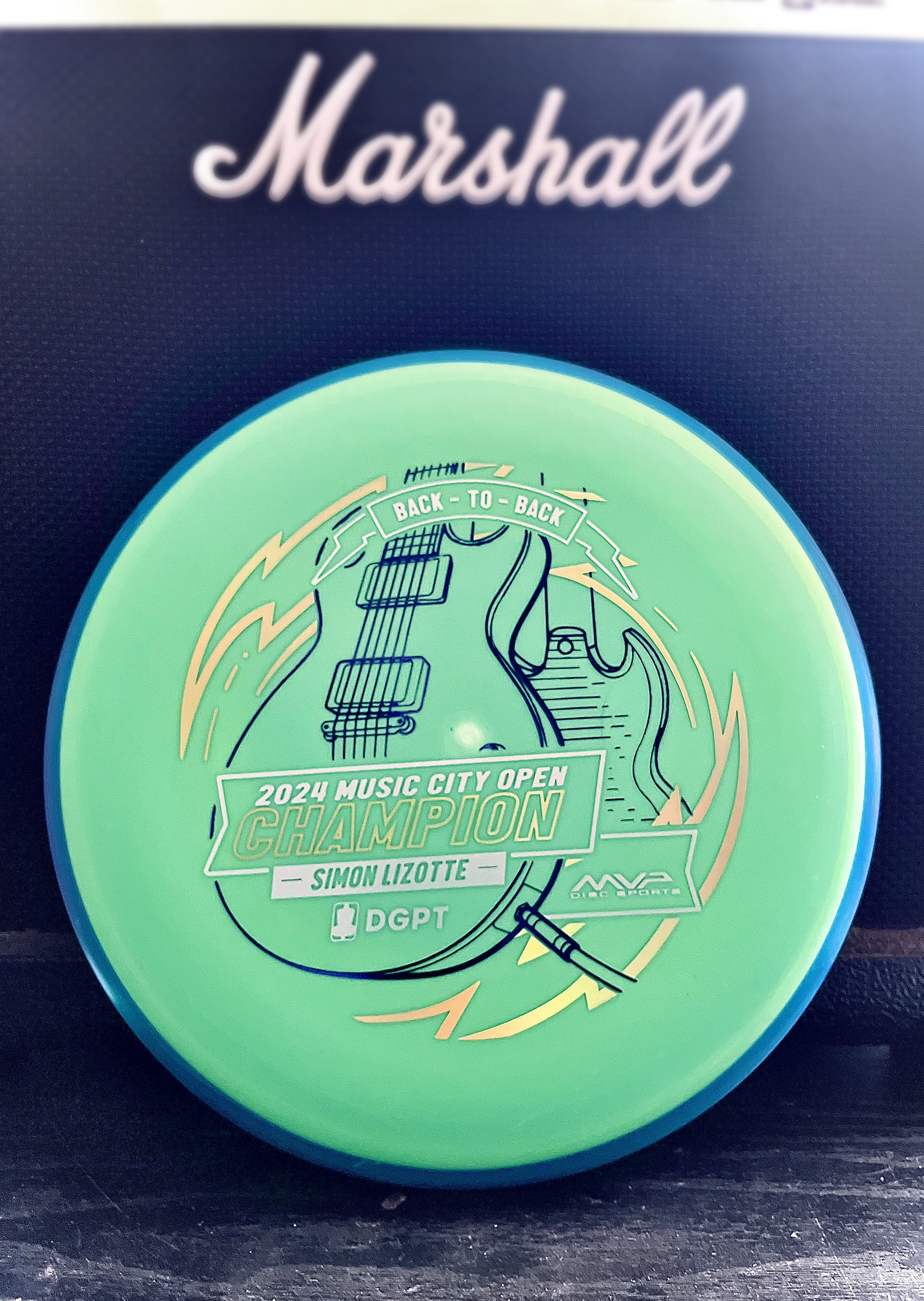
Simon Lizotte Music City Open Champion

Sunday, mid-afternoon the text came in to start thinking about a stamp. Simon Lizotte had a 2 stroke lead going into the final round. He played out of his mind and was making the proper plays down the fairway and hitting some incredible putts all weekend. We knew the Pixel would be the disc we would run. I took a quick hour that Sunday afternoon while action was kicking off to create a stand in stamp just in case. The initial idea was to keep with the theme of this year and the Les Paul. My initial blocking in was to feature the body of the guitar in simplified drafting shapes.

The decision to go with a “back to back” was universal within the MVP Disc Sports ranks. Sunday night I got on it and started gathering referencing of both front and back of the SG and Les Paul guitars. I used a mix of different library models from Google Sketchup to nail camera field of view. Mainly, it was an excellent resource to help me get both guitars on guitar stands and in proper perspective

The final stretch was adding in a sense of “flow state” which was mentioned quite a few times on the live event broadcast. Simon seemed to be in that headspace all weekend and I wanted to incorporate that element. I used radial symmetry and bolts to add the 2nd foil and consciously used the 3rd foil for the Event/ Logos/ and “Back-To-Back” banner up top. The final stamped product was dressed in dark purple metallic, gold holographic, and brushed silver foil. The custom triple foil stamp took a solid 2.5 days from start to completion.

The concept is pretty straight forward but overall, with the amount of pressure and time to get something to final, I’m pretty stoked on the outcome. Let me know what you think? How could I have done “back-to-back” differently? Thanks for stopping by.

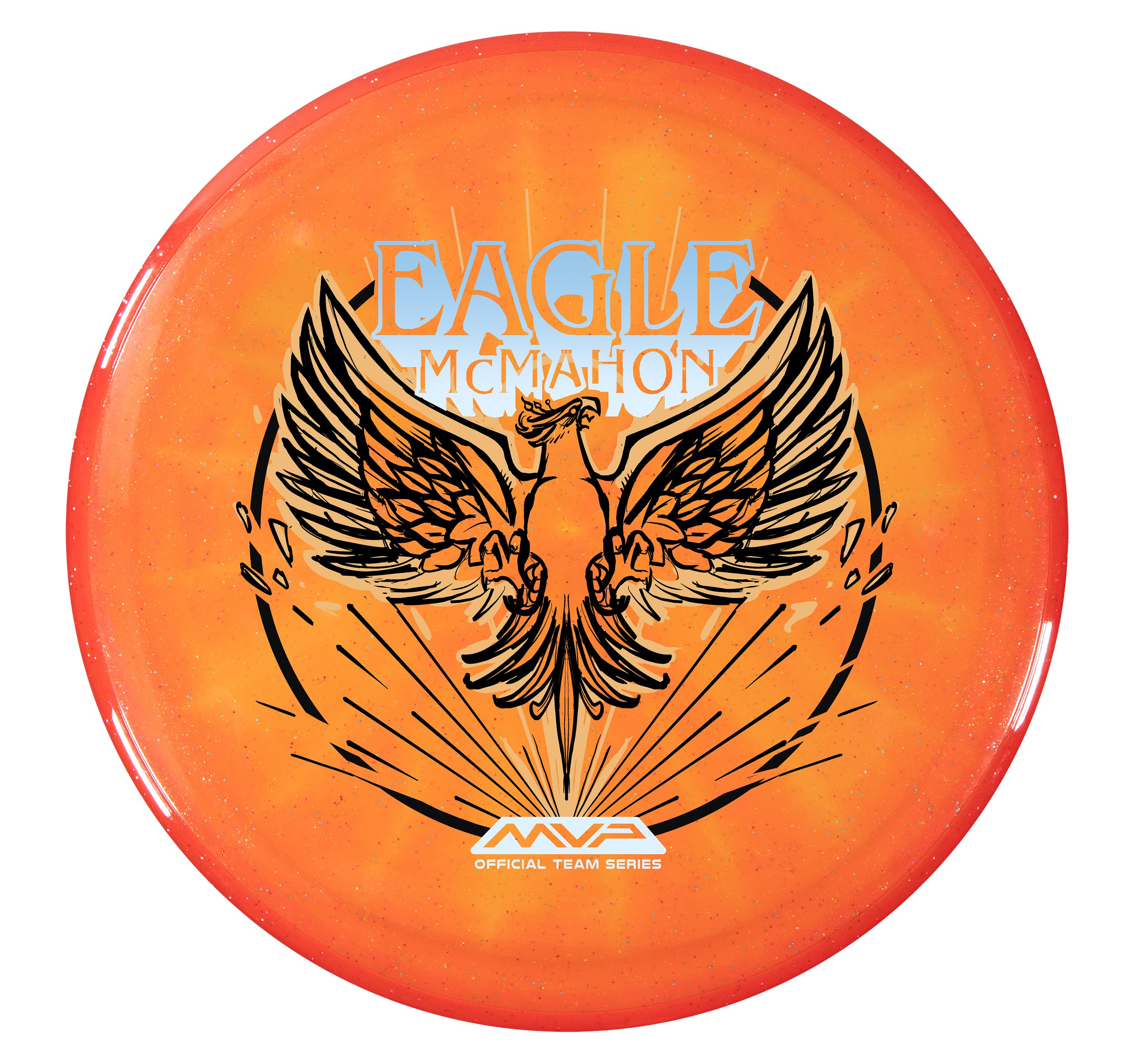
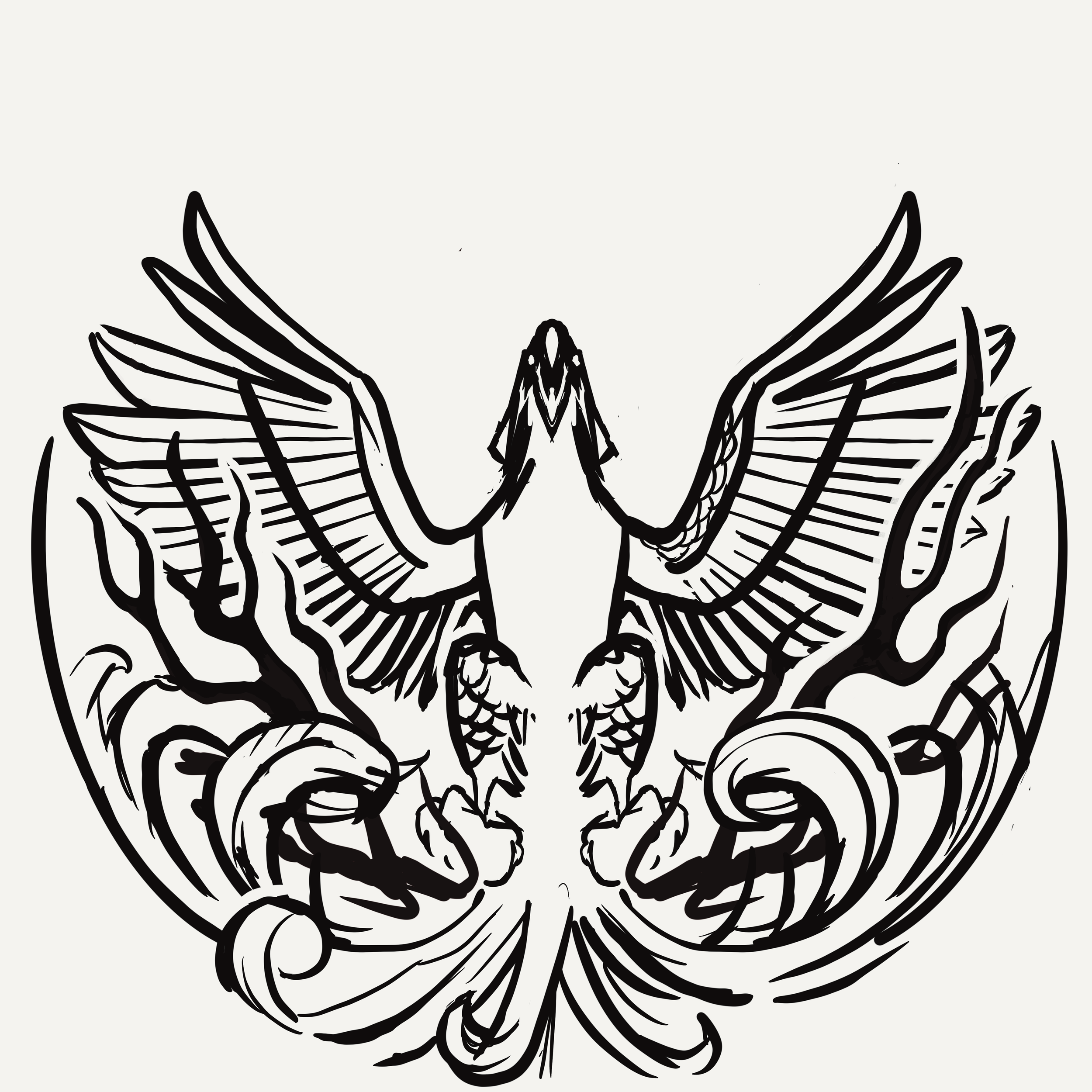
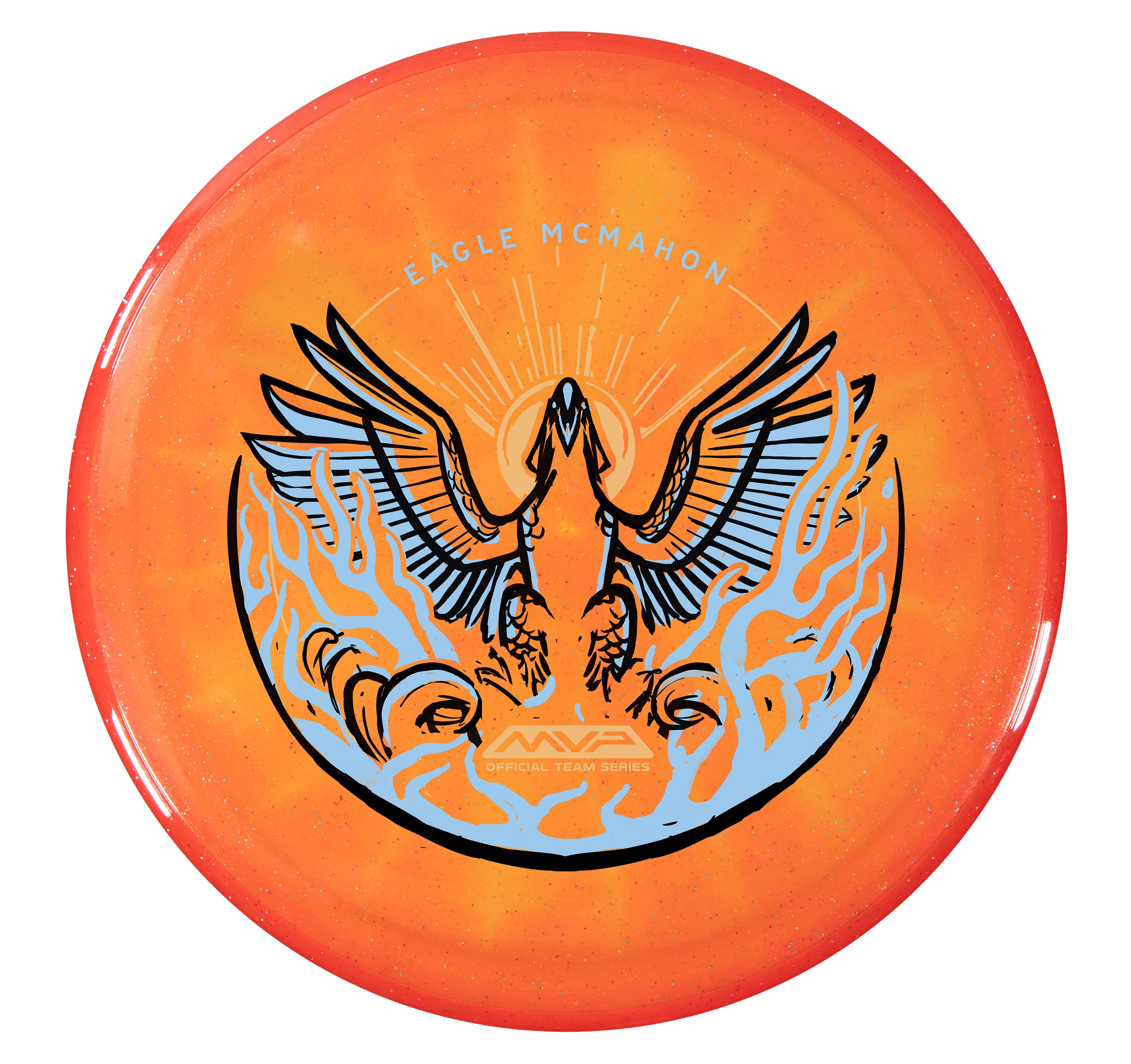
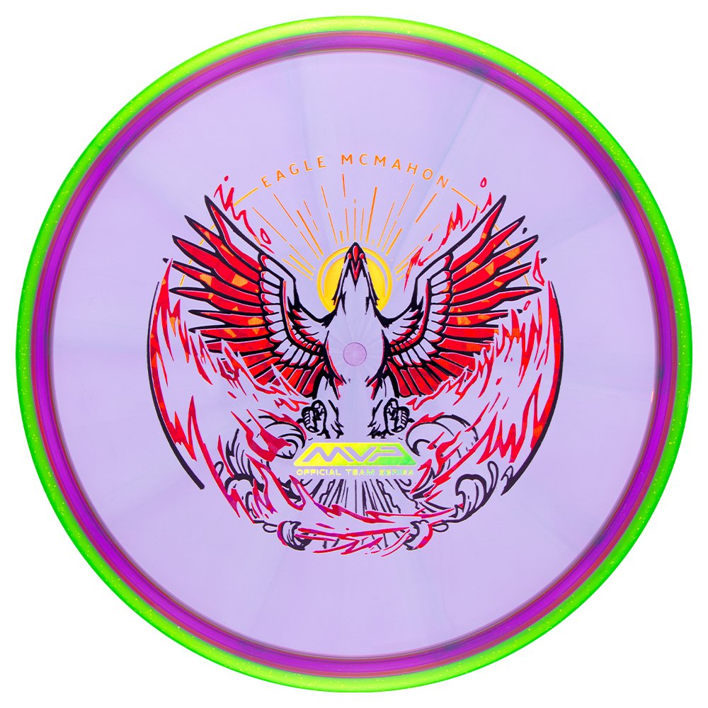
Eagle McMahon 2024 Team Series "Rebirth"

MVP Disc Sports is starting 2024 with some great Team MVP signings. One of them is Eagle McMahon! I can’t say this enough, but it was a team effort to design, film, edit, plan, and execute the Eagle McMahon recent news drop. I couldn’t be prouder to be a part of this team we have assembled. Eagle had requested in discussions that his Team Series disc be the Axiom Prism Proton Envy. Prism Proton is a combination of a Proton core with a Prism Proton rim. It differs from the standard stock Proton Envy with its Neutron overmold. It allows light to bounce through and create some remarkable results. The Envy is one of our company's most popular discs, and the Prism Proton Envy is easily one of the most gorgeous Envy’s we have ever produced.

Assignment:
To provide Eagle McMahon with a triple-foil 2024 Team Series design and to have stamped product before Eagle’s arrival at MVP HQ. At age 25, firmly in his prime, He knew this opportunity was the start of the next phase of his career. Those conversations led naturally to the concept of a phoenix, or rebirth. It was the start of something new and exciting. While this was my priority secret assignment, I had to conduct my day-to-day operations as the Art Director of MVP.

Phase 1
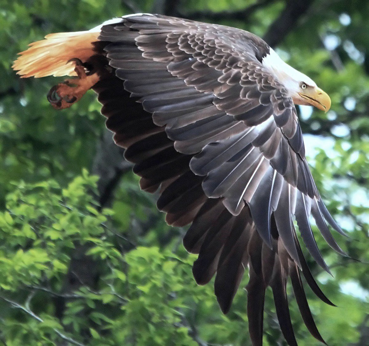
MVP/Axiom isn’t known to be a company to release anything bird-related. Where do we start? How can we work within the parameters of the phoenix lore and not create something similar to other disc golf brands? Cybernetic concepts? AI generation? The choice to use an animal has been made and redone countless times within the disc golf space. I relied on gathering references of phoenixes and eagles that displayed strong pose characteristics and unique silhouettes. While in the rabbit hole, I found references to an Eastern-style phoenix-like bird that steers toward ostrich/peacock comparisons. I felt there needed to be a sense of pomp and circumstance/elegance.

Phase 2
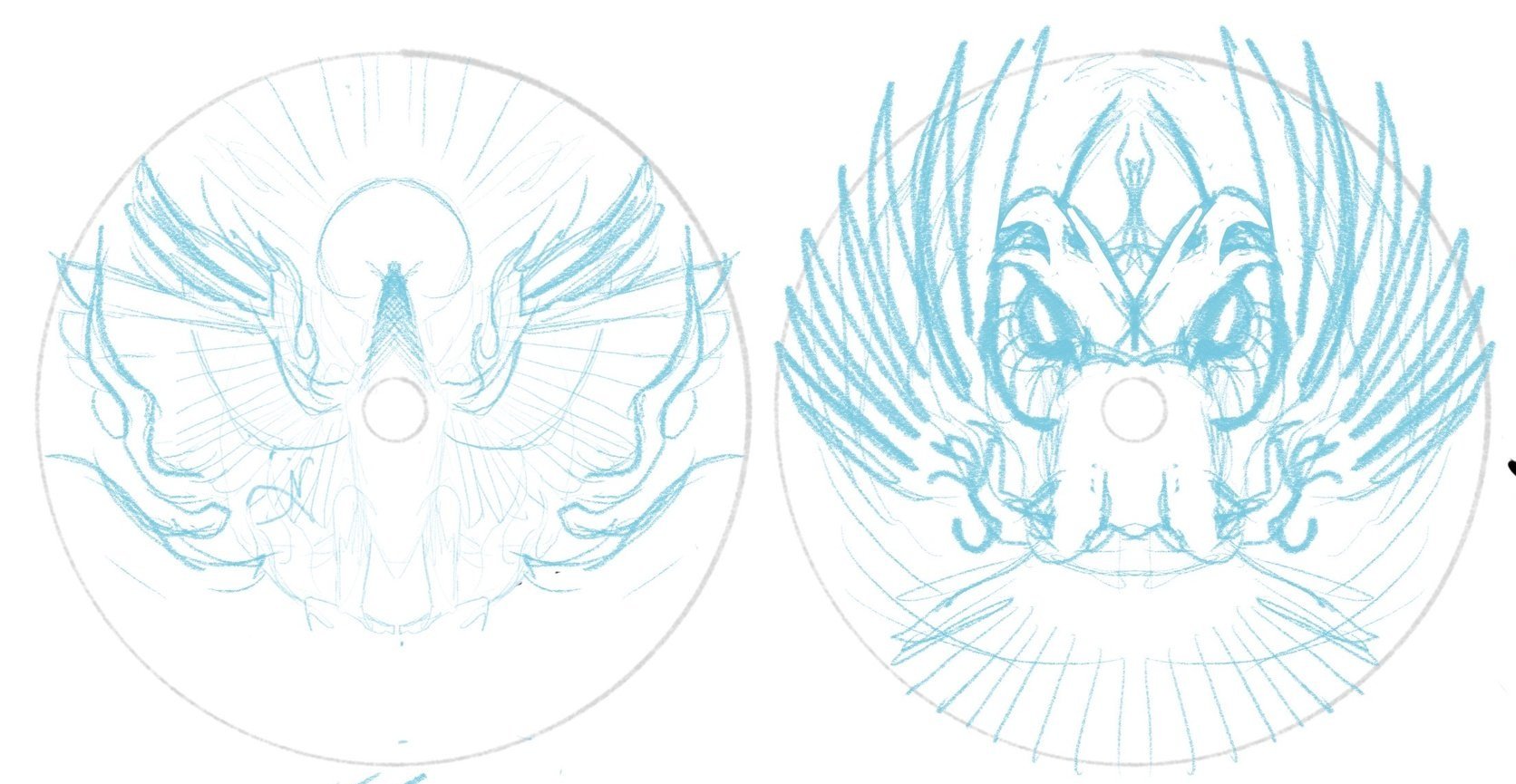
I got to work on a few sheets of thumbnails. Listening to feedback from the first thumbnail selection gave me more to chew on going into the second set of ideas. This sheet would land the bones/overall direction of the design moving forward. I brought a rough chosen thumbnail into Procreate and started to figure out bird, text, and logo placement within the stamp. There are standards for the Official Team Series seal with a minimum stamping size of 10mm tall, and I knew from the jump that those were must-haves. Going from loose drawings to idealized structure (mocked onto discs) helps show ratios and how the design feels with the characteristics of the plastic.

Phase 3
I learned a lot about Eagle during this first project. He wasn’t the biggest fan of his name taking up so much space as I initially thought we needed. We opted for a smaller footprint. The head facing to the right side offered the best silhouette value. Overall, leaving the head looking off to the side felt commonplace with the reference I’ve been seeing. Looking upward and straight on felt more engaging and powerful, so I continued with that mindset. We entered a more polished stage. I started thinking about all three foils. Eagle was pretty jazzed, and we all felt this was the final direction.

We were at the 80% mark when I felt the flames didn’t replicate the excitement/buzz going into 2024. In a traditional sense, the vibe fits more with the Eastern/traditional style fire. While working through the final ideas of the bottom stamp rocker, I realized that the airfoil caused by a bird rising from the fire would create a bit more disturbance. Adding more lateral energy helped add dynamics to the bottom portion tenfold.

The Final Phase
The last part to do was to finalize line quality, start placing the assets into the custom template, and work through final line detailing with stamping guidelines in mind. This design had to have little to no issues on the day they tested. It needed to work consistently for whoever was running the stamping machine at any point.

The Eagle McMahon “Rebirth” Team Series discs will include gold holographic foil, red holo foil styles (shatter, dots, and vertical holographic lines), and a black outline. I’d like to thank Eagle for his attitude and pure joy during this process. It aided in the extra hours needed to finish this. I’m beyond excited to see these out in the wild and can’t imagine what 2024 has in store for MVP Disc Sports. I hope you all enjoyed and feel free to ask any questions. Thanks!

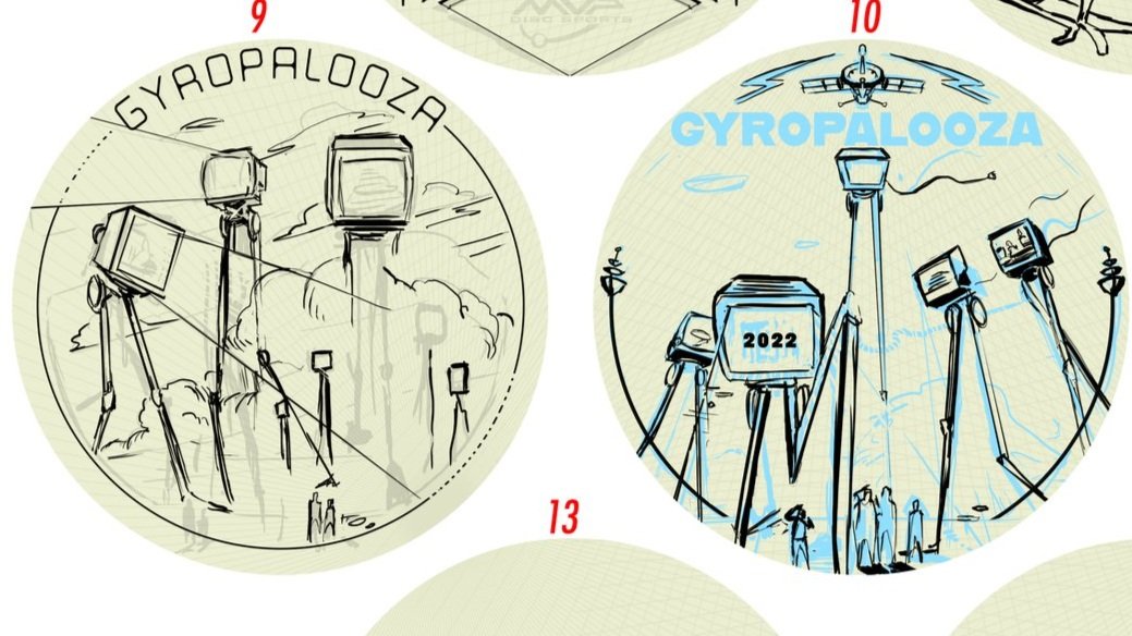
2022 Gyropalooza Total Eclipse Proxy

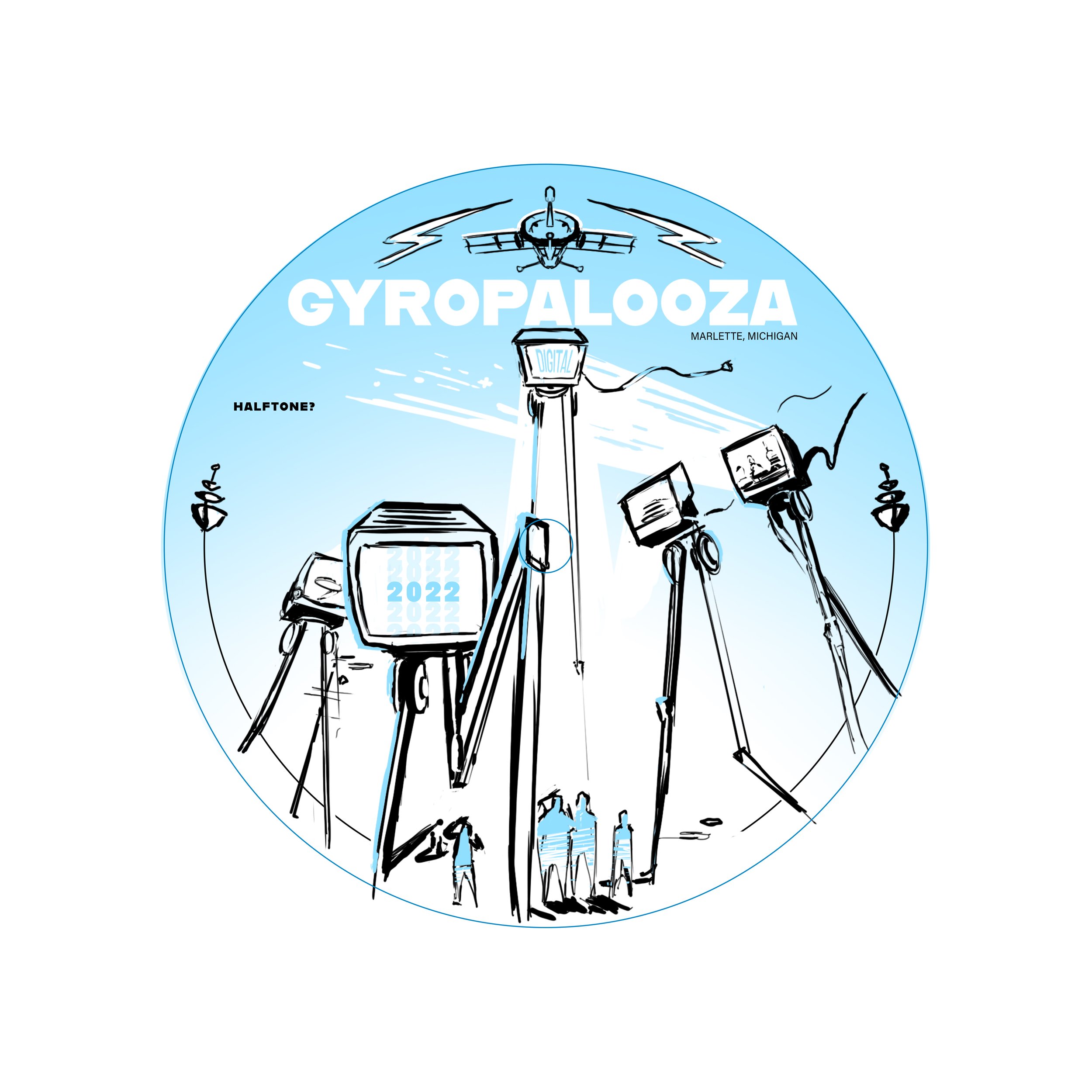
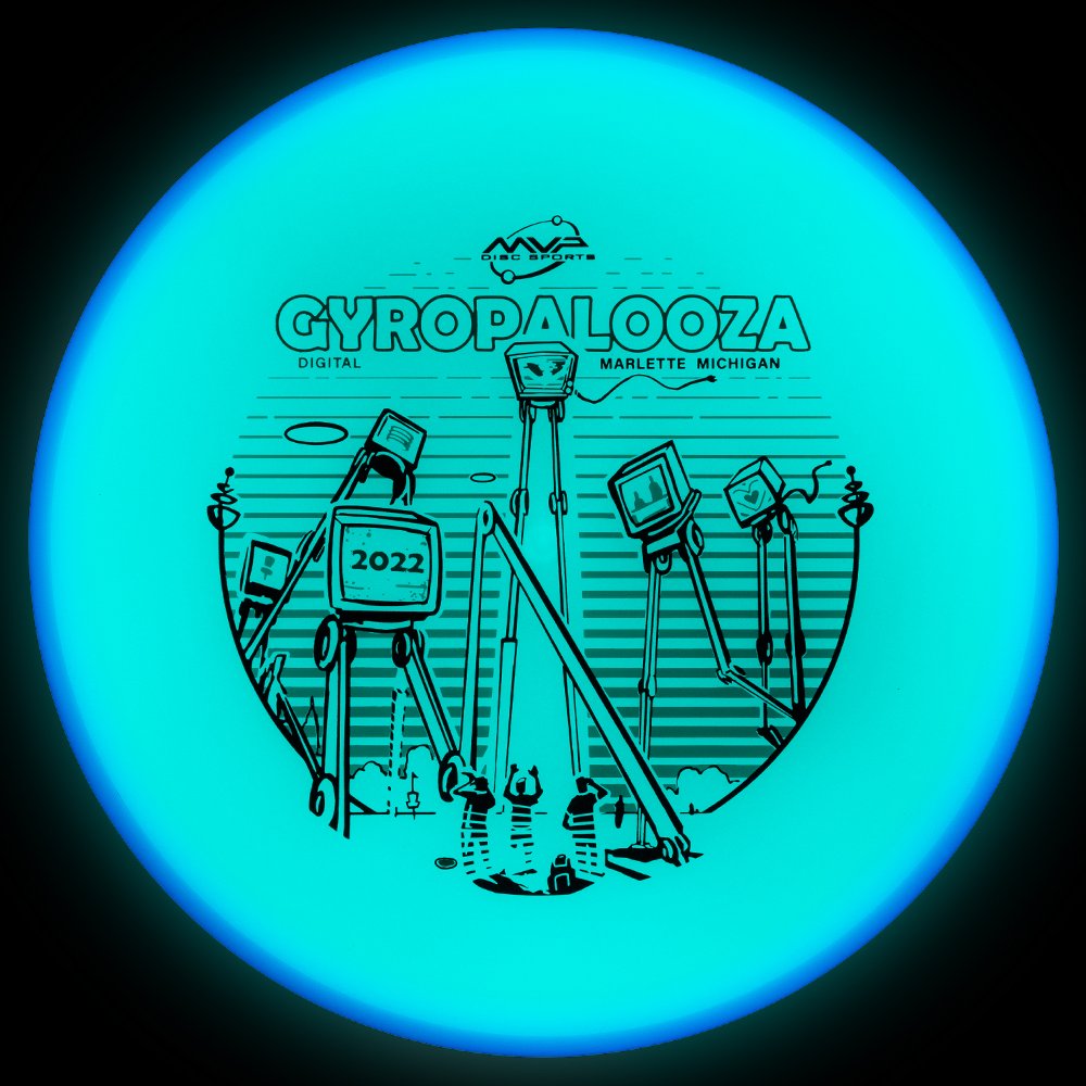
The 2022 Gyopalooza brings something pretty exciting. We had a new Total Eclipse glow technology in the lab awaiting its release. The Proxy is outfitted with both an Eclipse™ Glow flight plate and Eclipse™ Glow Rim. Colors vary from white, aqua, green, blue, and purple with a multitude of different combinations.

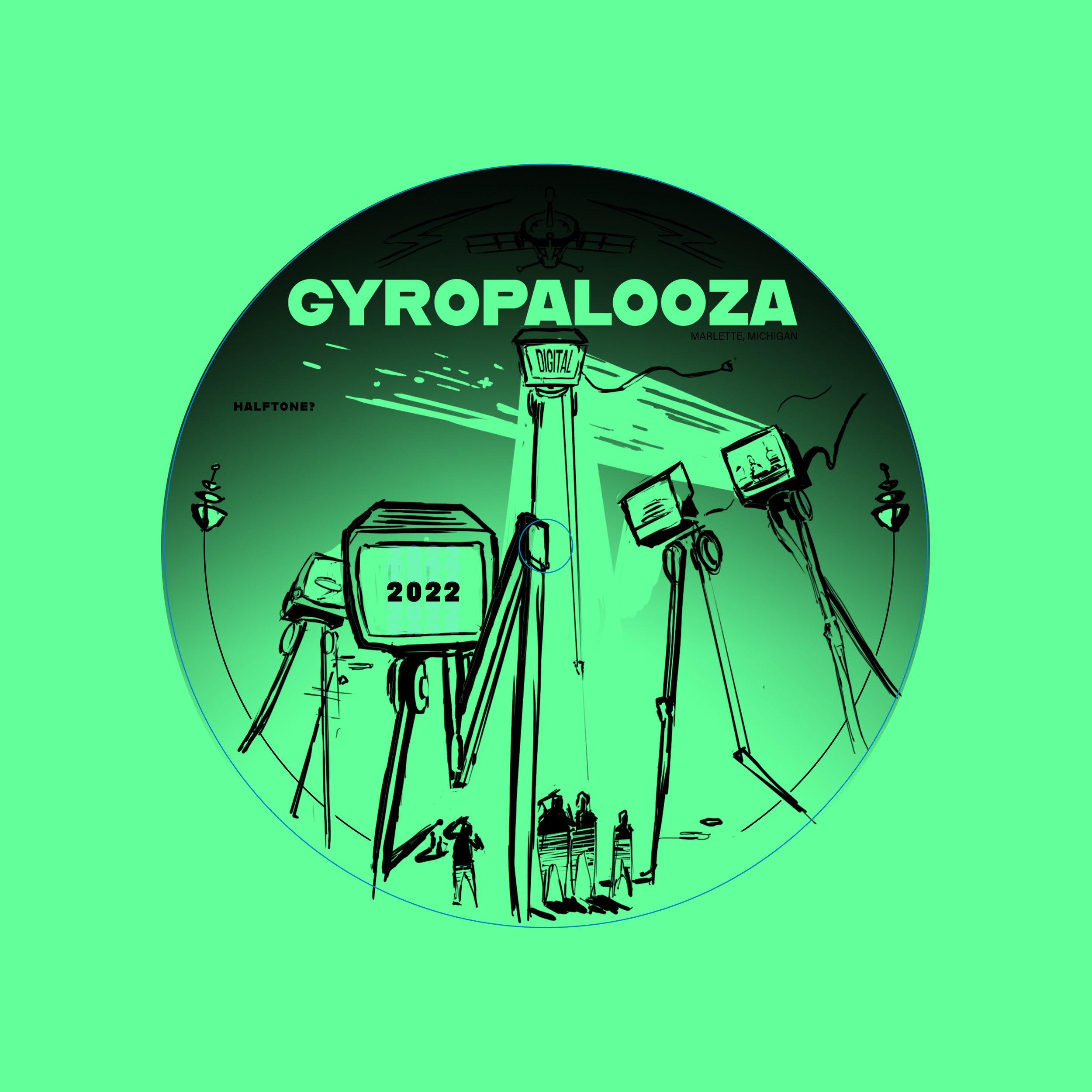
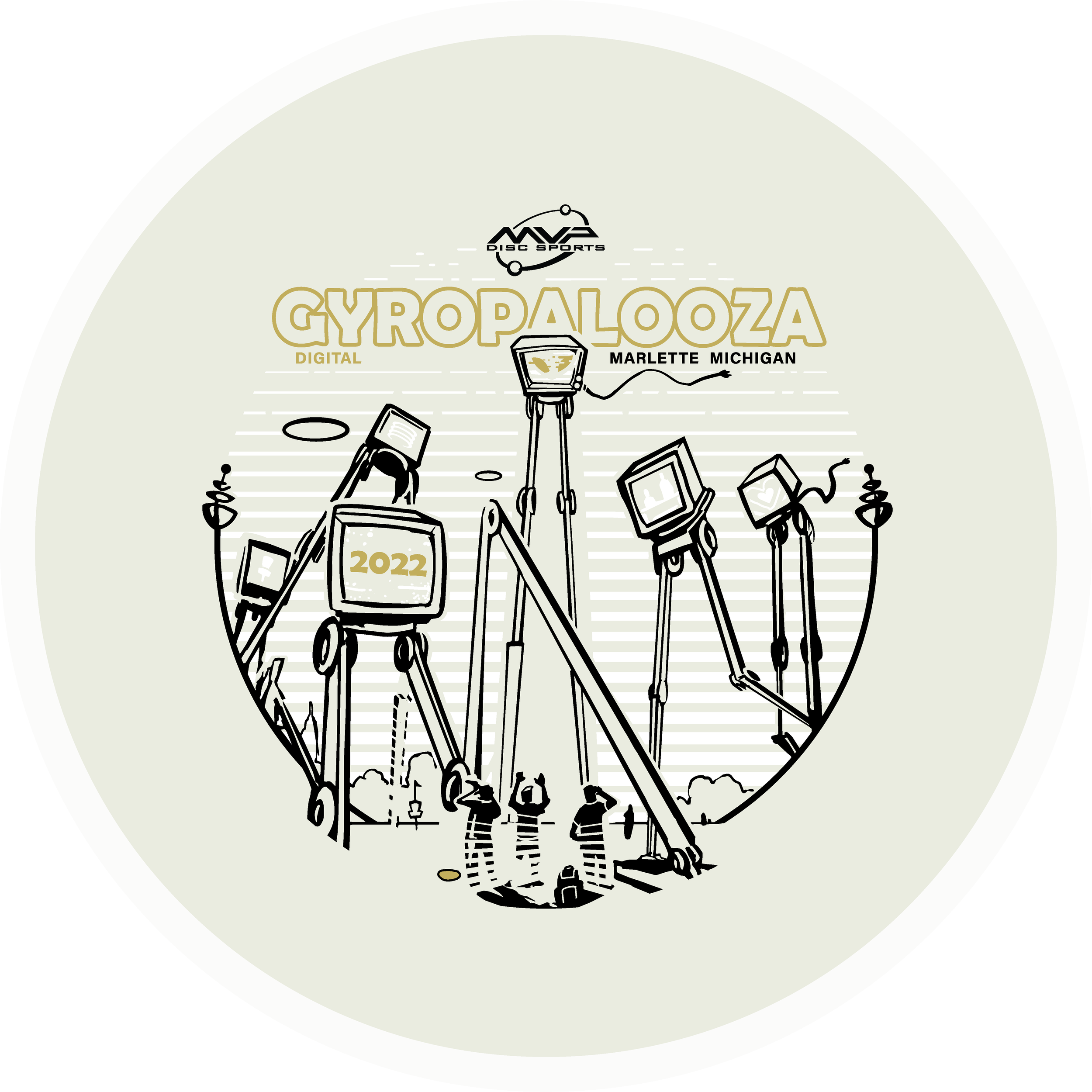
The Idea: I had this image in my head but instead of being an intimidating alien species laser-stomping everything in sight, they were dispatched to broadcast exclusive MVP content and news to the Gyronaut masses! All of this sounded great but the important goal from the get-go was not to hinder the glow properties. I think it’s important to design stamps with disc plastic in mind. If the glow is an important draw, why would you cloud it up with foil? Lastly, by setting up a two-point perspective grid, it gave me a great base to lay down that looming presence of the tall beings. There are still a few MVP iconic themes scattered about.

I wanted some of the TVs to engage with the local disc golfers. It was a good placement for “2022”, discs, and a Brad/Chad silhouette we’ve come to know so well these past digital versions of Gyropalooza. Lastly, the last and most important icon located on the far right represents a huge love for all of our fans who’ve stuck by us from the very beginning through the years of rapid growth. I love to infuse emotive characteristics in robots. Allowing robots to have a bit more life and curiosity like our human race. Lastly, I wanted the center alien bot to have its glow casting on the disc golfers underneath. I used a line screen in the background to enhance that particular element. Doing that for every TV would’ve clouded up where I wanted the focus to go.

Hot Stamping Foils: I’m a sucker for white pigment foil because of how bright the Eclipse glow plastic is. It allows some of that color to seep through and gives the glowing state a bit more depth. The accent color is a classy nod of brushed gold that allows it to pop off of that core plastic color. Again, it’s important that the accented foils work alongside the others during the glowing state.

Can’t wait to get some of these in my hands. MVP took their industry-leading glow and just made it better. I don’t get out and play glow rounds very often but this disc makes it tempting. What are your thoughts? Excited to see these in the wild? You can get your 2022 Gyropalooza pack from any reputable MVP dealer. Included will be this Total Eclipse Proxy, a Prototype Eclipse Color Glow Envy, and Lab Second discs for a pretty good price. Thanks for tuning in!

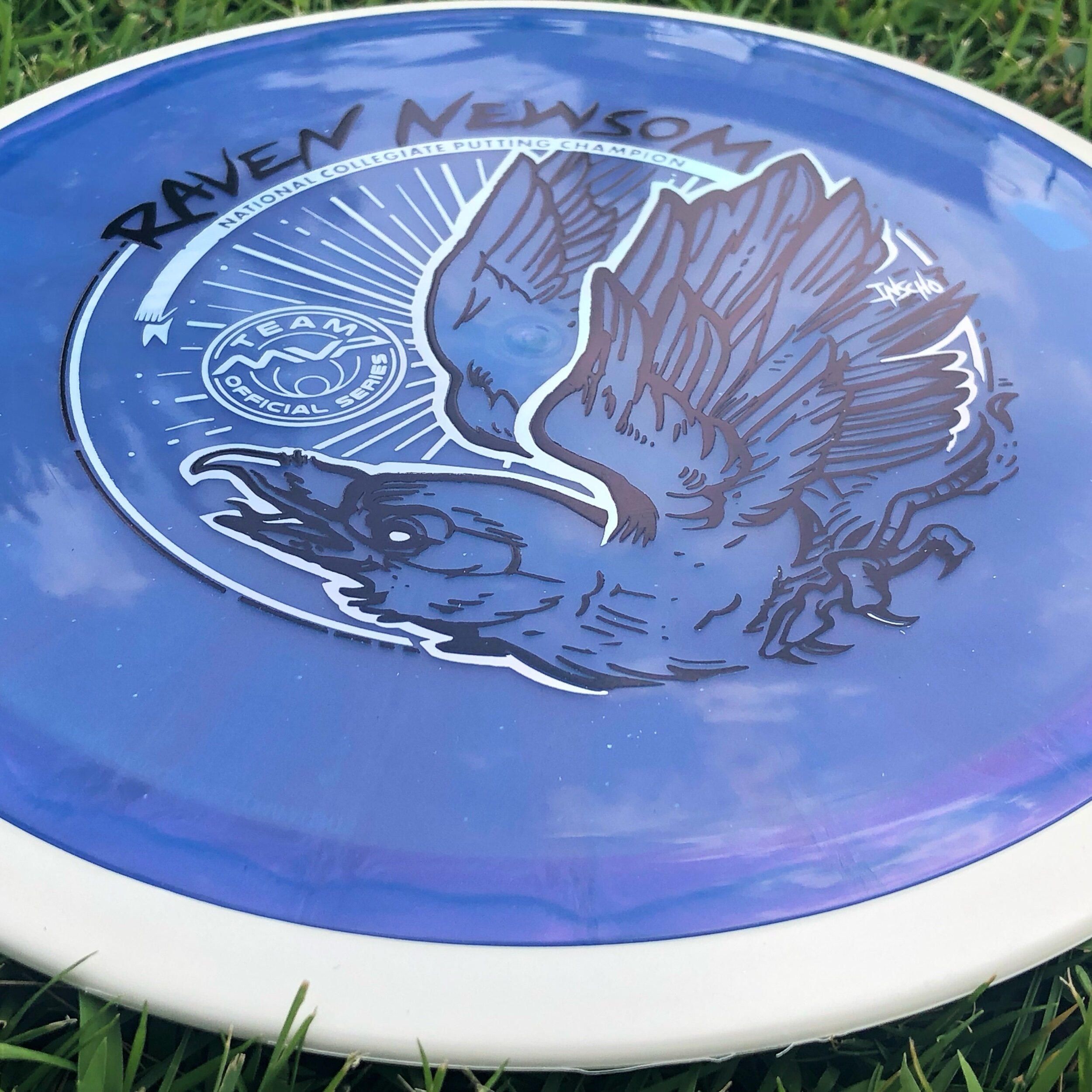
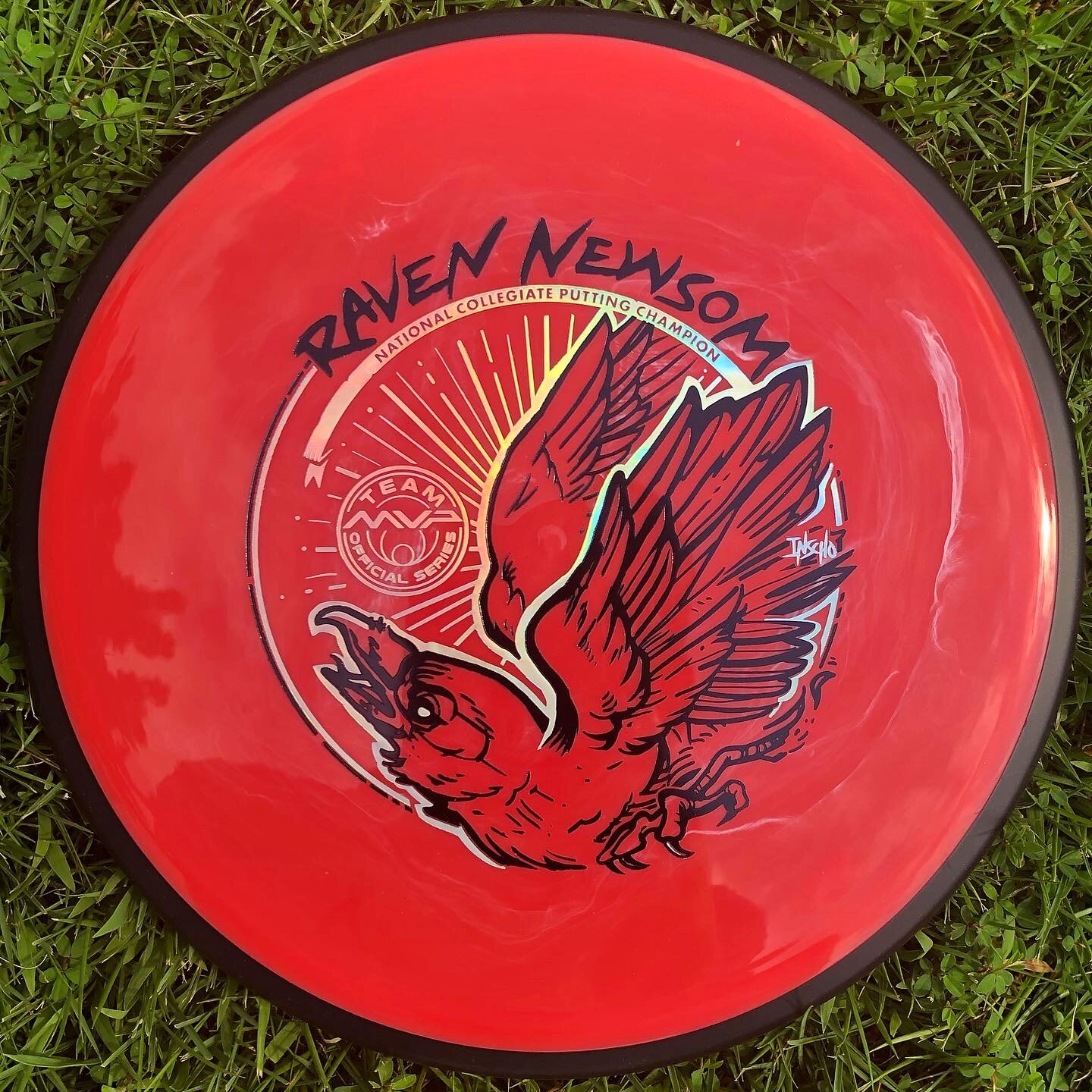
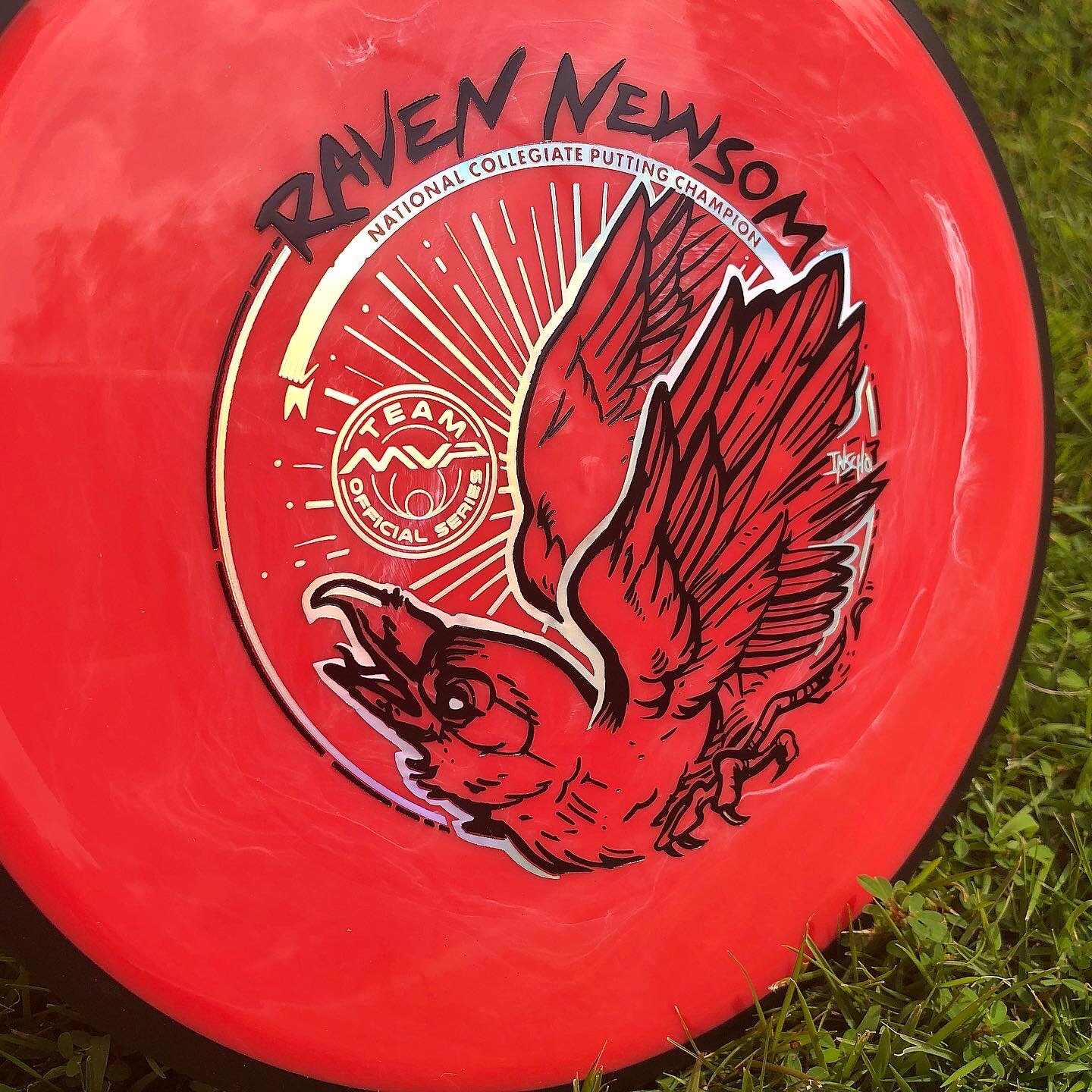
Raven Newsom - 2021 Tour Series

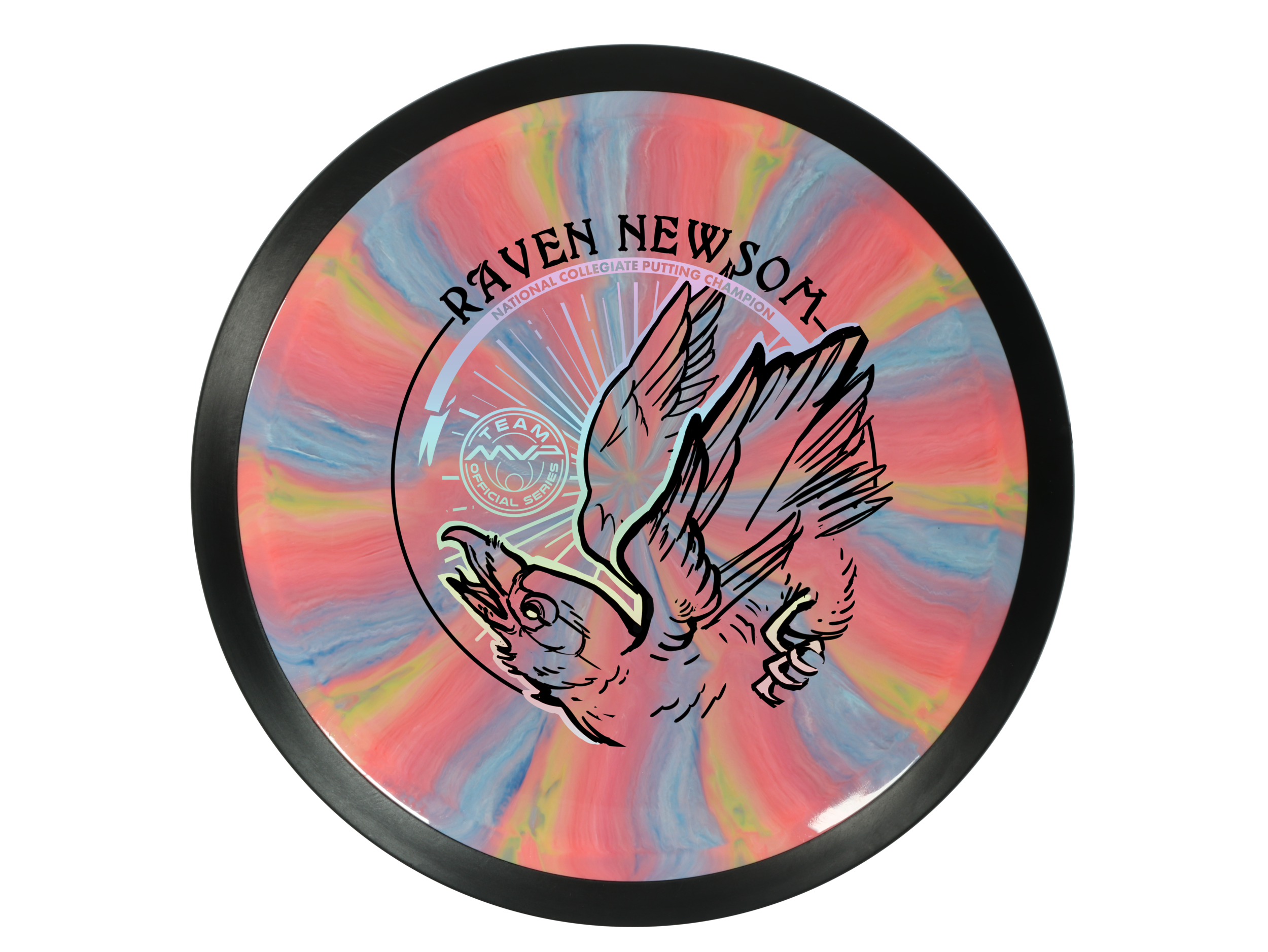
Raven Newsom officially went all-in on the 2021 season. He’s toured and pretty much played every National Tour and Disc Golf Pro Tour event that was on the calendar. I started early and before the holiday season of the previous year to get something geared up to help his touring efforts.

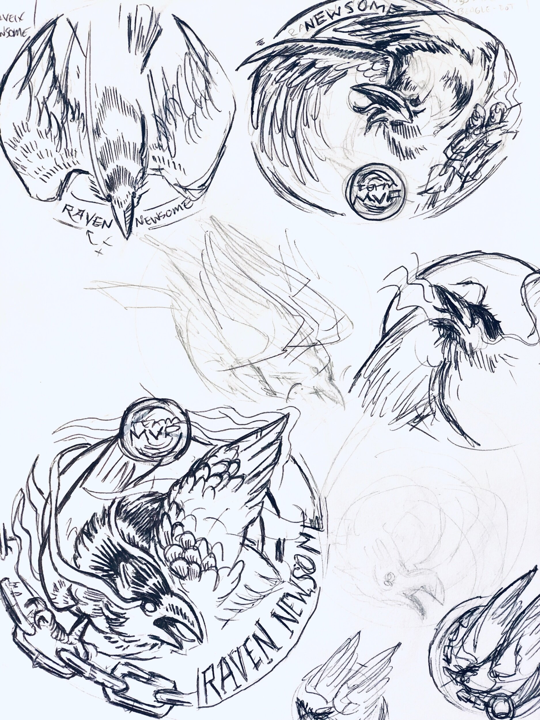
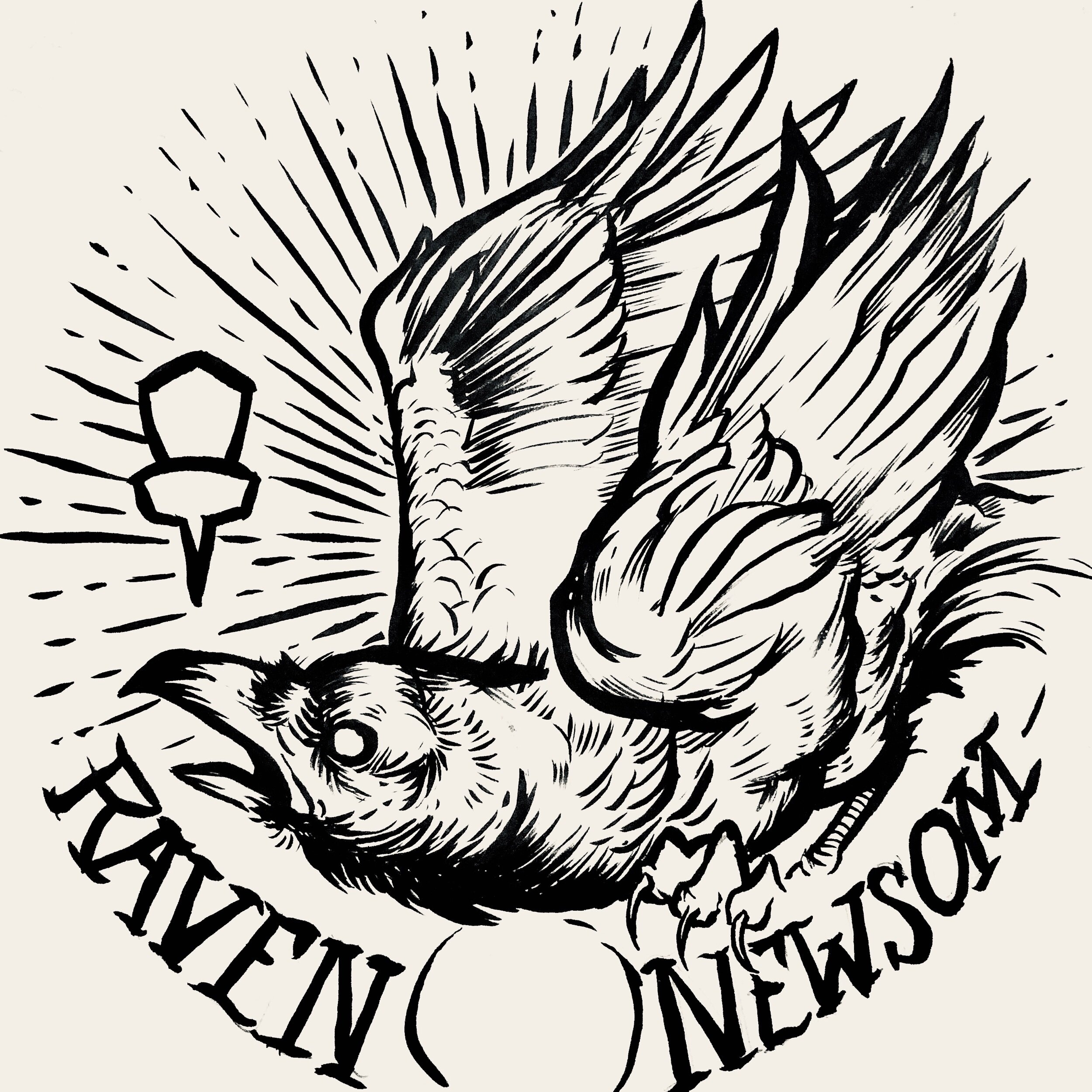
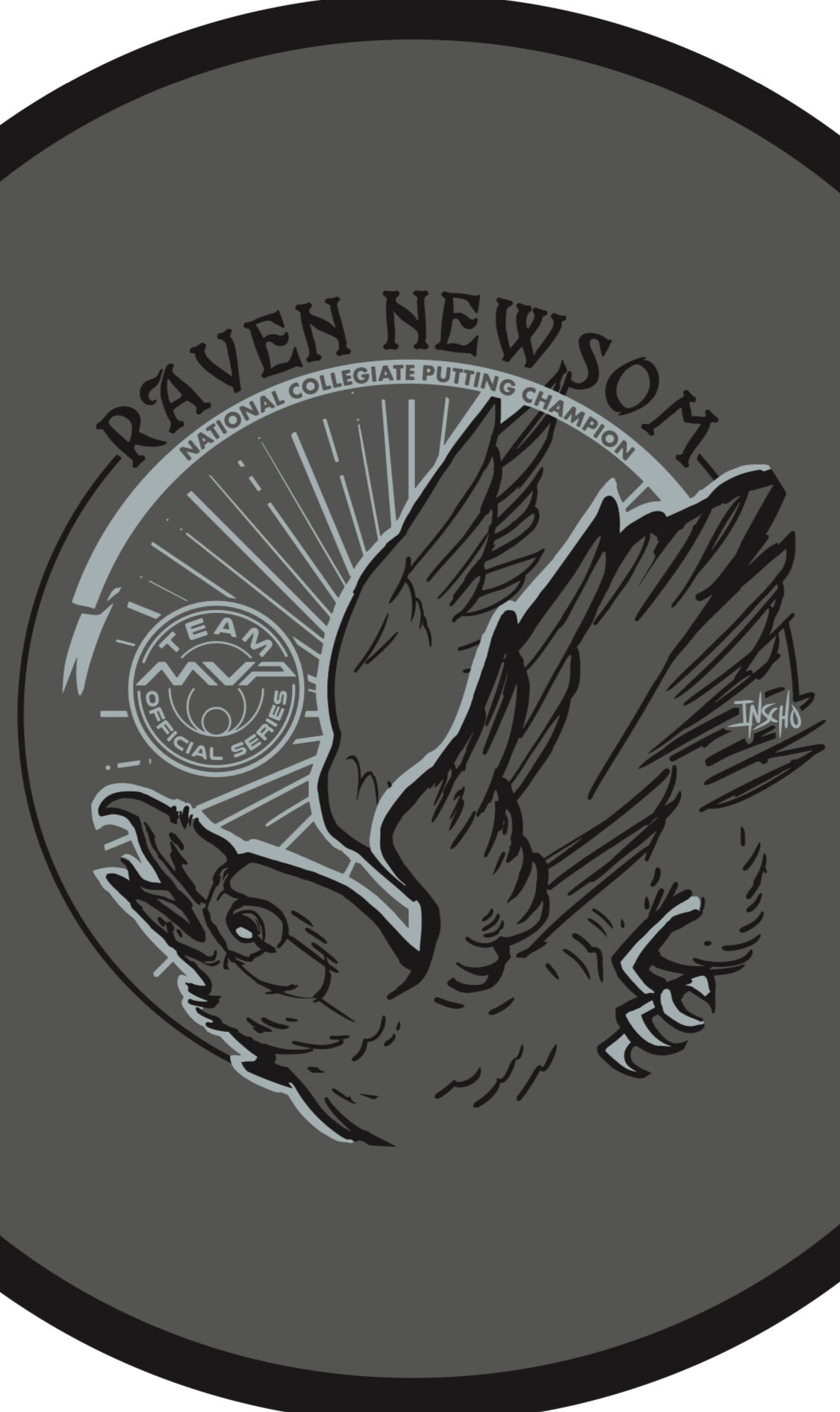
Raven made the process super easy. He trusted my design skills and let me come up with a few ideas to ponder over. As you see for the very early stages, the raven was refined and some of the heavy linework from my brush pen was slimmed down a bit. Everything was bold and it didn’t allow your eye to rest. I felt it was chaotic and the bird seems way out of shape. It took some more reference gathering to really started feeling better about the bird, its outstretched wings, and the overall ability to add in “Collegiate National Champion” with a bit of class.

With the worldwide COVID-19 pandemic; it’s been tough getting this design to the masses with only one or two small releases up to this point. Keep a lookout for more runs coming from Raven. I want to thank Raven for giving me this opportunity. If you have any questions, please hit me up or leave a comment!

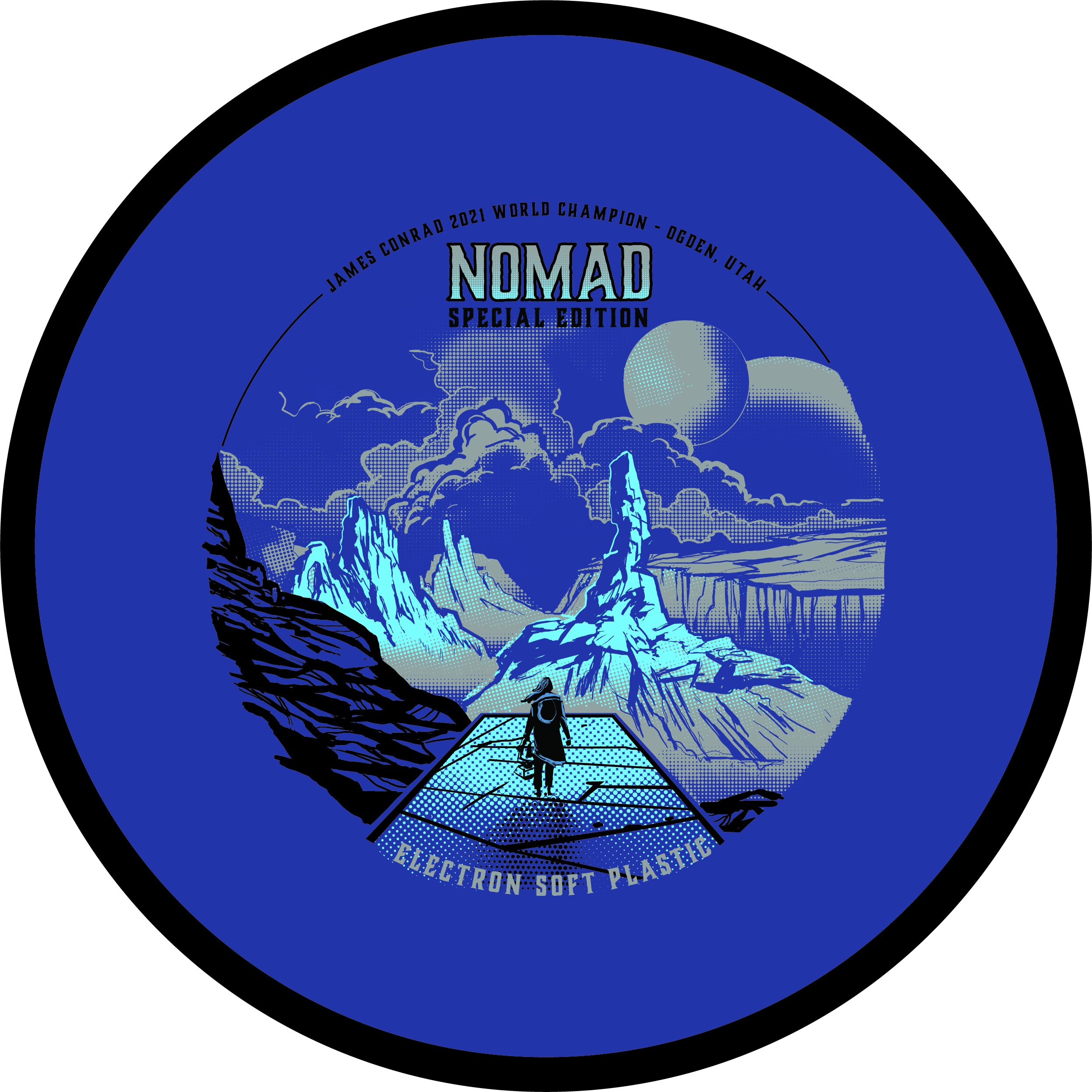
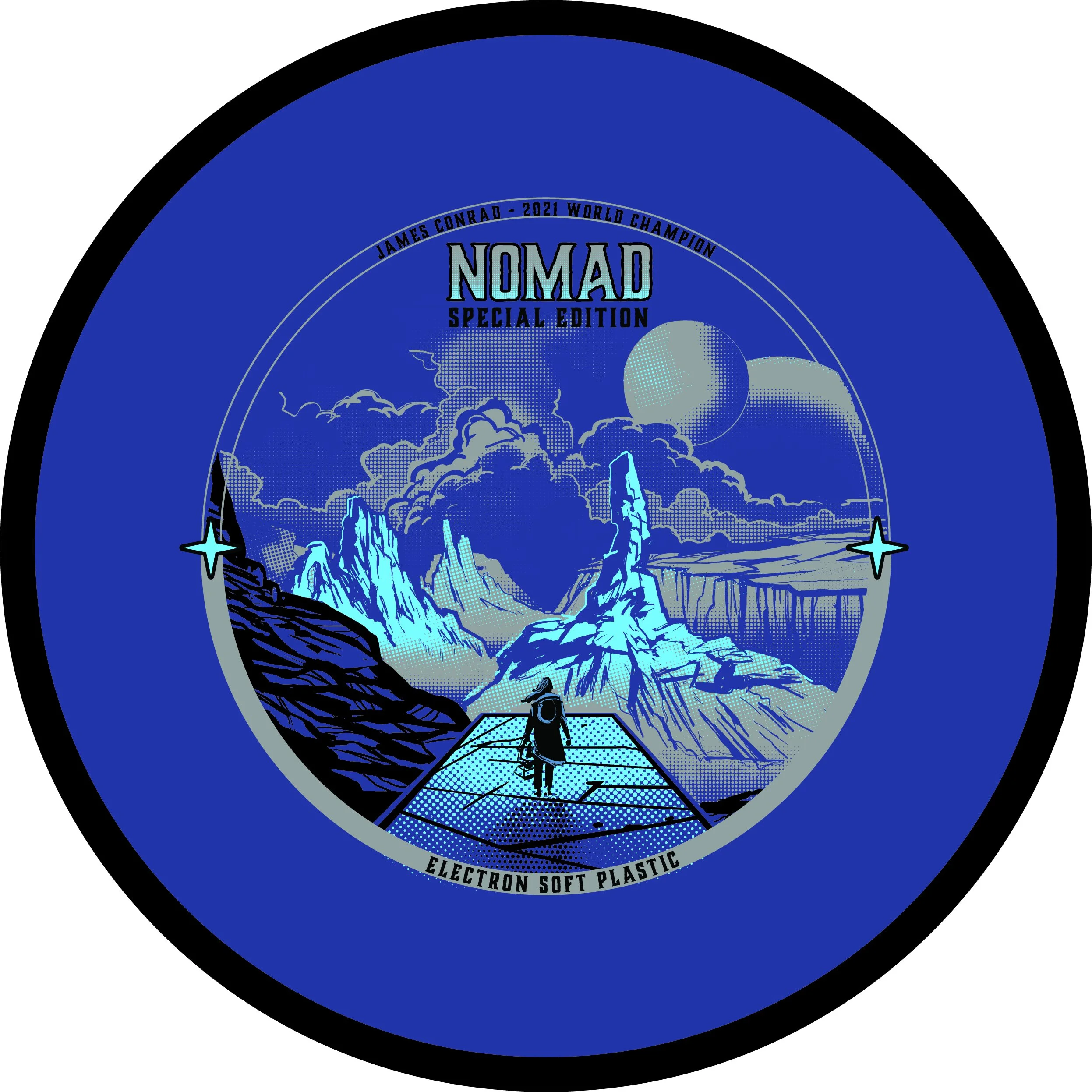
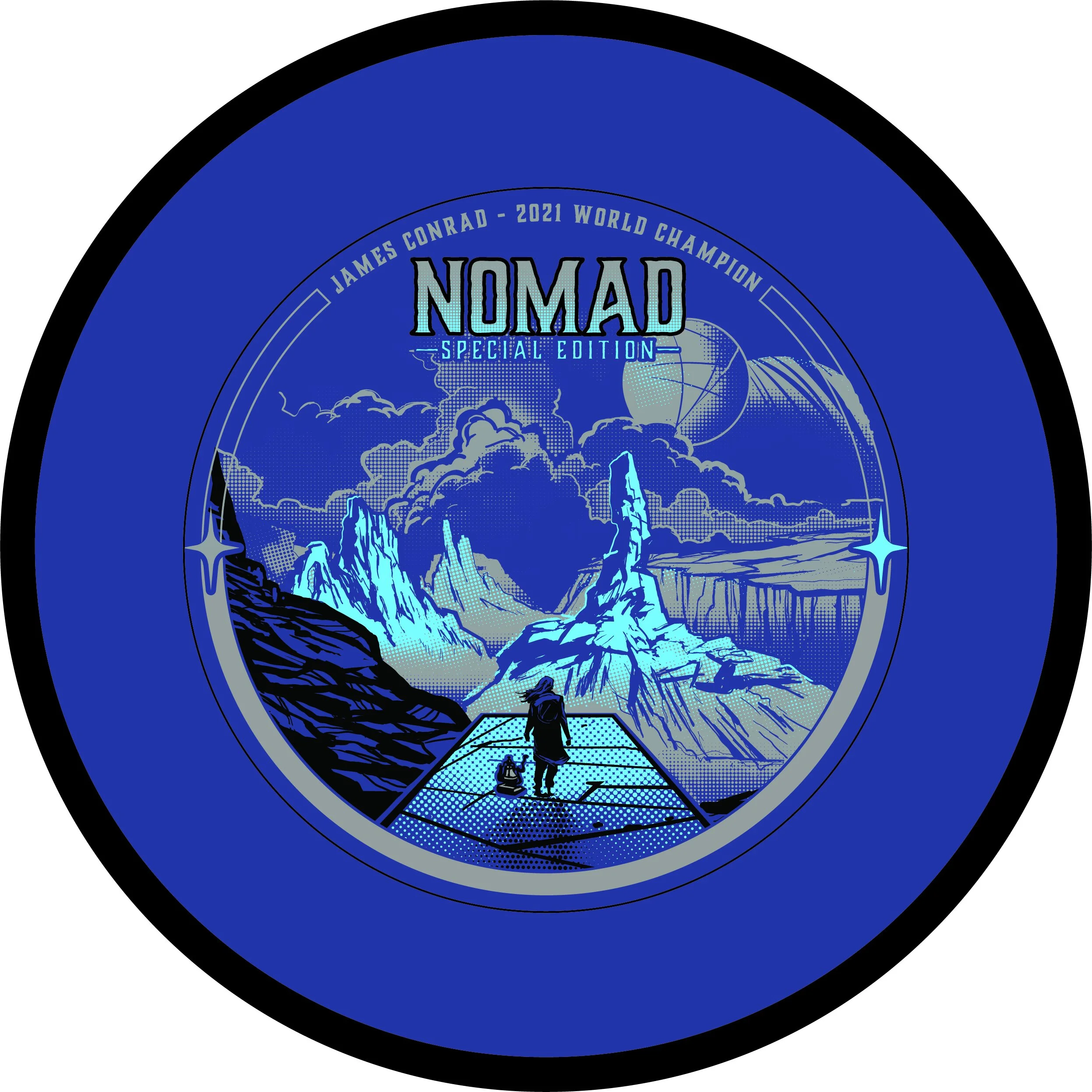
MVP Nomad - James Conrad Special Edition

The MVP James Conrad Nomad Special Edition was a unique one. This project kicked off a bit earlier than most people realize. We had James Conrad’s Signature Line Nomads in production before he hit the biggest shot in disc golf (IMO). With that event happening and the surge and interest solely on MVP and their debut of James’ first designed putter; We shifted gears just before going into final stamp design.

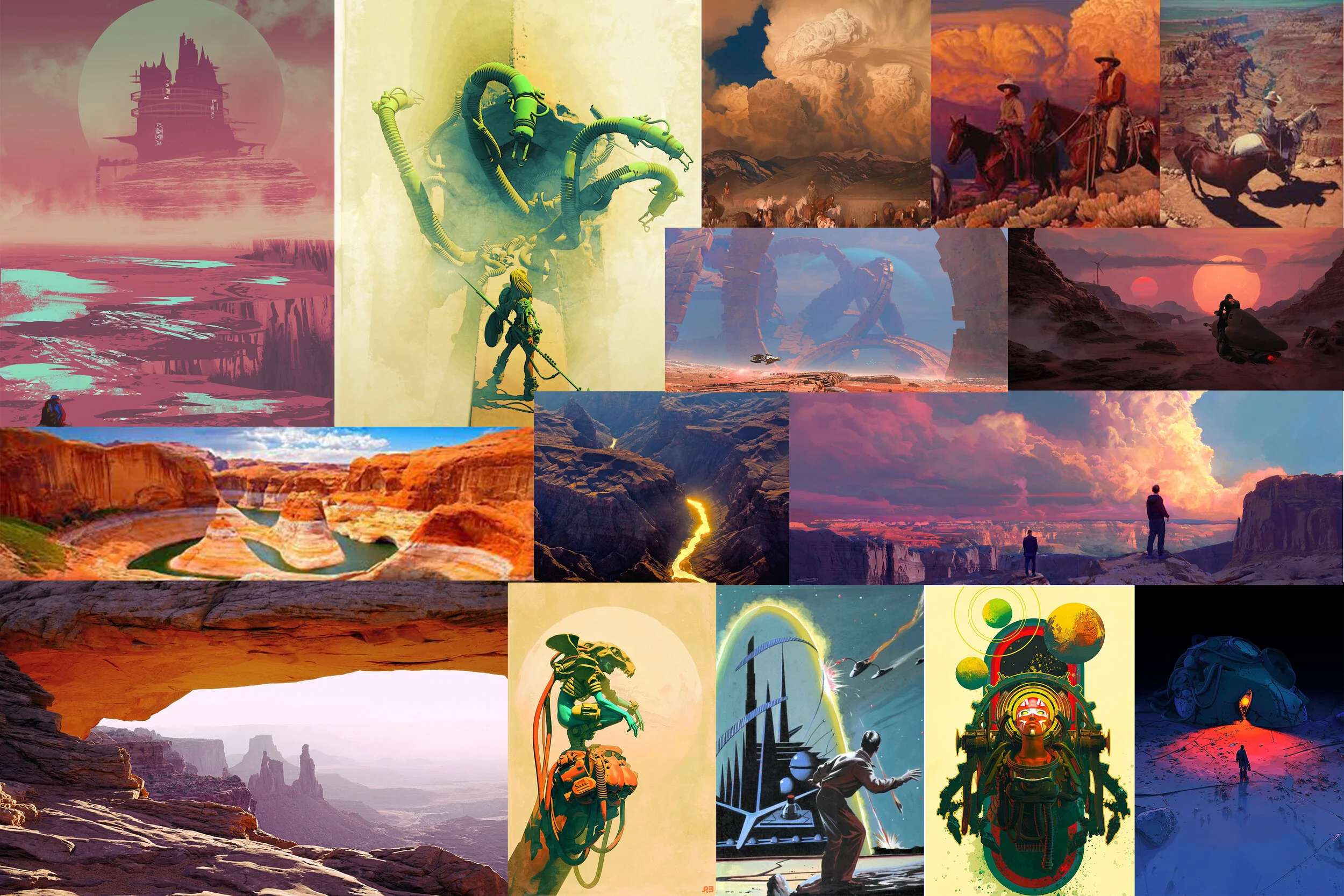
First off, this design from the get-go was a collective agreement from the MVP Media Dept. that it should be a cohesive nod to the stock Electron Nomad stamp that was also debuting at the same time. With that, I was able to dial in on the “traveler/ nomad” aspect and reach down into my science-fiction/ dystopian love. I’m one to do extensive research before going into the thumbnail stage. Grand Canyon/ desert paintings from the incredible minds of Mark Maggiori, Pablo Carpio, and Pascal Blanche helped dial in a smooth style with the rock formations and overall composition.

With this project; I knew I wanted to push the limits of our Election stamping capabilities. Although nervous, I knew our MVP HQ stamping team could put their best into making sure these came out successful. It took quite a bit of value painting work to figure out the half-toning fills. I worked back and forth with the inclusion of black within the stamp and found a great compromise of subtracting the would be black line work from the background.

In the end, i’m glad this art was in preproduction before James Conrad flipped MVP on its head. I was able to adjust on the fly and include the Worlds nods relatively easily. I’m glad this went ver so well with James and the pro players he showed during his warmup rounds. That meant a lot.

What did you enjoy most about the Nomad Special Edition?

Firm Electron Envy - Special Edition

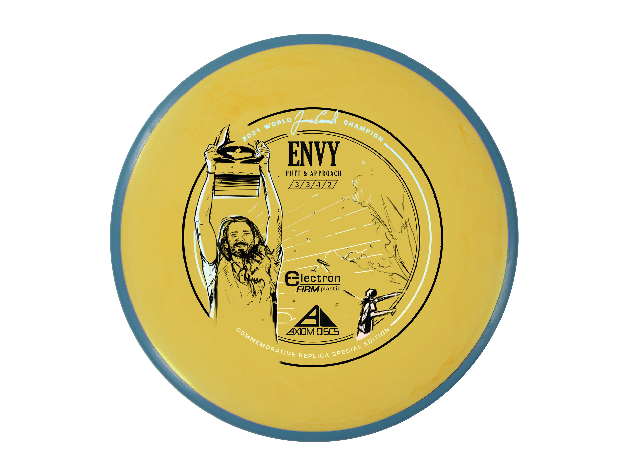
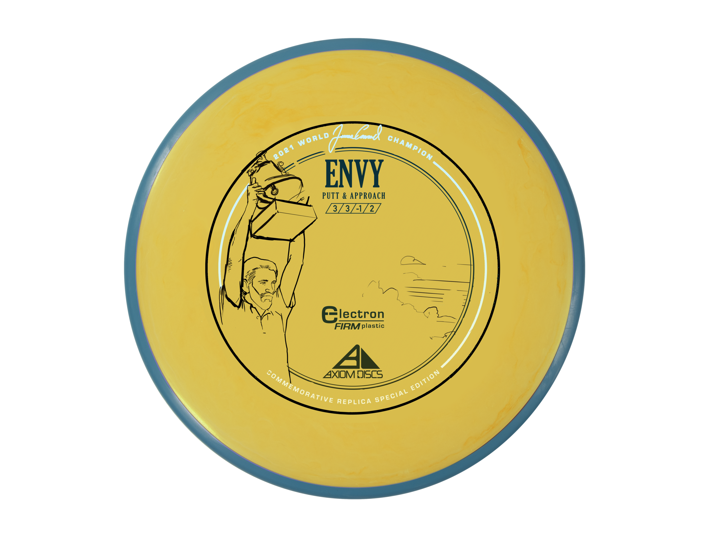
James Conrad. What a performance!! If you’ve been living under a disc golf rock, here’s the final round of the 2021 PDGA Disc Golf World Championships. That shot propelled MVP and Axiom Discs to run its first custom colorway since the early Axiom Artist Series releases. It’s been a little over a year since that day but I’ve finally told myself I should probably post this before the 2022 World Championships. We wanted to truly honor the win while also acknowledging the sheer interest in the Electron Firm Envy that he threw in from 257 ft to force the playoff with 5x World Champion, Paul McBeth.

This is up there with some of the most prolific design jobs I’ve ever done in the disc golf space. I knew going in that getting and sorting through all the media from that weekend was going to be the task at hand. We had boots on the ground with Team MVP Team Manager and Marketing Director, Andrew Johnson following James and getting some insane footage. We also had PDGA and Gatekeeper Media content at our disposal. It was important for us at MVP to celebrate “The Shot” but to also put the viewer in the exact moment James raised the trophy. He’ll remember that particular moment for the rest of his life. I think the decision to create a replica yellow core, blue rim Electron Firm Envy was decided on just a few days after everything went down. MVP HQ wanted to make sure that was something they could facilitate both with plastic availability and machine time.

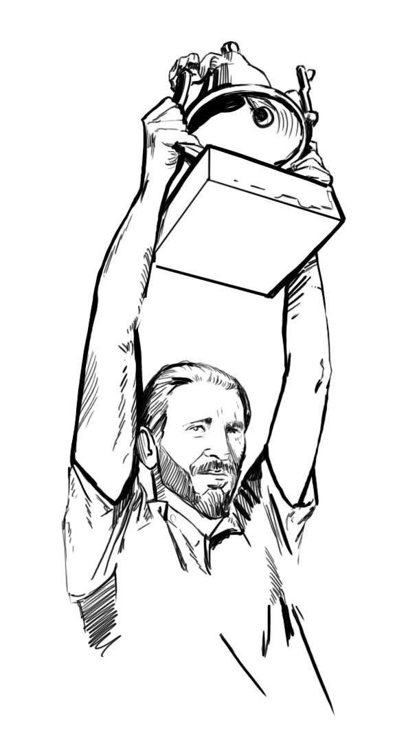
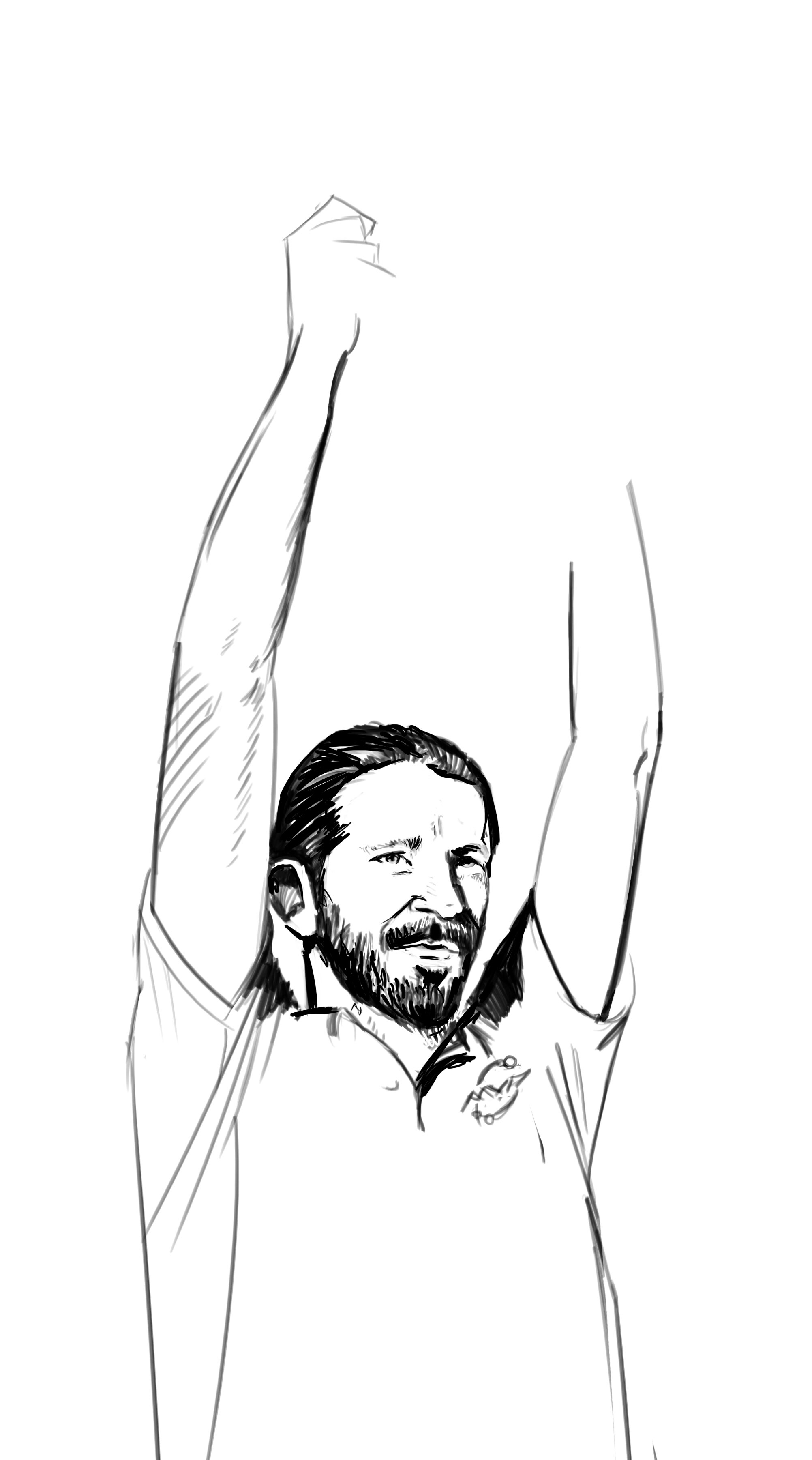
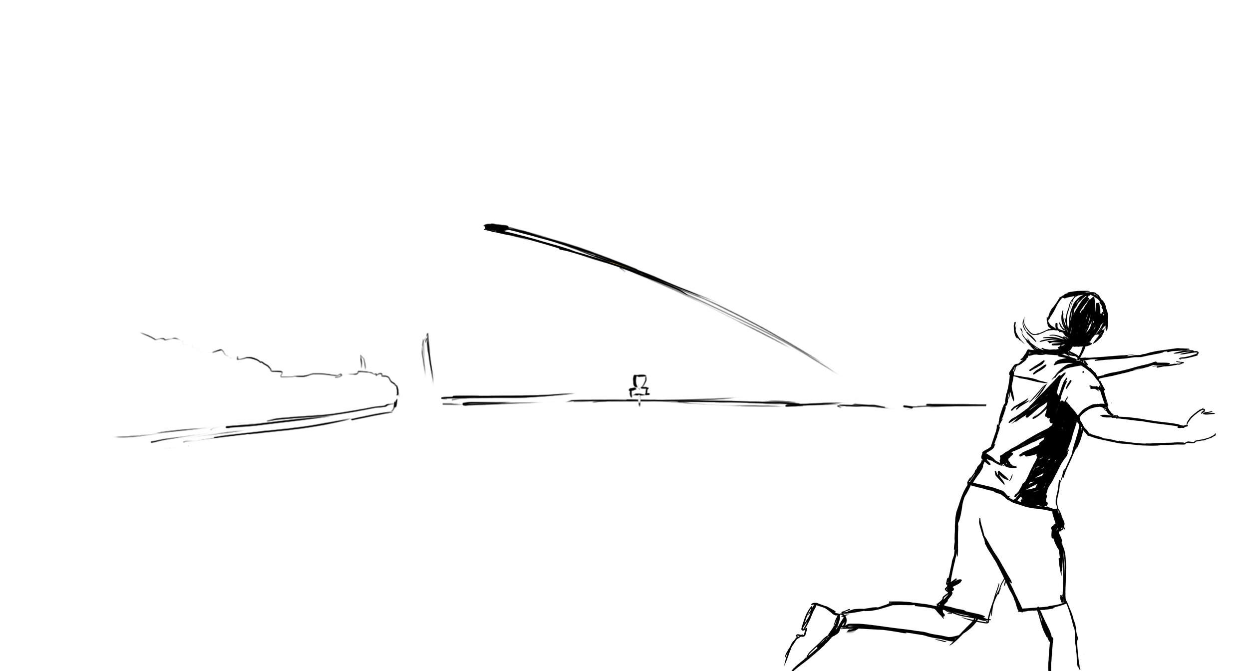
I had already made a mental note that most likely that was probably going to happen and started tinkering on editing the stock stamp created by Zachary Kelbaugh with some tasteful and clean Worlds win text. I wanted the stock Axiom Electron putter stamp to remain as much as possible while facilitating the celebration. While in the quick and dirty thumbnail phase, my gut said something had to go. The tightly wound audio waveforms representing the plastic firmness around the outside were extracted. I began working on a few inking pieces based closely on references of James that I paused from video footage. I’ve watched the shot 100+ times and probably in slow more for a majority of those trying to find particular moments. I remember the amount of pollen floating in the air, the time of day, and the sheer amount of sunlight beaming down on Hole 18 during the final approach. The grandstand, the crowd, the line, and the commitment around that right side tree. All of it. I put as much as possible while keeping it mostly uncluttered.

If you notice from the images I’ve shared below, we almost used the front-facing James shot from the award ceremony. I felt the rawness, the immediacy of the trophy raise near the water carried the energy from that thrilling playoff hole and favored that idea. With that finally decided, I went back and tightened up the Hole 18 grandstand, backhand throw, sunrays, and pollen around the Axiom and Electron Firm logos. This was a fast-paced project but I felt the ability to rush something out in a day or two just wasn’t the greatest idea. We wanted a classic design centered around James’ first PDGA Worlds win and something that acknowledged and represented the absolute insanity of the final round.

The Special Edition Firm Envy is out in the wild. Please be sure to ask your local retailer if they have any left in stock!

Cameron Beck 2021 MVP Tour Series

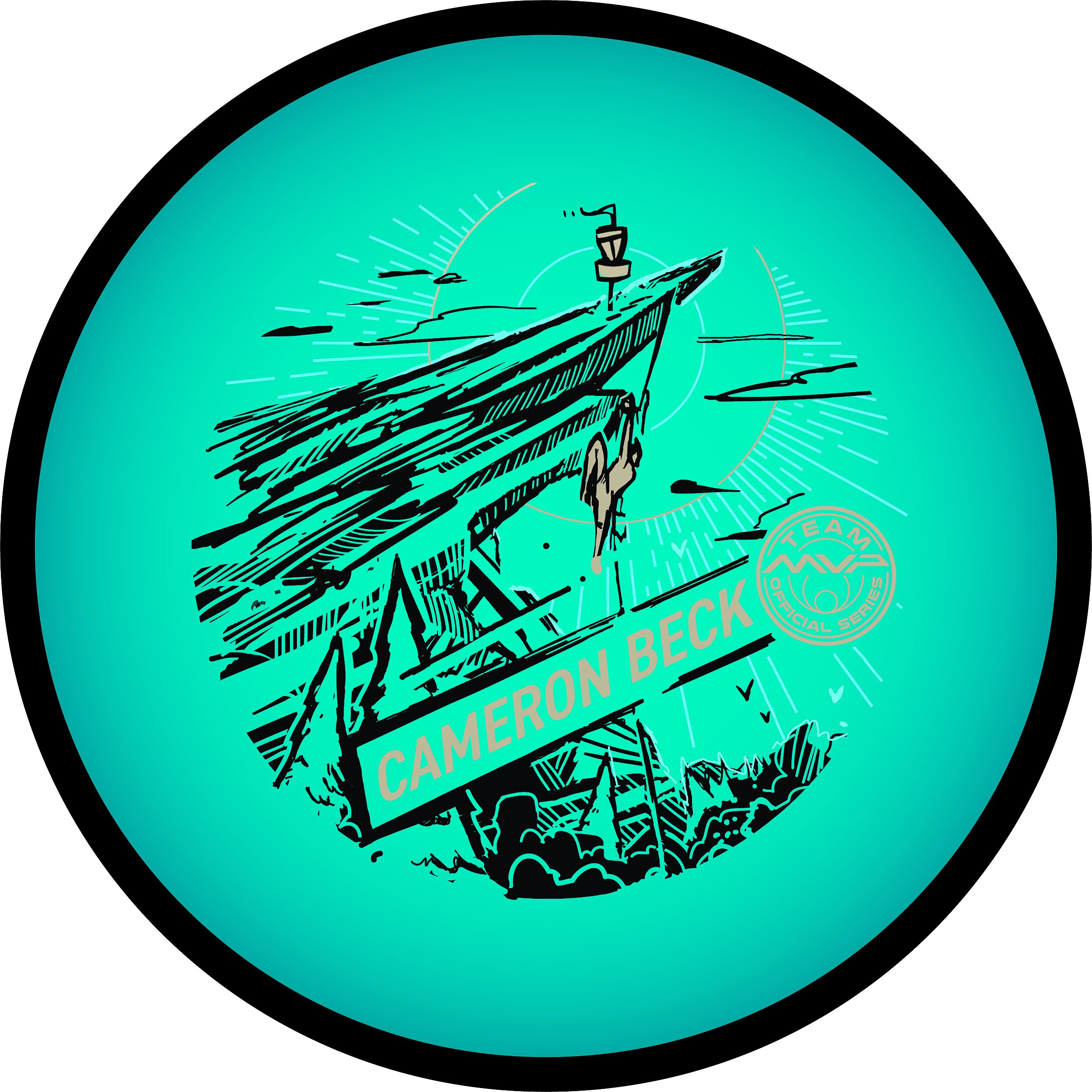
Cameron Beck is an avid climber and Team MVP member. He approached me this off-season with an idea to marry his love of rock climbing, eco-friendliness into his first official tour series stamp. Some of the proceeds would go to a local course but also support him for the 2021 touring season. I knew just by following Cameron that he spent some time over in France for a short period. Our initial thoughts on the design were to feature the cliff rocks from Étretat in Northern France. That arch is insanely beautiful and the fact that they climb with water below really got the gears going in the thumbnail stages.

I took some time to R&D but I couldn’t get enough reference of someone in the act of climbing that particular location. From there I went to a few ideas that I thought could make for a compelling stamp. The idea of this climber reaching toward a disc golf basket perched high above. It would allow me to encompass disc golf and his love of climbing into one stamp. The thumbnail sheet gave him 3 different approaches we could go with that idea. In the end, we both thought #2 had a creative solution around the center no art zone. It also featured sharp diagonals and great negative space underneath the climber to show the suspense and danger that comes along with sport climbing.

The design, shape, and placement of the rock face allowed the great vertical read from the basket - climber - down to his name in the lower 3rd of the stamp. I really liked how this stamp turned out and appreciate Cameron giving me the liberty to put something together for him.

"Hold On" Self-Portrait

Wow! Where do I start with this one? Michael “Sully” Sullivan and I have worked numerously on other projects. I was able to help him with his personal Team MVP stamp and multiple Gyroscope designs for the local events he runs with MVP discs. Mike came to me late last year with the idea he had of recruiting artists and just letting them do their thing. Drive home what’s important to them, their particular nuances and inspirations, and seeing what manifests from the idea. Soon enough, Michael was off and running and had me in mind for one of the first chosen artists. I simply couldn’t resist. To have that kind of trust to allow the artist to roll with what inspires them has so far been an idea paying huge dividends.

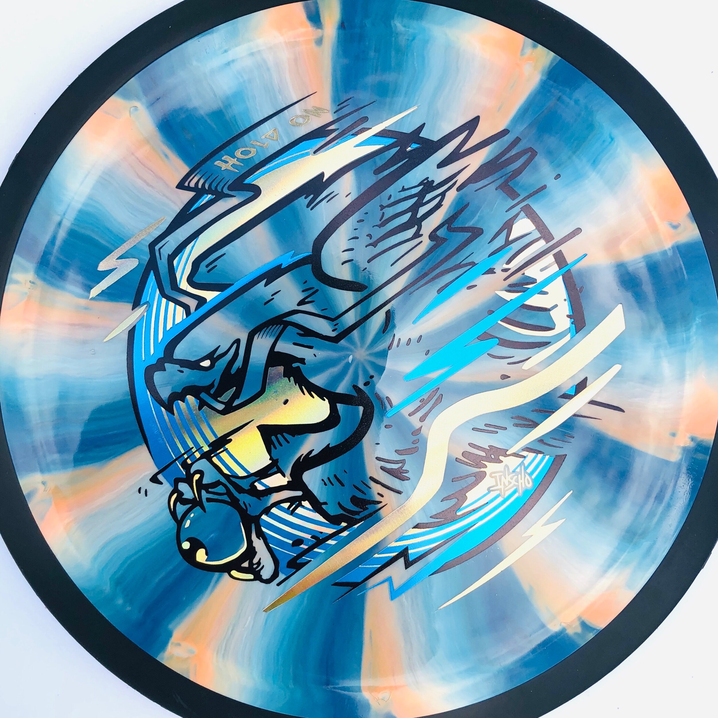
Why eyeballs and feathers?: I have a deep admiration for my father. He was very young at the time that he and my biological mother split ways. He worked long hours and with the help of my grandmother, took care of my sister and I. You have to be selfless as a parent and I’m learning those things rather quickly. At a very young age; I’ve seen numerous eagle imagery and have been inspired by some of the graphical posters/ tapestries on the walls of our home. While birds aren’t exactly easy to draw, they tend to create some really dynamic and interesting shapes. I enjoy that there are numerous ways to shift the head, body, and talons to create something unique. I chose a bald eagle because of my upbringing, & military service to my country. While it may be some hard times right now for a lot of people in the world and more specifically, within the U.S; I feel the eagle idea hit both a personal side and an aid to a more hidden message of resiliency, being present and educated with what’s going around you. This particular eagle doesn’t have its wings out to slow his movement. They’re fully back allowing less drag. I use these wind tunnel-like lines to accentuate it. This eagle is very much in control.

But Mike… eyeballs?: Eyeballs. What can I say? My love of Rat Fink, skateboard art, counterculture, and the weird. That’s why I love drawing and using them in my personal and professional work (when it fits the project). This eagle could very much rip this fleshy ball of goo with ease but he simply isn’t. I wanted a story and adding tension between the two elements was a starting point. There really aren’t any boundaries except the ones you create for yourself. I love that the most when creating in this style.

Is there a story?: This idea wasn’t there from the project kick-off. It just sort of clicked when pushing the final thumbnail phase. The eagle can symbolize the all-seeing eye. In my piece, the eagle aids the eye to look at the world from above. It would later set the hierarchy for the composition itself. I very much had in mind to bring in Western NY hidden elements. I’m a die-hard Buffalo Bills fan. Having nothing really stopping my personal aspirations, everything sounded like an awesome idea! I relied heavily on my past hot stamp design experience to pump the brakes. All of those elements simply weren’t going read well so they were scrapped. While the project was fully in my hands to do whatever I please (within acceptable reason), the rules of composition, read & graphic nature kept the stamp from becoming a total mess.

The ultimate goal was to create something people would visually gravitate to. While polishing up and choosing, the idea of this giant bird allowing the human eye to see the world from its view, spoke to me. We are still dealing with the COVID-19 virus, inequality, and a country very much in a shaky situation. Is it acceptable in disc golf to talk about these things? Why not? We’re individuals with our own views and ideals. This stamp definitely doesn’t tell you what to think; it says to pull back, look at the world from a different angle. All in all, this project was a lot of fun and something I definitely looking forward to doing again in some compacity. I can’t thank Mike enough for getting it rolling.

Luckily, there are still a few available after the initial pre-order time. Be quick but you can order and support my Self-Portrait by reaching out to Mike Sullivan here:
https://www.facebook.com/Sully68783

Fission Wave Special Edition

A new mold in MVP Disc Sports’ Fission™ plastic debuts and it’s the ever-popular Wave. Fission™ plastic bases its technology by considerably lightening the center core and increasing the outer weight in the overmold. You’re able to get a more gyroscopic flight.

I was tasked to bring an idea to the table. Instead of reinventing the wheel, the team and I looked back to a bunch of different ideas from previous MVP specific Special Editions I created that weren’t used. A lot of them had potential and it was a mix of an older MVP Limit thumbnail in combination with an idea I can’t share right now that really got the Marketing Department’s excitement up. When I’m pitching these ideas to the department, I’m trying to show them my linear progression in decision making. Once I shared the solid previous idea; interdepartmental conversation really helped to meld the two solid ideas together.

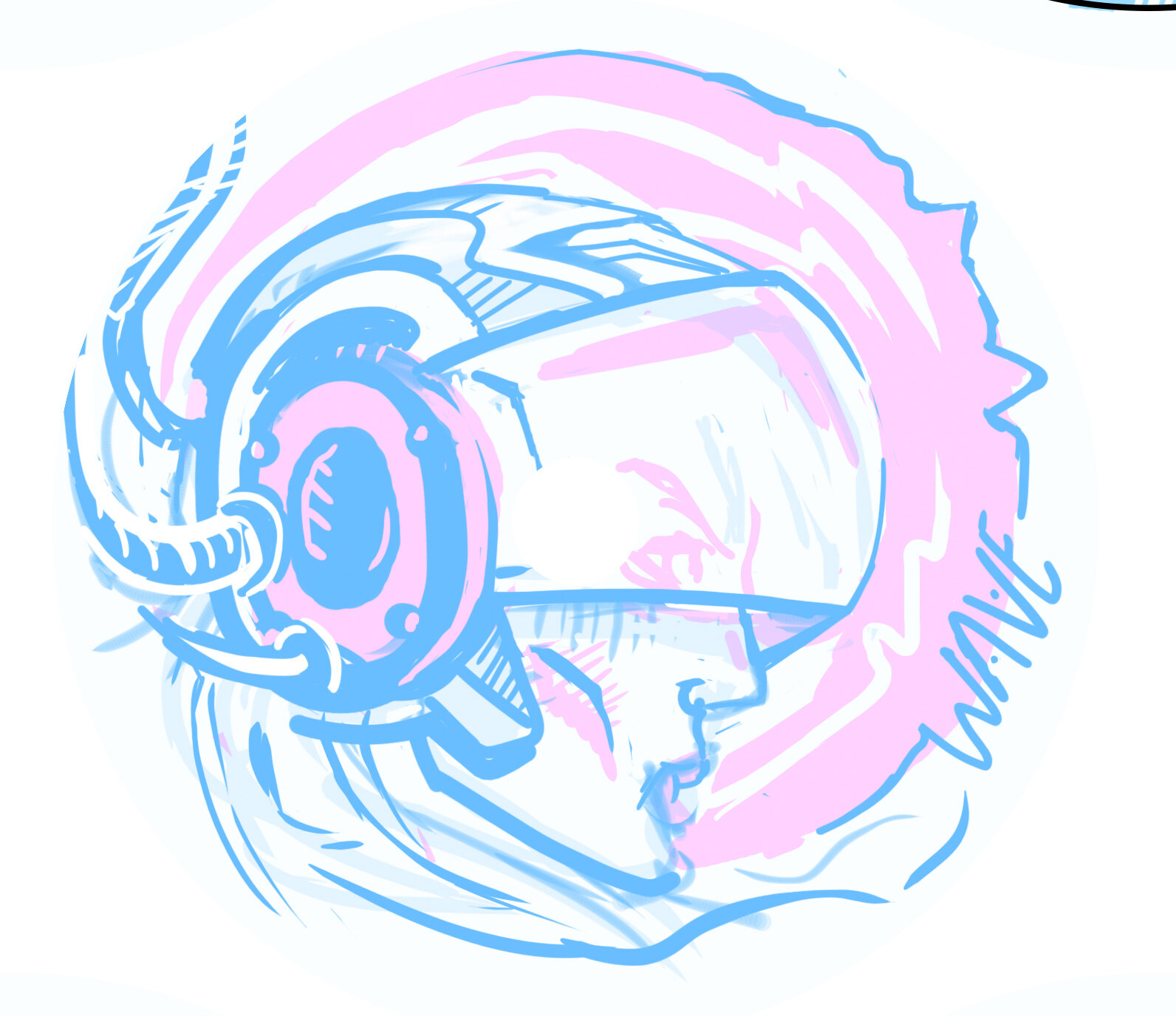
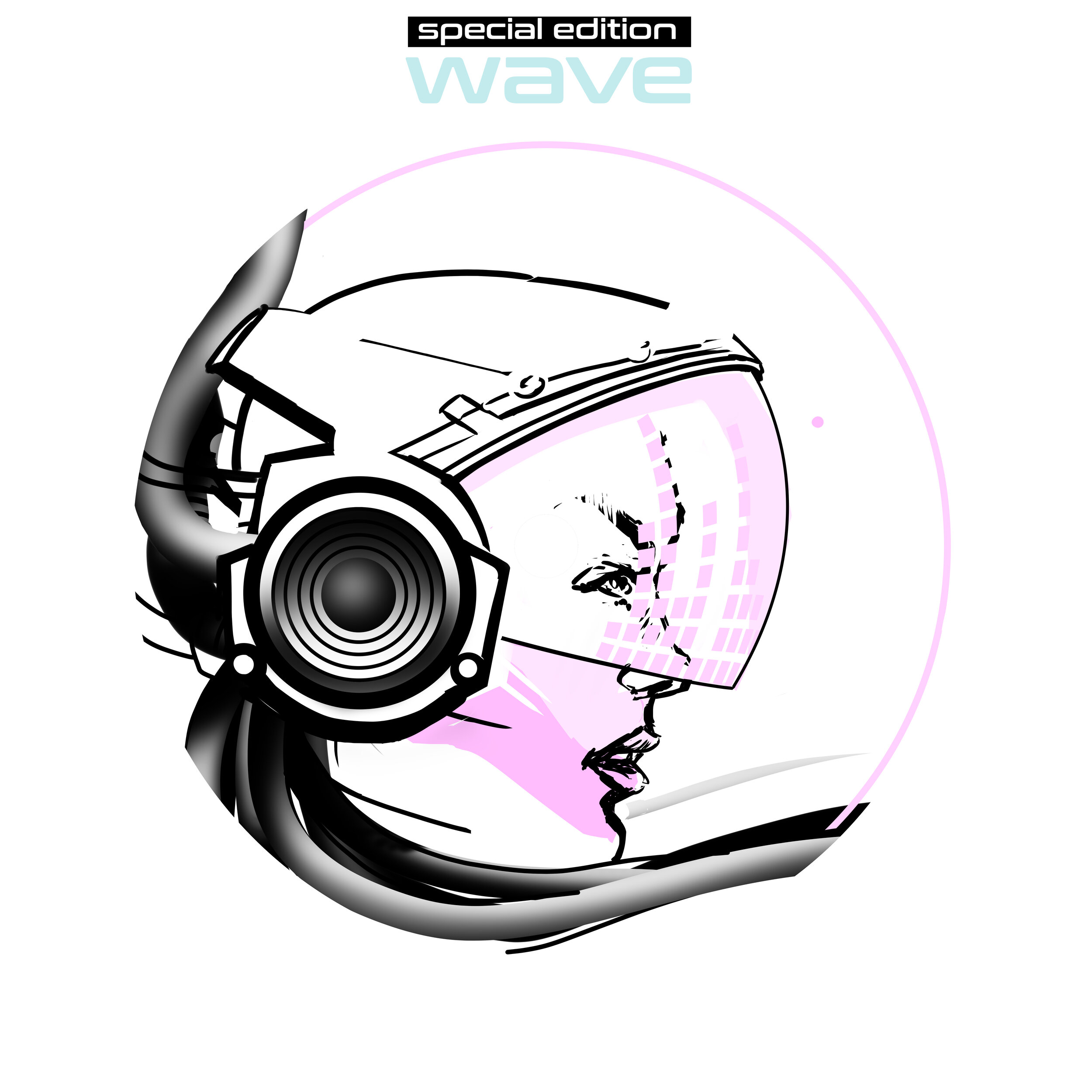
I’ve done some small reading on human resonant frequency in the past. I pictured this character having the gift and future technology to harness and magnify those vibrations into an auditory superpower. Sort of the same concept of pulling all of that weight to the outside rim of Fission™ Technology. Throughout the progression of the stamp; I battled with having a background to reinforce the story. I tried bolts and linear waves but felt the “WAVE” text and visor elements needed that space on the right side to breathe. So much was happening with the helmet and cable hair. Detail on this stamp was selective and when dealing with MVP and it’s history of Special Editions; it was an effort to keep this design clean and precise. From the rough to final draft, you see that it stuck really close to the original concept. With the help of female profile references to cyberpunk, & retro wave influences; I was able to create something that hopefully puts a positive look onto MVP and their multi-stamping abilities.

Get your hands on the Fission Wave arriving in stores, August 14th!

Gyroscope 2020

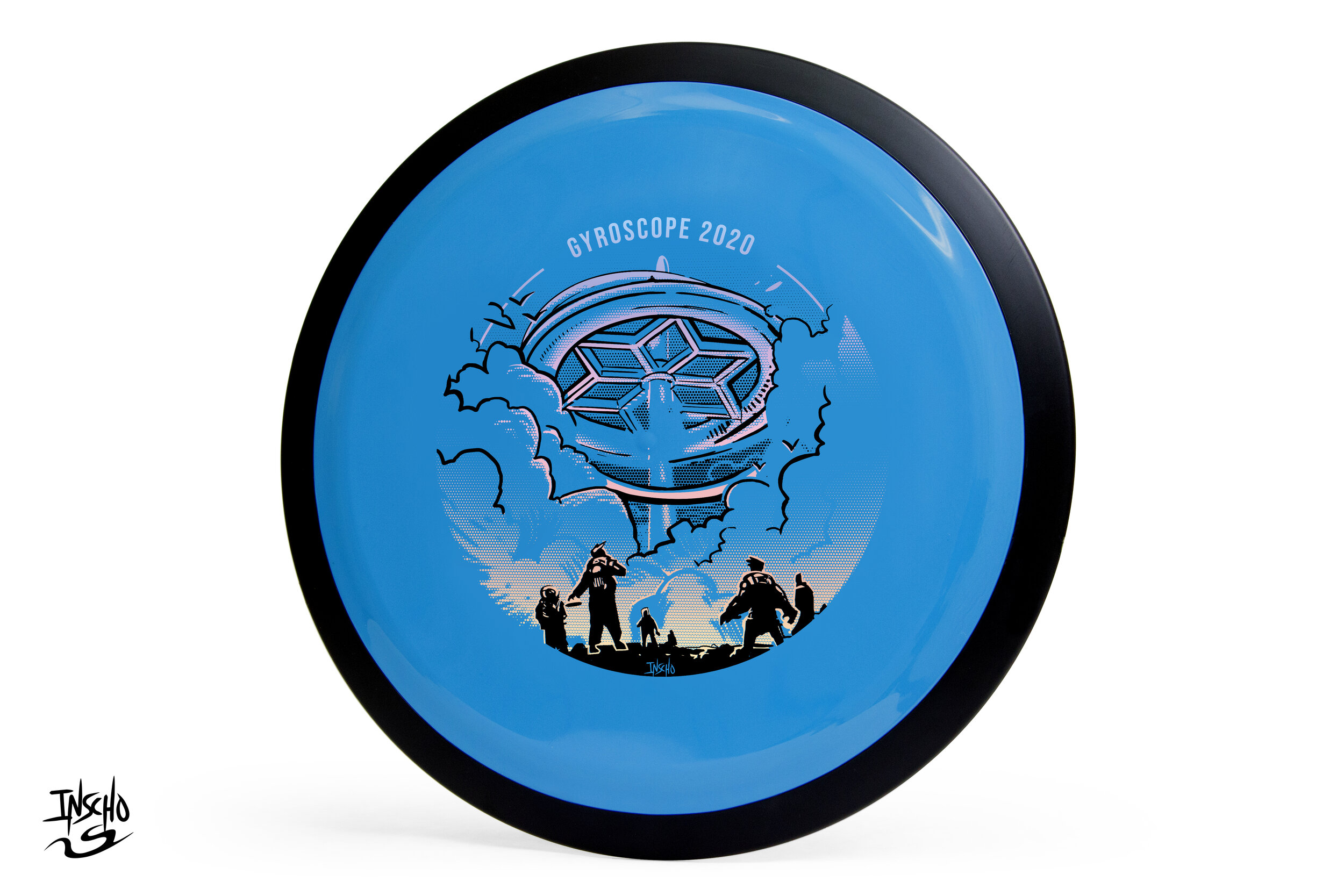
GYROscope is an event ran by Mike Sullivan out of Northern Virginia. The goal of the tournament is to promote MVP Disc Sports, run a fun PDGA (Professional Disc Golf Association) event and offer a one of a kind disc per event. Last year’s, 2019 think tank produced a handful of ideas and one of those core concepts was reciprocated to 2020.

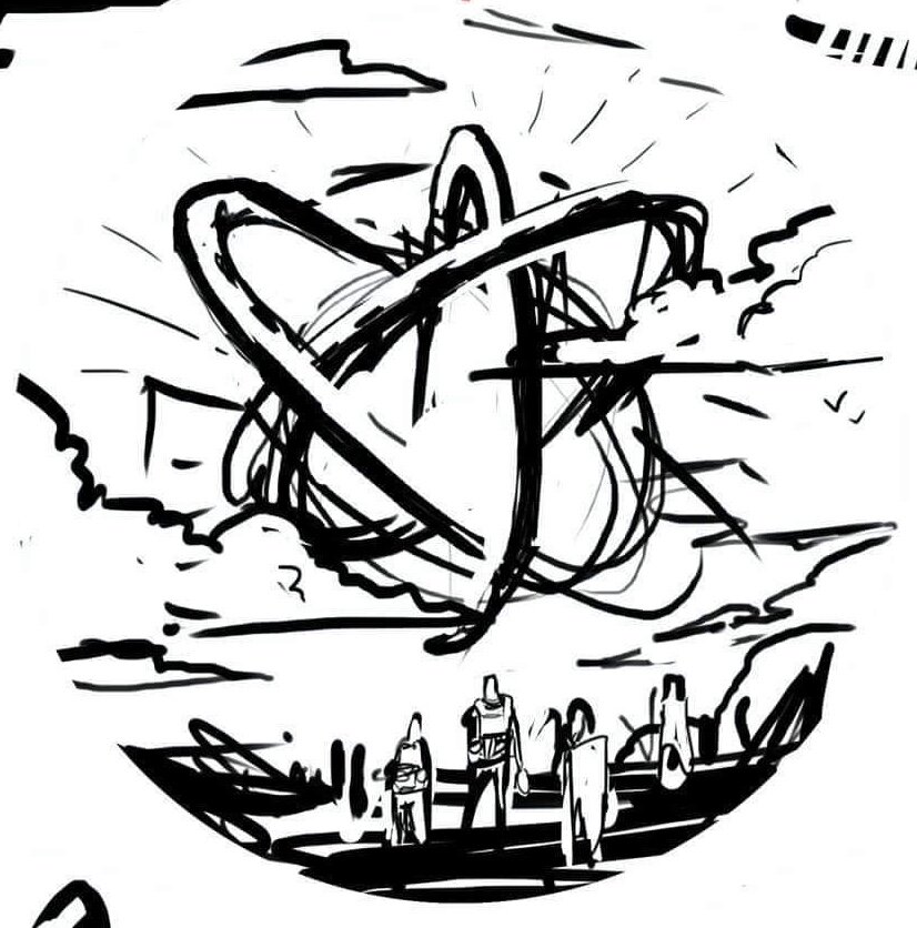
There’s a dead-center area of the disc that get’s unpredictable with stamping. Because of that reason, designers are faced with working the art around this area. The second thing I noticed is while the concept showed a sense of scale, the gyroscope wasn’t really present. I was more similar to a floating orb and I wanted to change it to a grounded structure. The concept fed off of last year’s Gyromonster theme. The Gyronauts figured out that the Gyromonster wasn't simply exchanging energy for its own benefit, it was taking that energy and spreading it far across the galaxy to an ancient source. This scene shows the travelers discovering the ancient ruin.

The design really only took a bit of 3D staging within Google Sketchup and re-inking cleanup. The gradient effect for the 2nd applied foil was done with a halftone dot technique. It’s the most efficient and practical way to lay down transitions in single color layers. I want to thank Mike Sullivan for the continued support and having faith in me to deliver a quality design. It’s with that confidence, that I’m able to hunker down and come out with something we’re all proud of.

How do acquire this stamp? Reach out to Mike Sullivan through
https://www.discgolfscene.com/tournaments/MVP_Disc_Sports_presents_GYROscope_1_The_Third_Campside_Open_2020/registration

OR

his Facebook page for future releases.

Schrock-A-Doodle-Doo

As 2019 was coming to a close, Tyler Schrock, Team MVP Pro asked me if I would like to do his 2020 Tour Series disc. Working with Tyler is pure joy. He’s kept an animal theme over the past few years that allowed me to do design an octopus and sloth. This year, his idea was a rooster. It turns out that his father was a chicken farmer! He raised chickens for 25 years. So this stamp idea was something he knew his family would love.

This idea started with chicken reference gathering even though I had a good idea of how I’d be able to pull this off. I think the strongest silhouette of a chicken is from the side. It gave me the room in the center of the disc to stay free from any no stamping zones. The chicken mouth action/or spit never made the final. That was an attempt to add that classic “action” seen in cartoons to show loud noises. We didn’t want the chicken looking like it was spitting so it was axed toward the end. The shading detail near the chest add a bit of contrast to show that it’s different color of feather.

The final pass was simply to add body/feather detail and import the consistent ring graphic from last years design. It was important to Tyler to continue that look and feel from year to year. When you display these side by side; it really adds a nice series look to them. I hope you all dig it! Share, like, comment on what you think!

Axiom Cosmic Neutron - Stock

If you’re a first-time reader and unfamiliar with MVP Disc Sports/ Axiom Discs/ Streamline Discs then you’ll need to look up who Zachary Kelbaugh aka ZAM is and his importance in setting a high standard with all three brands. While MVP Disc Sports follows more an analytical/ scientific realm; Axiom goes into more of the visual arts, punk, and a little bit more on the wild side if pushed that far. If you think about it, the parameters keep you grounded but a LOT of ideas can flow from that base.

I was given the difficult task to create a new stock stamp that would be used for Cosmic Neutron plastic within the Axiom branding. Cosmic Neutron plastic produces some unbelievable controllable swirling patterns. At this current time, swirls seem to be trending with multiple disc golf companies coming up with their ways to achieve it. It was my job to design something that could hang with Neutron’s iconic imagery that has been stamped on Axiom discs for 6 years.

With Neutron art at the very front of my reference gathering, I wanted to create something that seamlessly blended into the stock stamp Axiom family. That was goal #1. MVP’s history runs deep. The last thing I want to do is shred that to pieces. If you look at the far left image below; our heads were looking at high-level science, Leonardo da Vinci, 3D DNA molecule structures and honeycombed flower patterns. While all of those sounded great; the flying machine has been done. My research through da Vinci’s sketches led to me start researching perpetual motion machines. Bhaskara’s Wheel, Sadi Carnot and the Carnot Cycle. My mind went down the rabbit hole, you can say. I landed on the fact that while all of these machines and concepts sounded cool, quantum mechanics and the complex nature/theory burned me out. That doesn’t mean I won’t return back to these notes at a later date. Time was of the essence and I had to get to work.

I landed on a 3 cylinder schematic concept. The main idea is of a 3 piston firing order that is pushing energy toward the epicenter. A transfer of energy through the stamp design to the actual swirl look of the plastic.

Here are a few key points in the final Axiom Cosmic Neutron design:
•Get the name of the disc higher up on the flight plate so it can be seen on store shelves
•Disc name is the boldest part of the design while keeping with the overall schematic style of font. It doesn't scream old world but doesn't modern either. 
•Keep key shapes present in the new design. Circles, triangles, font look, and feel.
•Integrate a fresh idea

The below image gallery shows a peek into the 2-week process:

MVP Cosmic Neutron

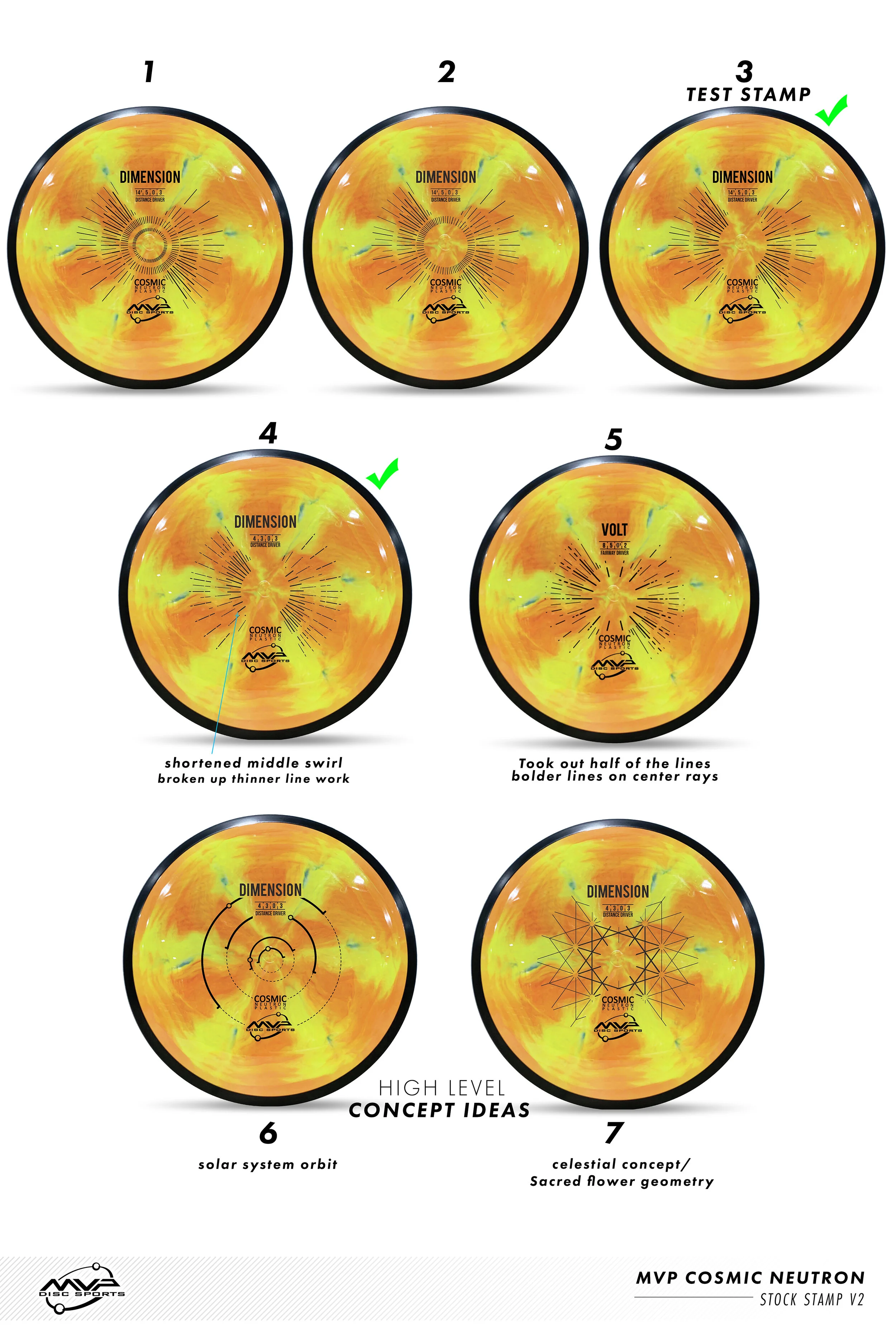
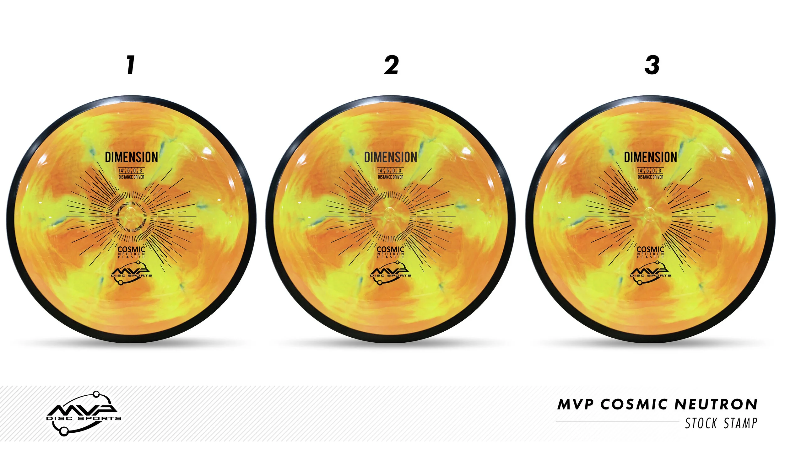
MVP Cosmic Neutron plastic creates some epic swirl patterns that you wouldn’t think would be possible in plastic manufacturing. This plastic was so awesome that MVP Disc Sports created a new plastic line and needed a stock stamp produced for all of it’s models. It was my job to research, design and implement it into MVP’s lineup.

The first design decision was an easy one: MVP’s standard Neutron plastic has this nice center alignment from Zachary Kelbaugh’s original and “New”tron stamp designs. I wanted to continue that nod into Cosmic Neutron. The second idea played off of the center plastic induction sprue. It’s the center of where all of these patterns meet. It felt fitting to hit that concept and start thinking of ways I could create a stamp that would rest in harmony with the beauty of the plastic. This idea sort of camouflages the radiating rays but bolds out the Disc name/ flight numbers/ MVP Orbit logo. This design nearly made it to final. The design was submitted and the die was sent off and created. We stamped Cosmic Neutron Volts and Entropy’s and let it sit and marinate within the team.

In the end, the earlier mock-ups (based on the zoom/swirl pattern) felt too forced and did the exact opposite of what this stamp needed to be. It needed to be bold enough to stand on its own against the Cosmic Neutron swirl but also open enough to let the plastic shine. So with that in mind, I feel very strongly about the concept of our solar system with a modern look/ feel to it. What I liked most is it's based on our solar systems ecliptic plane. The bold lines indicating when the planets are below the sun. It very well fits the Cosmic narrative and gives the stamp substance and reasoning. I would compare stock stamps like creating a company logo. You want something classic that will stick for a long time without updating. Even though the costs are much smaller for a changeover; that’s not really something I’m thinking about when designing.

I hope you’ve all enjoyed this deep dive into MVP’s Cosmic Neutron design process. I want to thank the people and MVP staff who gave me some honest and informative feedback through this process. Without that; I don’t think it would’ve turned out as it did.

What do you all think? Did the project reset improve the overall quality of the stamp?
 

Axiom Prism Plasma - Stock

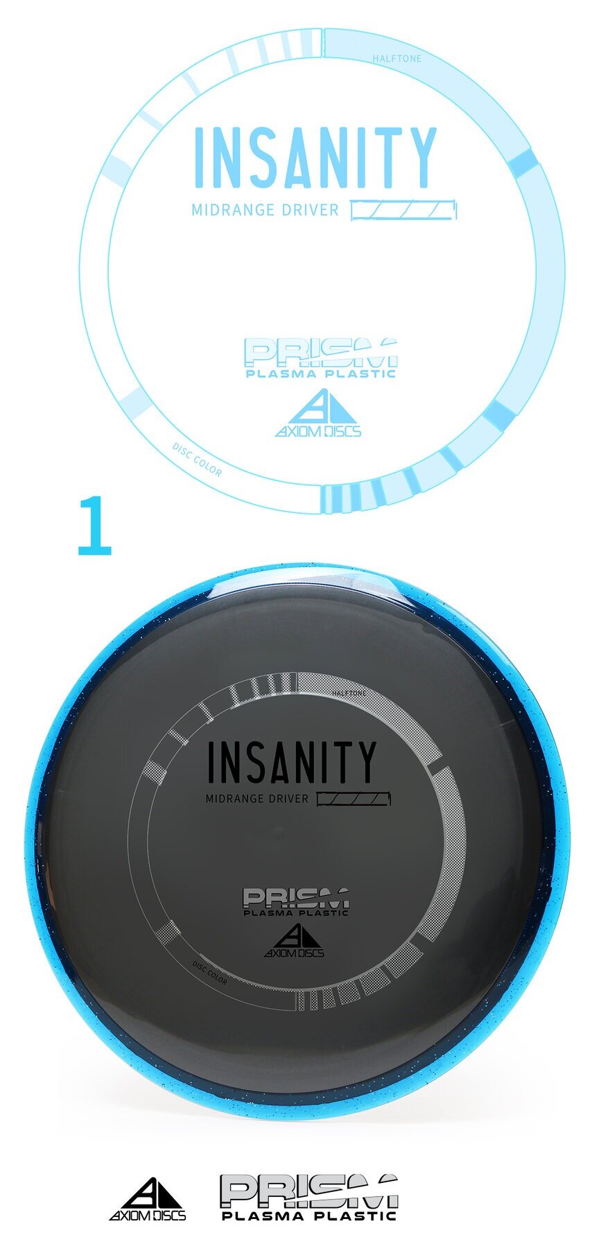
The Axiom Discs Prism Plasma plastic brings the shimmering beauty of a core fused with the luster of a candy-like Prism outer rim. In this development blog, I dip my toes into a few decisions that made me arrive at its current design. With pen and paper in my hand; the first thought was how can I get in and get out with the least amount of wreckage?

The plastic combination does the work for you! My goal was to create a non-intrusive 3 foil design that allowed the plastic to speak to the consumer. Axiom branding has dabbled in the Fibonacci sequence, DNA, flying machines and very artistic approach to high-level concepts. I centered this piece on simplicity. The ring uses to shape sequences that follow the 1,1,2,3,5,8,13,21 sequence. The design is duplicated and flipped on the opposite side. This creates this really cool halftone fill/ inverted look with the silver holofoil. Again, making this design bleed some of that beautiful, shimmering foil through. The 3 foils break down to Black, Silver holofoil for the ring and color transition holofoil for the Name/Prism logo fill. The font chosen to represent the disc name and flight numbers is Antonio. I wanted a font that was clean with a little bit of height to be legible from a distance.

All in all, sometimes the super simple designs take the most time. I’m glad we stuck to our guns on the outlining goals of this stamp art. It’s simply celebrating the look of the plastic and allowing a stamp to go along for the ride. It also looks really cool spinning through the air.

Robokitty 2.0

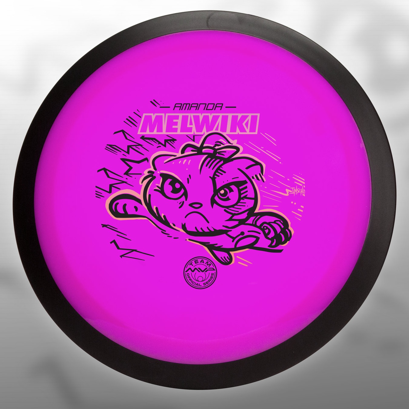
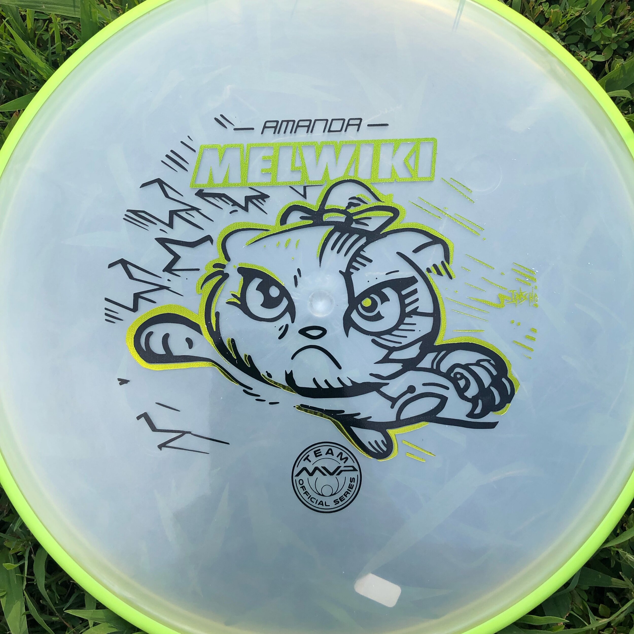
I received a request from an Team MVP member to change up a 2018 stamp design. Amanda Melwiki had a great 2018 year and her Robokitty design was a hit. She came to me with the idea of changing up the foils and adding a few elements to last years design. I had bigger plans for Robokitty and I’m glad she trusted me to do something new but a continuation of the concept.

I knew I wanted to show a fiercer side of the kitty. I wanted to marry the concepts of cute/friendly with the deep down drive and determination of getting better. That fueled the fire going into the concept stage. I had the idea more stored in the back of my head so this design didn’t really consist of a lot of reference gathering. Bringing in that exaggerated anime pop and allowing the opportunity to expand on the Robokitty character were the goals first and foremost. From there it was a few experiments with stars and how I was going to incorporate them into the design.

A huge thanks goes out to Amanda. Were you able to snag one? If not, she has a few available but will be selling out fast. Follow her here:

https://www.facebook.com/AmandaMelwiki

Streamline Flare Special Edition

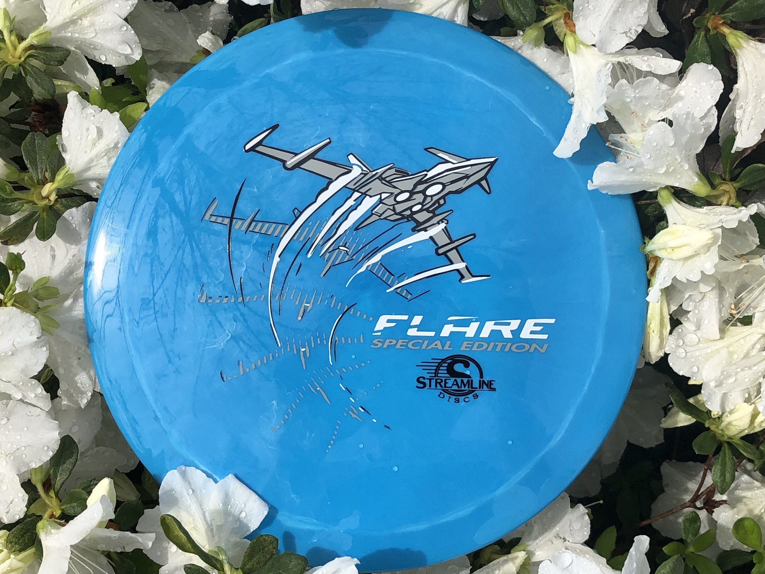
The Streamline Flare is the newest Fairway Speed 9 driver delivered with plenty of overstability for even the strongest arms in the disc golf game. I was asked to design around that special ability of the disc to fight out of constant steady winds. It’s a true wind fighter.

The design started with a page of ship designs based on direct relationships to the flare countermeasure that provides a decoy to heat sinking missles. Other quick concepts went the sci-fi ship route and that aspect of the design stuck out with the group. The frame-type of motion was liked by all and continued into the rough phase. Connecting the design with it’s actual flight characteristics was important to me. I used a rough block-in 3D model to mock up the ship orientation and ported that into Illustrator. The whole intent of that process was to create motion.

Other Streamline designs that I’ve done were in a direction where you couldn’t place a certain time period on it. It was kinda Sci-Fi/ kinda modern age but I wanted to take this into a futuristic realm. So I added lower propulsion units on the bottom and kept the edges and angles sharp. A few references of the Royal Canadian Forces doing evasive maneuvers in a valley inspired me to put atmospheric trails coming off the wings. Carrying that curve language subtracted from the “Flare” typeface finishes it off.

In the end, MVP Disc Sports HQ used a new grey pigment-based foil in combination with black and white to create a truly comic-like vibe with the stamp. You can find these by most big online retailers of MVP, Axiom and Streamline on April 19th.

Hyzerbomb-Marksman

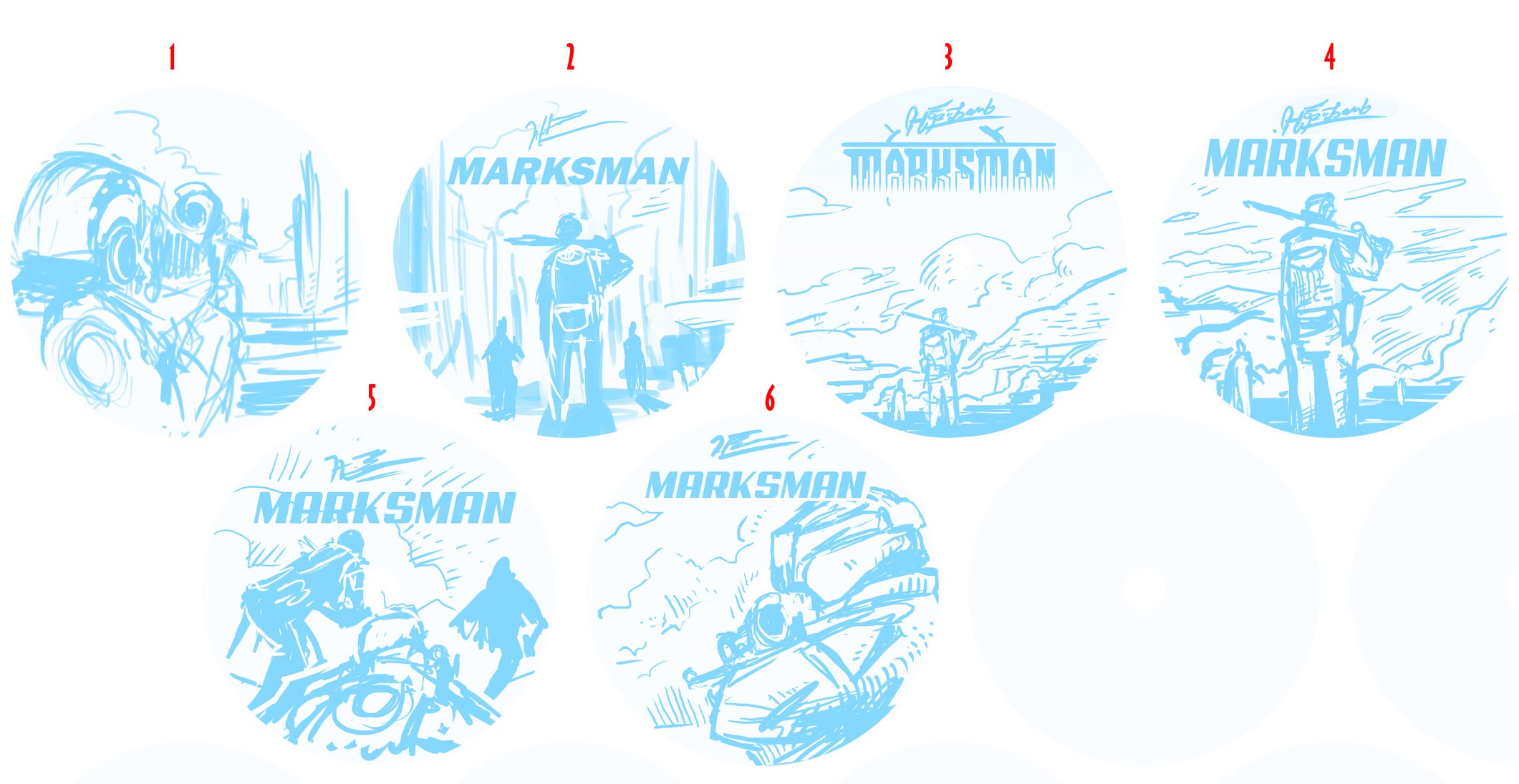
I was invited back to help Matt Siri and Hyzerbomb create a Limited Edition disc for Nick Hyde Memorial fundraising efforts. I wanted to continue things that helped make last years stamp successful and put them into this years design.

While I don’t want to rely heavily on reference, It was definitely needed this time around. While having experience shooting various munitions in the Marine Corps; I didn’t want to mix in wrong parts or screw up small details about the weapon the Marine is shooting. I found a fantastic image from John M. McCall that captured a Marine engaged in a firefight with an M249 Semi-Automatic Weapon. The overall shape worked well for stamp layout and would allow the signature clouds/ smoke from last year to make an appearance. It was important to me to keep this scene vague. No targets or houses to show where in the world this Marine was fighting. It leaves the design open to interpretation.  Having the helmet overlapping the “Marksman” text toward the far right kept the legibility intact and allowed that interaction.

Why a machine gun over a sniper rife? -  This is something Matt Siri asked me as well. While every Marine is a rifleman, I felt like the sniper rifle and knowledge was out of range of my understanding. I do know that Scout Snipers in the Marine Corps shoot outstanding Expert scores at the rifle range. I felt keeping the weapon a machine gun keeps the gunner feeling like the common Marine. It added action to the scene and allowed the opportunity to add some flying “brass” shell casings coming out of the ejection port cover.

In the end, my goal was to create something that felt similar to last year. Keep the continuity going. I want to thank Matt Siri for giving me an opportunity over these last few years to create something to help raise funds for the Nick Hyde Memorial. That’s what it’s all about.  If you’re interested in purchasing one, they are available here:

 http://hyzerbomb.com/product/swirly-marksman-mike-inscho/