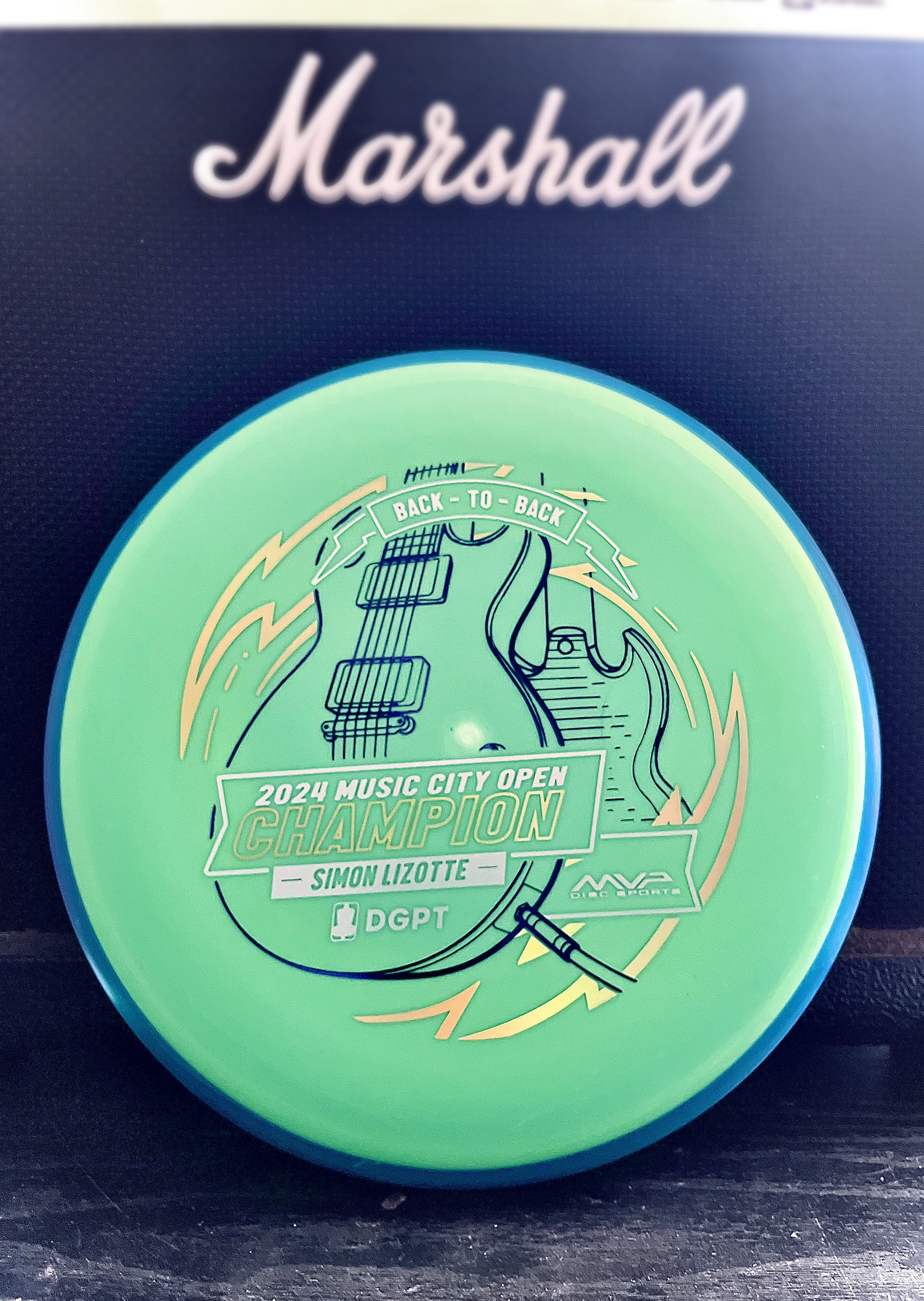
Sunday, mid-afternoon the text came in to start thinking about a stamp. Simon Lizotte had a 2 stroke lead going into the final round. He played out of his mind and was making the proper plays down the fairway and hitting some incredible putts all weekend. We knew the Pixel would be the disc we would run. I took a quick hour that Sunday afternoon while action was kicking off to create a stand in stamp just in case. The initial idea was to keep with the theme of this year and the Les Paul. My initial blocking in was to feature the body of the guitar in simplified drafting shapes.
The decision to go with a “back to back” was universal within the MVP Disc Sports ranks. Sunday night I got on it and started gathering referencing of both front and back of the SG and Les Paul guitars. I used a mix of different library models from Google Sketchup to nail camera field of view. Mainly, it was an excellent resource to help me get both guitars on guitar stands and in proper perspective
The final stretch was adding in a sense of “flow state” which was mentioned quite a few times on the live event broadcast. Simon seemed to be in that headspace all weekend and I wanted to incorporate that element. I used radial symmetry and bolts to add the 2nd foil and consciously used the 3rd foil for the Event/ Logos/ and “Back-To-Back” banner up top. The final stamped product was dressed in dark purple metallic, gold holographic, and brushed silver foil. The custom triple foil stamp took a solid 2.5 days from start to completion.
The concept is pretty straight forward but overall, with the amount of pressure and time to get something to final, I’m pretty stoked on the outcome. Let me know what you think? How could I have done “back-to-back” differently? Thanks for stopping by.
Simon Lizotte - Leapin' Lizottl' 2023 Tour Series
Wow. Simon Lizotte signed a 10-year deal with MVP Disc Sports. I was shocked when I heard of the acquisition of such an elite player within the disc golf tour. It had been a crazy week leading up to the MVP announcement. I’m just really proud to be a part of these pivotal moments in MVP’s short history.
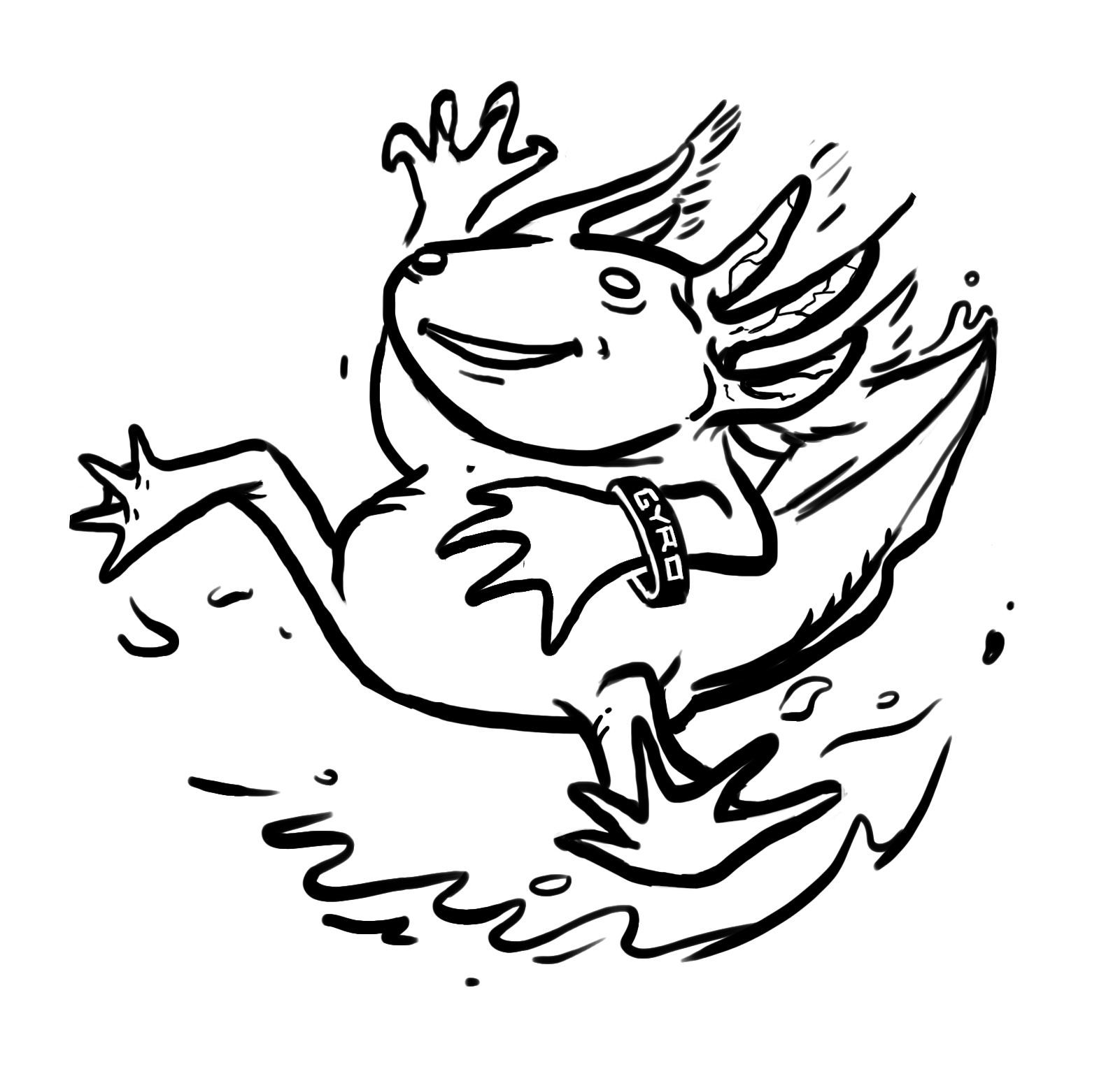
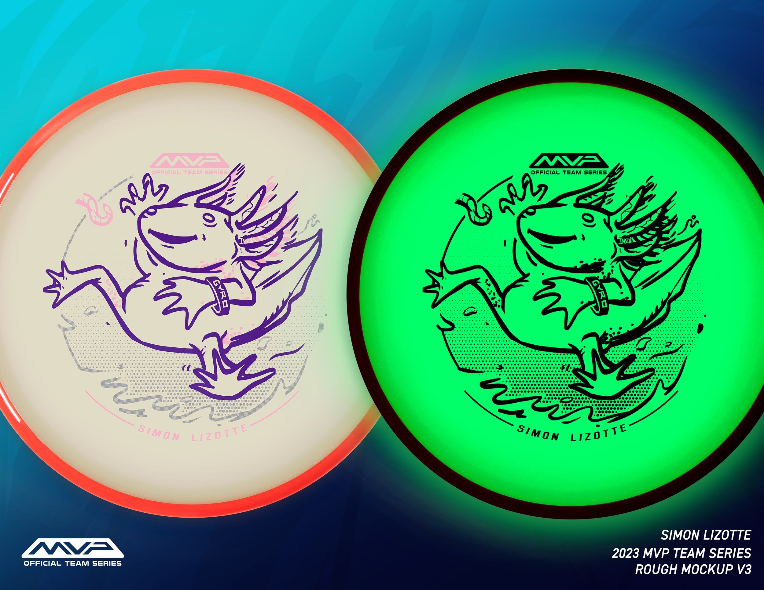
Besides the Glitch, the Hex is one of Simons’ favorite midranges. There were a few ideas created during the loose thumbnail stage that will be revisited in the near future. I sadly can’t show those just yet. I admittedly didn’t know too much about these axolotl creatures. Simon has a pet axolotl and I loved how they appear to be in good spirits all the time. I’ll admit that the initial open-air leap felt a bit disconnected in the concept. Bringing in the water brought him closer to his elements. I added the worm and a few motion lines to give him a reason to jump away from his comfortable habitat. Adding the GYRO wristband is a nod to the tight-nit and passionate MVP fanbase.
I’ve said this in other blog entries over the years of doing this but there’s something powerful in allowing a disc stamp design to breathe. With this being a potent Eclipse glow from MVP, I veered away from over complicating the background with detail. Axolotl jumping out from his comfort zone resonates with the kind of change Simon went through moving to a brand new sponsor and unfamiliar ground over this past year. I hope you all appreciated and bought the stamp to show your support.
Welcome to MVP, Simon.
2022 Gyropalooza Total Eclipse Proxy
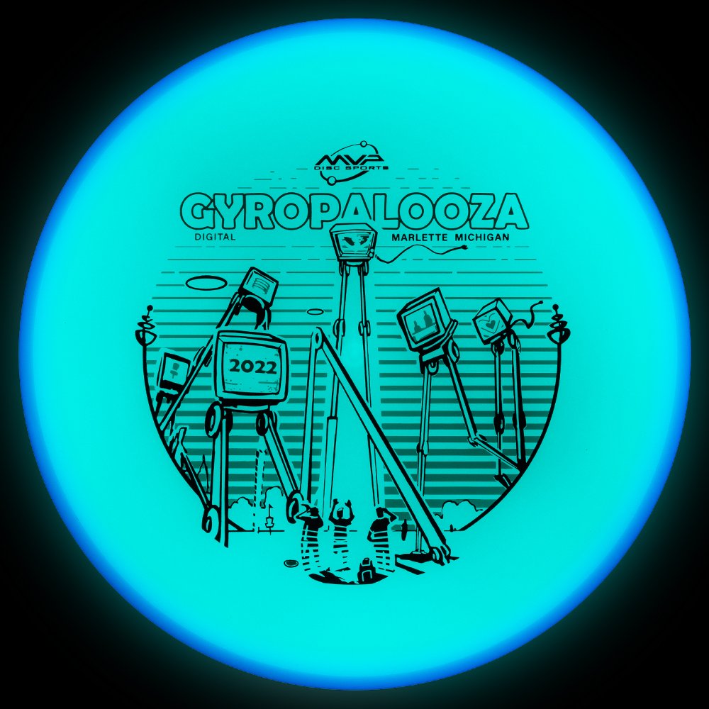
The 2022 Gyopalooza brings something pretty exciting. We had a new Total Eclipse glow technology in the lab awaiting its release. The Proxy is outfitted with both an Eclipse™ Glow flight plate and Eclipse™ Glow Rim. Colors vary from white, aqua, green, blue, and purple with a multitude of different combinations.
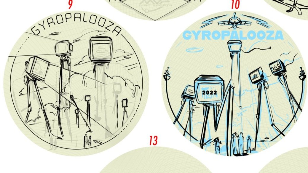
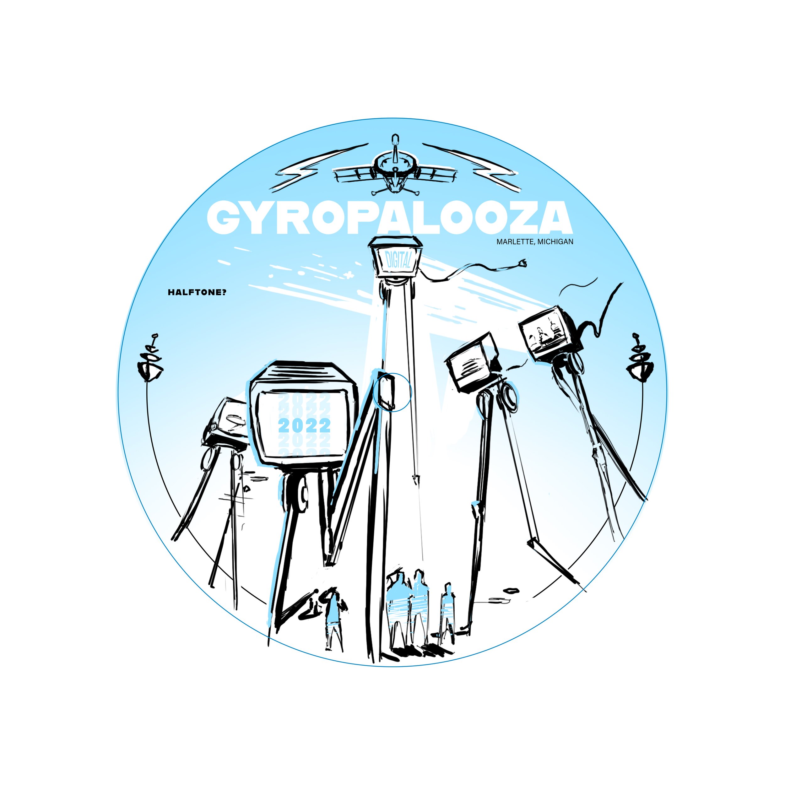
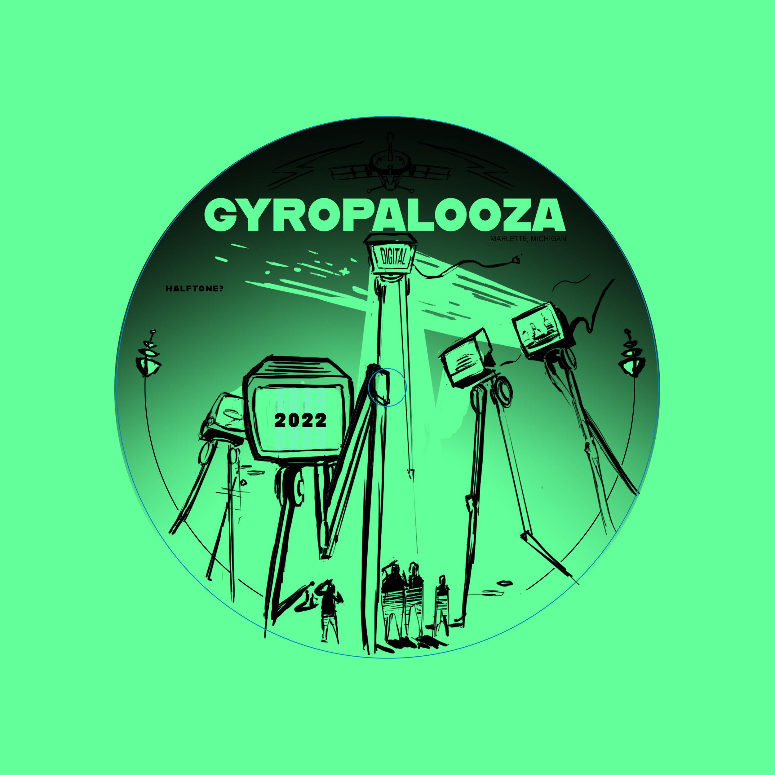
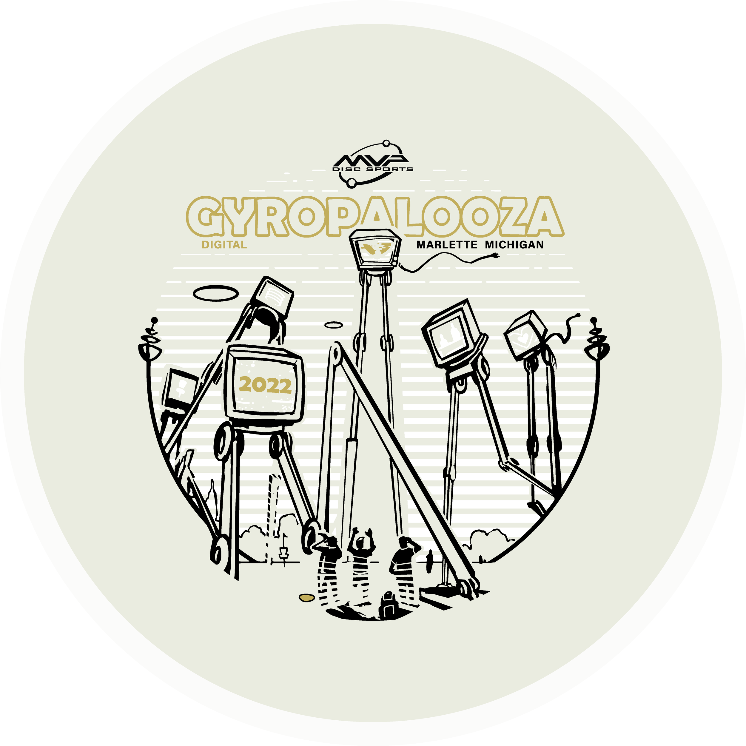
The Idea: I had this image in my head but instead of being an intimidating alien species laser-stomping everything in sight, they were dispatched to broadcast exclusive MVP content and news to the Gyronaut masses! All of this sounded great but the important goal from the get-go was not to hinder the glow properties. I think it’s important to design stamps with disc plastic in mind. If the glow is an important draw, why would you cloud it up with foil? Lastly, by setting up a two-point perspective grid, it gave me a great base to lay down that looming presence of the tall beings. There are still a few MVP iconic themes scattered about.
I wanted some of the TVs to engage with the local disc golfers. It was a good placement for “2022”, discs, and a Brad/Chad silhouette we’ve come to know so well these past digital versions of Gyropalooza. Lastly, the last and most important icon located on the far right represents a huge love for all of our fans who’ve stuck by us from the very beginning through the years of rapid growth. I love to infuse emotive characteristics in robots. Allowing robots to have a bit more life and curiosity like our human race. Lastly, I wanted the center alien bot to have its glow casting on the disc golfers underneath. I used a line screen in the background to enhance that particular element. Doing that for every TV would’ve clouded up where I wanted the focus to go.
Hot Stamping Foils: I’m a sucker for white pigment foil because of how bright the Eclipse glow plastic is. It allows some of that color to seep through and gives the glowing state a bit more depth. The accent color is a classy nod of brushed gold that allows it to pop off of that core plastic color. Again, it’s important that the accented foils work alongside the others during the glowing state.
Can’t wait to get some of these in my hands. MVP took their industry-leading glow and just made it better. I don’t get out and play glow rounds very often but this disc makes it tempting. What are your thoughts? Excited to see these in the wild? You can get your 2022 Gyropalooza pack from any reputable MVP dealer. Included will be this Total Eclipse Proxy, a Prototype Eclipse Color Glow Envy, and Lab Second discs for a pretty good price. Thanks for tuning in!
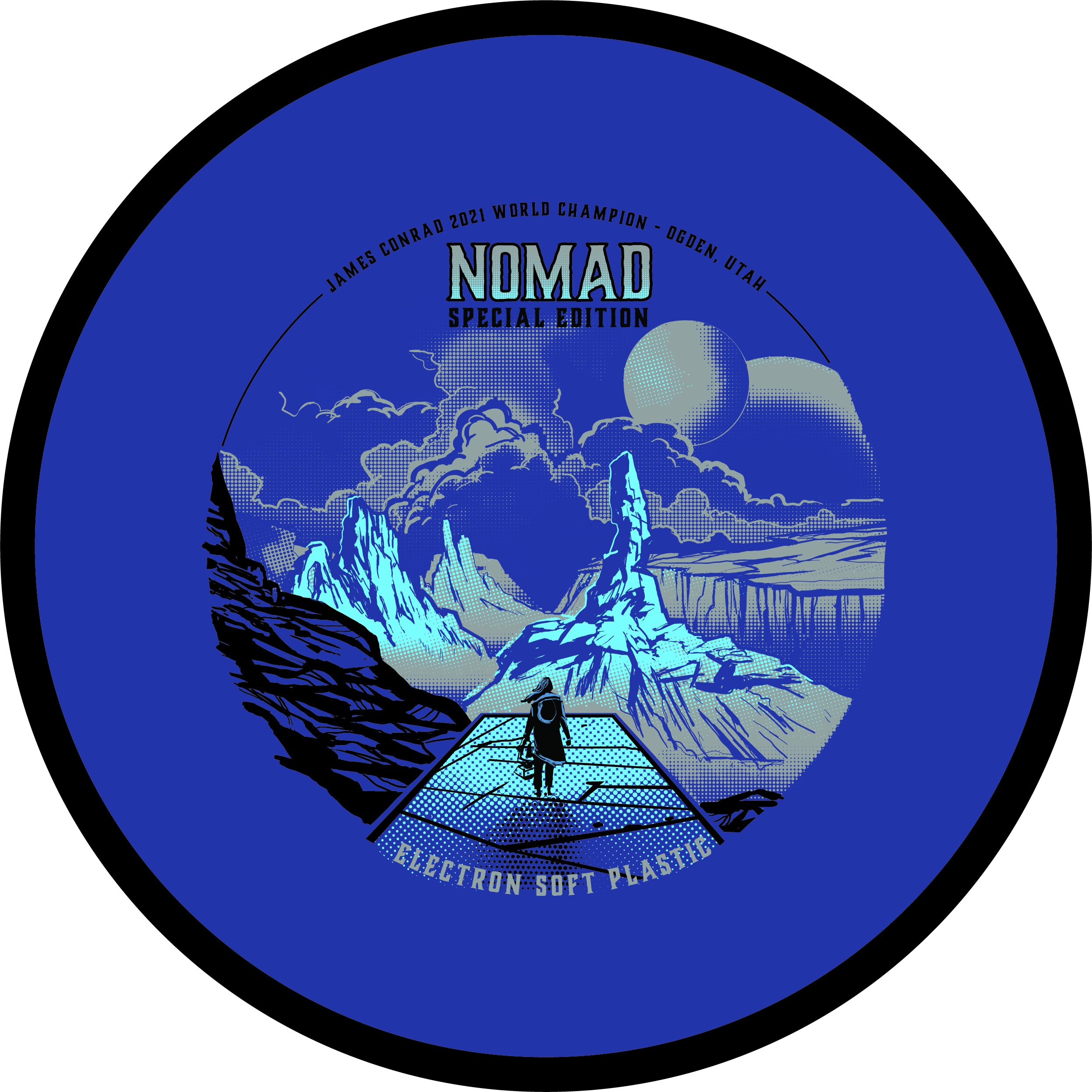
MVP Nomad - James Conrad Special Edition
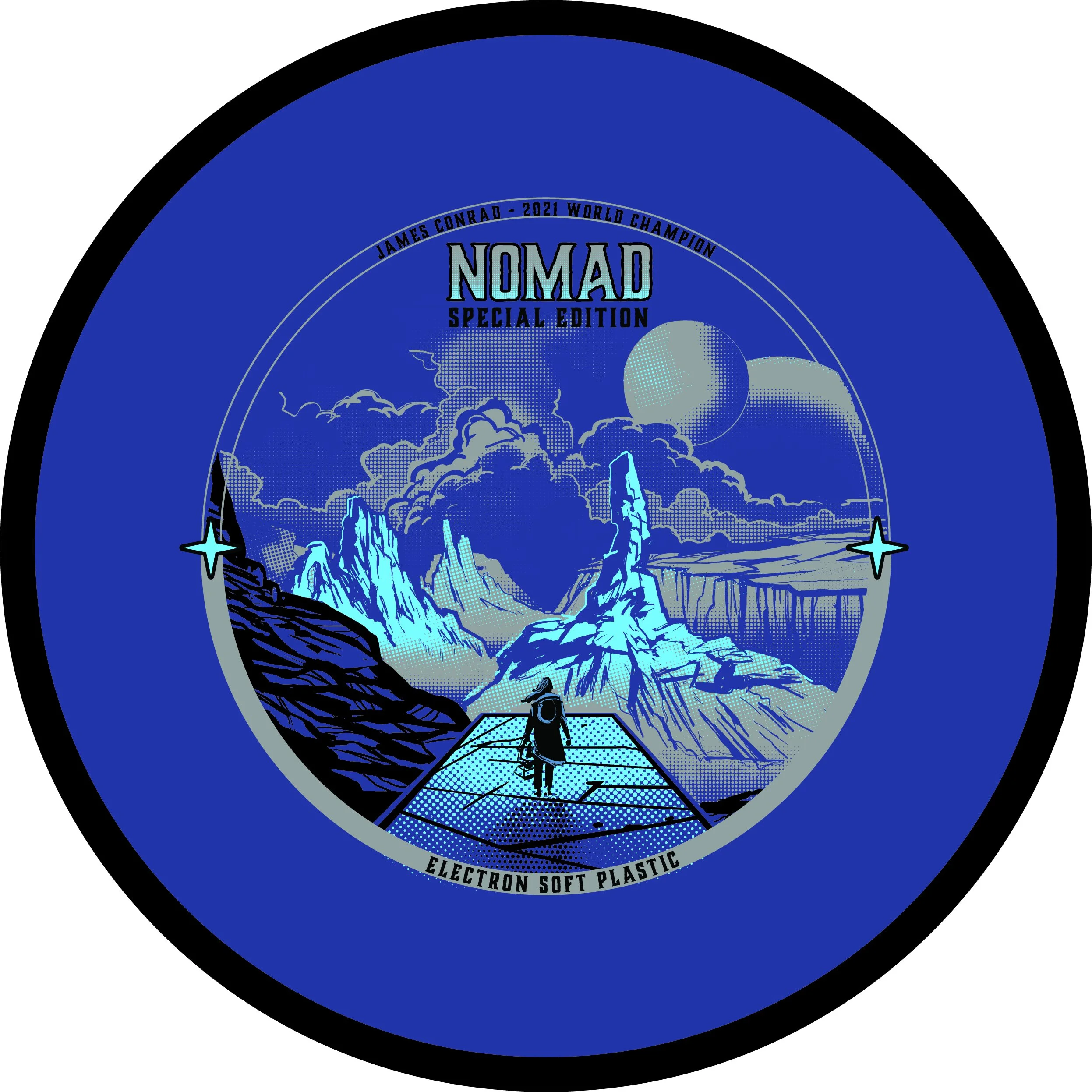
The MVP James Conrad Nomad Special Edition was a unique one. This project kicked off a bit earlier than most people realize. We had James Conrad’s Signature Line Nomads in production before he hit the biggest shot in disc golf (IMO). With that event happening and the surge and interest solely on MVP and their debut of James’ first designed putter; We shifted gears just before going into final stamp design.
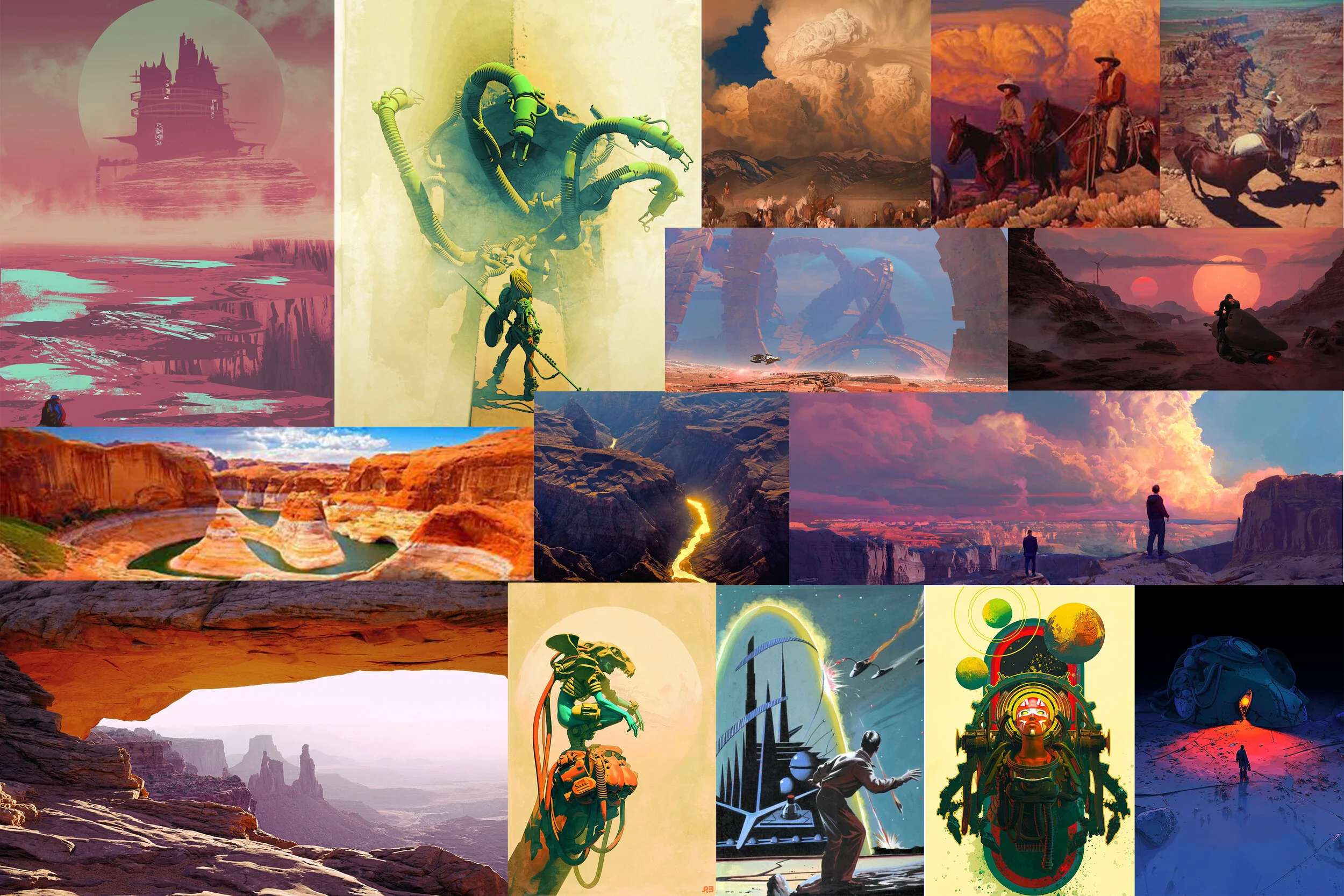
First off, this design from the get-go was a collective agreement from the MVP Media Dept. that it should be a cohesive nod to the stock Electron Nomad stamp that was also debuting at the same time. With that, I was able to dial in on the “traveler/ nomad” aspect and reach down into my science-fiction/ dystopian love. I’m one to do extensive research before going into the thumbnail stage. Grand Canyon/ desert paintings from the incredible minds of Mark Maggiori, Pablo Carpio, and Pascal Blanche helped dial in a smooth style with the rock formations and overall composition.
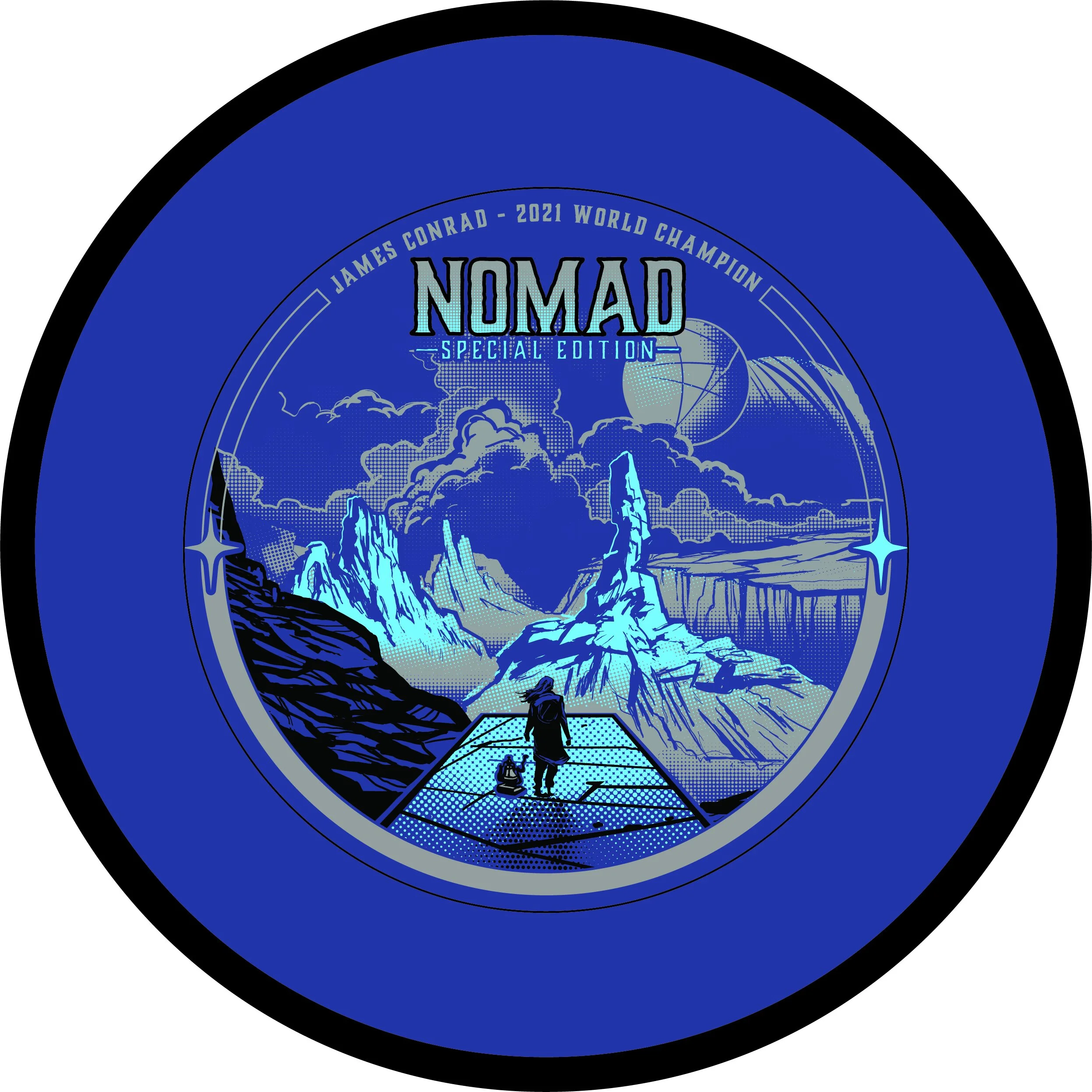
With this project; I knew I wanted to push the limits of our Election stamping capabilities. Although nervous, I knew our MVP HQ stamping team could put their best into making sure these came out successful. It took quite a bit of value painting work to figure out the half-toning fills. I worked back and forth with the inclusion of black within the stamp and found a great compromise of subtracting the would be black line work from the background.
In the end, i’m glad this art was in preproduction before James Conrad flipped MVP on its head. I was able to adjust on the fly and include the Worlds nods relatively easily. I’m glad this went ver so well with James and the pro players he showed during his warmup rounds. That meant a lot.
What did you enjoy most about the Nomad Special Edition?
