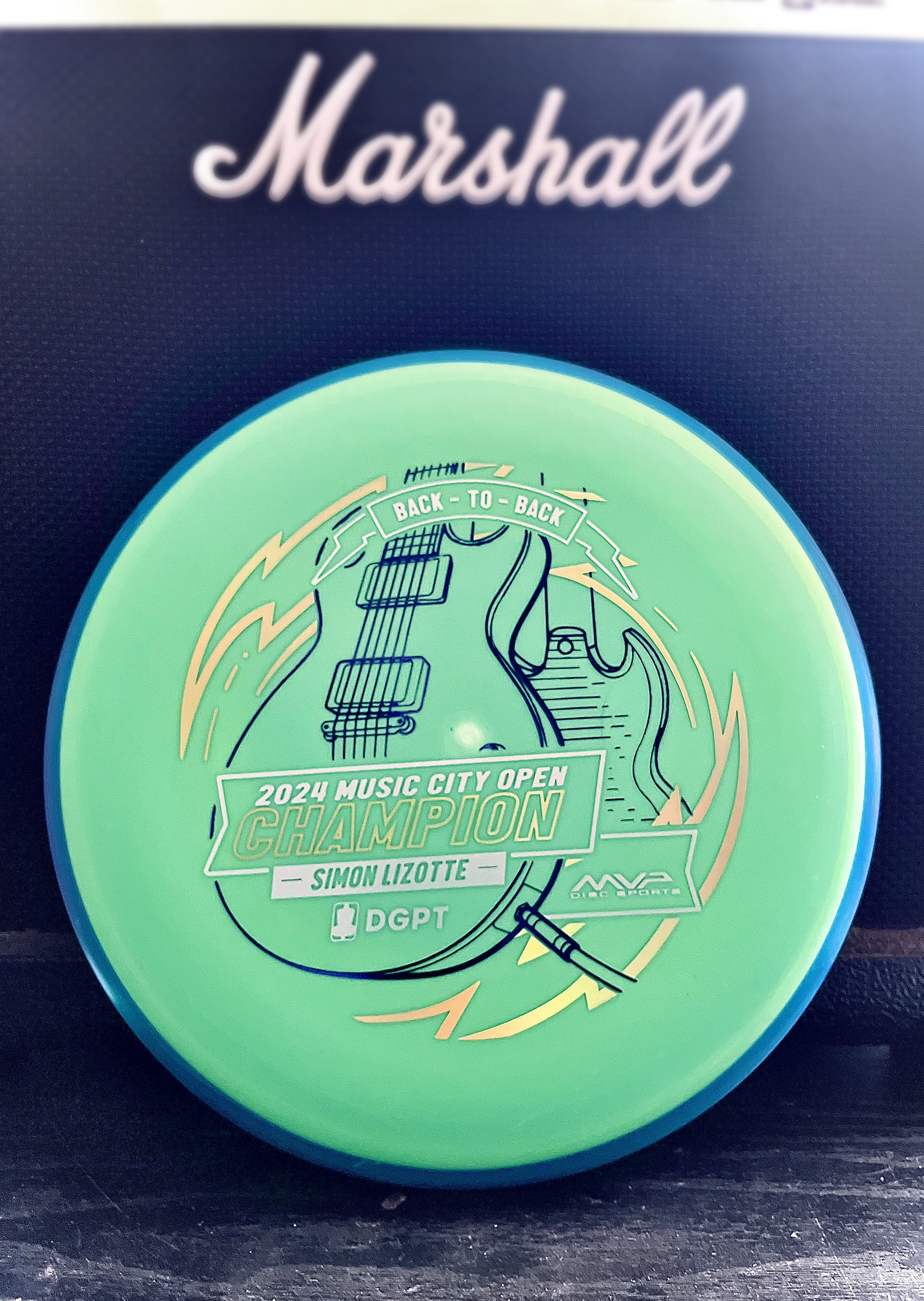
Sunday, mid-afternoon the text came in to start thinking about a stamp. Simon Lizotte had a 2 stroke lead going into the final round. He played out of his mind and was making the proper plays down the fairway and hitting some incredible putts all weekend. We knew the Pixel would be the disc we would run. I took a quick hour that Sunday afternoon while action was kicking off to create a stand in stamp just in case. The initial idea was to keep with the theme of this year and the Les Paul. My initial blocking in was to feature the body of the guitar in simplified drafting shapes.
The decision to go with a “back to back” was universal within the MVP Disc Sports ranks. Sunday night I got on it and started gathering referencing of both front and back of the SG and Les Paul guitars. I used a mix of different library models from Google Sketchup to nail camera field of view. Mainly, it was an excellent resource to help me get both guitars on guitar stands and in proper perspective
The final stretch was adding in a sense of “flow state” which was mentioned quite a few times on the live event broadcast. Simon seemed to be in that headspace all weekend and I wanted to incorporate that element. I used radial symmetry and bolts to add the 2nd foil and consciously used the 3rd foil for the Event/ Logos/ and “Back-To-Back” banner up top. The final stamped product was dressed in dark purple metallic, gold holographic, and brushed silver foil. The custom triple foil stamp took a solid 2.5 days from start to completion.
The concept is pretty straight forward but overall, with the amount of pressure and time to get something to final, I’m pretty stoked on the outcome. Let me know what you think? How could I have done “back-to-back” differently? Thanks for stopping by.
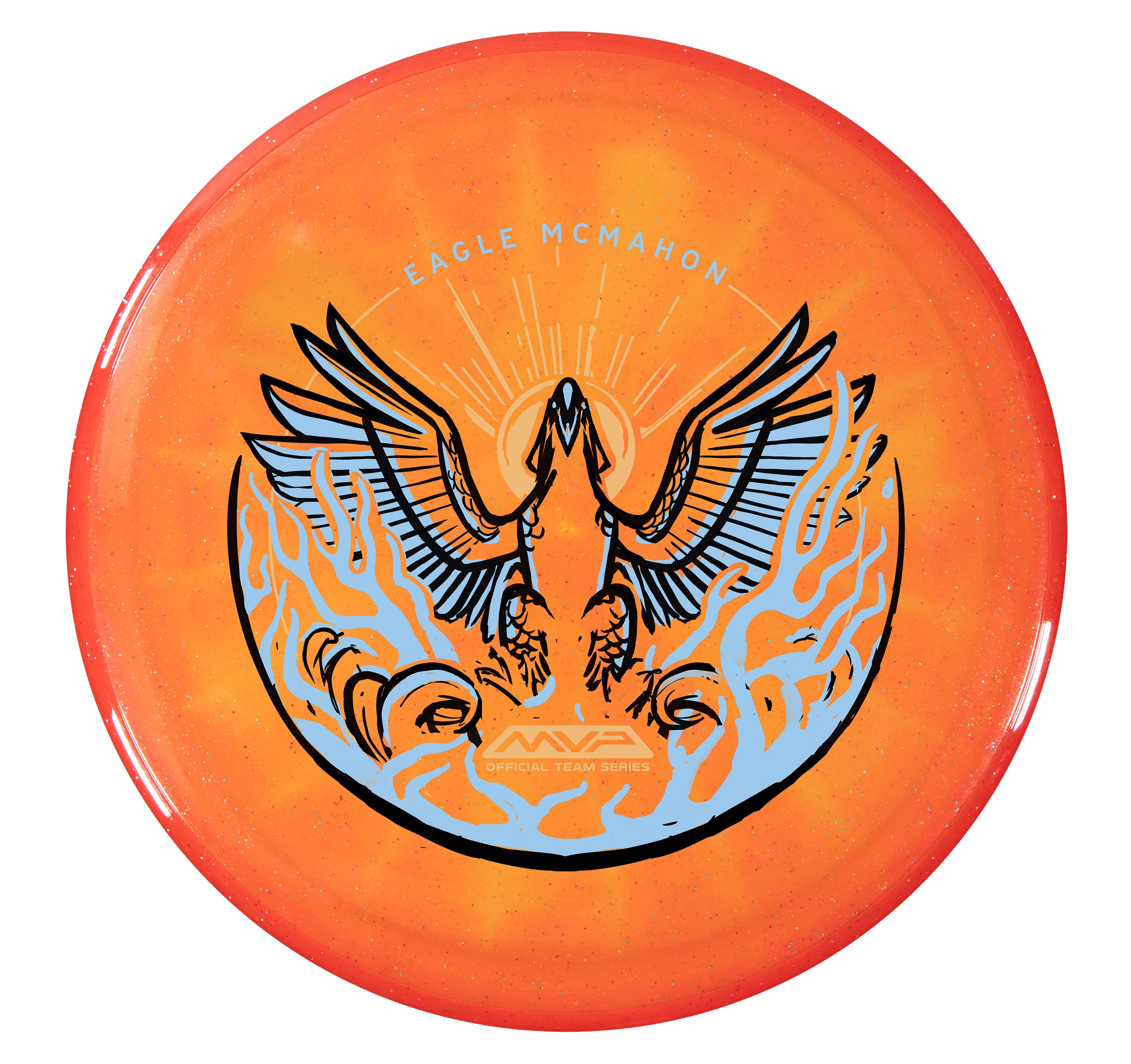
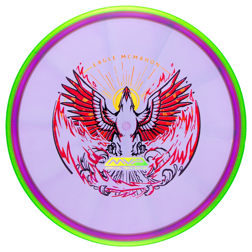
Eagle McMahon 2024 Team Series "Rebirth"
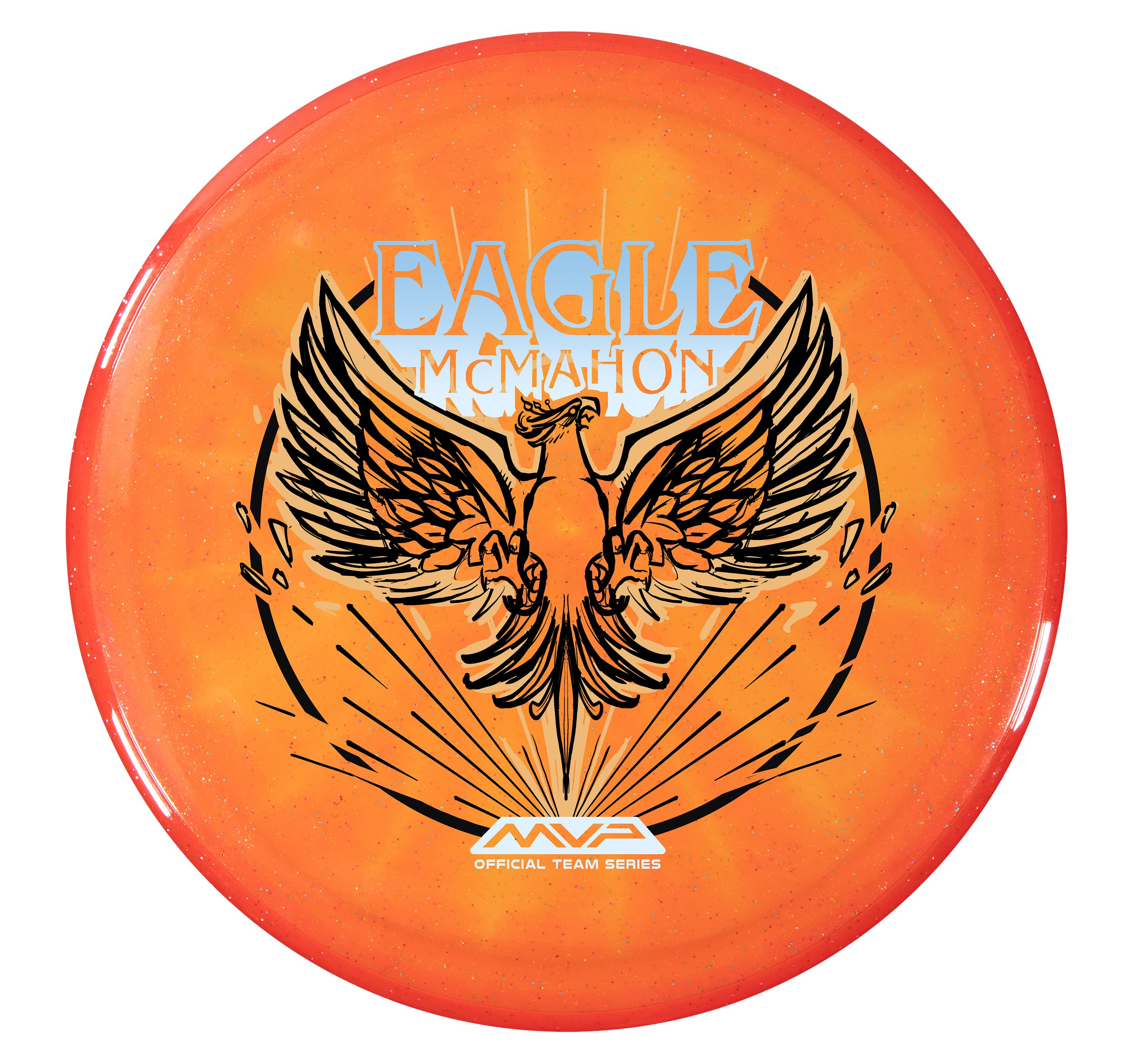
MVP Disc Sports is starting 2024 with some great Team MVP signings. One of them is Eagle McMahon! I can’t say this enough, but it was a team effort to design, film, edit, plan, and execute the Eagle McMahon recent news drop. I couldn’t be prouder to be a part of this team we have assembled. Eagle had requested in discussions that his Team Series disc be the Axiom Prism Proton Envy. Prism Proton is a combination of a Proton core with a Prism Proton rim. It differs from the standard stock Proton Envy with its Neutron overmold. It allows light to bounce through and create some remarkable results. The Envy is one of our company's most popular discs, and the Prism Proton Envy is easily one of the most gorgeous Envy’s we have ever produced.
Assignment:
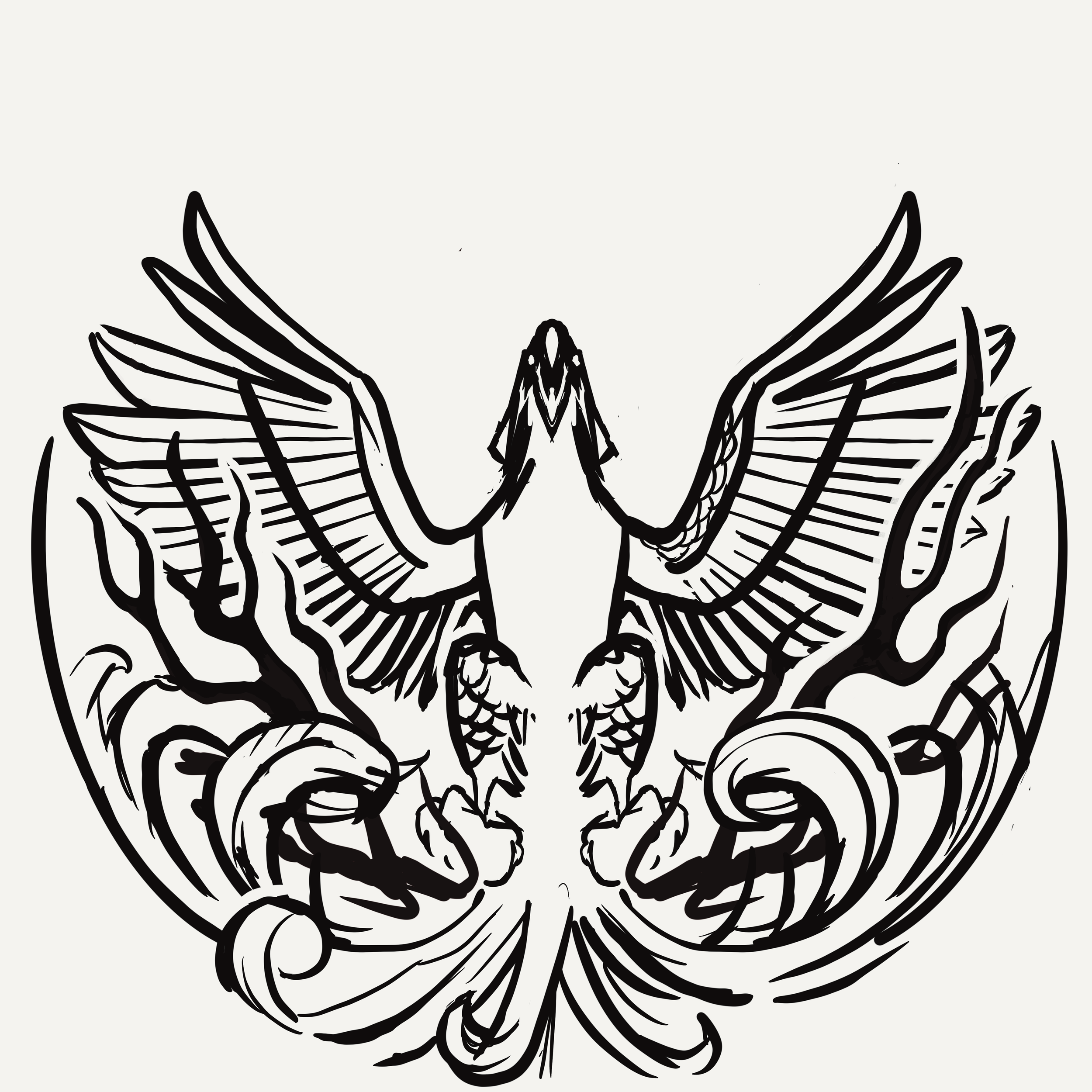
To provide Eagle McMahon with a triple-foil 2024 Team Series design and to have stamped product before Eagle’s arrival at MVP HQ. At age 25, firmly in his prime, He knew this opportunity was the start of the next phase of his career. Those conversations led naturally to the concept of a phoenix, or rebirth. It was the start of something new and exciting. While this was my priority secret assignment, I had to conduct my day-to-day operations as the Art Director of MVP.
Phase 1
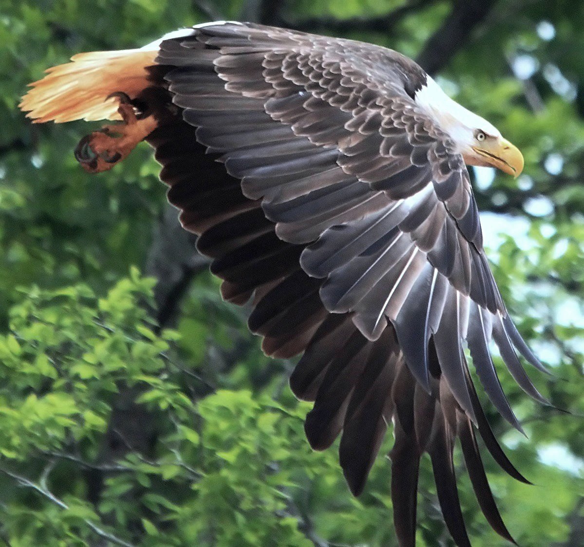
MVP/Axiom isn’t known to be a company to release anything bird-related. Where do we start? How can we work within the parameters of the phoenix lore and not create something similar to other disc golf brands? Cybernetic concepts? AI generation? The choice to use an animal has been made and redone countless times within the disc golf space. I relied on gathering references of phoenixes and eagles that displayed strong pose characteristics and unique silhouettes. While in the rabbit hole, I found references to an Eastern-style phoenix-like bird that steers toward ostrich/peacock comparisons. I felt there needed to be a sense of pomp and circumstance/elegance.
Phase 2
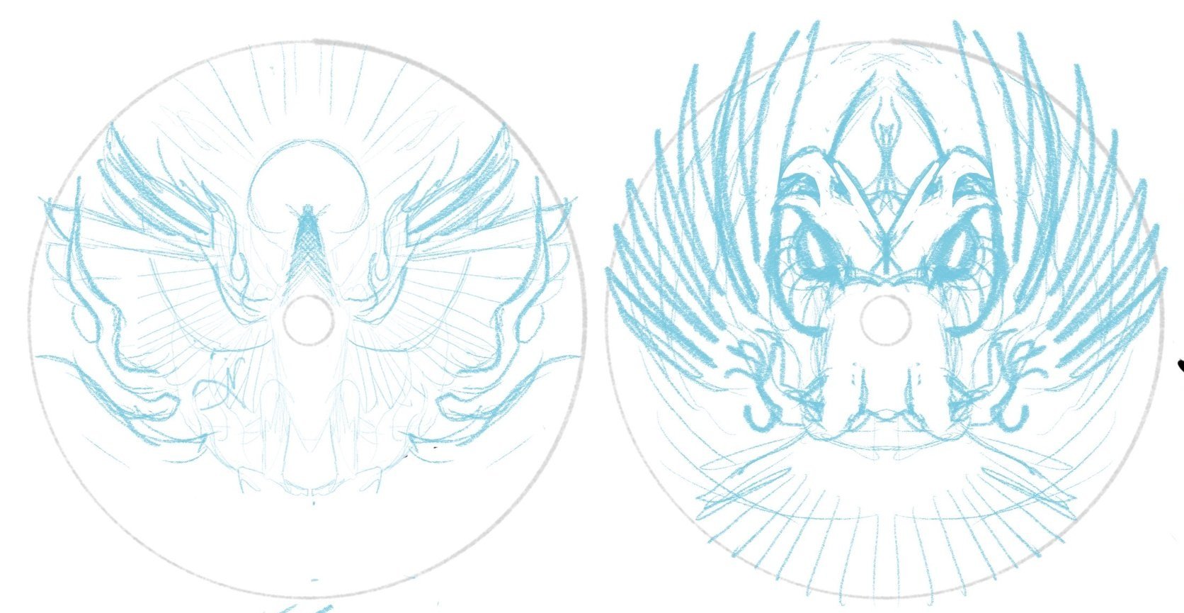
I got to work on a few sheets of thumbnails. Listening to feedback from the first thumbnail selection gave me more to chew on going into the second set of ideas. This sheet would land the bones/overall direction of the design moving forward. I brought a rough chosen thumbnail into Procreate and started to figure out bird, text, and logo placement within the stamp. There are standards for the Official Team Series seal with a minimum stamping size of 10mm tall, and I knew from the jump that those were must-haves. Going from loose drawings to idealized structure (mocked onto discs) helps show ratios and how the design feels with the characteristics of the plastic.
Phase 3
I learned a lot about Eagle during this first project. He wasn’t the biggest fan of his name taking up so much space as I initially thought we needed. We opted for a smaller footprint. The head facing to the right side offered the best silhouette value. Overall, leaving the head looking off to the side felt commonplace with the reference I’ve been seeing. Looking upward and straight on felt more engaging and powerful, so I continued with that mindset. We entered a more polished stage. I started thinking about all three foils. Eagle was pretty jazzed, and we all felt this was the final direction.
We were at the 80% mark when I felt the flames didn’t replicate the excitement/buzz going into 2024. In a traditional sense, the vibe fits more with the Eastern/traditional style fire. While working through the final ideas of the bottom stamp rocker, I realized that the airfoil caused by a bird rising from the fire would create a bit more disturbance. Adding more lateral energy helped add dynamics to the bottom portion tenfold.
The Final Phase
The last part to do was to finalize line quality, start placing the assets into the custom template, and work through final line detailing with stamping guidelines in mind. This design had to have little to no issues on the day they tested. It needed to work consistently for whoever was running the stamping machine at any point.
The Eagle McMahon “Rebirth” Team Series discs will include gold holographic foil, red holo foil styles (shatter, dots, and vertical holographic lines), and a black outline. I’d like to thank Eagle for his attitude and pure joy during this process. It aided in the extra hours needed to finish this. I’m beyond excited to see these out in the wild and can’t imagine what 2024 has in store for MVP Disc Sports. I hope you all enjoyed and feel free to ask any questions. Thanks!
2023 PDGA Membership Discs
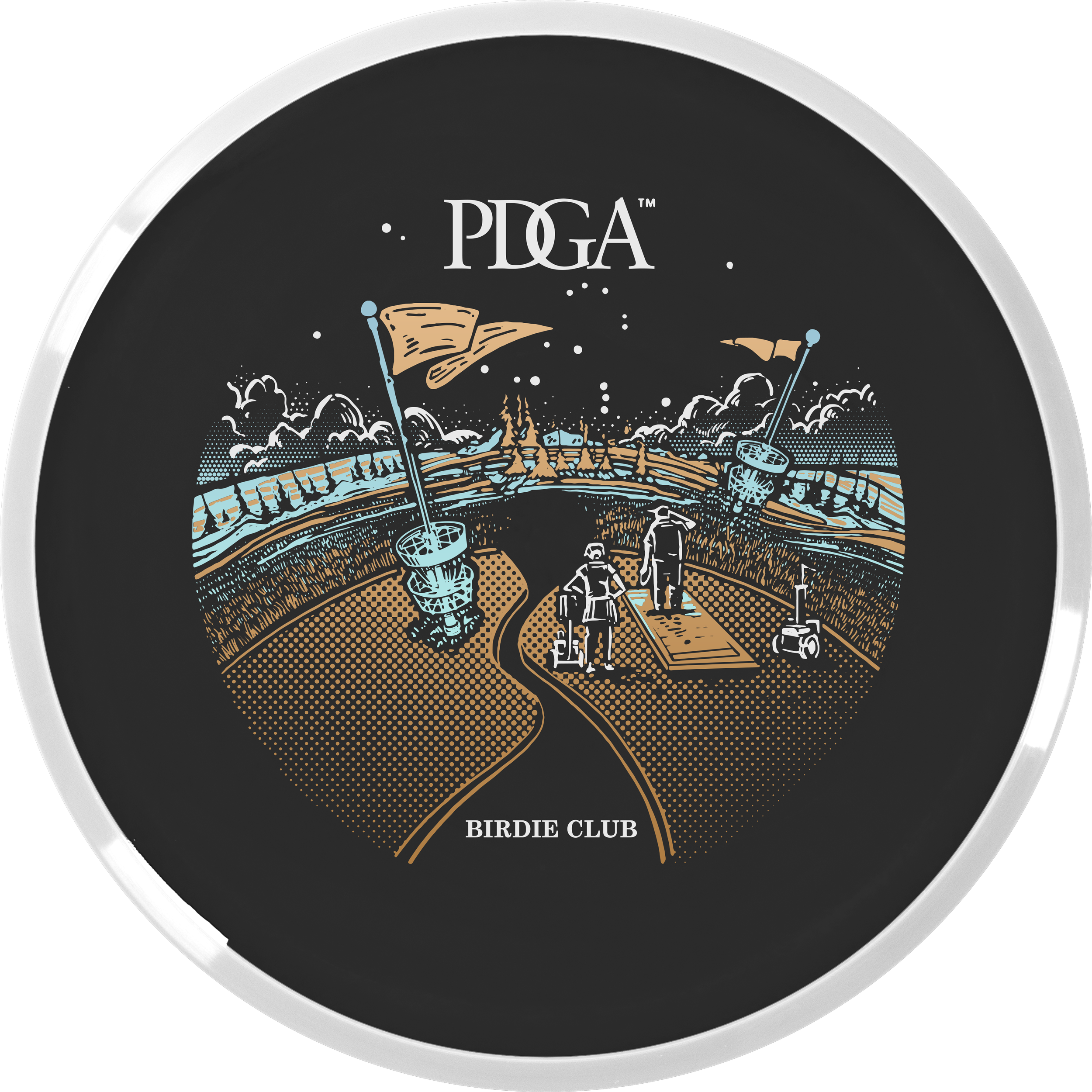
In mid-summer of 2022, Vic Allen reached out to me to ask if I’d be interested in taking on the 2023 stamp. On the table were the Membership, Birdie Club, and Ace Club discs. These discs were slated to be stamped on black R2 (MVP’s recycled line) Craves. So with that in mind, you’ve got your black line layer on the flight plate which allows you 3 colors to accent that. It’s a different way of thinking with stamp design but a fun one.
I’d noodle in my sketchbook for about a week or so when Vic came back with an idea to possibly do a collaboration with John Dorn. John has been doing disc golf/ frisbee stamp design for decades. He had recently created the 2021 Relay Turtle stamp that went over really well. I jumped at the opportunity, hit up John Dorn on a phone call to work out the pipeline, and we got to work.
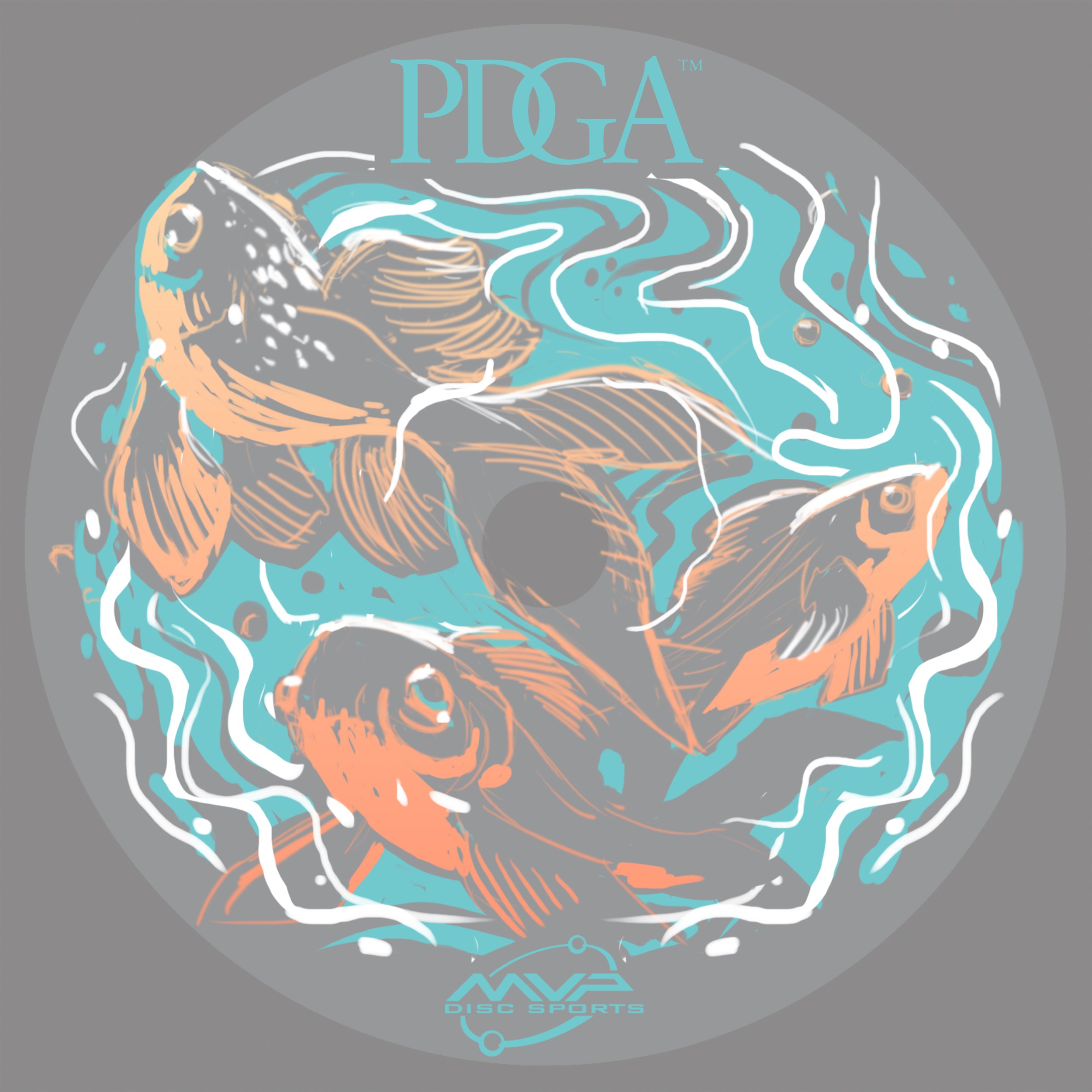
2023 PDGA Membership Disc: Koi Dragon
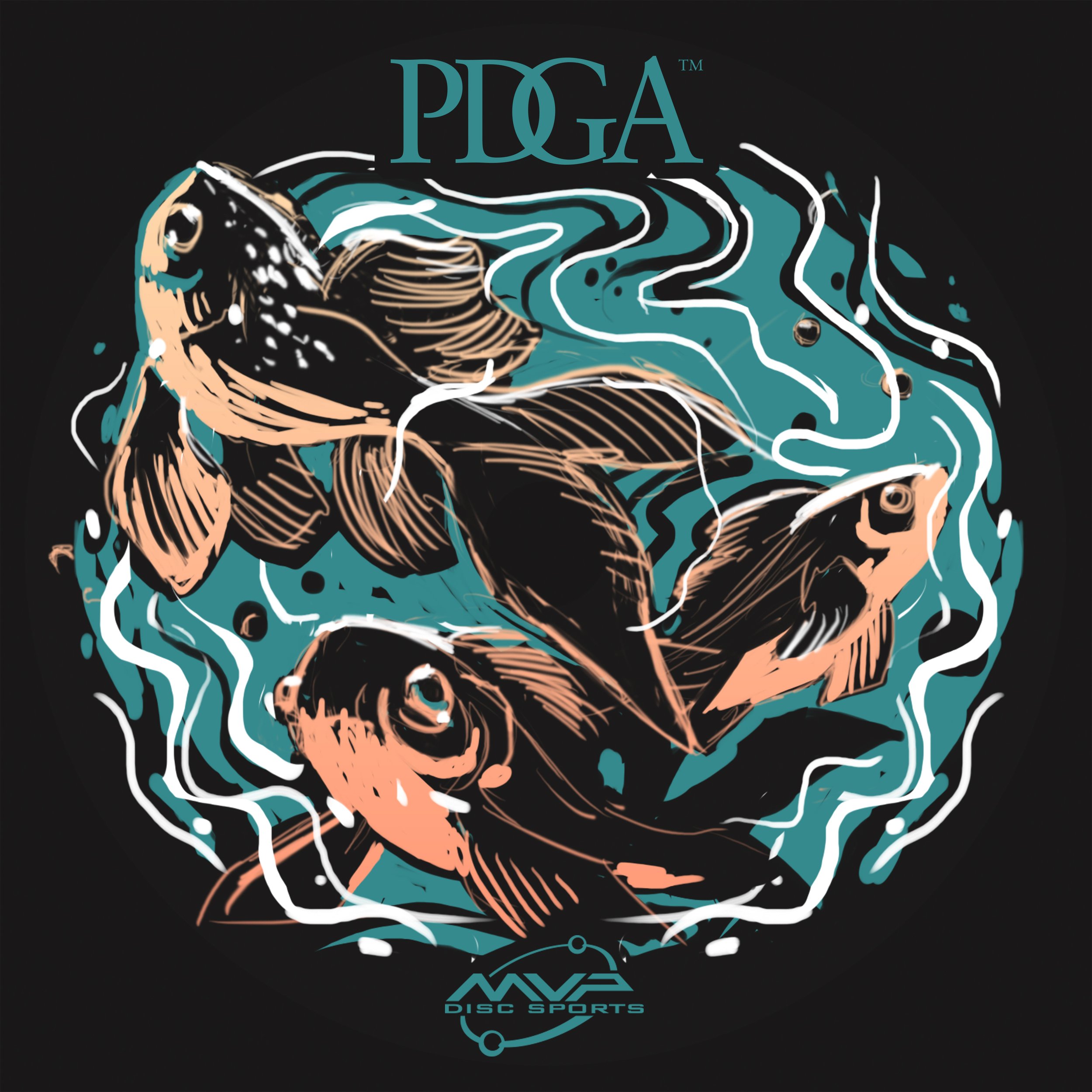
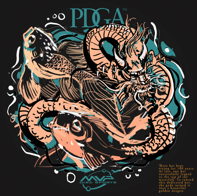
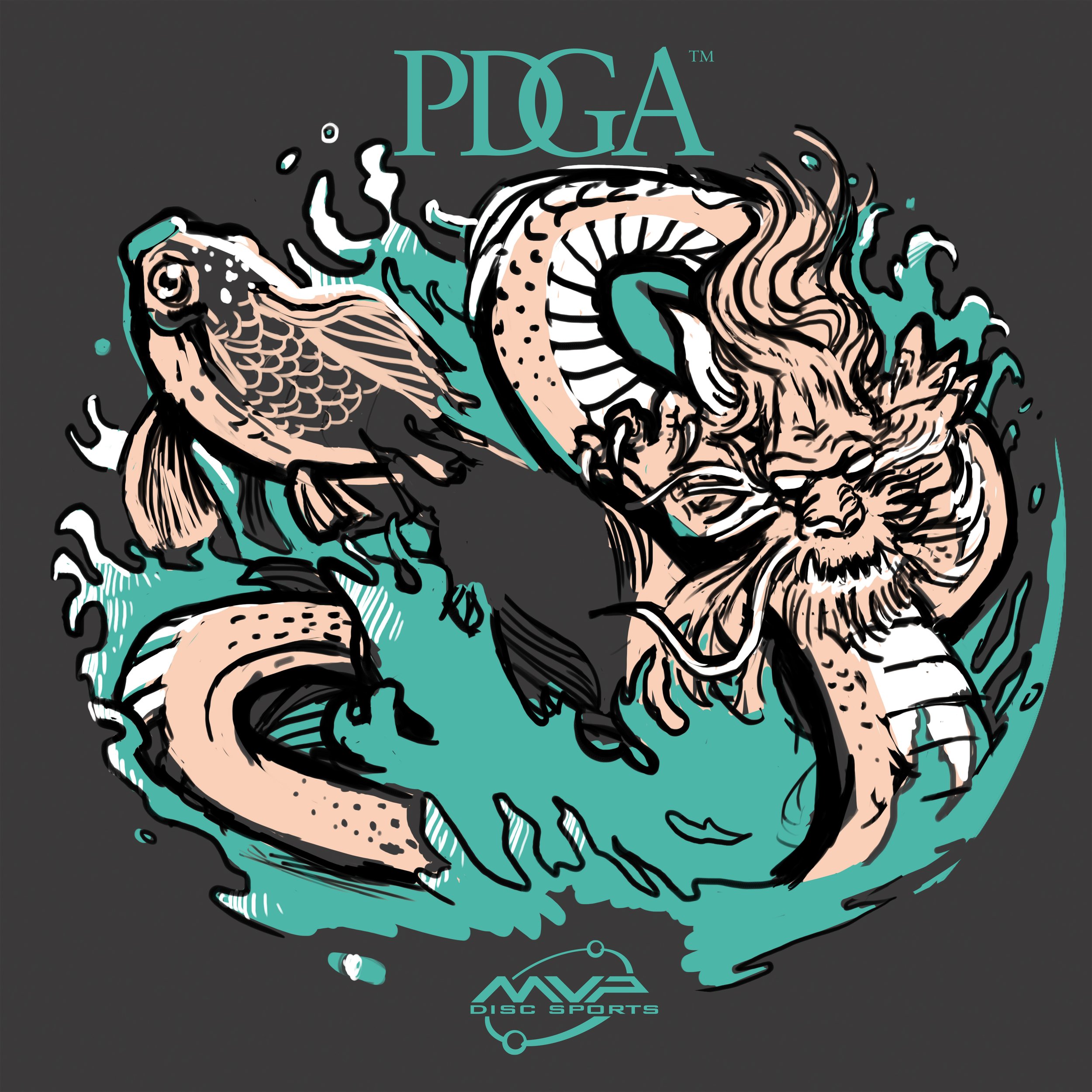
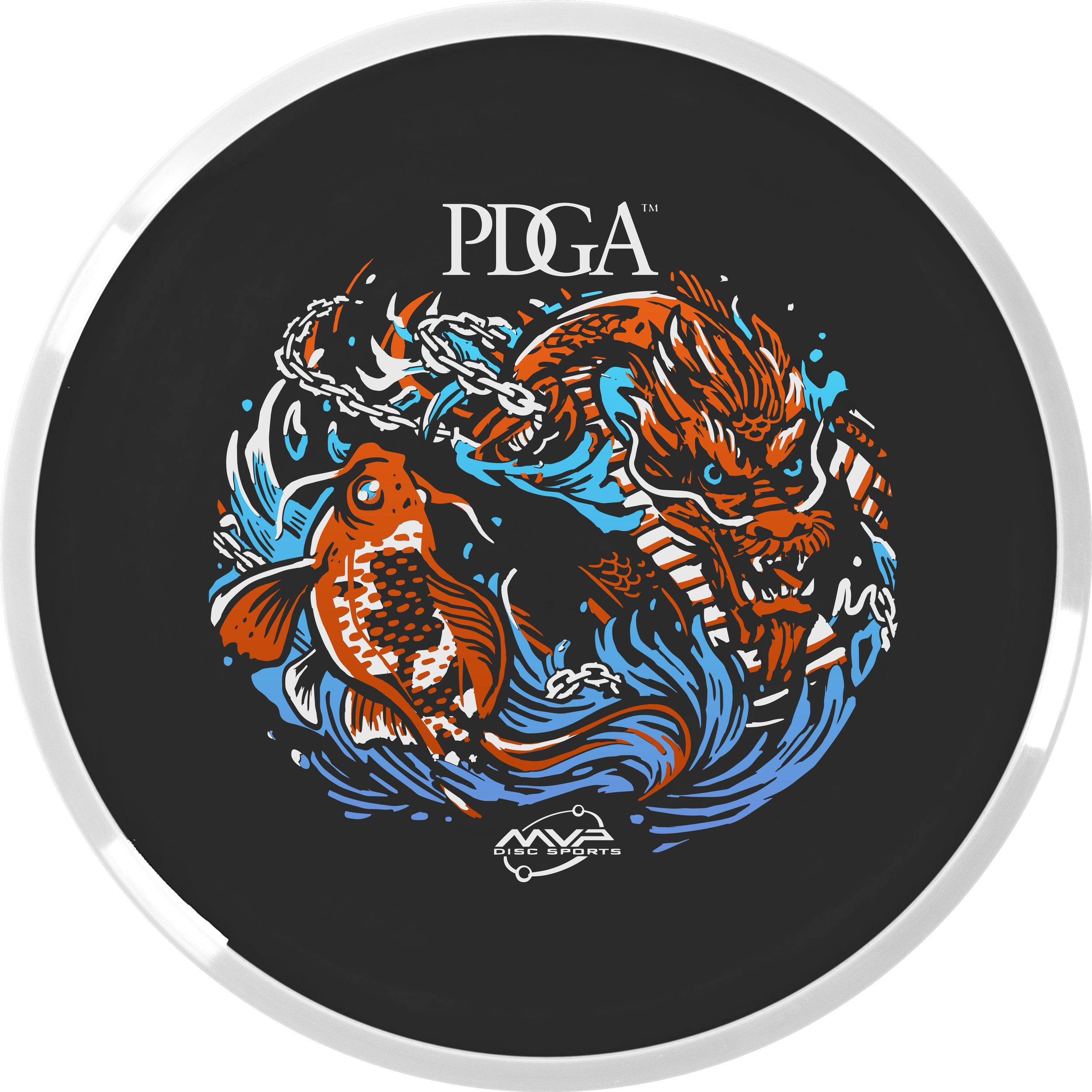
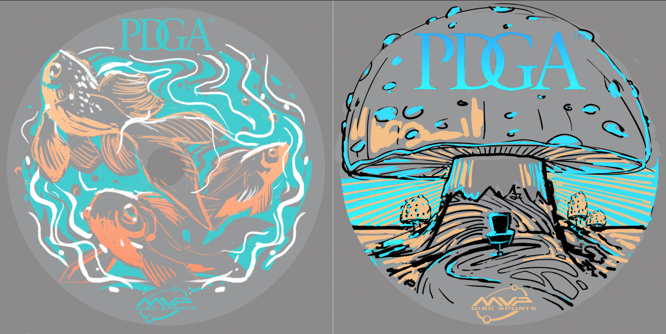
The Koi Dragon stamp started off as 3 fish swimming aimlessly in a fish bowl. After passing off this thumbnail to John, he added in the dragon and explained the story of how a Koi fish turns into a dragon. I thought this was awesome and definitely gave a jolt to this concept. John passed the concept back and it was my turn to dilute some of the noise and chaos happening and to bring this illustration home into 3 foil form. It took a bit to do that. The dragon was giving me fits. I probably redrew the dragon 2 or 3 times until I was happy with it.
The last edit going into the final phase was adding the important disc golf element. To do that, we came up with the solution to use a basket silhouette within the koi and include chains within the watery mix. I think this design turned out great!
2023 PDGA Birdie Club:
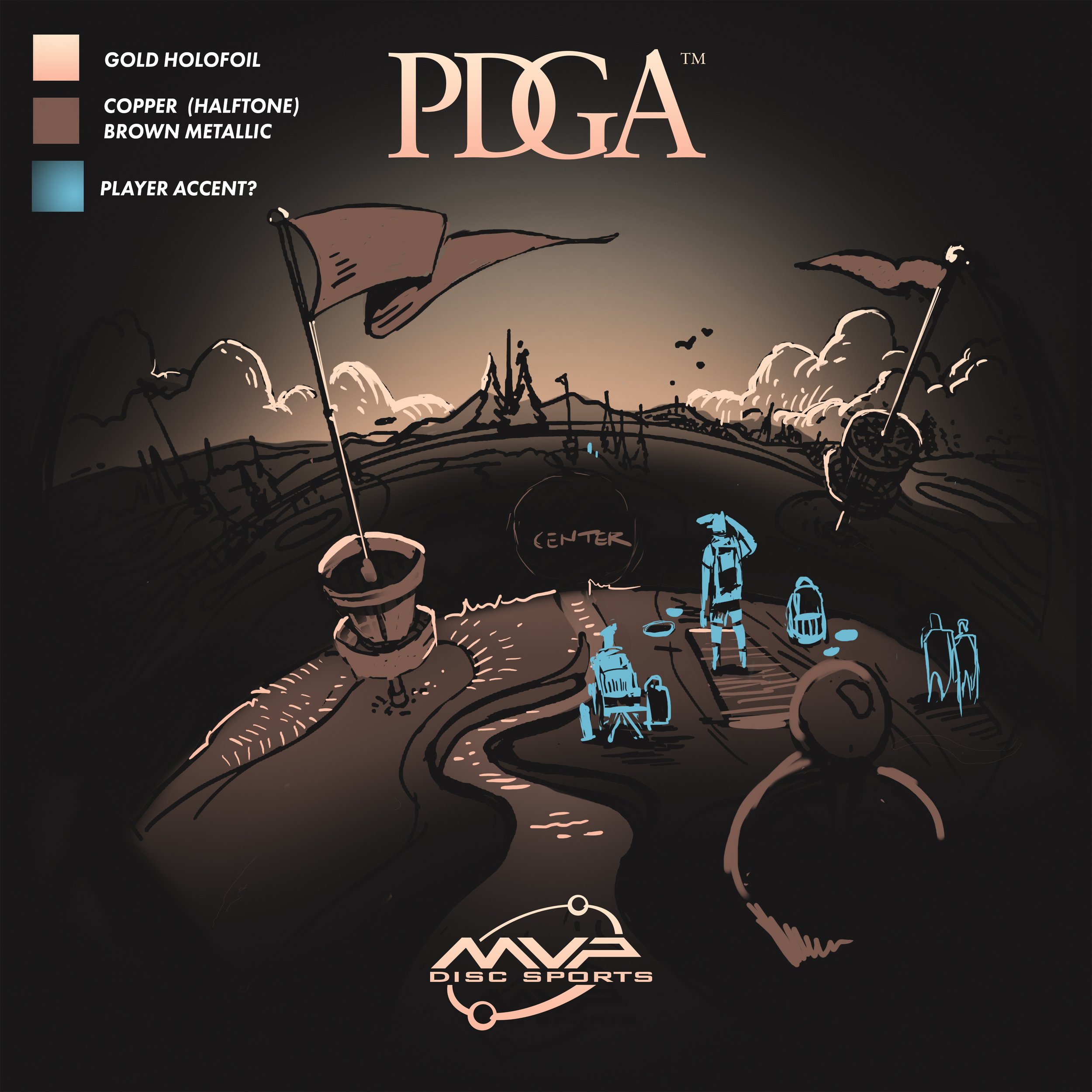
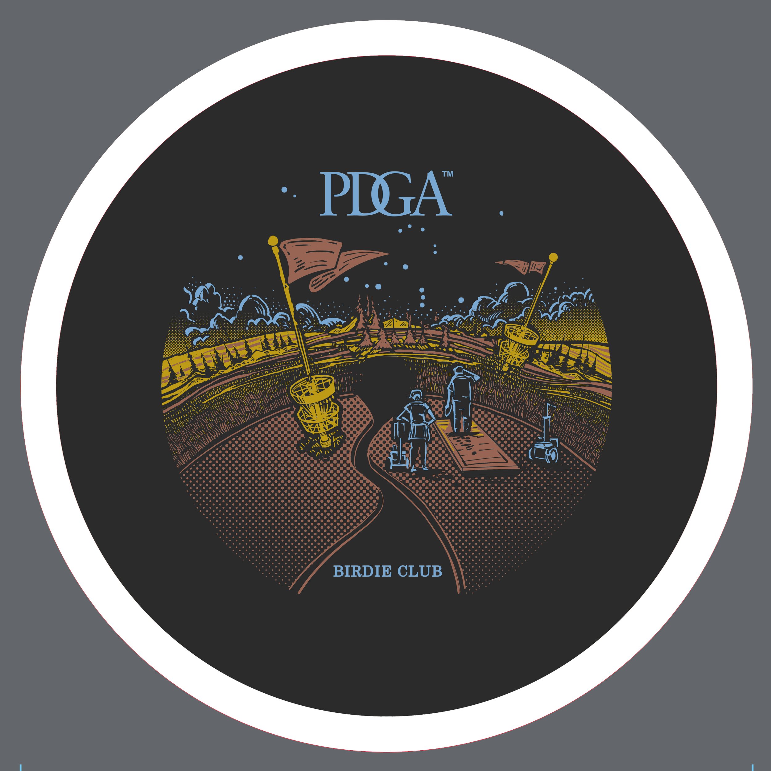
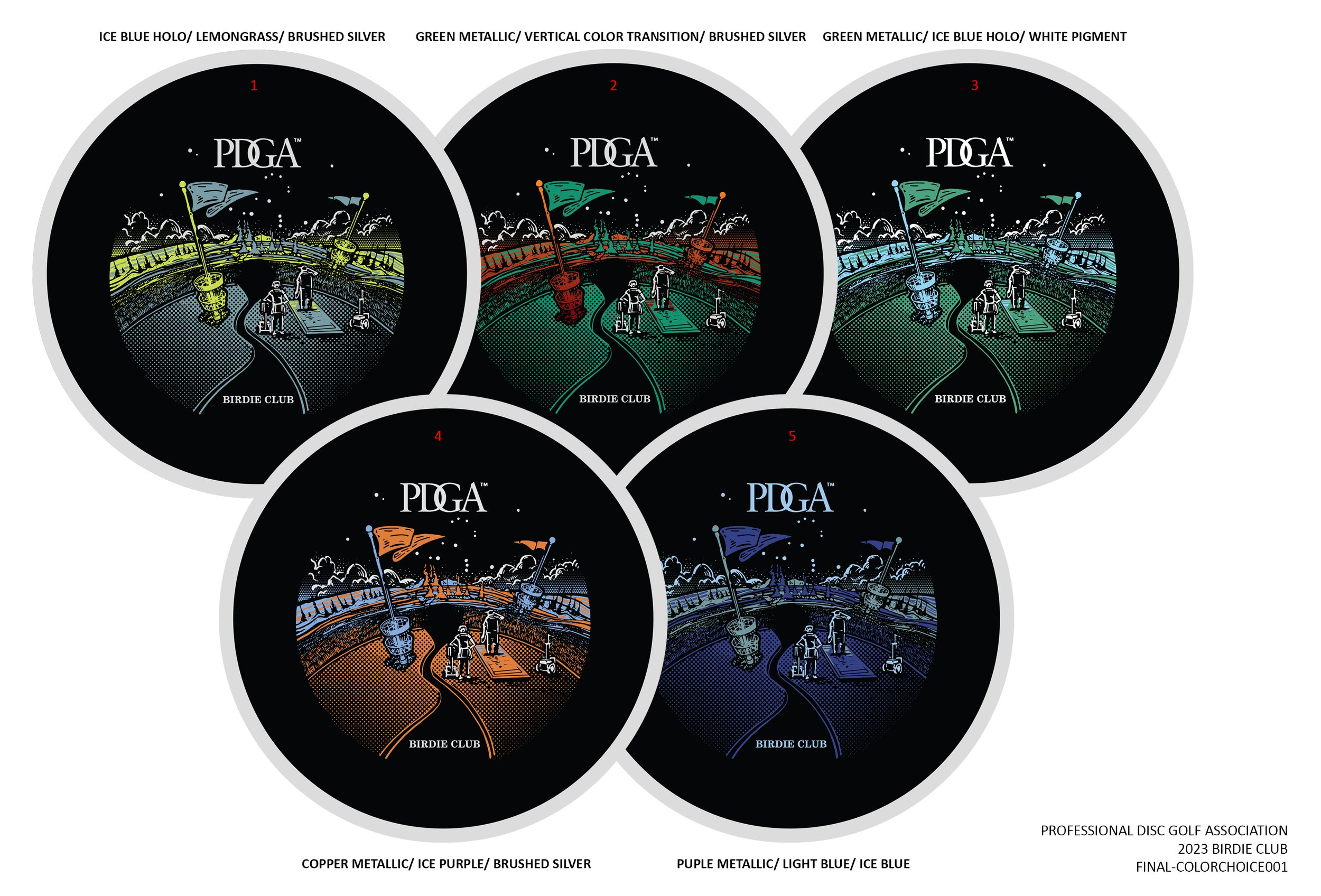
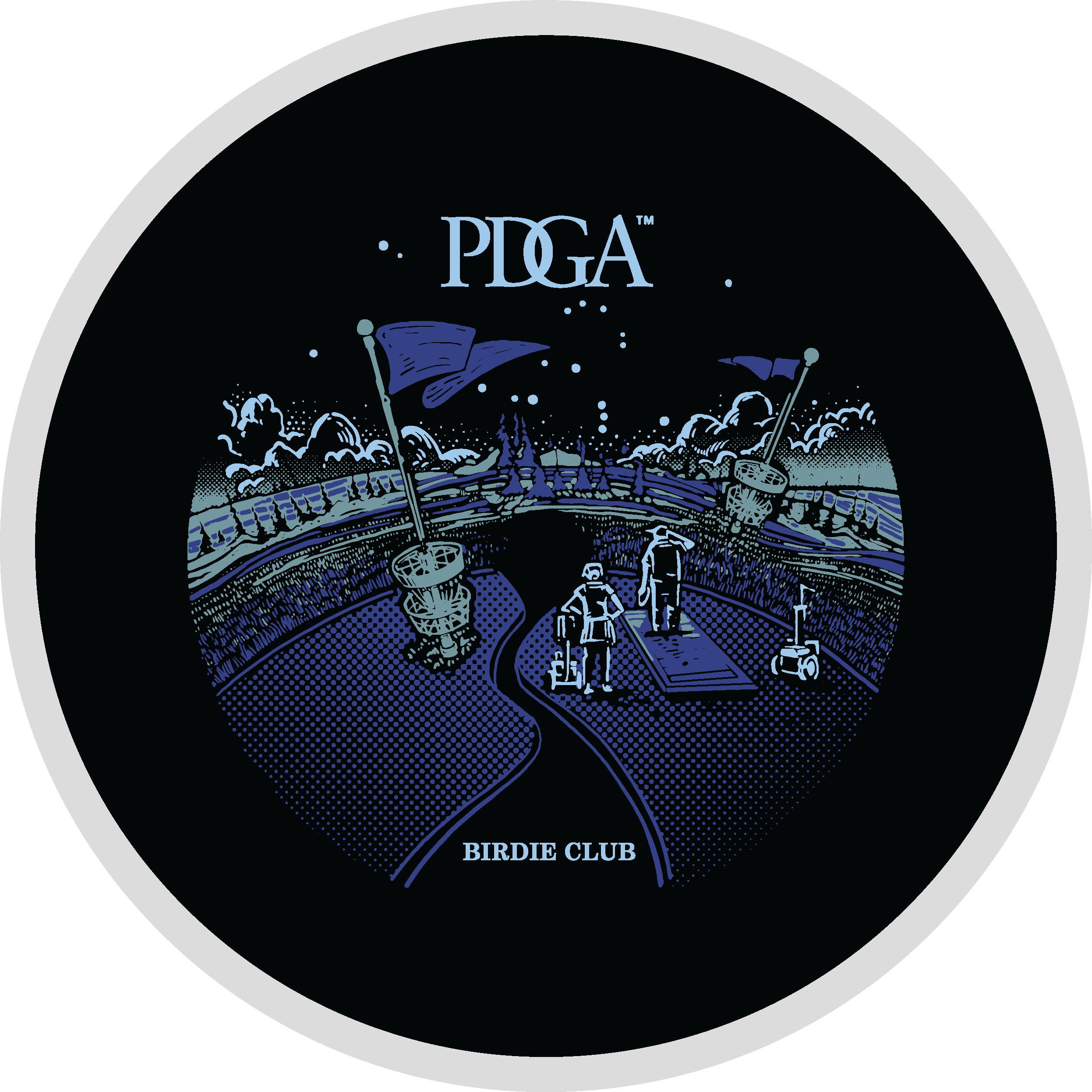
John started off with a super strong line drawing thumbnail for Birdie Club. When we passed off our designs, my first objective was to get this on a black background and start figuring out how this was going to work with foiling. I used gradients to John’s strength. He has a printing background and uses a halftone pattern fill for heavier parts of a design. I thought this could be a great way to blend the stamp into the dark flight plate. I thought that while the visual landscape was interesting; we needed characters navigating the course. That excitement of playing a disc golf course you’ve never played before. This felt very much like a dreamscape to me.
2023 PDGA Ace Club:
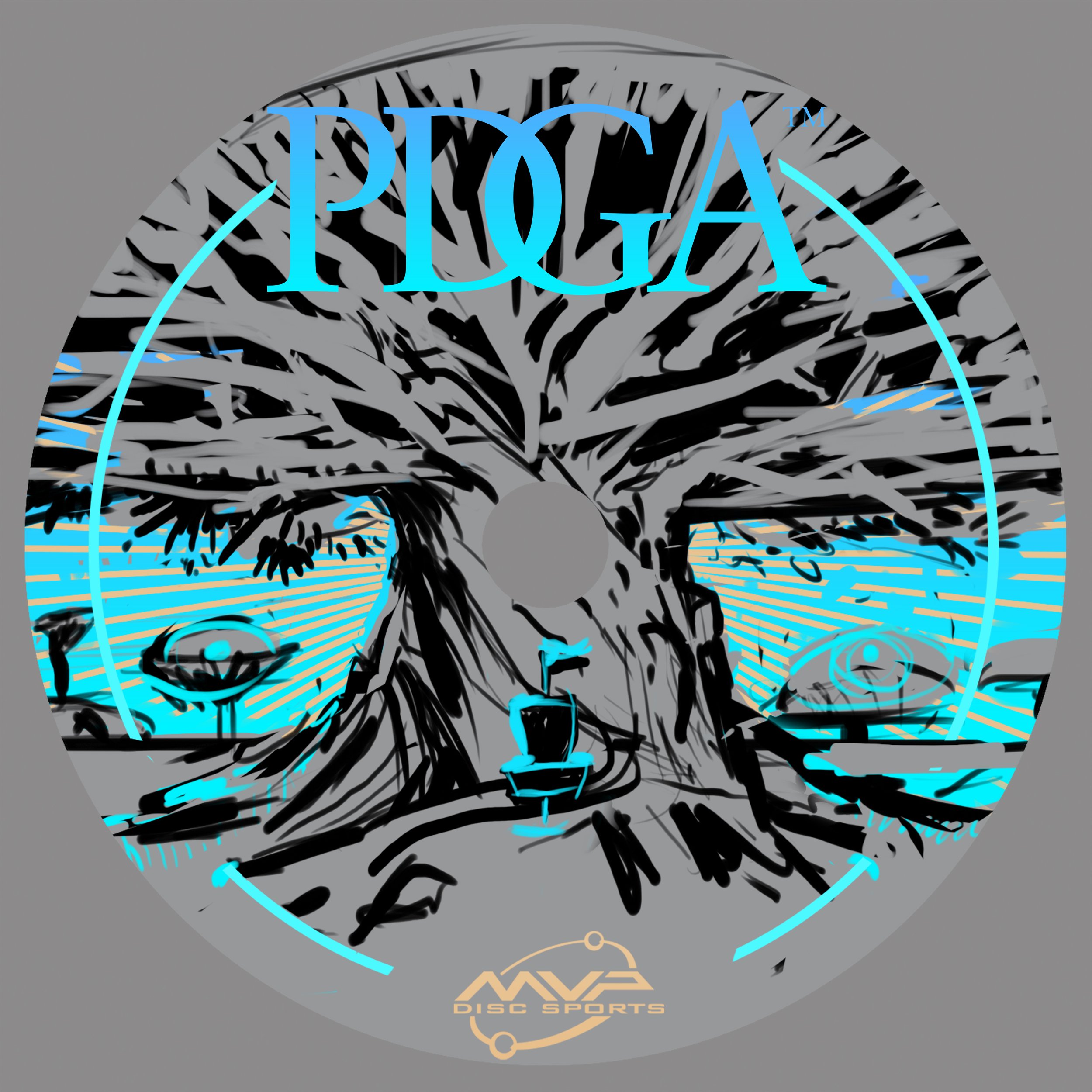
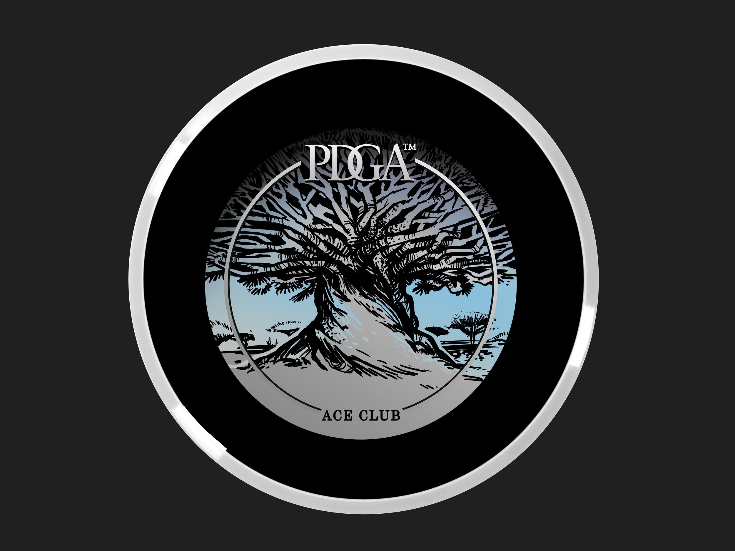
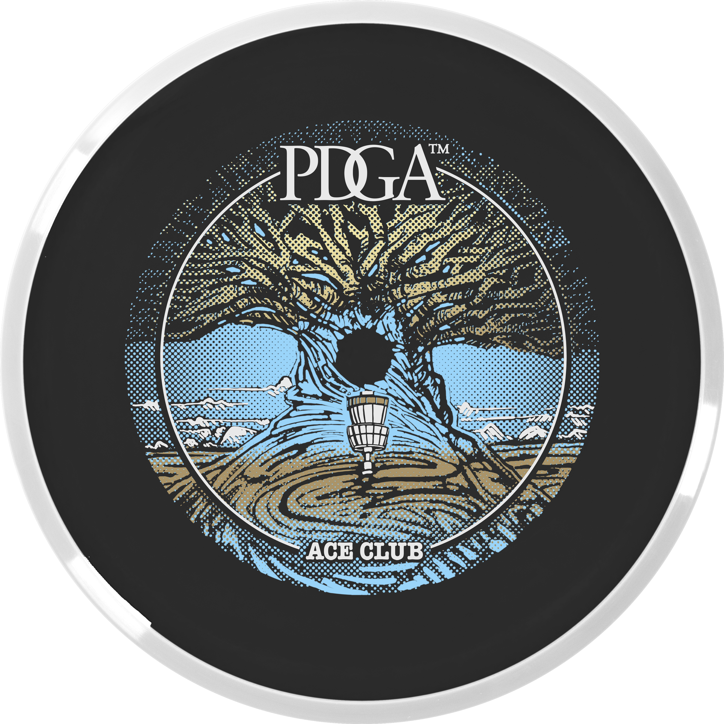
This Ace Club design started with a pretty strong photo from the known photographer, Beth Moon. The reference pulls from a dragon’s blood tree from Socotra Island. I love the umbrella-like silhouette and rigid shape of the canopy. It’s from there that I ventured away from the reference and put a more massive trunk like a very old oak tree. A combination of two ideas. John took then took my thumbnail idea and placed the basket and swirling root/ whimsical touch in the foreground section. We moved away from the gigantic mushroom because we didn’t want to show any psilocybin/ drug references as a PDGA offering. The absolute biggest hurdle with this stamp was the clipping area around the tree. Using the black R2 core to help with coverages and getting the correct foil gradients to do that work for us.
I just want to finish this by thanking Vic Allen for giving us the opportunity. It was a rewarding experience working alongside a disc golf design legend, a specific dark core color, and having to think about foil properties early on in the development stages. It helped us solve a lot of those issues before the Rough/ final phase of the artwork was to be addressed. A few stamp tests had to be sent to the PDGA before the final foils were chosen. I want to personally thank Ian Palmer for handling those logistics and collaborating to make sure we have the best foil represented on these. If you have any questions, feel free to ask below! You can actually purchase a Membership disc with your PDGA Membership renewal for $20!
Raven Newsom - Branding
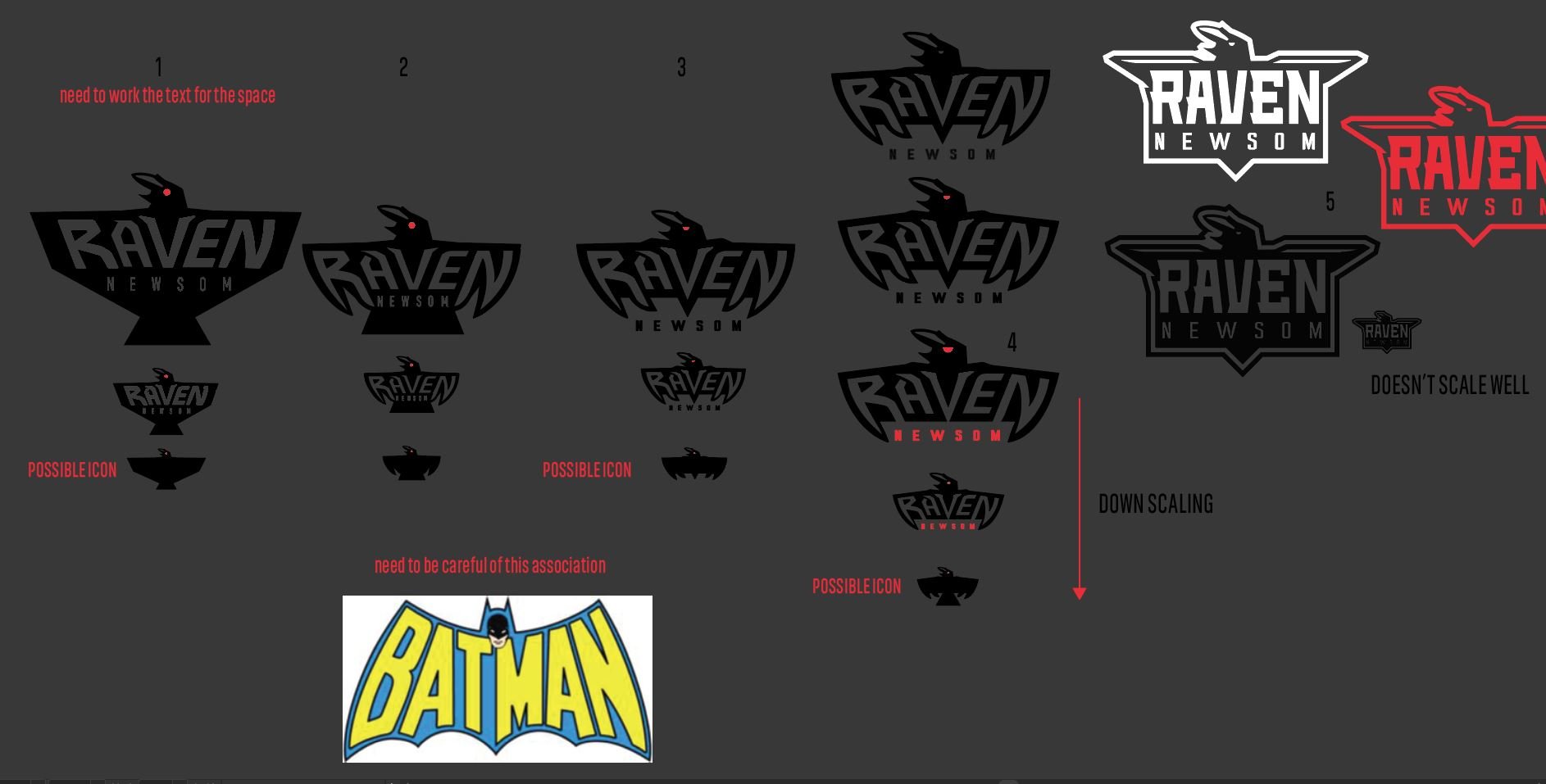
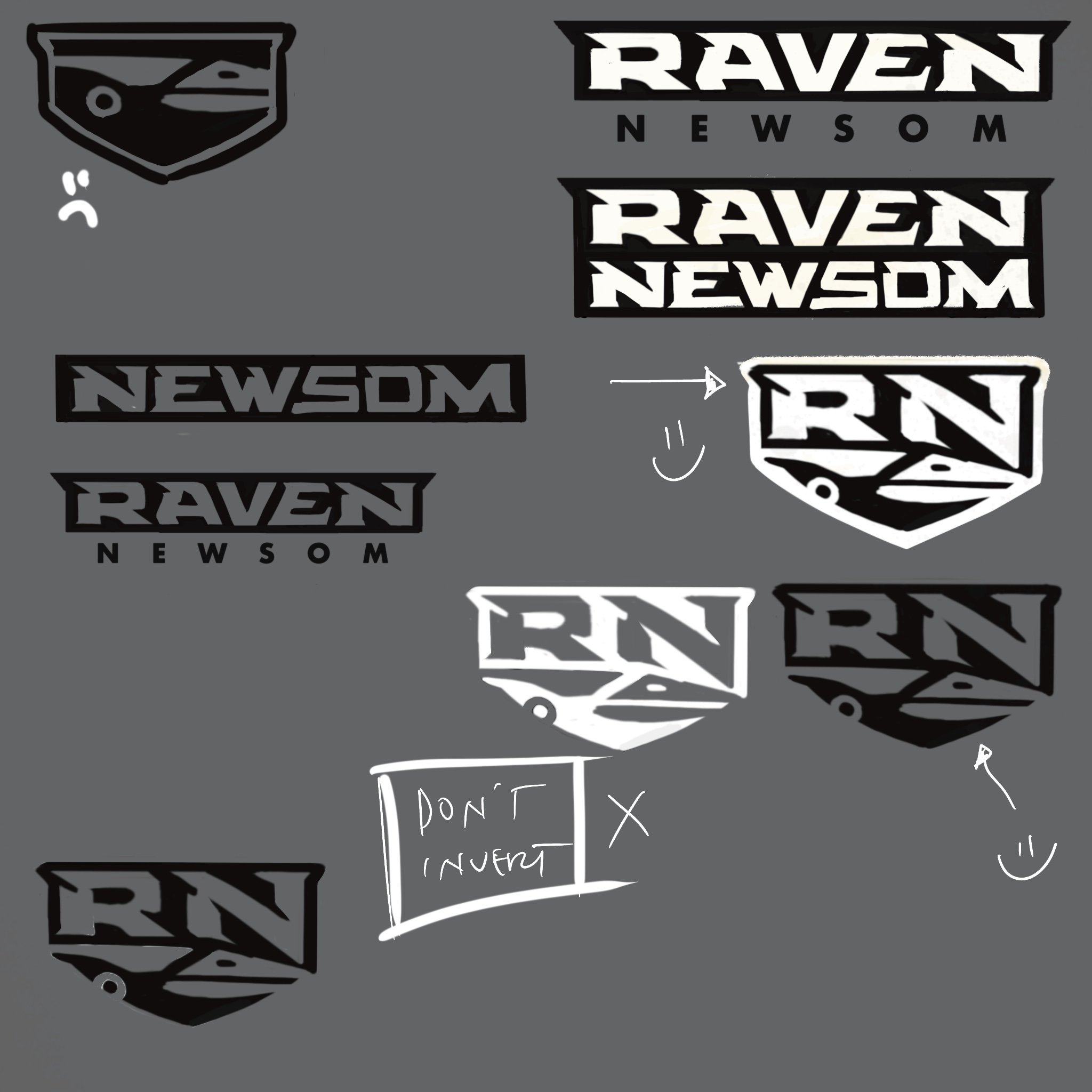
Raven came to me after the successful 2021 disc golf season. He was in need of a logo to represent himself on tour and have the logo represented on his soon to be need van wrap that was to be produced in-house by MVP’s marketing team. The obvious design decision was to use a “Raven” to create an iconic symbol reflecting his transformation in both maturity and disc golf game. Before that, we had collaborated on his second tour series discs so knowing Raven a little bit through past experience; prepped me before taking on this project.
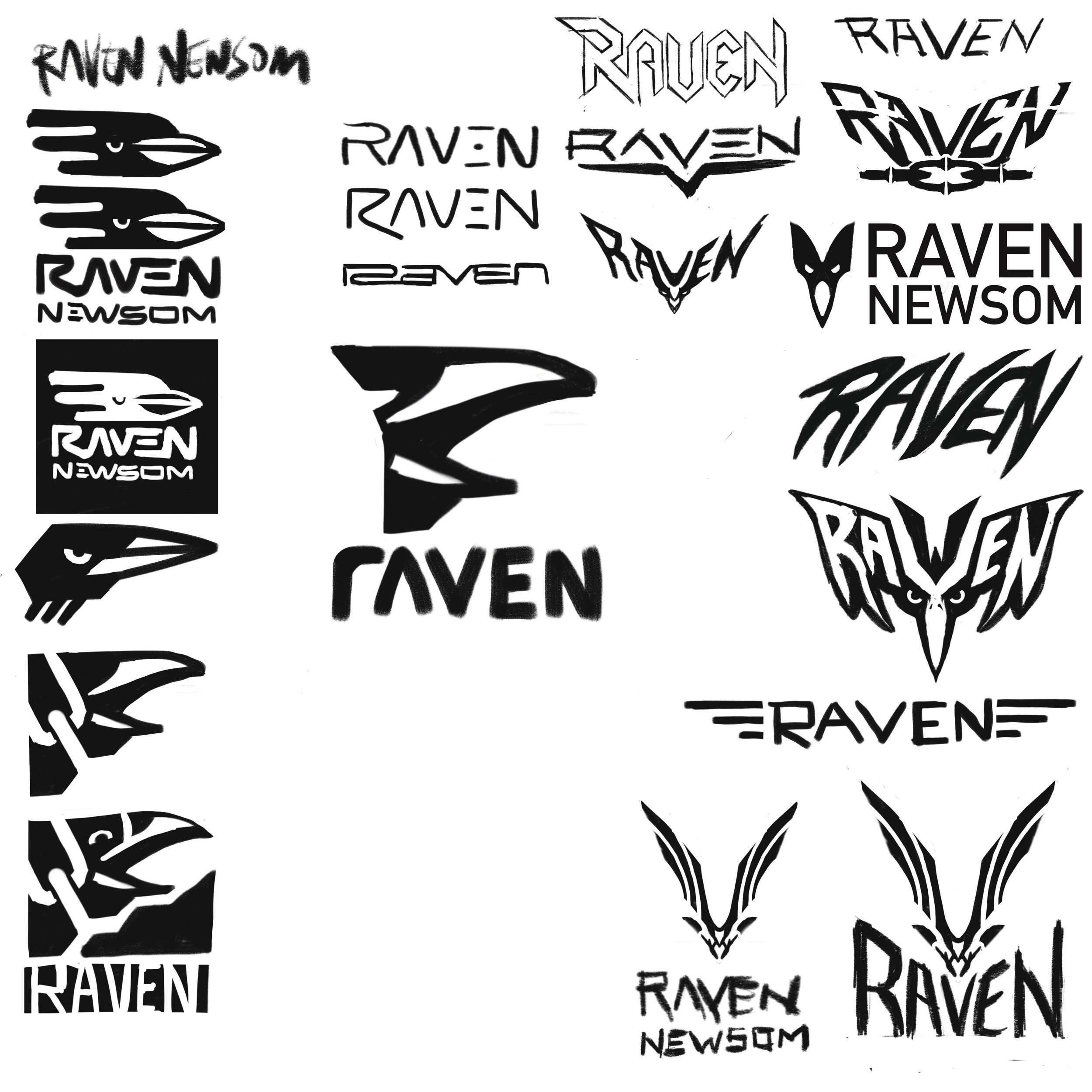
How many different ways can you represent a raven? I don’t think I reached every one but I certainly tried. You want to reach, try, experiment, and fail. That’s the point of these thumbnail sheets. Move things around quickly. Copy/ Paste and tweak some more. Push an idea until you’re sick of it. Why are you sick of it? Does it have lasting appeal? Move on to then come back again. These are all things going through my head when doing them. Maybe a combination of a few of these ideas will click with yourself and the client.
I make mental notes on sheets if I can’t get on a facetime/ call. Making arrows, anecdotes, and small mental notes of what I was thinking. I understand the symbol speaks itself but some people like to understand the “How” and “Why”. What about these appeals to the designer and why out of all the thumbnails, did we choose this one to present?
Raven was extremely happy with the end result. Quickly turning around clothing with his new apparel sponsor. A vehicle wrap came a few months later with the aid of Michael Ramanauskas. I outfitted Raven with a quick usage guide so he could send to outside vendors for self promotion. Excited to see him out on tour representing MVP Disc Sports and getting to the top of the leaderboard. Raven’s a great person and I respect him a ton. Thanks for stopping by.
Amanda Melwiki - 2020 Team MVP Tour Series
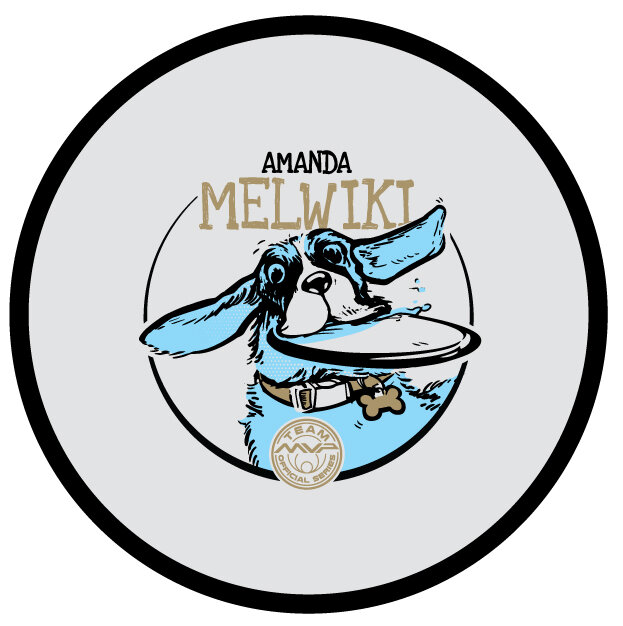
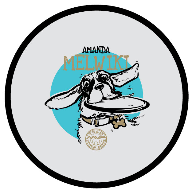
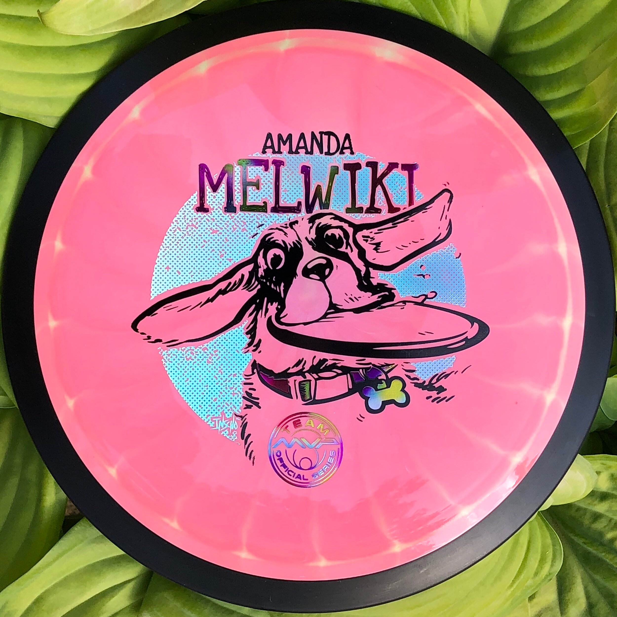
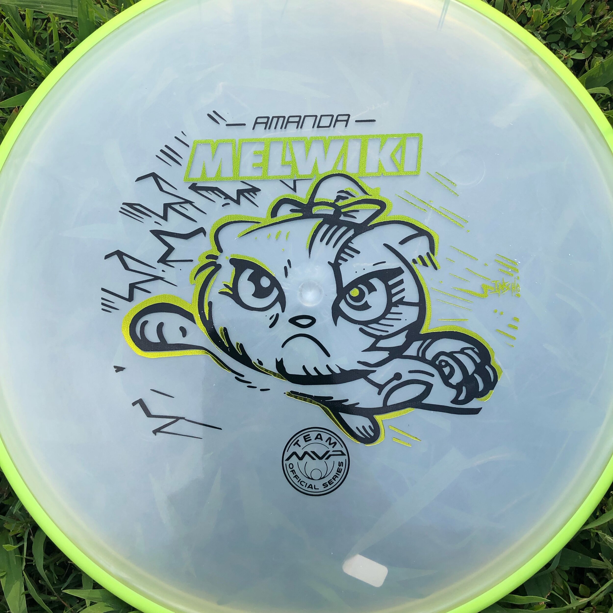
I’ve been working with Amanda Melwiki over the past few years on her Team MVP Tour Series discs. Her pup Charlie would now be the center of focus and Amanda and I welcomed the change-up. The theme for a few years prior has been “Robokitty” and initial thoughts were how to make the larger than life hound, half robot. Amanda was great to send me videos and photos of Charlie. What really sealed the deal to keep it full pet was a video of Charlie playing in & around a sprinkler.
Dealing with a hound type of pup, I wanted to accentuate the ears and jowls. That in combination with that “zoom” effect that dogs get where they run around expelling a ton of energy. They look at you daring you to take the toy from them with a wide-eyed look.
Once the design was in vector, a few hurdles arose that I didn’t see would be a problem in the rough. One instance was where I planned for the center sprue point of the disc to land. This template requires that center area to be clear of any art. The right side just under the nose was going to be that landing area. Doing so in the template left the design to be smaller than desired. To combat that, I had to clear out the left side detail just a bit and compromise on the dynamic overlap of the outer stamp & move the Team MVP seal toward the bottom.
Overall, I think Charlie got the real estate she deserved. Allocating a foil behind Charlie gave the disc color a chance to shine through the pup and evened out the 3 different foil types. In closing, I’m very grateful that Amanda reached out again this year to ask for my help. Her trust and instincts in these designs are really what makes this project fun every year. What did you think? Did I succeed in the playful nature of Charlie? Please comment, like, and share!
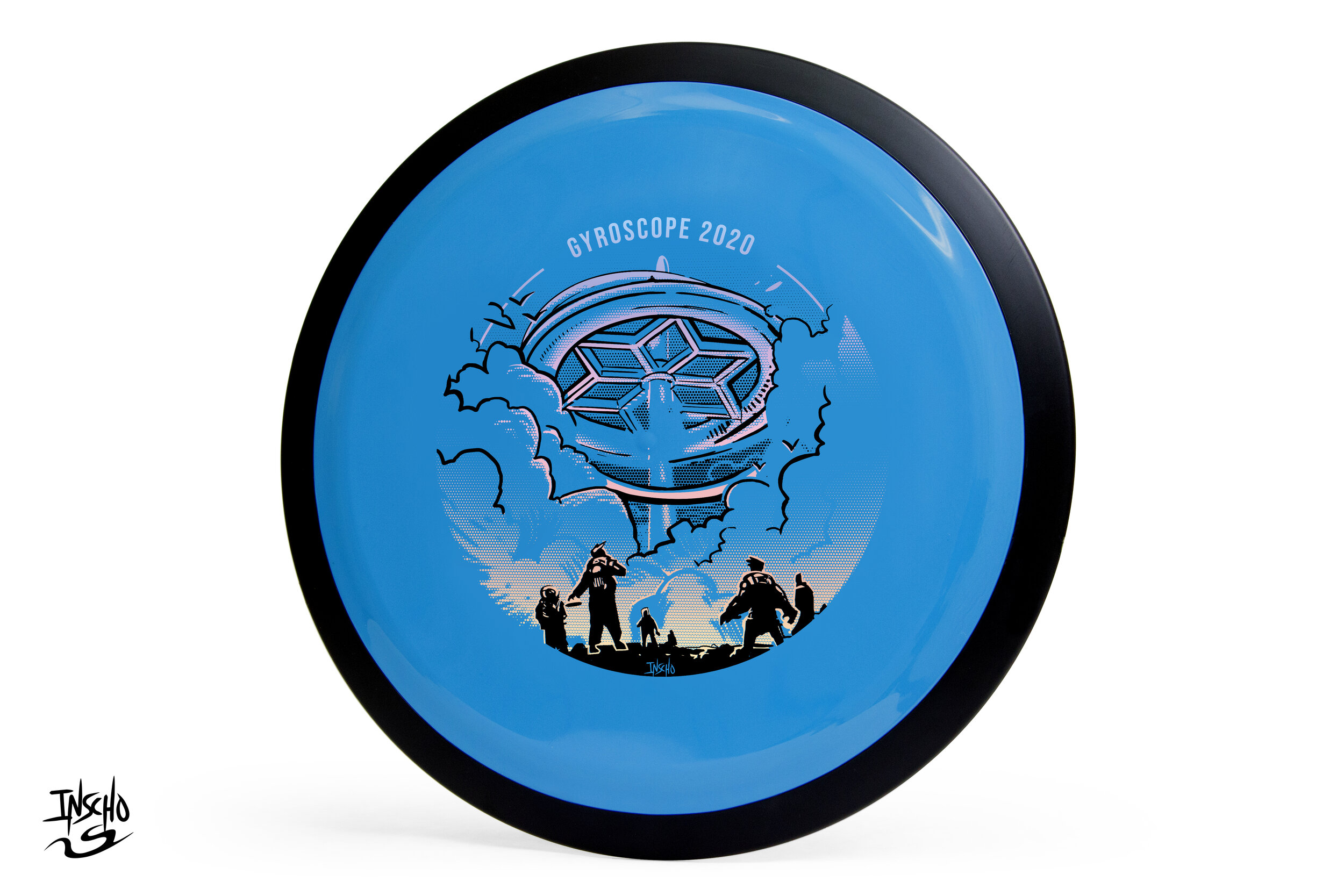
Gyroscope 2020
GYROscope is an event ran by Mike Sullivan out of Northern Virginia. The goal of the tournament is to promote MVP Disc Sports, run a fun PDGA (Professional Disc Golf Association) event and offer a one of a kind disc per event. Last year’s, 2019 think tank produced a handful of ideas and one of those core concepts was reciprocated to 2020.
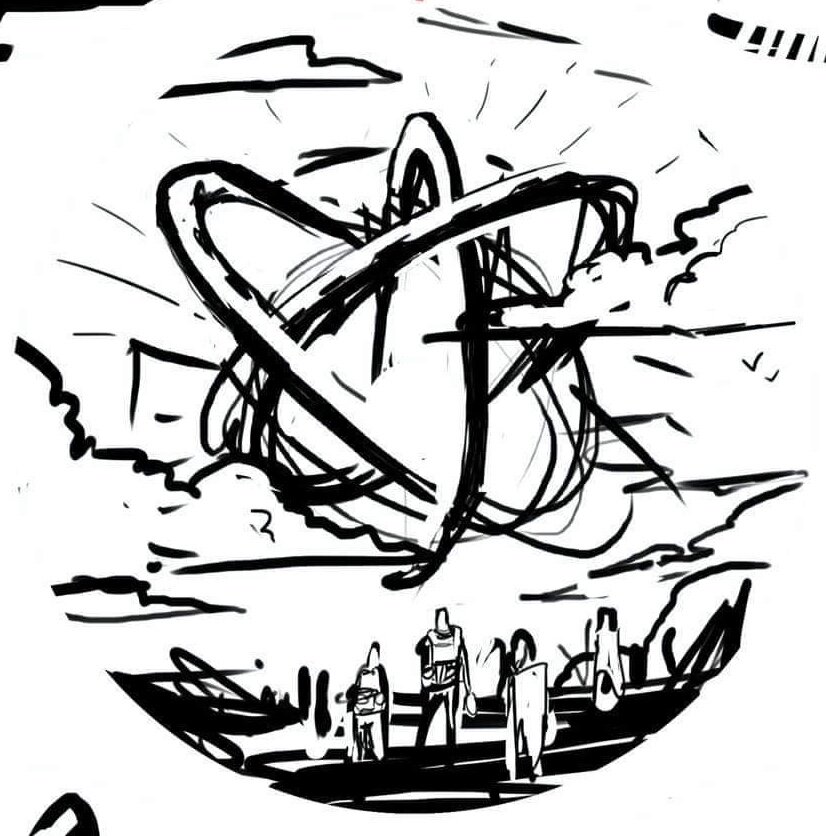
There’s a dead-center area of the disc that get’s unpredictable with stamping. Because of that reason, designers are faced with working the art around this area. The second thing I noticed is while the concept showed a sense of scale, the gyroscope wasn’t really present. I was more similar to a floating orb and I wanted to change it to a grounded structure. The concept fed off of last year’s Gyromonster theme. The Gyronauts figured out that the Gyromonster wasn't simply exchanging energy for its own benefit, it was taking that energy and spreading it far across the galaxy to an ancient source. This scene shows the travelers discovering the ancient ruin.
The design really only took a bit of 3D staging within Google Sketchup and re-inking cleanup. The gradient effect for the 2nd applied foil was done with a halftone dot technique. It’s the most efficient and practical way to lay down transitions in single color layers. I want to thank Mike Sullivan for the continued support and having faith in me to deliver a quality design. It’s with that confidence, that I’m able to hunker down and come out with something we’re all proud of.
How do acquire this stamp? Reach out to Mike Sullivan through
https://www.discgolfscene.com/tournaments/MVP_Disc_Sports_presents_GYROscope_1_The_Third_Campside_Open_2020/registration
OR
his Facebook page for future releases.
Axiom Cosmic Neutron - Stock
If you’re a first-time reader and unfamiliar with MVP Disc Sports/ Axiom Discs/ Streamline Discs then you’ll need to look up who Zachary Kelbaugh aka ZAM is and his importance in setting a high standard with all three brands. While MVP Disc Sports follows more an analytical/ scientific realm; Axiom goes into more of the visual arts, punk, and a little bit more on the wild side if pushed that far. If you think about it, the parameters keep you grounded but a LOT of ideas can flow from that base.
I was given the difficult task to create a new stock stamp that would be used for Cosmic Neutron plastic within the Axiom branding. Cosmic Neutron plastic produces some unbelievable controllable swirling patterns. At this current time, swirls seem to be trending with multiple disc golf companies coming up with their ways to achieve it. It was my job to design something that could hang with Neutron’s iconic imagery that has been stamped on Axiom discs for 6 years.
With Neutron art at the very front of my reference gathering, I wanted to create something that seamlessly blended into the stock stamp Axiom family. That was goal #1. MVP’s history runs deep. The last thing I want to do is shred that to pieces. If you look at the far left image below; our heads were looking at high-level science, Leonardo da Vinci, 3D DNA molecule structures and honeycombed flower patterns. While all of those sounded great; the flying machine has been done. My research through da Vinci’s sketches led to me start researching perpetual motion machines. Bhaskara’s Wheel, Sadi Carnot and the Carnot Cycle. My mind went down the rabbit hole, you can say. I landed on the fact that while all of these machines and concepts sounded cool, quantum mechanics and the complex nature/theory burned me out. That doesn’t mean I won’t return back to these notes at a later date. Time was of the essence and I had to get to work.
I landed on a 3 cylinder schematic concept. The main idea is of a 3 piston firing order that is pushing energy toward the epicenter. A transfer of energy through the stamp design to the actual swirl look of the plastic.
Here are a few key points in the final Axiom Cosmic Neutron design:
•Get the name of the disc higher up on the flight plate so it can be seen on store shelves
•Disc name is the boldest part of the design while keeping with the overall schematic style of font. It doesn't scream old world but doesn't modern either.
•Keep key shapes present in the new design. Circles, triangles, font look, and feel.
•Integrate a fresh idea
The below image gallery shows a peek into the 2-week process:
Robokitty 2.0
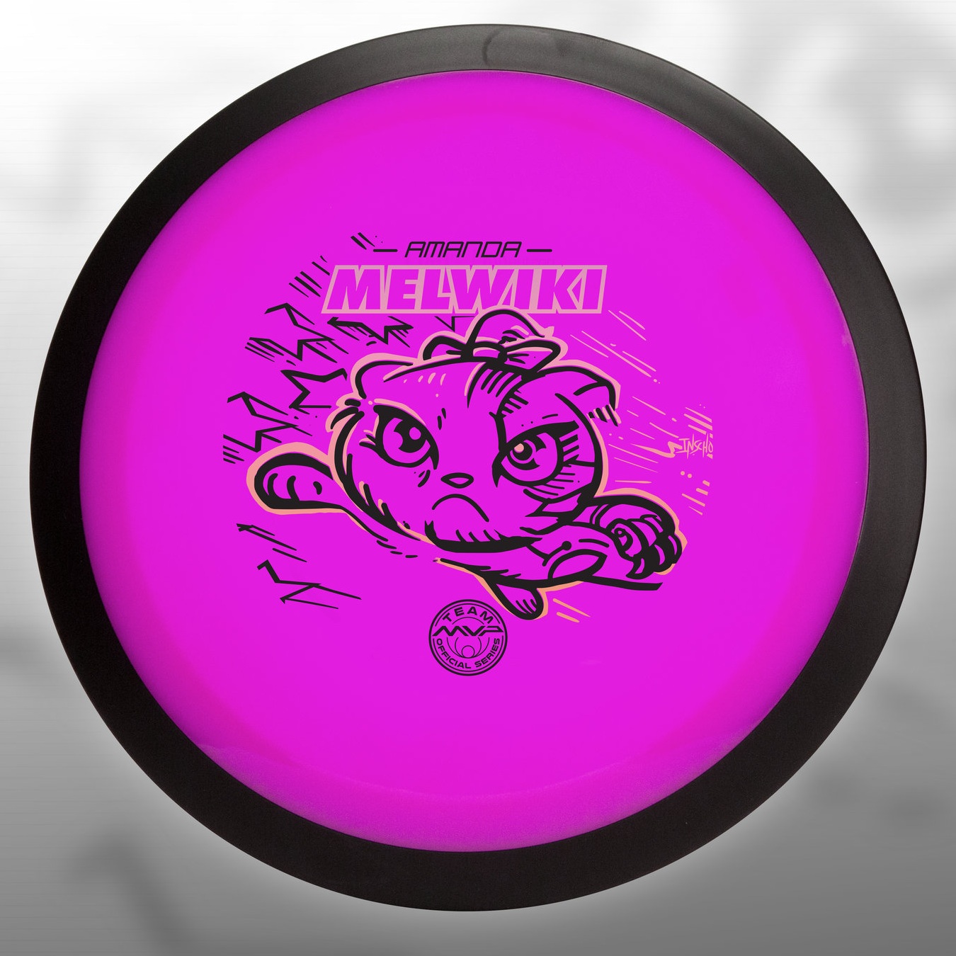
I received a request from an Team MVP member to change up a 2018 stamp design. Amanda Melwiki had a great 2018 year and her Robokitty design was a hit. She came to me with the idea of changing up the foils and adding a few elements to last years design. I had bigger plans for Robokitty and I’m glad she trusted me to do something new but a continuation of the concept.
I knew I wanted to show a fiercer side of the kitty. I wanted to marry the concepts of cute/friendly with the deep down drive and determination of getting better. That fueled the fire going into the concept stage. I had the idea more stored in the back of my head so this design didn’t really consist of a lot of reference gathering. Bringing in that exaggerated anime pop and allowing the opportunity to expand on the Robokitty character were the goals first and foremost. From there it was a few experiments with stars and how I was going to incorporate them into the design.
A huge thanks goes out to Amanda. Were you able to snag one? If not, she has a few available but will be selling out fast. Follow her here:
https://www.facebook.com/AmandaMelwiki
Streamline Flare Special Edition
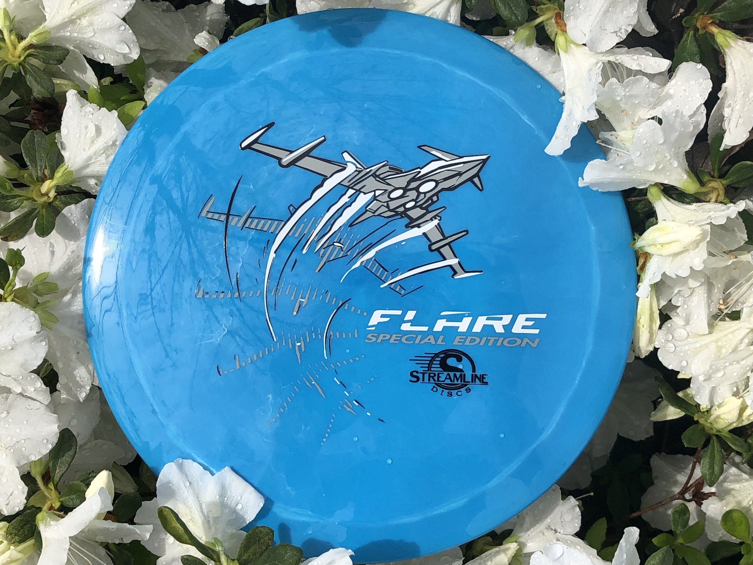
The Streamline Flare is the newest Fairway Speed 9 driver delivered with plenty of overstability for even the strongest arms in the disc golf game. I was asked to design around that special ability of the disc to fight out of constant steady winds. It’s a true wind fighter.
The design started with a page of ship designs based on direct relationships to the flare countermeasure that provides a decoy to heat sinking missles. Other quick concepts went the sci-fi ship route and that aspect of the design stuck out with the group. The frame-type of motion was liked by all and continued into the rough phase. Connecting the design with it’s actual flight characteristics was important to me. I used a rough block-in 3D model to mock up the ship orientation and ported that into Illustrator. The whole intent of that process was to create motion.
Other Streamline designs that I’ve done were in a direction where you couldn’t place a certain time period on it. It was kinda Sci-Fi/ kinda modern age but I wanted to take this into a futuristic realm. So I added lower propulsion units on the bottom and kept the edges and angles sharp. A few references of the Royal Canadian Forces doing evasive maneuvers in a valley inspired me to put atmospheric trails coming off the wings. Carrying that curve language subtracted from the “Flare” typeface finishes it off.
In the end, MVP Disc Sports HQ used a new grey pigment-based foil in combination with black and white to create a truly comic-like vibe with the stamp. You can find these by most big online retailers of MVP, Axiom and Streamline on April 19th.
