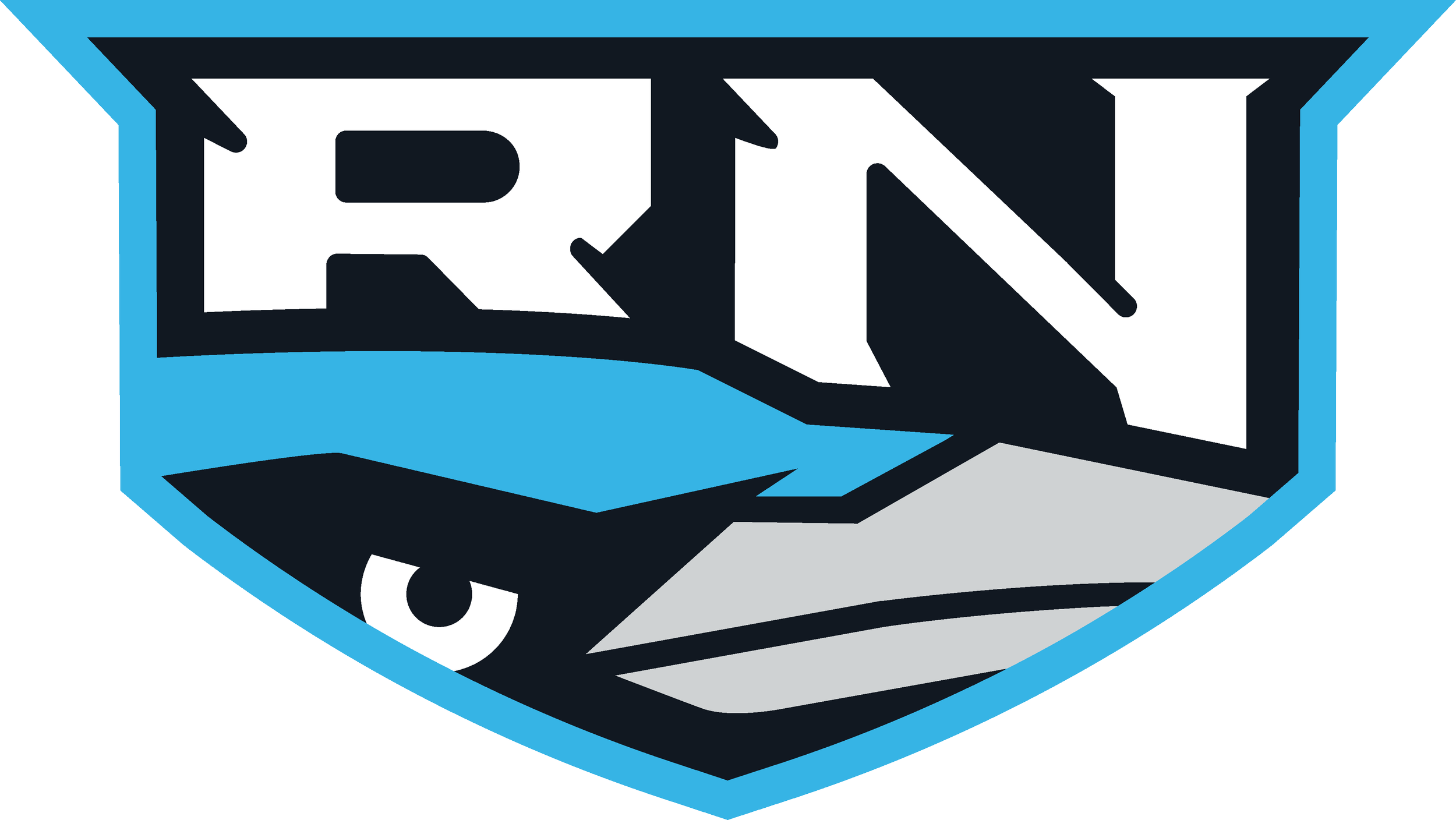
Raven came to me after the successful 2021 disc golf season. He was in need of a logo to represent himself on tour and have the logo represented on his soon to be need van wrap that was to be produced in-house by MVP’s marketing team. The obvious design decision was to use a “Raven” to create an iconic symbol reflecting his transformation in both maturity and disc golf game. Before that, we had collaborated on his second tour series discs so knowing Raven a little bit through past experience; prepped me before taking on this project.
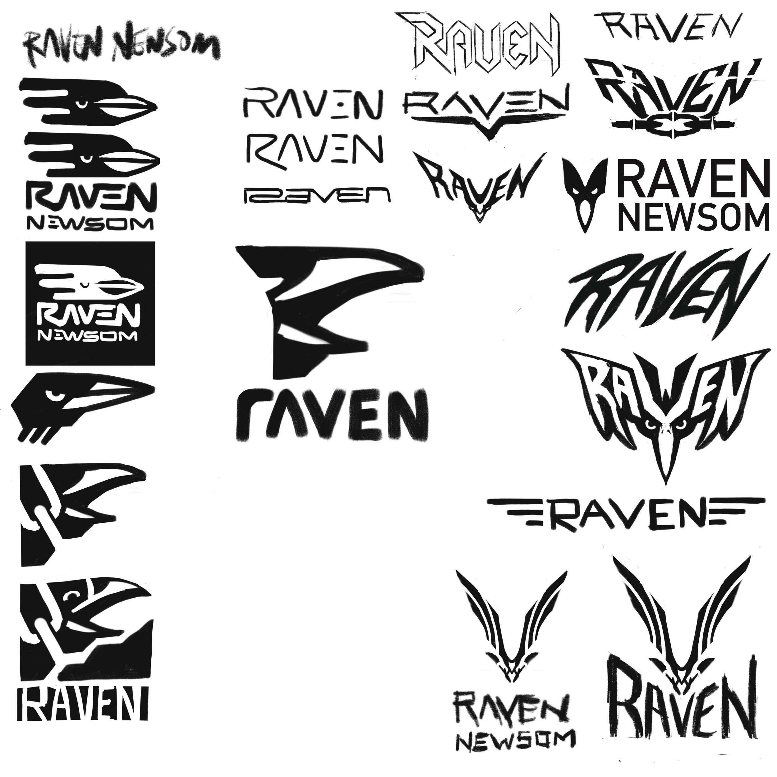
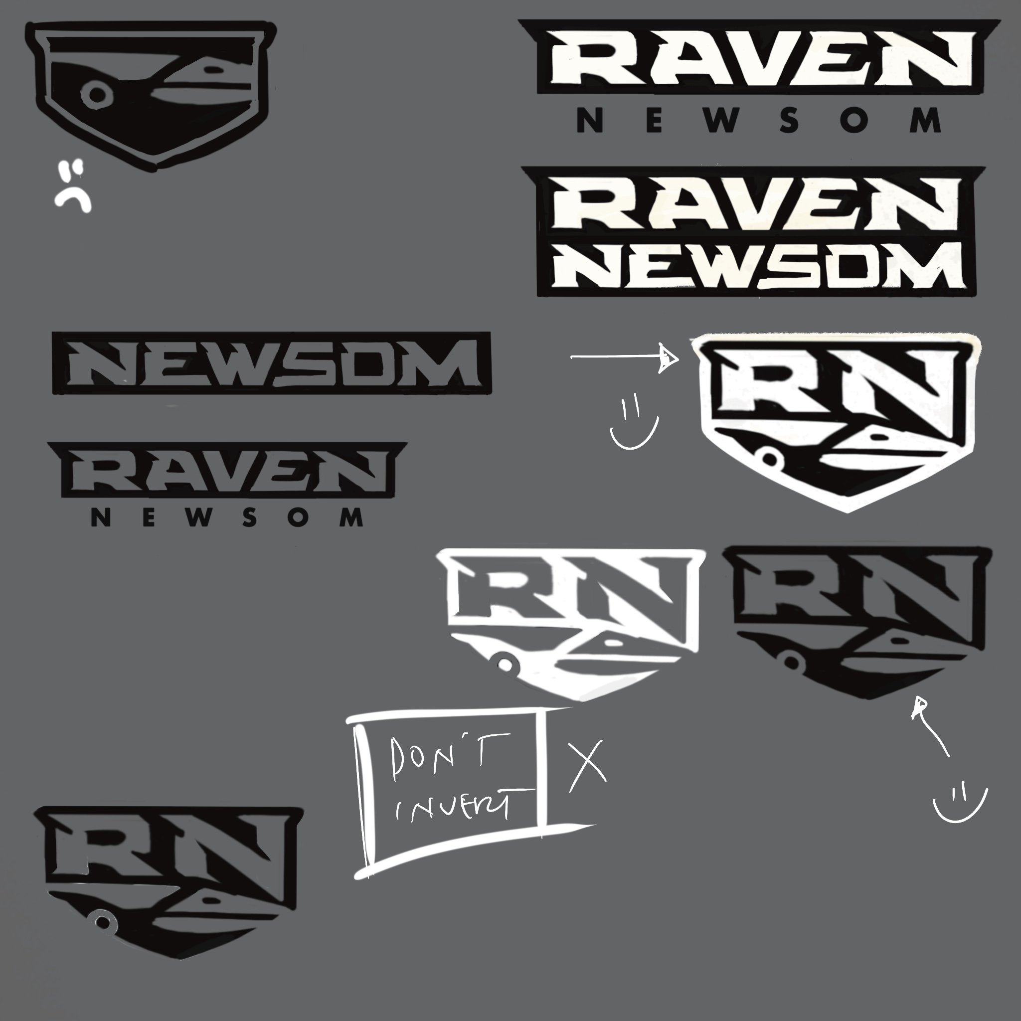
How many different ways can you represent a raven? I don’t think I reached every one but I certainly tried. You want to reach, try, experiment, and fail. That’s the point of these thumbnail sheets. Move things around quickly. Copy/ Paste and tweak some more. Push an idea until you’re sick of it. Why are you sick of it? Does it have lasting appeal? Move on to then come back again. These are all things going through my head when doing them. Maybe a combination of a few of these ideas will click with yourself and the client.
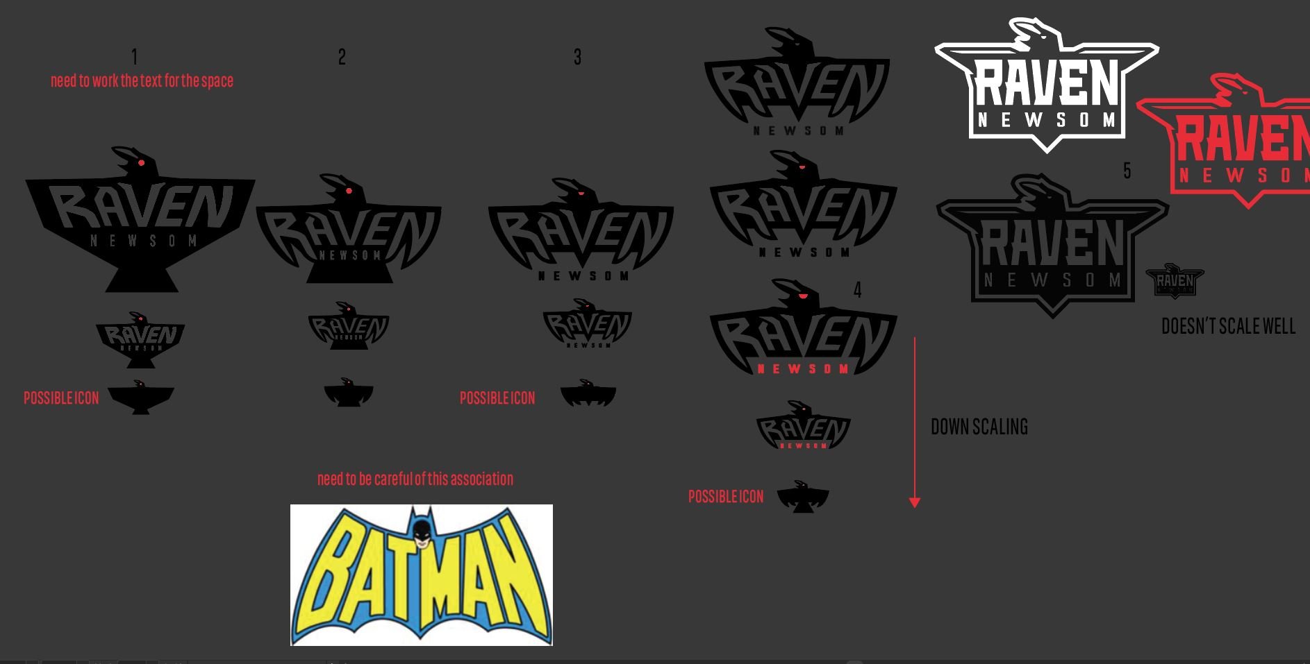
I make mental notes on sheets if I can’t get on a facetime/ call. Making arrows, anecdotes, and small mental notes of what I was thinking. I understand the symbol speaks itself but some people like to understand the “How” and “Why”. What about these appeals to the designer and why out of all the thumbnails, did we choose this one to present?
Raven was extremely happy with the end result. Quickly turning around clothing with his new apparel sponsor. A vehicle wrap came a few months later with the aid of Michael Ramanauskas. I outfitted Raven with a quick usage guide so he could send to outside vendors for self promotion. Excited to see him out on tour representing MVP Disc Sports and getting to the top of the leaderboard. Raven’s a great person and I respect him a ton. Thanks for stopping by.
Dank House Dyes
Dank House Dyes came to me very early in their formation. I was fresh off of #Inktober sketches and excited to take what I practiced in the month of October toward a paying gig. Dank House was started because Nick just couldn't find a dyed disc that really jumped at him. He took his heavily influenced graffiti and tattoo passion and started putting patterned designs on discs. He enjoyed my overall style and gave me unlimited freedom to explore. We agreed on a handwritten approach and a house to make this logo click with the company name. With their love of horror movies, I made sure to bring a little bit of their personality into the logo. The long quick strokes of my Pentel brush pen combined with the toothy sketchbook paper quality pulled it off almost perfectly.
I simply produced a 600dpi (dots per square inch) scan image and proceeded to clean up in Adobe Illustrator. I'll be honest and mistakenly designed the thumbnail sketches with "Dank House Designs". It was a clear oversight on my part but what really mattered was the overall idea. One more quick revision had me aiming toward the finish line. This was a project and idea that just came naturally. Some logo projects happen that way and I want to thank Dank House Dyes for giving me the opportunity.
Mighty Kind logo creation
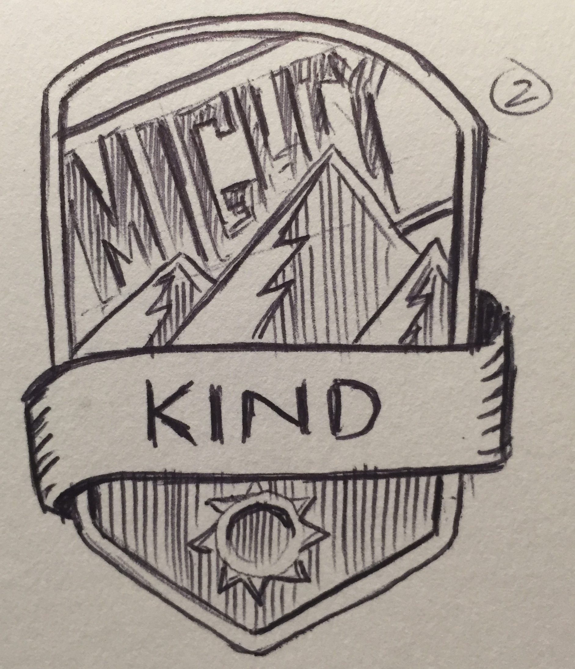
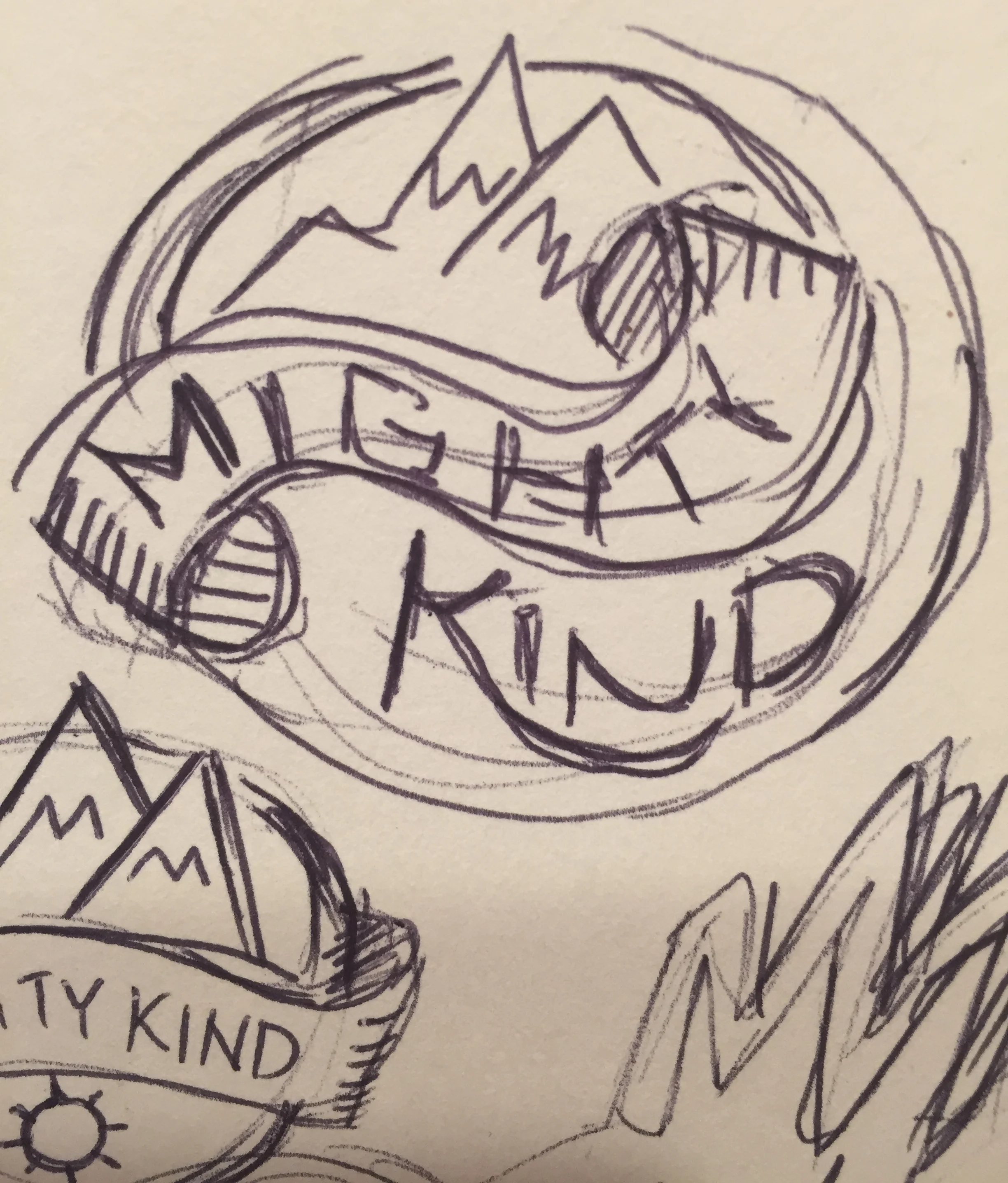
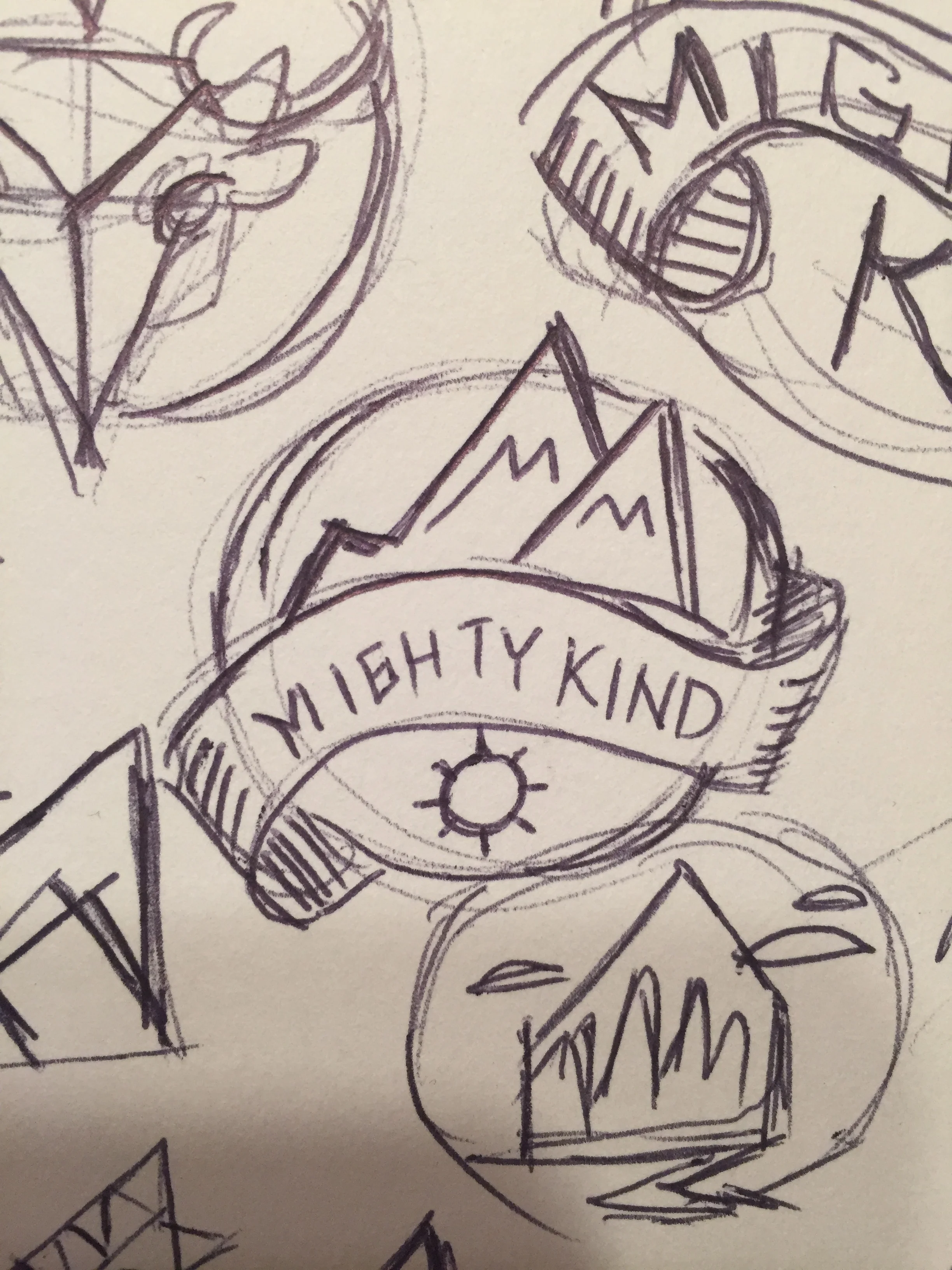
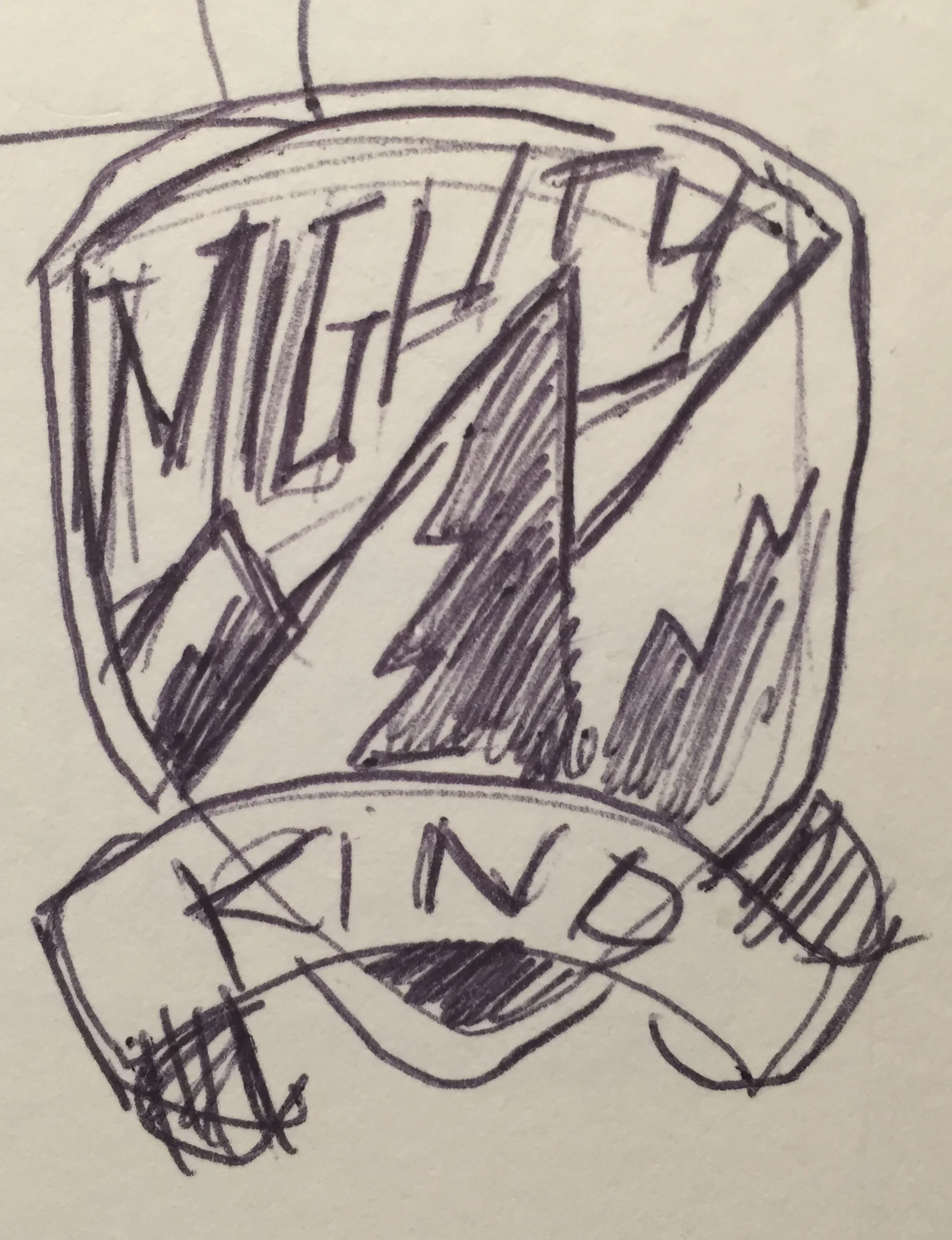
Mighty Kind is a quartet out of Brooklyn, NY who play a 90's Rock/ Alternative range of music. I had the opportunity to help a friend create a logo for his band. Our first brainstorming session started with what is tall and mighty but serine? Mountains. So I ran with it initially. I used the Lakota symbol and tried to incorporate where possible because of Sam Combs connection to the tribe. The ending logo outcome doesn't feature that idea but there could easily be other options the band will use in future shirts and graphics.
Major props to my buddy for sending me inspiration as we went through this creation process. I'm happy with the outcome and can't wait to see what's next for them.
You can check out their webpage here:
http://www.mightykindmusic.com/
Brooklyn Body Blossom
I received a call from a good budd of mine, Dr. Michael Murray over the summer. He was rebranding his practice to display more of his holistic approach to chiropractics. He needed my help to rebrand his business with a logo for the newly formed
.
Key initial ideas were:
1. Display the Brooklyn Bridge in some form
2. Show cues of an inspirational artist;
3. Include a lotus shape.
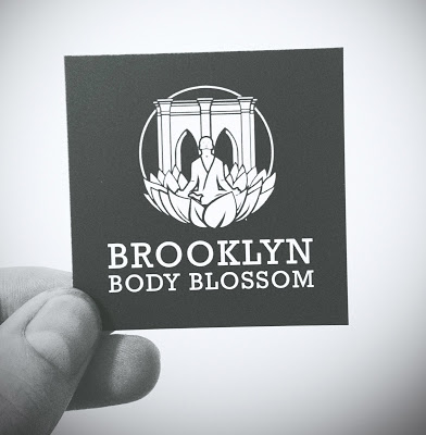
First and foremost, I want to thank Dr. Murray for working with me through last summer. This was a tough assignment but he was great with feedback and as an artist himself, I think we collaborated well to create a logo we're both proud of. I'll show the finished product first and then a few pieces that helped lead up to the final design.
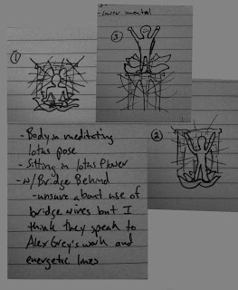
Clients quick napkin sketches
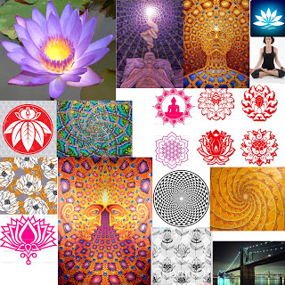
Inspiration board
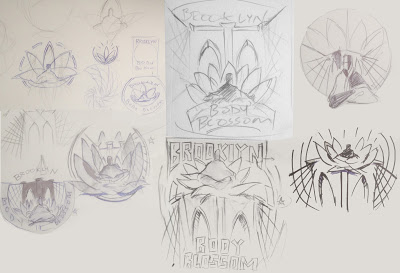
1st pass of thumbnail sketches
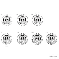
Almost there! Final font selection
