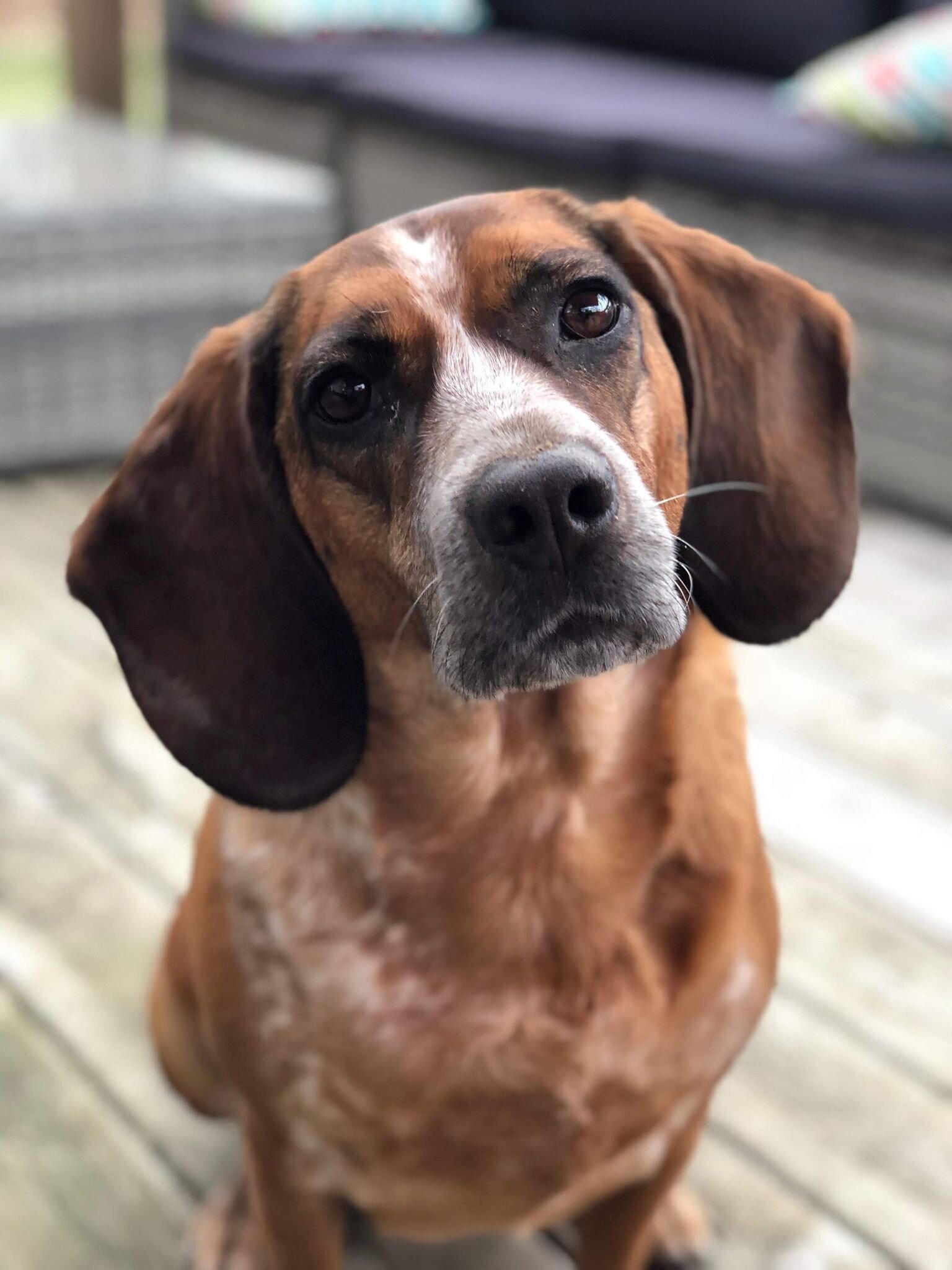
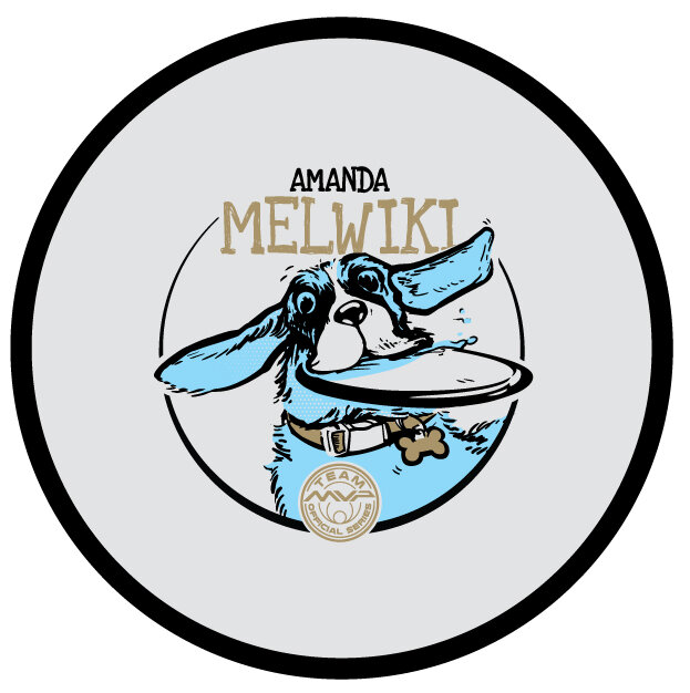
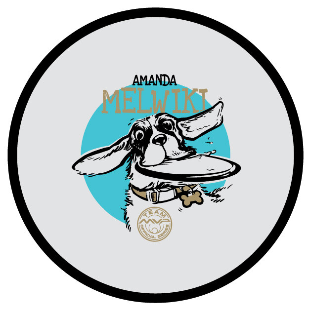
I’ve been working with Amanda Melwiki over the past few years on her Team MVP Tour Series discs. Her pup Charlie would now be the center of focus and Amanda and I welcomed the change-up. The theme for a few years prior has been “Robokitty” and initial thoughts were how to make the larger than life hound, half robot. Amanda was great to send me videos and photos of Charlie. What really sealed the deal to keep it full pet was a video of Charlie playing in & around a sprinkler.
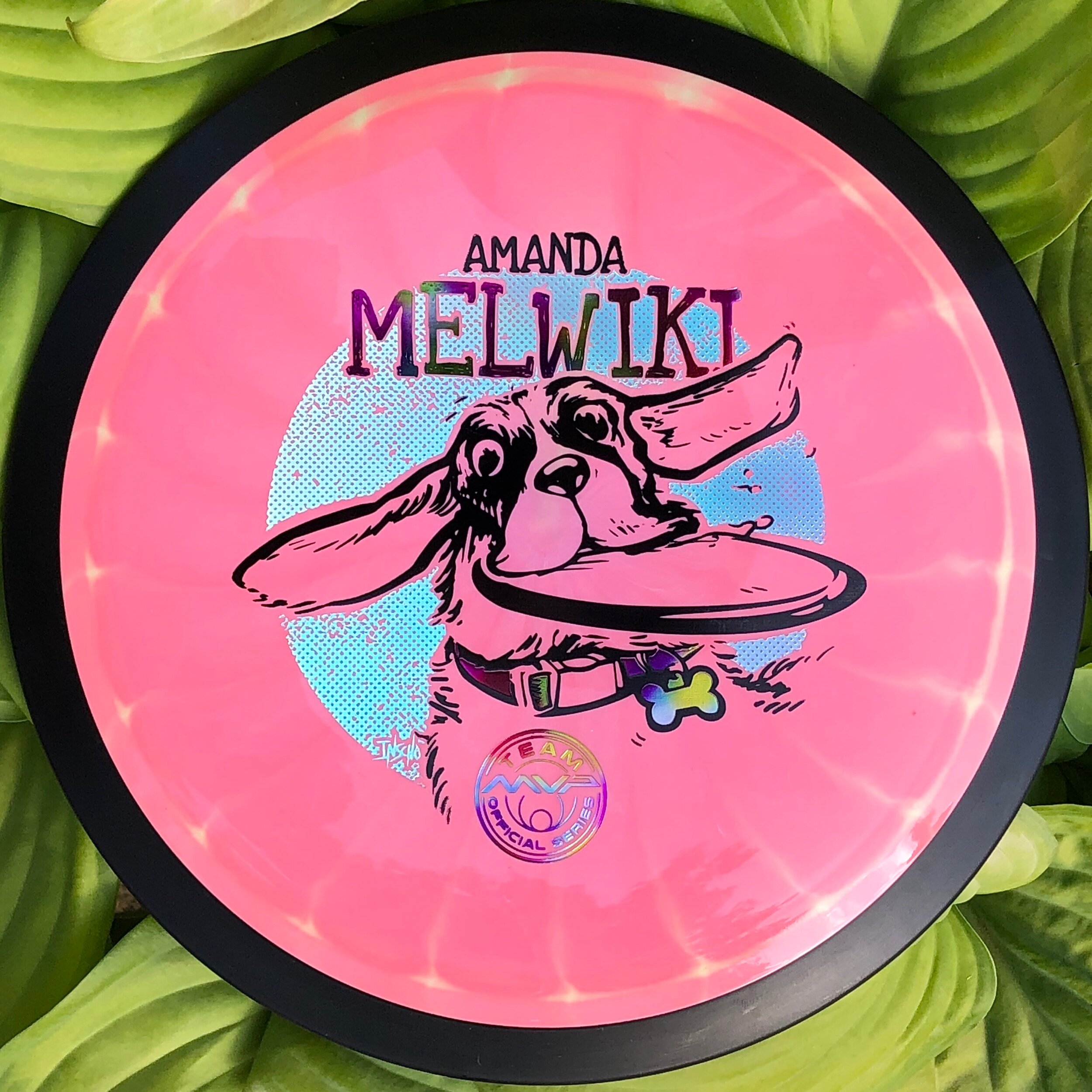
Dealing with a hound type of pup, I wanted to accentuate the ears and jowls. That in combination with that “zoom” effect that dogs get where they run around expelling a ton of energy. They look at you daring you to take the toy from them with a wide-eyed look.
Once the design was in vector, a few hurdles arose that I didn’t see would be a problem in the rough. One instance was where I planned for the center sprue point of the disc to land. This template requires that center area to be clear of any art. The right side just under the nose was going to be that landing area. Doing so in the template left the design to be smaller than desired. To combat that, I had to clear out the left side detail just a bit and compromise on the dynamic overlap of the outer stamp & move the Team MVP seal toward the bottom.
Overall, I think Charlie got the real estate she deserved. Allocating a foil behind Charlie gave the disc color a chance to shine through the pup and evened out the 3 different foil types. In closing, I’m very grateful that Amanda reached out again this year to ask for my help. Her trust and instincts in these designs are really what makes this project fun every year. What did you think? Did I succeed in the playful nature of Charlie? Please comment, like, and share!
Schrock-A-Doodle-Doo
As 2019 was coming to a close, Tyler Schrock, Team MVP Pro asked me if I would like to do his 2020 Tour Series disc. Working with Tyler is pure joy. He’s kept an animal theme over the past few years that allowed me to do design an octopus and sloth. This year, his idea was a rooster. It turns out that his father was a chicken farmer! He raised chickens for 25 years. So this stamp idea was something he knew his family would love.
This idea started with chicken reference gathering even though I had a good idea of how I’d be able to pull this off. I think the strongest silhouette of a chicken is from the side. It gave me the room in the center of the disc to stay free from any no stamping zones. The chicken mouth action/or spit never made the final. That was an attempt to add that classic “action” seen in cartoons to show loud noises. We didn’t want the chicken looking like it was spitting so it was axed toward the end. The shading detail near the chest add a bit of contrast to show that it’s different color of feather.
The final pass was simply to add body/feather detail and import the consistent ring graphic from last years design. It was important to Tyler to continue that look and feel from year to year. When you display these side by side; it really adds a nice series look to them. I hope you all dig it! Share, like, comment on what you think!
