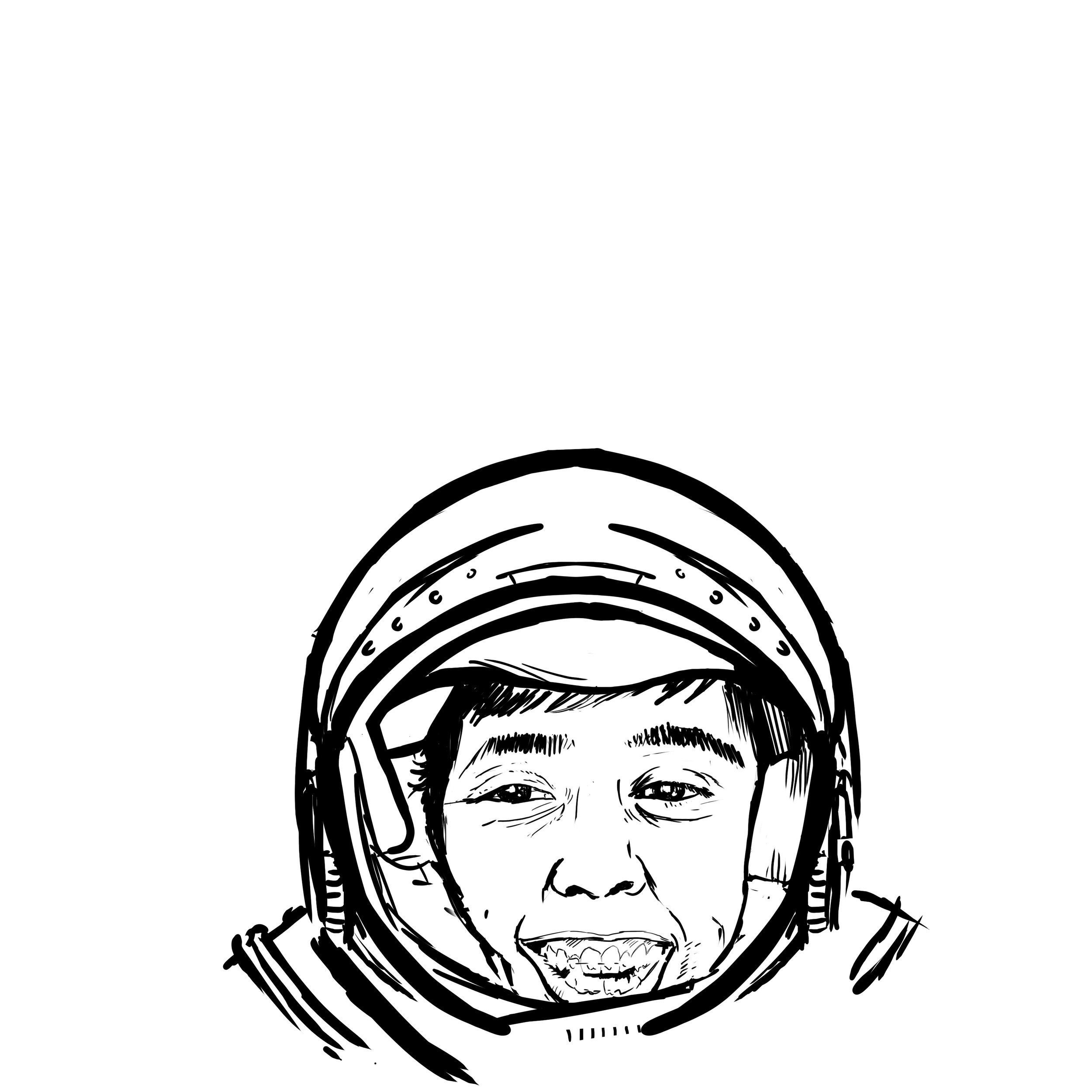
Jordan Castro is a new face to the MVP team this year. I was very fortunate to get a private message from him asking if I could help him out and get a stamp ready. Not knowing Jordan personally; I kept asking questions. What is he about? What are his passions? I went to down on a few ideas that would work within the disc template. Let’s just say I didn’t get off to the greatest start for his first Tour Series disc. Jordan is extremely humble, humorous and has an incredible work ethic. I wanted to take some of those traits and relate them to the artwork.
Shortly after the first/second round of ideas, we went back to the drawing board and Jordan hits me up one day and says “Castronaut! Can you work with an astronaut theme?” From then on we were locked in and the project really got rolling. We were lucky that one of the first one or two thumbnails nailed the direction. This straight on astronaut suit seemed to fit the easiest circular composition. I didn’t fully love that his helmet would be stuck to the bottom area of the stamp but you’re limited in some areas because of template restrictions. This layout really opened up the top to celebrate the “Castronaut” title and minimum Team MVP seal standards toward the top of the stamp.
Nailing the likeness of Jordan was extremely tough. The thumbnail gave more of a caricature feeling and I wanted the audience to instantly recognize. It took shades/ no shades/ and a few photo mashup’s to get the eye's and overall expression where I had envisioned it to be. The last phase was polishing up the Castronaut wording and framing by using the Illustrator 3D text tool and adding star bits and filigree to the top portion of the stamp.
All in all, this took a bit more development than I had anticipated. Jordan was awesome the entire way through this process and helped with reference photos and gathering resources where he could on top of his busy schedule. I hope this stamp starts a successful series for him and his years with Team MVP and MVP Disc Sports.
You can contact Jordan Castro on his tour fundraiser discs here!
https://www.facebook.com/jordan.castro.90
Schrock-A-Doodle-Doo
As 2019 was coming to a close, Tyler Schrock, Team MVP Pro asked me if I would like to do his 2020 Tour Series disc. Working with Tyler is pure joy. He’s kept an animal theme over the past few years that allowed me to do design an octopus and sloth. This year, his idea was a rooster. It turns out that his father was a chicken farmer! He raised chickens for 25 years. So this stamp idea was something he knew his family would love.
This idea started with chicken reference gathering even though I had a good idea of how I’d be able to pull this off. I think the strongest silhouette of a chicken is from the side. It gave me the room in the center of the disc to stay free from any no stamping zones. The chicken mouth action/or spit never made the final. That was an attempt to add that classic “action” seen in cartoons to show loud noises. We didn’t want the chicken looking like it was spitting so it was axed toward the end. The shading detail near the chest add a bit of contrast to show that it’s different color of feather.
The final pass was simply to add body/feather detail and import the consistent ring graphic from last years design. It was important to Tyler to continue that look and feel from year to year. When you display these side by side; it really adds a nice series look to them. I hope you all dig it! Share, like, comment on what you think!
Stock Proton Pilot
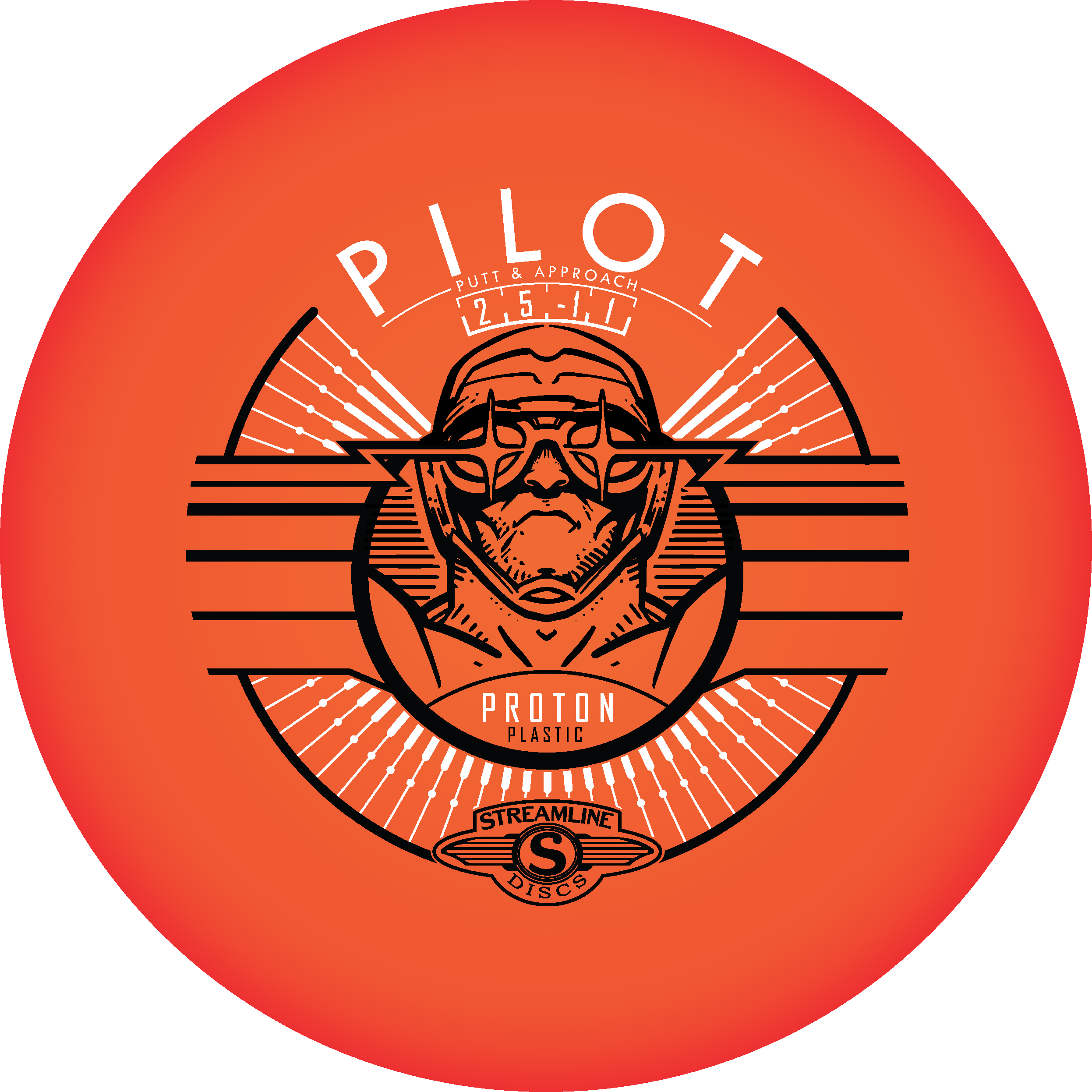
Here it is! My very first complete stock stamp designed from the ground up. It’s a first and I’m super excited on how it turned out. The Streamline Pilot has been one of those molds that has really taken off. Fans of the disc love its glide and super straight flight. It’s a great flyer and I knew early on that this disc was going to be a go to for a lot of disc golfers.
The whole goal in this design was to bring back some of that art deco/ retro futurism flavor that was in some of the earlier stamp designs from Streamline Discs. I really liked what Zachary Kelbaugh did with the Proton Drift and wanted to create something that is vaguely familiar with the consumer. Most importantly, I wanted to reestablish Streamline’s identity.
This is more of a take on the classic fighter pilot but abstract enough to offer viewers an ability to create their own story; their own hero. The intended goal was to create a design that had breath-ability but also had refined class. I found some great inspiration online. The classic silent film “Metropolis” was a huge inspiration and was the backbone of the main center figure. From there it was inserting flight numbers and logos in a way that didn’t feel obtrusive. We went with a silver holographic foil to really embrace that high polish look. I think it worked really well for the candy-like color properties of the plastic itself.
All in all, I’m very happy. I had always pictured my first commission stock stamp going much differently. I had that feeling that it would be so out of the way of how I did things. I don’t think I could have gotten more lucky. I want to thank Brad/Chad and crew for having the confidence in me to deliver.


