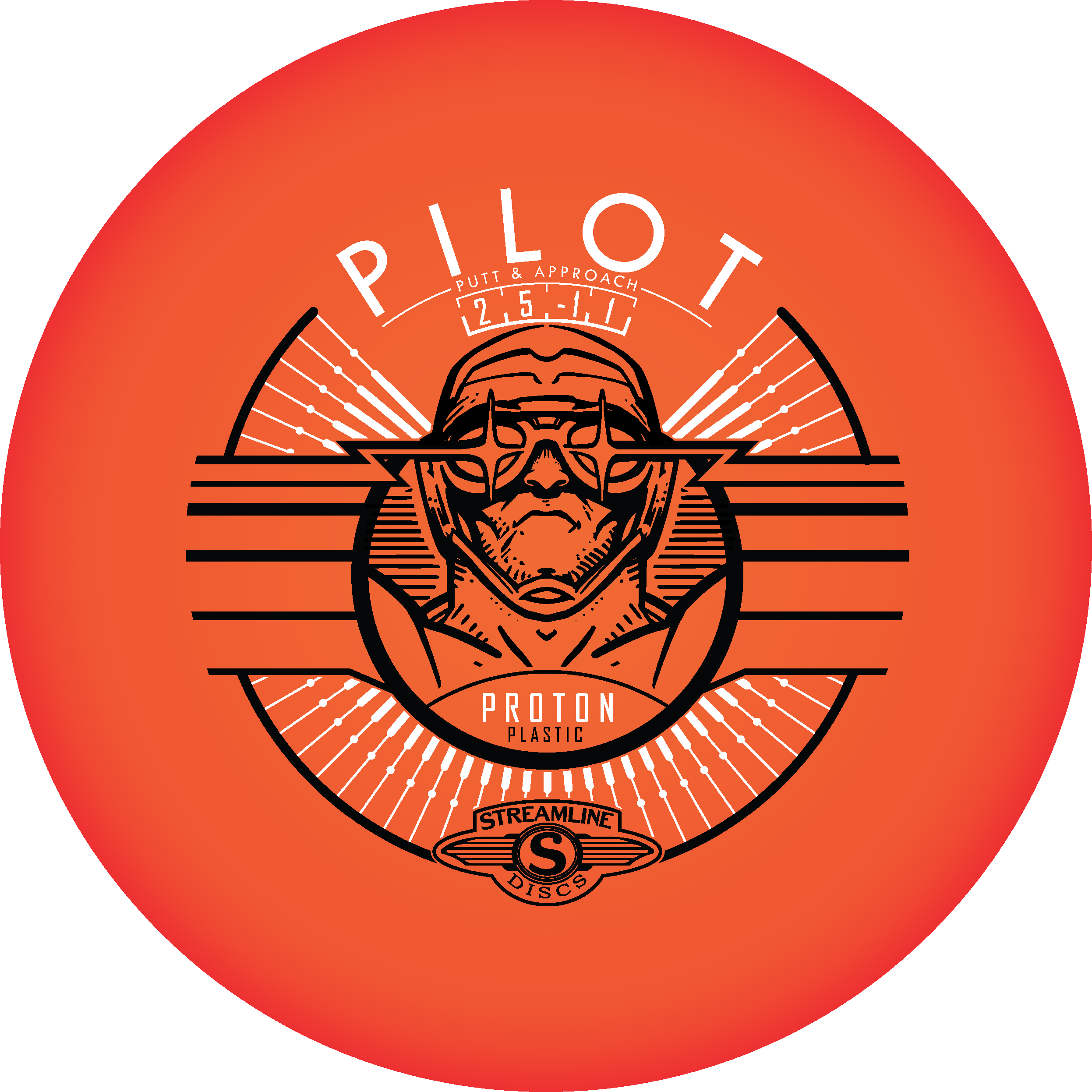
Here it is! My very first complete stock stamp designed from the ground up. It’s a first and I’m super excited on how it turned out. The Streamline Pilot has been one of those molds that has really taken off. Fans of the disc love its glide and super straight flight. It’s a great flyer and I knew early on that this disc was going to be a go to for a lot of disc golfers.
The whole goal in this design was to bring back some of that art deco/ retro futurism flavor that was in some of the earlier stamp designs from Streamline Discs. I really liked what Zachary Kelbaugh did with the Proton Drift and wanted to create something that is vaguely familiar with the consumer. Most importantly, I wanted to reestablish Streamline’s identity.
This is more of a take on the classic fighter pilot but abstract enough to offer viewers an ability to create their own story; their own hero. The intended goal was to create a design that had breath-ability but also had refined class. I found some great inspiration online. The classic silent film “Metropolis” was a huge inspiration and was the backbone of the main center figure. From there it was inserting flight numbers and logos in a way that didn’t feel obtrusive. We went with a silver holographic foil to really embrace that high polish look. I think it worked really well for the candy-like color properties of the plastic itself.
All in all, I’m very happy. I had always pictured my first commission stock stamp going much differently. I had that feeling that it would be so out of the way of how I did things. I don’t think I could have gotten more lucky. I want to thank Brad/Chad and crew for having the confidence in me to deliver.


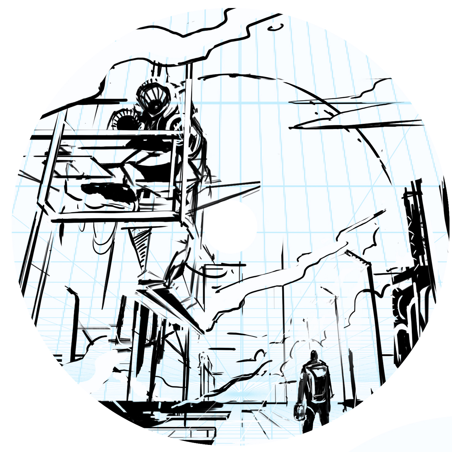
Streamline Pilot Special Edition
When given the opportunity to revisit a disc called the Pilot; I was all over it. The last time setting foot in the Streamline Pilot universe was for the Electron Limited Edition. That design featured a fearless fighter pilot locking in on his target. This time, however, it was time to step outside of that mindset.
Going into this design, I initially thought about how cool it’d be to take what I did with the Electron design but pump it up and put in a science fiction/ futurism space. I created a ton of thumbnails based on a technologically advanced fighter jet pilot. The thought of holograms or how future pilots would navigate the skies really stuck with me. In the end, we all agreed that while neat; we should create something totally fresh and new for the Neutron line. Those ideas might be revisited so I apologize in advance for not showing them.
I diverted to a Pilot character stepping onto the tarmac. Putting the viewer in the scene of a spacecraft pilot getting ready to debark on his mission. There’s something about showing massive scale between the character and where his attention is. I thought about mission bays, Ralph McQuarrie (prolific Star Wars concept artist) and how effective they were at creating these imaginative ideas. The ending result was a homage to the work that really got my gears going in concept art and illustration. There were numerous Star Wars concept art prints lining the school I was attending. Those pieces made me inquire more about that type of work and motivated me to go after that discipline.
My philosophy is to create these vast landscapes while always letting the viewer to fill in bits of detail. It allows them to create their own story or simply add to it. That’s what this stamp was all about. It was about not strapping down Streamline Discs’ brand identity to a certain period or time but expanding the possibilities heading into the future. The long steam trails coming from the left side of the image is homage to early 70’s fantasy and poster art. Thanks so much for taking the time to read this. Feel free to share among your peeps on any of your social spaces.


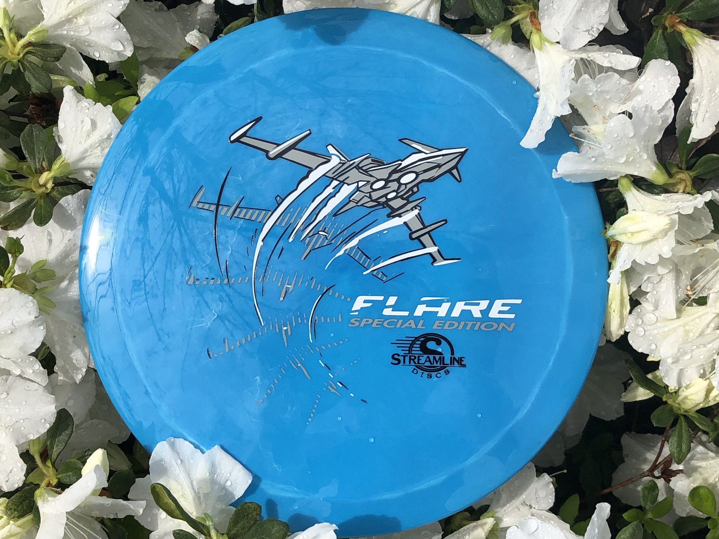
Streamline Flare Special Edition
The Streamline Flare is the newest Fairway Speed 9 driver delivered with plenty of overstability for even the strongest arms in the disc golf game. I was asked to design around that special ability of the disc to fight out of constant steady winds. It’s a true wind fighter.
The design started with a page of ship designs based on direct relationships to the flare countermeasure that provides a decoy to heat sinking missles. Other quick concepts went the sci-fi ship route and that aspect of the design stuck out with the group. The frame-type of motion was liked by all and continued into the rough phase. Connecting the design with it’s actual flight characteristics was important to me. I used a rough block-in 3D model to mock up the ship orientation and ported that into Illustrator. The whole intent of that process was to create motion.
Other Streamline designs that I’ve done were in a direction where you couldn’t place a certain time period on it. It was kinda Sci-Fi/ kinda modern age but I wanted to take this into a futuristic realm. So I added lower propulsion units on the bottom and kept the edges and angles sharp. A few references of the Royal Canadian Forces doing evasive maneuvers in a valley inspired me to put atmospheric trails coming off the wings. Carrying that curve language subtracted from the “Flare” typeface finishes it off.
In the end, MVP Disc Sports HQ used a new grey pigment-based foil in combination with black and white to create a truly comic-like vibe with the stamp. You can find these by most big online retailers of MVP, Axiom and Streamline on April 19th.