Schrock-A-Doodle-Doo

As 2019 was coming to a close, Tyler Schrock, Team MVP Pro asked me if I would like to do his 2020 Tour Series disc. Working with Tyler is pure joy. He’s kept an animal theme over the past few years that allowed me to do design an octopus and sloth. This year, his idea was a rooster. It turns out that his father was a chicken farmer! He raised chickens for 25 years. So this stamp idea was something he knew his family would love.

This idea started with chicken reference gathering even though I had a good idea of how I’d be able to pull this off. I think the strongest silhouette of a chicken is from the side. It gave me the room in the center of the disc to stay free from any no stamping zones. The chicken mouth action/or spit never made the final. That was an attempt to add that classic “action” seen in cartoons to show loud noises. We didn’t want the chicken looking like it was spitting so it was axed toward the end. The shading detail near the chest add a bit of contrast to show that it’s different color of feather.

The final pass was simply to add body/feather detail and import the consistent ring graphic from last years design. It was important to Tyler to continue that look and feel from year to year. When you display these side by side; it really adds a nice series look to them. I hope you all dig it! Share, like, comment on what you think!

Mike 'Sully' Sullivan "45"

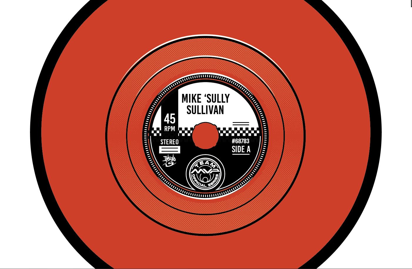
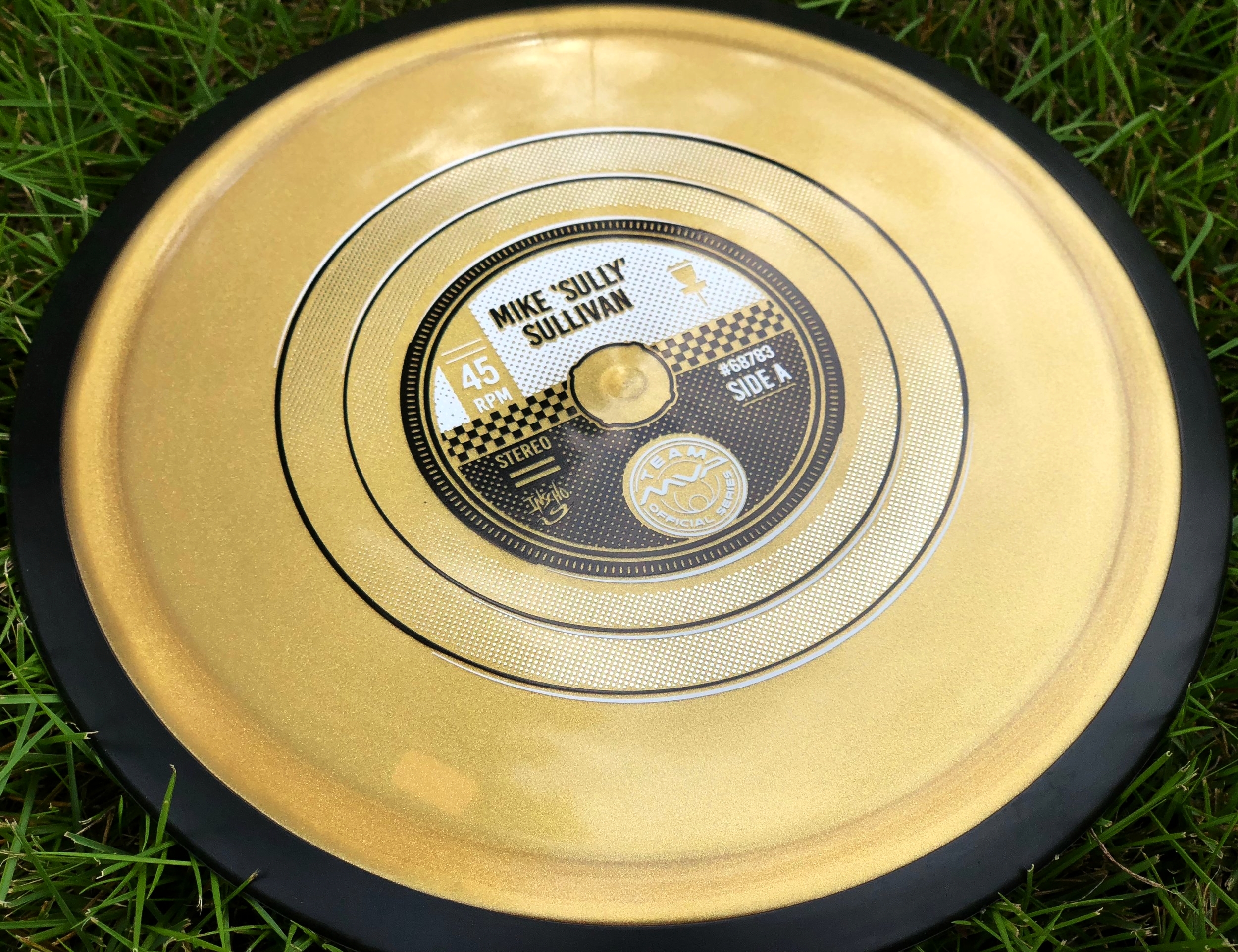
When Mike Sullivan of Team MVP approached me to do his Team MVP stamp, he was kind of giving me the reigns to come up with something. We chatted a bit over private message and our conversation led to music. Mike is a huge 70's punk/ New Wave fan. He also shares a common interest in vinyl. I've been wanting to do a record stamp for a while now and this was the opportunity to pitch it. Some of his favorite bands from that era were Crass, Joy Division and The Clash. My advice to upcoming designers: Talk to you clients! Make a connection. You just never know what might come out of it. I’m sure most people outside looking in had no idea Sully used to be an avid vinyl collector. I’m glad both and he and I were excited about pursuing this challenge.

Mike loved the idea and I quickly got to work. The hardest thing about doing this was that this needs to work on every disc color. Records are finely detailed and it would take lines under typical stamping requirements to pull off the sheen/ intricacies of the grooves. I had to plan smart and figure out a way that this could be possible, while also keeping it graphic and instantly recognizable. One common theme we both agreed on from the very beginning is this was before advances in colored label and surfaces. Most punk records were black and white or very simple graphically. I don’t know much about these bands so it was straight to google search to get some overall themes established. We knew that a full 12” record wasn’t doable with the center sprue being off limits. The next option was a 7” and if fit perfectly for what we were wanting to pull off.

The important thing about this stamp was breaking up the huge fields of black within the design. I used a simple halftone pattern technique to break apart the solid black and help ease up the overall tonnage for the stamping machine. One reference I found really fit well for placing all the information while mimicking the exact punk style Mike was aiming for. I had a blast working in a different style than past stamps. The initial plan was to use a clear holofoil for the record surface. MVP was out of that foil so they wisely went silver metallic and it worked out perfectly. It reflects the disc color and almost achieves the same effect we were going after.

Overall, I appreciate Mike Sully giving me full reign to run with it. I feel these bursts of excitement toward a project creates an overall better product in the end. Thanks everyone for tuning and and learning a bit about how I was able to pull it off! Share this blog if you feel so inclined.