2022 Gyropalooza Total Eclipse Proxy

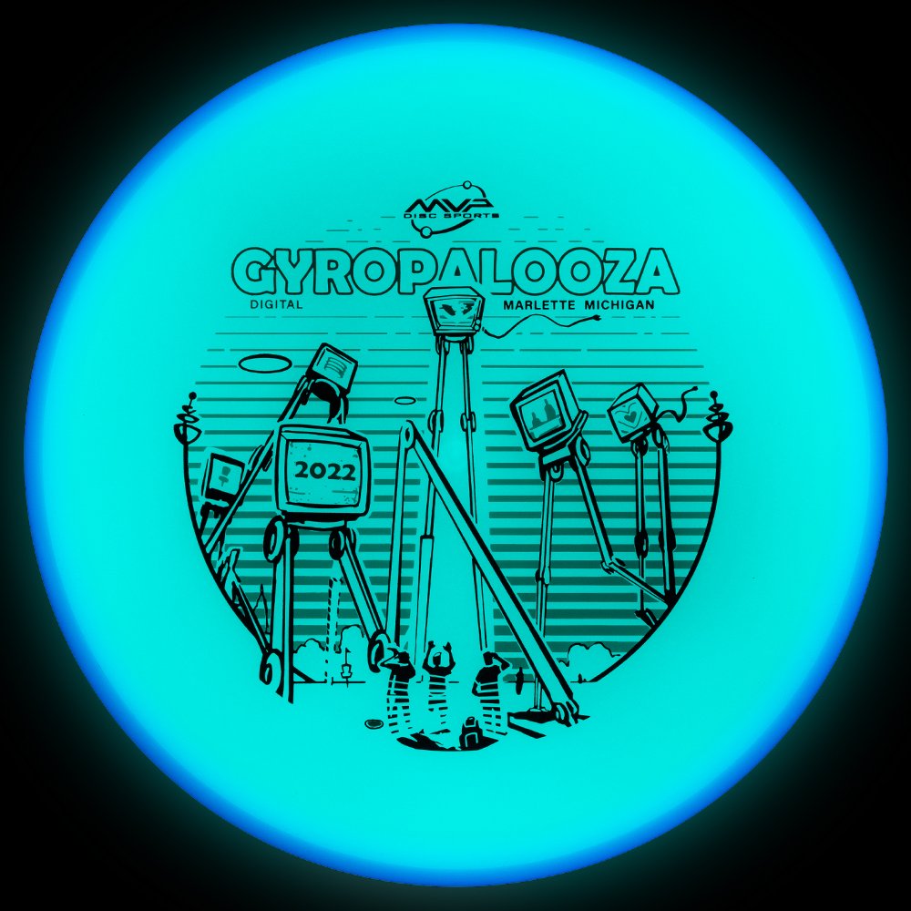
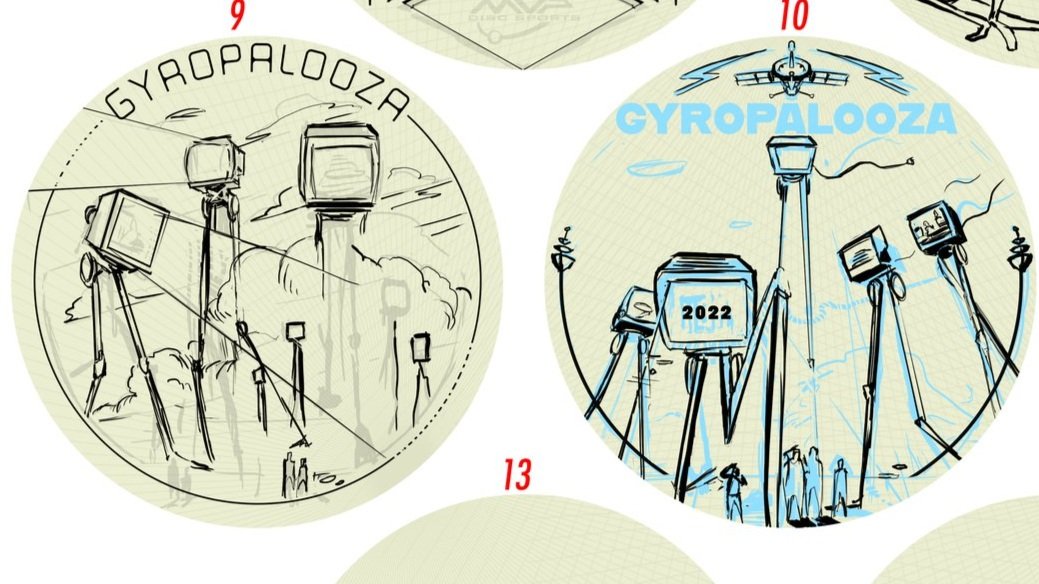
The 2022 Gyopalooza brings something pretty exciting. We had a new Total Eclipse glow technology in the lab awaiting its release. The Proxy is outfitted with both an Eclipse™ Glow flight plate and Eclipse™ Glow Rim. Colors vary from white, aqua, green, blue, and purple with a multitude of different combinations.

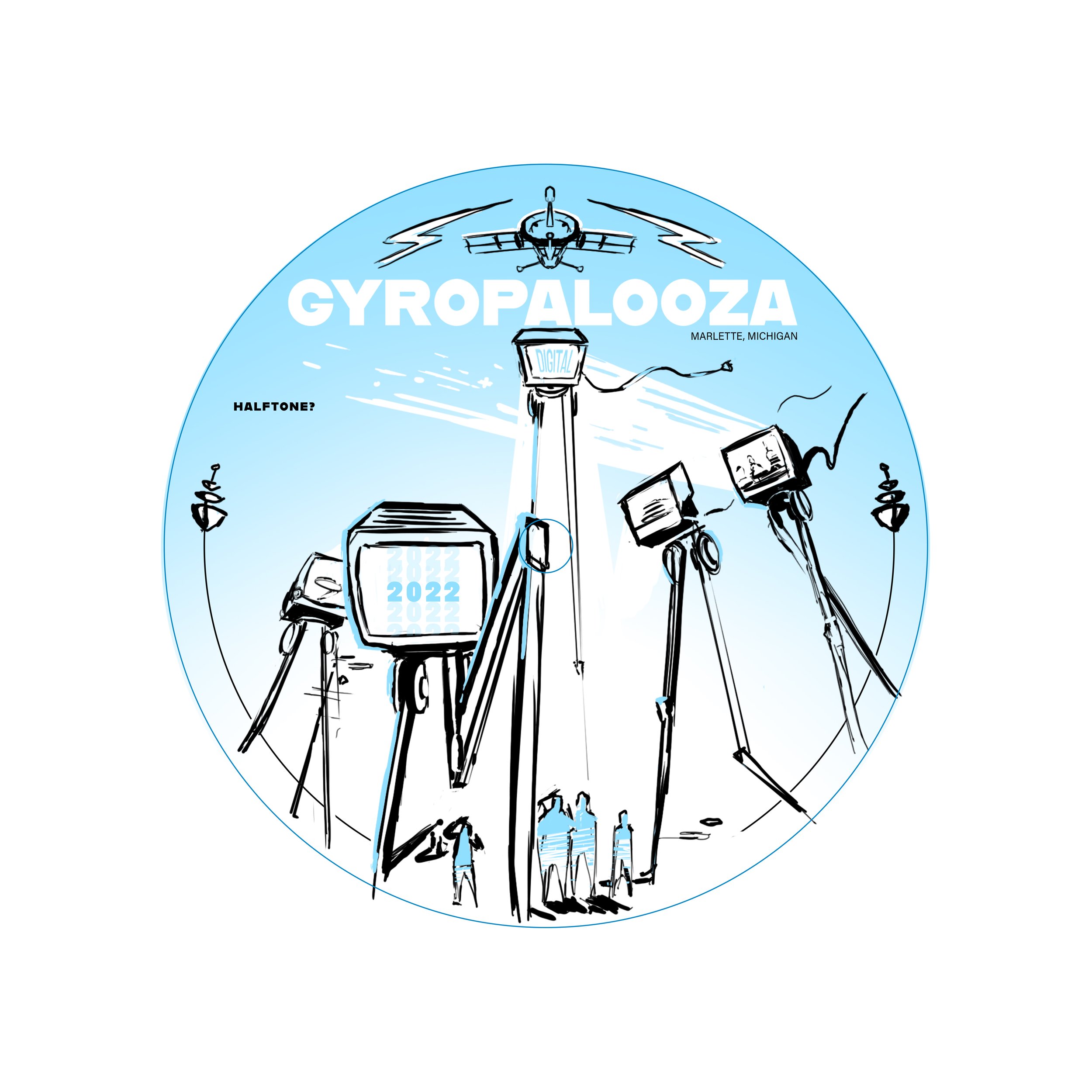
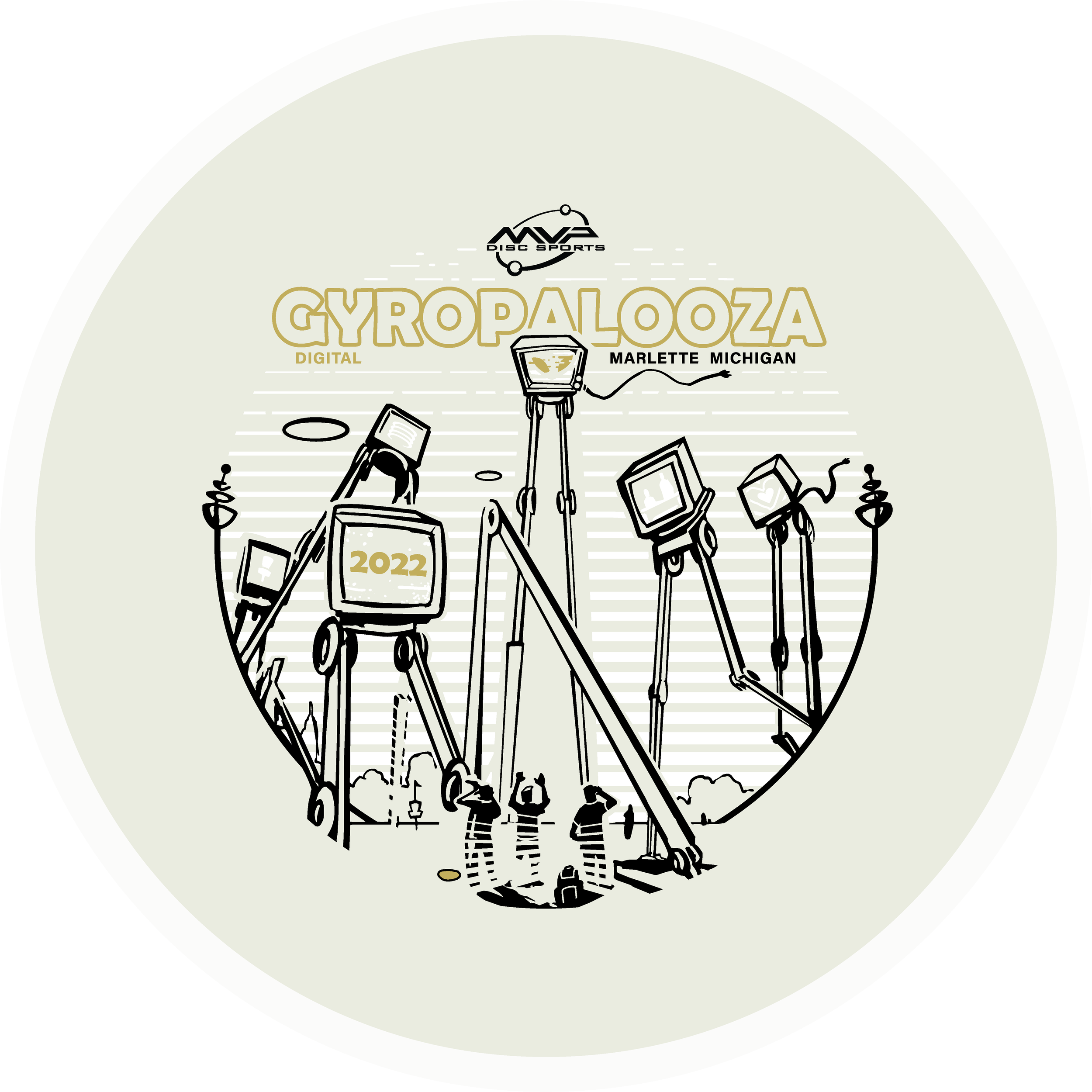
The Idea: I had this image in my head but instead of being an intimidating alien species laser-stomping everything in sight, they were dispatched to broadcast exclusive MVP content and news to the Gyronaut masses! All of this sounded great but the important goal from the get-go was not to hinder the glow properties. I think it’s important to design stamps with disc plastic in mind. If the glow is an important draw, why would you cloud it up with foil? Lastly, by setting up a two-point perspective grid, it gave me a great base to lay down that looming presence of the tall beings. There are still a few MVP iconic themes scattered about.

I wanted some of the TVs to engage with the local disc golfers. It was a good placement for “2022”, discs, and a Brad/Chad silhouette we’ve come to know so well these past digital versions of Gyropalooza. Lastly, the last and most important icon located on the far right represents a huge love for all of our fans who’ve stuck by us from the very beginning through the years of rapid growth. I love to infuse emotive characteristics in robots. Allowing robots to have a bit more life and curiosity like our human race. Lastly, I wanted the center alien bot to have its glow casting on the disc golfers underneath. I used a line screen in the background to enhance that particular element. Doing that for every TV would’ve clouded up where I wanted the focus to go.

Hot Stamping Foils: I’m a sucker for white pigment foil because of how bright the Eclipse glow plastic is. It allows some of that color to seep through and gives the glowing state a bit more depth. The accent color is a classy nod of brushed gold that allows it to pop off of that core plastic color. Again, it’s important that the accented foils work alongside the others during the glowing state.

Can’t wait to get some of these in my hands. MVP took their industry-leading glow and just made it better. I don’t get out and play glow rounds very often but this disc makes it tempting. What are your thoughts? Excited to see these in the wild? You can get your 2022 Gyropalooza pack from any reputable MVP dealer. Included will be this Total Eclipse Proxy, a Prototype Eclipse Color Glow Envy, and Lab Second discs for a pretty good price. Thanks for tuning in!

MVP Nomad - James Conrad Special Edition

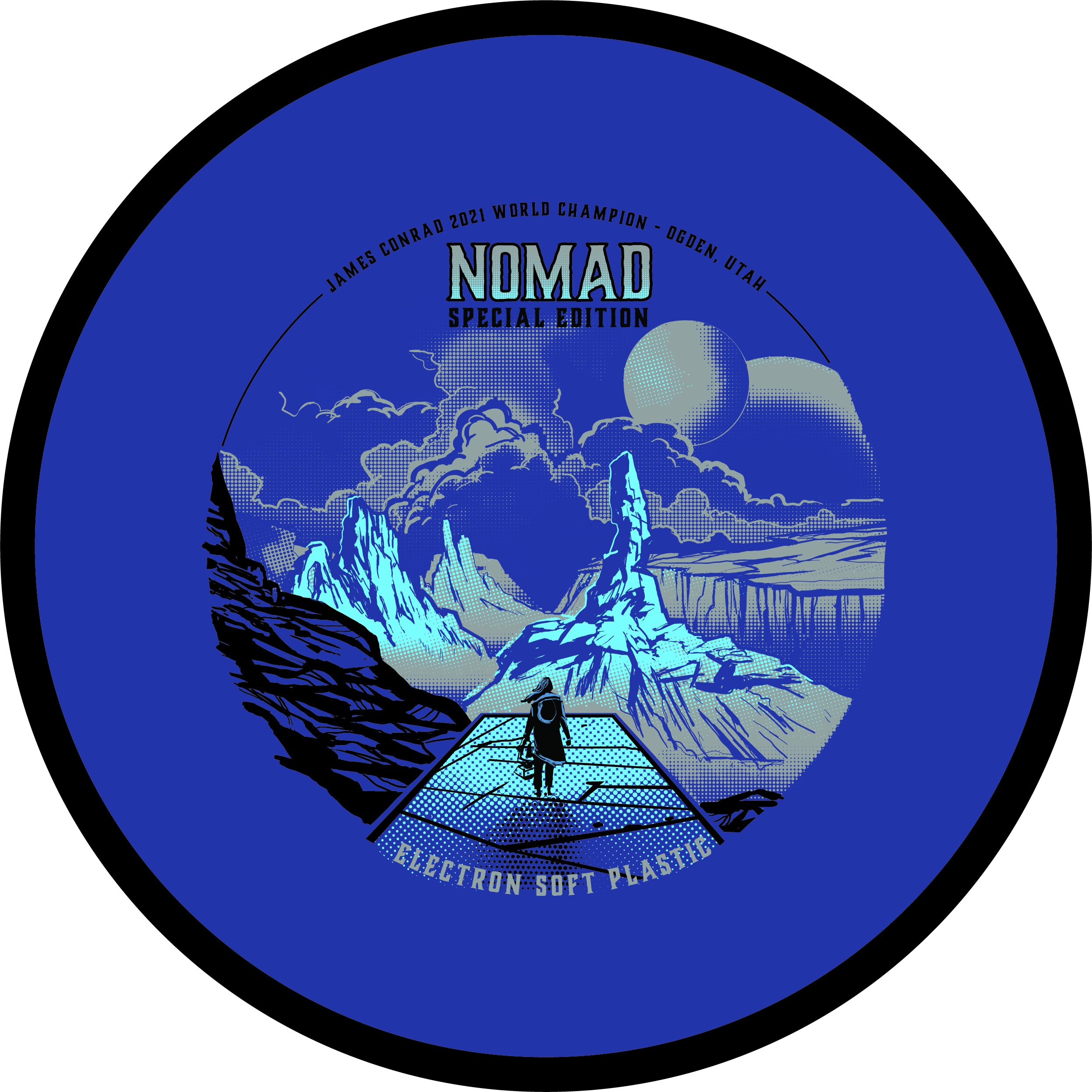
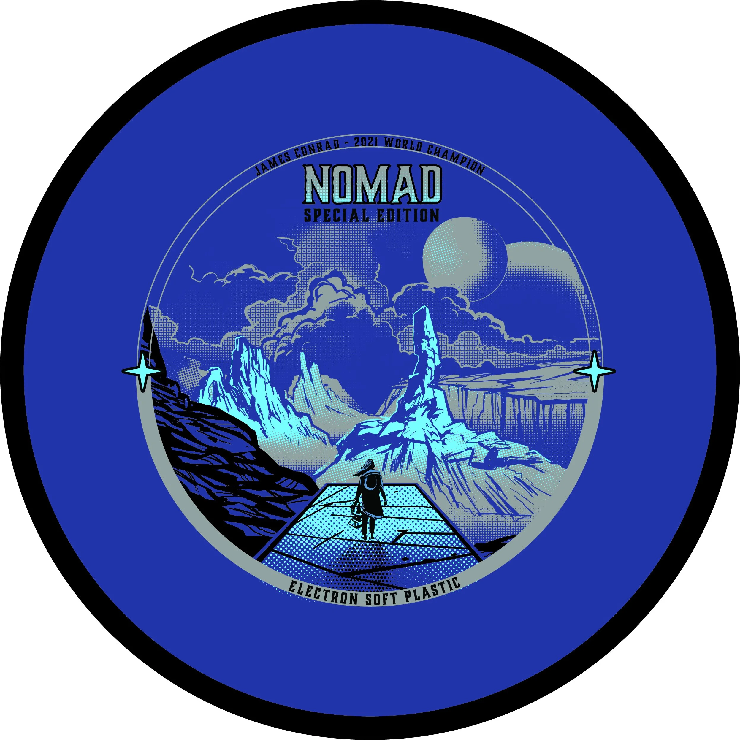
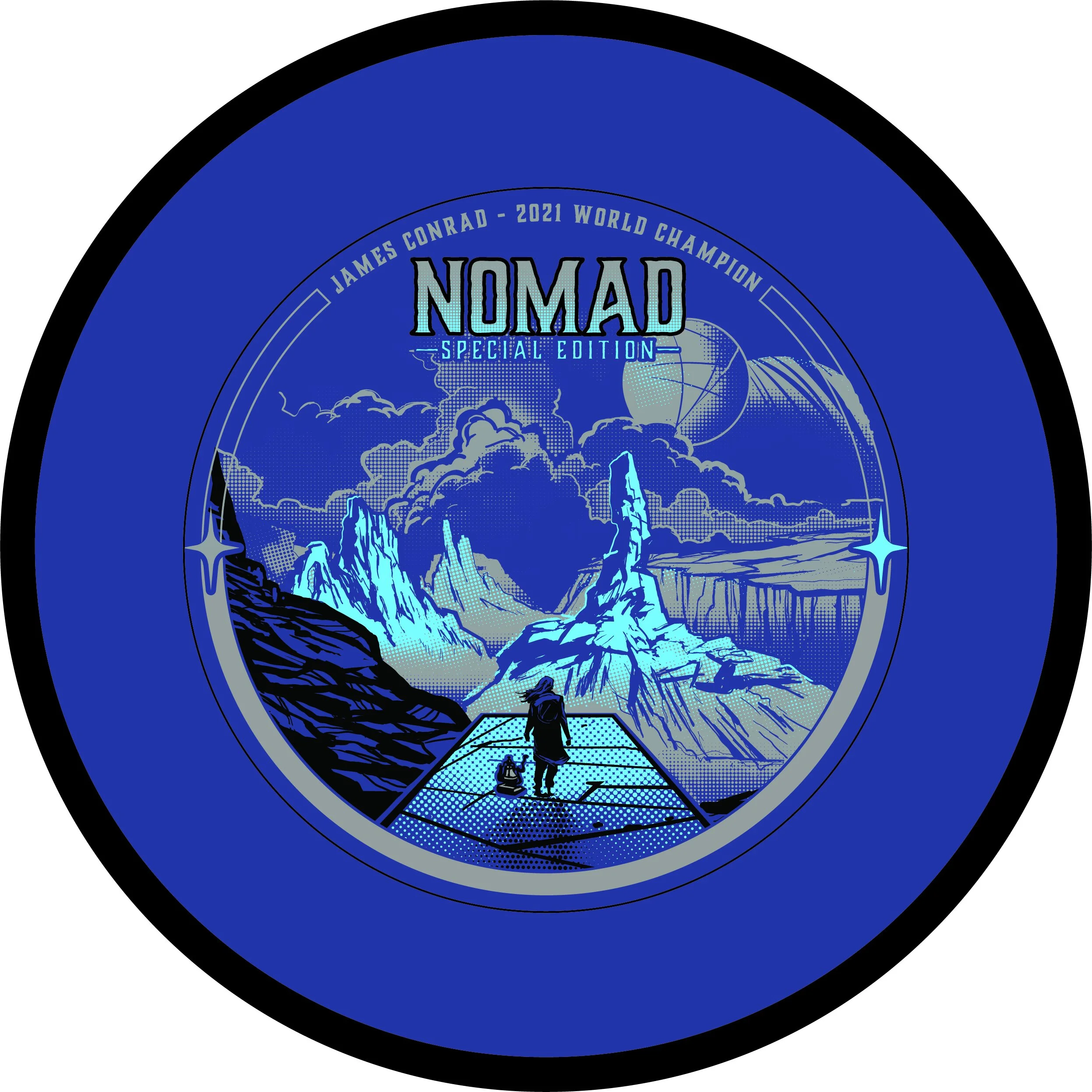
The MVP James Conrad Nomad Special Edition was a unique one. This project kicked off a bit earlier than most people realize. We had James Conrad’s Signature Line Nomads in production before he hit the biggest shot in disc golf (IMO). With that event happening and the surge and interest solely on MVP and their debut of James’ first designed putter; We shifted gears just before going into final stamp design.

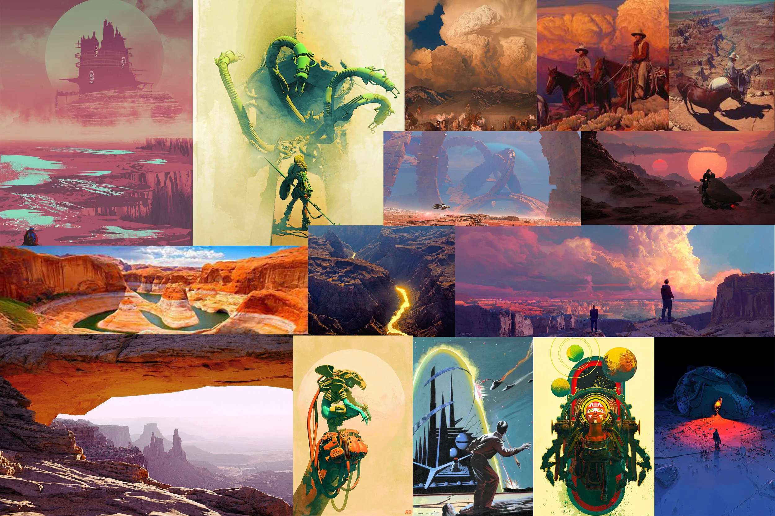
First off, this design from the get-go was a collective agreement from the MVP Media Dept. that it should be a cohesive nod to the stock Electron Nomad stamp that was also debuting at the same time. With that, I was able to dial in on the “traveler/ nomad” aspect and reach down into my science-fiction/ dystopian love. I’m one to do extensive research before going into the thumbnail stage. Grand Canyon/ desert paintings from the incredible minds of Mark Maggiori, Pablo Carpio, and Pascal Blanche helped dial in a smooth style with the rock formations and overall composition.

With this project; I knew I wanted to push the limits of our Election stamping capabilities. Although nervous, I knew our MVP HQ stamping team could put their best into making sure these came out successful. It took quite a bit of value painting work to figure out the half-toning fills. I worked back and forth with the inclusion of black within the stamp and found a great compromise of subtracting the would be black line work from the background.

In the end, i’m glad this art was in preproduction before James Conrad flipped MVP on its head. I was able to adjust on the fly and include the Worlds nods relatively easily. I’m glad this went ver so well with James and the pro players he showed during his warmup rounds. That meant a lot.

What did you enjoy most about the Nomad Special Edition?

Marie Curie Eclipse Glow Reactor

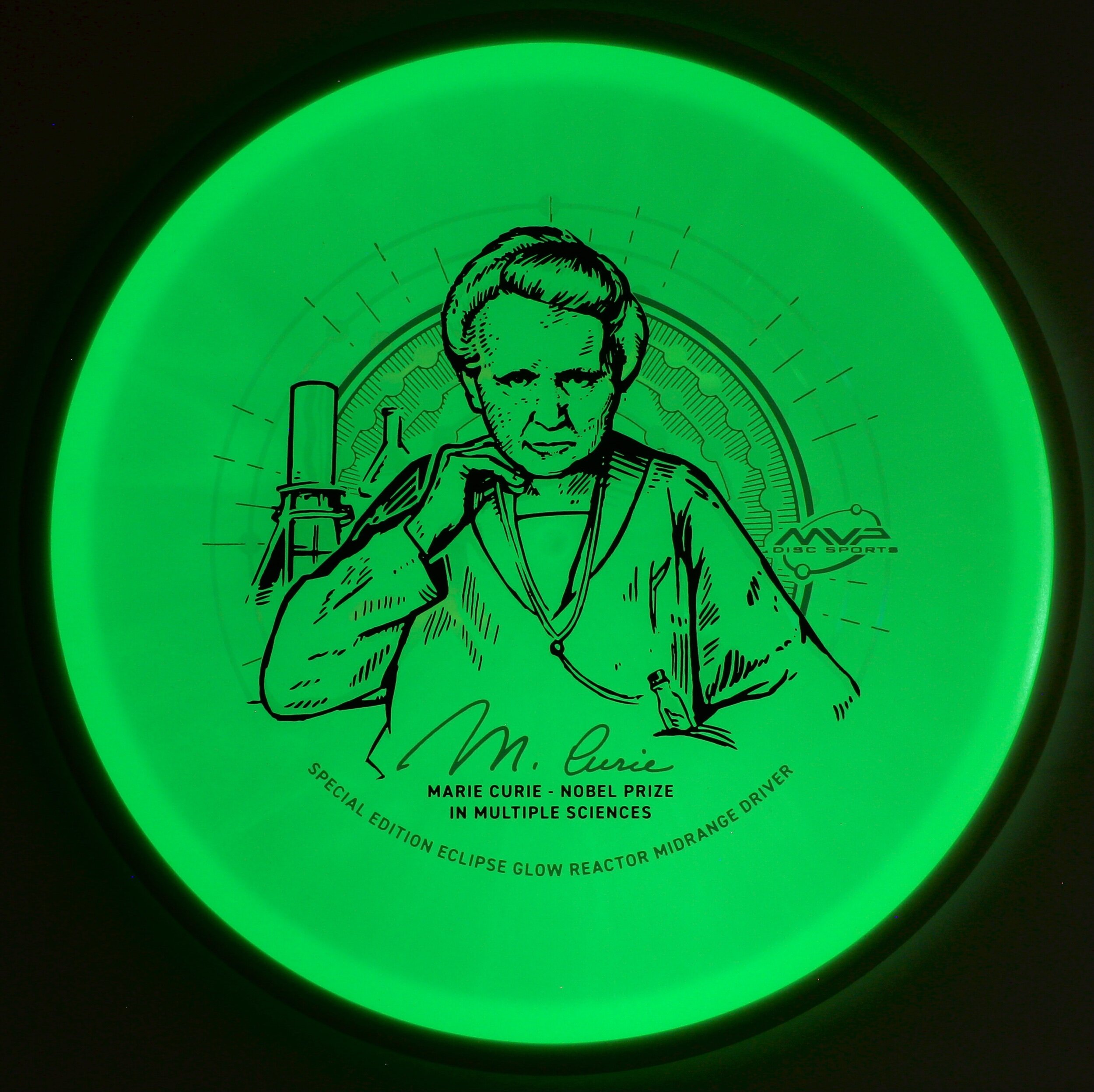
I’m working my typical day and the word came down that MVP HQ is experimenting with a new & improved Eclipse Glow blend of plastic with overmolds. With the recent success of the Reactor mold; both ideas hit me at once and we pitched the idea to try Reactors & see how they would mold up. The initial idea for a Glow Reactor Special Edition came in the form of glowing toxic material and powerplants.

Some say it’s not always good to roll with your first idea. We marinated a bit on the qualities of the plastic and used them to our strengths. The natural look of the Eclipse 2.0 blend in the daytime gives off a milky white/greenish appeal. I felt using this opportunity to honor the late Marie Curie and her life as a scientific pioneer. She would be the first woman to win multiple Nobel Prizes in both sciences. She’s also the first female featured in MVP’s Limited and Special Edition scientific line of stamps. We use this platform to give nods to some of the notable humans that have contributed to the world of science. Her magnificent and intense story led MVP down the path to honor her in this stamp.

While diving in and reading about Marie Curie; I jotted a few notes that would aid in design cues and decisions while building the vector art. Marie and Pierre found and named a new element called Radium that was 4x more radioactive than Uranium itself. Long story short, She and Pierre would take the next 4 years to process an incredible 10 tons of pitchblende down to 1/10th of Radium Chloride residue. She was able to give an atomic mass of Radium of 225.9 (226) and place it correctly in the Periodic table. I thought that was a pretty significant number that took an immense amount of work to arrive at. I would later use that number of radial lines from the discs’ center.

I used a variety of images of her from both her early years as a college student and those of her later years to compose a set of thumbnailed ideas. There are era-appropriate shapes and symmetry to really help merge the unique plastic color. MVP stamping and marketing worked in conjunction to test and make the transparent foil worked with the artwork. The molecular compound of Radium is featured as a clear holofoil backdrop that appears a muted grey when illuminated in the darkness. The new 2.0 Eclipse is so bright that the white foil we used allows light to soak through giving even more depth in the darkness. Marie’s pose is intense as in her work. Time is not wasted. Electrometer and infamous MVP shaped beaker are placed behind her. In her lower pocket is a glass tube of Radium. She was known to carry it around in the lab; as she wasn’t aware of the effects of radiation.

In the end, it’s the overall goal to honor a legend in the science field with tact and class. Use the plastic qualities as we did in the 2018 Am Worlds ”Queen Charlotte” and make it feel like it belongs in the lineage of MVP stamps created to honor those featured. We felt as a Marketing Department that this stamp did just that. These Special Edition Marie Curie Eclipse Reactors will be available at most major MVP Disc Sports dealers for a small amount of time. Be sure to inquire about them before they’re gone for good!

2020 MVP Halloween Special Edition

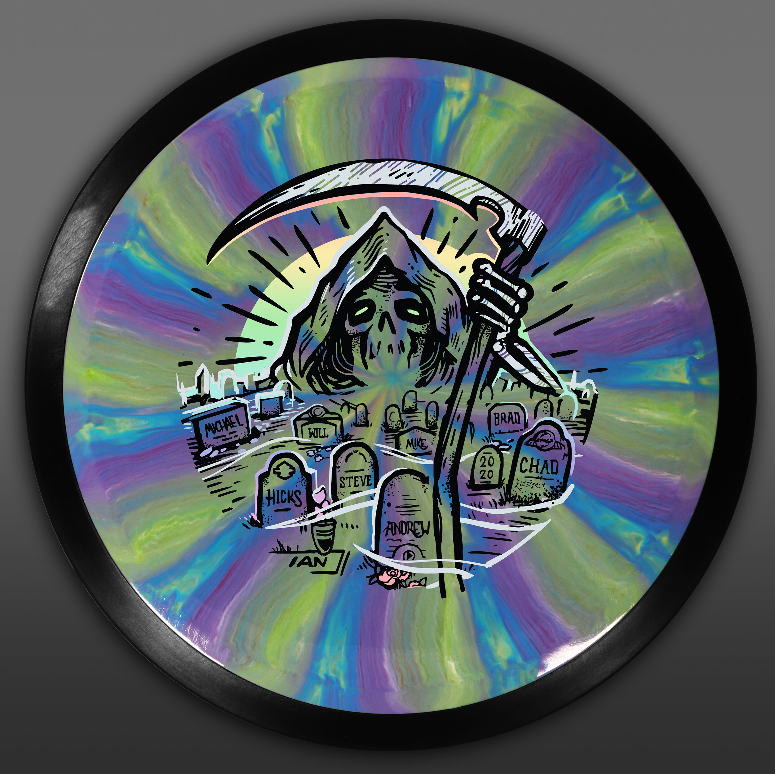
I can’t say enough about how weird of a 2020 this has been for everyone. The Cosmic Neutron Tesla from MVP Disc Sports would be the featured mold for this year’s Halloween release. This is a big deal because up to this point since 2014; no manufacturer owned by MVP other than Axiom Discs has had their share in the limelight.

This idea for the Grim Reaper came pretty easily and was chosen out of 3 solid ideas (2 of which may be saved for future Halloween’s down the road). While the Cosmic Neutron swirls pop, it’s extremely tough to get something to work alongside it. I felt like the reaper really had a strong composition that would help it stand up to the beauty of the plastic. Using bold foil choices would help aid it to stand out even more. If you look close to the rough and final design; I honored our marketing team and select MVP HQ employees with their own headstone. Everyone from the stamper himself to our social media guru, Will Davis. Toward the end, I saved pressure on the flat silver layer by removing the fill of the headstones. I like there’s a nod but I wanted the swirls to hide that small nod within the plastic qualities.

While I know the reaper has been done aplenty for Halloween festivities; I feel these small gestures and nods put this on its own plane. I hope everyone bought and enjoyed this year’s Halloween Special Edition. You can most likely find them at your local dealer that sells MVP/ Axiom/ Streamline Discs.

Schrock-A-Doodle-Doo

As 2019 was coming to a close, Tyler Schrock, Team MVP Pro asked me if I would like to do his 2020 Tour Series disc. Working with Tyler is pure joy. He’s kept an animal theme over the past few years that allowed me to do design an octopus and sloth. This year, his idea was a rooster. It turns out that his father was a chicken farmer! He raised chickens for 25 years. So this stamp idea was something he knew his family would love.

This idea started with chicken reference gathering even though I had a good idea of how I’d be able to pull this off. I think the strongest silhouette of a chicken is from the side. It gave me the room in the center of the disc to stay free from any no stamping zones. The chicken mouth action/or spit never made the final. That was an attempt to add that classic “action” seen in cartoons to show loud noises. We didn’t want the chicken looking like it was spitting so it was axed toward the end. The shading detail near the chest add a bit of contrast to show that it’s different color of feather.

The final pass was simply to add body/feather detail and import the consistent ring graphic from last years design. It was important to Tyler to continue that look and feel from year to year. When you display these side by side; it really adds a nice series look to them. I hope you all dig it! Share, like, comment on what you think!

Robokitty 2.0

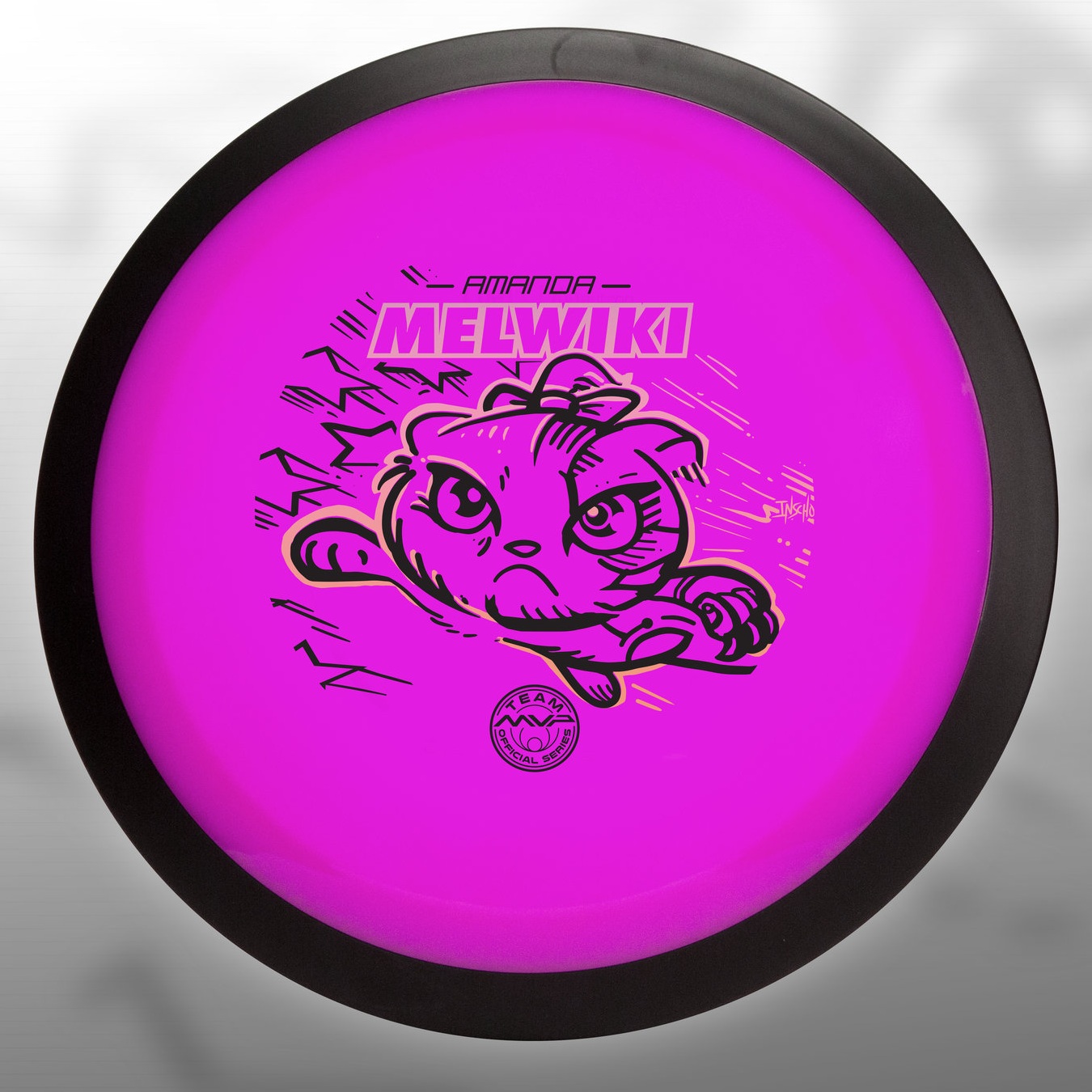
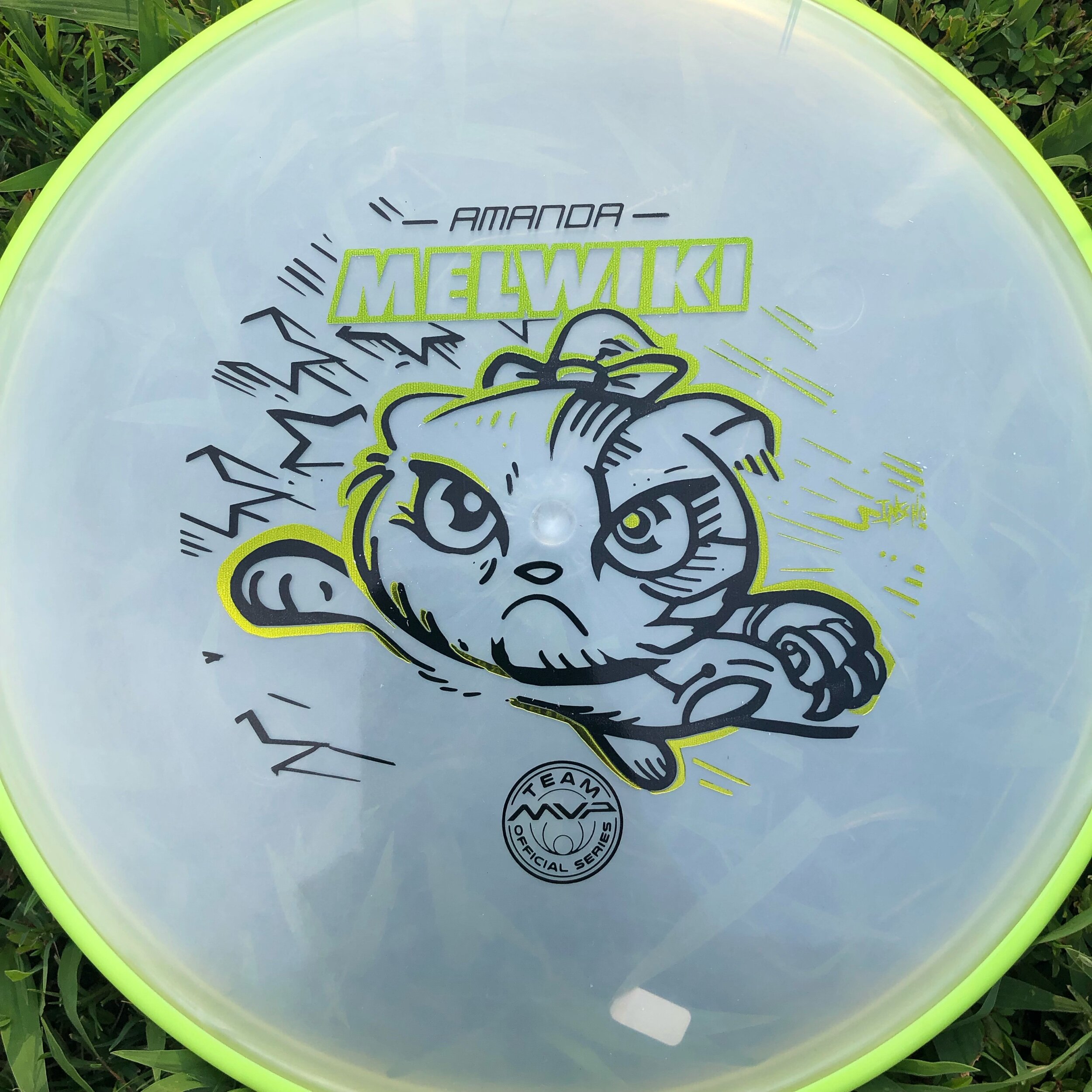
I received a request from an Team MVP member to change up a 2018 stamp design. Amanda Melwiki had a great 2018 year and her Robokitty design was a hit. She came to me with the idea of changing up the foils and adding a few elements to last years design. I had bigger plans for Robokitty and I’m glad she trusted me to do something new but a continuation of the concept.

I knew I wanted to show a fiercer side of the kitty. I wanted to marry the concepts of cute/friendly with the deep down drive and determination of getting better. That fueled the fire going into the concept stage. I had the idea more stored in the back of my head so this design didn’t really consist of a lot of reference gathering. Bringing in that exaggerated anime pop and allowing the opportunity to expand on the Robokitty character were the goals first and foremost. From there it was a few experiments with stars and how I was going to incorporate them into the design.

A huge thanks goes out to Amanda. Were you able to snag one? If not, she has a few available but will be selling out fast. Follow her here:

https://www.facebook.com/AmandaMelwiki