Robokitty 2.0

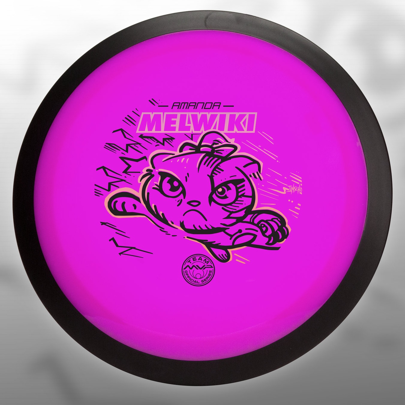
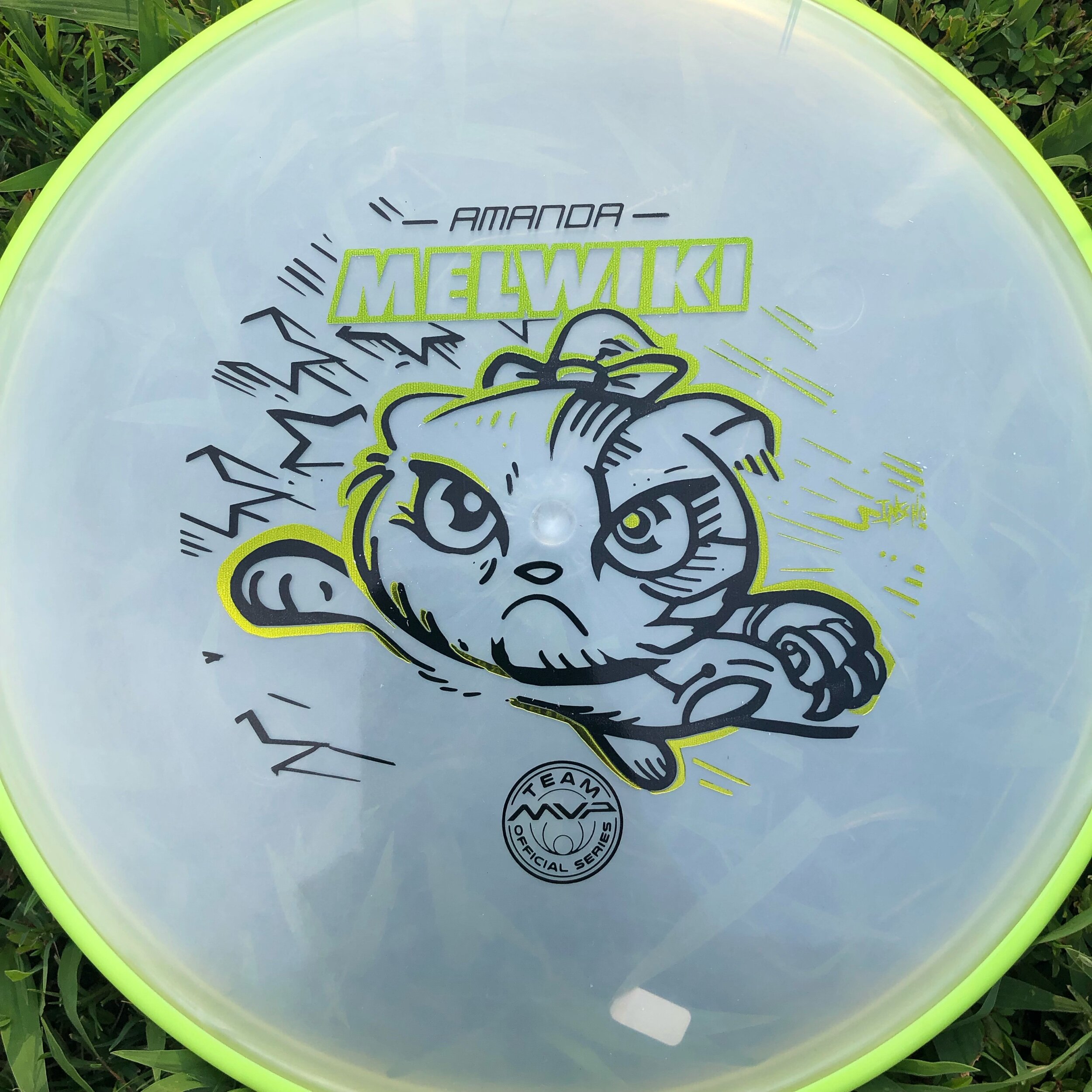
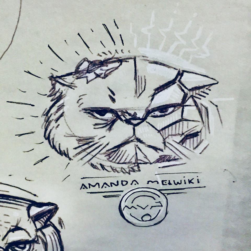
I received a request from an Team MVP member to change up a 2018 stamp design. Amanda Melwiki had a great 2018 year and her Robokitty design was a hit. She came to me with the idea of changing up the foils and adding a few elements to last years design. I had bigger plans for Robokitty and I’m glad she trusted me to do something new but a continuation of the concept.

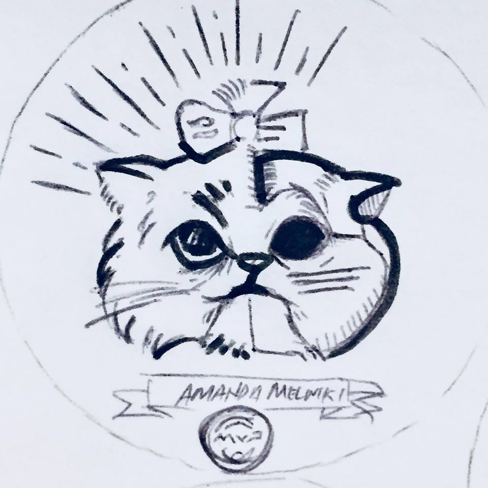
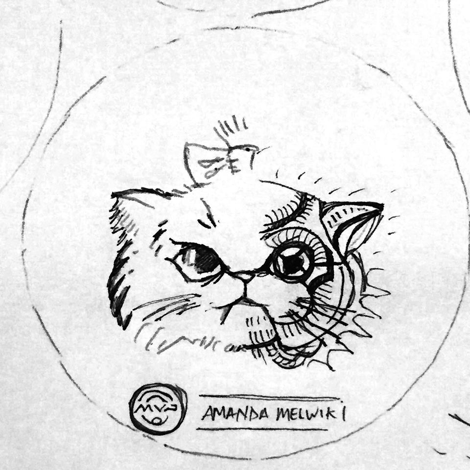
I knew I wanted to show a fiercer side of the kitty. I wanted to marry the concepts of cute/friendly with the deep down drive and determination of getting better. That fueled the fire going into the concept stage. I had the idea more stored in the back of my head so this design didn’t really consist of a lot of reference gathering. Bringing in that exaggerated anime pop and allowing the opportunity to expand on the Robokitty character were the goals first and foremost. From there it was a few experiments with stars and how I was going to incorporate them into the design.

A huge thanks goes out to Amanda. Were you able to snag one? If not, she has a few available but will be selling out fast. Follow her here:

https://www.facebook.com/AmandaMelwiki

Robokitty

As the disc golf season starts, I often get the opportunity to help disc golfers fund their season long ambitions. Amanda Melwiki approached me with a rather interesting design idea for her tour series disc. She says to me:
"I’m thinking a cat but I want pieces of him to be missing and under he’s a robot"
"you might have to get a bit girly too..."


Amanda was rocking a dubstep tune by Excision called "Robo Kitty". The idea came to her that with her love of felines and an appreciation for this track. The idea was worth exploring. With those beginning ideas and rules now set, it was time to get to work.

29133120_519423731591_684951050674765824_n.jpg

Reference Sheet

I began with a pretty extensive reference sheet. Drawing cats is not my strong suit. So getting as much anatomy and idea reference as possible will help me and the client understand what direction this idea could lead to. 

The challenge with this design was clearly "How am I going to mix a kitten with its face missing in spots and keep it cute?" I tried a dozen or more sketches. We both arrived at the idea of introducing more foils to the design and splitting the concept straight down the middle. It allows both sides to have a clear representation while not overcrowding/ overcomplicating the design. 

29136061_519431995031_39890144416759808_n.jpg

First crack

Here is the very first go at it mixing feline and robot/cyborg properties to her. You have to start somewhere. I'm exploring the Persian kitten because of the well defined face features. They're adorable kittens and well renown.

Bad ideas out of the way! It's rare that the first drawing you ever do for a project sticks. The upper left persian grumpy kitty stuck out to both of us. Now it was the task of mixing the robotic properties and adding a bit of cuteness. The idea of the split came from this initial Pinterest board Amanda had created to get some ideas flowing. 

28461582_519316311861_347055142_o.jpg

Fork in the road

The idea of the split came from this initial Pinterest board Amanda had created to get some ideas flowing. You can see I took a liking to the idea of doing a split down the middle like the left side example. 

These roughs were made knowing that split was going to happen. The next stage was figuring out how the robot side of things were going to look like. The great thing about this is I'm still in a traditional mindset and pumping out quick ideas on paper. Nothing is digital yet so those options can be explored rather quickly. As you can see from the sheet, some of these ideas (especially dealing with the eye socket of the kitten) got a bit dark/ or away from cute. Toward the end, I was able to reel it back in and experiment with the rays/electric bolts surrounding the Robokitty head. 

Amanda was excited and loved the roughs. It was now time to really finalize the robot side of Robokitty and get this stamp finished for her. Main things that needed tackling were how the two hot stamping foils were going to be split up. Would I do the left side in black..and the right side of the kitty in pure secondary foil? It took a few mockups in photoshop to determine what I was going to do in Adobe Illustrator. 

MelwikiRobokittyTeaser.jpg

Final Mock Up

I like to create a splash image for my clients to use to get the word out. During this time between file submission and receiving product, If they want to tease the notion of what's coming, I leave them the option to do so.

I'd like to thank Amanda Melwiki from Team MVP for being so engaged in the process. She helped gather references she was drawn to. She was quick with feedback on every draft I sent her. Robokitty was a challenging task but she made this project fun. I'd also like to thank MVP HQ for giving this dual foil stamp what it needed. They did an excellent job using accent foils that really fit Amanda as a person.