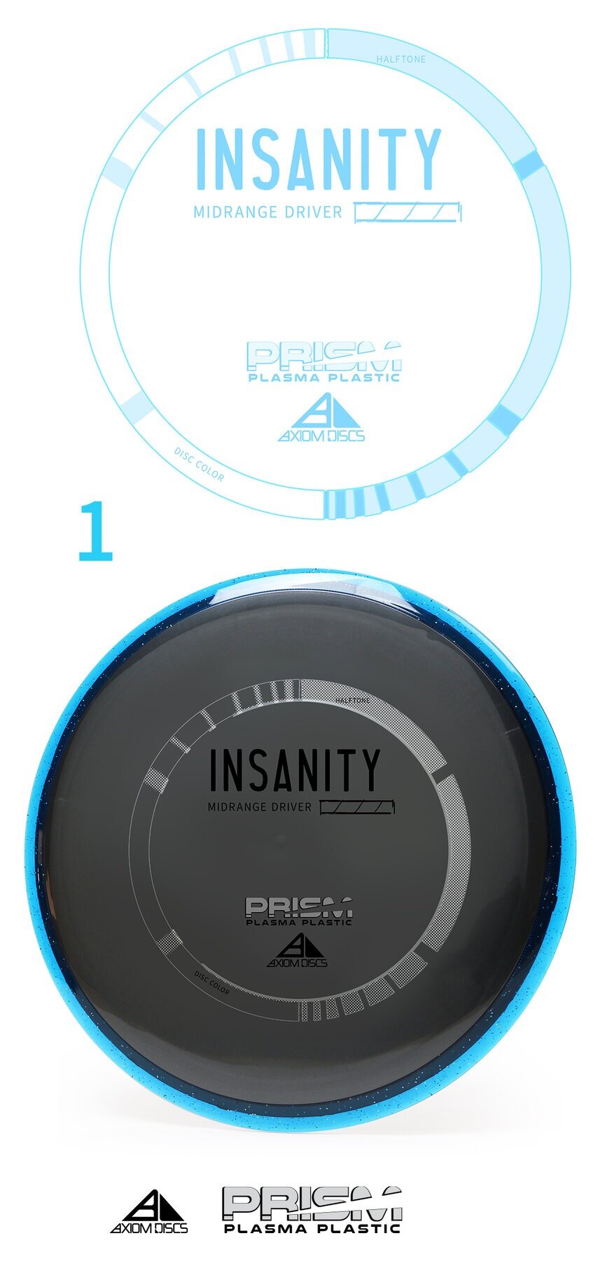
The Axiom Discs Prism Plasma plastic brings the shimmering beauty of a core fused with the luster of a candy-like Prism outer rim. In this development blog, I dip my toes into a few decisions that made me arrive at its current design. With pen and paper in my hand; the first thought was how can I get in and get out with the least amount of wreckage?
The plastic combination does the work for you! My goal was to create a non-intrusive 3 foil design that allowed the plastic to speak to the consumer. Axiom branding has dabbled in the Fibonacci sequence, DNA, flying machines and very artistic approach to high-level concepts. I centered this piece on simplicity. The ring uses to shape sequences that follow the 1,1,2,3,5,8,13,21 sequence. The design is duplicated and flipped on the opposite side. This creates this really cool halftone fill/ inverted look with the silver holofoil. Again, making this design bleed some of that beautiful, shimmering foil through. The 3 foils break down to Black, Silver holofoil for the ring and color transition holofoil for the Name/Prism logo fill. The font chosen to represent the disc name and flight numbers is Antonio. I wanted a font that was clean with a little bit of height to be legible from a distance.
All in all, sometimes the super simple designs take the most time. I’m glad we stuck to our guns on the outlining goals of this stamp art. It’s simply celebrating the look of the plastic and allowing a stamp to go along for the ride. It also looks really cool spinning through the air.