I’ve had the honor of working on MVP’s Holiday series for a few years now. We approached this project a little bit differently this year. The main gripe I have with holiday discs is that people are out of the spirit as soon as January. In a way, they feel novelty. We decided during the thumbnail stages that we wanted to create a stamp that has a little bit of holiday flare, but not so much that it’s overkill.
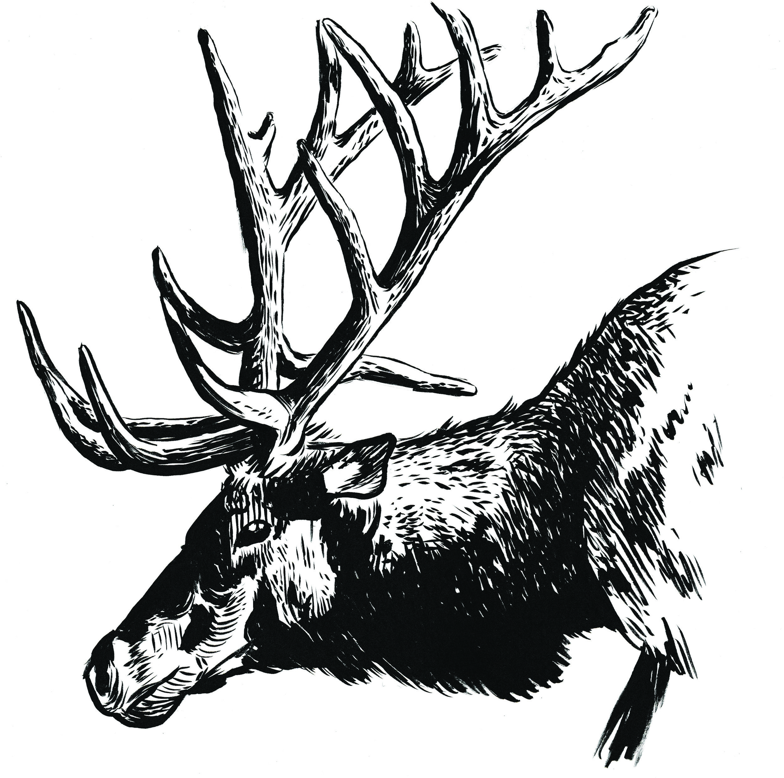
My initial design plan had this elk as a symmetrical stamp. Symmetrical stamps really help knock out details quickly and are pleasing to the eye. We decided that the shape of the antlers from the side really give this stamp some character. The single ornament hanging among his antler gives it that touch of holiday feel. The background comprises of flowing wind with abstract circular breaks that resemble snow. John Hafner is a photographer I discovered when trying to find some really good wildlife reference for this project. The way he captures light and subject drew me in. I feel strongly about using a reference if you don’t know much about it. You find more about certain things by comparing multiple images. Fur patterns, the way the antlers form, and can make out different details of musculature by viewing the same animal under different lighting conditions. His wildlife photos helped me immensely during the traditional stages. The last step before vector work was actually illustrating with traditional pen and ink. I used a Pentel brush pen on Strathmore Bristol board.
Breaking this design into 3 different foils was pretty easy this time around. I knew with the illustrative style of the elk and the fact that it’s being stamped on Proton plastic; I’d want something that would work with all different color types. After mocking up the rough draft on a blank disc, I knew with this amount of surface area coverage that some reduction of the design needed to happen. It helps lessen the load on foil stamping machines and makes the warehouse staff happy. I used a simple line fill technique. The far antlers make the elk feel almost 3 dimensional by allowing some of the plastic color through the design. MVP Disc Sports ran half of the run with the transparent shatter foil. The clear shatter glistens in the sun similar to a fresh snow. It’s a great nod to a snowy season. The other half of the run had the gold holographic foil allocated.
Let me know what you all think? Do you think going sideways profile with the elk was a good direction? Happy holidays, everyone. Thanks for reading.
2016 Innova Pumpkin Design
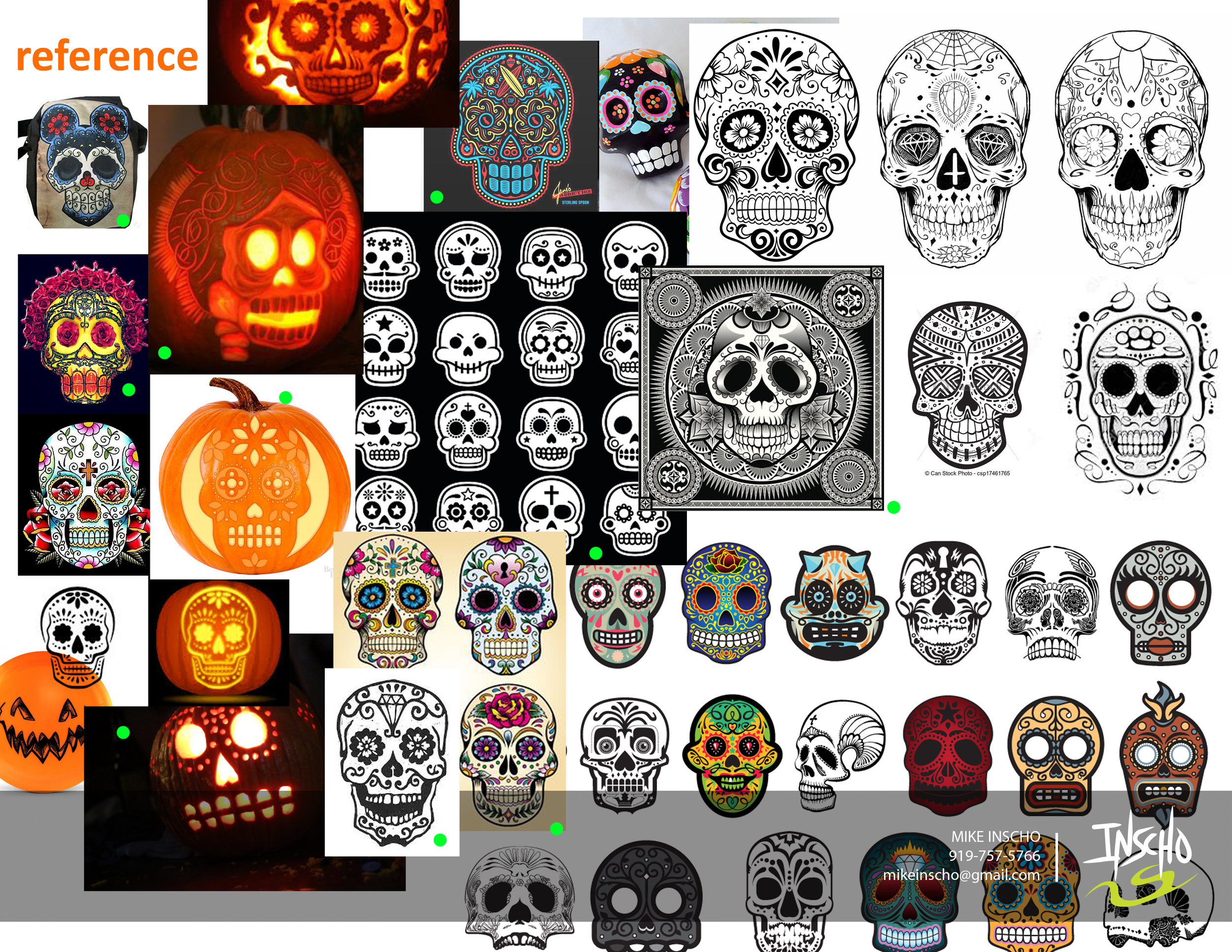
Every year since 1996, Innova Champion has put out an annual "Pumpkin" edition stamp for the Halloween season. Every year.. until this year, they've kept the theme consistent with the standard jack o' latern. After doing a first set of sketches and teasing a few skull designs toward the end of the thumbnails, Adrian Southern over at Innova mentioned the de los muertos theme and sugar skulls. So many possibilities and to give it a chance and see what comes out of the experiment.
I worked closely with Zeb Campbell and Adrian over the course of multiple revisions and options. The general consensus was the love of the bat wing basket. The challenge with this design was to incorporate the detail you see with common sugar skulls but keeping it simple enough where carving it could be believable.
Over the course of a few weeks, It led us down a few rough passes and we ended up Frankensteining parts of the final 4 to create one design. Here is 2016's Pumpkin Design. Thanks to Innova, Adrian and Zeb for having confidence in me to put something out against the grain. Hope you all like.
You can purchase them here: http://dgustore.com/index.php/specialty/holiday-discs.html


