The last opportunity I had to design an album cover was from Exeter's "Prolepsis" album in 2007. I was still in art school, still learning the many things about digital painting and one of my side kicks since, Adobe Photoshop. My friend came to me this past spring and wanted to know if I'd love to design their album cover for their upcoming album "Non Sequitur".
Non Sequitur: a conclusion or statement that does not logically follow from the previous argument or statement.
I learned quickly that the general sentiment of this album, vastly different from their first effort (hence the album title), was to express the band's strong libertarian leanings, and in particular showed an anti-authoritarian bent. The cover itself was intended to critique what the band sees as an overt and perhaps overly aggressive and reactionary militarization of American police forces. These are, according to the band, POLICY issues, not intrinsically policing issues. The first thing he asked was if I was going to be comfortable doing album art with such strong political meaning. My job as an artist is to give the client what they want. I wanted to push the bar a bit more than they were expecting. The design process took a little bit to finish but I'm glad they were patient and let me finish this for them.
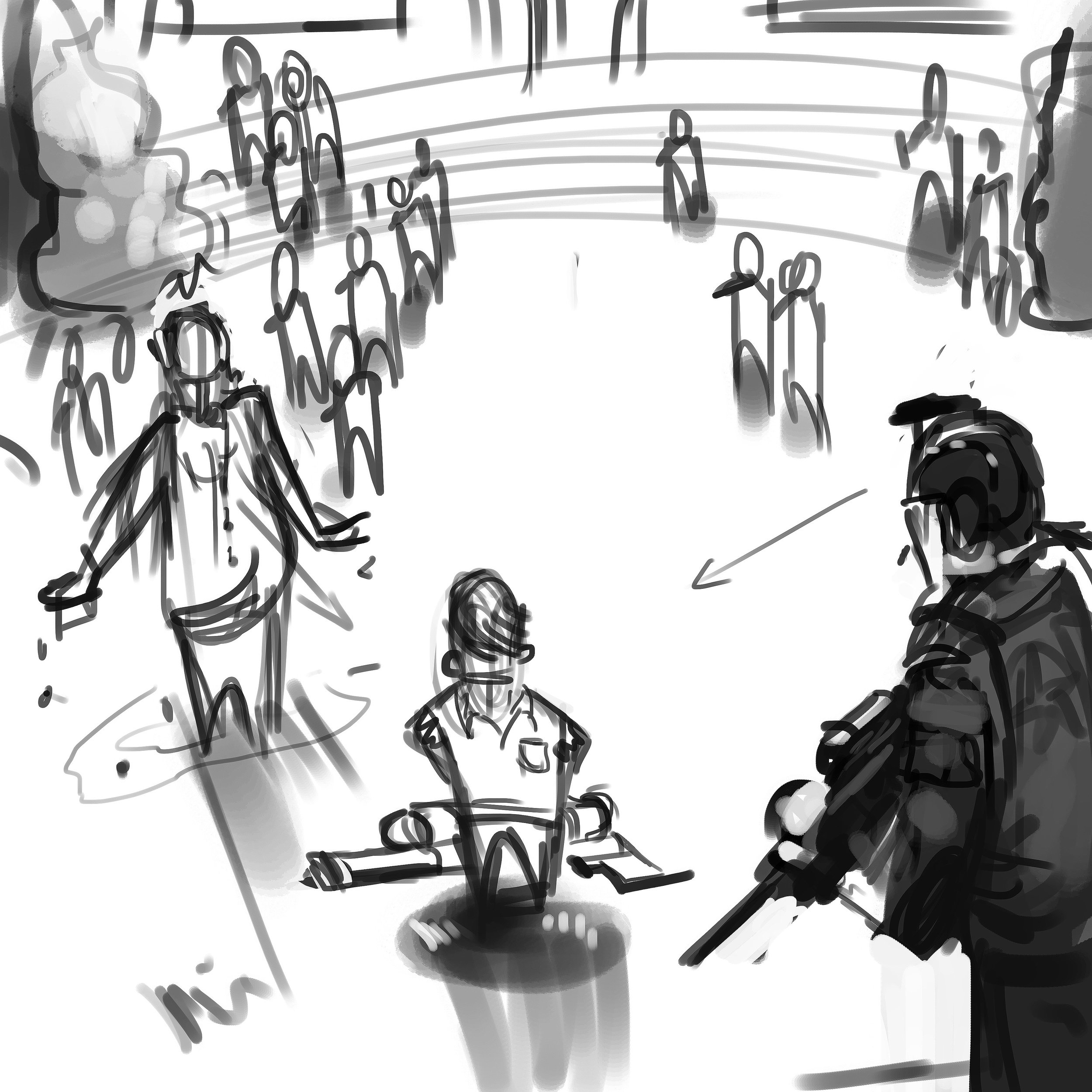
I experienced some challenges during this illustration. The direction was to show the protagonist/antagonist (depending on one's view) center screen with his class peers in uniform garb, looking on from a distance. It had to be clearly read that the kid only had a super soaker-like squirt gun. The victim, in this case a faceless administrator, had to be shown that he was dowsed in water and have them surrounded by a police presence. That's a lot to fit into one image. I focused on the kid first and came up with a composition that would work to facilitate everything they wanted in the main image. The background reference I gathered came straight from a school I attended from 4th to 10th grade. It's not meant to be a message to my hometown but the band wanted a rural, low key type of school yard setting. These older school that were built in the 40's-60's had a certain type of charm and aesthetic that I wanted to portray in the background imagery.
Working through a thumbnail to rough pass, I was able to show different angles and quick lighting scenarios to the band. The reference helped show the real world influence. It truly helps bring in a more accurate human element that would not of been achieved by purely relying on memory. Your memory can only remember so much and I urge other artists to always have reference. I can't stress that enough.
Halen, Luke & Dave, thank you very much for the opportunity to design this cover. You can purchase the album through these venues:
https://www.cdbaby.com/cd/exeter3
https://itunes.apple.com/us/album/non-sequitur/id1150069777
https://play.google.com/store/music/album/Exeter_Non_Sequitur?id=Blmytyabwcyqjolsye6ci4uzy4a&hl=en
https://www.amazon.com/Non-Sequitur-Explicit-Exeter/dp/B01M02LK8E


