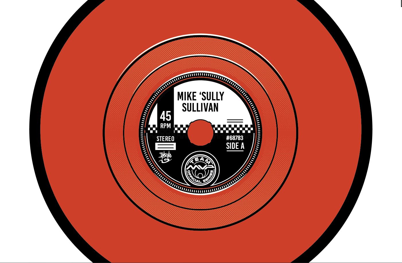
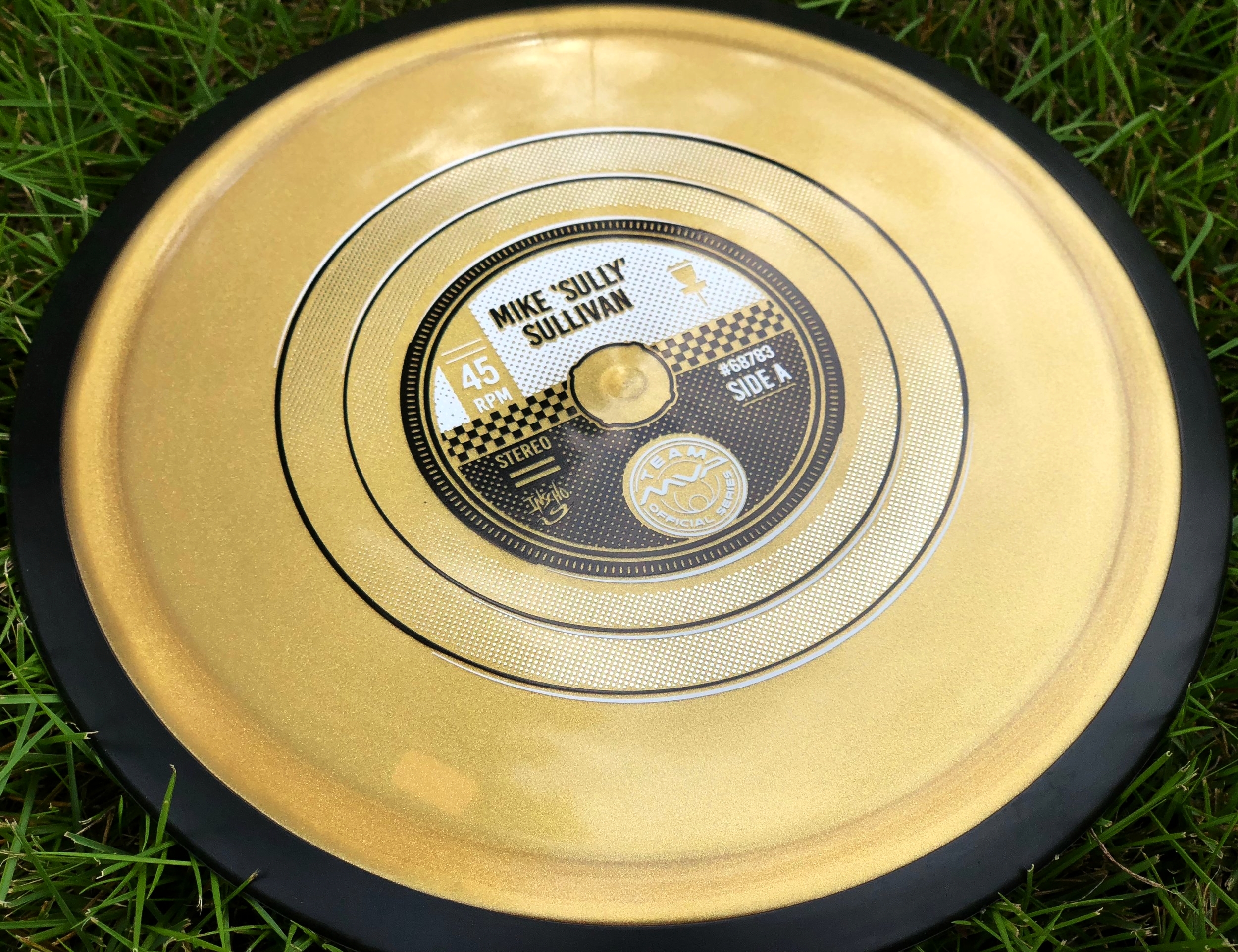
When Mike Sullivan of Team MVP approached me to do his Team MVP stamp, he was kind of giving me the reigns to come up with something. We chatted a bit over private message and our conversation led to music. Mike is a huge 70's punk/ New Wave fan. He also shares a common interest in vinyl. I've been wanting to do a record stamp for a while now and this was the opportunity to pitch it. Some of his favorite bands from that era were Crass, Joy Division and The Clash. My advice to upcoming designers: Talk to you clients! Make a connection. You just never know what might come out of it. I’m sure most people outside looking in had no idea Sully used to be an avid vinyl collector. I’m glad both and he and I were excited about pursuing this challenge.
Mike loved the idea and I quickly got to work. The hardest thing about doing this was that this needs to work on every disc color. Records are finely detailed and it would take lines under typical stamping requirements to pull off the sheen/ intricacies of the grooves. I had to plan smart and figure out a way that this could be possible, while also keeping it graphic and instantly recognizable. One common theme we both agreed on from the very beginning is this was before advances in colored label and surfaces. Most punk records were black and white or very simple graphically. I don’t know much about these bands so it was straight to google search to get some overall themes established. We knew that a full 12” record wasn’t doable with the center sprue being off limits. The next option was a 7” and if fit perfectly for what we were wanting to pull off.
The important thing about this stamp was breaking up the huge fields of black within the design. I used a simple halftone pattern technique to break apart the solid black and help ease up the overall tonnage for the stamping machine. One reference I found really fit well for placing all the information while mimicking the exact punk style Mike was aiming for. I had a blast working in a different style than past stamps. The initial plan was to use a clear holofoil for the record surface. MVP was out of that foil so they wisely went silver metallic and it worked out perfectly. It reflects the disc color and almost achieves the same effect we were going after.
Overall, I appreciate Mike Sully giving me full reign to run with it. I feel these bursts of excitement toward a project creates an overall better product in the end. Thanks everyone for tuning and and learning a bit about how I was able to pull it off! Share this blog if you feel so inclined.
Pounce
It's always a pleasure to help out some fellow Team MVP members with their tour fundraiser stamps. They're depending on a great stamp that will help them travel and tour to the biggest events out on the Professional Disc Golf Association (PDGA) National Tour. Jason Krueger hit me up to do just that.
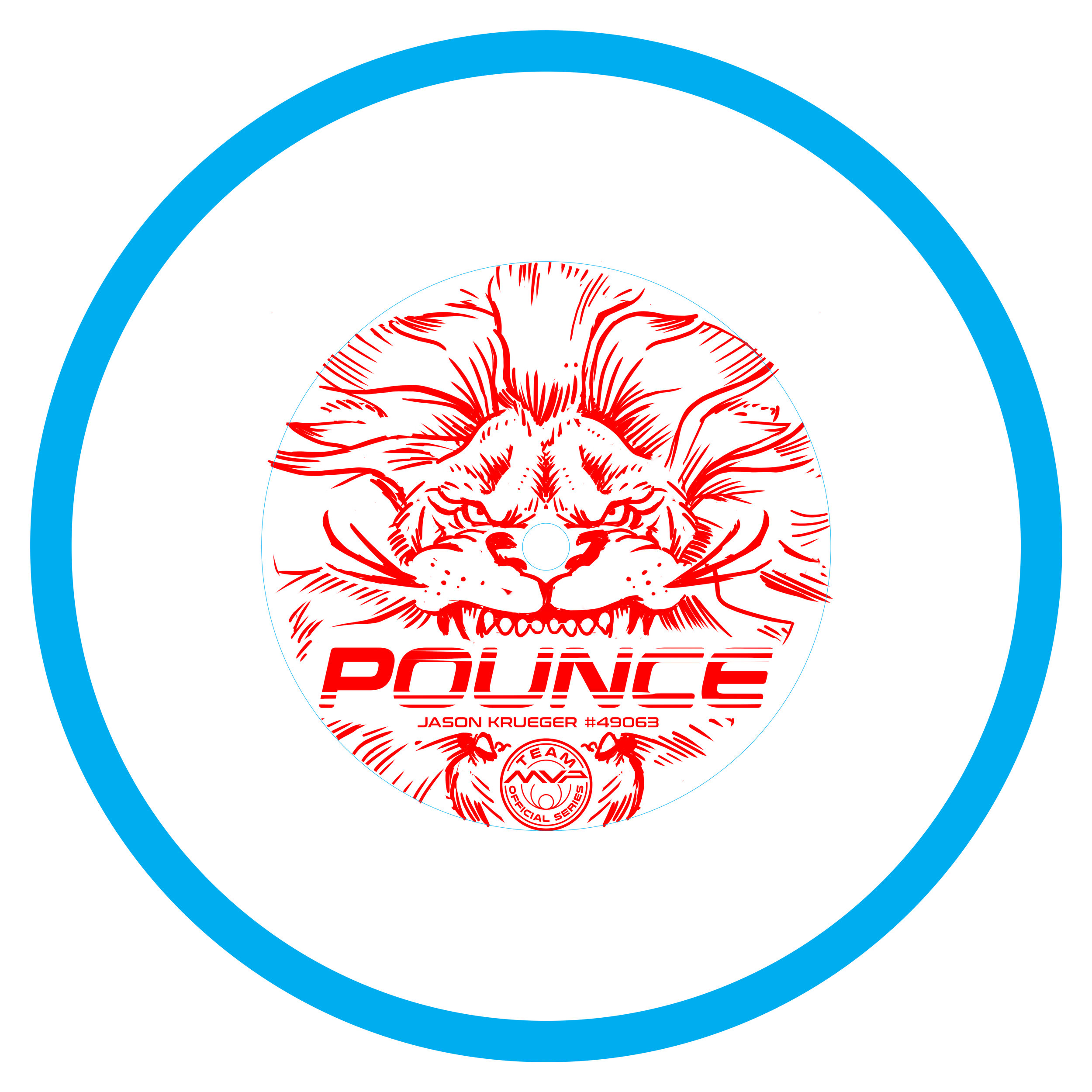
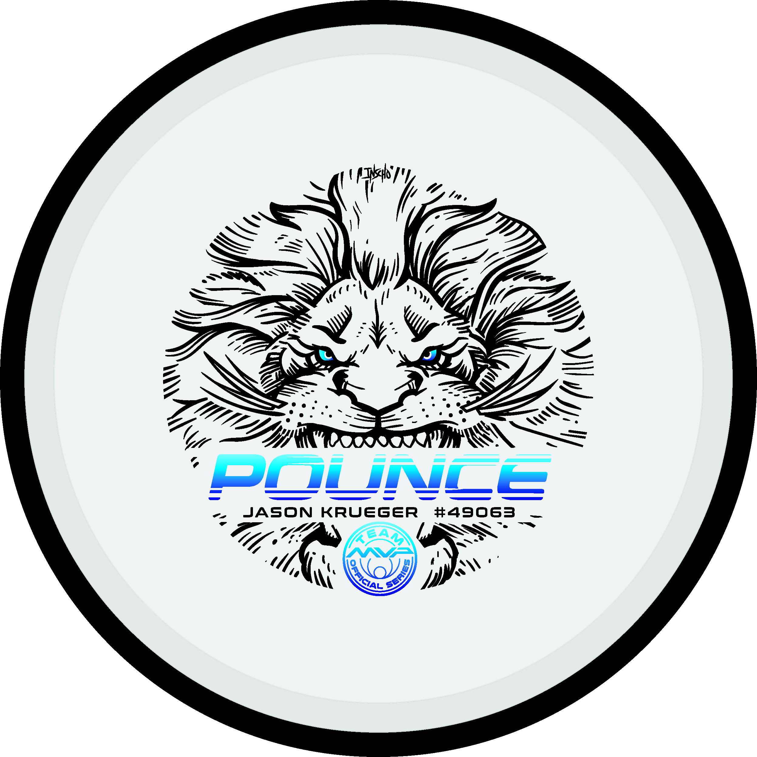
Jason has done a great job branding himself up to this point with his Pounce branding. He wanted me to create a lion stamp with Pounce text treatment in the mouth. I started by hitting the sketchbook and seeing what came out. This stage was all about exploring detail limits, size relationships and where the client valued one thing more than another. Jason was great at knowing what he had in mind. It kept the guesswork minimal and allowed me to hit this stamp fast.
Thumbnail was chosen and It's common for me to jump into Photoshop to start cleaning up line work. Something wasn't right. Leaving area for the center sprue was deleting detail in the nose that helps identify a lion. I went back to the drawing board and gathered inspiration/ reference to see where I could fix my existing image. I realized there needed to be a few things that needed to exit the stamp. The light rays behind the head was one of them.
Redrawing happens. Don't force something that doesn't feel right. The end result ended up being a mixture of a thumbnail I thought was too detailed and wasn't going to work. With the combination of elements and deleting away a bit of the detail, we had a winner. I want to thank Jason Krueger for his patience and confidence that I could deliver what he was envisioning.
have any questions? I'd be glad to answer them. Please leave a comment and share this post!
MVP Open-LE Resistor
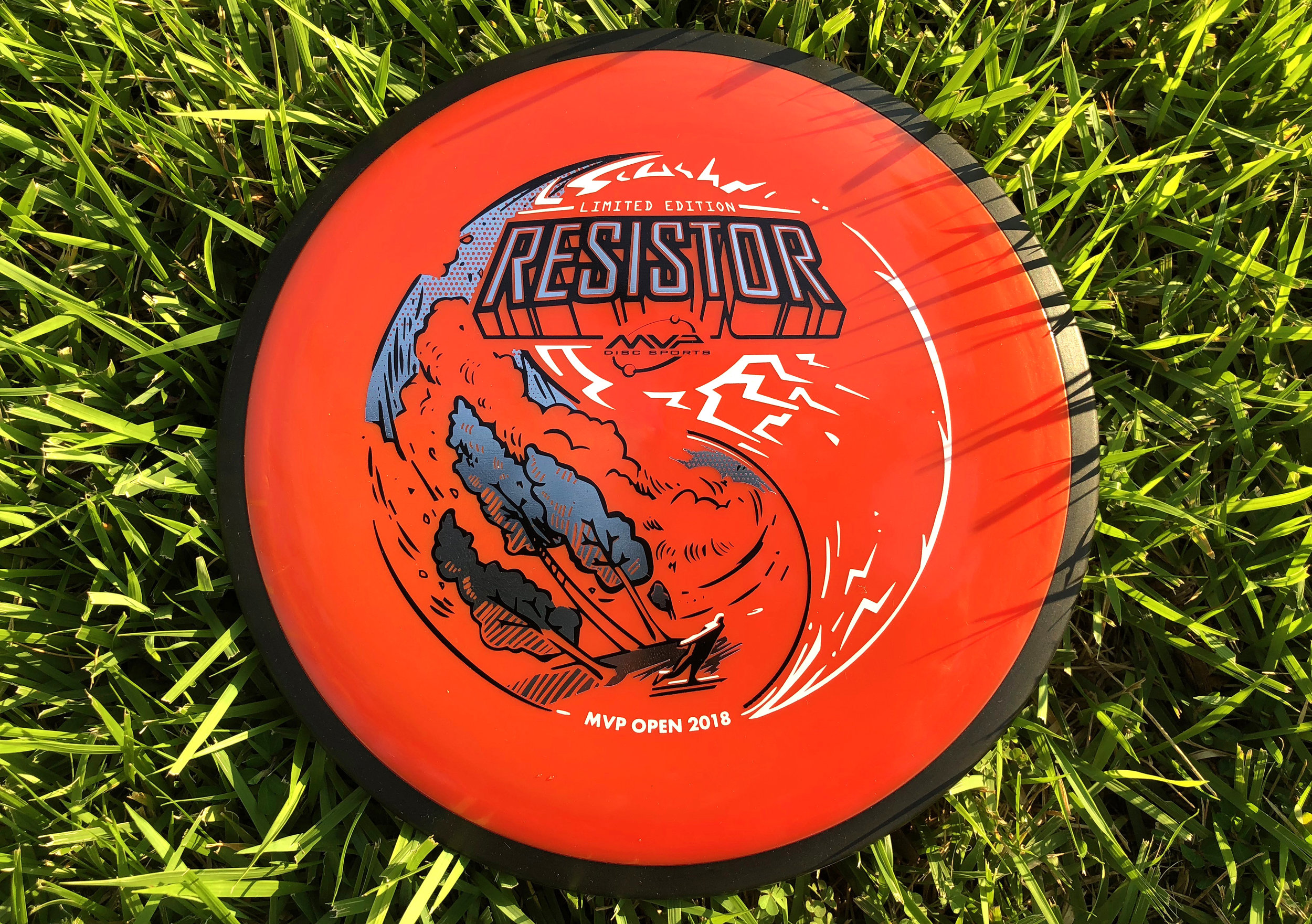
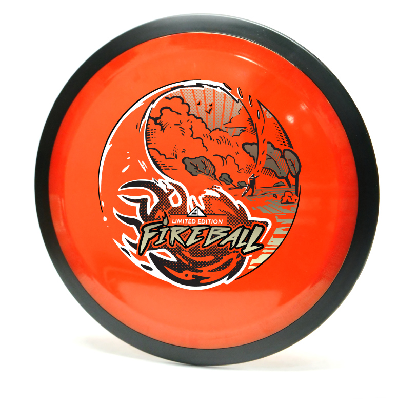
With the success of the MVP Open Pro side Limited Edition Fireball stamp, it was now time to turn my focus. The goal was to take the same general theme as the Fireball and create a triple foil stamp with the same visual appeal for the Amateur side of the MVP Open tournament. Since this disc will also debut in the same new "Firebalm" Plasma plastic as the Fireball, it should me for a pretty nice pairing.
Going into this design, the idea of inverting/ flipping of what was done previously, was brought up among the marketing team. I really liked that idea and ran with it. The Resistor is a widely used utility fairway driver that also has a lot of overstability (the typical flight of a disc that turns left for a right handed backhand thrower). Since I couldn't use the shot mimic'd in the first stamp, I have the disc golfer throwing a typical backhand hyzer that follows the overall circumference of the outer edge of the stamp.
The Fireball had it's font treatment on the bottom of the design, I also wanted to change this up as well. For the Resistor wording on the top portion of the design, I would design that area to act as if the circuit board and different pathways connecting itself to it. As I continued to layout out the circuits and pathways, it felt flat. I switched gears toward the end and made the call to work around the Resistor typeface and create bolts to simplify.
All in all, it was awesome to continue a theme from one Limited release to another. That's a first for me and hope everyone digs it. Thanks so much for stopping in and reading about this design. The MVP Open was a huge success and I can’t wait to see what next year brings for MVP Disc Sports.
Great 8 - 20th Anniversary
The 20th Anniversary of the Great 8 disc golf tournament was among us! The Great 8 encompasses endurance, grit and sure will to navigate and play 8 disc golf courses in ONE day. It's a grueling but rewarding endeavor. I was asked this year if I could do something to commemorate the achievement. I didn't have much time to work with but I knew a few things:
• Keep it within the marine/animal subject I've been doing the last few years (except the Fibonacci stamp)
• Involve "8" somewhere
• Serpent-like
• Involve both doubles partners into the stamp somehow
Going into this stamp, first thing I had to do was figure out how in the heck to fit 8 hydra heads on one stamp without clogging up all of my space. That in itself was rather difficult, to say the least. I probably spent 6-8 hours with my sketchbook mapping out different solutions. Either quick gestural flow mock ups with heavy line weight from the brush pen or continuations and ideas I couldn't shake. It came down to indecision. I wanted in my mind for all of these to work and be successful. I took the battle scene and a few others a bit further into Adobe Illustrator. Knowing what I had in my head was a bit clearer than what was sketched out, I wanted to give them an honest chance. Receiving real honest critique and suggestions may be hard for some people. When it's offered to me, I'll listen.
Backing up and restarting isn't easy. It's happened quite a few times in my few years of doing stamp art. Sometimes you just have to trust your gut and not try to force anything. The end product came out amazing and I hope the attendees appreciated it. I want to give a huge thank you to Jay Pontier and Capital Area Disc League for giving me another shot at this.
2018 Amateur Worlds
2018 Amateur Worlds are here! MVP Disc Sports has partnered up with Am Worlds to produce a limited run of prototyped Prism Insanities. Prism is a concept teased last year where we run a translucent rim and core. It sure looks like a million bucks and I think people will be stoked to have one of these.
Going into this design, as a team we knew we wanted to shed away from the norm. A typical layout for the host city would be a skyline shot somewhere within the design. I wanted to play off of where Charlotte got its name. I scoured the internet to find this article written by Tom Hanchett explaining the birth of the City:"King George III still ruled the Colonies when European settlers chartered the town back in 1768. They named the new hamlet after the King's wife, Queen Charlotte, and gave the surrounding county the name of Mecklenburg in honor of her majesty's birthplace in Germany".
From this bit of information I stumbled across a pastel portrait of Queen Charlotte created by Francis Cotes. It was this portrait that sparked the idea of meshing new with old. With her finger so eloquently pointed up, I thought it would be a great idea to have her spinning a disc.
The Dogwood being our state tree and the Laurel on the left signifying the spirit of competition. Designating the 3 different foils was tricky. Since this was to be stamped on a Proton core, you have to pay attention to how much surface area you're allotting and how much light penetrates through it. Too many marks creates a thick and messy appearance when the stamp is in low lit areas.
You can pick up one of these beauties at the MVP tent at Amateur Worlds in Charlotte, NC. Quantities are limited!
MVP Open Fireball LE
I loved everything about working on this project. You go into the thumbnail process thinking that something like what you did could never work or not be as good. During our initial staff meeting, I was able to show a few of the thumbnails from my sketchbook. The vast majority and better reaction was to the yin yang design. I'm glad I've got great people to rely on and encourage me to take that idea a bit further. The other thumbnails were worthy enough for possible future expansion so I can't show them, unfortunately.
The shot is called an underhand thumber. It looks rather painful but a shot that does exist to get the player out of an unfortunate spot. I found the shot through an old throwing clinic video on YouTube. I watched the flight and thought it would fit perfectly (with a little bit of modification) to that of my yin yang concept. I think the dynamic of the fireball crashing toward the foreground is why this was a success. Last thing I want to mention about the design is the spacing of the the heavy items of the stamp. The Fireball text and ball itself are pretty heavy. I consciously wanted that weight balanced so I gave the sky a full foil with minimal spacing for rays and birds in the sky. I think the balance worked out well!
The Limited Edition Fireball design is a tour fundraiser for the Disc Golf Pro Tour. The MVP Open will be at Maple Hill Disc Golf Course located in Leicester, Massachusetts. This event brings some of the world's top players and will be an exciting time. If you're in attendance, there may be some left at the Maple Hill Disc Golf store.
Robokitty
As the disc golf season starts, I often get the opportunity to help disc golfers fund their season long ambitions. Amanda Melwiki approached me with a rather interesting design idea for her tour series disc. She says to me:
"I’m thinking a cat but I want pieces of him to be missing and under he’s a robot"
"you might have to get a bit girly too..."
Amanda was rocking a dubstep tune by Excision called "Robo Kitty". The idea came to her that with her love of felines and an appreciation for this track. The idea was worth exploring. With those beginning ideas and rules now set, it was time to get to work.
Reference Sheet
I began with a pretty extensive reference sheet. Drawing cats is not my strong suit. So getting as much anatomy and idea reference as possible will help me and the client understand what direction this idea could lead to.
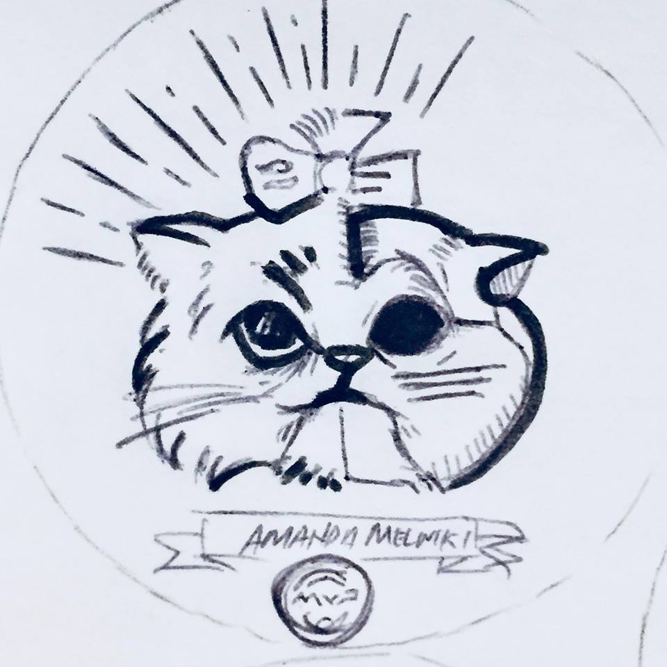
The challenge with this design was clearly "How am I going to mix a kitten with its face missing in spots and keep it cute?" I tried a dozen or more sketches. We both arrived at the idea of introducing more foils to the design and splitting the concept straight down the middle. It allows both sides to have a clear representation while not overcrowding/ overcomplicating the design.
First crack
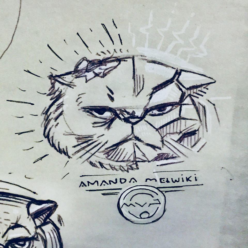
Here is the very first go at it mixing feline and robot/cyborg properties to her. You have to start somewhere. I'm exploring the Persian kitten because of the well defined face features. They're adorable kittens and well renown.
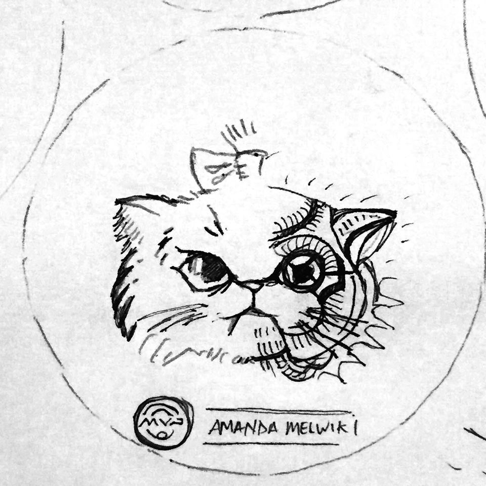
Bad ideas out of the way! It's rare that the first drawing you ever do for a project sticks. The upper left persian grumpy kitty stuck out to both of us. Now it was the task of mixing the robotic properties and adding a bit of cuteness. The idea of the split came from this initial Pinterest board Amanda had created to get some ideas flowing.
Fork in the road
The idea of the split came from this initial Pinterest board Amanda had created to get some ideas flowing. You can see I took a liking to the idea of doing a split down the middle like the left side example.
These roughs were made knowing that split was going to happen. The next stage was figuring out how the robot side of things were going to look like. The great thing about this is I'm still in a traditional mindset and pumping out quick ideas on paper. Nothing is digital yet so those options can be explored rather quickly. As you can see from the sheet, some of these ideas (especially dealing with the eye socket of the kitten) got a bit dark/ or away from cute. Toward the end, I was able to reel it back in and experiment with the rays/electric bolts surrounding the Robokitty head.
Amanda was excited and loved the roughs. It was now time to really finalize the robot side of Robokitty and get this stamp finished for her. Main things that needed tackling were how the two hot stamping foils were going to be split up. Would I do the left side in black..and the right side of the kitty in pure secondary foil? It took a few mockups in photoshop to determine what I was going to do in Adobe Illustrator.
Final Mock Up
I like to create a splash image for my clients to use to get the word out. During this time between file submission and receiving product, If they want to tease the notion of what's coming, I leave them the option to do so.
I'd like to thank Amanda Melwiki from Team MVP for being so engaged in the process. She helped gather references she was drawn to. She was quick with feedback on every draft I sent her. Robokitty was a challenging task but she made this project fun. I'd also like to thank MVP HQ for giving this dual foil stamp what it needed. They did an excellent job using accent foils that really fit Amanda as a person.
Hyzerbomb-Mortar
I was reached out to by the owner of Hyzerbomb Discs to create a special stamp for the attendees of the Nick Hyde Memorial. This design was going to be on Swirl and Glow "Mortar" discs found in their players packs. While military and pre-production experience is a huge plus, I can't stress enough how much reference gathering plays an important role in the final image.
I've had my share of firing .50 cal's, M249's and M203 Grenade launchers... Mortarmen require a special ability and something I never trained in. After doodling out those initial ideas with the poster reference in mind; I took to YouTube to find footage of a Mortar team working in harmony and really got to know an outside looking in view. I found a great video reference "Mortars Fly in the Hills of Ft. Carson" and knew this would be the center point of the design. A loader took a pause with a mortar shell primed with a cheese charge. I instantly thought: "Whoa.. who does that? This dude is a bad ass!". It gave me that same type of feeling that the poster did and worked a bit better because he's somewhat in a pause before firing the round. For stamp simplification, I chose to show the loader. This idea felt straight forward and could be easily understood by people who know nothing about mortar firing and or history.
Lastly, I chose to chisel him up a bit. Create edges and bold, sharp angles to show a more aggressive vibe. I kept shading pretty even and clean to pair with the overall style of the stamp. Smoke in the background clears out a bit of business to frame him up in the foreground.
All in all, seeing the reactions from Nick Hyde Memorial tournament goers and from Matt Siri is what it's all about. I want to give a huge shout out to Hyzerbomb Discs, their supporters and everyone who signed up for the Nick Hyde Memorial. It was a great pleasure being able to do a military themed stamp.
Unique Hyzerbomb Mortars are located here while supplies last:
http://hyzerbomb.com/pro…/swirly-frontline-mortar-mortarman/
Schrocktopus
With the 2018 disc golf season among us, it was with great excitement that the first tour stamp of the year leaned on my love for the octopus. I was given pretty much open freedom to come up with a stamp for Tyler Schrock of Team MVP. "Schrocktopus" is his nickname, so we ran with it.
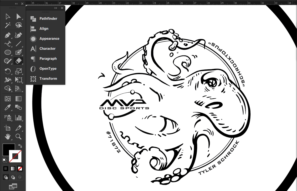
Going into this project, My focus was on giving Tyler Schrock the real estate I thought he wanted. I went to the sketchbook and used the octopus within his name plate. The ideas resembled something he could take and use on other applications or patches. The feedback I received from the thumbnails surprised me a bit. While most Tour Discs have the sponsored player either written somewhere in text or with a signature; Tyler didn't want that. He wanted his stamp to focus more on the art and his nickname. Going into the rough draft, I had a pretty clear picture of how this artwork was going to finish out as. There were last minute changes that needed to be made, though. It's a valuable lesson on logo use and the end solution was to insert the official Team MVP seal. It replaced the MVP "Orbit" logo from the initial final. The stamp lost a little bit of playfulness (in my opinion) but I still think it came out great!
It was a pleasure being asked to work on this for him. Contact Tyler Schrock through this link for inquiries on availability.
Limited Edition-Streamline Pilot
I received a task to assemble a Limited Edition rendition over a short period of time. A Limited Edition run refers to a design that has a specific number of discs available for purchase. MVP Disc Sports Headquarters usually runs a thousand of these designs and then retires the stamp art.
I knew that one day, whether it would be for my employer or as a separate release through my freelancing opportunities; this idea was going to happen. The short film called "Paths of Hate" by Damian Nenow had a renown affect. I remember watching this film for the first time and being so taken away by the sheer beauty of the clouds and flight of the planes. The look of the film was rather inspirational as well. Another huge influence was the "Aces High" art created for Iron Maiden. With these two fantastic references and a nice sheet of helmet and stylistic goals, it was off to the races.
The only challenges were the hands, yoke and overall look of the pilot. I scoured through countless old war plane movies to help improve the drawing overall. The way the thumb pads are putting weight on the triggers from my initial drawings, was the reason I left them be. In the "Aces High" example, the thumbs are exaggerated; as if "Eddie" was quickly willing to fire. I feel they were an important part of the story but the main focus and action lines went more toward the pilot's piercing menace. Halftoning is a popular method of shading using one color, but sticking with clean heavy to light parallel lines kept the overall design less chaotic. This method also allowed me to take focus on the curvatures of the hard surfaced elements. Goals for the look of the fighter pilot were to mix old and new. Keep the overall style clean with a slight retro feel to it. The use of initial symmetry in the vectorizing process, helped keep this stamp balanced. In the end, I actually really like and recommend this disc to players. That enthusiasm and the chance to create a limited edition, really helped me pull through to get this stamp ready for production.
These are available online on April 20th from most major MVP and Axiom retailers. What do you all think? Please like, share this with your friends and comment!
Nailed It! Disc Golf - Custom Hot Stamp
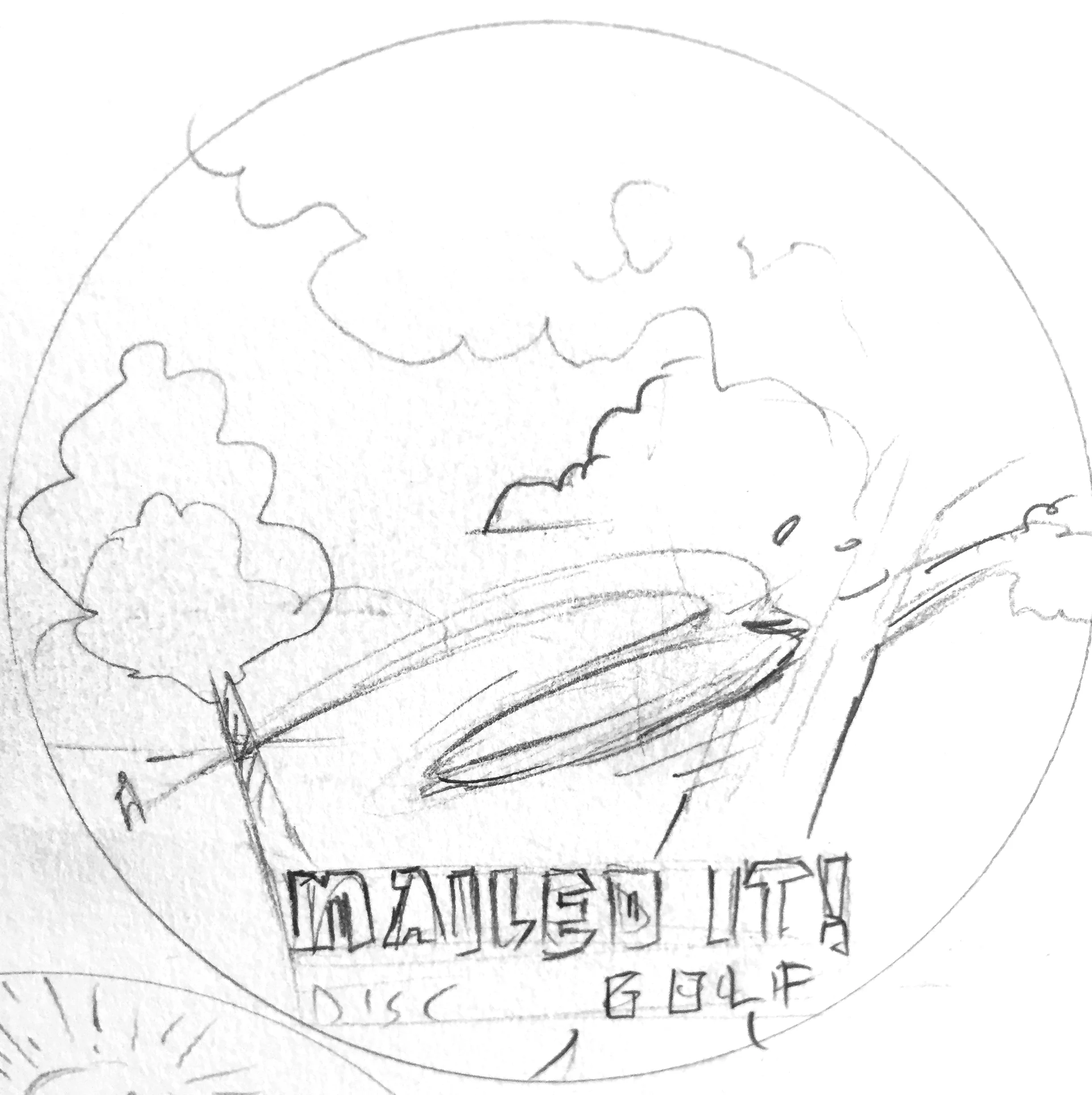
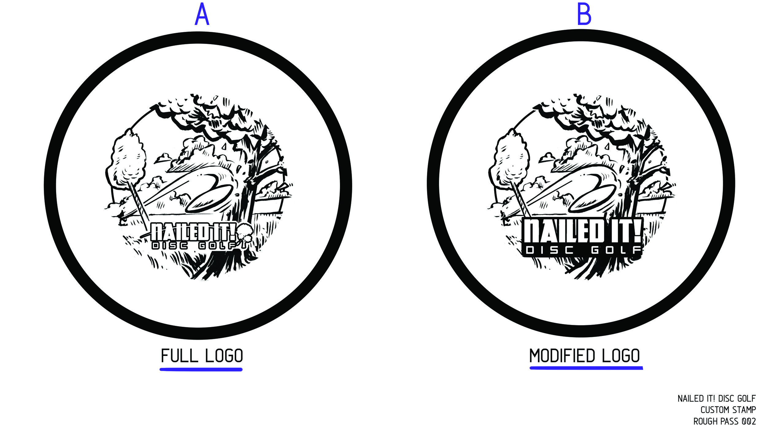
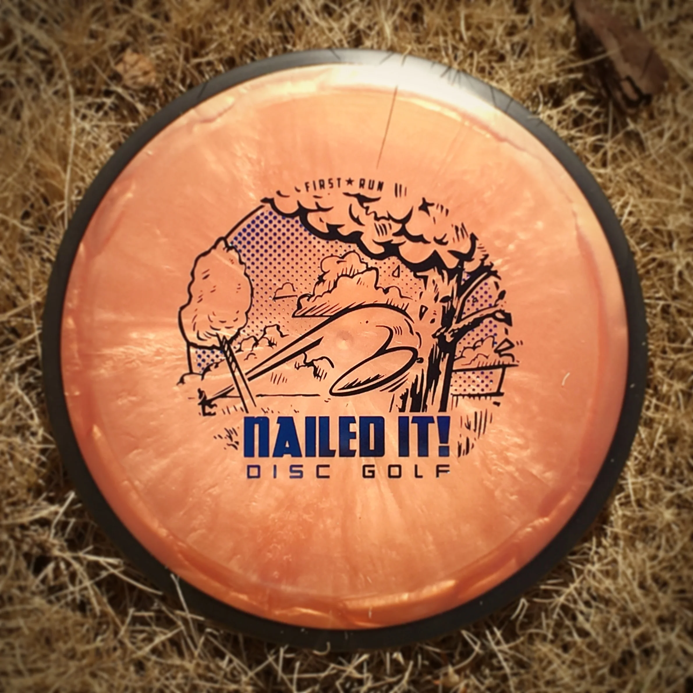
I was approached by Brad and Jenna Tritten from Nailed It! Disc Golf store out of Weston, Wisconsin. One of the best clients are the ones who see your strengths and let you have creative freedom to hit the sketchbook and see what sticks. Going into this stamp, I wanted "Nailed It! Disc Golf" to be priority one. This kind of 2 foil concept worked well for previous Solitude Open stamps so I translated it to their idea.
The original Nailed It logo includes a disc flight path and a tree to the right of the typography. I felt extracting that from the logo and developing a stamp along the lines of a disc golfers nemesis. Tree's seem to be something even the most skilled disc golfer can't always escape. I felt like this idea would resonate with most disc golfers. The plan was to keep the illustration in black/ base foil and allow their logo shine with the second metallic foil. Toward the end, I felt a soft gradient could really lend itself to different colored foil options for the hot stampers at MVP Disc Sports, Headquarters. This stamp was also run as a single foil offering for Dynamic Discs, Latitude 64 and Westside disc options.
I want to thank Brad and Jenna of Nailed It! Disc Golf for their patience and overall positive attitude throughout this entire design process. Everything from stamp creation to help with embroidered patches. It was one of my favorites from 2017. What do you all think? I'd love to hear your initial thoughts and reactions in the comment section.
You can purchase these discs and various items at their website!
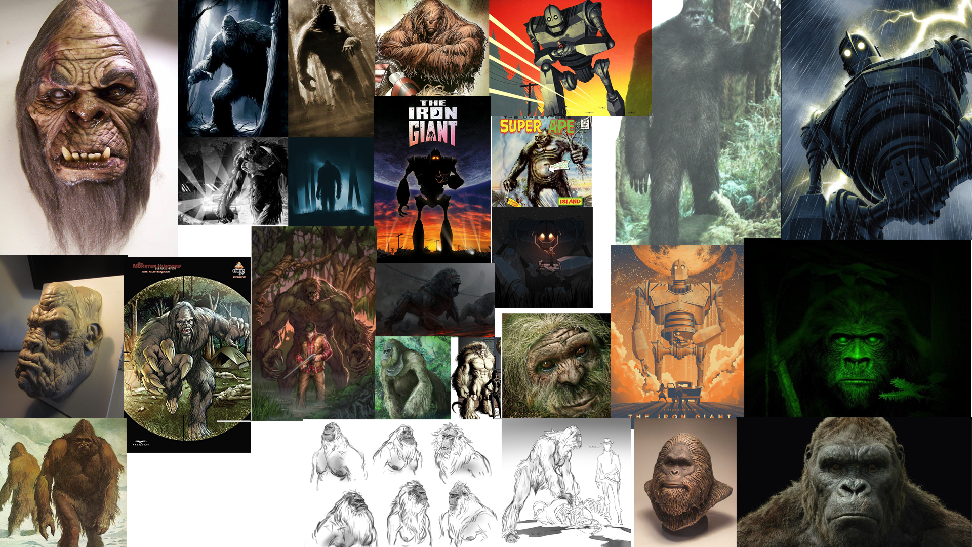
Out Of Bounds #2 - Sasquatch
Here's the 2nd installment in the Out of Bounds Series! I've partnered up with Brian Sweet to venture deep into the woods with this one. The first installment was a Kraken theme where the disc golfer perched on top of the cliffside went for the putt. Brian puts it so eloquently:
"What lurks in the out of bounds when playing disc golf? A whisper in your ear, the electricity of your hairs standing on the back of your arm. You can feel your heartbeat all the way up in your neck as you are frozen in fear"
Going into the second design, our initial idea was to have a towering sasquatch camouflaged into the tree line. The disc golfers would have no idea that this giant gargantuan of a beast, looms overhead. This idea did have its challenges.
The first challenge was scale. To have this beast towering with the treetops dismissed the typical size of a Sasquatch. What really is the size of one of these beasts? My gut reaction and typical approach, when faced with this decision, is to go big! So initial sketches showed the scale I was hoping. As you can see from my rough ideas, blending the beast into the wood line left a lot of opportunities off the table. Typically, a person dominating a scene in a film has the subject taking priority in the shot. To make it this rule effective, I needed to scale the Sasquatch above the tree line.
In the end, you see that we changed course at the last possible second. Sometimes grinding on a design is an indicator that it just isn't working. Sasquatch dude felt more like "King Hippo" from Mike Tyson's Punch-Out!!. Bending the main character over made it felt like he was engaged in the scene. Taking some of that chunk out of his frame and choosing Sasquatch identifiers helped sell the idea. His giant hand shadowing over the poor soul who has no clue, and the chain necklace of his most recent winnings, really made the scene. All in all, I'm really happy on how this second installment turned out. I want to thank everyone for their support with the Out of Bounds series. I look forward to the next one! ...whenever that might be. To keep in the loop, join this Facebook group for all "Out of Bounds" news related items!
https://www.facebook.com/OBdiscgolf/
USDGC Hole 5 Collector Roc
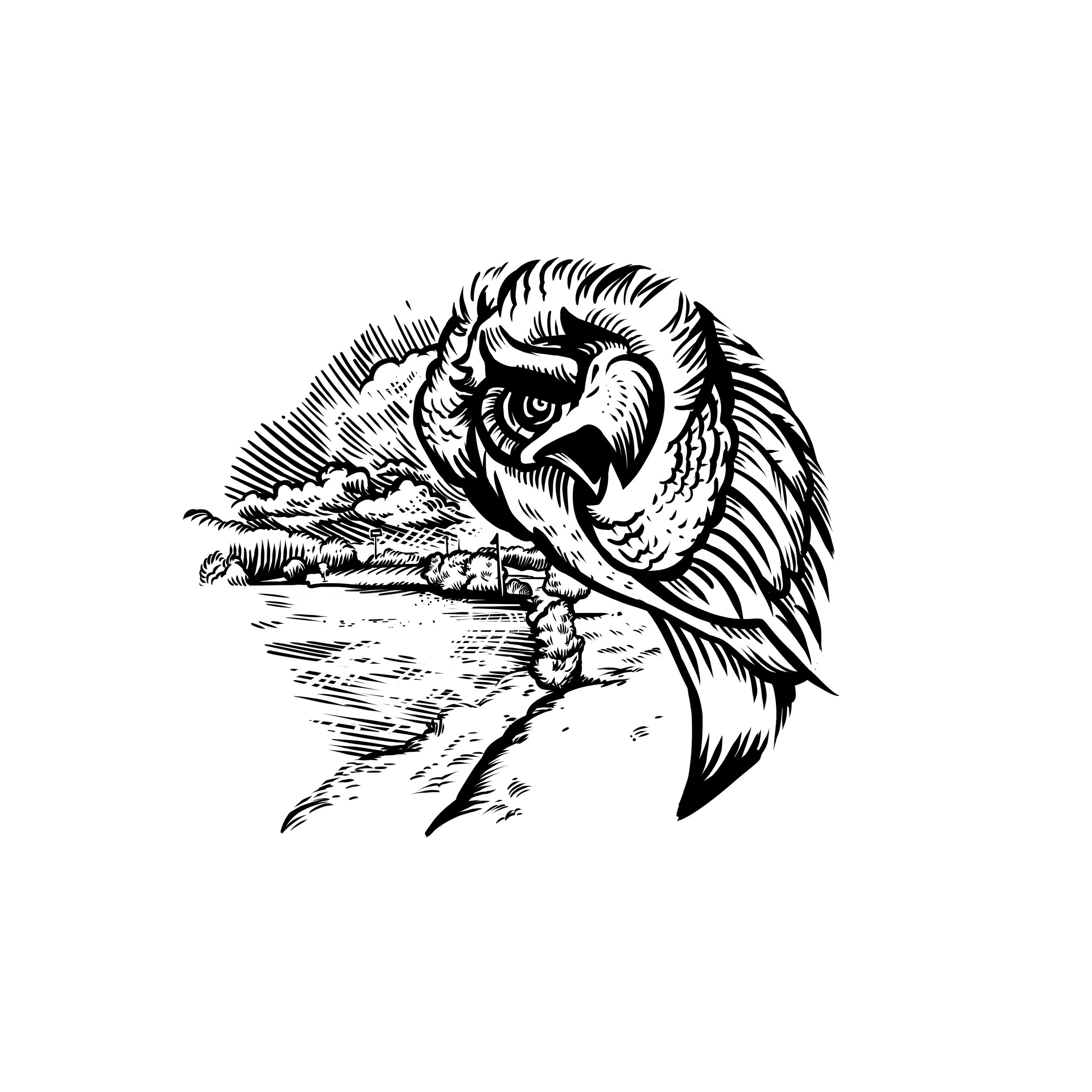
Continuing from last years United States Disc Golf Championship (USDGC) run, I was offered the chance to design a stamp to help fund-raise for the 2017 USDGC in Rock Hill, SC. The event is one of disc golf's best displays of competitive play in the world. The first objective in mind from Adrian Southern of Disc Golf United/ Innova East was to create a design for the Thrower Roc release. The goal was to create a flying Roc bird in a yin yang shape. Both flying dynamically and in harmony with each other. As you see from the thumbnails, I couldn't quite get something that felt right. Most ideas were either too cropped or too busy. After the thumbnails were drawn and ideas started manifesting, these ideas expanded into a USDGC collector Roc piece.
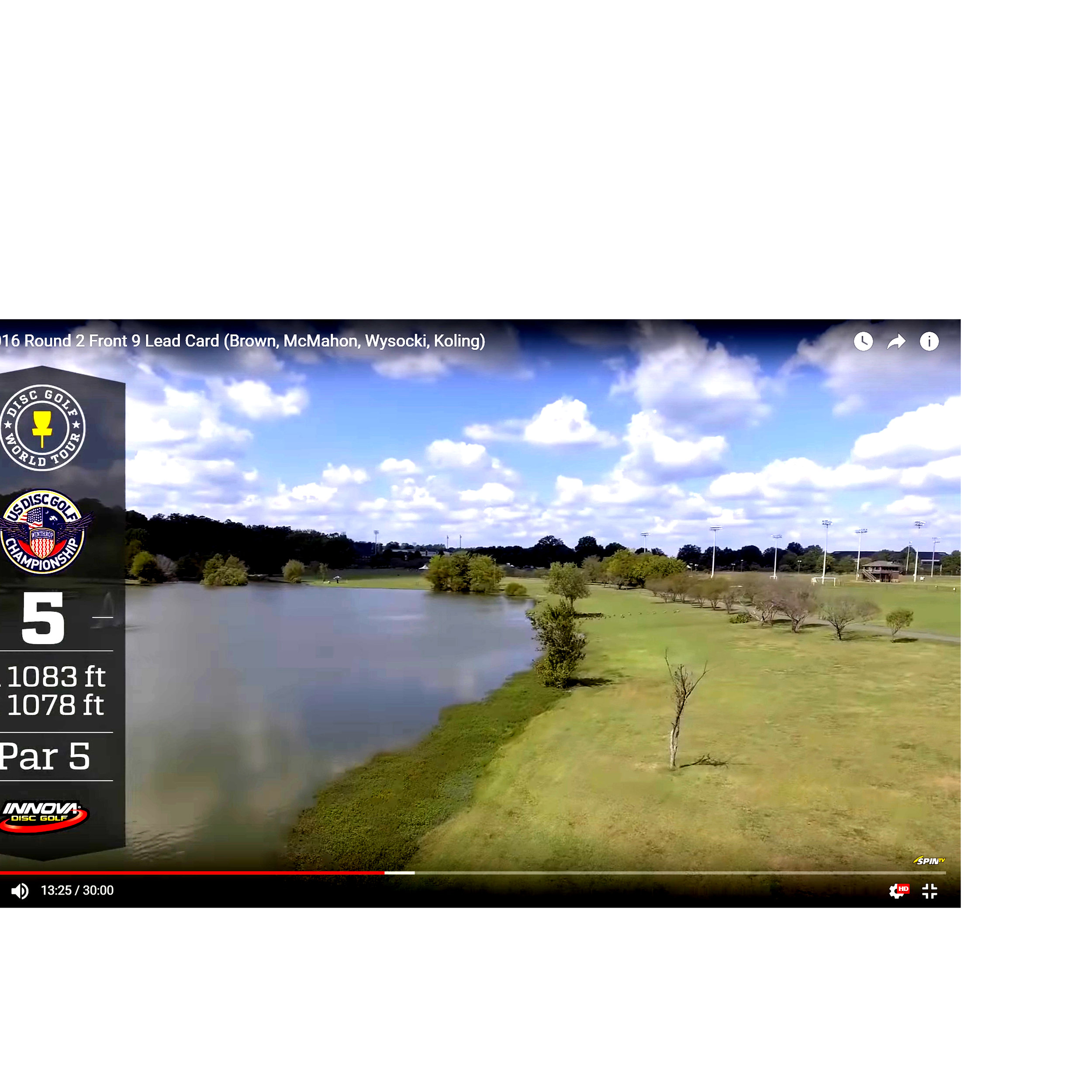
Ideas come from everywhere. At this point, I've already spent some hours combing over what I could do with a yin yang shape and wasn't too fond of the results. I stumbled across a vulture tattoo design from Mike Moses of Spiritus Tattoo in Columbus, Ohio. This piece really got me fired up. The stance, proportions and overall shape really filled in the pieces perfectly. It was my job to use that inspiration and get this stamp back on track. As you can see from the start and then more toward the end, I experimented with that outward protruding chest, neck rotation and feathers. I wanted movement on each side of the design. So I directed the movement with the S shape of the yin yang. Adrian and I both talked about doing a showcase hole design last year during this time. This was the opportunity to do that. So the left side displays the monstrous Hole 5. This hole sits at 1083ft and is a par 5.
I want to thank Adrian and crew for being patient while this idea sort of manifested itself along the way. The end result was able to capture the USDGC hole tradition with a twist. What do you all think? I'd love to hear your thoughts in the comments.
Special Edition MVP Limit
"Push it to the limit"
The MVP Limit is a 24.5mm High Speed Driver designed to be the fastest, most overstable disc in MVP's entire line up. My Art Director, Zachary Kelbaugh laid out a pretty good description to start planning behind:
"We talked about the conceptual intersection for the name... being the fastest, most overstable disc -- and the class as a whole refers to space travel, with the speed of light being the theoretical limit for speed in the universe. "
I had an opportunity to bust out my love for everything 80's. I changed into my jammer shorts and pulled out the 80's action playlist on Spotify! Getting started on this didn't take me much time at all. The initial idea was to mimic the typical action movie posters of the time (Rambo, Over the Top, Big Trouble Little China). Heroic character posed in the center with explosions, and commotion happening behind him/her. I even went so far down the rabbit hole and stumbled onto some retro-futurism which was really neat. None the less, for the scope of the project and how the release was playing out, We went with a retro-wave direction into the rough and final stages. As a team, we felt like keeping the design clean and tech felt more MVP without crossing into the Axiom Discs branding.
In the end, there are some things that you all aren't getting a chance to see. There were some really solid ideas in the thumbnail stage that just might poke their head up when a new project comes a long. A little bit out of my comfort zone but it takes experimentation like that to really grow as an artist. I hope you all enjoy. You can pick up this special edition and a bunch of online disc golf retailers.
Warrior Transition Battalion-Stamp
Christopher Altman, a fellow Cary Area Disc League member, approached me to offer him some help. He wanted to host a tournament to get soldiers involved with disc golf. To do that, he was going to organize a tournament for the Warrior Transition Battalion (WTB) down at Ft. Bragg, NC. The overall goal of the WTB is to provide the commensurate quality of life, quality of healthcare services and quality of leadership which matches the quality of service and sacrifice made by our sick, injured and wounded warriors in transition and their families.
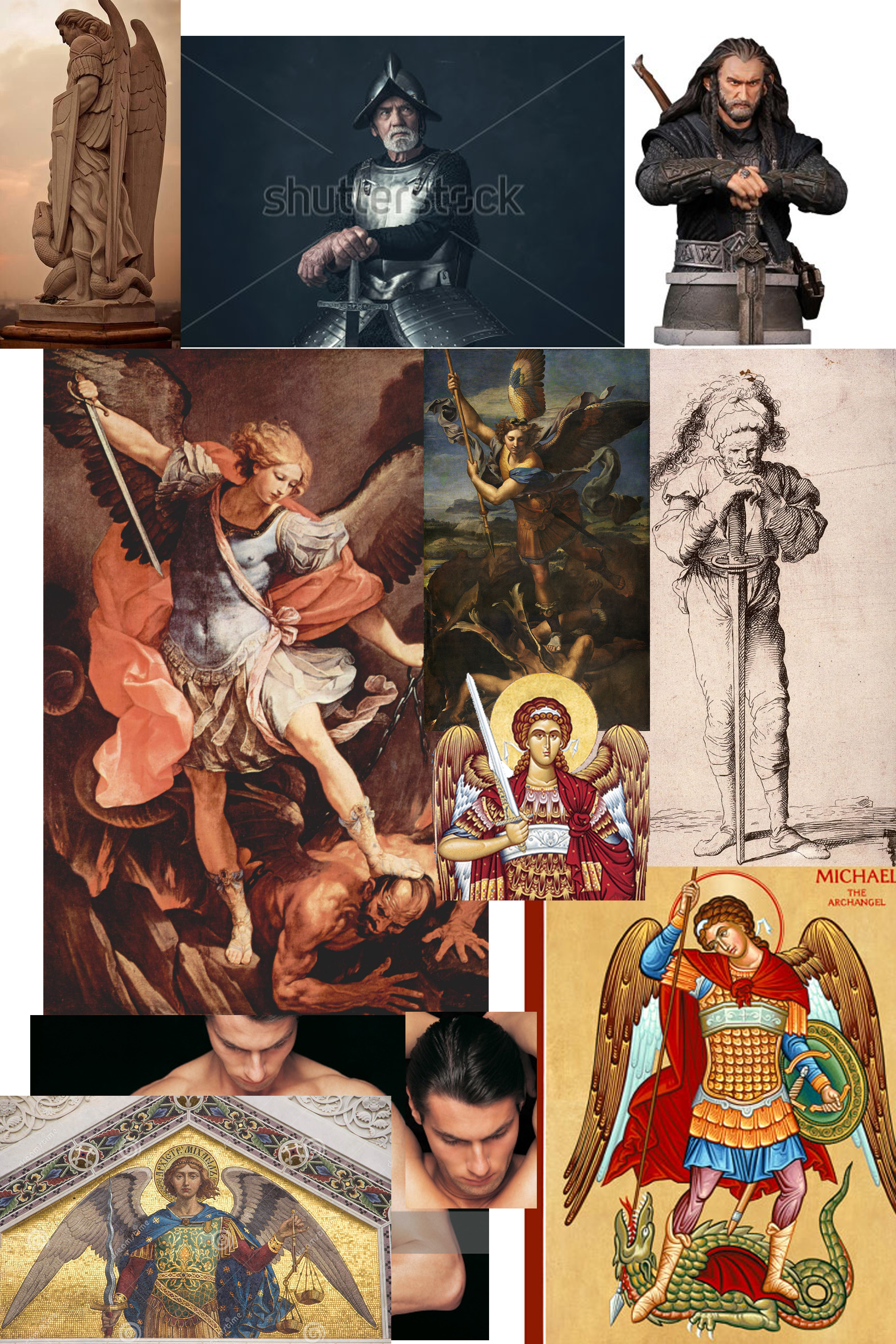
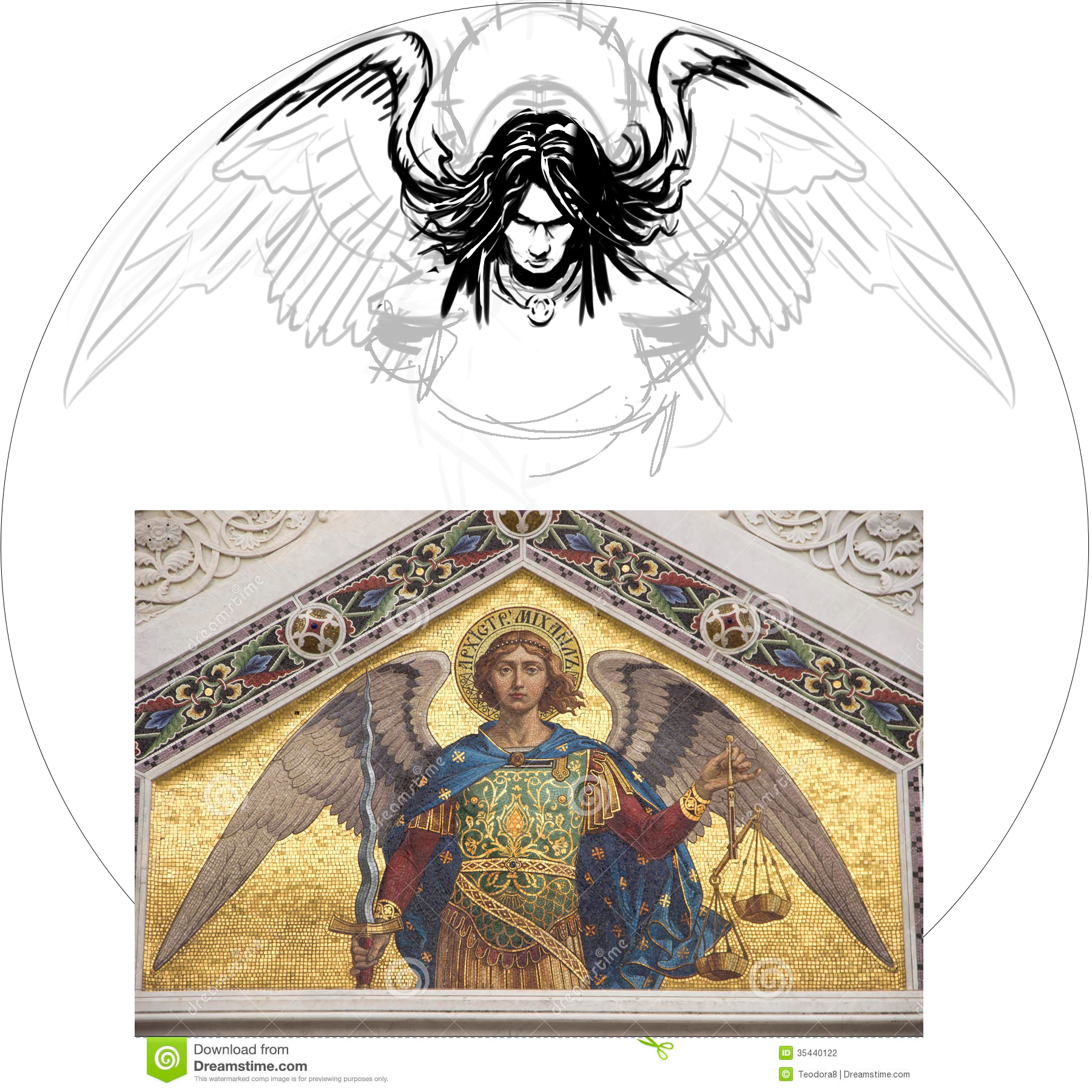
The goal of the stamp was to include a mixture of 4 different elements. The WTB logo, St. Michael, and a soldier helping a wounded warrior off of the battlefield. Lastly, the words "Find New Strength". The only image supplied to me was the soldier helping another soldier. The Airborne's St. Michael artwork someone had previously done. The styling of St. Michael was inspired by religious iconography from both Google searching and my wife and I's trip to Rome and Greece a few years back. With the combination of 4 elements, It was my job to do the best I could to incorporate them into one design.
In the end, it took a little bit to finish up. I was working on this design during my off time while working a full schedule. I'm very happy to support a great program and a great cause. I hope the tournament go'ers enjoyed this event and continue playing disc golf.
30th Anniversary of the Roc
Excited is an understatement. Jeff Panis (Marketing Director of Innova Champion Discs) reached out quite a while ago when he assumed his new role. A lot of things were on his plate at the time, so we talked briefly and got back in touch a few months down the road. An opportunity was in place to design a commemorative stamp honoring 30 years of the Roc's existence. The Roc has been one of Innova's most popular molds without question. This was a huge opportunity that came with a lot of weight.
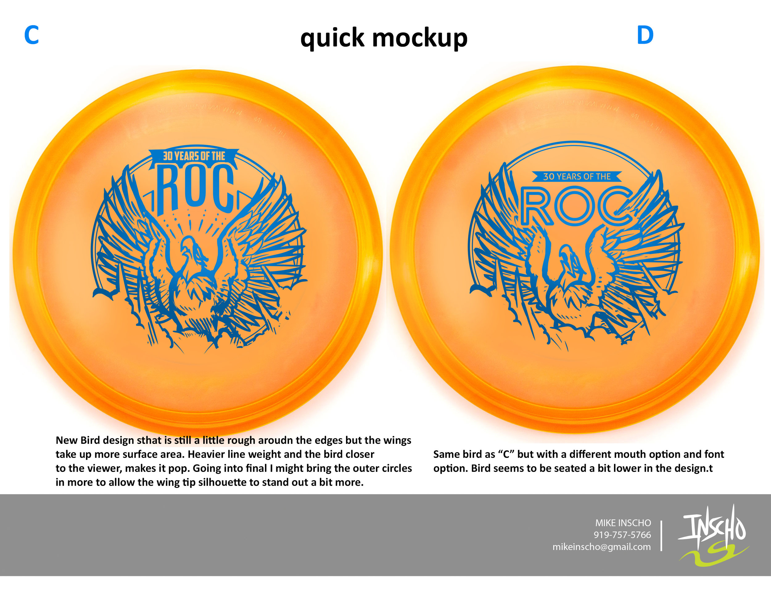
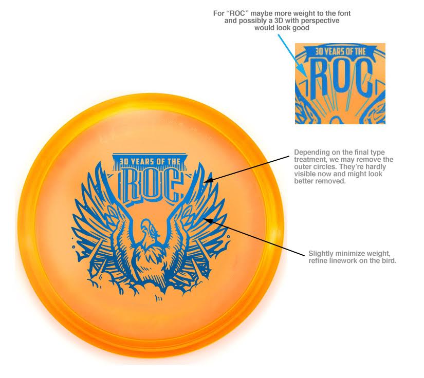
In the initial sketches I proposed, there were some good things to build off of. I had awesome friends who helped me out in critique. One of the main things I overlooked that they quickly pointed out was the silhouette strength of the head. My goal was to have this Roc reach a point of near weightlessness. For example, If you stretch your back out in your chair (I do this from time to time) , you arch the back, the chest protrudes out and your chin tips up. This pose is something I tried to capture. As Innova and I progress through the development of the stamp, The head tips back down a bit to give the bird more shape. The wings extend out to give some symmetry to the stamp. The body develops all the way to it's last and final version and the final is the result of of multiple revisions for the better.
If it wasn't for my friends and their fresh eyes to give me critique, the direction of Jeff Panis, Levi Wilcox and the crew to keep pushing this stamp, it would've honestly turned out to be less than what it should've been. What do you all think? I'd love to hear your thoughts in the comments. Thanks for reading.
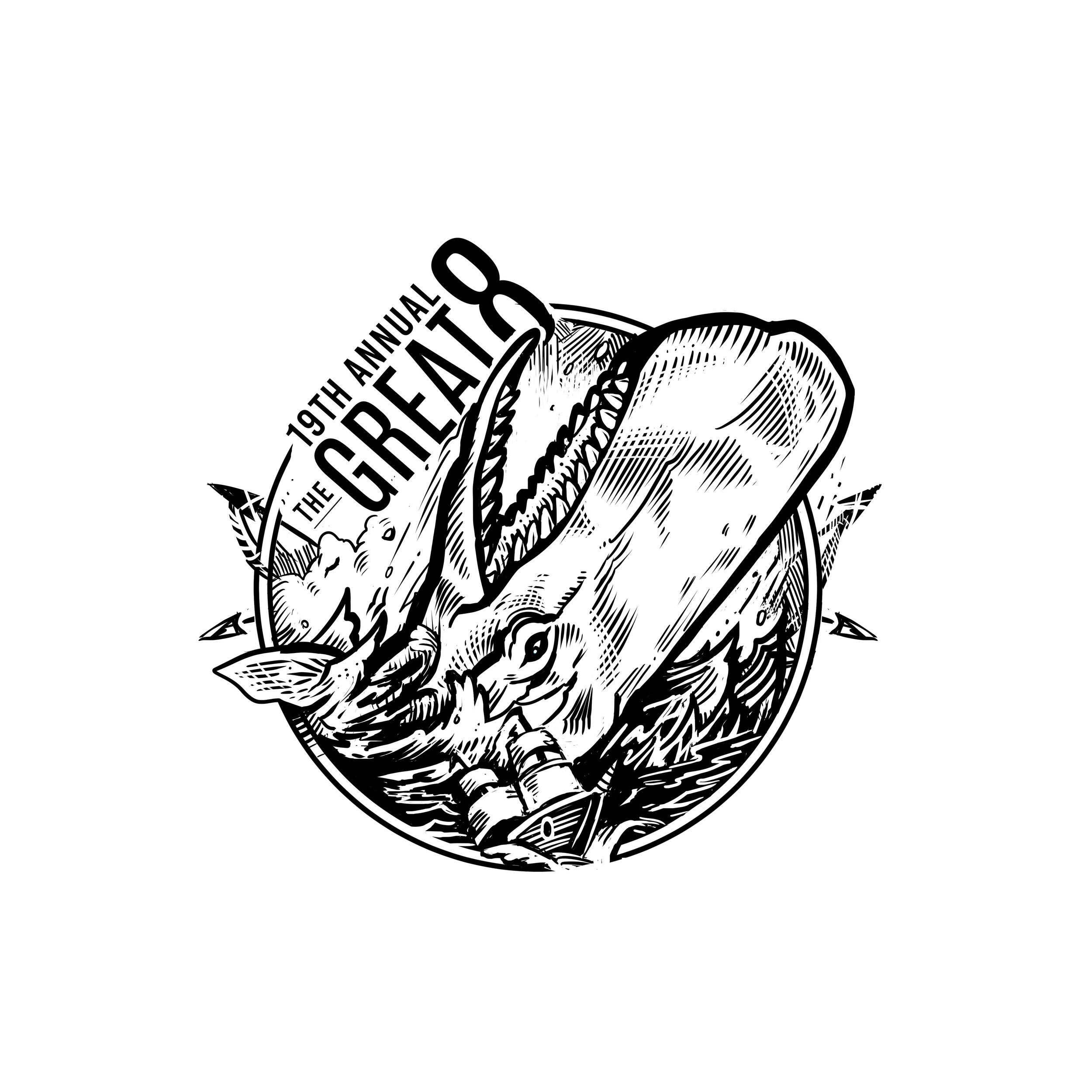
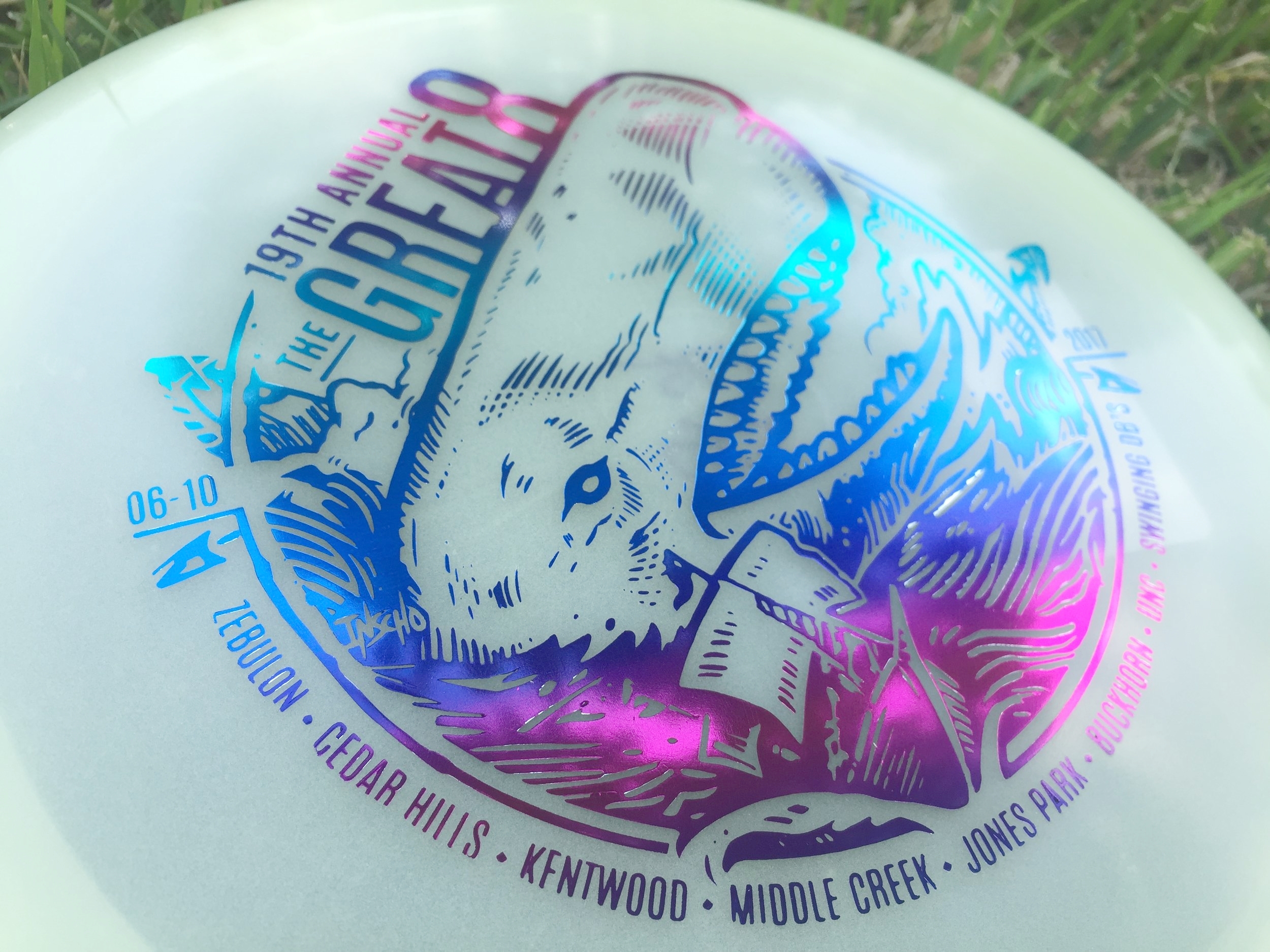
19th Annual Great 8
The Great 8 tournament is in its 19th year. It's a one day, 8 courses, from sun up to sun down event that only the crazy dare to do. I had the honor of doing this year's stamp and was really excited, even though it was down to the wire (totally on me). We've returned to the nautical themed roots to have something pair up well with the dual octopus stamp that was done a few years ago.
The major hurdle with this stamp is what you can see in the early stages. I wanted the huge whale to be coming out of the water and landing on top of the ship. To make that read clearly was definitely a challenge. After much debate and great advice from my friends, the whale was flipped the other way. I couldn't agree more with the move.
I want to thank Jay Pontier for always giving me an artistic freedom when it comes to doing these stamps. It makes it so enjoyable.
MVP "Limited Edition" Teleport
The MVP Teleport is the first one out of the gates for MVP Disc Sports 24.5mm class of high-speed drivers. To commemorate the release of this disc, MVP came to me wanted a limited edition stamp. My job was to portray teleportation while sticking with what MVP's brand identity is and to create this design using their three foil stamping abilities.
Mathematics, science, and technology take the forefront of what MVP's graphics have always been about, My mind started there. How would I depict teleportation in a way that worked well? That was tough. If you take a look at my thumbnail process in the very first gallery image, you see the spectrum was pretty wide. Anything from math grids and charts to space pilots entering a warp tunnel. My main hurdles with this design were turnaround times and getting the funnel graphic and perspective to give off a disorienting point A and B. Hot stamping has a limit to line width that will be transferred to the disc successfully. What I wanted to do is convey these two portal entry's that disappeared to the disc color while keeping the main and important element (the Teleport name and MVP logo) bold and black.
All in all, I'm super grateful for the opportunity and learn the most when I step outside my comfort zone. The Limited Edition stamp will be available through most major retailers that carry MVP Disc Sports merchandise. What do you all think? Does it keep with the brand? Leave me a note in the comment section. Thanks for stopping by.
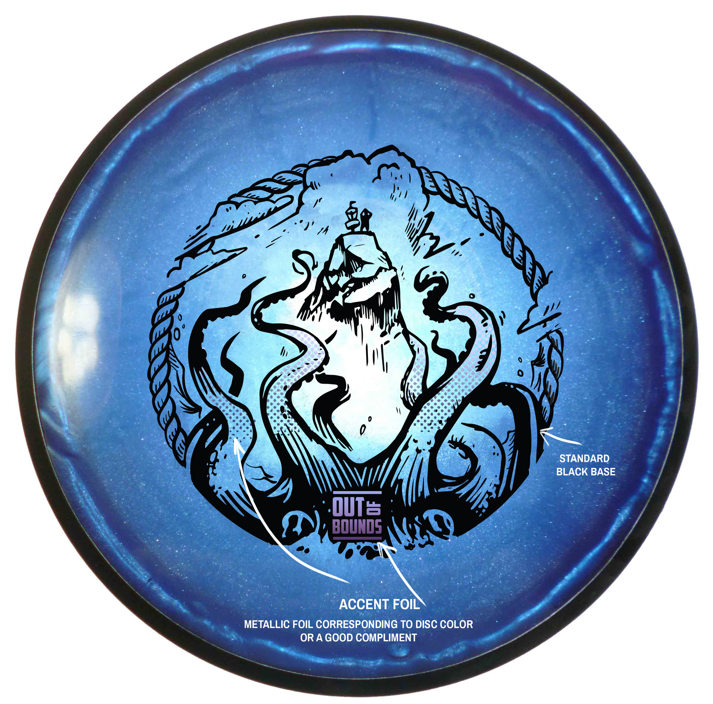
Out of Bounds Series #1
The Out Of Bounds Series was an idea drawn up by a fellow MVP Gyronaut by the name of Brian Sweet. He came to me with an interesting take that I've never thought about before. Tight fairways, landing areas and almost impossible pin placements exist somewhere in the disc golf world. His idea is to shed light on these situations.
This idea stems from fantastical ideas about what lurks hidden, as your disc takes a plunge into the unknown. Out Of Bounds Series #1 explores the depths of an impossible landing area. The disc is now belonging the keeper. A mix of Cthulu/Kraken/Squid vibes. I wanted the eyes of the creature fixated to the onlooker. The eyes had to adjust from the sides of the beast to more in front to convey the idea. The introduction of the second foil to bring the viewers attention from the bottom of the stamp up toward the poor fellow on the cliff side.
I want to thank Brian Sweet for having the faith to let me run with his napkin sketch and go for it. These are available in a dual foil set up exclusively on MVP/Axiom/Streamline Discs plastic.
Please let me know what you think in the comments and share with your friends!
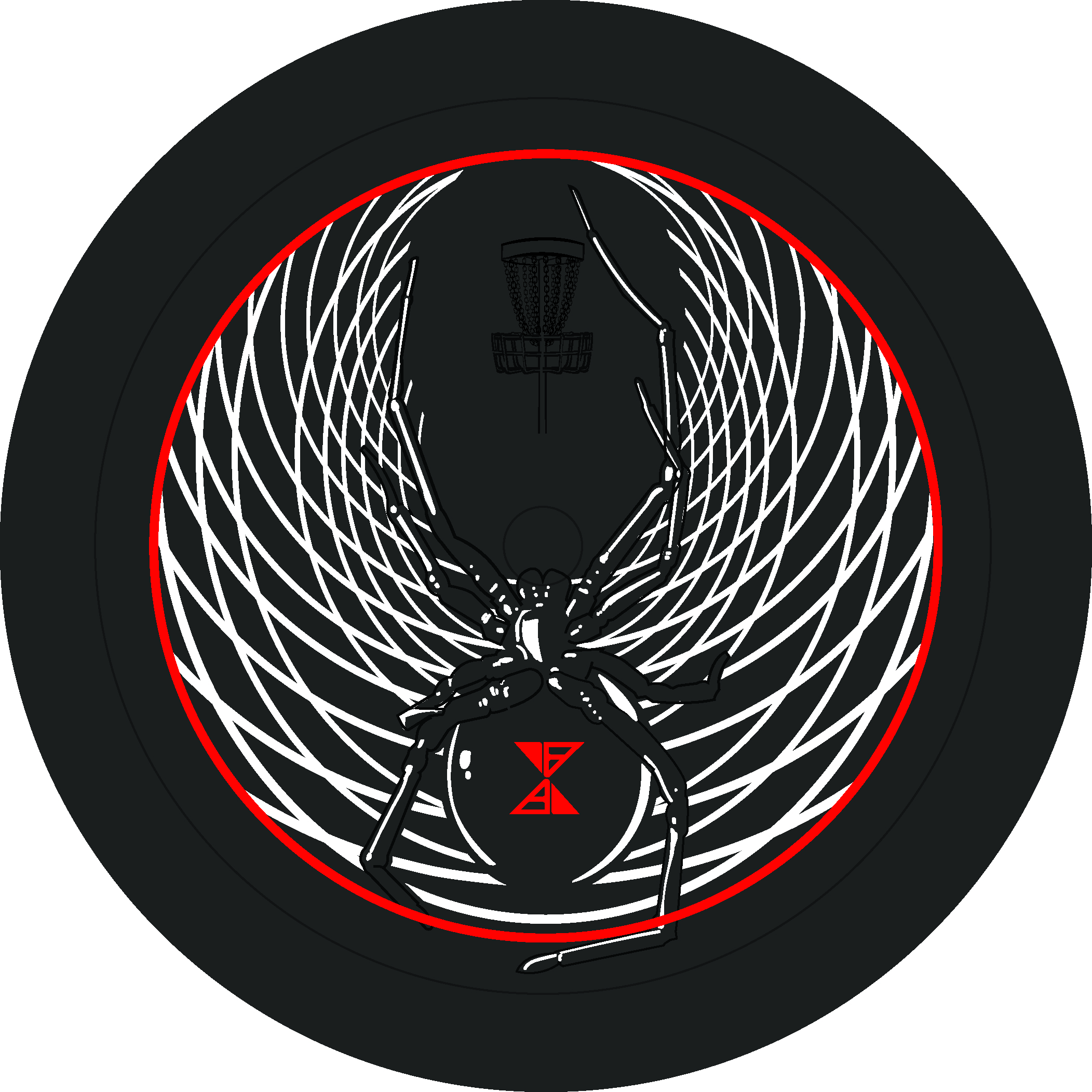
Axiom "Black Widow" Vanish
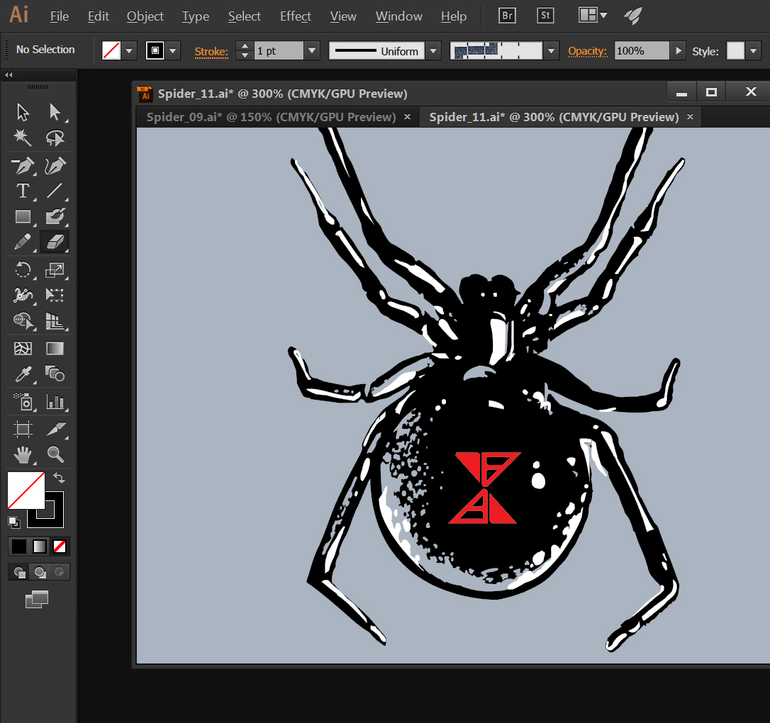
I've had the honor of working with MVP Disc Sports and Axiom Discs a lot this past year. They needed some reinforcements for this years Halloween themed stamp. Spider 2.0. Very first question I asked myself is how I'm going to stack up to the original design by hot stamp legend, ZAM.
Expanding on the iconic black widow that was on the first release was the focus. I had a lot of fun and it was a definitely a stamp I learned from. With the core being lighter in color than expected, I had to shift focus off of just lighting hints from the initial plan and add black contrast to the spider. The stippling technique and use of the natural disc color, played a huge roll at the end.
I want to thank Axiom Discs and MVP HQ this opportunity. During the rough phase, all the staff really helped to dial this in. Definitely was a group effort. It's a big release trying to follow up to their first Spider stamp.
