Gyroscope 2020

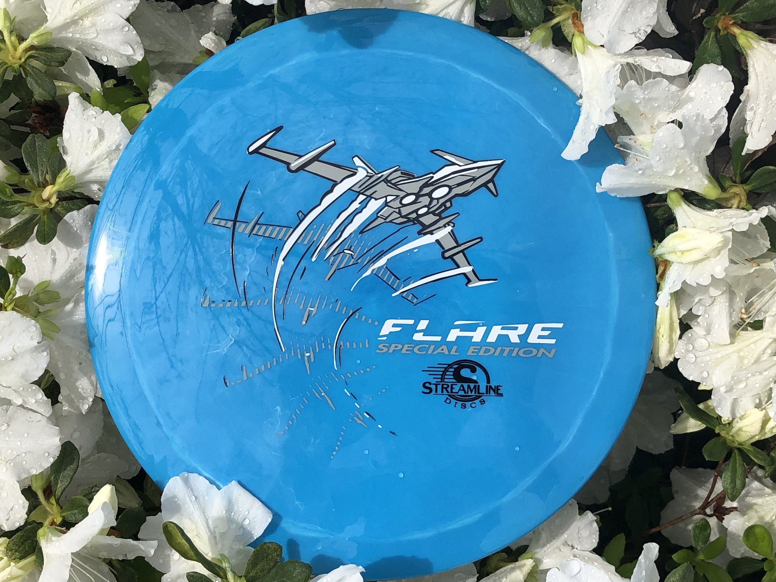
GYROscope is an event ran by Mike Sullivan out of Northern Virginia. The goal of the tournament is to promote MVP Disc Sports, run a fun PDGA (Professional Disc Golf Association) event and offer a one of a kind disc per event. Last year’s, 2019 think tank produced a handful of ideas and one of those core concepts was reciprocated to 2020.

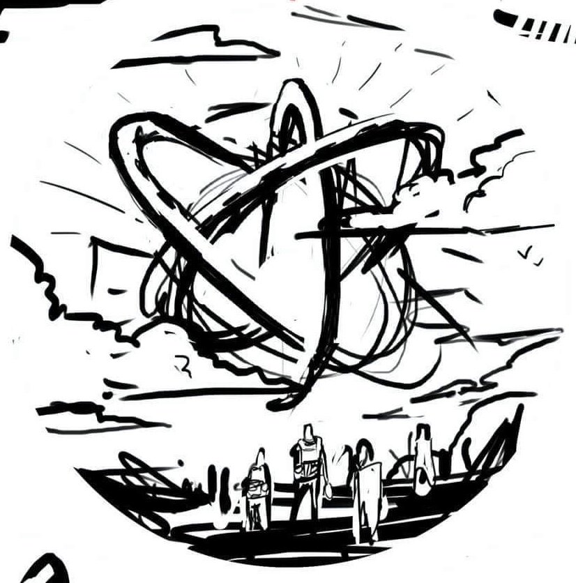
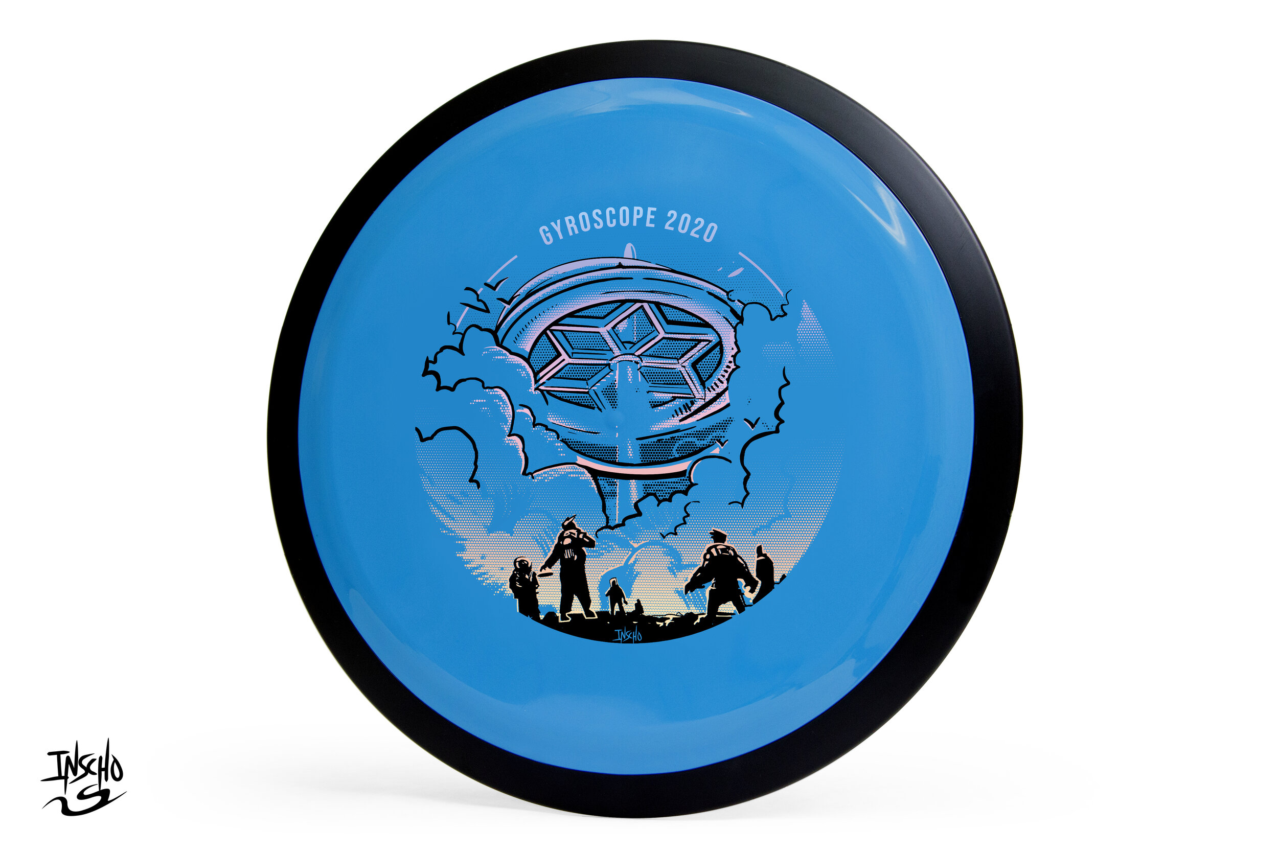
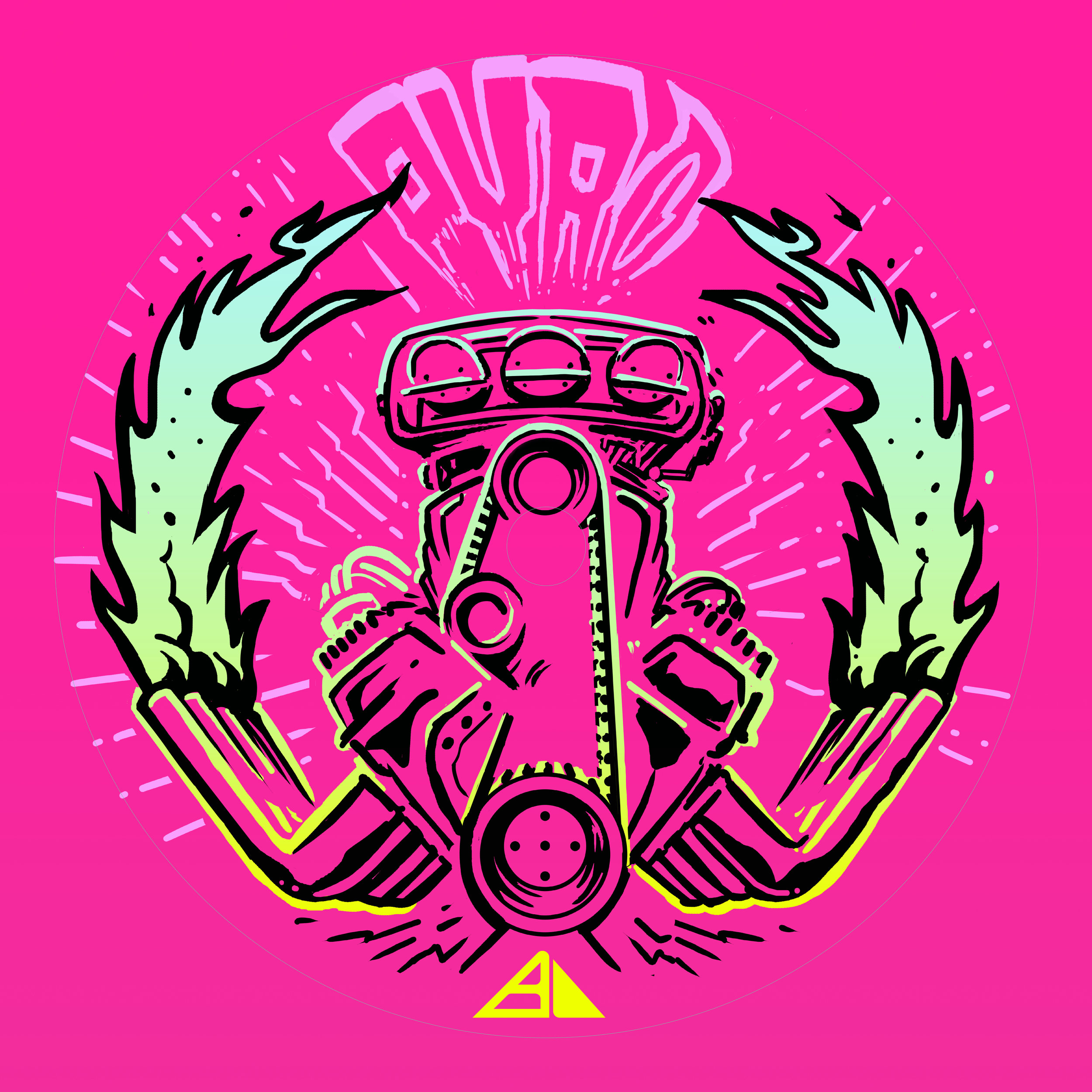
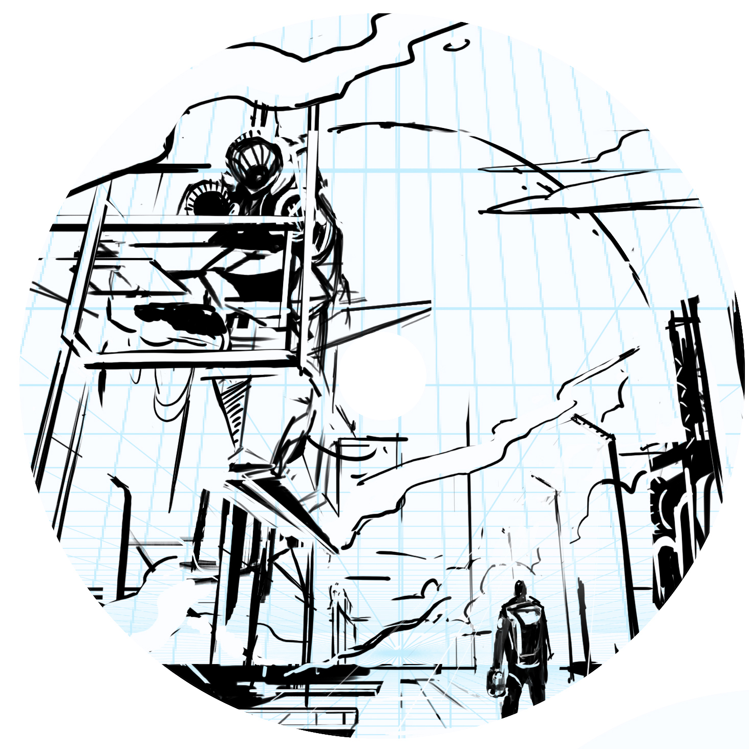
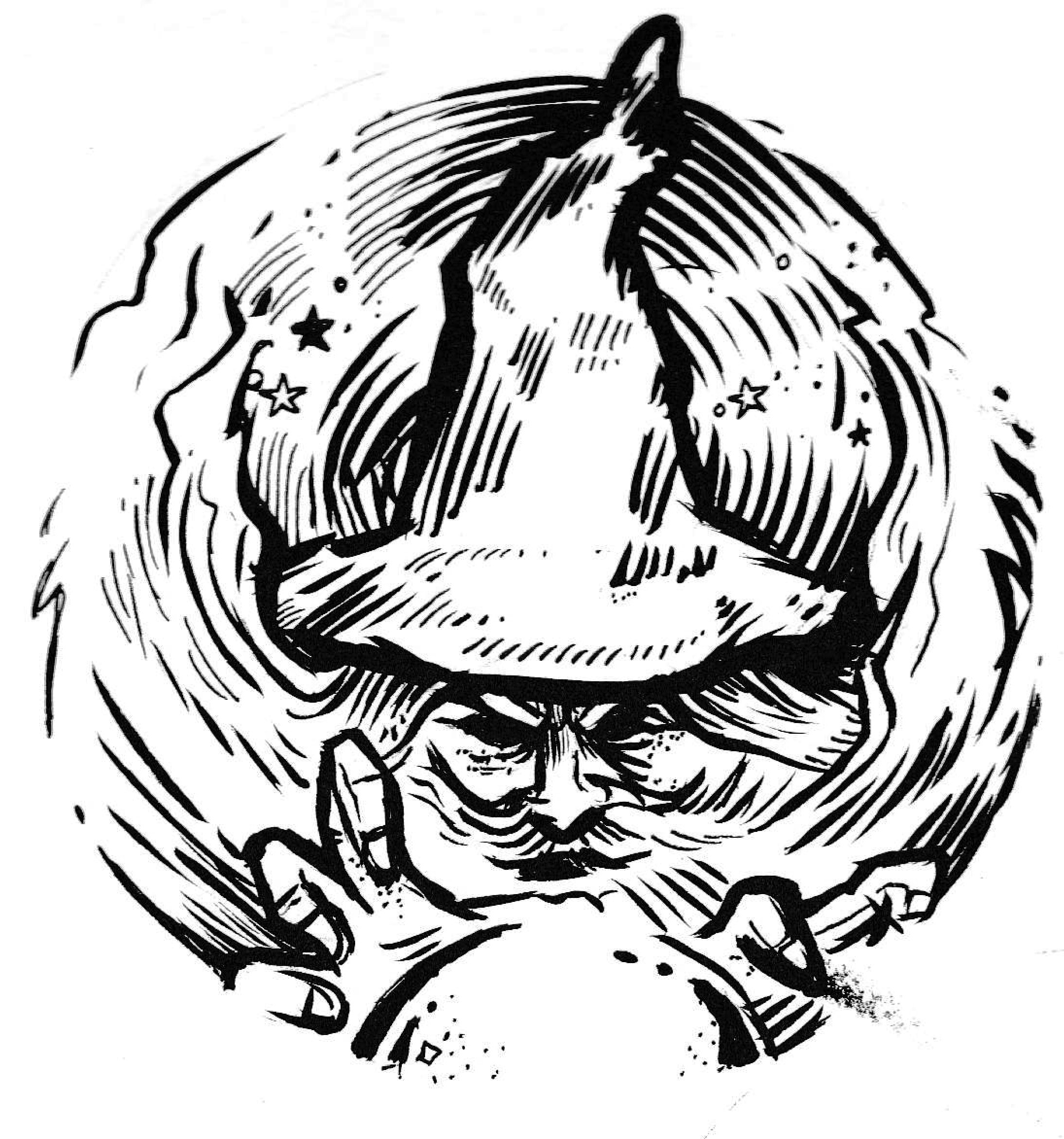
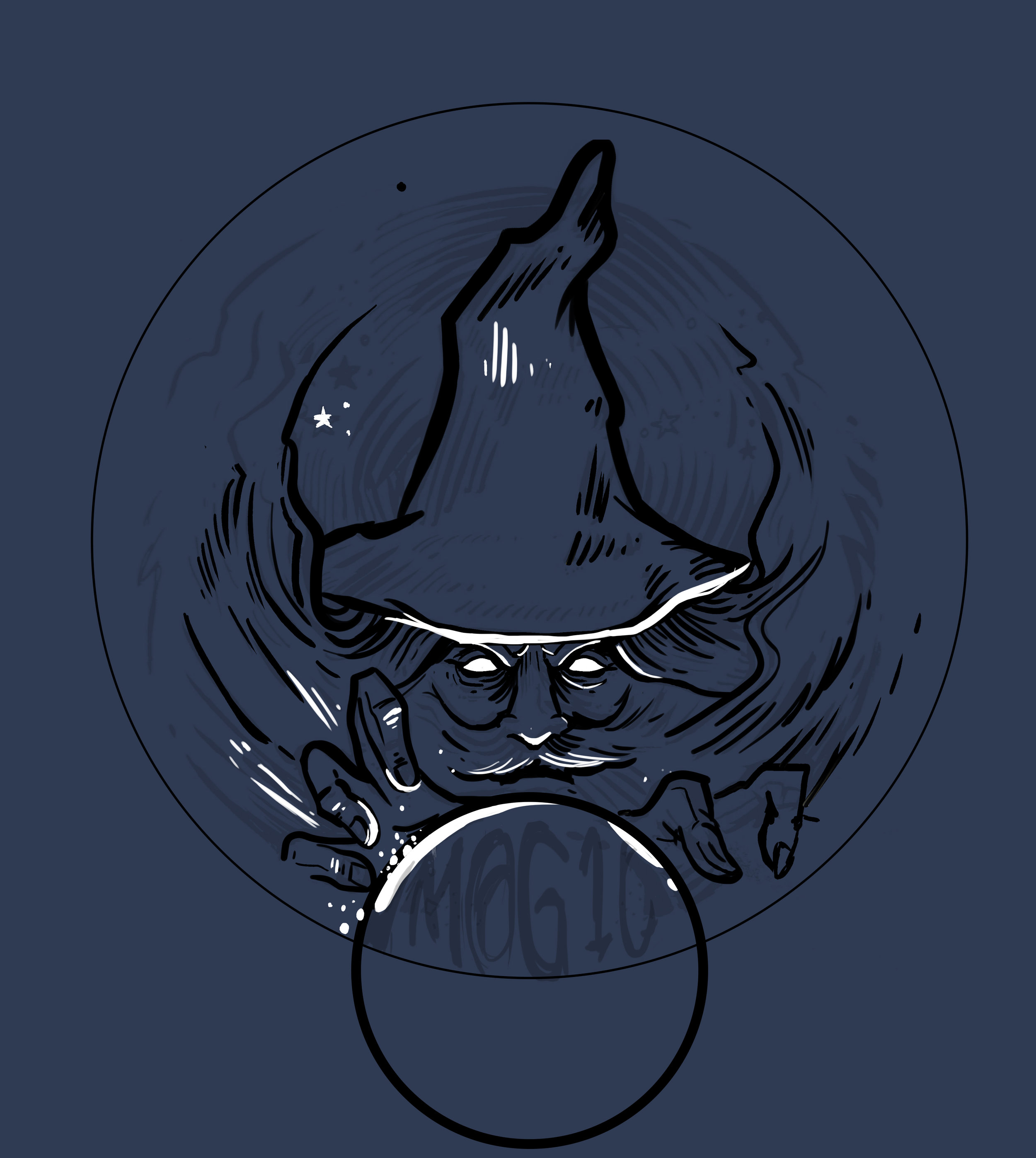
There’s a dead-center area of the disc that get’s unpredictable with stamping. Because of that reason, designers are faced with working the art around this area. The second thing I noticed is while the concept showed a sense of scale, the gyroscope wasn’t really present. I was more similar to a floating orb and I wanted to change it to a grounded structure. The concept fed off of last year’s Gyromonster theme. The Gyronauts figured out that the Gyromonster wasn't simply exchanging energy for its own benefit, it was taking that energy and spreading it far across the galaxy to an ancient source. This scene shows the travelers discovering the ancient ruin.

The design really only took a bit of 3D staging within Google Sketchup and re-inking cleanup. The gradient effect for the 2nd applied foil was done with a halftone dot technique. It’s the most efficient and practical way to lay down transitions in single color layers. I want to thank Mike Sullivan for the continued support and having faith in me to deliver a quality design. It’s with that confidence, that I’m able to hunker down and come out with something we’re all proud of.

How do acquire this stamp? Reach out to Mike Sullivan through
https://www.discgolfscene.com/tournaments/MVP_Disc_Sports_presents_GYROscope_1_The_Third_Campside_Open_2020/registration

OR

his Facebook page for future releases.

Schrock-A-Doodle-Doo

As 2019 was coming to a close, Tyler Schrock, Team MVP Pro asked me if I would like to do his 2020 Tour Series disc. Working with Tyler is pure joy. He’s kept an animal theme over the past few years that allowed me to do design an octopus and sloth. This year, his idea was a rooster. It turns out that his father was a chicken farmer! He raised chickens for 25 years. So this stamp idea was something he knew his family would love.

This idea started with chicken reference gathering even though I had a good idea of how I’d be able to pull this off. I think the strongest silhouette of a chicken is from the side. It gave me the room in the center of the disc to stay free from any no stamping zones. The chicken mouth action/or spit never made the final. That was an attempt to add that classic “action” seen in cartoons to show loud noises. We didn’t want the chicken looking like it was spitting so it was axed toward the end. The shading detail near the chest add a bit of contrast to show that it’s different color of feather.

The final pass was simply to add body/feather detail and import the consistent ring graphic from last years design. It was important to Tyler to continue that look and feel from year to year. When you display these side by side; it really adds a nice series look to them. I hope you all dig it! Share, like, comment on what you think!

MVP Proton Deflector

MVP Disc Sports Deflector is a midrange driver that they’ve been needing for a long time. It took continuous development to make sure the public got the overstable midrange they were wanting. The wind is no match for this mid and it’s their most overstable in the lineup. Proton plastic adds a bit more toughness to the Deflector mode and introduces some highly visible colors like chartreuse, bright orange, pink and blue.

I approached this Deflector concept by doing research on old tube tv technology. I gathered my pieces of reference on magnetic forces, inner TV diagrams, and previous/current MVP Proton stock stamps. It was my goal to create something that would seamlessly fall into the lineup. No matter how hard I worked to create something unique; It felt a bit too close to Zachary Kelbaugh’s idea for a Neutron Deflector Special Edition set. The other hurdle was the use of 3D. If you look at most of the current stock stamps in the first gallery example; you’ll see crisp line work and believable lit geometry. I used the free 3D program called Blender.

My idea derived from the reference I saw on a circular looking reactor. The MVP Tangent, Axis, Atom and a few others have a common shape appearance; the sphere. Starting from there, I dove into a science fiction “deflection shield” idea. The protected metallic panels would orbit this levitating drone and protect it from the enemy. It was important to keep it very much away from any Pokemon tie in so it remained simple with these 4 supporting braces cupping the main housing. After the scene was lit and materials were configured, I set up a quick viewfinder render and used that as a base for the vector shapes in Illustrator.

The final addition was to bring back in the grids I found while researching deflectors/ TV tech. I felt it fit with the metallic styling of the panels and added a bit more depth to the stamp. I hope you all enjoyed this brief look into the design decisions of the MVP Proton Deflector stock stamp. Leave a comment and please share if you’re willing. Thank you!

Axiom Cosmic Neutron - Stock

If you’re a first-time reader and unfamiliar with MVP Disc Sports/ Axiom Discs/ Streamline Discs then you’ll need to look up who Zachary Kelbaugh aka ZAM is and his importance in setting a high standard with all three brands. While MVP Disc Sports follows more an analytical/ scientific realm; Axiom goes into more of the visual arts, punk, and a little bit more on the wild side if pushed that far. If you think about it, the parameters keep you grounded but a LOT of ideas can flow from that base.

I was given the difficult task to create a new stock stamp that would be used for Cosmic Neutron plastic within the Axiom branding. Cosmic Neutron plastic produces some unbelievable controllable swirling patterns. At this current time, swirls seem to be trending with multiple disc golf companies coming up with their ways to achieve it. It was my job to design something that could hang with Neutron’s iconic imagery that has been stamped on Axiom discs for 6 years.

With Neutron art at the very front of my reference gathering, I wanted to create something that seamlessly blended into the stock stamp Axiom family. That was goal #1. MVP’s history runs deep. The last thing I want to do is shred that to pieces. If you look at the far left image below; our heads were looking at high-level science, Leonardo da Vinci, 3D DNA molecule structures and honeycombed flower patterns. While all of those sounded great; the flying machine has been done. My research through da Vinci’s sketches led to me start researching perpetual motion machines. Bhaskara’s Wheel, Sadi Carnot and the Carnot Cycle. My mind went down the rabbit hole, you can say. I landed on the fact that while all of these machines and concepts sounded cool, quantum mechanics and the complex nature/theory burned me out. That doesn’t mean I won’t return back to these notes at a later date. Time was of the essence and I had to get to work.

I landed on a 3 cylinder schematic concept. The main idea is of a 3 piston firing order that is pushing energy toward the epicenter. A transfer of energy through the stamp design to the actual swirl look of the plastic.

Here are a few key points in the final Axiom Cosmic Neutron design:
•Get the name of the disc higher up on the flight plate so it can be seen on store shelves
•Disc name is the boldest part of the design while keeping with the overall schematic style of font. It doesn't scream old world but doesn't modern either. 
•Keep key shapes present in the new design. Circles, triangles, font look, and feel.
•Integrate a fresh idea

The below image gallery shows a peek into the 2-week process:

MVP Cosmic Neutron

MVP Cosmic Neutron plastic creates some epic swirl patterns that you wouldn’t think would be possible in plastic manufacturing. This plastic was so awesome that MVP Disc Sports created a new plastic line and needed a stock stamp produced for all of it’s models. It was my job to research, design and implement it into MVP’s lineup.

The first design decision was an easy one: MVP’s standard Neutron plastic has this nice center alignment from Zachary Kelbaugh’s original and “New”tron stamp designs. I wanted to continue that nod into Cosmic Neutron. The second idea played off of the center plastic induction sprue. It’s the center of where all of these patterns meet. It felt fitting to hit that concept and start thinking of ways I could create a stamp that would rest in harmony with the beauty of the plastic. This idea sort of camouflages the radiating rays but bolds out the Disc name/ flight numbers/ MVP Orbit logo. This design nearly made it to final. The design was submitted and the die was sent off and created. We stamped Cosmic Neutron Volts and Entropy’s and let it sit and marinate within the team.

In the end, the earlier mock-ups (based on the zoom/swirl pattern) felt too forced and did the exact opposite of what this stamp needed to be. It needed to be bold enough to stand on its own against the Cosmic Neutron swirl but also open enough to let the plastic shine. So with that in mind, I feel very strongly about the concept of our solar system with a modern look/ feel to it. What I liked most is it's based on our solar systems ecliptic plane. The bold lines indicating when the planets are below the sun. It very well fits the Cosmic narrative and gives the stamp substance and reasoning. I would compare stock stamps like creating a company logo. You want something classic that will stick for a long time without updating. Even though the costs are much smaller for a changeover; that’s not really something I’m thinking about when designing.

I hope you’ve all enjoyed this deep dive into MVP’s Cosmic Neutron design process. I want to thank the people and MVP staff who gave me some honest and informative feedback through this process. Without that; I don’t think it would’ve turned out as it did.

What do you all think? Did the project reset improve the overall quality of the stamp?
 

Axiom Prism Plasma - Stock

The Axiom Discs Prism Plasma plastic brings the shimmering beauty of a core fused with the luster of a candy-like Prism outer rim. In this development blog, I dip my toes into a few decisions that made me arrive at its current design. With pen and paper in my hand; the first thought was how can I get in and get out with the least amount of wreckage?

The plastic combination does the work for you! My goal was to create a non-intrusive 3 foil design that allowed the plastic to speak to the consumer. Axiom branding has dabbled in the Fibonacci sequence, DNA, flying machines and very artistic approach to high-level concepts. I centered this piece on simplicity. The ring uses to shape sequences that follow the 1,1,2,3,5,8,13,21 sequence. The design is duplicated and flipped on the opposite side. This creates this really cool halftone fill/ inverted look with the silver holofoil. Again, making this design bleed some of that beautiful, shimmering foil through. The 3 foils break down to Black, Silver holofoil for the ring and color transition holofoil for the Name/Prism logo fill. The font chosen to represent the disc name and flight numbers is Antonio. I wanted a font that was clean with a little bit of height to be legible from a distance.

All in all, sometimes the super simple designs take the most time. I’m glad we stuck to our guns on the outlining goals of this stamp art. It’s simply celebrating the look of the plastic and allowing a stamp to go along for the ride. It also looks really cool spinning through the air.

Stock Proton Pilot

Here it is! My very first complete stock stamp designed from the ground up. It’s a first and I’m super excited on how it turned out. The Streamline Pilot has been one of those molds that has really taken off. Fans of the disc love its glide and super straight flight. It’s a great flyer and I knew early on that this disc was going to be a go to for a lot of disc golfers.

The whole goal in this design was to bring back some of that art deco/ retro futurism flavor that was in some of the earlier stamp designs from Streamline Discs. I really liked what Zachary Kelbaugh did with the Proton Drift and wanted to create something that is vaguely familiar with the consumer. Most importantly, I wanted to reestablish Streamline’s identity.

This is more of a take on the classic fighter pilot but abstract enough to offer viewers an ability to create their own story; their own hero. The intended goal was to create a design that had breath-ability but also had refined class. I found some great inspiration online. The classic silent film “Metropolis” was a huge inspiration and was the backbone of the main center figure. From there it was inserting flight numbers and logos in a way that didn’t feel obtrusive. We went with a silver holographic foil to really embrace that high polish look. I think it worked really well for the candy-like color properties of the plastic itself.

All in all, I’m very happy. I had always pictured my first commission stock stamp going much differently. I had that feeling that it would be so out of the way of how I did things. I don’t think I could have gotten more lucky. I want to thank Brad/Chad and crew for having the confidence in me to deliver.

Robokitty 2.0

I received a request from an Team MVP member to change up a 2018 stamp design. Amanda Melwiki had a great 2018 year and her Robokitty design was a hit. She came to me with the idea of changing up the foils and adding a few elements to last years design. I had bigger plans for Robokitty and I’m glad she trusted me to do something new but a continuation of the concept.

I knew I wanted to show a fiercer side of the kitty. I wanted to marry the concepts of cute/friendly with the deep down drive and determination of getting better. That fueled the fire going into the concept stage. I had the idea more stored in the back of my head so this design didn’t really consist of a lot of reference gathering. Bringing in that exaggerated anime pop and allowing the opportunity to expand on the Robokitty character were the goals first and foremost. From there it was a few experiments with stars and how I was going to incorporate them into the design.

A huge thanks goes out to Amanda. Were you able to snag one? If not, she has a few available but will be selling out fast. Follow her here:

https://www.facebook.com/AmandaMelwiki

Prism Proton Pyro - Special Edition

The Prism Pyro Special Edition took a few twists and turns until we reached the final intended direction. Those first twists and turns I (sadly) cannot show. BUT! I can let you in to where the project really started picking up steam (errr….heat). This project put Axiom Discs in a position to really push a different side of the the alternative scene. Zachary Kelbaugh had done a punk character riding a Big Wheel on the Proton Mayhem SE and that’s how far it ever really went in a hot rod type of direction.

The design stemmed from a quick thumbnail while I was thinking of an awesome game around 2006/2007 time frame by the name of Brutal Legend from Double Fine Games. Brutal Legend had an intro with a chrome beast named Ormagöden, "The Fire Beast, Cremator of the Sky, and Destroyer of the Ancient World." We liked the symmetry of the skull/ fire/ pipes (that were mistaken as lab beakers) in the thumbnail stage. From that idea, we traveled down the late 60’s & 70’s wild illustration of engines and chrome. An area I know a little too well.

The design was road-mapped out in Adobe Photoshop. It was there that we decided 80% of our foil allocation. The lines were cleaned up and then ported into Adobe Illustrator. A higher pixel count helps make sure that there’s no quality issues when using Illustrators’ Live Trace feature. The important thing about designing on a translucent type of plastic is to allow it to breathe. Really, that’s a good fundamental to remember with any stamp! For Proton Plastic in general, the goal was to introduce the core color wherever possible. The last design decision was to allow negative space to creep into the top parts of the flame tips. This in turn allowed the intensity to be focused at the hottest part of the flames closest to the engine. The design wrapped up by inspecting all 3 stamp layers and double checking for discrepancies.

What do you all think? Was this the right direction to go? Please take a minute to like and share this post!

Streamline Pilot Special Edition

When given the opportunity to revisit a disc called the Pilot; I was all over it. The last time setting foot in the Streamline Pilot universe was for the Electron Limited Edition. That design featured a fearless fighter pilot locking in on his target. This time, however, it was time to step outside of that mindset.

Going into this design, I initially thought about how cool it’d be to take what I did with the Electron design but pump it up and put in a science fiction/ futurism space. I created a ton of thumbnails based on a technologically advanced fighter jet pilot. The thought of holograms or how future pilots would navigate the skies really stuck with me. In the end, we all agreed that while neat; we should create something totally fresh and new for the Neutron line. Those ideas might be revisited so I apologize in advance for not showing them.

I diverted to a Pilot character stepping onto the tarmac. Putting the viewer in the scene of a spacecraft pilot getting ready to debark on his mission. There’s something about showing massive scale between the character and where his attention is. I thought about mission bays, Ralph McQuarrie (prolific Star Wars concept artist) and how effective they were at creating these imaginative ideas. The ending result was a homage to the work that really got my gears going in concept art and illustration. There were numerous Star Wars concept art prints lining the school I was attending. Those pieces made me inquire more about that type of work and motivated me to go after that discipline.

My philosophy is to create these vast landscapes while always letting the viewer to fill in bits of detail. It allows them to create their own story or simply add to it. That’s what this stamp was all about. It was about not strapping down Streamline Discs’ brand identity to a certain period or time but expanding the possibilities heading into the future. The long steam trails coming from the left side of the image is homage to early 70’s fantasy and poster art. Thanks so much for taking the time to read this. Feel free to share among your peeps on any of your social spaces.

2019 St. Patrick's Classic

The 2019 St. Patrick’s Classic is a tournament that caught my attention when I started playing competitively. I realized right then and there that great artists are involved with the game of disc golf. Final 9 Sports had a great artist doing art for their St. Patrick’s Classic tournament. I was later informed that artist was Jimmi Myers who has sadly passed away just a few years ago.

A fellow disc golf art talent; Tyler McNair reached out and connected me to Bruce Kinsley who runs Final 9 Sports. Bruce was awesome to work with and provided me with all the past art for this event. This stamp had a huge weight on my shoulders. I wanted to impress the client that grabbed my attention those many years ago. Squirrels, Leprechauns, Celtic Knots and Shady Oaks Disc Golf Course are all many themes that have been done before. The squirrels really spoke out to me. They offered so many stories and are often the innocent bi-standards on the course. I felt like the was the direction we should go.

It took a lot of finessing as you can see from below. I’m just glad the drafts got better the more we worked through it. In the end, I believe the client was happy. I hope they had a successful event. If you’re out in the Orangevale, CA area, I hope you were able to attend and get your hands on some of these.

Streamline Flare Special Edition

The Streamline Flare is the newest Fairway Speed 9 driver delivered with plenty of overstability for even the strongest arms in the disc golf game. I was asked to design around that special ability of the disc to fight out of constant steady winds. It’s a true wind fighter.

The design started with a page of ship designs based on direct relationships to the flare countermeasure that provides a decoy to heat sinking missles. Other quick concepts went the sci-fi ship route and that aspect of the design stuck out with the group. The frame-type of motion was liked by all and continued into the rough phase. Connecting the design with it’s actual flight characteristics was important to me. I used a rough block-in 3D model to mock up the ship orientation and ported that into Illustrator. The whole intent of that process was to create motion.

Other Streamline designs that I’ve done were in a direction where you couldn’t place a certain time period on it. It was kinda Sci-Fi/ kinda modern age but I wanted to take this into a futuristic realm. So I added lower propulsion units on the bottom and kept the edges and angles sharp. A few references of the Royal Canadian Forces doing evasive maneuvers in a valley inspired me to put atmospheric trails coming off the wings. Carrying that curve language subtracted from the “Flare” typeface finishes it off.

In the end, MVP Disc Sports HQ used a new grey pigment-based foil in combination with black and white to create a truly comic-like vibe with the stamp. You can find these by most big online retailers of MVP, Axiom and Streamline on April 19th.

Magic Warlock

Mystical designs are something I don’t have a lot of experience with. When the request came in from Mike Visgar to bring his idea to life, I was all about it. Visgar had an idea that incorporated his M@g1c nickname. The first of that series of idea was the warlock concept. After just a few sketchbook doodles, I landed on this warlock pencil drawing and proceeded to use my Pentel brush pen to add some character to the line work. The pen allows me to go super thick and thin very quickly and give the doodles that much more life.

Dual foil brings in another aspect of design. There needs to be a purpose for bringing in that secondary color. I chose the light of the crystal ball to represent it. MVP Headquarters chose a rainbow metallic to really enhance the light play without making it too crazy on the viewer. I ditched the busy circular filler behind the warlock and opted for stars. Lastly, the added in some pointillism dot work to add a bit of grit and give it that slight vintage/ stoner rock feel.

Mike V. was great to work with and trusted me completely throughout the process. I appreciate that sort of working relationship and hope there’s more to this series coming later down the road. Please comment, like, and share this post if you wish. Thanks for stopping in.

Hyzerbomb-Marksman

I was invited back to help Matt Siri and Hyzerbomb create a Limited Edition disc for Nick Hyde Memorial fundraising efforts. I wanted to continue things that helped make last years stamp successful and put them into this years design.

While I don’t want to rely heavily on reference, It was definitely needed this time around. While having experience shooting various munitions in the Marine Corps; I didn’t want to mix in wrong parts or screw up small details about the weapon the Marine is shooting. I found a fantastic image from John M. McCall that captured a Marine engaged in a firefight with an M249 Semi-Automatic Weapon. The overall shape worked well for stamp layout and would allow the signature clouds/ smoke from last year to make an appearance. It was important to me to keep this scene vague. No targets or houses to show where in the world this Marine was fighting. It leaves the design open to interpretation.  Having the helmet overlapping the “Marksman” text toward the far right kept the legibility intact and allowed that interaction.

Why a machine gun over a sniper rife? -  This is something Matt Siri asked me as well. While every Marine is a rifleman, I felt like the sniper rifle and knowledge was out of range of my understanding. I do know that Scout Snipers in the Marine Corps shoot outstanding Expert scores at the rifle range. I felt keeping the weapon a machine gun keeps the gunner feeling like the common Marine. It added action to the scene and allowed the opportunity to add some flying “brass” shell casings coming out of the ejection port cover.

In the end, my goal was to create something that felt similar to last year. Keep the continuity going. I want to thank Matt Siri for giving me an opportunity over these last few years to create something to help raise funds for the Nick Hyde Memorial. That’s what it’s all about.  If you’re interested in purchasing one, they are available here:

 http://hyzerbomb.com/product/swirly-marksman-mike-inscho/

2019 Jomez Pro

Another one of these awesome moments where an opportunity fell in my lap to assist an MVP/ JOMEZ Pro partnership for an order. Jomez is a film production company pushing out top notch disc golf footage. There wasn’t any preconceived ideas they wanted to run. The slate was clean and I quickly got to work. One thing I really dug about Jomez’s look from the year previous was the style in which they used for their video intro’s. It’s very similar to a style I’ve admired for years that combines 2D animation with live action film. You’ll see it in Who’s Framing Roger Rabbit, Gorillaz, A-Ha “Take On Me” music video, and many others. If you want to geek out, Here’s a great video explaining it in the first 6 minutes.

We expanded a bit on the explosion coming from the Jomez Pro logo similar to their introduction sequence. Jomez wanted to see what the next step of that design would look like. While we loved the idea of it, i felt like their logo was taking a smaller role in the stamp didn’t feel right. The other idea both parties really honed in on was the Follow Flight shot tracking stamp idea. Follow Flight is essentially Jomez’s most featured post production trick that they use. It allows viewers to view a replay with the flight of the disc highlighted in the shot. The biggest thing is it created more space for a much larger logo.

It was back and forth within MVP’s design team on whether halftone should be included. Everyone was on board for a lightened load of main black foil. The design without it allows the whole stamp to breath a bit more. To have a stamp work on a variety of plastic properties is highly important when they’re wanting a large order. In the end, Jomez was stoked and we were proud to get their support. Let me know if you dig this design! Were there thumbnails that you would’ve liked to see expanded more? Leave a comment and share this blog. Thanks for tuning in!

You can buy the stamp here from Jomez directly!
https://www.jomezpro.com/shop/?orderby=date

Sias Elmore-2019 Tour Series Disc

When Sias was announced as a new Team MVP member for the 2019 Disc Golf season, I simply reached out to him to see if there was any interest in collaborating on a 2019 tour fundraiser stamp. Sias’s nickname is “Siasquatch” so I felt like with my experiences with Sasquatch/ Bigfoot stamps in the past, that this would be a perfect fit.

Sias is from Campbell, California and learned how to play disc golf in the infamous Redwood Curtain. I’ve personally never seen these trees up close in real life, but the sheer scale and volume of these trees is really inspirational. I wanted to set the scene of the stamp within this forest.

A few design decisions came quickly after: If I want to show the massive scale of Redwoods but the typical size of a Sasquatch… There essentially isn’t going to be any redwoods to show. The scale of those trees are so massive, they’ll take up too much space in the stamp. The other design decision:

So what’s the scale of Sasquatch? How do I put both into the same scene?

Luckily, Sias embodies a few features that really allows me to pull this design off. He’s definitely not vertically challenged. Sias is close to 6’ 5 at 270 lbs and is touring Pro that shoots 1000+ rated disc golf. Tweaking the scale of a typical Sasquatch to a giant is well within the confines of Sias as a person. This fit and essentially what made this idea stick out against all of the rest.

It was an honor doing a stamp for Sias. If you’re looking to support Sias and his touring efforts, please reach out to him via Facebook or Instagram. I’m sure he’ll make sure to take care of you. I wish him well with the rest of the 2019 touring season.

Axiom Plasma Fireball: Special Edition

The Axiom Fireball has been a chosen go to for overhand and forehand dominant players. I was given the opportunity to create a special fundraiser for the Disc Golf Pro Tour in 2018. When the opportunity landed in my lap to create a Plasma design for Axiom Discs this year; I was all over it.

Overall, the idea in my head was there. It was just a matter of figuring out the horizon line and overall fireball shape. I have a huge respect and love for Robert Valley’s work. He was trained under Peter Chung and worked along artists I’ve been admiring for years; Alberto Mielgo & Jamie Hewlett (NSFW). I like that push, pull and stretch that Robert is able to get with his perspective and characters. It’s more of an elongated figure style. Both simplified and graphic in his approach. Robert is a master at the fish eye effect. It’s more of first person view to his stories. I love that he doesn’t think about it, it just happens. You see this style with the final guy on the right side of the stamp.

All in all, It went through a few stages. We found that my initial punk dude was more in a comical superman pose. It didn’t feel right so ZAM (Art Director at MVP Disc Sports) helped me out and scrounged together a few reference photos of silhouetted bodies against a blast. Nothing too grotesque. If I could’ve kept the clouds filled in and graphic, that most likely would’ve been my ending place with overall cloud style. The restrictions of hot stamping needed me to break it a part a bit. I experimented with some tribal’esque cloud fills but felt overall, it didn’t fit the vibe well. It did, but it didn’t. I wasn’t aiming for a Polynesian scene or outcome but when I do, I’ll make sure to transfer that idea forward.

What do you all think? Did this equal up to 2018’s MVP Open Fireball stamp? If not, why? Leave your comments and I’ll make sure I return any questions or opinions you might have! Thanks.

Tyler Schrock- The Schloth

I would say Tyler Schrock and I had a successful freshman outing with his “Schroctopus” Tour fundraiser disc for 2018. He was able to make a few refresh orders to help get him to disc golf events last year after being sponsored by MVP Disc Sports. It was awesome to see that he wanted to work with me again in 2019 on a concept in the same vein as the previous. This time, the connection was a game his alumni club came up with called “Sloth”. It was a mix of rugby/soccer/handball.

We shared some references back and forth and it was time to get to work. The most iconic way you see a sloth in their habitat is hanging from a branch. That position also gives way to a rounded shaped backside that works withing the template I previously mentioned. I went to the sketchbook and nailed the position. The likeness of a sloth was a lot of trial and error. Either the sloth looked to chimpanzee-like or not enough to identify.

In the end, the reference gathering process helped me out so much. I was able to look at a few stylized examples and put those observations into our final stamp layout. This stamp screams lightheartedness. It really is an example of the person this art represent. While I’ve yet to meet Tyler, I know he’s represents MVP Disc Sports with the upmost professionalism as an athlete and ambassador.

Do you like the design for this year? I’d love to hear your thoughts in the comments!

Carolina Hurricanes-Homegrown Series

Being invited back to such a great local hockey initiative is pretty exciting. The Carolina Hurricanes reached out for a poster design for the 2018/2019 Homegrown Season. The Homegrown Series aims to get the local art, food and breweries more visibility. After some rearrangement of days, I was assigned Jan 11th 2019 against the Buffalo Sabres. What most people do not know, is that I’m a WNY (Western New York) kid. Born and raised in Steuben County and only 2 hours south of Buffalo. This assignment was exciting but difficult as Buffalo pulls at my heart strings. To that end, I never watched much hockey growing up. The only player from Buffalo that I knew was Dominik “The Dominator” Hasek. One of the finest goalies of the NHL at that time.

To springboard off of the success of 2016's "PNC" poster, I feel as if I should stick to my passion and strength: Landscapes. I like the sound of the "Take Warning" motto the team has. I wanted to depict a small herd of Buffalo light boxed in front this gigantic (freaking huge) hurricane type of system moving in behind them. The bison would act as a secondary read. It's a mix of opponent based imagery but all in all, creating a beautiful poster that people would be proud to hang in their homes. 

After much tweaking and trying to get this concept to work, we took a 180 and focused on an interior scene of PNC Arena. I felt it was a good compromise. The whole idea was to celebrate the “Caniacs” and fans. This year showed the birth of a cool winning celebration on home ice and to partially show that concept ended up being pretty fitting. Carolina’s starting goal tender, Scott Darling was released by the team mid season. It’s the risks you take showing players jersey’s in the poster. I was happy to edit it to make it current.

I thank the Hurricanes and the Homegrown Series for allowing artists and local business’s show what they have to offer. If given the opportunity, It'd be an honor. What do you think? Do you like the original idea or where the poster ended up? Comment and share this post!

2018 Holiday Deflector

I’ve had the honor of working on MVP’s Holiday series for a few years now. We approached this project a little bit differently this year. The main gripe I have with holiday discs is that people are out of the spirit as soon as January. In a way, they feel novelty. We decided during the thumbnail stages that we wanted to create a stamp that has a little bit of holiday flare, but not so much that it’s overkill.

My initial design plan had this elk as a symmetrical stamp. Symmetrical stamps really help knock out details quickly and are pleasing to the eye. We decided that the shape of the antlers from the side really give this stamp some character. The single ornament hanging among his antler gives it that touch of holiday feel. The background comprises of flowing wind with abstract circular breaks that resemble snow. John Hafner is a photographer I discovered when trying to find some really good wildlife reference for this project. The way he captures light and subject drew me in. I feel strongly about using a reference if you don’t know much about it. You find more about certain things by comparing multiple images. Fur patterns, the way the antlers form, and can make out different details of musculature by viewing the same animal under different lighting conditions. His wildlife photos helped me immensely during the traditional stages. The last step before vector work was actually illustrating with traditional pen and ink. I used a Pentel brush pen on Strathmore Bristol board.

Breaking this design into 3 different foils was pretty easy this time around. I knew with the illustrative style of the elk and the fact that it’s being stamped on Proton plastic; I’d want something that would work with all different color types. After mocking up the rough draft on a blank disc, I knew with this amount of surface area coverage that some reduction of the design needed to happen. It helps lessen the load on foil stamping machines and makes the warehouse staff happy. I used a simple line fill technique. The far antlers make the elk feel almost 3 dimensional by allowing some of the plastic color through the design. MVP Disc Sports ran half of the run with the transparent shatter foil. The clear shatter glistens in the sun similar to a fresh snow. It’s a great nod to a snowy season. The other half of the run had the gold holographic foil allocated.

Let me know what you all think? Do you think going sideways profile with the elk was a good direction? Happy holidays, everyone. Thanks for reading.